
This article continues the series for which the two most recent updates were:
The analyses from these are consolidated here with additional data for March 2018.
In part II of this article, I will review headway reliability and especially the less than stellar operations on March 29-31.
The mean temperature for March held fairly steady near zero with a slight increase in the final week. Major rainfall occurred on Thursday, March 29 coinciding with the Blue Jays Home Opener. That day was also the last business day of the week as March 30 was Good Friday. Both days are reviewed in detail later in this article. The statistics linked below are for the weather station at Toronto Island (YTZ) which better represents conditions downtown than data for the station at Pearson Airport (YYZ).
PM Peak Travel Times
PM peak travel times stayed in the same range as previous months westbound across the study area. Because the original version of this chart received a lot of circulation in other media, an updated version will be presented in these articles for continuity.
Note that Good Friday, March 30, is not included in this chart because it is a statutory holiday, not a weekday.
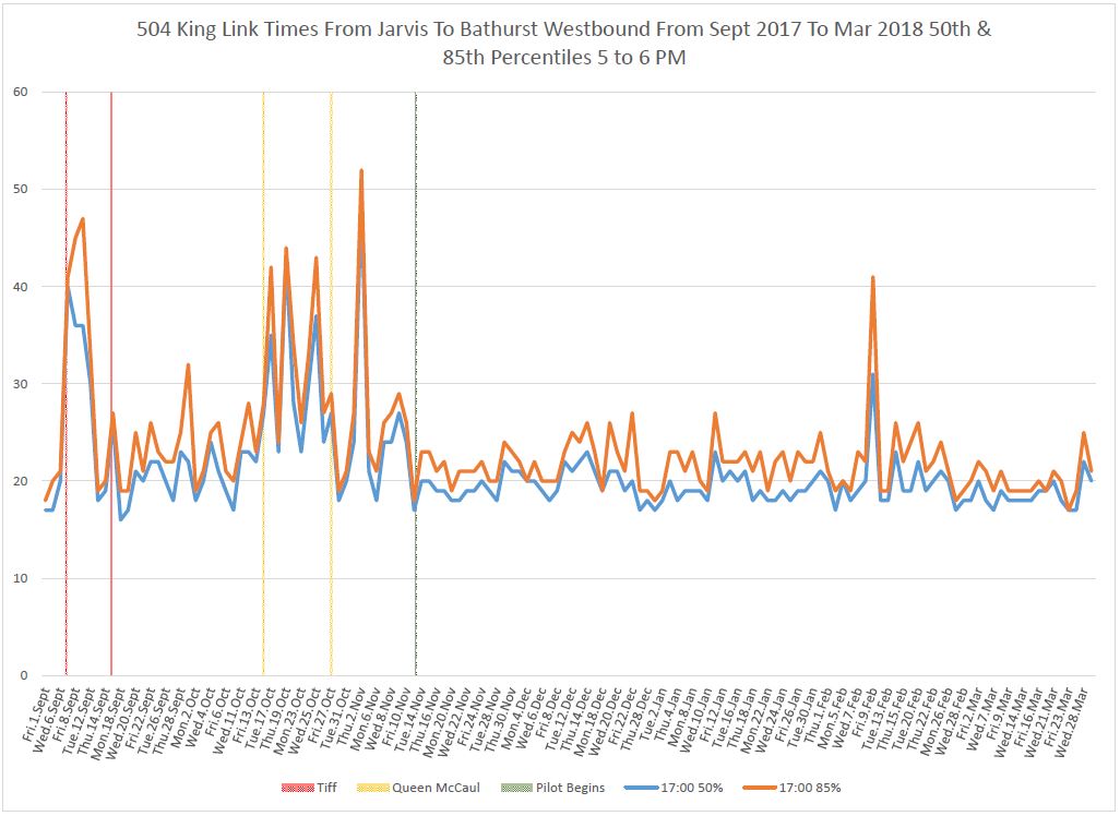
There is an uptick at the end of the month, but this falls on Wednesday, March 28.
Severe congestion is evident approaching University Avenue and also at Spadina Avenue in the latter part of the hour from 5-6 pm (17:00 to 18:00). The problem begins with a backlog of cars approaching Jarvis, and once these move off through the pilot area, they encounter delays at traffic signals because it is common for only one car to clear the intersection on a cycle while the car ahead serves the farside stop. (This was also a problem for nearside stops before the pilot because of the TTC practice that a car must be at the stop before operators open the doors. Combined with traffic signal delays, this can throttle the rate at which bunched cars can clear an intersection.)
University Avenue poses special problems because north-south traffic can block the intersection robbing the streetcars of green time. However, the delays to westbound cars (after 6 pm) are greater in the chart above suggesting that the bunching has more to do with the slowdown than conflicting north-south traffic.
A similar problem with bunched service triggering queueing delays is visible at Bathurst eastbound at about 5:00 pm.
The full sets of 85th and 50th percentile charts are linked below.
Unusual events visible in these charts are:
- Tuesday, March 20 evenings both ways: Construction at King and Brant caused a service diversion between Shaw and Spadina. There are no travel times for the Bathurst/Jarvis segment.
- Friday, March 23 1:00 to 2:00 pm: A collision at Peter causes a spike in westbound travel time data.
Line Capacity
Service capacity did not change much in March versus February as the relative proportion of trips provided by new cars was roughly the same during both months. The charts below show the capacity inbound at Bathurst in the AM peak and outbound to the west at Yonge in the PM peak.


The updated chart sets for various locations and times are linked here:
- 504_201601_201803_Capacity_Jameson_AM_Peak_EB
- 504_201601_201803_Capacity_Bathurst_AM_Peak_EB
- 504_201601_201803_Capacity_Yonge_PM_Peak_WB
- 504_201601_201803_Capacity_Bathurst_PM_Peak_WB
- 504_201601_201803_Capacity_Jameson_PM_Peak_WB
Detailed Breakdowns of Travel Time Data
The charts in this section update the material presented in the detailed review with the addition of March 2018 data. In the interest of saving space, only selected excerpts are shown below, but the full chart sets are linked in pdfs.
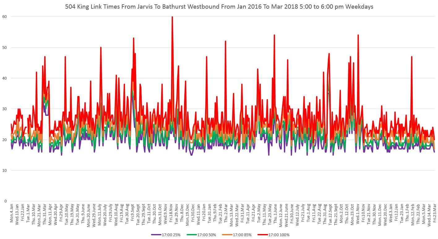
Weekday Travel Times
The chart sets at the beginning of this article showing the behaviour of travel times include only the 85th and 50th percentiles. The charts here show four values instead of two:se show the conditions experienced by most riders (85th percentile) and the median values (50th), but they do not show the full range. The next sets of charts include two additional bands:
- 100th percentile (red): This is the maximum travel time. In the period preceding the pilot, this line is a lot “spikier” with a lot of high values showing the extremes which would occur regularly.
- 85th percentile (orange): This is the typical condition experienced much of the time by riders.
- 50th percentile (green): This is the median value with half of the trips taking longer, half taking shorter intervals.
- 25th percentile (purple): Only one quarter of the trips take less time than this value and this establishes the “best case” riders can expect typically.
To the degree that the purple, green and orange lines are close together, the range of travel times riders see is narrow and predictable. This does not include any variation caused by service regularity or bunching that can affect both the wait time for a streetcar and the crowding on that car when it arrives. Even if travel times are consistent, irregular headways and crowding can make the overall experience worse than travel time data alone can show. Regularly spaced service, consistent travel times and adequate capacity can compound to improve the riding experience by more than the contribution of each component.
I will turn to headway reliability in Part II as this affects portions of the route well beyond the pilot area.
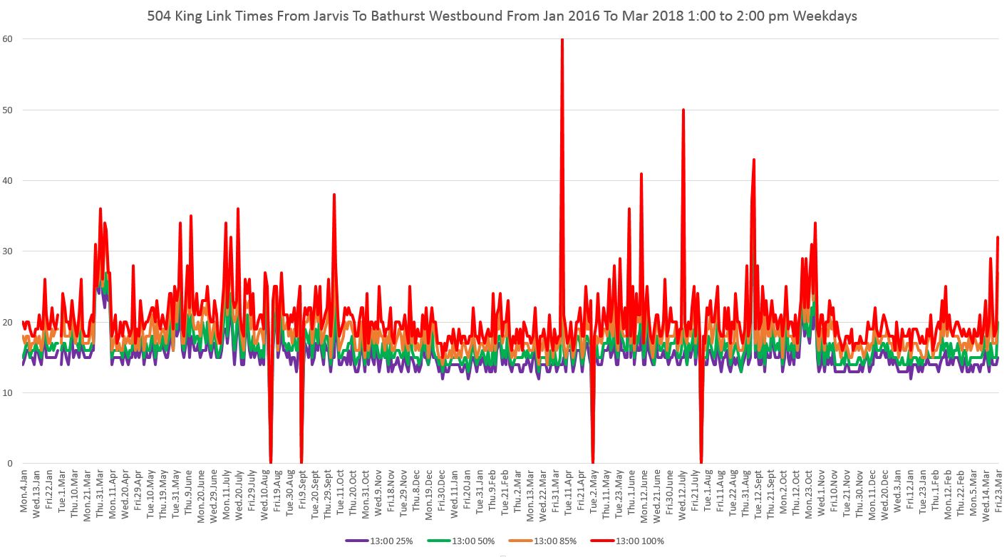
In the chart below, the early afternoon travel times westbound appear to increase compared with January and February. A review of the data for the affected days (March 14, 19 and 23) shows that in each case there was a minor service delay that pushed up the 100% values for the 1-2 pm period. This is not matched by a change in the PM peak (see chart above).
Although the maxima for the days in question go up (red line), the other percentiles are not affected as much.
The longer-term concern is that these events should be only a “blip” in the data, and not become a common type of service disruption.
Day-of-Week Breakdowns
In the previous article, the charts for individual days of the week were published in three sets, one each for the AM peak, PM peak and late evening. In this version, they are consolidated into one set of charts for each direction.
The data for March behave generally the same as in previous months with the notable exception that late evening travel times, especially westbound, appear to be rising with the onset of less frigid weather.
Hour-By-Hour 85th Percentiles
Most of the charts in these articles focus on specific time periods in order to highlight the range of values over various percentiles. The last set of charts shows the 85th percentile values for each hour from 6 am to midnight so that their evolution through the day is visible.
The data for March 2018, as on other charts, are generally similar to previous months. The pattern of substantial improvement in evening travel time on busy nights in the entertainment district continued into March.

Service Reliability
To be continued in Part II.

A rule which operators happily ignored when feasible to speed up operations. That can never happen with the new arrangement. What really gets me now is how CLRV’s will wait on the near side instead of proceeding to the far side if there is a CLRV already present on the far side when the platform space is big enough for two CLRV’s!
If they’re sticking with far side stops, I feel they need to extend the stop space to fit two Flexity cars at University, Yonge, and any other location where there are long dwell times due to large amounts of transfer traffic.
With 3 separately scheduled routes sharing King Street, bunching is inevitable, and the tiny platforms combined with “only one car at a time may proceed through” policy makes intersections a huge crawl. What kind of disaster is waiting to happen if the TTC had to divert 501 cars to King? Perhaps they will only divert to Dundas now?
Steve: Yes, the stops definitely need to be longer especially at the major stops. Of course the originally proposed transit malls at Yonge and University would have provided this.
LikeLike
Spadina would probably be my other nomination for an extended stop area. Are there any indications of changes coming? The pilot is approaching the half-way mark with few changes despite promises of routine adjustments during the trial period.
Steve: There was also a proposal for a closed area between Spadina and Brant, but the ones at the subway stations had a stronger justification given the volume of transfer traffic there.
Also I note 503 cars are still being signed out as 504 Spadina and 503 York via King at random by the ops and Wellington/York is occasionally being used as a short turn service even though the track east of Yonge should probably have been condemned by this point.
Steve: The track east of Yonge while in rough shape is still useable. I believe the plan is to do it in 2019. For 2018, there was (a) a hold up for Hydro work east of Yonge and (b) a desire not to tear up a parallel street during the pilot. It’s worth noting that the 503 extension to Spadina is described in some TTC notices as temporary. At least when they short turn via Wellington and York, they still hit the eastbound stops unlike the common 502 (and previous 503) short turns at Church which ran back east empty, but nominally on time.
LikeLike