
The purpose of this article is to delve into the data on the behaviour of King Street transit at an even more finely-grained detail than in past articles. The presentation here focuses on:
- Hourly variations in travel times.
- Daily variations based on the day of the week, including weekends.
The data are the same as those used for previous articles, but with changes in presentation to bring out different aspects of the “story” that they tell. In particular, it is important to examine the data at a level of detail sufficient to see where variations exist and where they do not. Averages over several days and over multi-hour periods simply do not reflect the way the line behaves.
A fundamental purpose of the King Street Pilot is to “shave off” the worst of the transit delays caused by congestion. For periods when traffic is free-flowing, there will be little or no change because nothing was “in the way” to begin with. Expectations of large savings in travel time can really only apply to periods when service was likely to be disrupted. This can vary from hour to hour, by day of week, due to special events, weather, and other factors. The whole point is that if the worst of the disruptions are eliminated, service will more reliably be at close to “best case” conditions.
The source data for this and all other studies of transit operations I have published come from the TTC’s vehicle tracking system. Subject to the caveat that some data must be discarded thanks to wonky GPS readings of vehicle location, this represents as close to a 100% sample as one is likely to achieve. The data are from January 2016 to February 2018, except for February 2016 which I do not have.
There are several sets of charts here, and this article is intended to take the reader through progressively more detailed views.
Complete chart sets are provided in linked PDFs, and only a few of these are presented as illustrations in the body of the article to save on space.
I leave exploration of the charts to readers with the hope that this shows the kind of detail that is available, and that a closer look is needed to see how the route behaves under various conditions. As the year goes on, I will update these charts periodically with additional data to examine whether better weather, more activity and special events disrupt what has been, so far, a clear improvement in transit’s performance on King Street.
Travel Times on Weekdays
These charts present the range of travel times based on percentiles. This is the same format as used in previous articles, with the difference here that four ranges of values are shown rather than two:
- 25th percentile (purple): One quarter of all trips occurred in the time shown by this line or less. This gives a sense of the best possible travel times one can expect to see.
- 50th percentile (green): Half of all trip times fell below this value, and half above. This is the median, which is not the same thing as the arithmetic mean or average.
- 85th percentile (orange): All but the worst 15% of trips took this value or less. In effect, this is what most riders see. Ideally, if the orange and green lines are close together, then a large number of trips fall in a short range of travel times.
- 100th percentile (red): This is the maximum value. Spikes are usually, but not necessarily, the result of blockage, although they can also result from congestion as we will see below.
Downward spikes to zero indicate that for the day and hour in question, no streetcars travelled between the two bounds of the pilot area, probably due to a short-term diversion. Longer term diversions are included in the “maps” of the route that I create for these analyses, and so the extended travel times show up as a jump in values. (Rather than appearing to go “off route”, cars on long running diversions are tracked for continuous trips between Bathurst and Jarvis even if part of this did not occur on King Street. This shows the “cost” to riders in the time needed for diversion routes.)
Notable periods include:
- March-April 2016: Reconstruction of King & Charlotte. Service diverted via Spadina, Queen and Church/York.
- Early September 2016 and 2017: TIFF diversion. Same as above.
- October 2017: Queen-McCaul reconstruction diverted traffic and 501 Queen service onto King Street.
Although presentation of all four ranges gives more information, especially a better sense of the extremities, this can be a crowded view. The main purpose is to show the overall variation over time and the general character of the data.
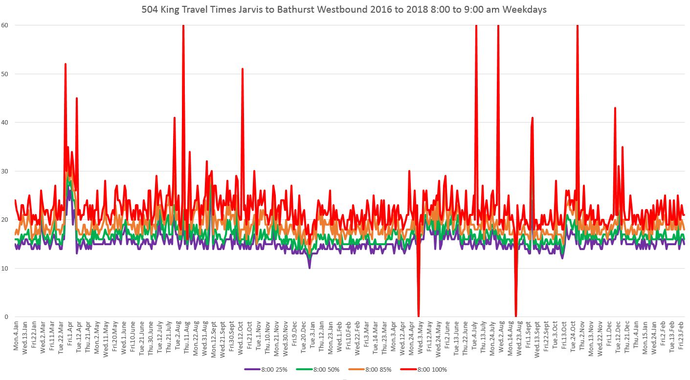
AM Peak Westbound
Travel times during the AM peak are more or less the same in the pilot period which began on November 13, 2017. The range of values is fairly limited, but this is not unlike the data for early 2016 and 2017, and one cannot attribute the smooth 2018 behaviour entirely to the pilot.
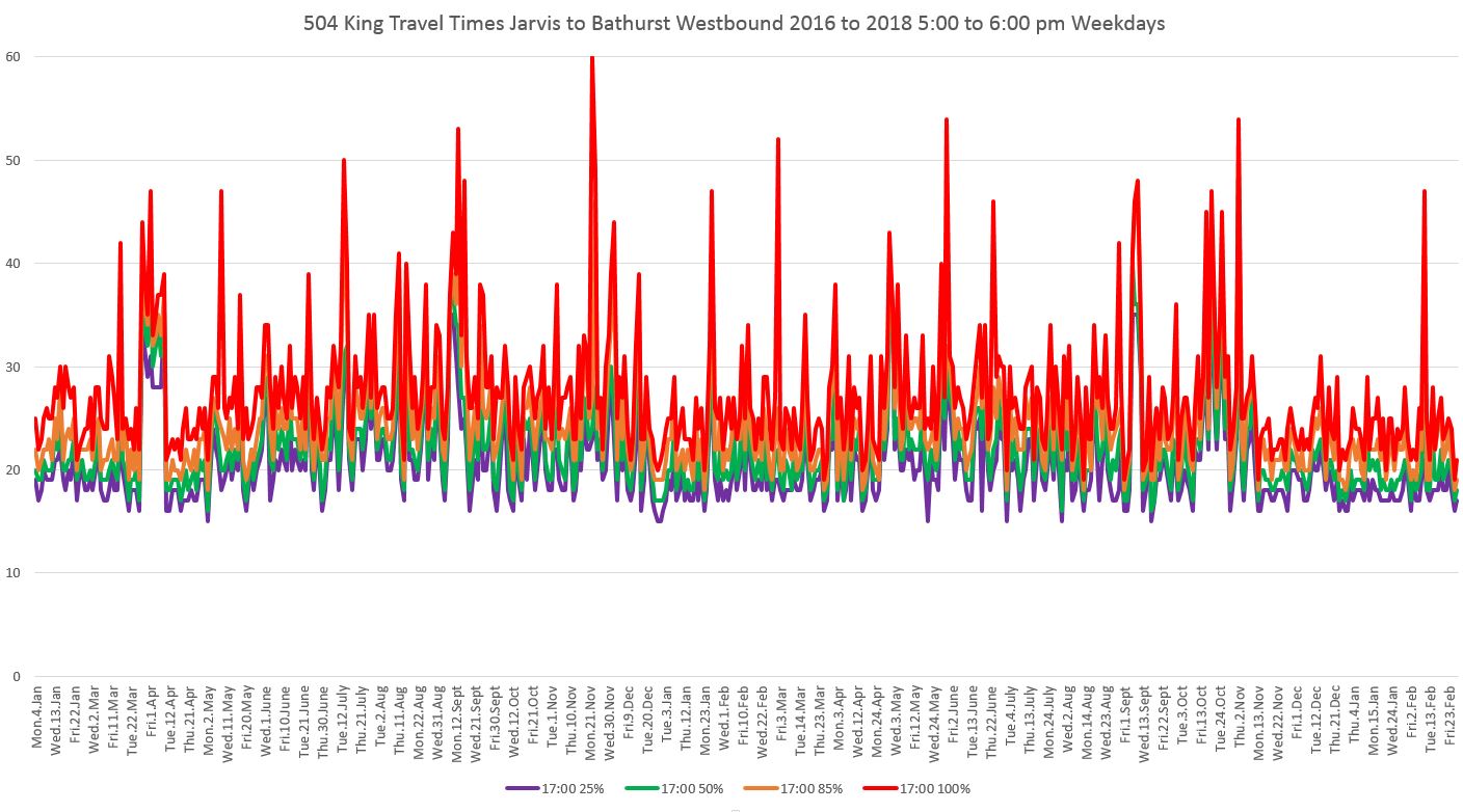
PM Peak Westbound
For the PM peak, the values lie at a higher level, and high maxima are common. Except for one data point in February 2018, the pilot period is demonstrably “better behaved” than the pre-pilot era.
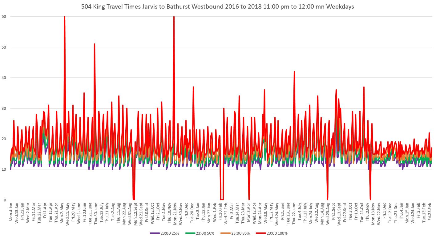
Late Evening Westbound
In previous articles, I used the 10-11 pm hour as “late evening”, but I have shifted one hour later to show a particularly striking change. The difference between pre-pilot and pilot data is obvious, but something else shows up here. There is a “heartbeat” in this chart in the pre-pilot era, and those spikes correspond almost exclusively to Friday evenings thanks to congestion in the entertainment district.
This chart illustrates two levels of detail that can be masked when there is too much information on one page:
- Day-to-day variations only stick out here because there is such a strong effect for one day of the week.
- The red maximum line overshadows the orange 85% line and masks just how high up the 85% values lie.
In later charts, individual days are broken out so that their behaviour and trends are more obvious. Also, charts including only the 85% line show how this value behaves without the very high maxima getting in the way.
The following PDFs contain these charts for each direction, and for five time periods starting at 8:00 am, 1:00, 5:00, 8:00 and 11:00 pm, for all weekdays. (Statutory holidays that fall on weekdays are not included here.)
504_201601_201802_JarvisBathurst__MFSummaries
504_201601_201802_BathurstJarvis__MFSummaries
Travel Times By Day of the Week
The next sets of charts break down the travel times depending on the day of the week for the periods beginning at 8:00 am, 5:00 and 11:00 pm. The charts for 8:00 am are uneventful and are included simply to show this fact.
AM Peak
For the hour between 8:00 and 9:00 am, there is little difference from Monday to Friday, but Saturdays are a bit faster, and Sundays faster still.
504_201601_201802_JarvisBathurst_0800Daily
504_201601_201802_BathurstJarvis_0800Daily
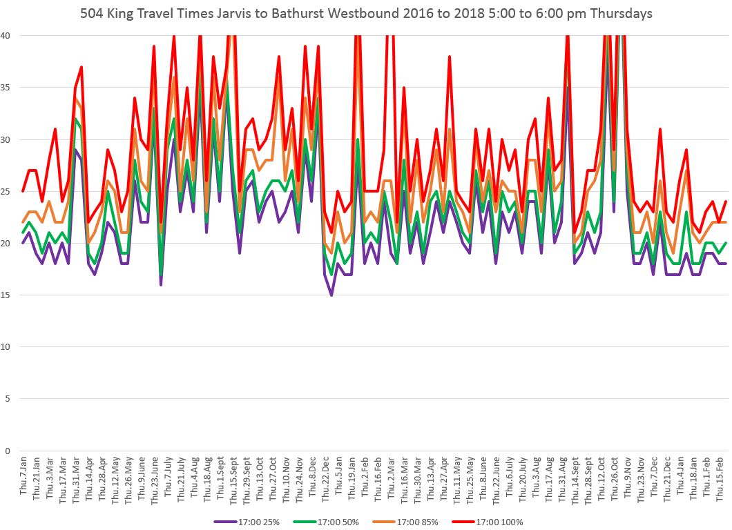
PM Peak
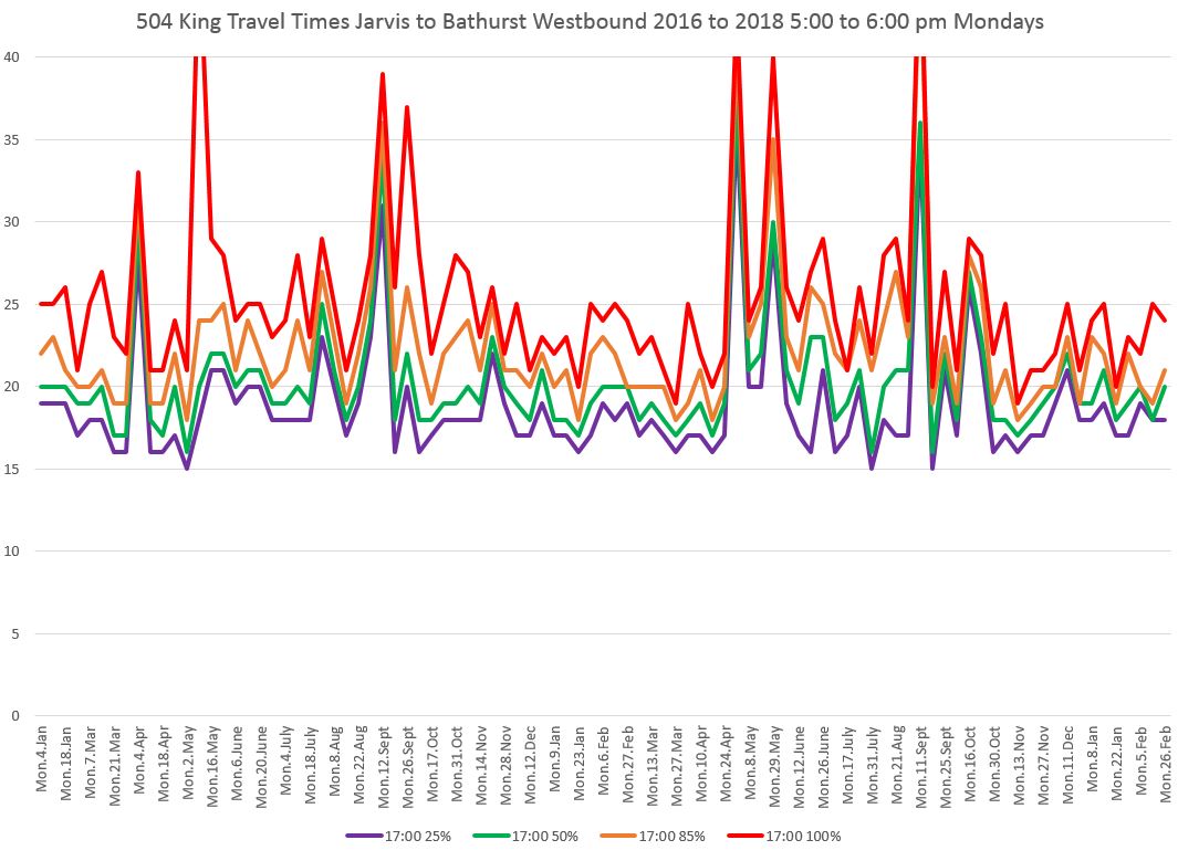
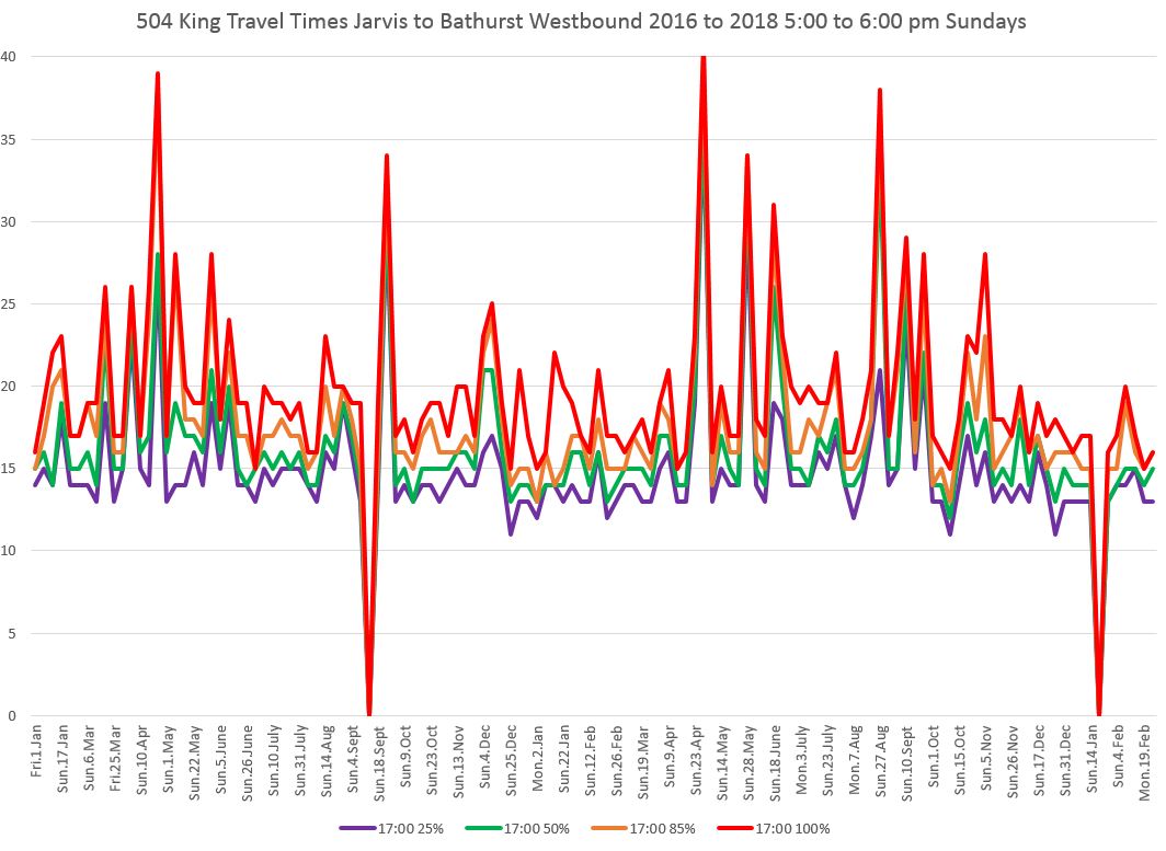
Travel times in the hour from 5:00 to 6:00 pm show a pilot era improvement in reliability, and to a lesser extent of median travel times. Mondays are generally the best of the weekdays, and Thursdays are the worst. The Sunday chart is included below to show how comparatively quiet things are although there are spikes in the summer period. These probably coincide to major events downtown, and an important issue as we move through 2018 with the pilot configuration is whether these peaks reappear even with the supposed transit corridor.
504_201601_201802_JarvisBathurst_1700Daily
504_201601_201802_BathurstJarvis_1700Daily
Late Evening
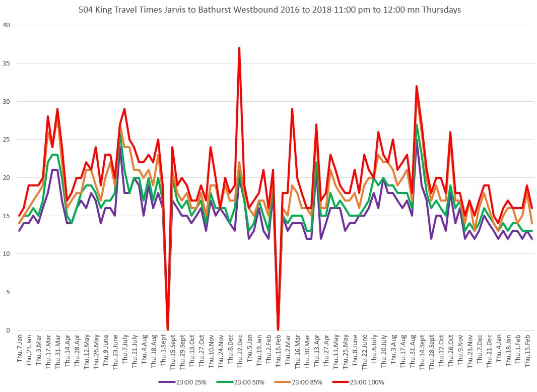
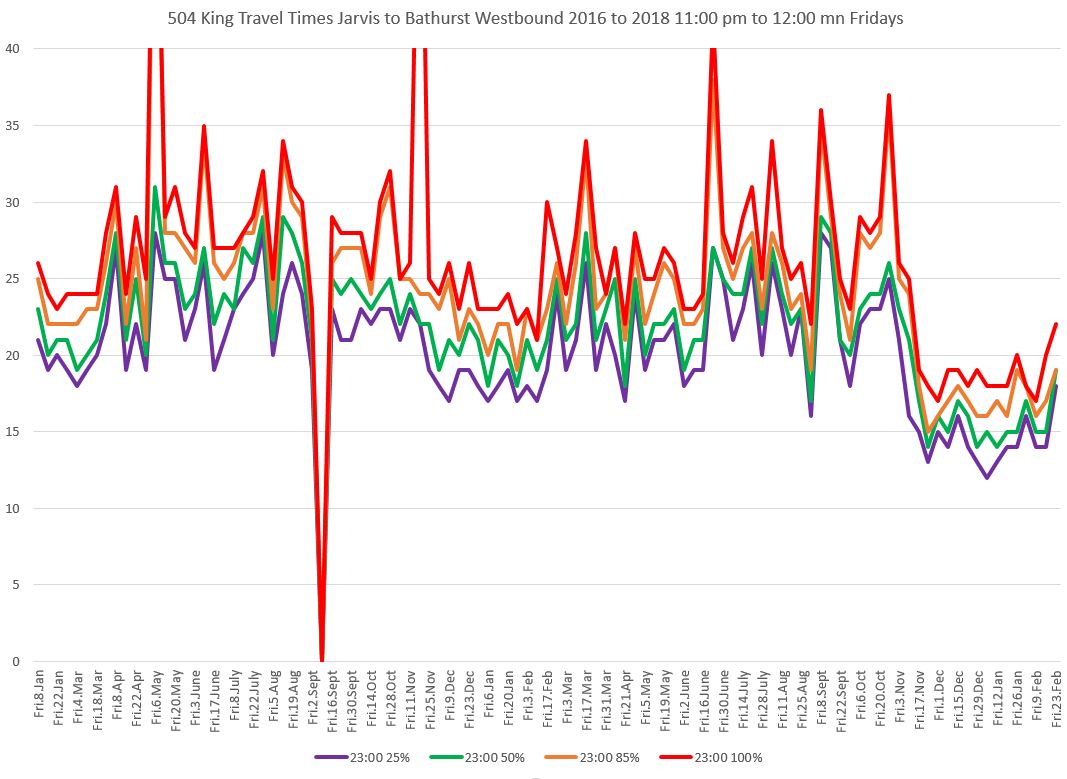
There are striking differences in late evening travel times depending on the day of the week. Monday to Wednesday is a quiet period, but starting on Thursday and peaking on Saturday, there is a marked change between pre-pilot and pilot era travel times. Even with lax enforcement in the club district, streetcars were getting through the area much more quickly in the 11:00 pm to midnight period. This is important because gaps and short turns on the outer ends of the route are not welcomed by riders at that time.
504_201601_201802_JarvisBathurst_2300Daily
504_201601_201802_BathurstJarvis_2300Daily
Thursdays
Although there are some fairly high maxima (red), the 85% line is not quite as bad in most cases. There is a clear drop in values and a reduction in their range once the pilot begins.
Fridays
The drop in travel times is quite pronounced for Fridays to a range that has no comparable values before the pilot.
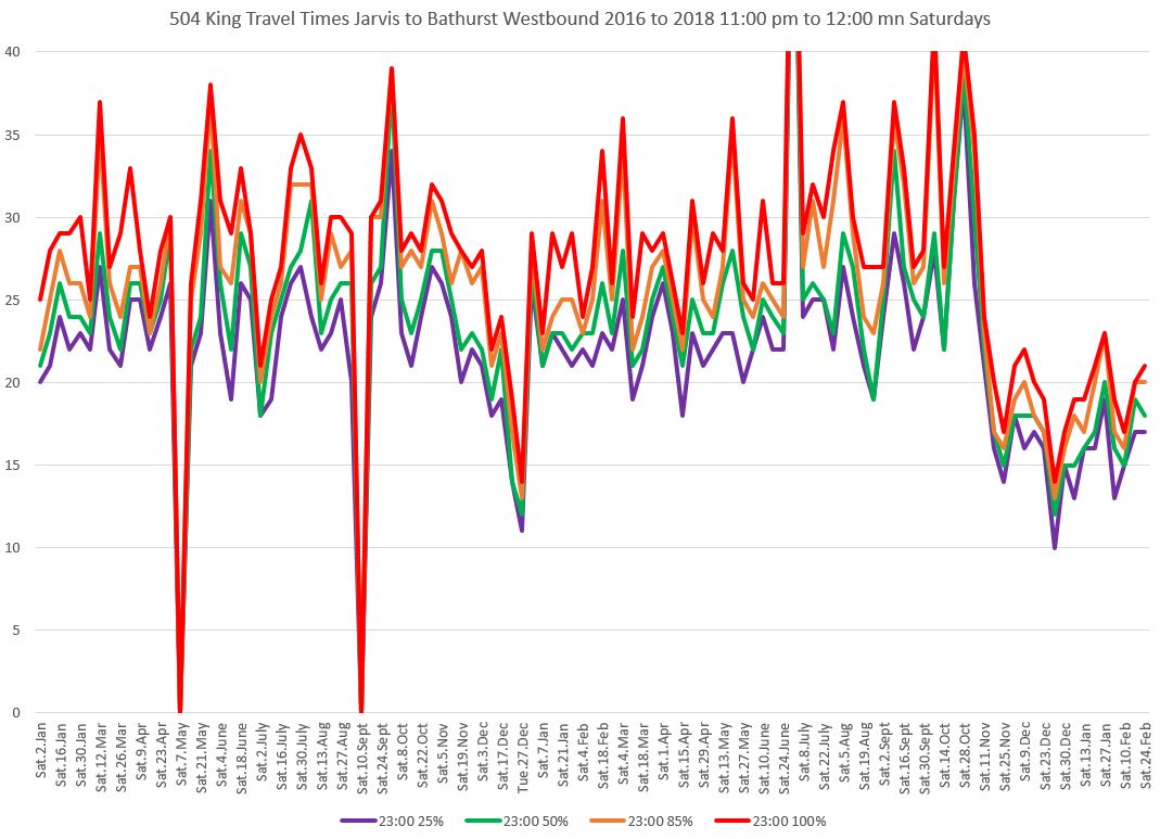
Saturdays
The decline in travel times on Saturdays are the greatest in all of the data covered by this article. This is a very strong example of the benefit of the transit priority scheme during a non-peak, non-weekday period.
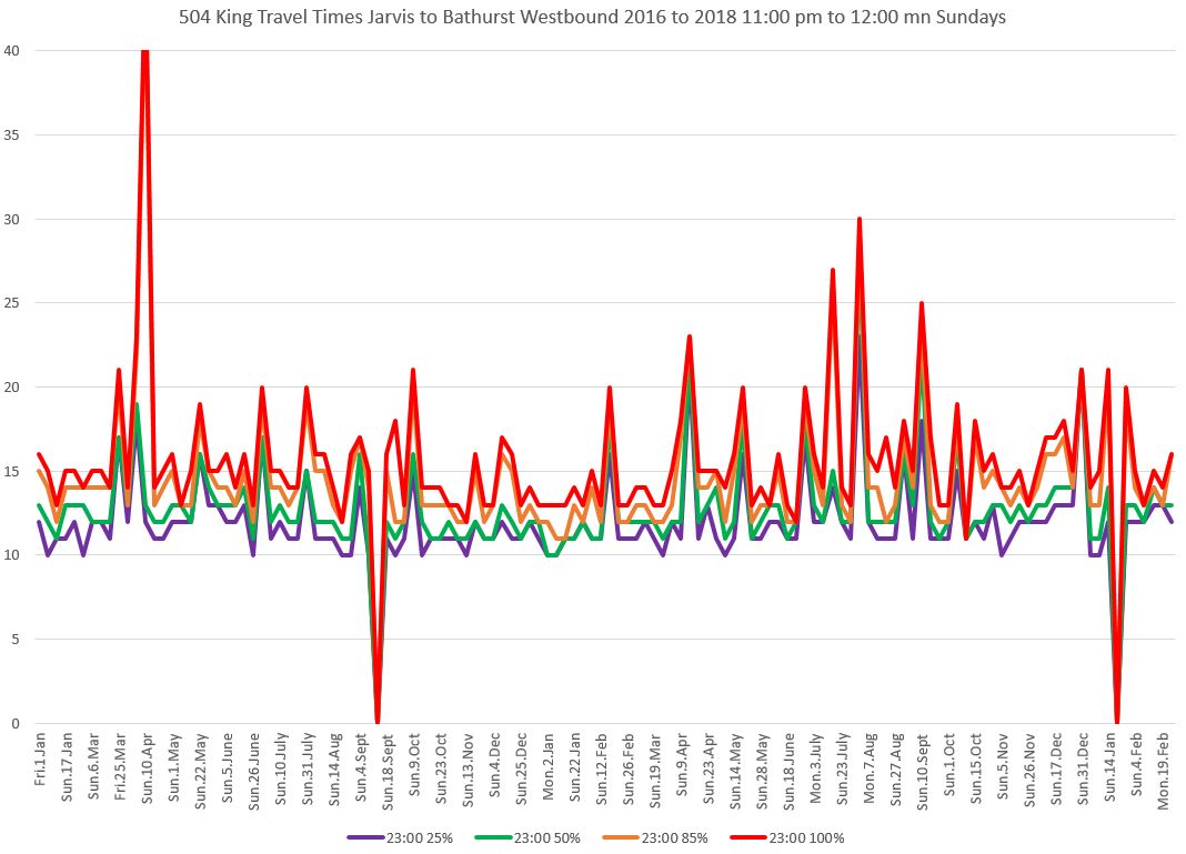
Sundays
With no activity in the Entertainment District, there is nothing to hold up the streetcar service. The range of values lies in the same general band before and after the pilot begins.
85th Percentiles for All Hours and Days
Within the limitations of a flat surface, two dimensions and a few colours, it is not practical to put too many different types of data on the same page. However, by restricting the view to the 85th percentile values (what most riders see with the worst 15% of cases omitted), there is room for more data. In the charts linked here, the 85th percentile values are shown for each hour of the day from 6 am to midnight, and subdivided by the day of the week.
504_201601_201802_JarvisBathurst_85pct
504_201601_201802_BathurstJarvis_85pct
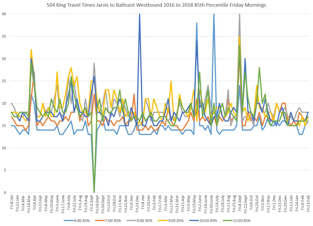
There are three pages for each day in these chart sets. The Friday westbound pages are shown below as an example.
Friday Mornings
The light blue line showing data for 6:00 to 7:00 am is, unsurprisingly, the best of the lot. Following hours up to the 8-9 data (yellow) show the buildup for the peak period, and the values then fall back through late morning. The values are better behaved once the pilot gets underway, and there is less spread between the shoulders of the peak and the peak hour itself.
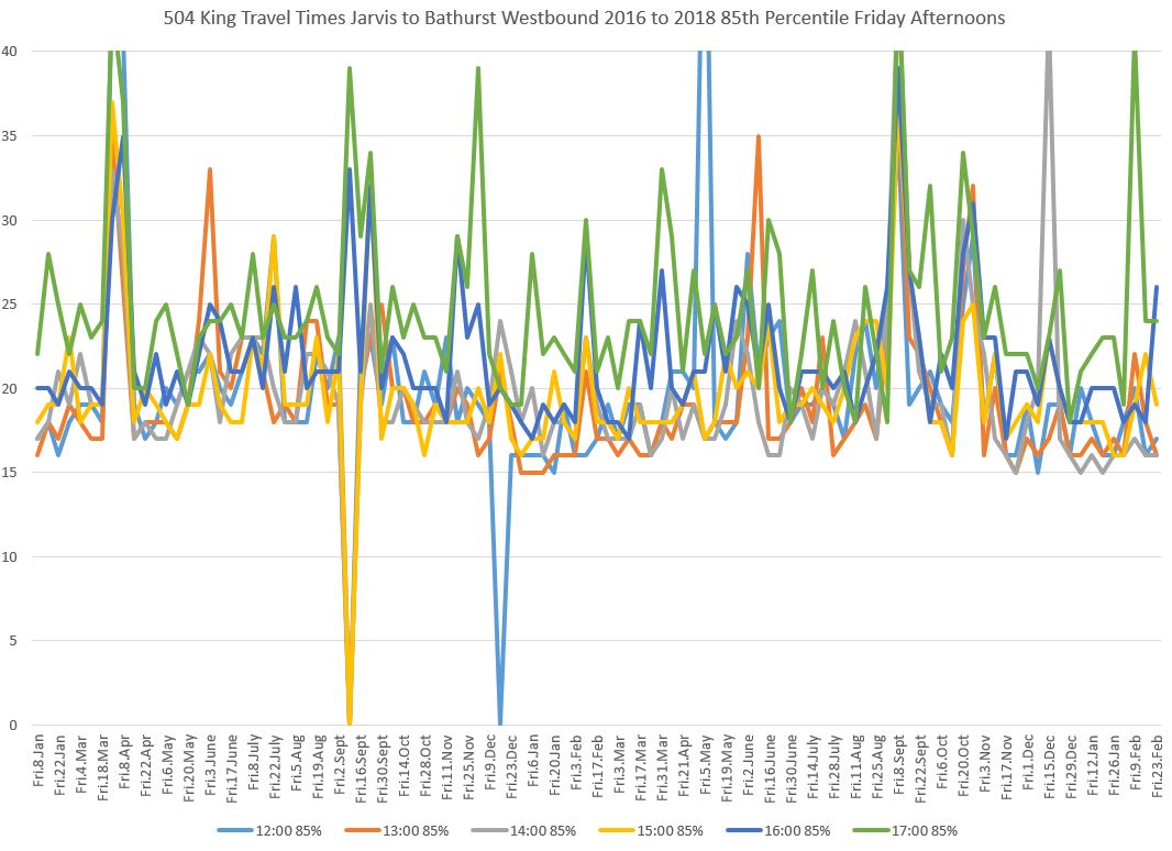
Friday Afternoons
There is a small improvement in travel times during the afternoons although less so in the peak hour 5-6 pm (green).
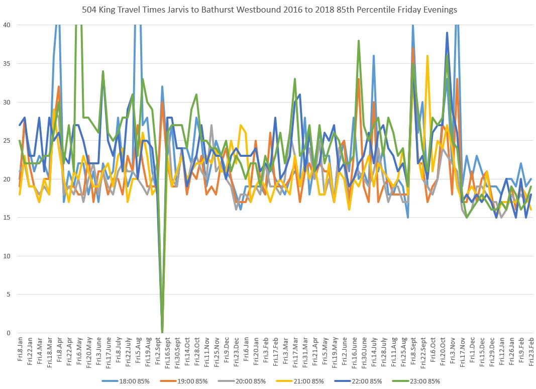
Friday Evenings
The benefit of the pilot on evening travel times is quite striking here and is the best of the whole day’s data. Not only are the values for each hour spread over a smaller range, that range is about five minutes lower than for the pre-pilot era at its best.

My daily westbound trip at about 8:20am is getting frustrating due to the continued unpredictability at University Ave. I have mentioned problems there before, and am surprised no tweaks to fix it have yet been made. It’s even worse now with the random 503 cars on the street.
This morning I got through reasonably quick, but on exiting I saw a parade of five cars queued up behind mine at the intersection, with another approaching from Bay (I have a picture I can submit). It’s a 90 second wait for one light cycle at University which allows only one car through due to a lack of space. That means the poor souls stuck at the back of the queue faced a 7.5 minute wait to move up one block from York to the far-side University stop.
It’s a guessing game whether to get off at Bay and walk west to University now. People are craning their heads to see what traffic is like down the street to decide if it’s actually faster to walk the rest of the way. I thought that pilot was supposed to remove the situations where walking was faster? A partial solution is to restore the stop westbound at York.
Steve: Yes. The farside stops have their advantages, but they assumed regularly spaced service, and this does not always happen. I agree that a westbound stop at York would be better.
Ideal would have been the original proposal discarded during development of the plan which would have closed the entire block between York and University except for transit and created a block-long stop in both directions. A similar arrangement would have been between Victoria and Yonge Streets. This idea was discarded as it was though to interfere with traffic too much, but would have been far superior for transit and pedestrians.
LikeLike
And there, in a simplified sentence, is a summary of all that is wrong with this City’s “approach” to public transit: “If X is bad for cars and car drivers, X *won’t* be done.” Never mind if X benefits 1000 times the number of voters/citizens/taxpayers/residents (= transit users) – in Toronto: facilitating transportation is not a democracy; it is only to benefit those relatively well-off car-owning taxpayers who deserve to have the passage of their one-passenger-at-a-time vehicle given carte blanche at any time on all thoroughfares.
I mean, it’s not at all similar to the “King Street Trial Project” *farther west* – that “unmitigated disaster” deserving of a middle-finger ice statue – where, as a result, all the restaurants throughout *that* zone will be closed by the summer because of that streetcar interference. (Never mind colder than normal temperatures and worse weather this past winter along with 3 shows split between the Royal Alexandra and Princess of Wales Theatres. Except that, with the multi-storey office towers, there are fewer “local shopping/dining opportunities” for folks that are driving.
Plus, how is it that car drivers can somehow adapt to travelling around on-street construction sites for days or even weeks (because they *have to*) but if you threaten to close a roadway – even just a block from University to York or Yonge to Victoria to allow quick passage of transit vehicles, it’s as if you are drowning puppies on live TV.
The charts above are vibrantly clear as to the benefits of restrictions along King Street and better service to transit users – even when it may only be a few minutes (see how much furor was raised by drivers faced with a proposed 1-minute-longer commute along Yonge St. between Sheppard and Finch Avenues with the width reduction from 6 lanes to 4….) There DOES need to be a long-term and dedicated War on the Car to chip away at the privileges that drivers have been and continue to be given in this city. Thousands of transit users are taxpayers and citizens too and their voices need to be heard and their transportation needs respected too instead of being held hostage by this particular “special interest group” and the councillors who serve their interests.
LikeLike