An online meeting of the Stakeholder Advisory Committee for Waterfront East transit was called for May 13. Normally these events provide significant new information about the project, and they are usually just ahead of a new round of public consultation or reports to Council.
That was certainly not the case for this round. What information was conveyed has already appeared in previous announcements and reports, and the presenters from Waterfront Toronto and the City’s Transit Expansion Office were loathe to part with details, assuming they knew anything about the project.
Notable by its absence was any detailed discussion of project phasing: which chunks of the Waterfront East will be built first and what the interim service plans will look like. Any further updates have been punted to early 2027 conveniently beyond the election.
I could not help remembering a conversation with then-Mayor Tory at TTC’s 100th Anniversary celebration at Hillcrest in 2021 where he was quite firm that the Waterfront line was a “priority” for him. We are still waiting.
The meeting was one of those embarrassing affairs with roughly the same number of public participants as staff. Notable by their absence was anyone from City Planning, the TTC or any Councillors’ office.
What was presented is already known:
- There is now $3-billion committed by Toronto, Ontario and Canada to fund the project.
- Council has authorized continuing with design work as well as “early works” this year in preparation for construction next year. The early work is construction of the ductbank on Small Street north from Queens Quay to Lakeshore to the site of a future substation to be incorporated in a new development there.
- Planned construction will be on Queens Quay east but not all the way to Cherry, and it is unclear just how much will be done in 2027.
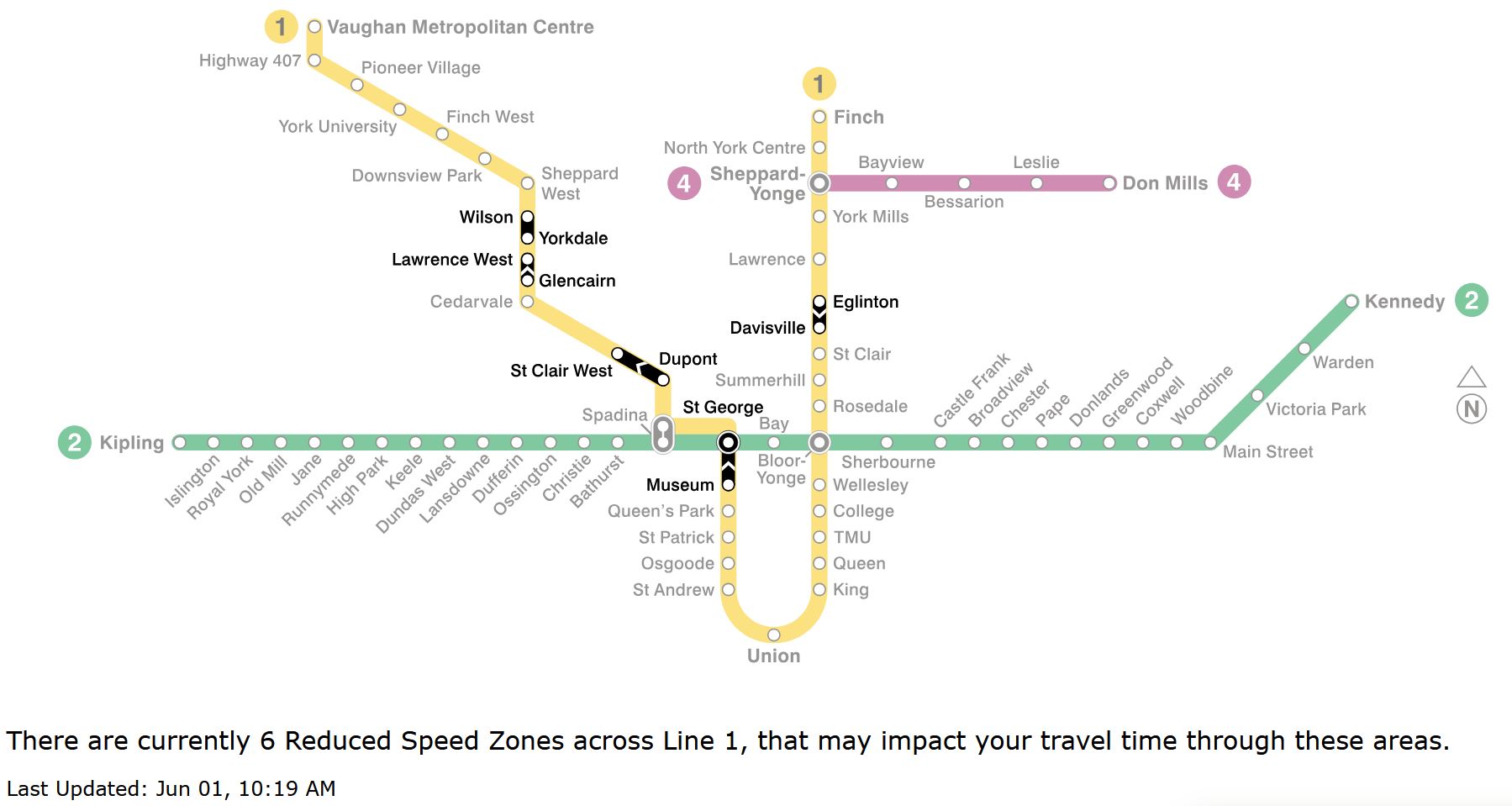
The opening date, as repeatedly stated, is now linked to the 2032 occupancy of new buildings on Ookwemin Minising (formerly Villier’s Island). It is almost as if all of the development already on Queens Quay does not exist or need better transit service as soon as possible. Reading between the lines, this will be the tail end of a service running east across Queens Quay from Spadina, but not yet to Union Station.
There is no staging plan yet. Obviously an east-west link on Queens Quay is needed first and that is impossible without interrupting service at Bay to Queens Quay and Union Stations. There is no projection for the duration of work that will first shut down streetcar service completely, then reopen only for through east-west travel pending completion of the Union Station rebuild.
Also uncertain is the timing of the branch north via Cherry to connect with Distillery Loop. This would provide an alternate link from the east, but there are timing issues with both Metrolinx work (Ontario Line), and the relocation of the Gardiner/DVP ramps. The legacy Cherry Street Tower just north of the rail corridor also needs to be moved.
This meeting did not discuss the many issues related to the Bay Street tunnel including work needed to expand the streetcar loop and to improve connections to the Ferry Docks at Queens Quay. It is ironic that hours before I wrote this, the City announced the names of two new electric ferries that will substantially increase capacity to the Toronto Island.
At the very least, some of these events already have dates or tentative plans, although they must be stitched together into an overall project. The “players” are notorious for changing plans without notice, and there is no guarantee a plan formed today will last until tomorrow. All the same, the public and politicians deserve to know what all the parts are and what issues might arise. We have $3-billion burning a hole in our pocket, but no idea of how to spend it or even if it will cover all of the planned work.
With the opening off to 2032 and full operation to Union beyond that, other projects potentially serving the waterfront also should be discussed including the Broadview extension south to Commissioners, and the extension of the WERTL east to at least Broadview. Waterfront planning has many moving parts, and nobody seems willing to unpack the complete list let alone speculate on costs and timeframes.
I had a real sense that the presenters were clearly the City’s “B” team, the kind of people one sends to a public meeting with a script to say as little as possible. Either they did not know what the options and decisions are on the table, or they were not telling even with repeated chances to clarify. SAC members had expected an update on staging this spring, but now we (and by extension Council and voters) must wait until 2027 after the election.
In some doublespeak worthy of Metrolinx we learned that the former Waterfront East LRT has been renamed the Waterfront East Rapid Transit Line. The purpose is to distinguish it from Lines 5 and 6, with the WERTL being an extension of the existing streetcar network. A rose by any other name.
Years ago, the TTC’s planning function was spun off to the City’s Transit Expansion Office, a group that has never felt like an “A” team. They seem to have taken over this project from the City’s Planning Department who gave a sense they actually knew what was happening having been involved for so long in redevelopment of the eastern waterfront.
Toronto deserves an open and honest discussion of waterfront transit issues, not a once-over-lightly presentation with almost no detail.
Continue reading →