Updated April 23, 2018 at 9:30 am: A section has been added following the original article to discuss travel times over the full route from Main Station to High Park including weekend data.
With the temporary conversion of the 505 Dundas and 506 Carlton routes to bus operation for much of 2018, there is a chance to compare how these routes operate with each vehicle type. In this and future articles, I will review travel times across the routes as well as headway reliability.
Data for 506 Carlton that I have collected runs from June to October 2017, and from January to March 2018. For the purpose of speed comparisons, weekdays from January 8-19 (streetcar) and March 19-28 (bus) 2018 are used. This avoids major storms as well as periods when schools were closed and traffic was lighter than normal.
There are seasonal variations in travel times due to the nature of streets and neighbourhoods transit services run through. As the year progresses, it will be possible to compare data for warmer months when the streets are busy between 2017 and 2018 data, although this must be tempered with the effect of diversions that were in effect during 2017.
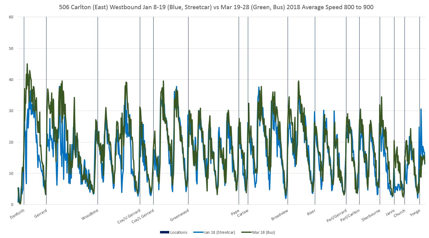
There is a slight improvement in travel time at certain periods of the day and certain locations/directions for buses, but this is not large or widespread even in off-peak periods. Buses tend to reach higher peak speeds between stops where conditions permit, but in many cases the speed profiles are comparable for the two modes.
Bus headway reliability has been a topic of some discussion on Twitter along with the capacity of the replacement service, but I will turn to those issues in the second part of this analysis.
Route History
The 506 Carlton route changed from time to time over the past year, and this affects the travel times reported here.
- June 18, 2017: Service diverted via Dundas and Bathurst both ways for streetscape work on College. This increases travel times on the west end of the route starting in mid-June.
- June 19 to July 9, 2017: Service diverted via Queen between Parliament and Coxwell for construction on Gerrard.
- July 10 to 25, 2017: Service diverted to Coxwell-Queen Loop for construction on Upper Gerrard. Bus shuttles provided service east of Coxwell.
- July 26, 2017: Service returned to Main Station. West end diversion via Dundas continues.
- October 14, 2017: Service resumes standard routing.
- February 18, 2018: Conversion to bus operation. Western terminus extended to High Park Station.
Chart Formats
The charts presented here are similar to those I have used in previous articles with some minor changes.
In the chart sets containing percentiles of travel time values, there are three groups of charts.
- The first three pages show the 85th percentile values by hour through the day. Most trips fall within this range, and using the 85th percentile shaves off the worst of the peaks.
- The next three pages show the 50th percentile values by hour. The format is the same as in the first group, but the values are the medians – half of the trips take longer, and half take shorter.
- The last four pages show four percentiles from 25th (only 1/4 of trip take this time or less), 50th (median), 85th (most trips) and 100th (maximum values) for four one-hour periods through the day representing the am peak, midday, pm peak and early evening.
For the collection of 85th percentiles, the travel times rise and fall through the day. Detailed comments appear later in the article, but a few points are worth noting here:
- Travel times in the summer (until Thanksgiving weekend) were longer than in the fall and winter.
- Some of the highest values fall not in the AM peak but in the late morning.
- Where there is a spike up, this indicates a delay severe enough to push the 85th percentile to a high value. Where there is a spike down to zero, there was no service over thr route section and direction during the hour in question (for example below, on September 22 between 11 am and noon).
Data are grouped based on the hour when a vehicle enters the section being measured, in this case crossing Yonge Street westbound.

Sample 85th percentile values for 6 am to noon
The charts with the four percentile bands give a sense of the range of values. At the low end, the 25th percentile (purple) gives a sense of the best case times as only one quarter of the trips achieve this time or better. At the high end, the 100th percentile (red) shows the maximum that can occur. This might only be one vehicle or it could be several. The space between the lines gives a sense of how spread out the values are.
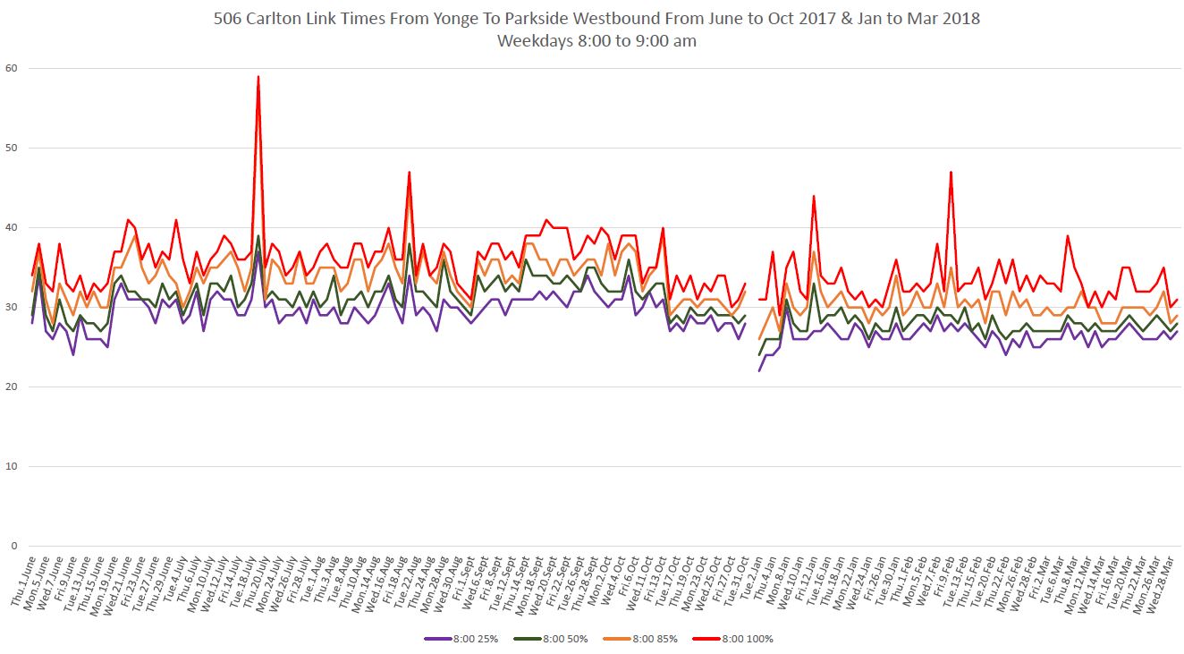
Sample percentile values for the AM peak hour
The charts showing average speeds are organized differently to show vehicle behaviour over the length of the route.
- There are 20 pages to each set of charts, one for each hour from 6-7 am to 1-2 am.
- To allow the charts room to “breathe”, the data are split into the east and west half of the route divided at Yonge Street, and there are separate chart sets for westbound and eastbound travel.
- Westbound charts should be read left to right. Eastbound charts should be read right to left.
- To the degree that the blue (streetcar) line hangs below the green (bus) line, this shows areas where streetcars travel, on average, more slowly than buses during the hour in question, averaged over the period. Where the blue line rises above the green line, the streetcars are faster.
- One can get a sense of the evolution of travel times for both modes over the course of the day by stepping through the pages to view the rise and fall of values.
- Late at night, the number of vehicles in service falls, and with that the number of data points. Charts for the period from 1-2 am have less granularity as a result.
Methodology: From the tracking data, we know where each vehicle is every 20 seconds, and from this can derive the speed at that location and time. The route is subdivided into 10m segments, and the calculated speeds are allocated to wherever the vehicle is observed at a given time. The total is then divided by the number of observations to produce average speeds. The downward notches in the charts correspond to places where vehicles stop, or at least slow, typically on the approach to a transit stop or signal. Not all trips stop at all locations, and so a non-zero average can result. Where the downward “notch” approaching a stop is wide, this indicates vehicles queueing on the approach due to congestion.