
Schedule changes for 501 Queen pending on June 23 are, in part, related to a growth in travel times. This article examines the evolution of the route’s operation and travel times over the past year.
There are a lot of charts in this post in part to show many aspects of the discussion and in part so that readers can refer to different parts of the route of interest. All charts are clickable to open a larger version.
Previous articles in this series are:
- Analysis of 501 Queen: January-April 2019 (Part I – Headways at Neville Loop)
- Analysis of 501 Queen: January-April 2019 (Part II – Headways at Humber Loop)
- 501 Queen: Low Floor Cars But Wider Headways
The growth in 501 Queen travel times from 2018 to 2019 is summarized in the following chart of monthly averages across the route westbound.

This prompted theories both by readers and by me about possible causes including:
- Longer dwell times caused by new streetcars
- Greater congestion caused by changes in traffic signal timing
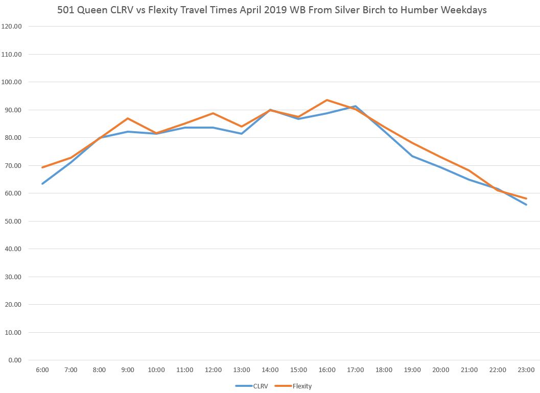
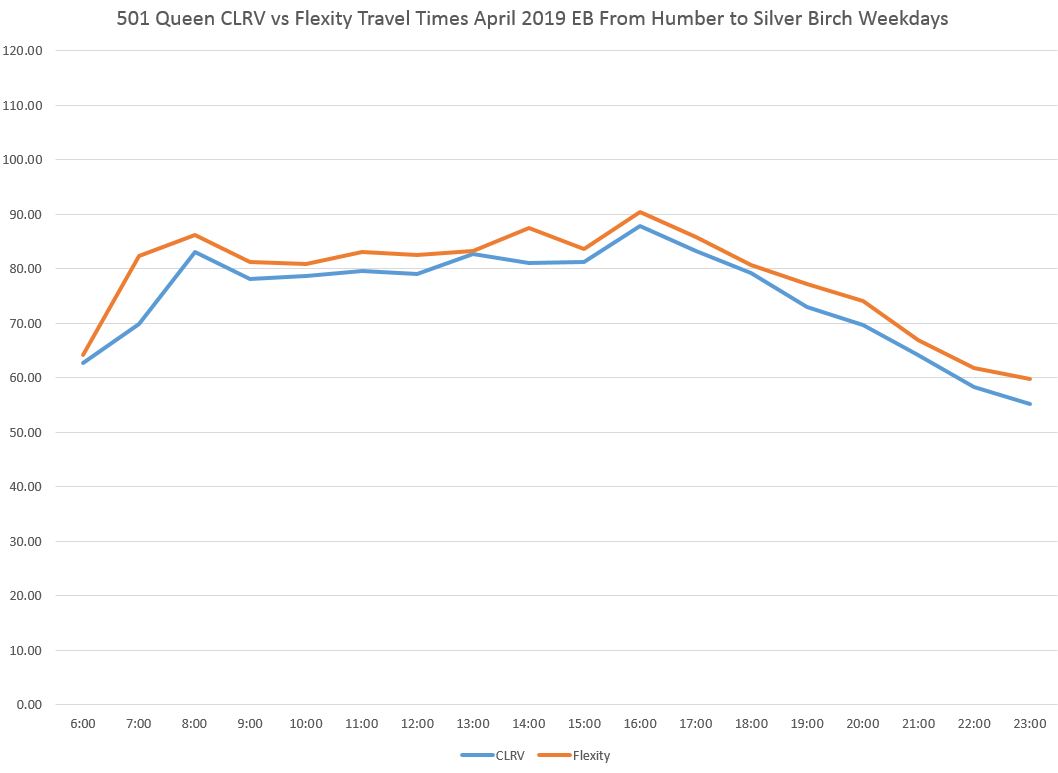
The charts below, included in a previous article, compare average travel times by hour in each direction and show slightly longer averages for Flexitys compared to CLRVs. A valid question here is whether the CLRV times are artificially higher because they catch up to Flexitys and then travel at a lower speed than would otherwise happen. This is difficult to verify because there is already much bunching leaving Neville and Humber Loops, and “gap cars” (the first car in a parade) slows following vehicles regardless of which type it is. However, a detailed review of the headways in front of each type of car shows that in many cases Flexitys tend to be carrying wider gaps. This is not, however, consistently the case.
As to the concern about signal timing, a factor that affected the King Street Pilot for part of its run, this did not pan out for the route as a whole, but was a factor at one location. City staff advised that the only place that was changed was at the Queen/Lansdowne/Jameson intersection where work is underway, and transit signal priority has been shut off. Elsewhere, the signal timings were not modified.
A further question lies in a jump in travel times midway through April. Both the CLRV and Flexity travel times went up and also became more varied from day to day in weeks 3 and 4 of April. This implies some change affecting the route overall, not just one vehicle type. A review of detailed data showed:
- The proportion of service provided by Flexitys did not change in the second half of April. Any effects due to their operating characteristics should be the same throughout the month.
- An unknown activity between Sherbourne and Jarvis slowed traffic during the late morning hours of the last two weeks in April. Some other congested locations such as the Lansdowne/Jameson and Bay-to-York areas also worsened during this period.
- The TTC instituted one of its periodic “no short turn” policies start in mid-April. While this makes the management statistics look good, the effect is to create larger gaps which, in turn, drive up average travel times as packs of cars follow each other and gaps are not filled.
Total trip times can be affected by extra dwell time at stops, by slower operating speeds, or by a combination of the two. In reviewing the data for April in both 2018 and 2019, I found that changes in speed were more marked than changes in dwell times.
Of particular note is that some of the areas where streetcars go slower in 2019 are areas of bad track where slow orders have been implemented. The number of these locations is growing on the streetcar network, and there is reason to worry that the TTC is not keeping ahead of this problem. Most notable is the track at Queen/King/Roncesvalles including the carhouse entrance and Sunnyside Loop. This has been on the books for replacement for a few years, and that work was delayed yet again to 2020 due to problems at the City with planning and contracting for the work. However, this is not the only place on the route where slow orders are a quick fix for track that needs repair. The TTC has a generic “go slow” policy for all intersections which slows streetcar service across the system.
I will update this tracking with May and June 2019 data as they become available.
In the next article in this series, I will review operations on 501 Queen during the period when there appears to have been an embargo on short turns.
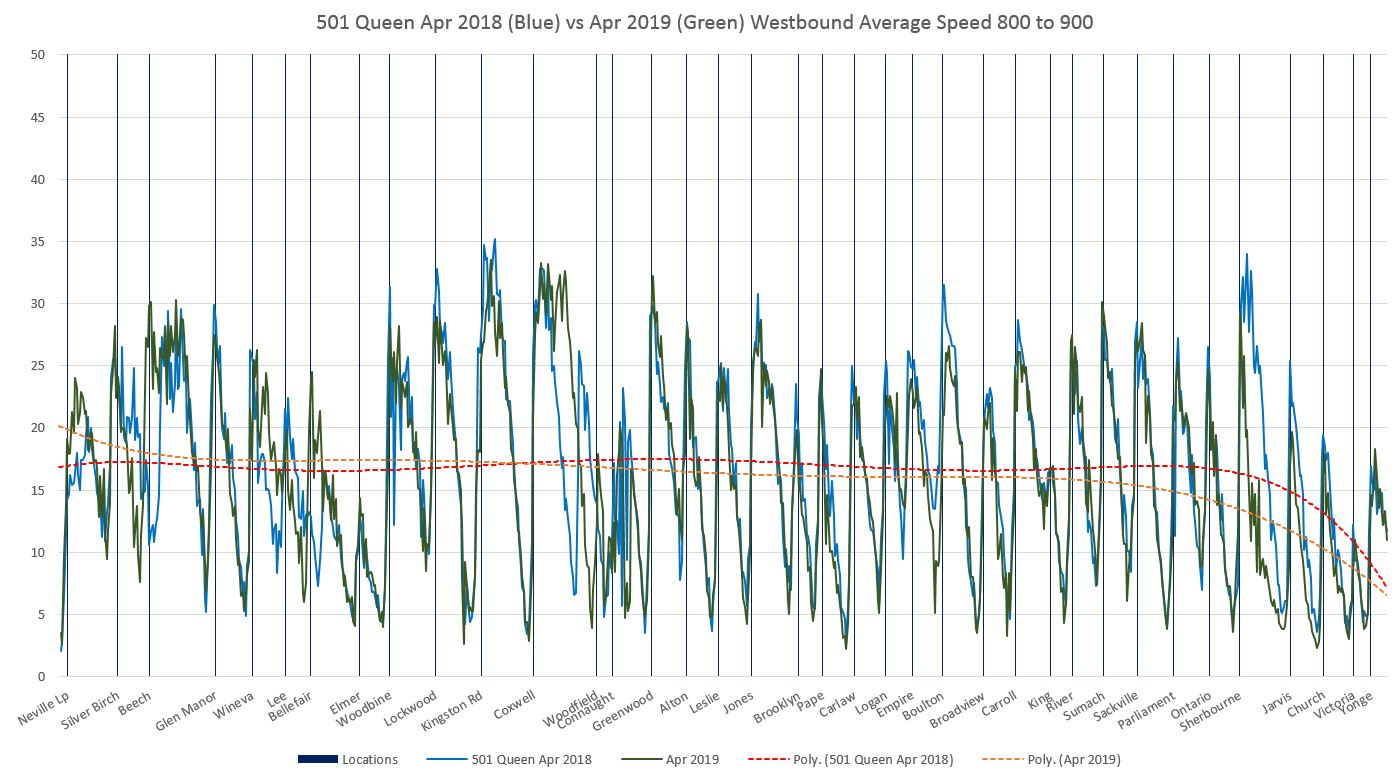
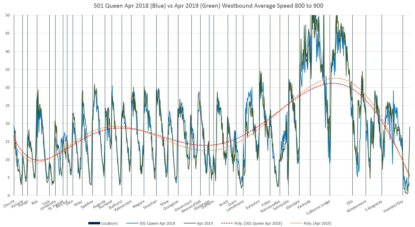
Travel Time on 501 Queen April 2018 vs April 2019
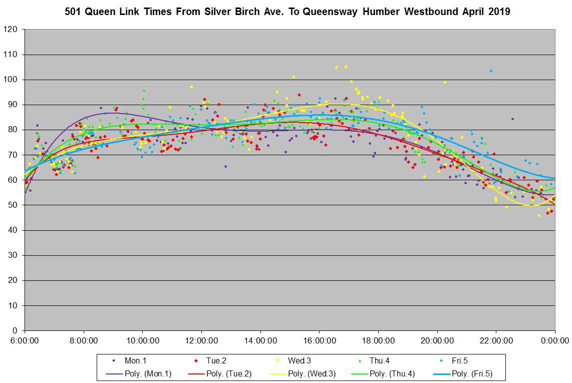
The charts included here contain data from all weekdays in the month of April (not including Good Friday) for 2018 and 2019. The full sets are linked as the “Speed Stats” charts at the end of this section. For clarity, the route is broken into eastern and western halves at Yonge Street. Each page shows the data for streetcars within a one hour period.
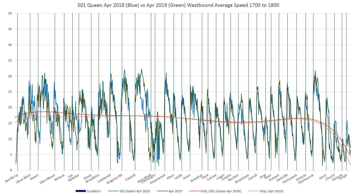
Here are examples for the AM peak hour westbound. The blue lines show 2018 data, and the green lines show 2019. Trend lines in red and orange, respectively, show the overall values. a few things are visible here:
- In The Beach, the lines diverge near Beech Ave, Lee Ave and Woodfield Rd due to stop relocations.
- There is a cluster of values west of Connaught caused by streetcars sitting at various locations in the yard at Russell Carhouse.
- Travel speeds west of Sherbourne to Jarvis were noticeably higher in 2018 than in 2019.
- Travel speeds west of Lansdowne and west of Roncesvalles were a bit higher in 2018.
For the PM peak:
- There is somewhat more difference in speeds westbound in The Beach, but the relative slowness west of Sherbourne has disappeared.
- The trend lines lie close together with 2018 having a small advantage over parts of the route. In some cases, such as near Lansdowne, relative highs and lows in each year balance out.

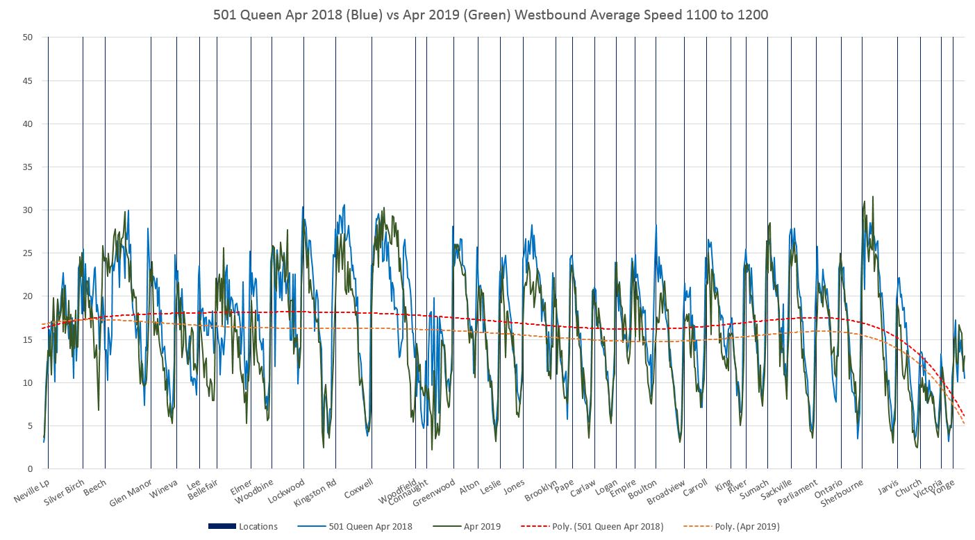
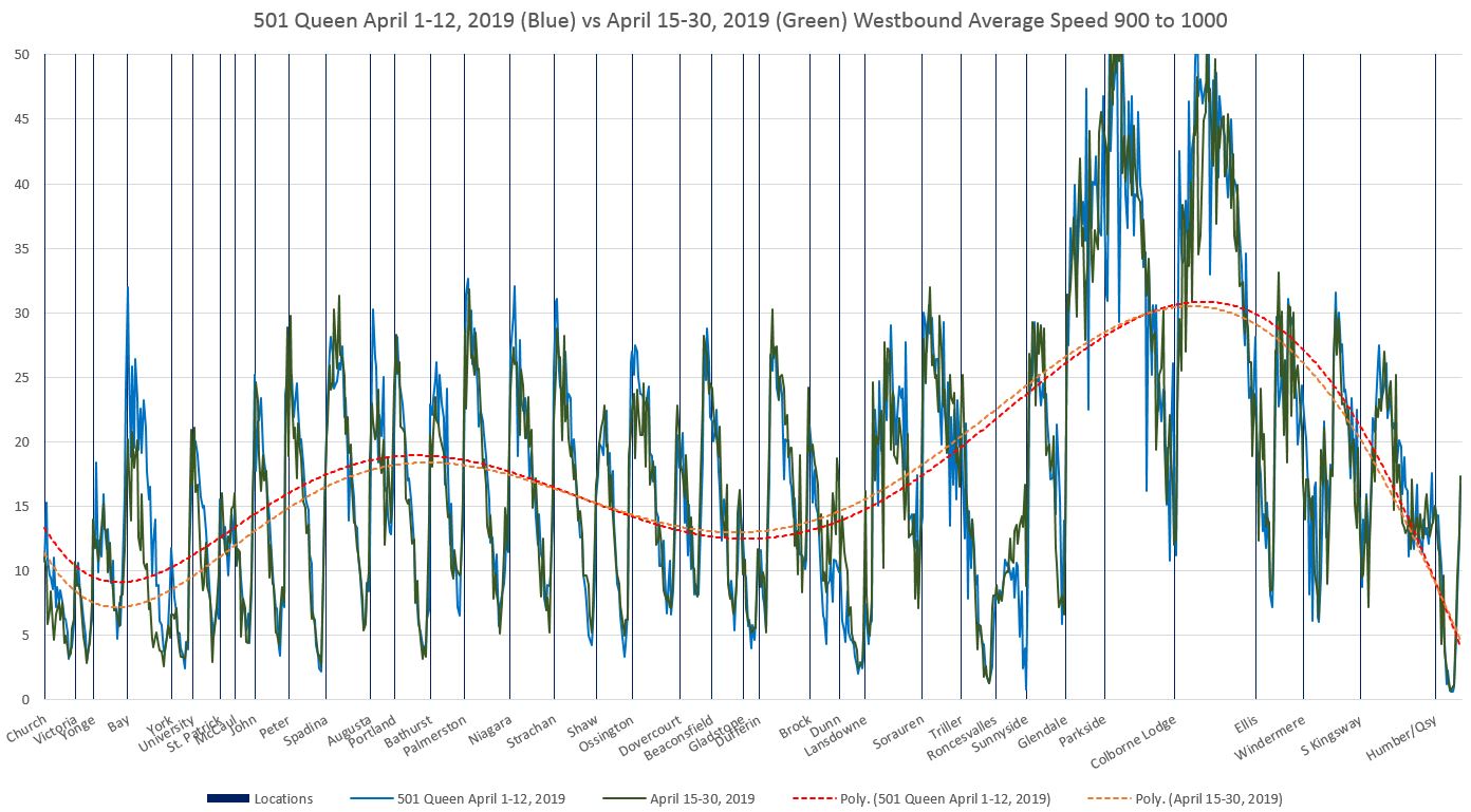
The difference in average speeds is more evident during off-peak periods when 2018 speeds are consistently higher. Here are the westbound charts for the hour starting at 11:00 am.

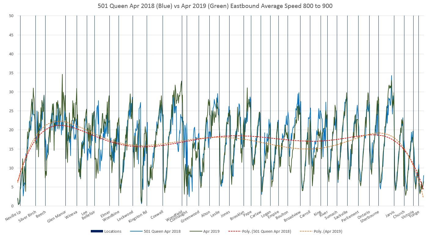
For eastbound service the charts are similar, but have certain direction-specific characteristics. Note that these charts should be read from right to left.
- In the AM peak, the slower operation approaching Roncesvalles as well as delays eastbound to Lansdowne in 2019 are quite evident. The effect is much less in the PM peak.
- East of Kingston Road, the downward spike in average speed is caused by short turning cars sitting in Woodbine Loop.
- The effect of queuing at Neville Loop shows up as a wider set of points with a low average speed as compared to stops along the route.
- Off peak charts (see the full chart sets) are similar to westbound in that 2018 speeds tend to be higher, but with a different pattern of locations.

Afternoon peak:
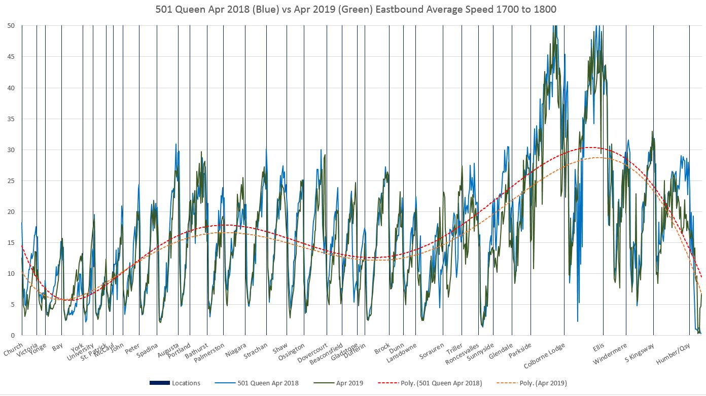

If you click on the links below to get the charts for every hour, you can step through them to see how the differences, such as they are, evolve through the day. Among the locations where 2019 speeds are lower are 2019 slow order locations:
- At Russell Carhouse
- Between Empire and Broadview WB (Degrassi underpass and track west of Boulton)
- At McCaul Street
- West of Roncesvalles
- East of Humber Loop
Full Chart Sets
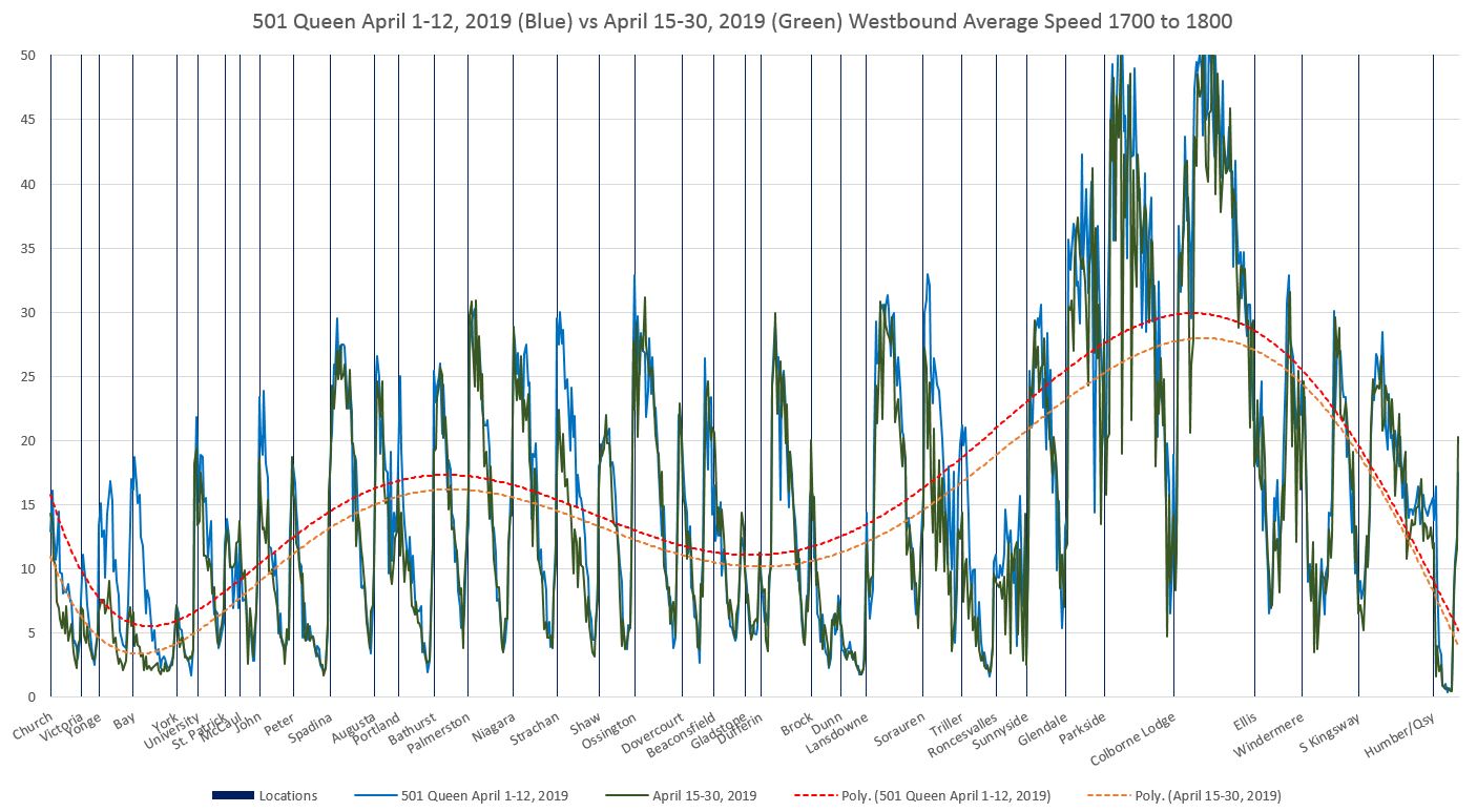
These charts show the average speed and dwell times over the 19 hourly periods starting from 6:00 am and ending at midnight. The route is split into east and west halves so that all of the information can appear on a page without crowding. To view the effect through the day, step through pages of the chart to move hour-to-hour to see how the values change.
Speeds are shown in km/hr.
In all charts, 2018 values are shown in blue, 2019 values in green. The trend lines are red for 2018 and orange for 2019.
CLRV data are shown in red, and Flexity data in blue.
Westbound
- 501_201804_201904_SpeedStats_WB_Full_Comparison_East
- 501_201804_201904_SpeedStats_WB_Full_Comparison_West
Eastbound
- 501_201804_201904_SpeedStats_EB_Full_Comparison_East
- 501_201804_201904_SpeedStats_EB_Full_Comparison_West
Travel Time on 501 Queen Weeks 1-2 vs Weeks 3-4 April 2019
In a previous article, I flagged the change in travel times during the latter part of April. A chart from that article shows this clearly. Where there are spikes in the standard deviation values that show up in only one week’s data, this is typically caused by short term events such as major delays or short-lived choke points.
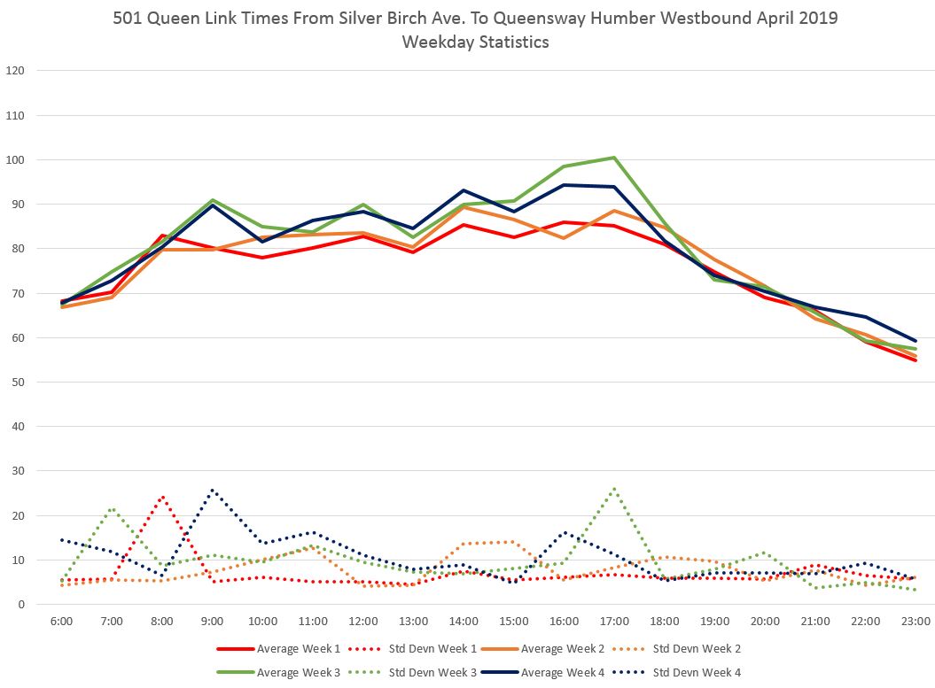
There are considerable differences between individual days as these charts of the beginning and end of the month show.
Week 1:
Week 4/5:

One important lesson from these charts is that with a potential variation in one-way trip time of twenty minutes or more, there is no reasonable schedule that can provide a short-turn free service without an extreme amount of padding to handle the worst case situations. Moreover, the spread in travel time values seen in late April is wider than in early April, and schedules should not be designed to work for bad situations that do not necessarily occur all of the time.
To determine the location(s) of changes in running time, I created speed charts including data for weeks 1-2 and 3-4 of April 2019. These are in the same format as the 2018 vs 2019 comparisons above, but with data for the two halves of the month. The weekly comparison chart shows that the largest differences were in the hours beginning at 9 am and at 5 pm.
In the 9 am westbound data, the differences between the two periods lie mainly in The Beach, west of Sherbourne, and west of Bay.

For the 5 pm data, there is less difference on the eastern half of the route, but the western end is slower over its entire length.

For eastbound travel, there is a similar pattern but not as extreme. Although week 3 shows higher averages, the standard deviation values are lower than for westbound trips, and the range of values is narrower particularly in week 4.

Week 4 is actually the lowest week for average times eastbound in the 8:00 am hour and it fares generally better than week 3 across the day.
For the 5:00 pm hour, eastbound travel times are similar on most of the western half of the route eastbound with the exception of the area just east of York Street. On the eastern half, travel times in the Beach are slower, and by a greater amount than for westbound data shown above. There is also a slow patch between Sumach and River Streets.


The point in all of this is that there will be variations in the average speed of service by time of day and year, and by location, and for the most part these cannot be predicted. What is important is to distinguish between changes that are permanent rather than transient, those that are seasonal and should be accommodated in scheduling, and those that reflect long-term trends in the speed of traffic.
When May 2019 data are available, we will see whether the rise in travel times for late April is permanent, or if times have dropped back to values in earlier weeks.
Full Chart Sets:
Westbound:
Eastbound:
Headways Carried by Old and New Streetcars
Some readers have observed that gaps on 501 Queen appear more likely to be followed by a Flexity than by a CLRV. This implies that the new cars might be delayed longer at stops because of the way door controls are typically left active for an extended period and there is often “one more rider” who manages to reopen doors just before a departure might occur.
Assuming that streetcars leave terminals on a similar spacing, then we should see an evolution of headways in front of each type of vehicle as they make their way across the city. One problem with this analysis is that headways are already ragged at terminals as I have discussed in previous articles. Anything that selectively slows one type of car will accentuate this problem by delaying it more than would have happened if the same gap were in front of the “faster” car type.
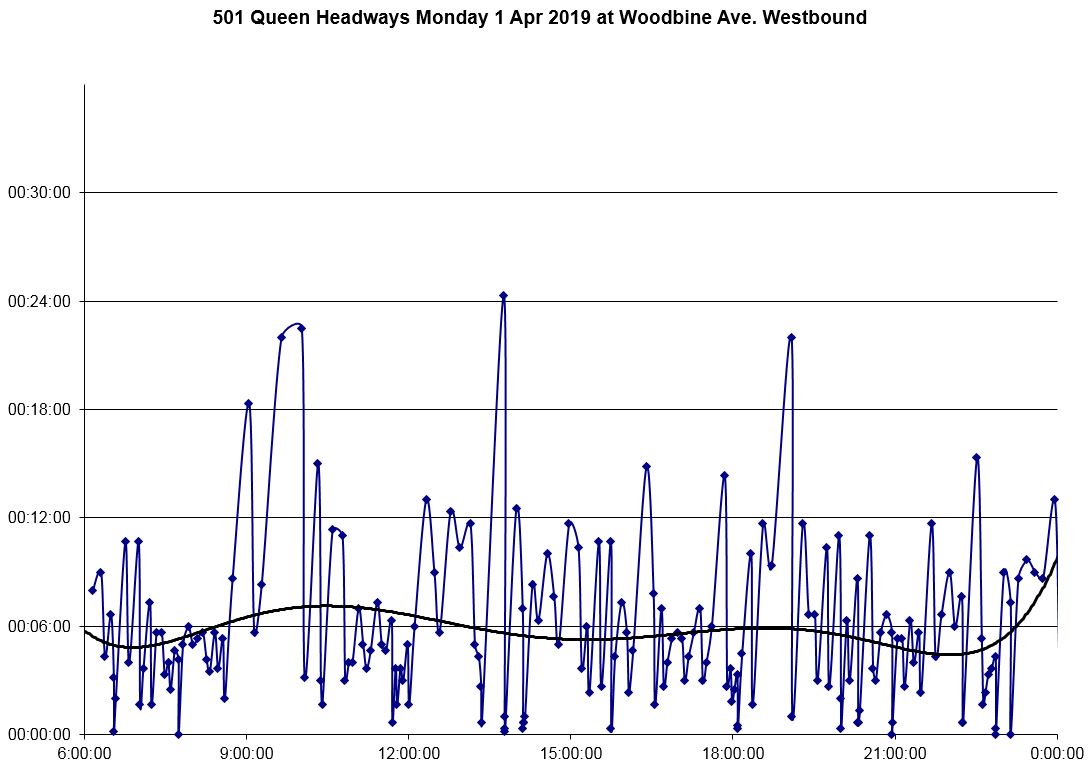
The chart below is in a format used in many previous articles on this site. It shows the headways crossing Woodbine Avenue westbound on April 1, 2019. Each dot represents one car, and the blue line joining them shows the fluctuation in headways over the day.The height of the dot shows the gap in time (headway) between cars and the horizontal position shows the time of day. The black trendline shows the general shape of the data with the spikes smoothed out.
This is not a pretty sight, and yet it is common to see service this irregular on the 501 Queen route. Worth noting here is that the trendline lies in a range from 5-7 minutes while the scheduled service is under 5 minutes at all times of the day except late evening. This is caused by short turning at Woodbine Loop (Kingston Road) which widens the average headway.
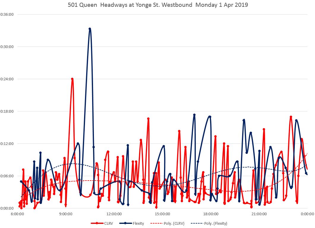
The chart below contains the same data, but values have been separated for trips operated with the old, smaller CLRVs (red) and the new, larger Flexitys (blue). Trendlines for each vehicle type are shown separately. Some of the headways are quite high compared to the supposed level of service, and these peaks are shared by both vehicle types. However, in this case, the trendline for Flexitys runs above that for CLRVs until mid-afternoon. Gaps of over double the scheduled headway are common.
The trendline from the chart above (all cars) falls between the mode-specific lines below, and is closer to the CLRV line because more than two-thirds of the service is provided by that type of vehicle except on weekends.

The pattern is different on every day through the month (see the full chart sets linked below), but there are common points throughout:
- The CLRV trendline lies lower than the Flexity line at most days and times.
- Wide gaps are common on all days.
Moving west across the line, one can see the progressive effect of the uneven headways.
At Greenwood, the swings in headways are not as severe as at Woodbine because cars entering service either from Woodbine Loop or Russell Carhouse (east of Greenwood) fill in the worst of the gaps. However, many data points lie near the horizontal axis where the headway is close to zero showing the degree to which service is bunched long before it makes its way into the busy part of the city.
Note that the trendline for Flexitys which is well above the CLRV values during the midday at Woodbine has moved down to the same range for service at Greenwood thanks to gap-filling. During this period and at this location, the headways for each vehicle type both bounce around, but they are comparable.

By the time the service reaches Yonge Street, the headways have opened up again and peaks that stayed at around 12 minutes at Greenwood have widened considerably. The very large gap mid-morning was caused by a service blockage that required a diversion via Broadview, Dundas and Parliament. The gap car happened to be a Flexity.
By the evening, service has formed into bunches which echo back and forth across the route between roughly 7 and 10 pm with Flexitys often running as the gap car followed by at least one CLRV.
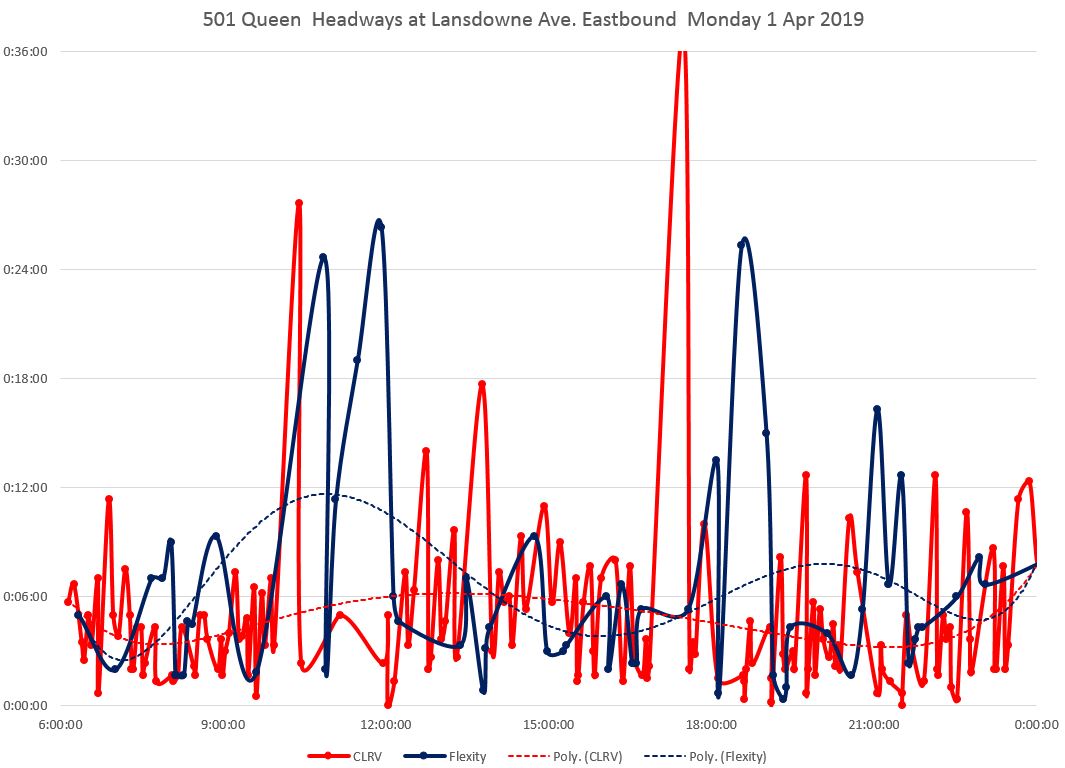
At Lansdowne, the peaks have pushed even higher, and the spread between the trendlines at some times of the day has opened up. Note, however, that the two lines stay fairly close to each other through the afternoon. In other words, if a Flexity happened to be a gap car, then the gap widened as the car moved west moreso than for a CLRV.

The situation eastbound is similar to westbound.
Leaving Humber Loop, the echo of the westbound gap from the diversion shows up at about 11 am.

At Lansdowne, some CLRVs have been short turned into the gap as it travelled east, but most of the gap filling was done at Dufferin/Shaw and at Bathurst, and the benefit does not show up until the next chart at Yonge Street.
At about 5 pm, there is a wide gap eastbound caused by blocked service, and most cars diverted from Roncesvalles via King and Dufferin. The gap after 6 pm was caused by bunching westbound to Humber that began the series of travelling packs of cars over following hours.
At Yonge, the spikes in headways are not as bad as at Lansdowne thanks to diversions and short turns, but the parade of cars led by Flexitys shows up twice at about 7 and 9:30 pm.
This begs the question of how much of the problem is due to Flexitys pet se, and how much to an absence of headway regulation.

At Woodbine, the effect of short turns at Kingston Road appears and there are large gaps to Neville of which one, over 30 minutes, happens to be a CLRV. The effect of the larger proportion of service operated with the CLRVs shows up in the trend line which is not affected as much by this peak as the trend line for Flexitys would be with a comparable value.
Over the day as a whole, wide gaps of three scheduled headways and more are common.

Full Chart Sets
These chart sets contain one page for each day of the month, including weekends, showing both the overall behaviour of the route, and the large variation from day-to-day in headway reliability regardless of which mode is operating.
Westbound
- 501_201904_Woodbine_WB_MonthHeadways_ByMode
- 501_201904_Greenwood_WB_MonthHeadways_ByMode
- 501_201904_Yonge_WB_MonthHeadways_ByMode
- 501_201904_Lansdowne_WB_MonthHeadways_ByMode
Eastbound
- 501_201904_Humber_EB_MonthHeadways_ByMode
- 501_201904_Lansdowne_EB_MonthHeadways_ByMode
- 501_201904_Yonge_EB_MonthHeadways_ByMode
- 501_201904_Woodbine_EB_MonthHeadways_ByMode
Dwell Times
In an attempt to determine differences in dwell times, I tried to produce charts similar to the speed charts, but showing the time when cars were stationary rather than their speed when moving. Although there is some difference, mainly in favour of the CLRVs, the differences are small and at some locations are clouded by stops as vehicles creep up to stops in congested traffic. A car could be stopped because it is serving passengers, waiting for a traffic signal to clear, or stuck in traffic. The latter two affect any vehicle, although operators of the shorter CLRVs may be more likely to open their doors before they are fully at the stop than Flexity operators.
The temporal resolution (see technical note below) is such that some of the differences are lost.
A Note About Methodology
Streetcars report their location in GPS co-ordinates every 20 seconds. This is the raw data that I have boiled down into route analyses for many years. The first step in the process converts the GPS to a single-dimensional number as if the route were a piece of string that were pulled out into a straight line. With a scale of one unit every 10 metres, Neville is at zero, and Humber Loop is at about 1670.
For each “tick” of the clock, a streetcar will have a “current” and “next” position. The change in position tells us the speed (location change in 10m increments times 180, the number of 20-second “ticks” in an hour). For each location across the route, the speed of all passing streetcars is averaged by hour of the day to produce the speed profile charts below.
The lowest resolution for dwell time (the length of time in one place) possible is that 20-second tick, but if two or more consecutive locations reported by a car are the same, then it is not moving and a dwell time at its location can be assigned in multiples of 20 seconds. These values are averaged for all cars to give the average dwell time for each hour at each 10m location across the route. The actual dwell time could be less or more than a multiple of 20, but that is the best possible resolution with the data available.
Note that if streetcars are caught in stop-and-go traffic, they can have dwell times over 20 seconds on the approach to a stop as well as at the stop. However, for this analysis, the main question is whether and how the numbers changed from one year to the next. Dwells on approach will go up if congestion causing queuing worsened in the intervening year.
Headways are calculated by measuring when each car passes various screenlines on the route. Charts of this information have appeared in previous articles. The change for this analysis is that data for old and new car types have been broken out so that the effect, if any, of mode-induced gaps is visible.

Steve, there also appears to be a slow order for westbound streetcars approaching Humber Loop. as they seem to operate very slowly from The Kingsway to Humber Loop. I am not sure if it is planned slow order or just temporary.
Steve: Yes, that shows up in the data for both directions, and I noted it in the article. Each slow order doesn’t have much effect, but cumulatively it’s another story.
LikeLike
It’s also getting slower west of Humber loop, and for that section Flexities have only starter to appear this board period, and I suspect will not be affected by late walk-ups as they might be on Queen St.
I have a 2009 service summary that shows running times Neville-Humber and Neville-Long Branch, as it was really operated as one route back then. The afternoon peak period shows minutes extra running time to Long Branch versus Humber; other periods show less running time, down to 45 minutes.
In the current service summary, morning and evening peak periods have 60 minutes running time between Long Branch and Humber, with 5-7 minutes terminal time. My experience is that streetcars generally adhere to this, though I await your data analysis as I don’t ride it that often any more.
On the other hand, early morning streetcars on the weekends are supposed to hop to it and do the run in 42 minutes!
So is part of the longer running time problem “the schedule has been made to work out evenly, and you have more time” and operators taking that extra time?
As a contrast, back in 2008/2009, there was an op on one particular run (18 I think) who would reliably leave Long Branch loop around 8:42 AM (when The Current’s theme started playing, I had to get out the door and to the stop), and it would arrive at Spadina and Queen around 9:30 AM, plus or minus a couple of minutes. That’s under 50 minutes. With the slower operation and split service (random waits at Humber), I’m sure that the minimum trip time would be one hour, and more like an hour and a half if you’re unlucky.
LikeLike
Once all CLRV’s and ALRV’s retire, how likely is it that two or more LFLRV’s that arrive at the same kerbside stop (no safety island) in the same direction will be allowed to load simultaneously? This would demand 60+ metres of loading space, and cannot happen at stops with safety islands (which are only 45 metres long) unless the second driver opens the front doors only. If people are so worried about random last-minute passengers having the power to hold up a new LFLRV against the will of a driver, I feel that not allowing more than one loading LFLRV would exacerbate this problem.
LikeLike