
For many years, the TTC has had a fetish for reducing short turns, or more accurately, for reducing short turn counts. Together with “on time” stats, this is a primary metric for TTC management, the one they get gold stars for.
When former CEO Andy Byford hired the current CEO Rick Leary, one of his first tasks was to reduce short turns. The result is that the CEO’s report concentrates on two factors to the exclusion of all other measures of service quality.
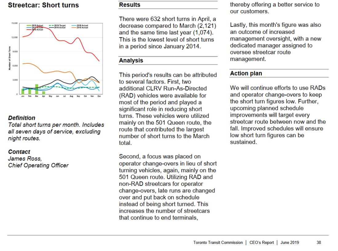
Here are two pages from the June CEO’s Report for streetcars. There are similar pages for the bus network.

In a recent newsletter to constituents, Councillor Brad Bradford, also a member of the TTC Board, included the following chart to show how the TTC is attacking the short turn problem. Short turns on 501 Queen were the lowest in number among all streetcar routes in early April, and fell to zero on Monday April 15 (along with a big drop on other routes too). This looks good, but as we will see later, has unintended side effects.
Bradford’s newsletter included this text:
We all know the frustration of too many short-turning streetcars, especially during rush hour. As a member of the TTC Board I’ve been working hard with my colleagues to improve the streetcar service and reduce the number of short-turns. I’m happy to report that April 2019 had the lowest number of short-turns since 2014, including the 501 streetcar which had ZERO short turns for several days.
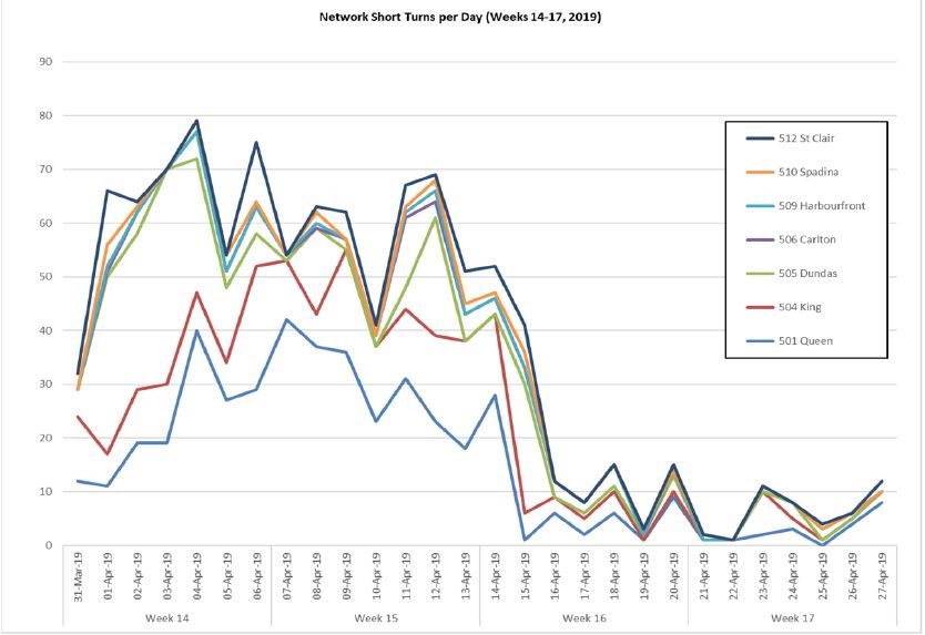
Short turns disproportionately affect Bradford’s constituents as they live at the eastern end of the 501 Queen and 506 Carlton routes. However, irregular service which I have documented in numerous articles affects riders along the entire route. Gaps of 15 minutes or more in what is advertised as “frequent service” do not encourage ridership, and the unpredictability of service leaves many people walking or taking alternate modes to the TTC.
Measures of Service Quality
The count of short turns only tells us how many cars did not reach a terminal over the course of the day. It does not tell us:
- What proportion of the service this count represents. The scheduled service to Neville over the course of a day (6 am to midnight) is about 200 trips with a similar count at Humber. 40 short turns represent about 10% of service assuming they are equally divided between the two terminals.
- What time(s) of day were most affected. Certain times of the day are disproportionately affected by short turns, notably the hours immediately after the am and pm peaks, and through the evening especially on busy nights in the club district downtown.
- Whether the short turn was successful in restoring more regular service, otherwise known as “filling the gap” on its next trip. There appears to be little or no management of cars re-entering service from short turns, and they may well reappear immediately ahead of or, even worse, behind a “through” car without reducing the headway. The average headway looks better, but it’s a bunch of two cars with a wide gap, not evenly-spaced service.
Unless one sees a breakdown such as the one published by Councillor Bradford, the numbers in the CEO report are accumulated for all routes over all periods of operation including weekends. This is a very generic average value, and it gives only the most general idea of short turning as a trend, rather than pinpointing problem routes and times of the day.
The other published metric is the “on time departure”. This is something of a misnomer because “on time” is defined as a window from one minute early to five minutes late, in other words six minutes’ grace relative to the schedule. For a route with a five minute scheduled service, three cars could depart close together and be “on time” for the stats.
The TTC does not report on headway reliability and bunching, issues which are at least as important as short turns. A rider on a Queen car bound for, say, Dufferin Street from Yonge does not care if their car gets short turned at Sunnyside, but they do care if no car shows up for 15 minutes or more, and they cannot board the first one in the parade.
If the scheduled times were 12:00, 12:05 and 12:10, the actual departures could be 12:05, 12:07 and 12:09 and fit within their allowed windows. The service is supposed to look like this:
X————X————X————X————X————X————X————X————X————X
But it can look like this and still be “on time”:
—————X—X—X——————————X—X—X——————————X—X—X——————
It would not take long for cars to bunch together as triplets running across the route. However, the on time measurement only applies at the terminals, and what happens after vehicles leave is not reported.
The TTC produced route-by-route statictics for five months, April to August 2018, but they have been missing-in-action ever since.
An important metric is the distribution of headways by time of day. Charts showing this information are published regularly on this site. (See this article about headways at Neville Loop and scroll down to charts showing the range of headways actually operated.)
The TTC would do well to report on the proportion of headways that are less than 50% of the scheduled value, or more than 50% over that value, broken out by by time of day and by location. Situations where vehicles are running very close together (except for the few routes and periods where the scheduled service really is that frequent) should be flagged. This is not a particularly challenging exercise, but potentially quite embarrassing.
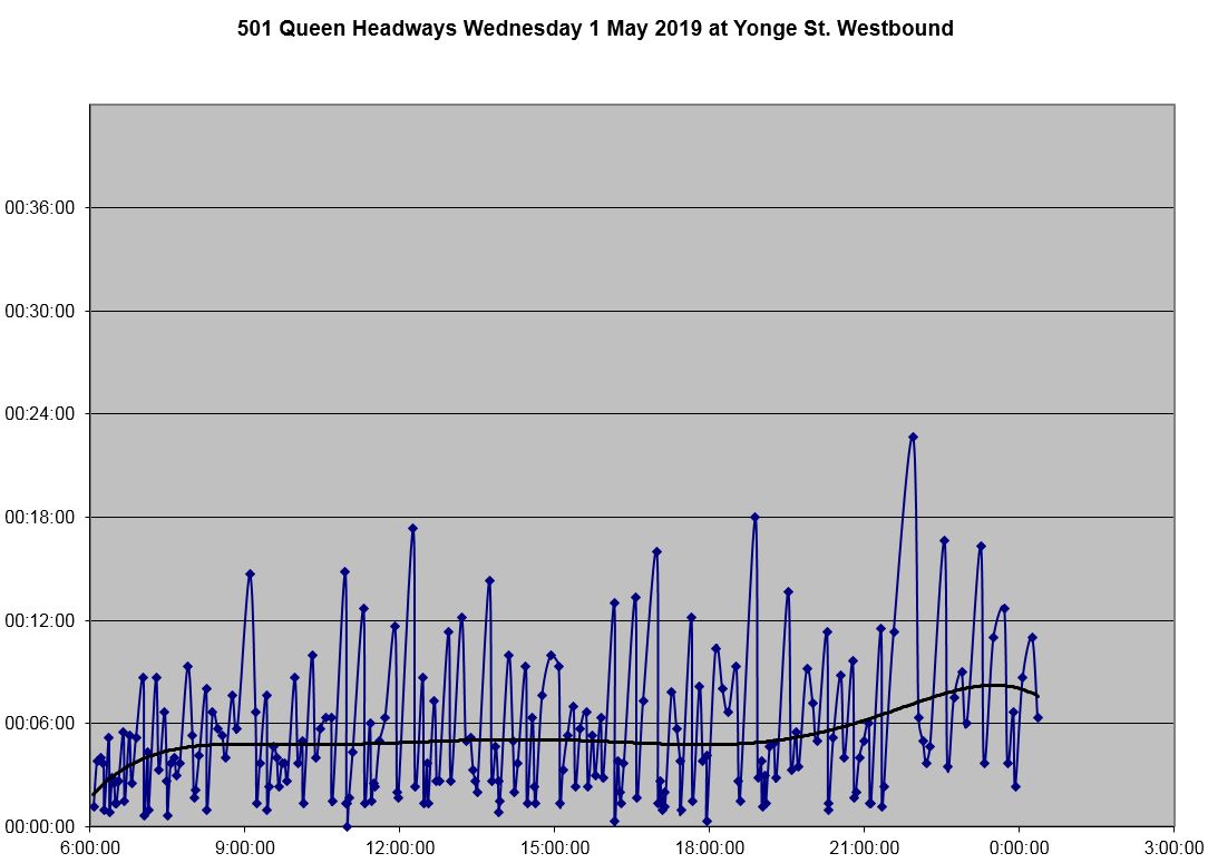
As a quick check, I looked at 501 Queen westbound at Yonge on Wednesday May 1. Of the 215 trips crossing Yonge Street, 54 were on a headway of two minutes or less, or one quarter of the service. There were 25 trips on headways ranging from 10 up to 18 minutes, over 10% of the service. Those are all-day values, and the proportions vary by time period. (The eastbound stats are comparable.) Here is a chart of the day’s data. Note that the trend line sits at about 5 minutes for much of the day only slightly above the scheduled headway, but what riders experience is wide gaps followed by at least two cars.
(For those who might argue that this is the fault of a mix of new and old vehicles, 501 Queen and just about every other route in the system has looked like this for years.)
Although there will be more data to digest, the TTC would have a better idea of just what riders face. Exception reporting would quickly flag areas of concern, although from my own experience looking at these data, there would be a lot of “exceptions” until the TTC addresses the problem of service reliability, not just of “on time performance”.
Crowding statistics are produced from time to time, but these rarely are broken down in public reports. This should be a standard part of the CEO’s report. If the TTC does not identify when its service is overcrowded, how can the public or the politicians with responsibility for transit funding and oversight reconcile claimed service provision with rider experiences?
Crowding and headway reliability are linked in that uneven headways lead to crowded vehicles (the “gap” car) and underused capacity. The average load might look good, but the average experience is not. Most riders are on the crowded vehicles and the “average rider” will report an overcrowded trip not to mention the possibility that they boarded the first vehicle to show up with difficulty, if at all.
Vehicle reliability is reported on an overall basis, not for its effect on service. Once a failure causes a delay of five minutes or more, it “counts”, but there is no distinction about the severity of the delay or the actions taken to restore normal service. Delays caused by infrastructure issues or by external events, and again the actions taken to counter their effects, are not reported. There is no metric for how well or poorly service was managed when things went wrong.
