
Route 505 Dundas has operated with buses since February 2018 thanks to various construction projects and the shortage of streetcars. March 29, 2020 will see Flexity streetcars on Dundas.
The past two years have not been kind to riders on this route. Flocks of buses travel back and forth, often in packs, and large gaps in service have been common. An easy answer to any complaints is that congestion induced by construction prevents the TTC from providing reliable service.
Actually tracking the route’s behaviour has been difficult because most of the vehicles on Dundas were using the new Vision tracking system, and the data extracts from Vision were, until recently, at a much simpler and less illuminating level than the data from the old CIS system that Vision replaced. This changed in October 2019 when detailed tracking data for Vision vehicles became available, and I have been collecting this for the past five months.
The High Points
This is a long read, and many will not do go through the whole presentation. The following points are of special interest:
- Over the period of bus operation, schedules were changed a few times in response to conditions on the route, or at least that was the idea.
- Some of these schedules had inadequate running time, but TTC management did not react, in general, with short turns which are a very bad thing from a point of view of reporting on service quality to the TTC Board.
- Instead, they adopted the tactic of either running buses express across a parallel route (Dundas is “U” shaped) to make up time, or having buses lay over at terminals to get back on time for their next trip. This reduced the actual bus/hour count along the route below the scheduled level causing crowding and increased dwell time.
- The schedules that added travel time back onto the route in mid-February had the unexpected effect of lowering travel times during some periods, and of improving line capacity because very few buses now run express to get back on time.
- A problem with irregularly spaced service and gaps remains even with the new schedule, but the situation has improved considerably.
These observations should not be taken as a blanket endorsement of longer scheduled travel times. There will always be a trade-off between having enough scheduled time so that almost no service short-turns and having so much padding in schedules that buses and streetcars congregate in packs at terminals. Conditions vary from day-to-day and no schedule can be “perfect” for all situations.
Service History January 2018 to March 2020
Before getting into the details, here is a brief history of service changes over the past two years.
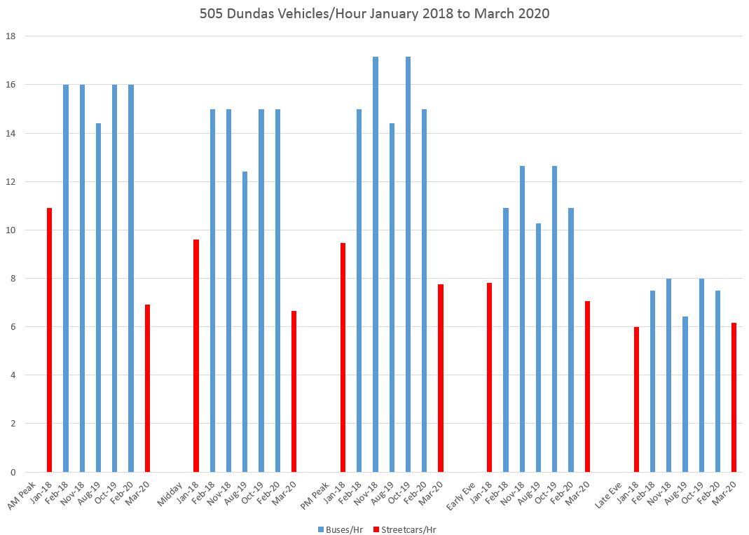
When buses replaced streetcars in February 2018, the number of vehicles scheduled per hour went up in recognition of the smaller capacity of buses. The chart below shows these values by schedule period for weekday service.
[Note: Vehicles per hour is a direct measure of service capacity while headways, the interval between vehicles, is the inverse. If the headway is small, the capacity is high and vice-versa. Using vehicles/hour gives a direct measure of the advertised service level where “up” on a chart matches “up” in capacity.]
When the Flexity cars replace buses at the end of March 2020, the number of cars in service will generally provide a capacity increase over the former streetcar service with CLRVs, although this applies more to the PM peak and evening than to the AM peak and midday service. AM peak service is constrained by the fleet size, but the capacity will be supplemented by four bus trippers during the half hour peak-within-peak. That capacity is not included in the chart below.
A related issue for bus service on Dundas has been the adequacy of scheduled travel and recovery times. These have evolved over the past two years.
In the chart below, the two components are shown separately, but the height of each column represents the total time allotted to a round trip.
Note: “Recovery time” in TTC schedules has until quite recently been used more to round the total trip time to a multiple of the headway, not as true “recovery” time. Indeed, there are cases below where there is no recovery time in the schedule at all. Recently, as part of the attempt to improve service reliability, recovery times have started to grow to allow for the variation in travel times on routes. The intent is to reduce the need for short turns, but a side effect is that vehicles accumulate at terminals when conditions are good because they do not need as much “recovery”.
The schedules for the streetcar service to operate starting March 29 has longer travel and recovery times than at any period in the past two years except for the PM peak in Aug-Oct 2019. This was a period when the Dundas bus was given extra time to compensate for the effect of water main construction downtown.
After that construction ended, the October 2019 schedules reverted back to, approximately, the November 2018 scheme, although this proved too tight for day to day operations. In February 2020, the schedule changed to the same design that had been used two years earlier when the bus substitution began. This had unexpected effects on the service actually operated on the route as we will see later in this article.

The charts above plus a detailed history of schedule changes are in the pdf here:
Service Reliability
Because of the bus fleet’s transition from CIS to Vision (the old and new tracking systems) and the unavailability of detailed data from Vision, I cannot present a view of how the service evolved up to October 2019. However, from that point forward detailed data are available.
October 2019 at Broadview & Danforth
October 2019 saw the transition from a schedule with substantial travel and recovery time for construction to one with short running times that had been used from November 2018 to August 2019. Buses were unable to maintain the schedules, and service that was already uneven became less so after the transition.
[Editorial note: Various readers of these article prefer the data in different formats, and as an aid in showing how these formats relate to each other, I include three charts drawn from the same data in different ways.]
Here is a scatter diagram of the headways southbound from Broadview & Danforth in week 2. Note that the values lie in a band roughly between 0 and 10 minutes with a few outliers beyond that.

Here is the service in the first week with the new schedules (Monday is omitted because it was a holiday). There are more points at the zero value (buses leaving Broadview Station together) as well as points above the 10 minute line. The headways are more widely scattered with the new schedule than the old.

This also shows up when the same data are plotted in box-and-whisker format showing the quartiles of values. In week 2, the second and third quartiles are narrower showing that half of the headways lie in a smaller range of values. In week 3, half of the service is spread over a wider range of headways, and the maxima are generally higher than in week 2.
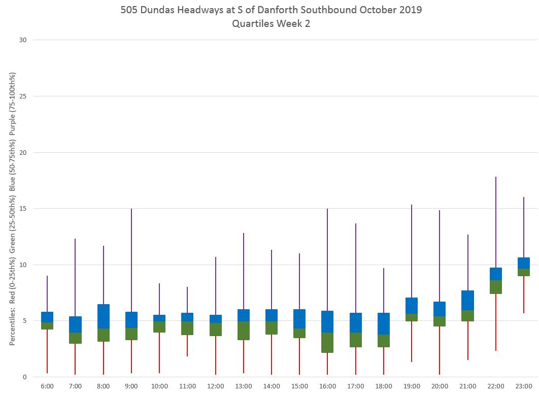

Finally, if the data are plotted as averages and standard deviations, what is evident is that the averages bounce around more starting in week 3 (green below) and the standard deviations are lower in weeks 1 and 2. This is another way of seeing how the headway reliability changed for the worse with the new schedule.

The full set of charts for this location is here:
October 2019 at Yonge Street Westbound
The situation at Yonge street is similar, but the difference is not as marked because even with the “better” early October schedule, service reliability would deteriorate as buses made their way across the city.
A point of note here is that the headway values appear in distinct bands across the chart. The reason for this is that the screenline is in the middle of Yonge Street, and buses tend to pull away from the stop and cross this line at the beginning of a green cycle. Therefore the headway is always a multiple of that cycle because the traffic signal, effectively, “dispatches” the transit vehicles.


As at Danforth, the box-and-whisker format shows a narrower range of headways for the middle two quartiles in week 2, although not as good as it was at Danforth. There are also higher maxima in week 3 with the new schedules.


Finally, as at Danforth, the averages are a bit better behaved in weeks 1 and 2, as are the SD values, but not by as much.

The full set of charts for this location is here:
October 2019 Eastbound
The eastbound data behave similarly to the westbound and I will not include examples here. Intested readers can browse the full sets of charts linked below.
There is less difference at Yonge Street eastbound than westbound between weeks 2 and 3 because the trip from Dundas West to Yonge is over a longer distance and through the most difficult part of the route compared to the trip from Broadview Station westbound.
February 2020
By early 2020, the shortcomings of the schedules introduced in October had produced a novel response in line management. Rather than short turning buses because they were late (and thereby contributing to the short turn stats which are reported to the TTC Board), many buses operated express over part or all of their trips to get back on time. Some of these trips went via Bloor Street completely bypassing the route the buses nominally were supposed to be on.
Another problem was that buses would take very long terminal layovers either because they were early from an express trip, or because they were dropping back to their next scheduled departure. This contributed to the flocks of buses laying over at Broadview and Dundas West Stations.
When the new schedules came into effect in mid-February, the effect on service was not what one would expect from longer running times and, at some times of the day, wider scheduled headways between buses.
Because fewer (if any) buses had to resort to express trips to stay on time, the number of buses per hour actually went up quite substantially and the headways became shorter. In turn, this reduced some of the crowding that beset the route, and the travel times actually went down. Crowded buses waste a lot of time trying to fit passengers onto and off of vehicles.
Counter-intuitively, this was a case where longer running times improved service because they eliminated the need for management tricks that kept buses on time at the expense of the route getting all of its scheduled service.
February 2020 at Broadview & Danforth
The transition from week 2 to week 3 in February shows the reverse of what was seen in October. The scatter of headways is worse in the before chart and better after the new schedules. The average headway trendlines for each day stay below the 5 minute mark with the new schedules, while they are regularly above it on the old ones. There are fewer points above the 10 minute mark, although values close to zero (buses leaving in pairs) are still common.


The box and whisker version of the same data show both lower means (the boundary between the second and third quartile, green to blue below) as well as maximum values that are less extreme.


The average and standard deviation values show quite clearly how service with the new schedules provided a shorter average headway and greater reliability (lower SD) particularly during the midday period even there was no change in the scheduled headway.

The full set of charts is linked below:
February 2020 Westbound at Yonge
The situation at Yonge Street is similar to that at Danforth shown above. In week 3, there is less scatter in the headways, and the average trendline is noticeably improved sitting at roughly the scheduled level of service rather than well above it. This shows that most or all of the buses on the 505 were actually serving the route rather than running express to get back on time.


The box and whisker plots show the change quite dramatically with a shorter range for the middle two quartiles and lower maximum headways in week 3 compared to week 2.


Finally, the average and standard deviation values show the improvement in weeks 3 and 4 of the month.

The full set of charts is linked here:
February 2020 Eastbound
The eastbound data behave similarly to the westbound. Intested readers can browse the full sets of charts linked below.
February 2020 Time Spent at Broadview Station
With the new schedules and with most buses actually making their scheduled trips rather than running express, many fewer buses arrived early at Broadview Station. The result was that the time spend, on average, by buses there has dropped quite substantially with the new schedules.
In these charts, the time is measured from crossing Danforth northbound, through the loop and then crossing Danforth southbound. A few buses make this circuit in under five minutes, but much larger values are evident.

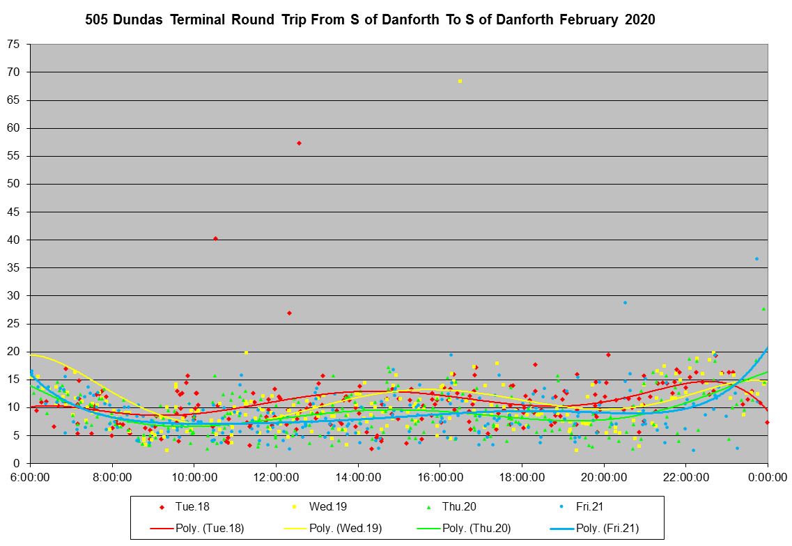
To maintain consistency in these charts, I normally plot them with a maximum Y value of 30 minutes. However, there are several data points above the 30 minute line in the charts above. Here is what they look like with a maximum of 75 minutes.
[Note that values above 60 were discarded in the analysis behind the other charts here as being out of range. The before/after differences in the other charts would be even more striking if I had included them.]
Note that in week 2 there are many instances of buses spending over 20 minutes, and as much as 70 minutes laying over at Broadview Station.

In week 3 there are a few long layovers at Broadview Station, but not very many compared to week 2, and almost all of the data points lie below 15 minutes.
The data seen in box and whisker format echo the same story. The central quartile boxes are quite long and the maximum values run off of the top of the chart in week 2.

In week 3, the values are much better behaved with a narrower band for the central quartiles. From personal observation, I can confirm that the problem with a very large number of buses congregating at Broadview has been reduced, although not eliminated.

The averages and standard deviations show just how different the before and after periods are at Broadview Station. Weeks 1 and 2 have high average values reflecting the number of buses sitting out of service, and the standard deviations are also high because the values are scattered over a wide range. Weeks 3 and 4 show fairly consistent terminal times and lower SD values reflecting much more consistent behaviour.

Here is the full chart set for both Broadview and Dundas West Stations.
- 505_202002_BroadviewStation_TerminalTime_MonthLinks
- 505_202002_DundasWestStation_TerminalTime_MonthLinks
Weekly Variations in Travel Time October 2019 to February 2020
One of the challenges for schedule designers is that conditions on routes vary all of the time. Some of the day-to-day changes are evident on the charts above where the trendline are not an exact match for each day, and where the pattern of data points also varies. This can be due to weather, surge loads, construction and traffic congestion.
No schedule will ever “get it right” for every circumstance. However, the TTC has taken to scheduling travel and recovery times so that short turns, a metric that is reported to the TTC Board, are minimized. “Reliability improvements” shoot for 95% of actual trips to fall within the scheduled allowance. However, with week-to-week and day-to-day variations this can produce situations where buses are chronically early, and bunching at terminals results.
The examples above of 505 Dundas with longer schedules actually improving service arise from the peculiarities of line management on that route where a faster express trip was possible to get buses back on time while not actually serving passengers. The same trick would not work on a “straight” route with no quick way to get to the other end of the line via a shorter and faster path.
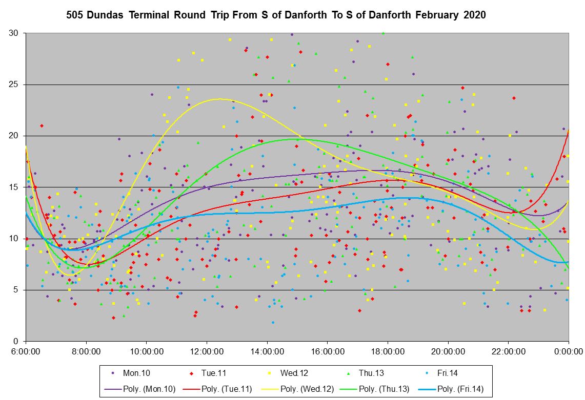
The chart below shows the average travel time from Broadview & Danforth to Dundas & Bloor by hour and week from October 2019 to February 2020. The lines shown in dashed format correspond to the two weeks of Christmas break (pale green, blue) and the two weeks after new schedules were implemented in mid-February (red, pink). The difference in travel time was not because the schedules encouraged faster driving because they gave operators more, not less, time to make their trips. (A review of average driving speeds follows later in the article.)
Worth noting here is that the situation in the AM peak is very different from the PM. Travel times start to build up from 10 am and hit their highest values in the 4-to-6 pm period. Note that the times refer to the point at which a bus crosses Danforth southbound and so the “5 pm” data reflect trips made by buses leaving Broadview Station during that hour.
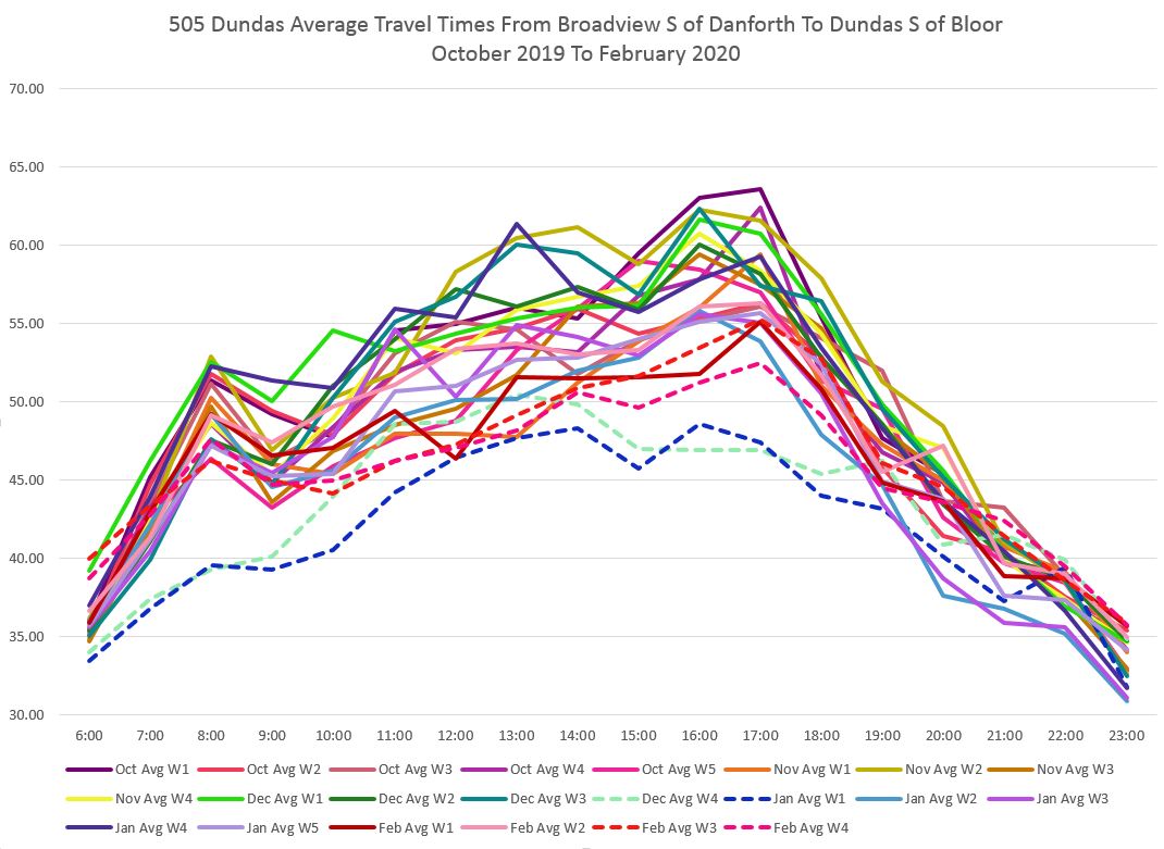
If we look at the same data in columnar format, there is both a week-to-week change in averages and the noticeable drops in the four weeks flagged above. For clarity, the chart is broken into two sections because of its width. The layout is not intended to encourage picking out individual weeks, but to show the overall shape of the data.
The TTC schedules service, generally, with five distinct periods of the day (see the service history at the beginning of the article for an example). Broadly these periods are:
- AM Peak
- Midday
- PM Peak
- Early Evening
- Late Evening
The transition times between periods vary from route to route, and they can only be seen by looking at the detailed schedules.
The charts of travel times both above and below show that actual values do not change at discrete boundaries and then run unchanged to the next transition. Instead they vary gradually over the day. This means that any scheduled time will either be tight for parts of some periods, or unduly generous.
With ongoing variations, no schedule will ever match actual conditions every day. The real question is how much mismatch would be tolerable from both an operations and passenger perspective.


The chart below shows the terminal times at Broadview Station over the same period. The values are all over the map, but are better behaved in weeks when buses were not taking layovers to get back on schedule.

The full set of charts is linked here:
Operating Speeds: February 2020
The chart below shows the average speed of westbound buses during the period from 8-to-9 am along the Dundas route. Data for the before and after schedule change periods were plotted here, and there is not much difference between them. The trend lines stay close together showing that overall the speed profile along the route did not change.
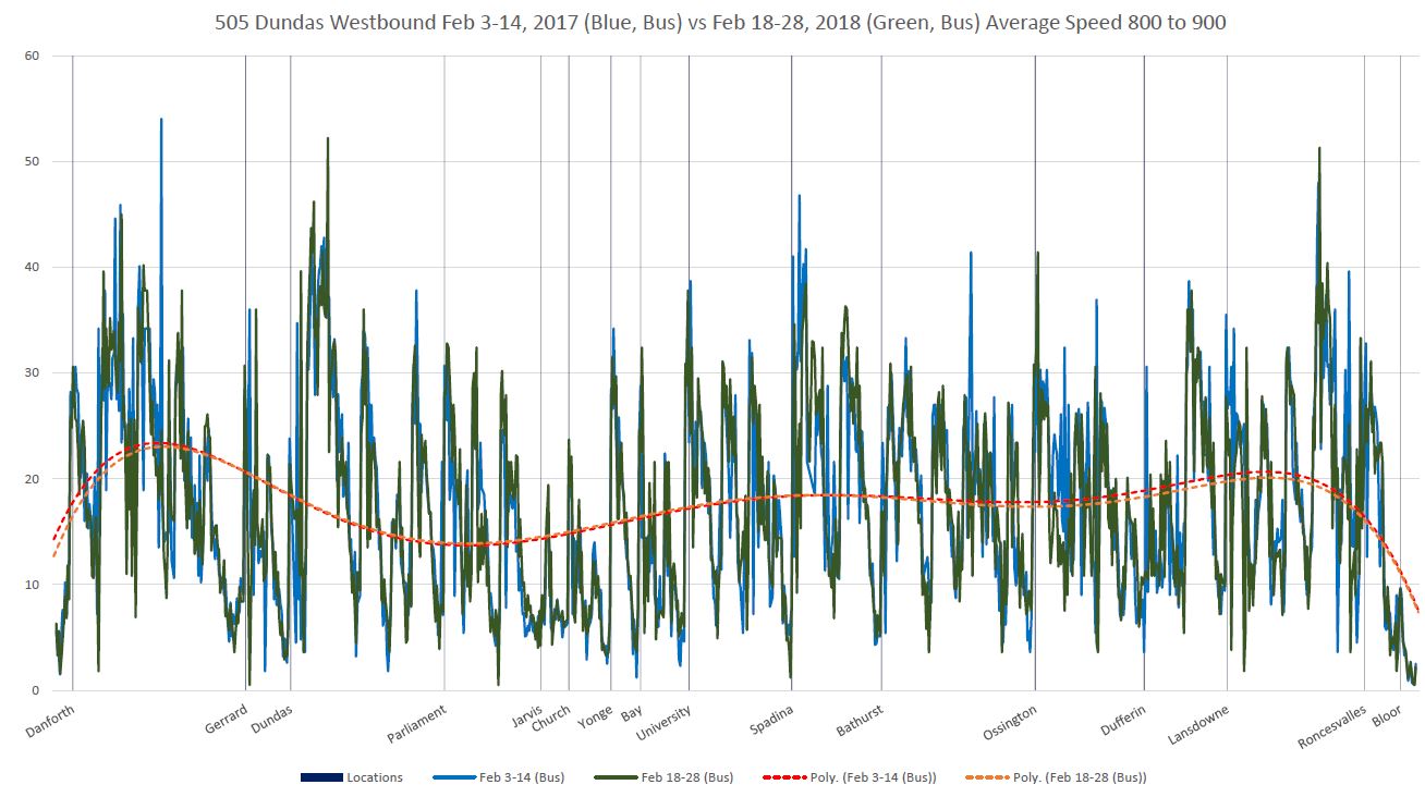
A few hours later, here is the speed comparison. Note that in several places corresponding to stops, the blue line (early February) dips below the green one (late February) indicating that the average speed at stops was lower. The difference is subtle, but it is spread across the route.
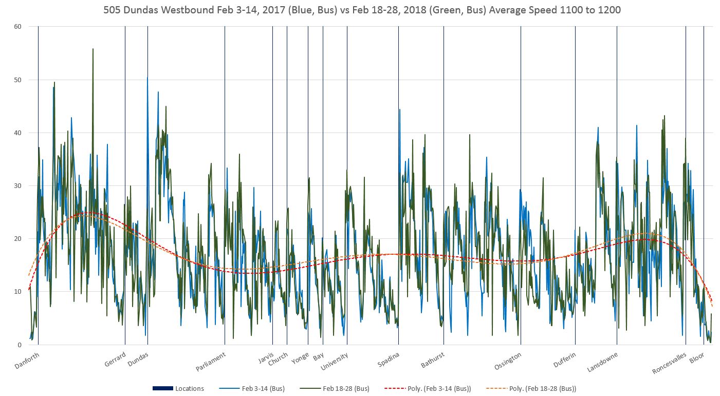
The all day set of charts is linked here:
Eastbound data are similar and I have not included them.
If the speeds are the same, but the travel time has dropped, the difference must be in dwell times at stops. Crowded buses take longer to board and unload passengers trying to get just one more on board, or waiting while someone fights their way through a crowded bus to a doorway.
Travel times by route segment are summarized in the charts below. Each set of four bars represents one hour of the day, and each column one week. Where the travel times are lower, there is no single part of the route that stands out for the savings, but rather the differences are spread out.


The difference in buses per hour at Yonge Street is summarized in the chart below which shows counts for each week, adjusted to a daily basis (week 3 has only 4 weekdays).

With more buses per hour thanks to the disappearance of express operations, crowding can be reduced and travel times improve. This is an important lesson for those who are enamoured of packing more passengers on buses and streetcars.
The full chart set including eastbound data is here:
Detailed Daily Operating Charts
For those who are interested in the gory details, here are charts for Monday and Tuesday of week 2 in February 2020:
What is evident in these charts is that buses commonly ran in packs, especially as the day wore on, and there was not much effort to spread them out. Wide gaps echo back and forth on the route including buses that could have been spaced out on departure from terminals, but were not. It is possible that they were all chronically late, but if so this shows the problem of adherence to a schedule rather than to regularity of service.
Careful examination will also reveal buses disappearing and reappearing. These are cases where they ran express off route for some distance. This reduces service available to riders, but does not affect the dreaded “short turn” statistic.
The situation with the new schedules later in the month is better, but there are still cases of buses running in packs.
And Thanks …
I will return to analysis of 505 Dundas after a few months of streetcar data have accumulated.
If you have come this far, thank you for reading!

It’s a scandal that buses would be allowed to waste away at a station for the better part of an hour just to hide shortcomings in management. People are literally being paid to do nothing because management refuses to manage.
LikeLike
To address the reality that travel time is subject to unpredictable variation, it seems like the solution is to manage vehicles to maintain constant spacing rather than a fixed schedule.
Why doesn’t the TTC do this?
Steve: There are two aspects to this.
First, there is a need for operators to end shifts (or portions of shifts) at their scheduled time to (a) avoid overtime payments and (b) ensure that their vehicle is in the appropriate location on time for the next operator to take over. If the problem is that the schedule is inadequate for actual conditions, then keeping on time can snowball without short turns.
However, second, there is a chronic problem across the TTC that they only actually measure “on time” performance at terminals, and even there they do not hit their targets. Vehicles are considered to be “on time” if they leave no mre than one minute early or up to five minutes late. On most routes, the scheduled service is often enough that two, possibly three, buses can leave together and be “on time”. After vehicles are enroute, small differences in headway are magnified as they travel along the route because the “gap bus” will carry a heavier load and run more slowly.
Rarely is any attempt made to space out the service.
A further problem, even when there are short turns (which have been all but outlawed to make the management stats look better), there is little monitoring to ensure that vehicles coming out of the short turn blend into the through traffic on an even headway. Similar problem afflict routes with branches where the blending of vehicles is left entirely to chance.
And so, part 1 is a planning problem (also related to contract language), but part 2 is a line management issue.
This is a very long standing problem which the TTC refuses to address or acknowledge. The current management philosophy is that if vehicles are on time at terminals, the rest will look after itself. It won’t. But actively managing a line requires skill and a recognition that this is important work.
LikeLiked by 1 person
While I agree with L. Wall that TTC management lacks many managerial skills, I think one should also look at the lack of interest shown by the Board to the reports they receive. For example, the number of bus short-turns in the November 2016 CEO Report was 3864 and in November 2019 was 469. The equivalent figures for streetcars are 3102 to only 122.
While one clearly wants to reduce the number of short-turns, there will always be some that are inevitable (accidents, breakdowns, customer caused delays) and there need to be a balancing act between extending running times so that short-turns are virtually impossible (at the expense of huge layovers at terminals) and having so many that service is seriously impacted.
If I were on the Board I would be asking why the number of short-turns is now so low (and why the CEO report does not give details on bunching and why TTC management does not take steps (route management) to address it. As has often been discussed here, and as is clearly shown in most of Steve’s route reports, buses and streetcars love to run in packs – and this results in the uneven service that so frustrates customers.
Steve: Management regularly cites the low number of short turns as an example of what great service they provide, and some board members even publish charts of this in their own newsletters. Rick Leary gets a gold star for making sure all of the Queen cars get to Neville, but there is no reporting on bunching or crowding, although the latter may appear sometime this year. I suspect it will reveal problems the TTC does not want us to know about.
The Board is so overwhelmed with information, especially those members who also have Council duties, that they tend to take management reports at face value.
LikeLike
The new streetcars of Dundas are going to be a nightmare. Espeically around Yonge St where taxis/ubers/lyfts idle outside of 10 Dundas East and back up traffic to Churct St.
Factor in the poor timing of lights at Victoria and the scramble at Yonge and it’s a recipe for diaster.
It may take 10-15 minutes now sometimes to get past Yonge. Wait till the streetcars are lined up and you get that one person who needs to run and press the button to open the door and start the cycle of waitng all over again.
Steve: One thing I do agree with is that the signal at Victoria needs to be changed. Indeed, one could argue that the whole intersection needs to be rethought with any traffic directed onto Dundas Square east or westbound (sorry CityTV, that includes your “parking lot”).
Re one more person running to push the button: Some operators seem to know how to close the doors and disable the buttons in preparation for departure, others do not.
LikeLike