
Updated May 26, 2023 at 5pm: In response to a reader’s suggestion, I have added a sample chart that includes average wait times for would-be riders in place of the count of vehicles. To jump directly to this update, click here.
In the many articles I have published trying to review service quality on the TTC, one topic has eluded presentation: how to chart service quality over a long period while preserving the hour-by-hour, day-by-day character of the data? That question has several dimensions because a quality metric is not simply a matter of pooling stats and saying that overall things are not too bad, or even worse that service meets some sort of standard on average.
In the past I have published charts showing headways, and others showing how organized (or not) service on a particular day might be, but it has been more difficult to condense months of data for multiple times and locations.
The TTC standard for surface routes is:
On-time performance measures vehicle departures from end terminals. Vehicles are considered on time if they depart within 59 seconds earlier or five minutes later than their scheduled departure time. (-1 to +5)
CEO’s Report, May 2023, p. 18
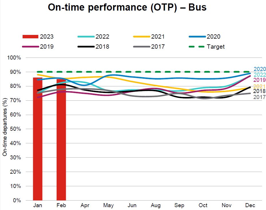
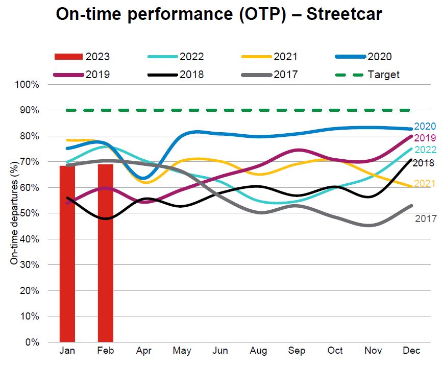
The intent is to hit this target 90% of the time, but the TTC does not achieve this with values typically falling in the 70-to-85 per cent range. At an individual route level results can be considerably worse. Streetcar routes fared worse with a 50-to-85 per cent range, and the higher end was achieved during the pandemic era when traffic and demand were light. The numbers have fallen since then.
The TTC’s metrics have big credibility problems because they bear little relation to what riders actually experience.
There are three major reasons:
- Quality is measured on an all day basis, or worse on longer periods such as months. Variation by day and time is completely obscured by this approach. Reliable service at 10 pm is cold comfort to a rider whose bus has not shown up for 15 minutes in the peak period.
- Quality is measured only at terminals, not along routes where various factors can degrade service that might begin well, but quickly deteriorates with bunching and gaps.
- Service is measured relative to schedule on the assumption that “on time” performance will automatically be reliable. However, there is considerable leeway in that standard allowing irregular service to be considered “on time”, and the TTC does not even hit their target levels in many cases.
The CEO’s Report tries to work around the limitations of the metric by noting that some routes do farly well while others encounter a variety of problems. With respect to the bus network, the report notes:
Network performance was negatively impacted by the inclement weather the weeks of February 20 to March 10, where over 60 centimetres of snow fell on the city during this time. Weekday On-time performance was 88% for Weeks 7, 11 and 12. During weekends for the period, OTP was 82%. During February, 32 of 159 weekday routes were impacted by construction for at least three weeks of the period. Overall weekday OTP was 88% for the 127 routes not affected by construction:
- 48 routes were “On-Time” (90% OTP or better).
- 53 routes were “On the Cusp” (85-90%).
- 26 routes were “Not On-time” with OTP less than 85%. In summary, 80% of the routes not affected by construction scored 85% or better.
This still does not address reliability issues at the level riders experience. Moreover, for frequent service, riders do not care if a bus is “on time”, only that service is reliable. TTC assumes that on time service will, by definition, produce reliable service, but they don’t actually operate on schedule and fail to measure service as riders see it.
Irregular service also affects crowding because passenger loads are not evenly distributed. If most riders are on full buses, the following half empty vehicles are not part of their experience (except possibly their frustration with a long wait for the advertised “frequent” service). Average crowding stats do not reveal typical riding conditions. (Analysis of crowding is complicated by the limited availability of automatic passenger counter data outside the TTC. I have tried for a few years to obtain this without success.)
The charts show that bunching (headways of two minutes or less) and large gaps (20 minutes or more) are common, and that they exist across the four months of data here. They are not occasional effects, but a basic feature of TTC service. The stats at terminals, where the TTC takes its on time performance measurements, are less than ideal, but the service degrades as buses and streetcars move along their routes. Most riders do not board at terminals.
This article presents a proposed method of charting service quality on routes to provide both the detail of day-by-day, hour-by-hour conditions and a broader overview. The charts are an experiment in condensing a lot of data into a manageable size, but I am not wedded to the format. Comments are welcome. Regular readers will recognize the format from a previous attempt, but I hope this is an improvement.
The goal is to produce something that can track the quality of service over time so that the decline or recovery of TTC routes is clearly visible along with the effectiveness (or not) of any changes to schedules, transit priority or route management.
There are a lot of charts in this article, and it is a long read for those who are interested. Feedback on this method of presentation is most welcome.
Methodology
Once a month, I receive downloads from the TTC’s vehicle tracking system for selected routes. The data are voluminous and must be converted to a format that simplifies presentation and analysis. The process is described in these articles:
- Methodology For Analysis of TTC’s Vehicle Tracking Data
- Understanding TTC Service Analysis Charts: A Primer
One key result of this process is a “timetable” for a route’s operation that reflects when the vehicles actually crossed key locations (“screenlines”) each day. From this, both the headways (actual times between vehicles) and travel times between the screenlines can easily be calculated.
The challenge is to find a way to present this information.
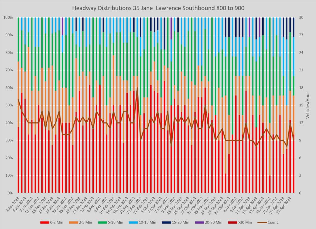
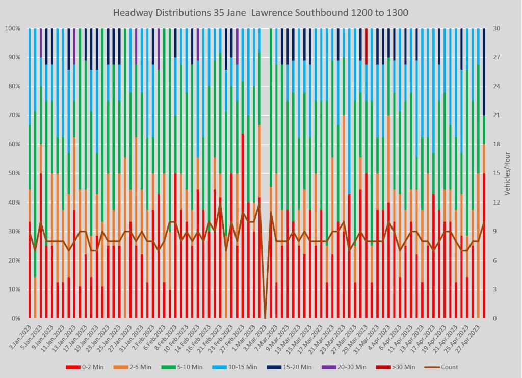
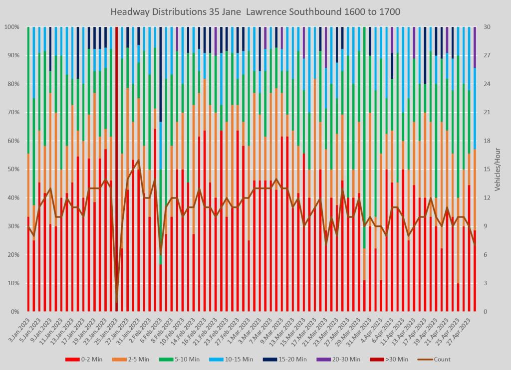
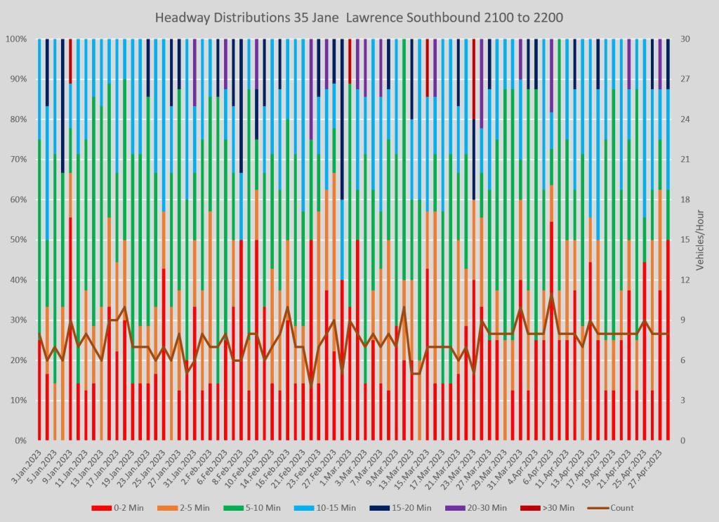
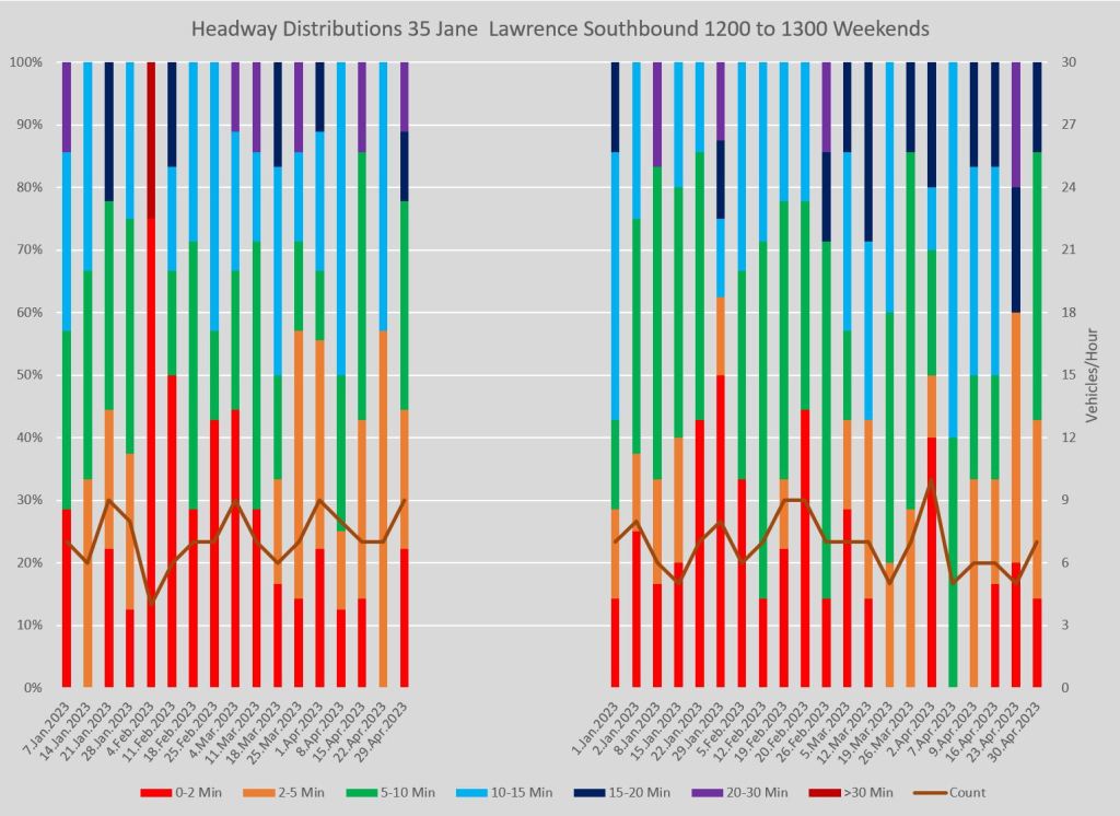
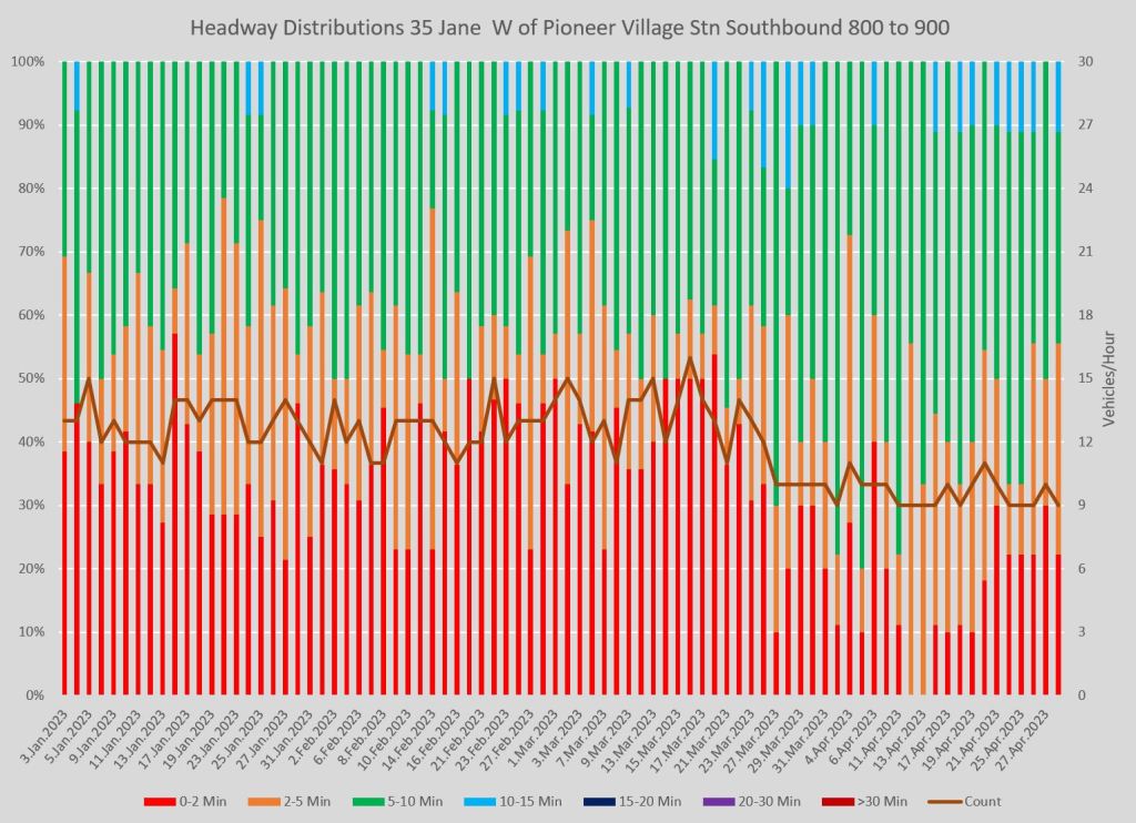
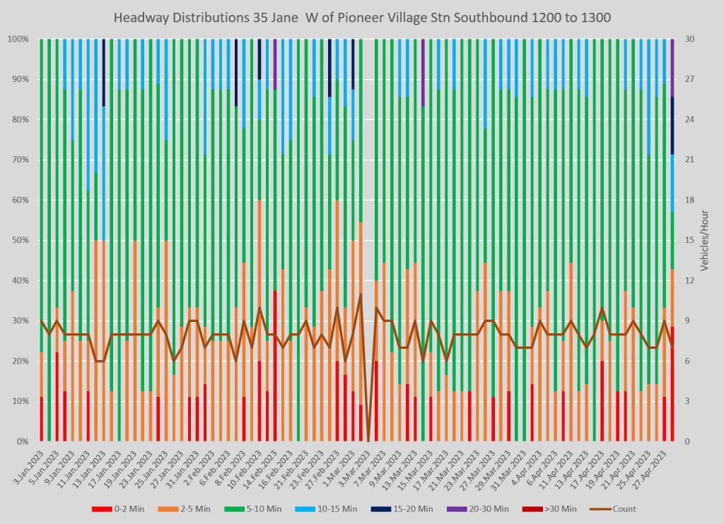
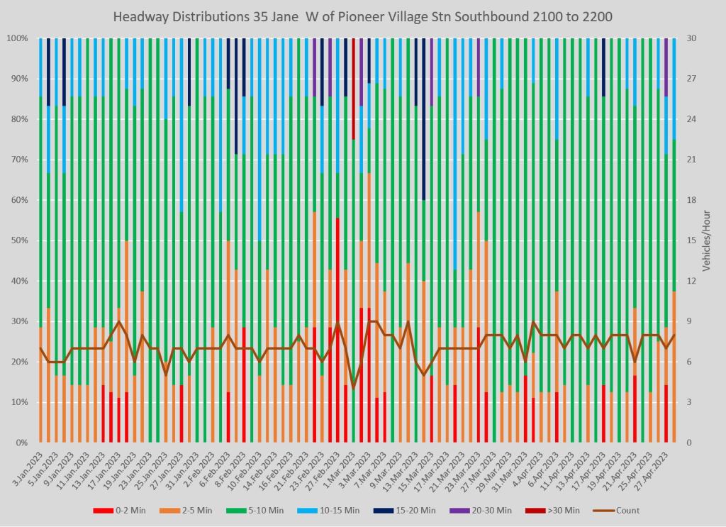
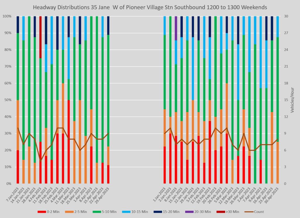
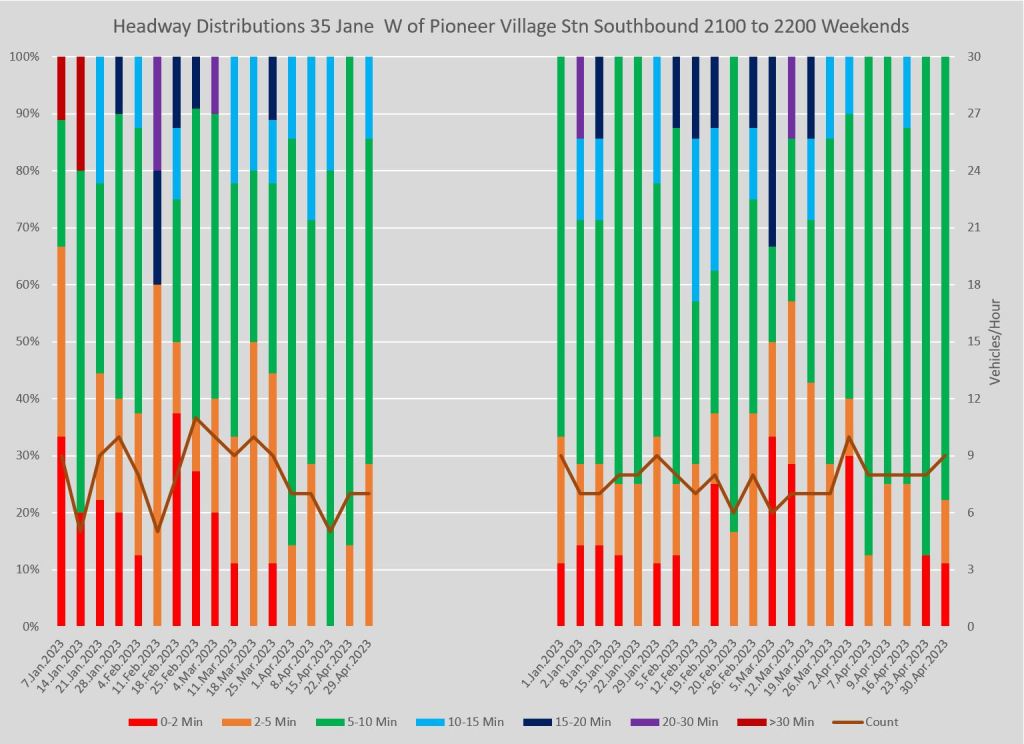
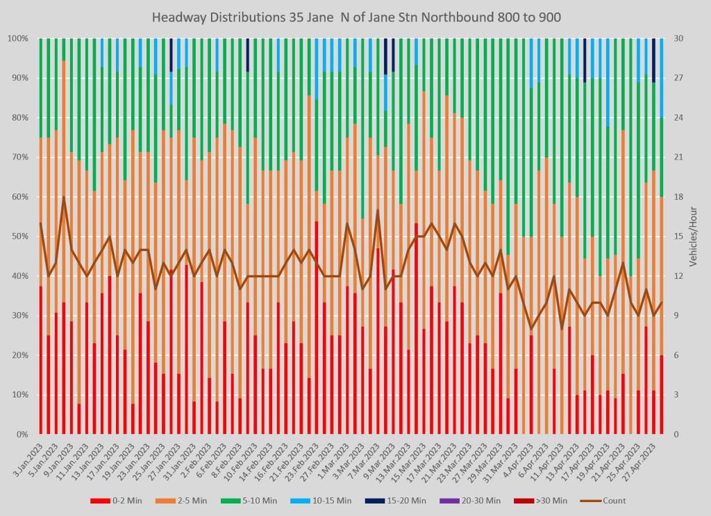
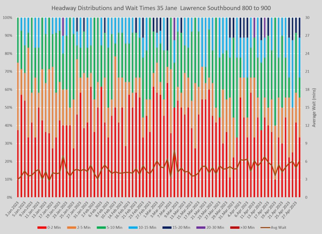
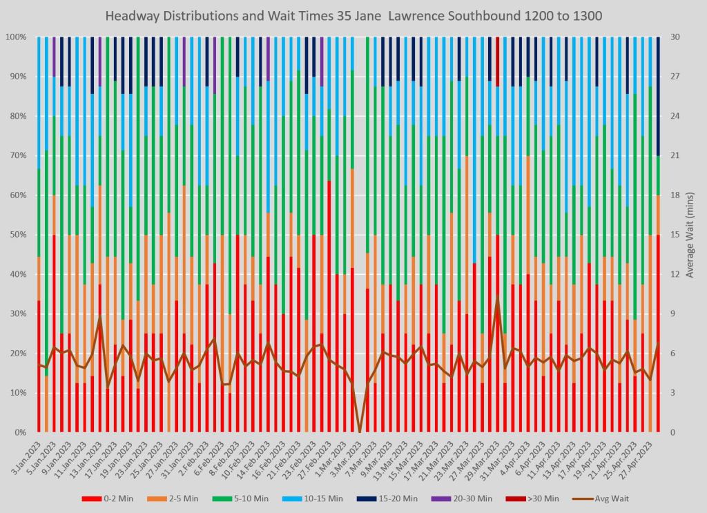
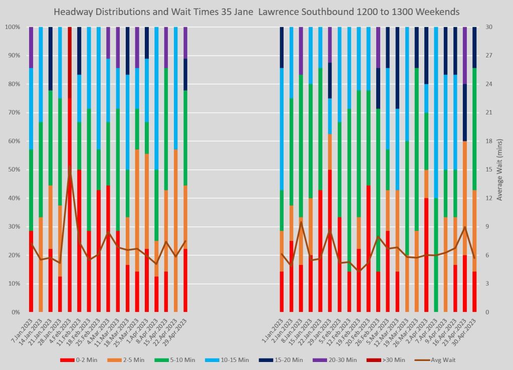
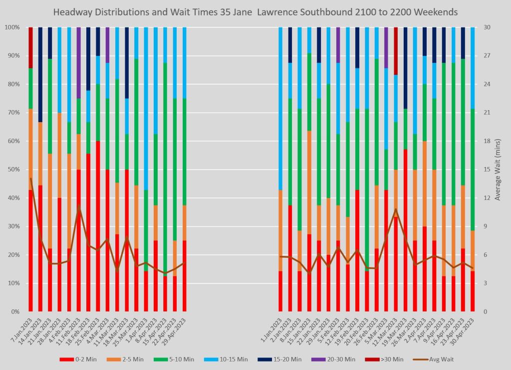
There are more dimensions than will fit on a page, and the consolidation I chose is shown in the examples below which display data for the 35 Jane bus (local service only) southbound at Lawrence.
- There is one page per hour (only select times are shown here).
- There is one column per day.
- The colour bars indicate the percentage of trips on each day falling within various headway bands.
- The brown line across the chart tracks how many vehicles are included in the data (with the scale on the right side of the chart).
- Weekend service is shown on its own page with Saturdays on the left and Sundays/Holidays on the right.
In all of the charts, the same headway bands are used regardless of the scheduled frequency. The intent is not to track service versus the scheduled level, but to show what proportion lies in a “bunched” or “gapped” group as well the ranges more commonly expected by riders. Most routes in Toronto operate on headways in the 5-15 minute range, and my preference was for a standard chart layout that would not have to be adjusted for various routes and conditions.
The first four charts are for weekday service at 8 am, noon, 4 pm and 9 pm. The last two are for weekends at noon and at 9 pm. In cases where routes do not operate into the mid-evening an earlier evening sample is used.
What is particularly troubling is the large area occupied by the colour red indicating a headway of 2 minutes or less. This shows that it was common in peak periods to have 40% or more of the service running as (at least) a pair of buses. Even in the off-peak, about 20% of the service operates on headways below two minutes.
The orange and green bands bracket the scheduled headway and we would hope to see most of the service there, but that is not what actually operated. Even more troubling are the areas in turquoise, dark blue and purple which are gaps of 10 minutes or more.
Note that there will typically be more vehicles in the “red” portion than colours for wide headways because buses do not just run in pairs, but sometimes in trios or quartets (and occasionally worse). For a quartet, there will be three short headways, but only one long one (the gap before they all arrived).
The goal is to have as much service in the orange to turquoise section of the chart as possible depending on the scheduled frequency: more to green-orange for a frequent service, more to turquoise-green for less frequent service. Dark blue gets us into the 15+ minute territory, and the mauve and dark red bands are for even longer gaps. These should not be seen on any service claiming to be “frequent”, let alone reliable, but they are quite common.
On weekends, the situation is no different even though the scheduled service is less frequent making for very long gaps between pairs of buses.

For reference, here are the service designs for 35 Jane in effect at the beginning of 2023, and the late March revision when service was trimmed. (For those seeking archived TTC Scheduled Service Summaries, they are available here.)
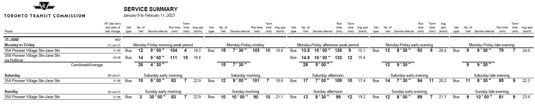
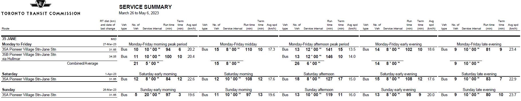
In both the AM and PM peaks, the decline in buses/hour is evident on the charts, although there is considerable day-to-day variation in he number of buses/hour even before March 26.
In both February and March, the proportion of buses operating at a 2 minute or less headway routinely crests the 50% line with a correspondingly large number of very wide headways.
The scheduled peak headways lie in the 4’30” to 6’00” range, equivalent to 13 and 10 buses/hour respectively. The actual number of buses in this hour on each day varied considerably (the big dip in January was due to a storm). We would hope to see the majority of trips in the orange or green bands where the 5′ mark is the boundary between them, but that is not the case.
At midday, the count of vehicles/hour does not bounce around quite as much as the 8am and 4pm charts. The red area is smaller, sometimes down near 10% which would probably be one bus at the scheduled service level. There are still incursions at the top of the chart showing a wide gap, again probably one bus.
By mid-evening, the scheduled service runs less frequently than during the daytime, but there are still many buses running very short and very long headways. Days with purple bars (a gap over 20 minutes) are common, and there are a few dark red (over 30 minutes) as well.
Weekends fare little better. There is an unsettling amount of red across these charts not to mention purple (20-30 minutes). This applies to both midday and mid-evening service.
An important point which should be quite evident by now is that bunched service is not something that happens on rare occasions, but as a routine matter every day on this route. There are only four days in the weekend chart where there was not at least one bus on a two minute headway or less, and 20 minute or more gaps appear on more than half of the days.
I picked 35 Jane because it is notorious for reliability problems, but other routes with these issues are easy to find. Jane is one of the corridors under study for RapidTO red lane treatment.
Full sets of hourly charts as PDFs are linked in the section below. You can step through them to see how service evolves over the day. These include the northbound service at Lawrence which I have not shown here because it is similar to the southbound charts above.
This is an overview of my proposed scheme for charting reliability. It does not address the creation of standards, but does show the erratic service as it actually exists in much more detail than the TTC publishes. Any new standard must deal not just with “on time” performance, but with the actual reliability of service.
In following sections I will review the difference between measurements at terminals and further into routes, as well as a selection of other routes.
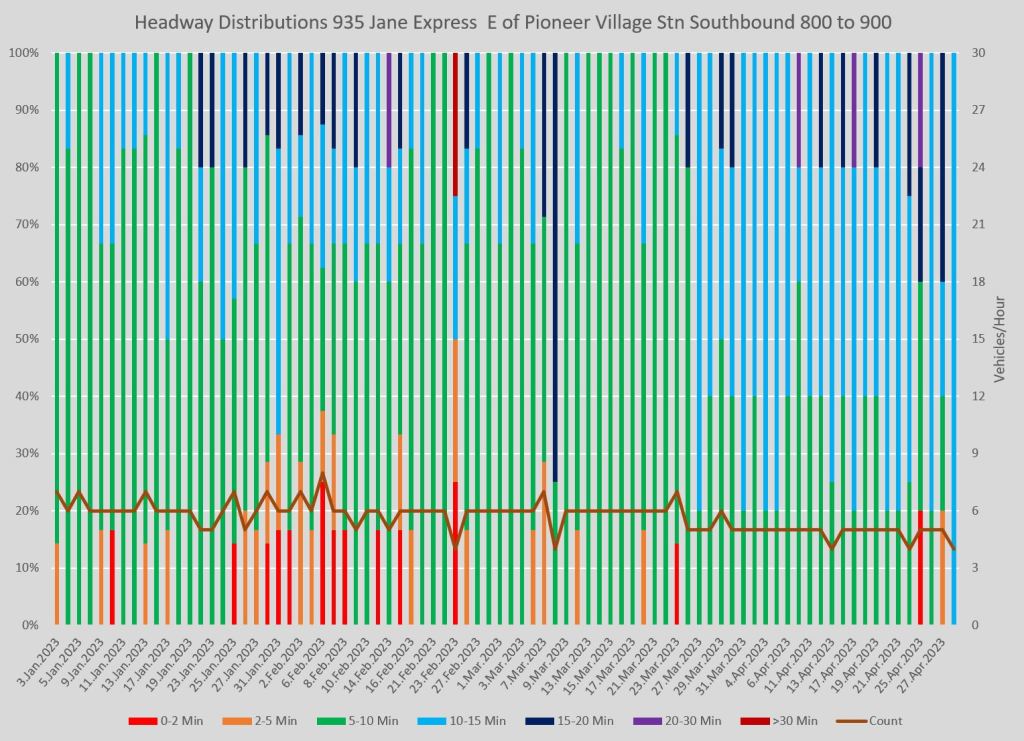
35 Jane Terminal Headways
The TTC Standards only refer to headways at terminals, and buses fend for themselves in between. One might argue that the situation shown above for Lawrence southbound represents the disorganization of a route midpoint, but the service does not leave the terminals on an even spacing either.
Here are the charts for service leaving Pioneer Village Station. The proportion of very short headways (red) in the peak periods is lower than at Lawrence, but still routinely in the 30-40% range. Off peak periods are better, but far from ideal especially with gaps of 20 minutes or more fairly common.
The situation northbound from Jane Station is similar.
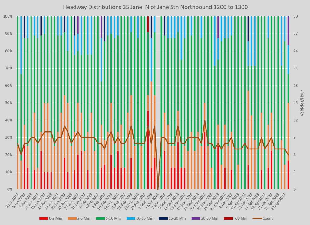
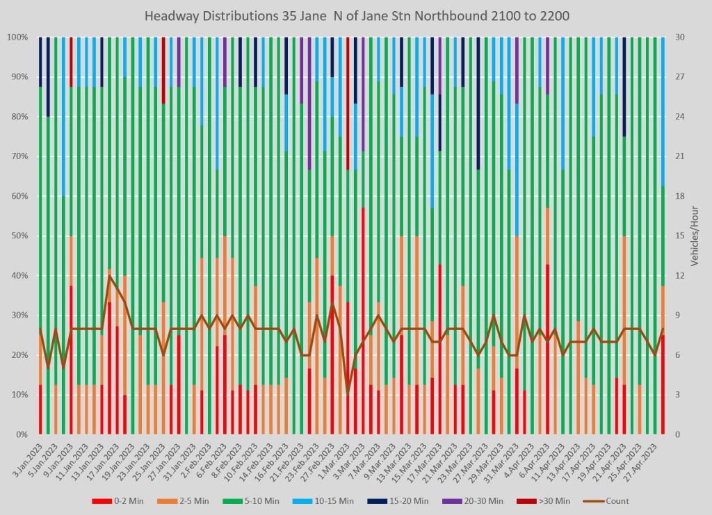

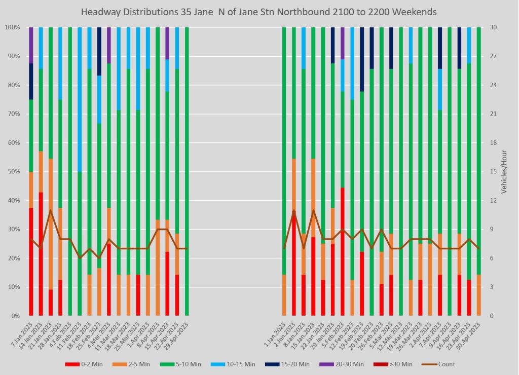
Full chart sets:
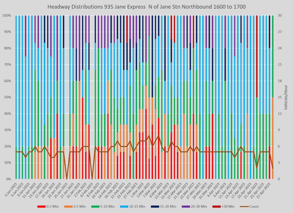
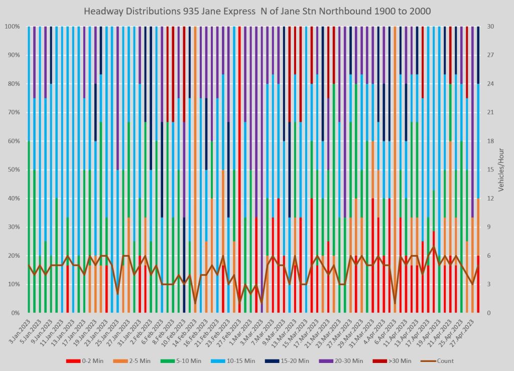
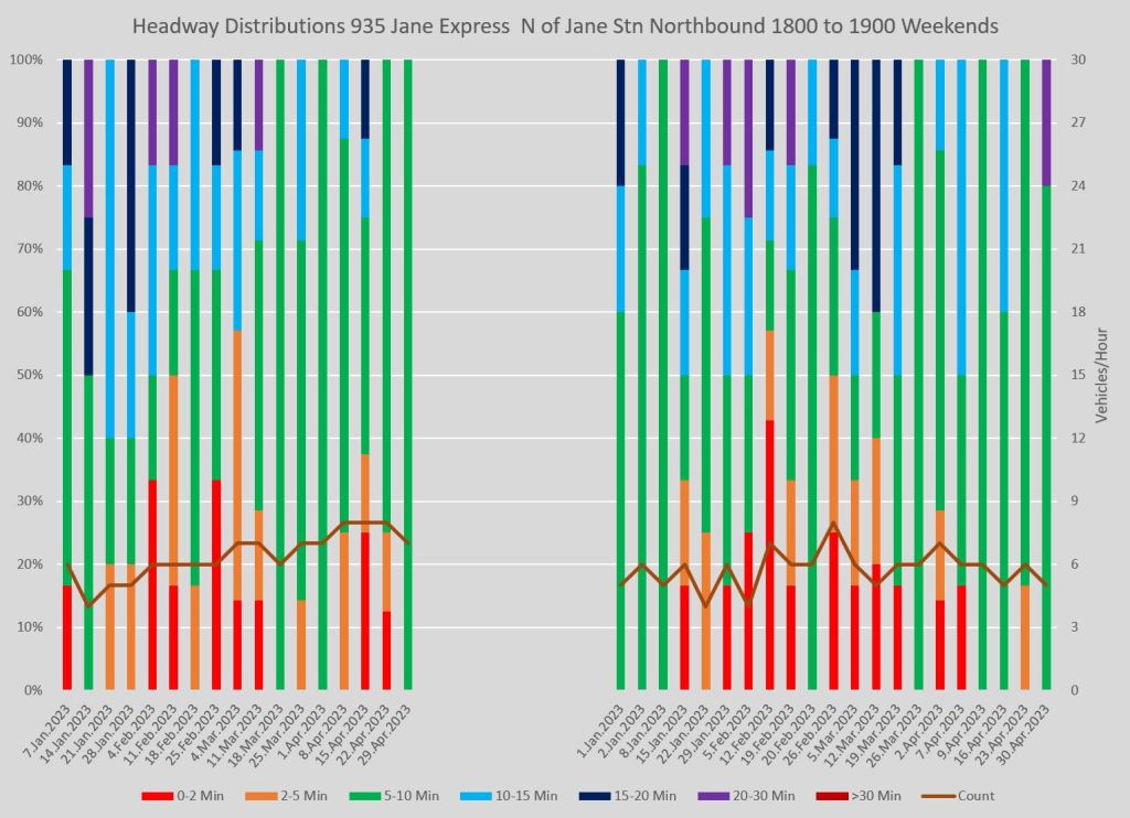
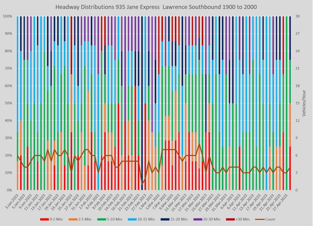
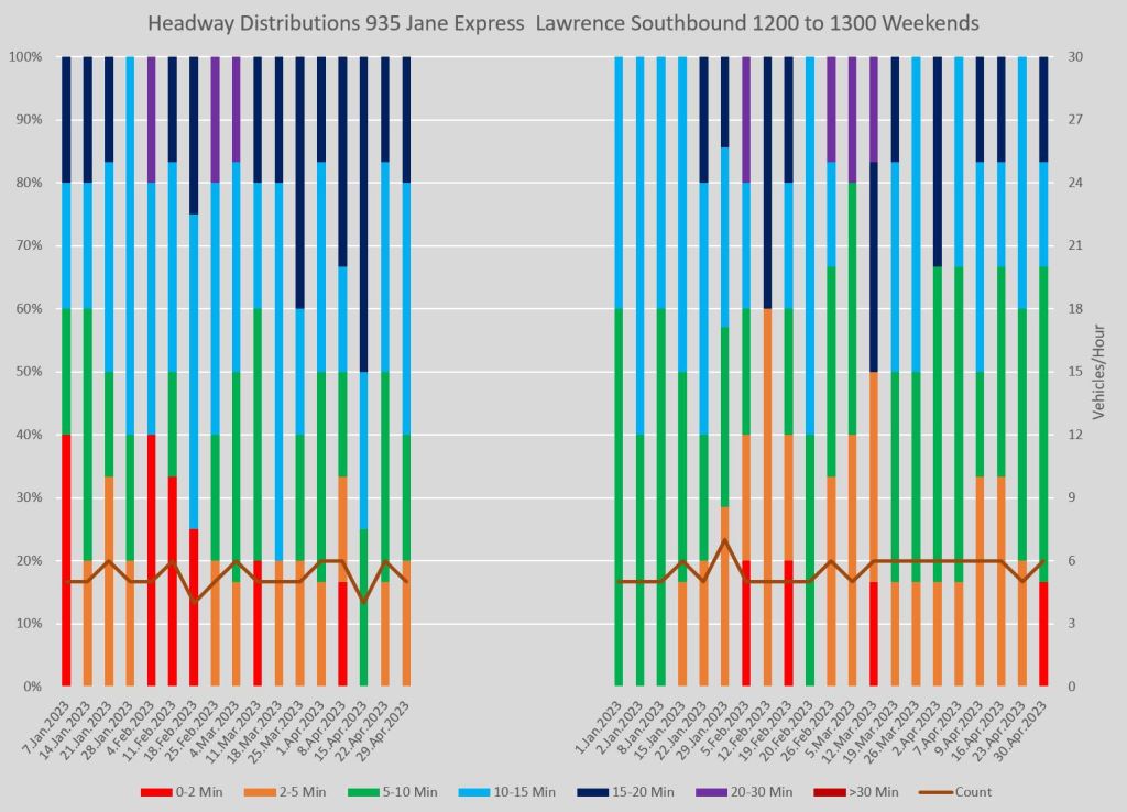
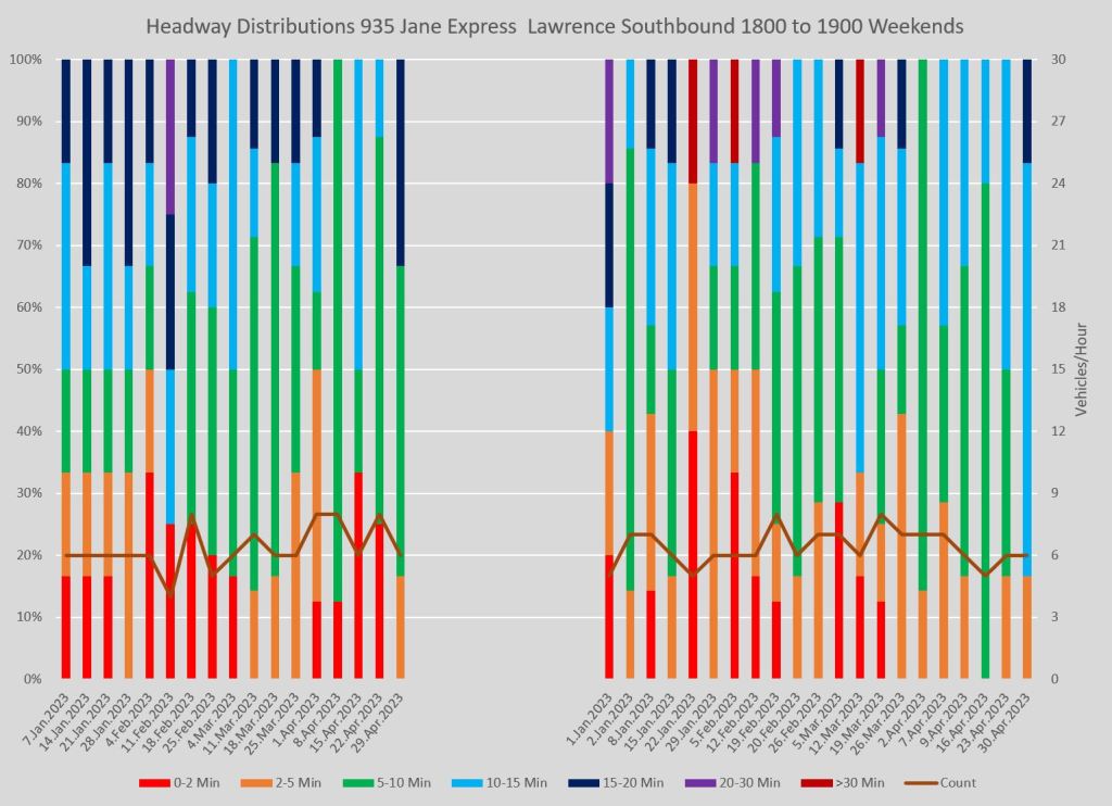
935 Jane Express
For reference, here are the service designs for 935 Jane Express as of the beginning of 2023 and effective March 26.
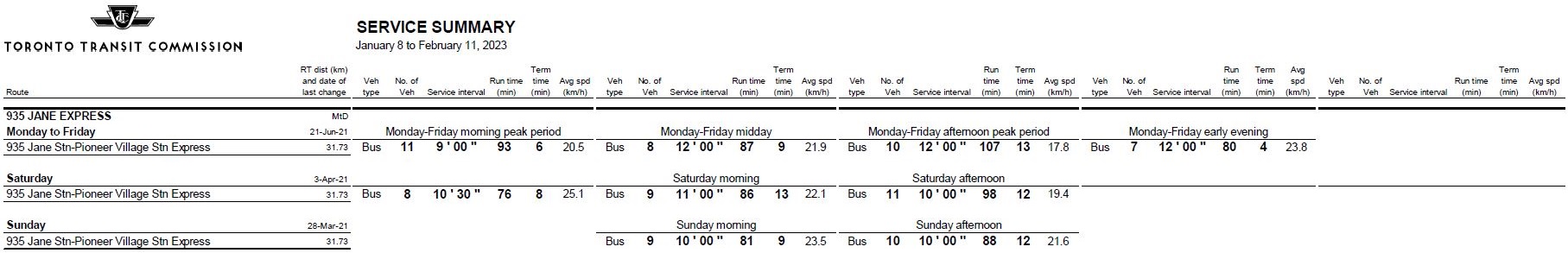
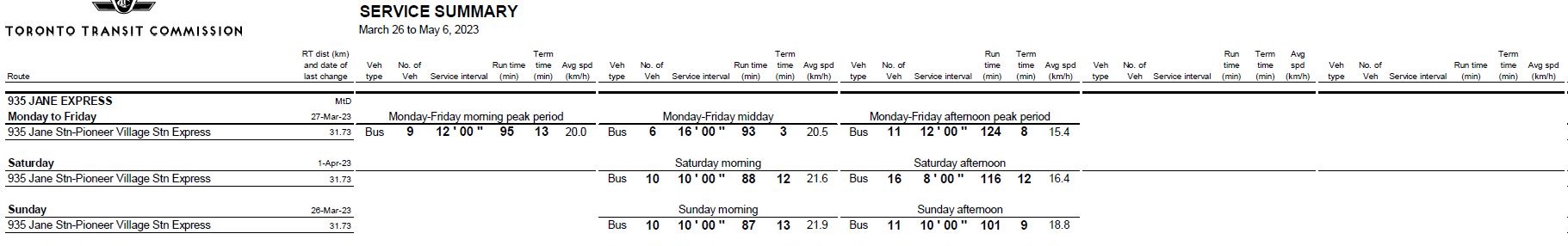
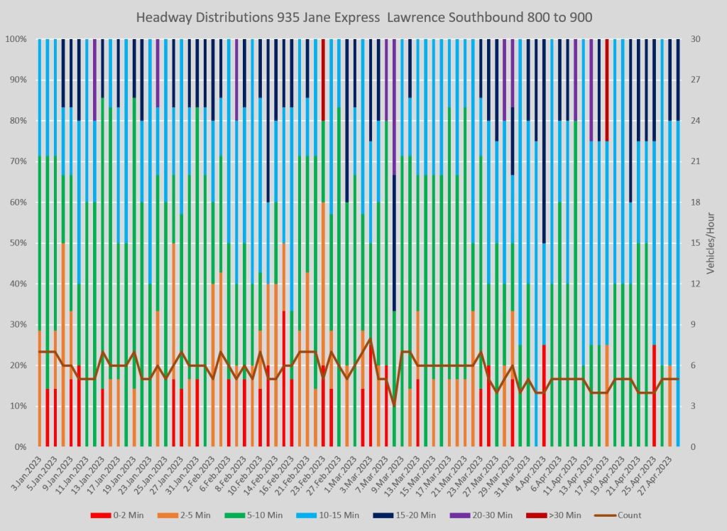
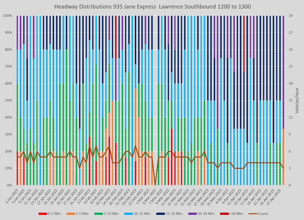
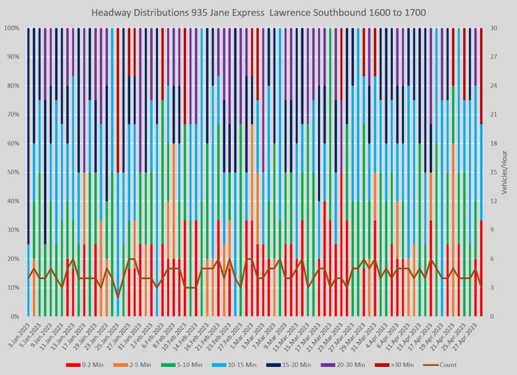
Service on the 935 Express is less frequent than on the local 35 Jane bus, and headway reliability is more important because with fewer buses, the gaps can be bigger and negate the faster travel time of a so-called express service.
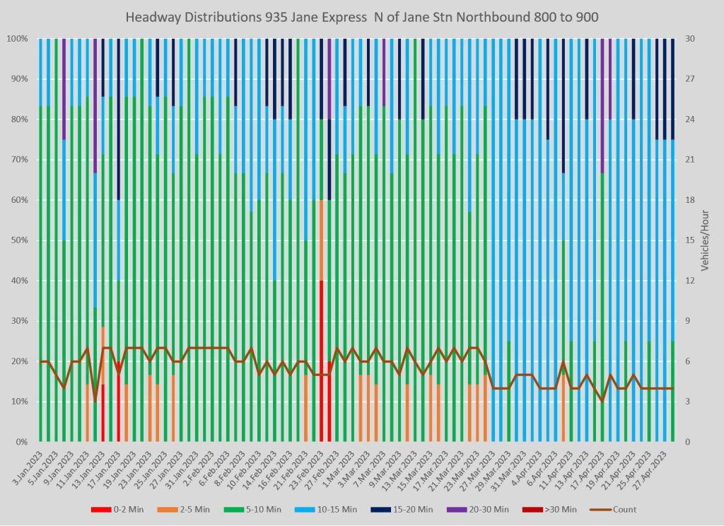
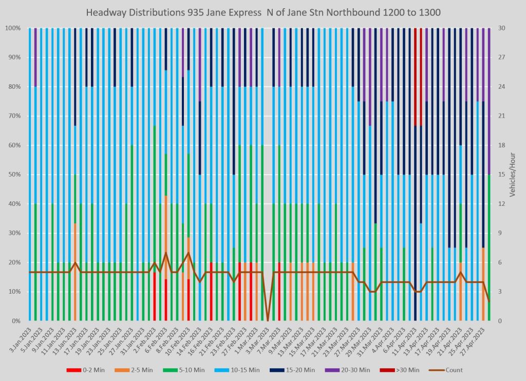
Here are the charts for service leaving Jane Station northbound. In the AM peak, service is comparatively well-behaved with headways staying in the bands corresponding to scheduled frequency. However, as the day wears on, shorter headways (and corresponding gaps) appear particularly in the PM peak. Weekend service commonly has buses running close together even though the scheduled service is, at best, every 8′.
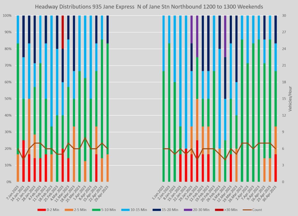
At Pioneer Village the situation is similar to Jane Station. Even though this is a terminus where the departure of buses should be easy to regulate, bunching does occur especially late in the day.
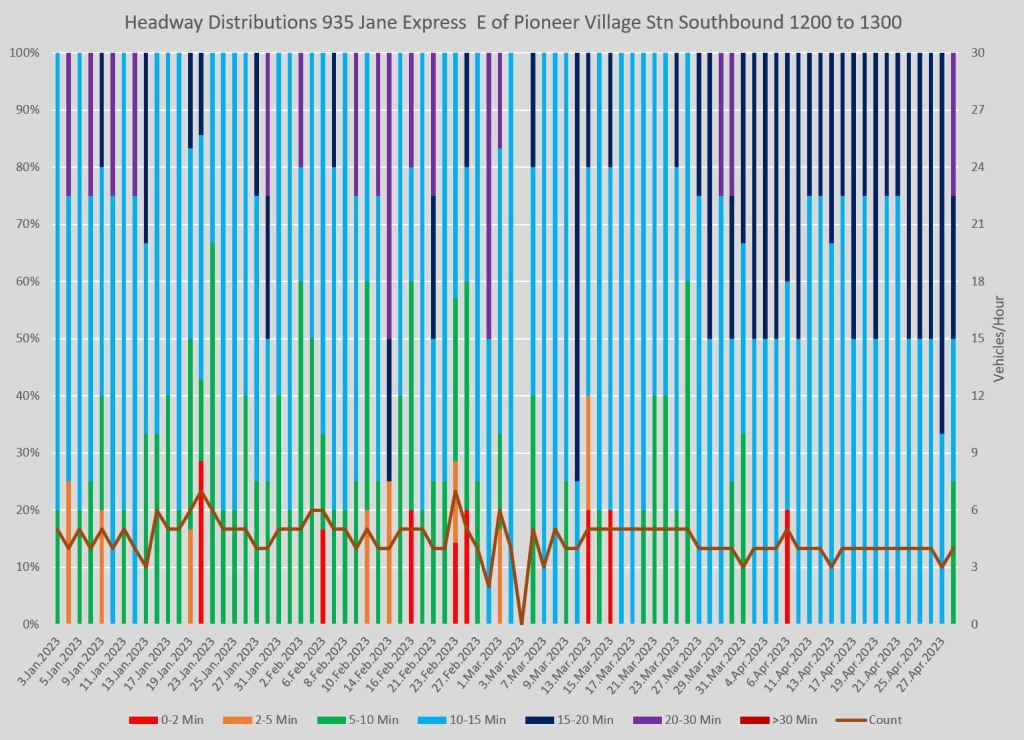
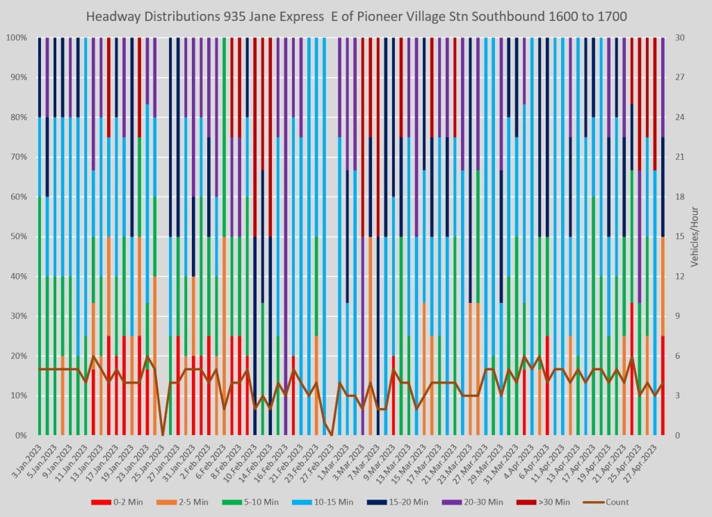
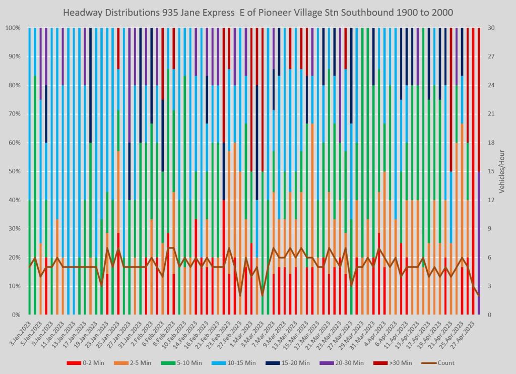
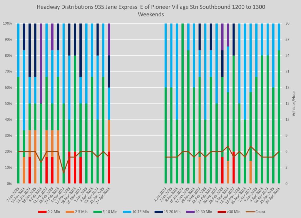

In mid-route, southbound at Lawrence, here is the service. (The situation northbound is similar and I have not included those charts here.) Very short and very long headways are common.
Full chart sets:
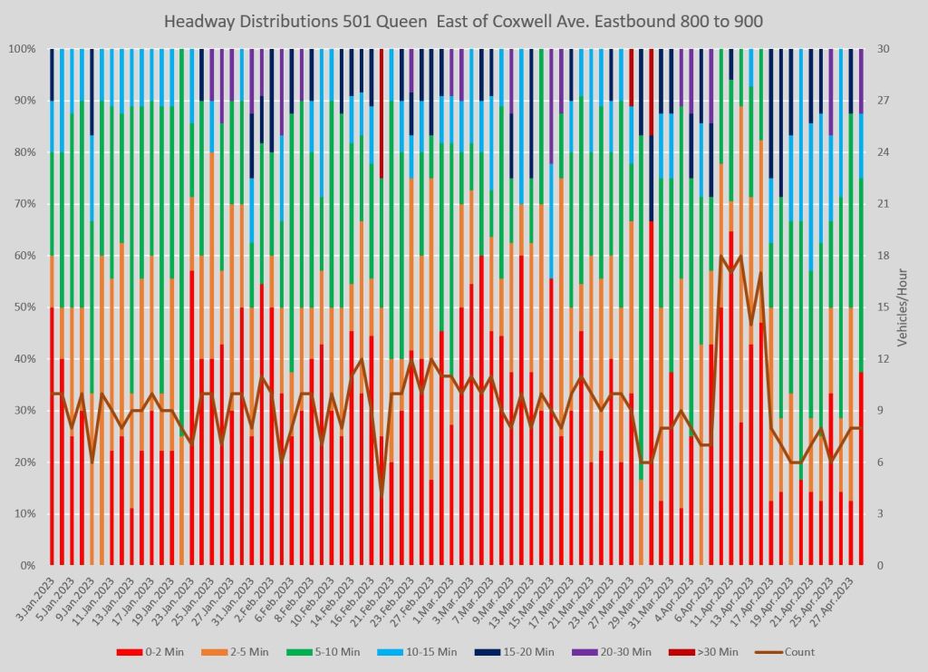
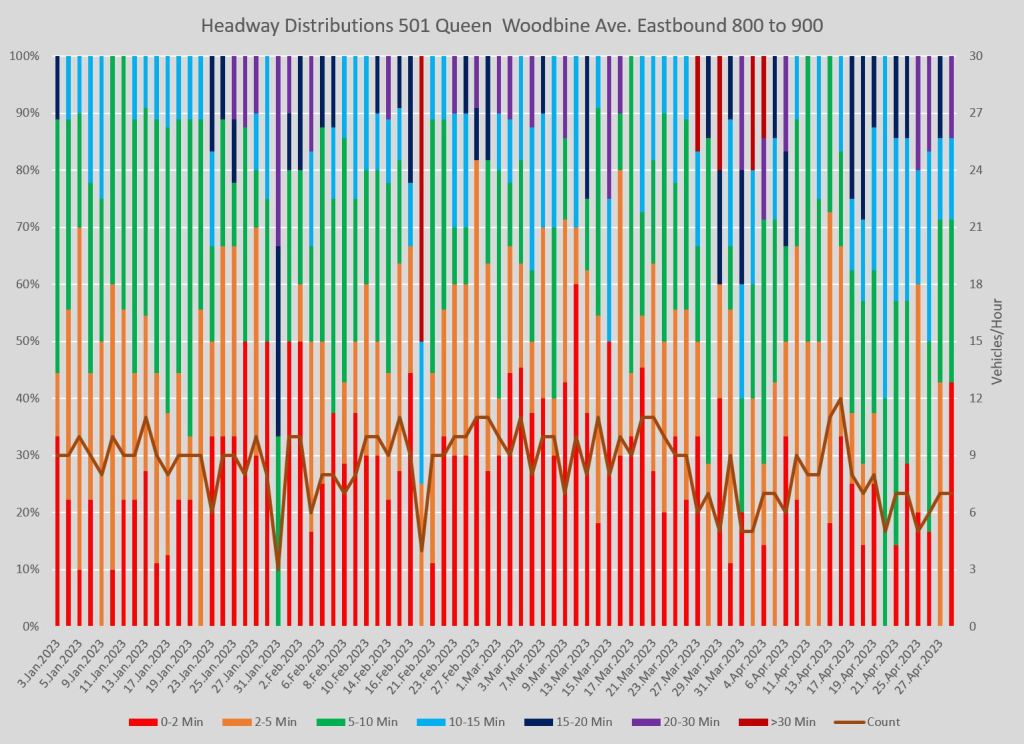
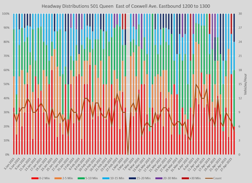
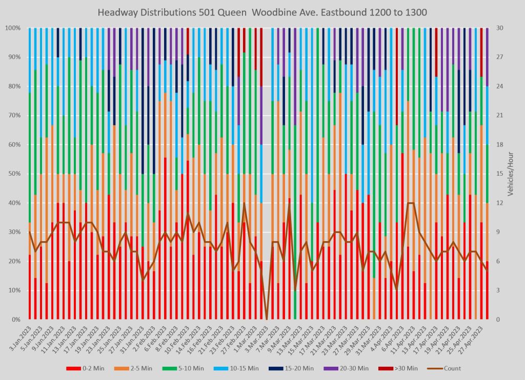
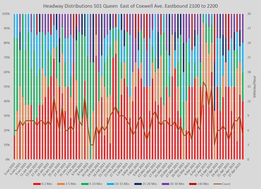
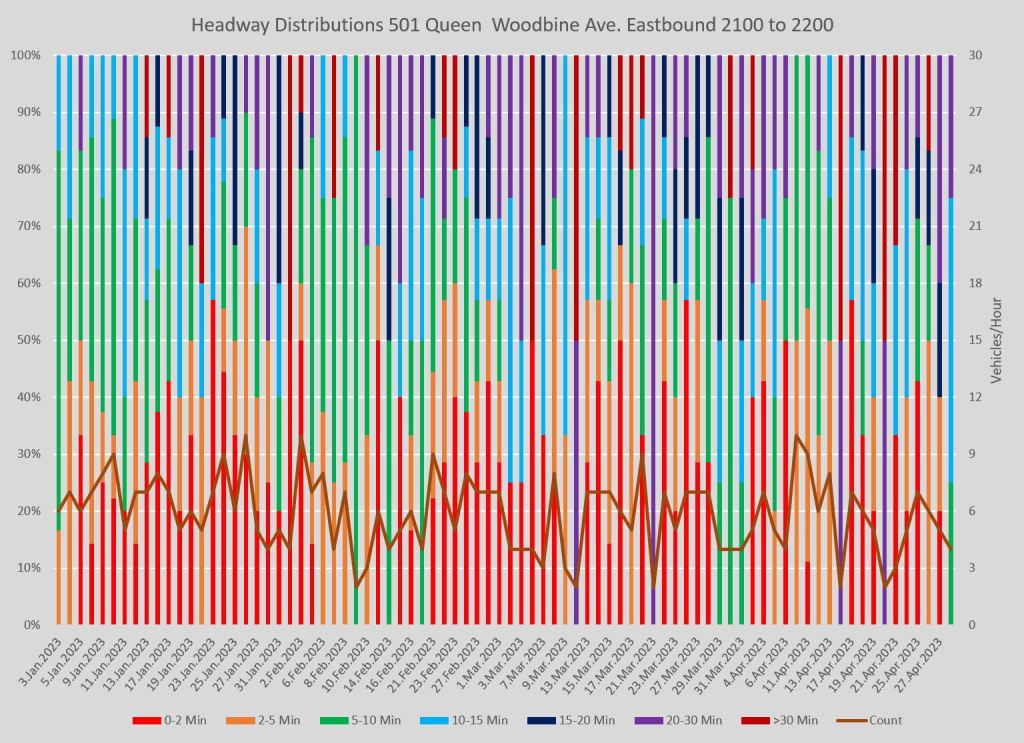
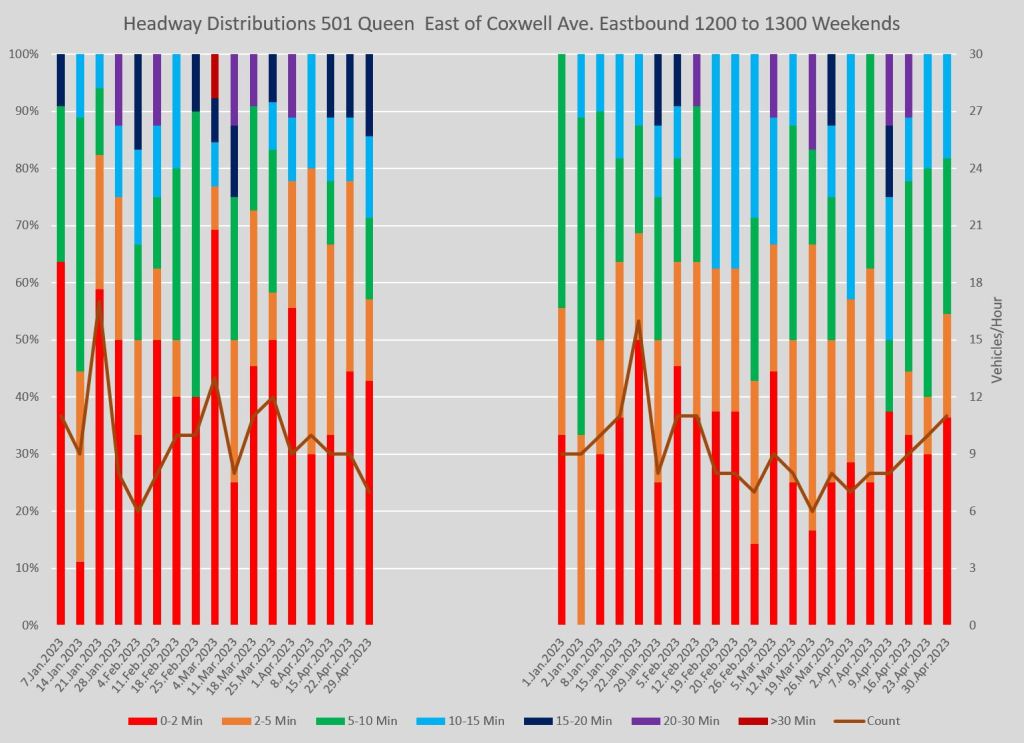
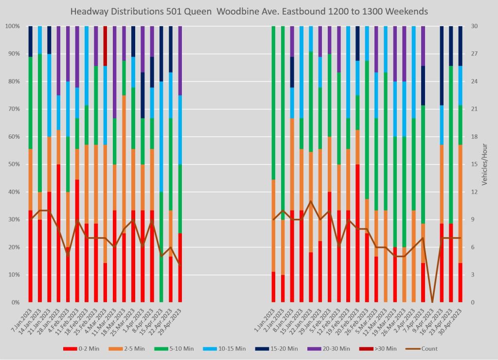
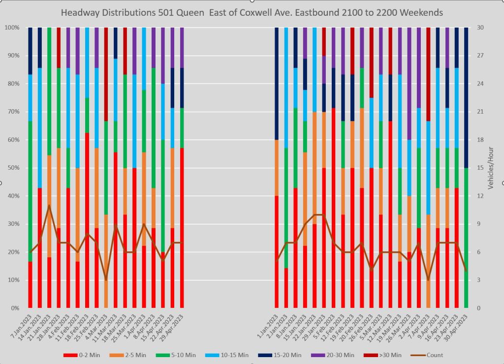
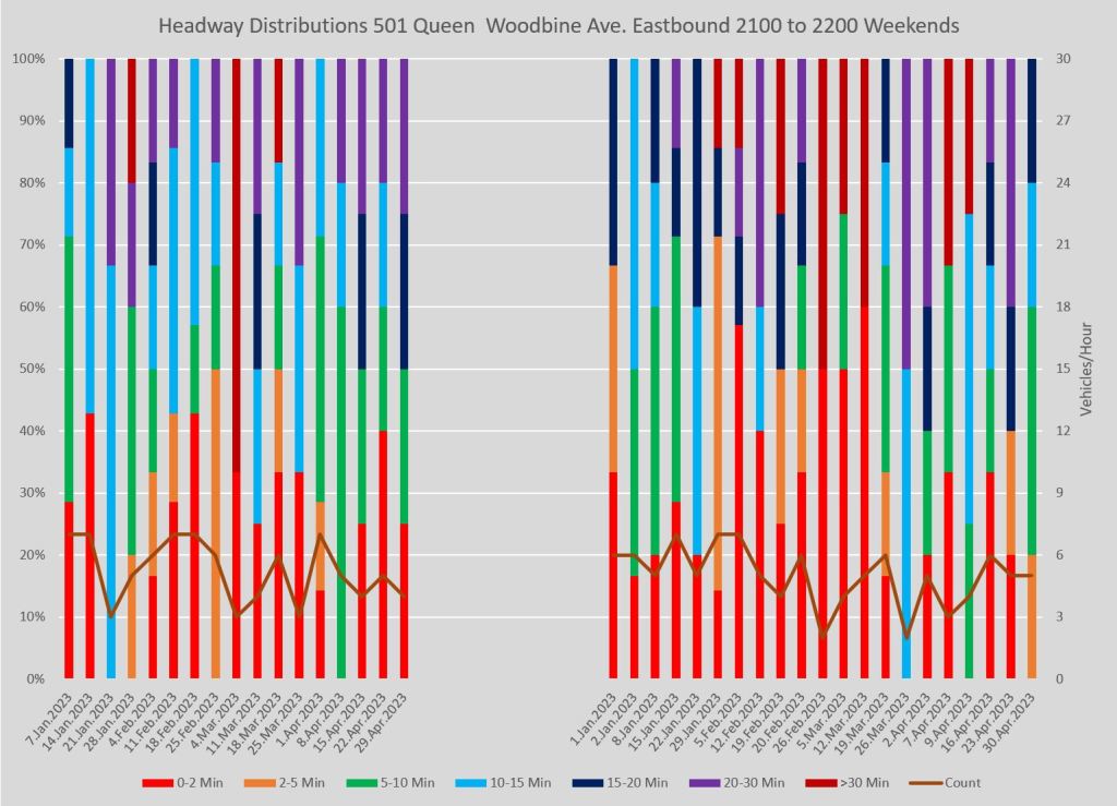
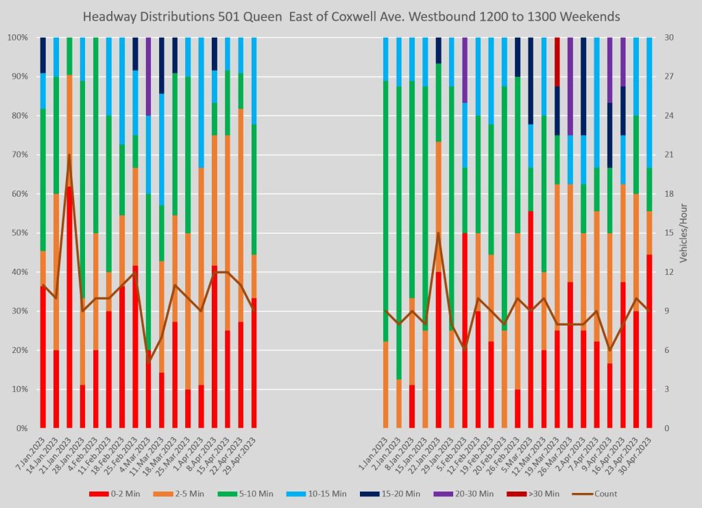
501 Queen in The Beach
The data here show the behaviour of the 501 Queen car at the east end of the line. Note that this predates the effect of Ontario Line construction diversions.
Eastbound service toward Neville Loop is the cumulative effect of whatever problems streetcars have encountered on their way across the city. The bunching that is inevitable over a long route shows up here at all times of the day, night and any day of the week. With scheduled service being further and further apart, bunching that many years ago might have created an 8 minute gap based on a 4 minute headway can now create a gap of 20 minutes or more when the combined effect of schedules and variability are considered. This is not an attractive service.
Here are the service plans effective during January through April 2023:
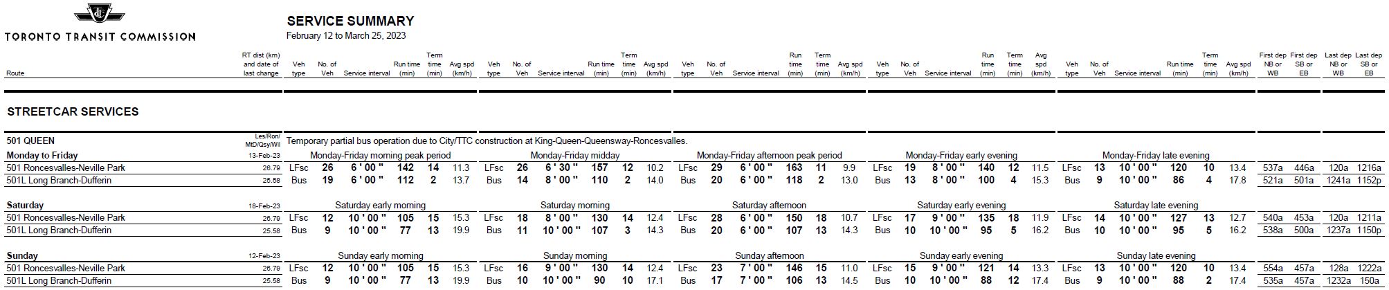
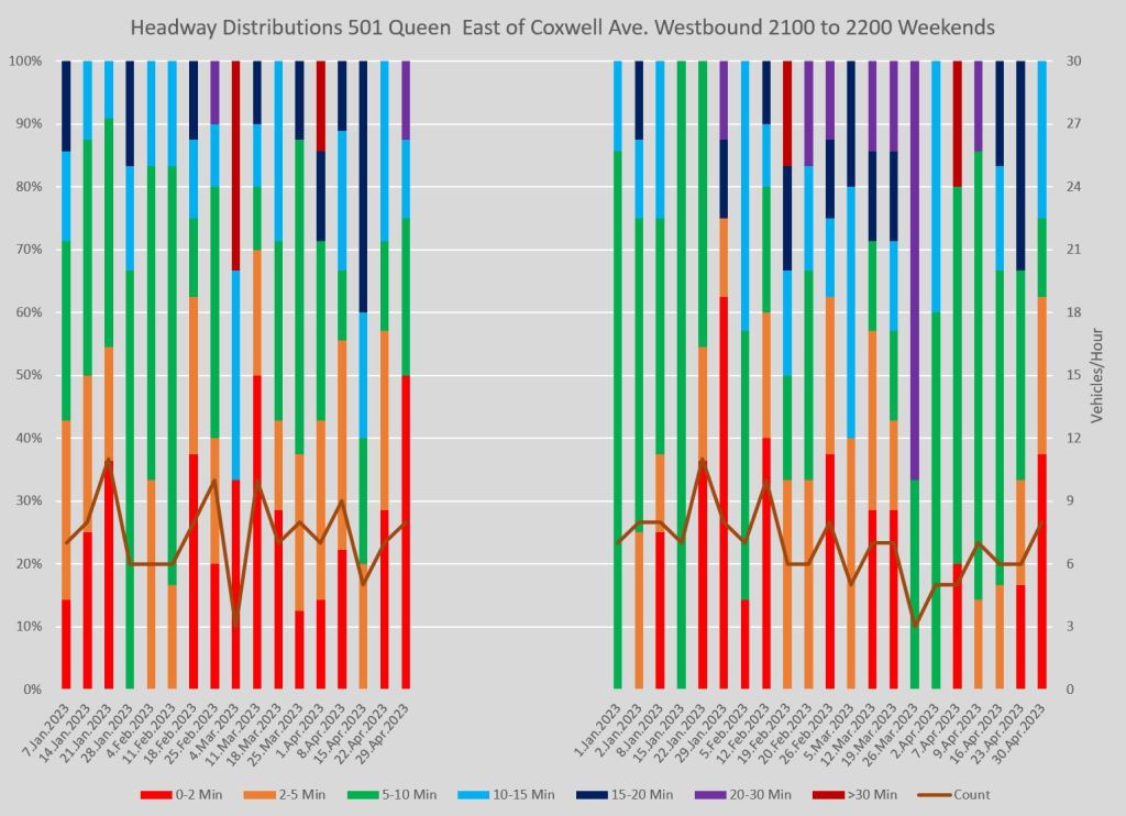
The charts below show side by side comparisons of stats for a screenline east of Coxwell and another at Woodbine. This compares the service before and after the short turn point at Kingston Road, Woodbine Loop. A few points to note:
- In spite of the scheduled service frequencies, the red (2 minutes or less) section dominates the charts even on weekends.
- The dark colours corresponding to wide gaps appear across the top of all charts, but they often “hang down” lower for the Woodbine than for the Coxwell charts because of service that short turns at Kingston Road without reaching Woodbine Ave.
- There is a substantial chance that a rider attempting to get to The Beach will encounter a gap of at least 15 minutes, with values over half an hour on occasion, especially in the evening.
- The spike in vehicles/hour counts at Coxwell in April is due to a temporary bus substitution for track work east of Woodbine. The substitute buses ran far more frequently than the scheduled streetcars.
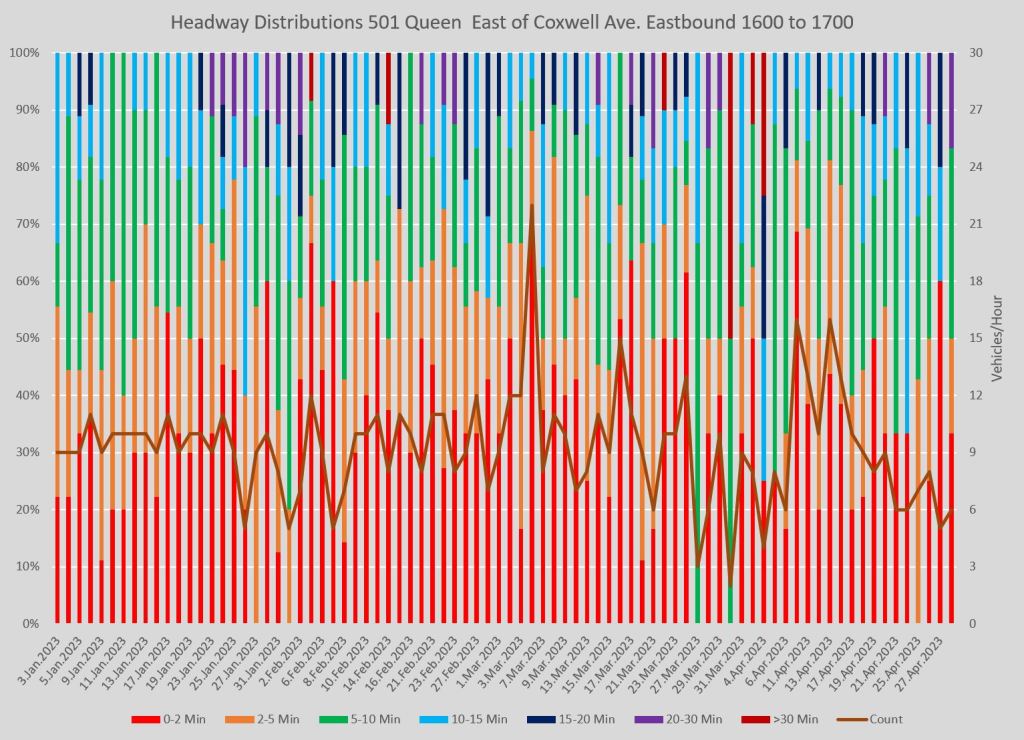
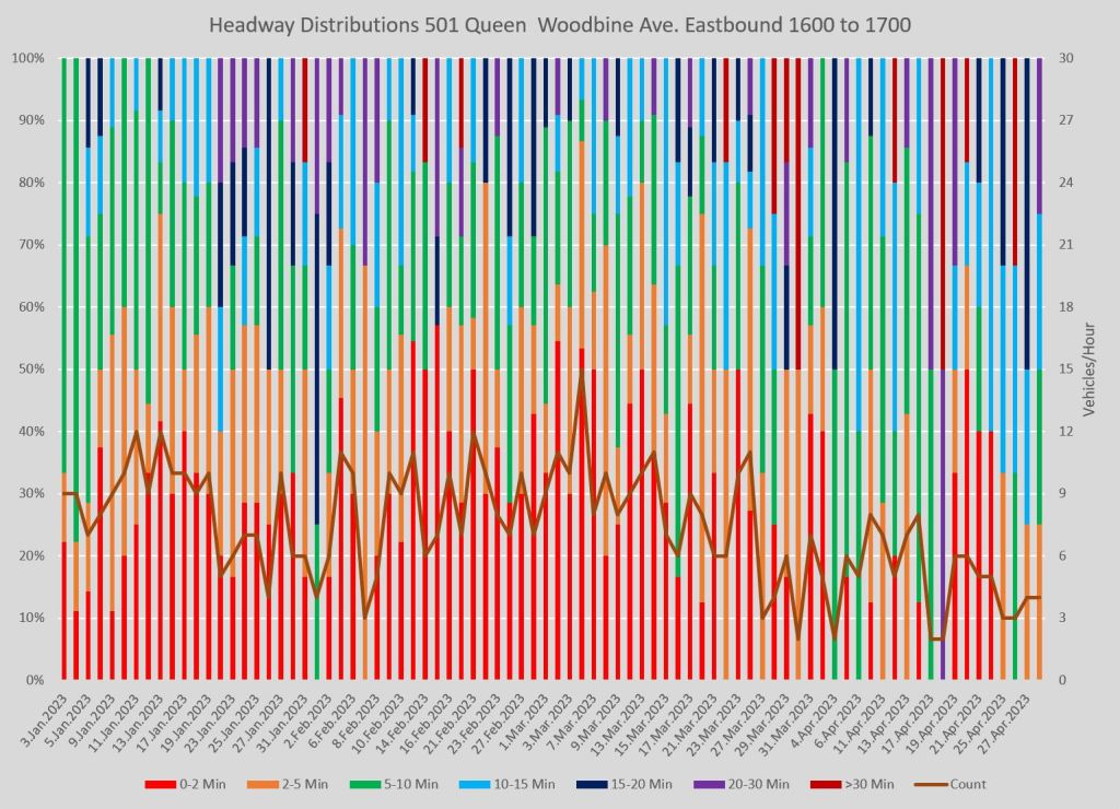
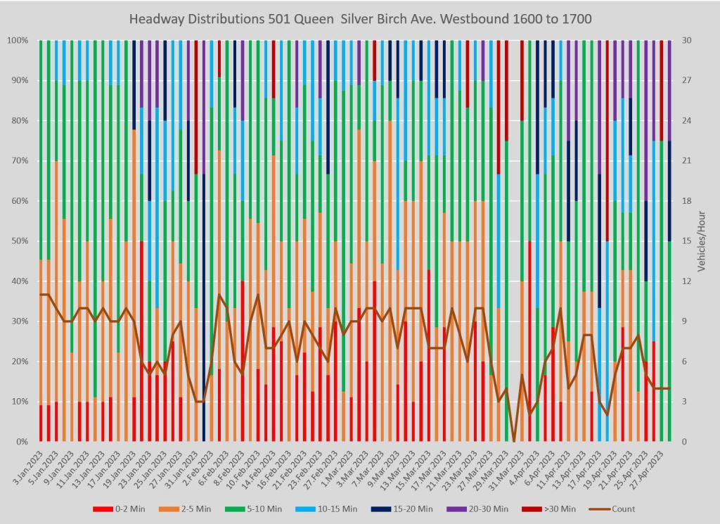
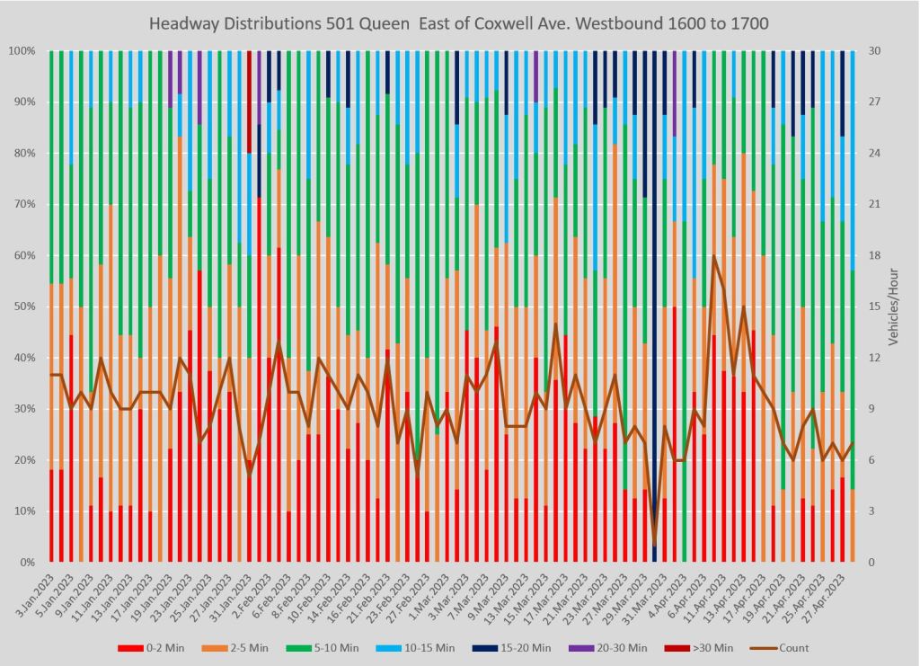
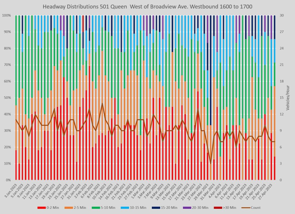
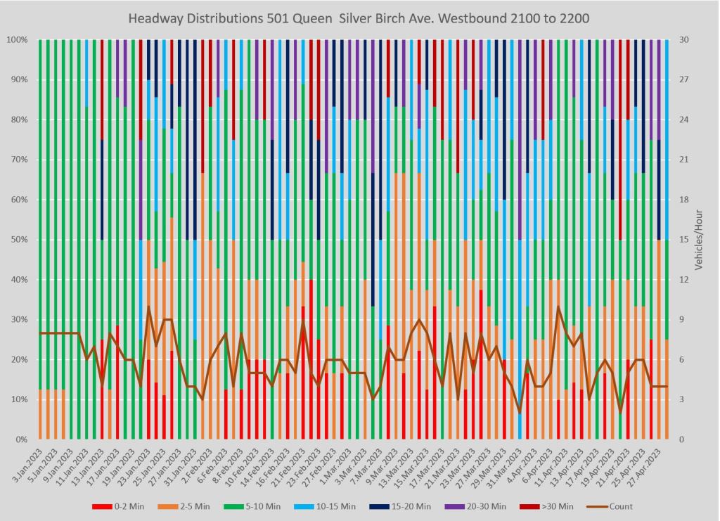
The next set of charts shows the westbound service from Neville Loop as seen at screenlines at Sliver Birch (two blocks west of Neville), Coxwell and Broadview. (Silver Birch is used as the reference point to avoid problems with streetcar backlogs at Neville Loop.)
Note how the proportion of short headways grows as we travel west showing how a problem with irregular departures from Neville is magnified along the route as pairs of vehicles catch up with each other. Measuring service quality measured only at the terminal understates the effect of bunching further along the line.
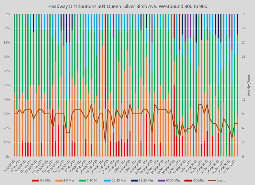
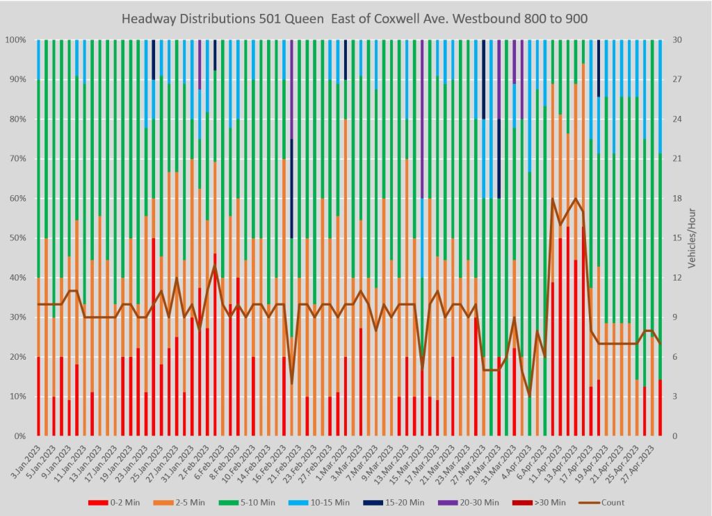
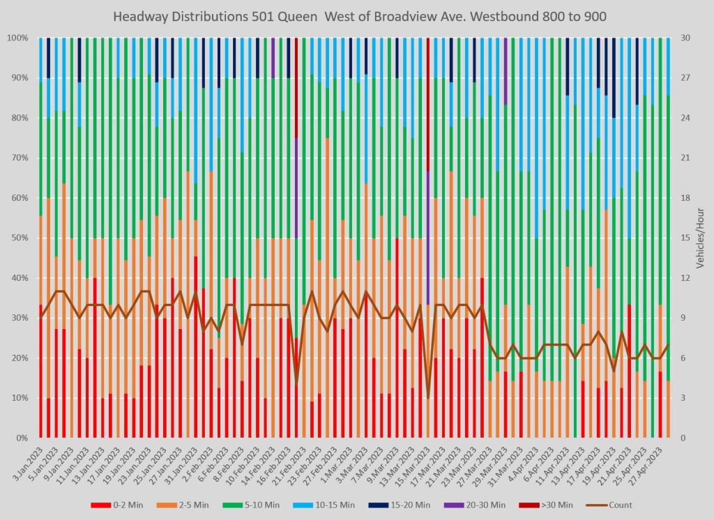
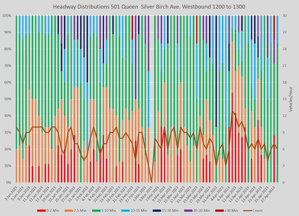
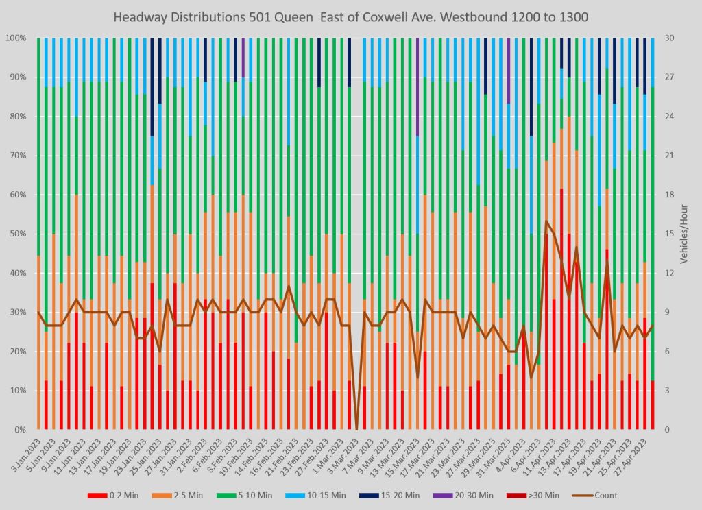
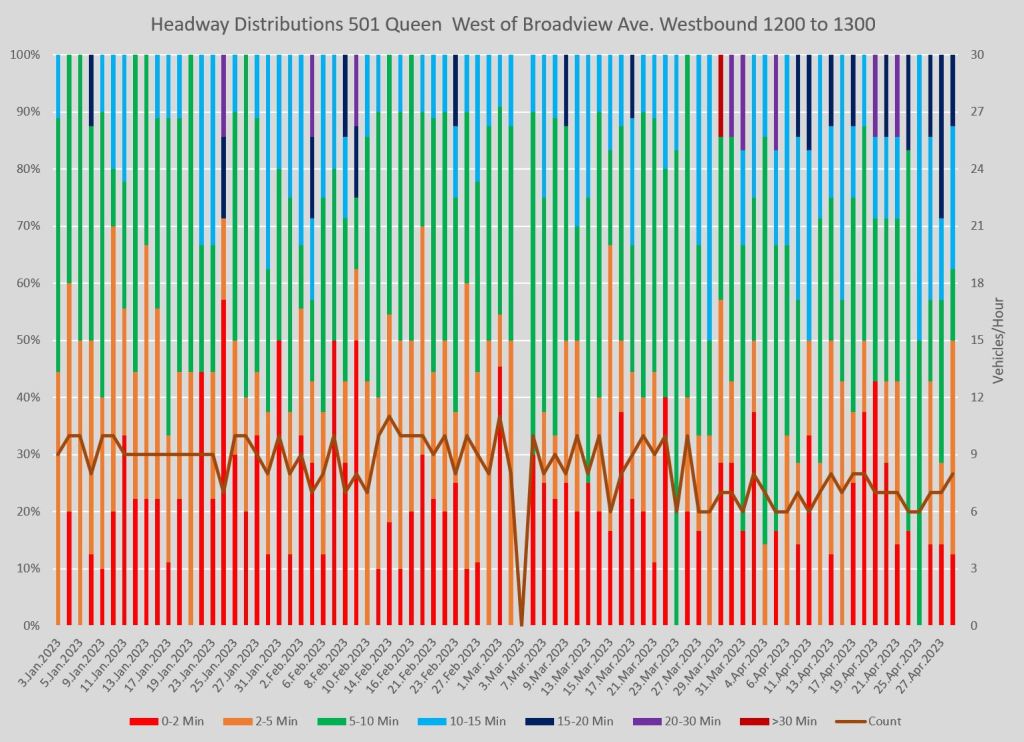
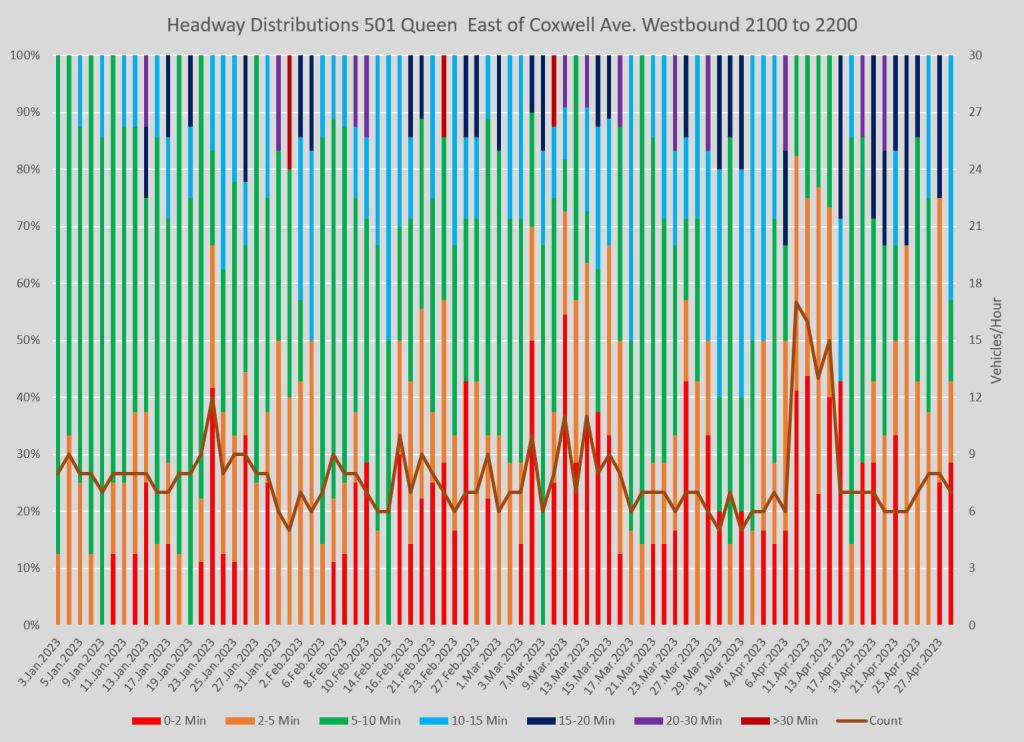
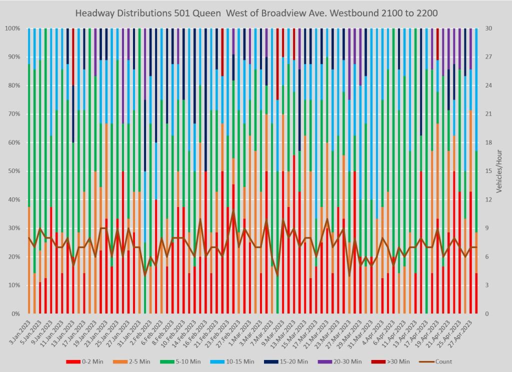
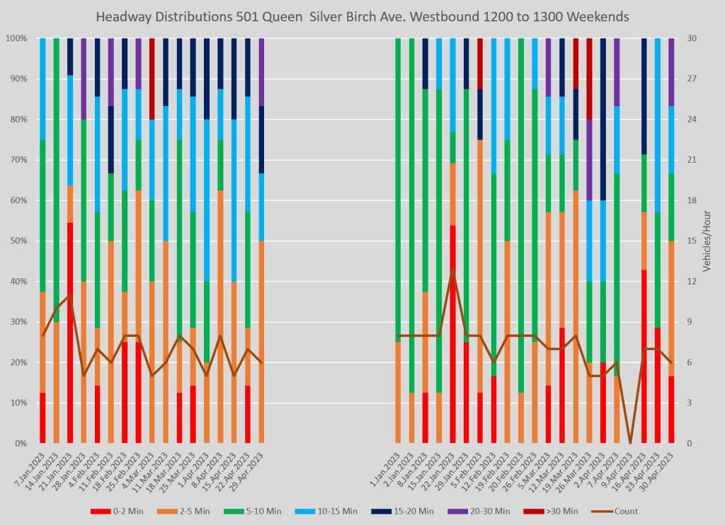
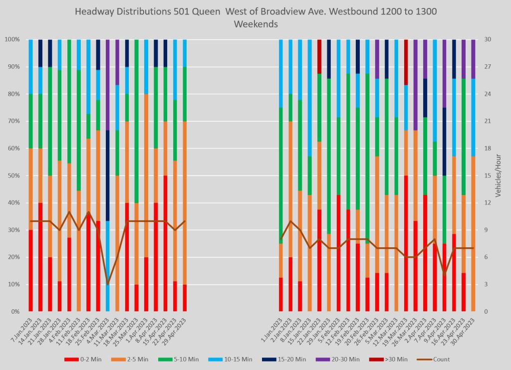
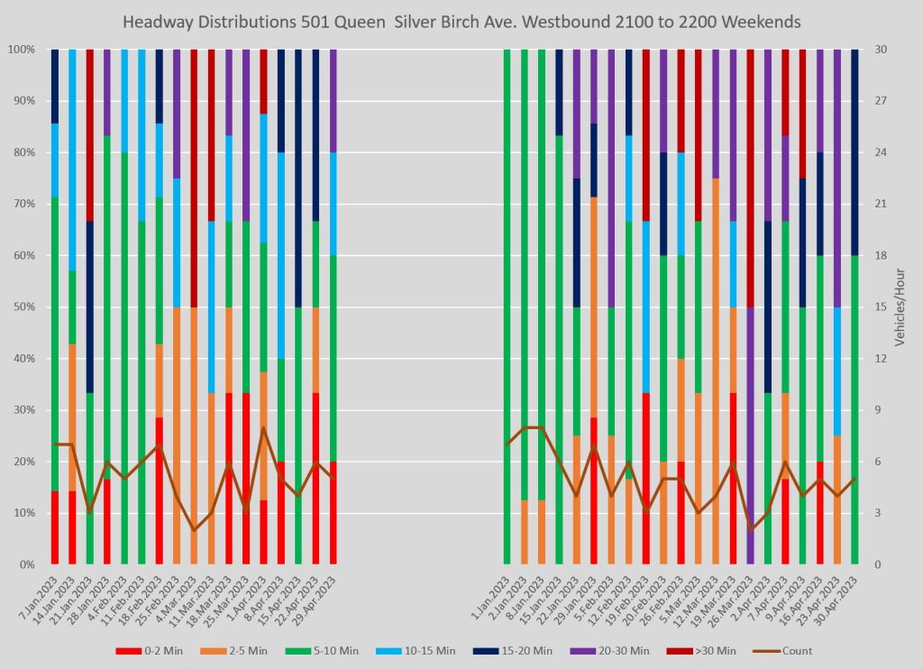
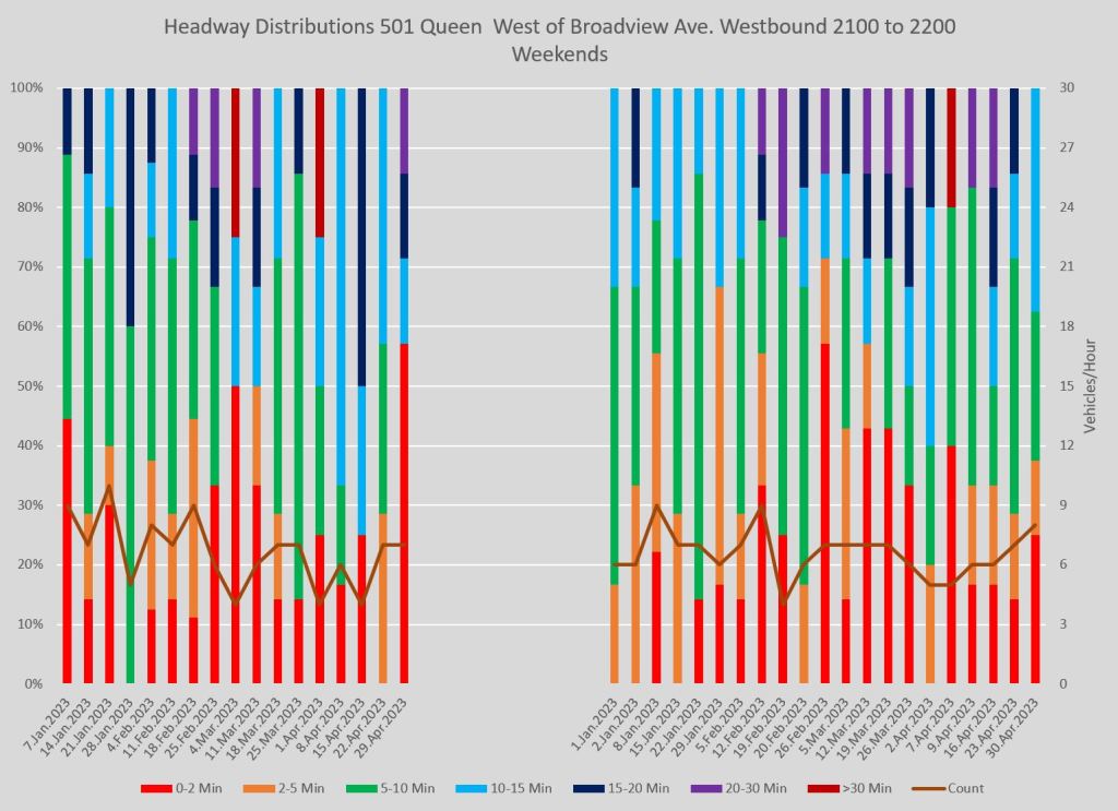
Full chart sets:
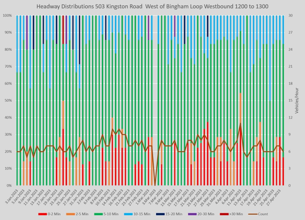
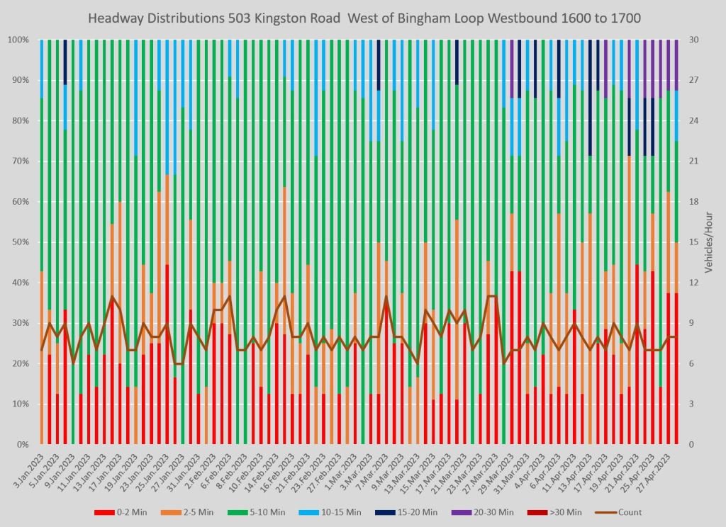
503 Kingston Road
During the period from January to April, the 503 Kingston Road service operated with buses over similar territory to the 501 Queen car. This route runs only on weekdays until about 7pm.
In spite of scheduled service of 8 minutes peak, 10 minutes midday, short headways westbound from Bingham Loop are common. For the returning eastbound service from downtown wide gaps are fairly common.

At Bingham Loop (west of Victoria Park Avenue):
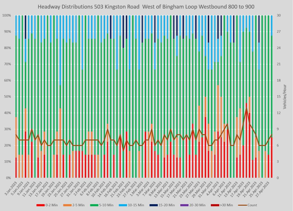
At King & Yonge eastbound:
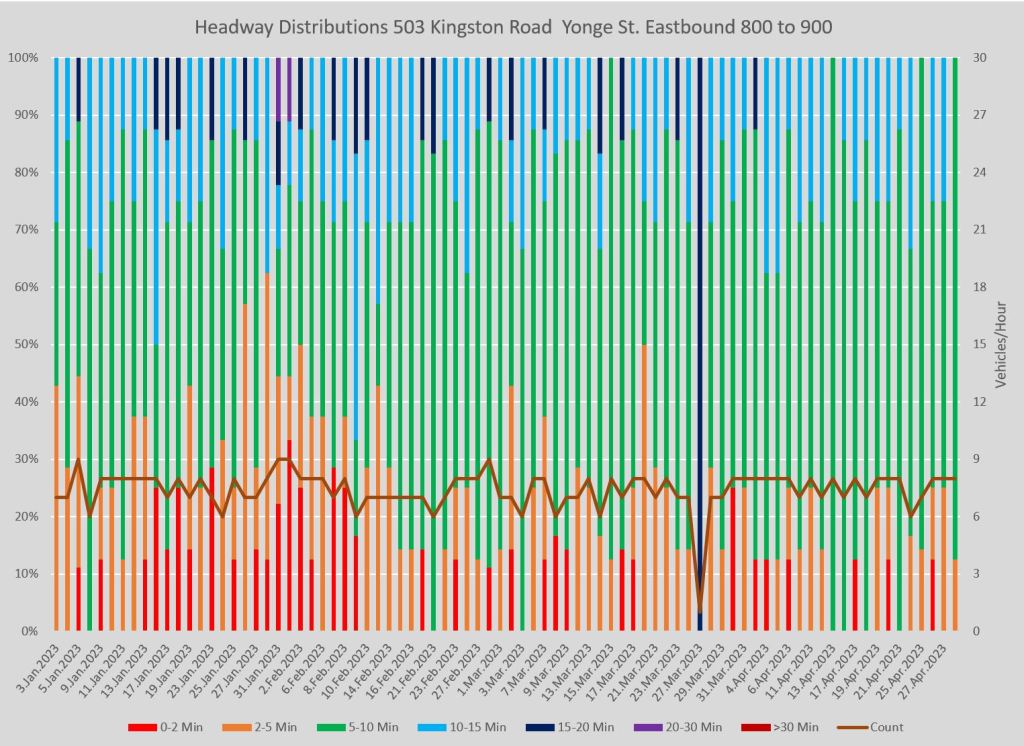
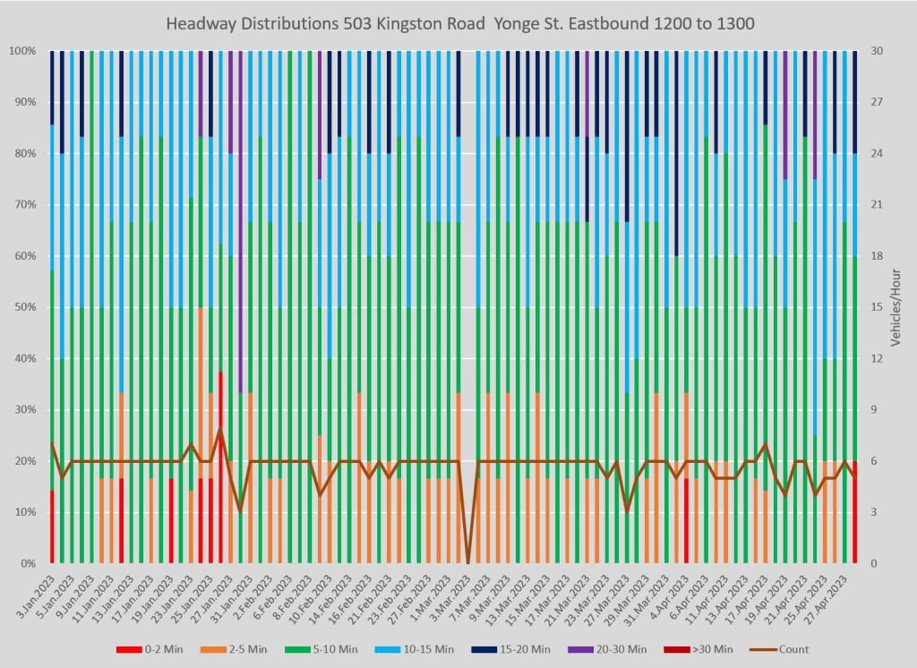
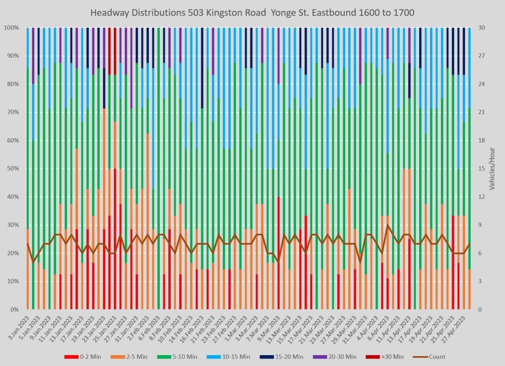
Full Chart Sets:
505 Dundas at Yonge
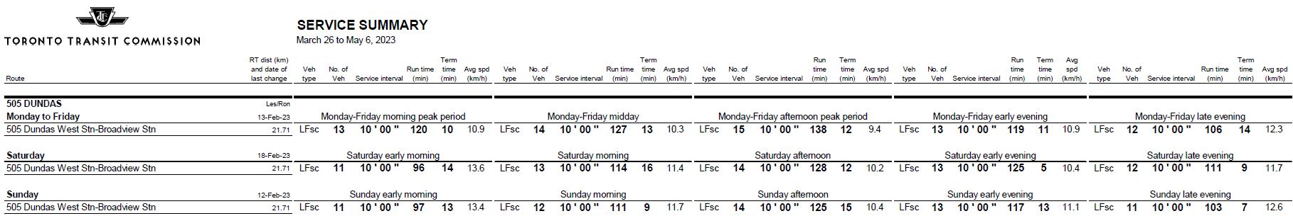
505 Dundas service was reduced in mid-February 2023, in some cases quite substantially. Headways that ranged from 6’30” to 10’00” at various times were changed to 10’00” at all hours. Running times were also extended to improve service reliability.

The charts below show the service both ways at Yonge Street. Problems with bunching declined on weekdays in the morning and midday, but they persisted in the afternoon and evening. Wide gaps in service are common.
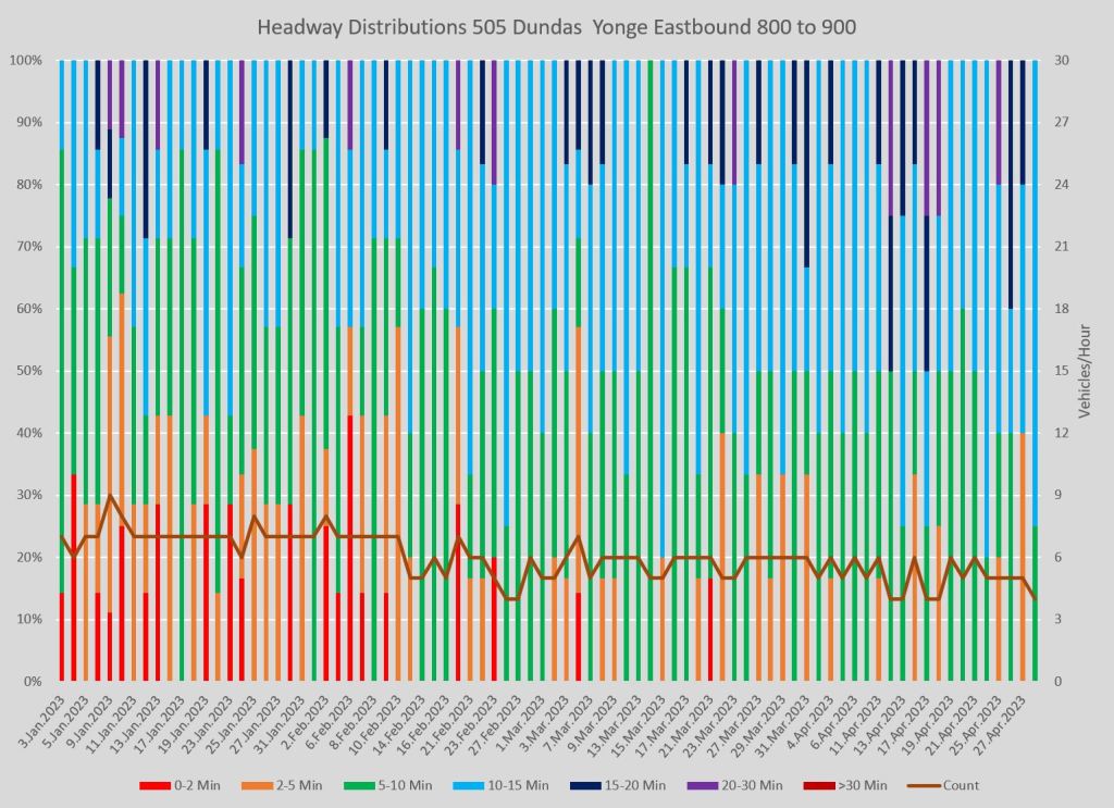
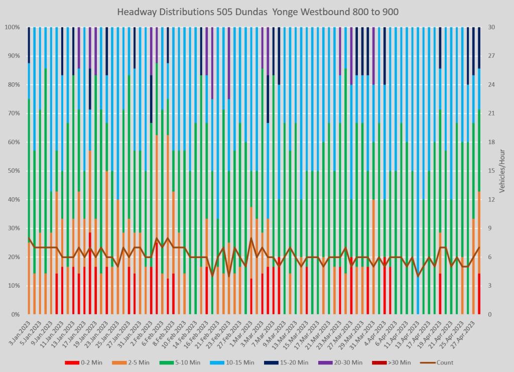
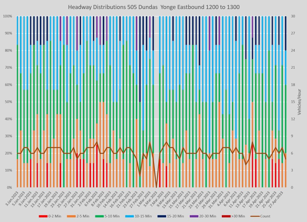
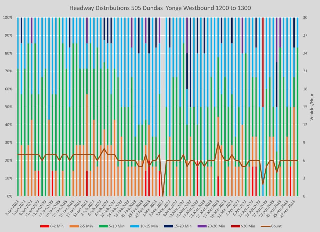
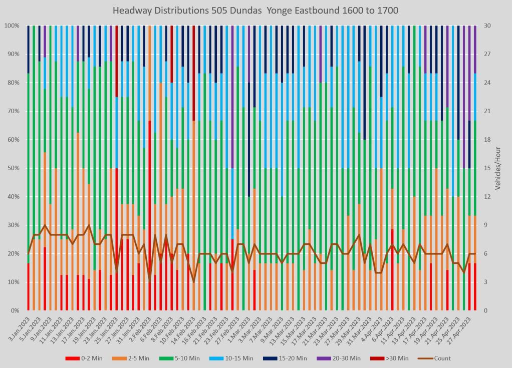
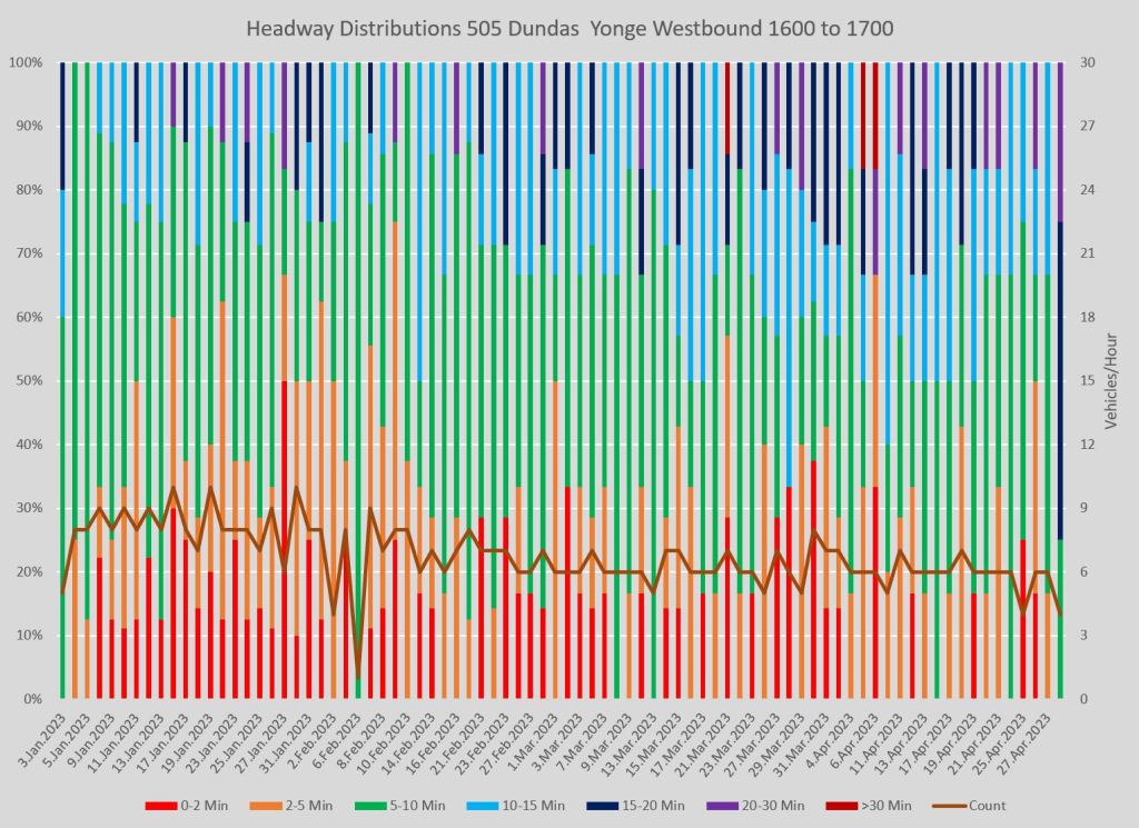
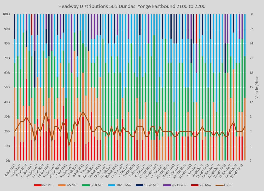
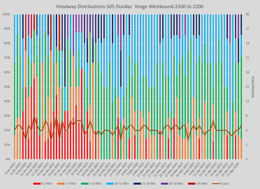
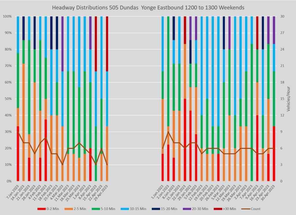
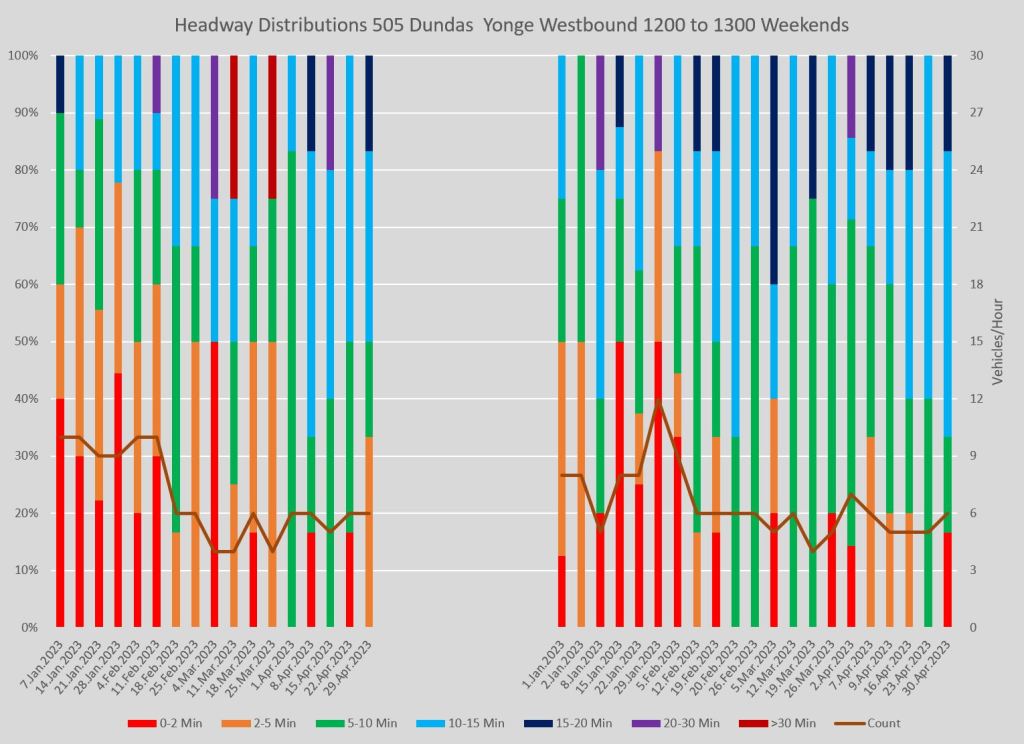
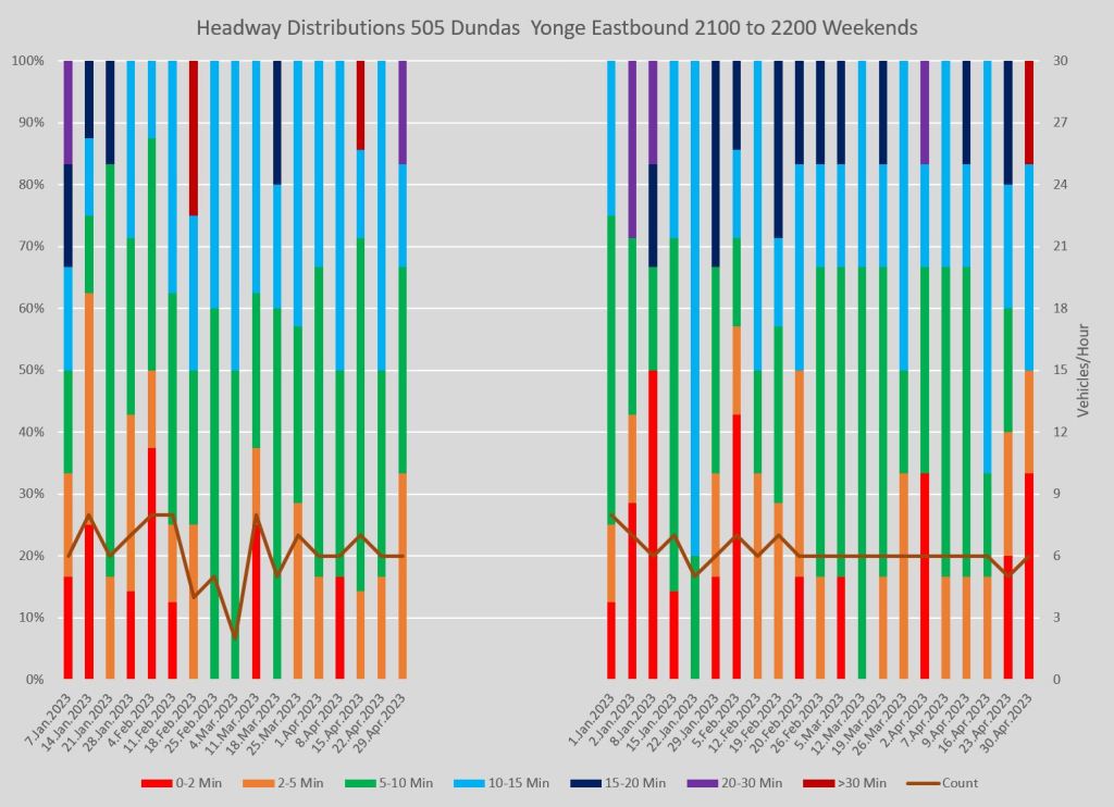
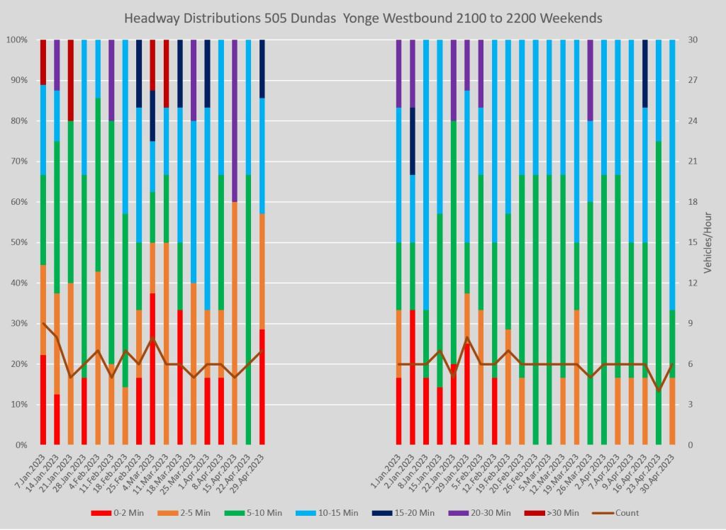
Full chart sets:
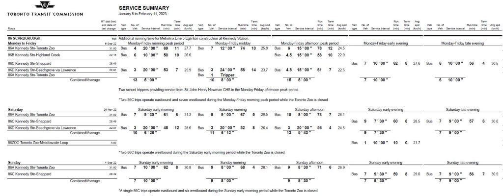
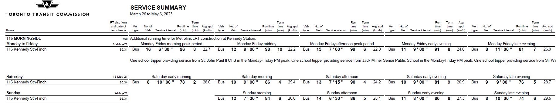
86 Scarborough
86 Scarborough is one of three routes presented here that use the RapidTO red lanes on Eglinton East and Kingston Road. That project concentrates on reducing travel times and limiting variations so that the service is more reliable. This was an effect seen on the King Street transit priority pilot where the improved reliability was at least as important as the reduced average travel time.
Service on the 86 Scarborough route had two changes over the period covered here:
- In mid-February Saturday schedules extended the travel times to improve reliability.
- In late March, weekday service was reduced and travel times were extended during the peaks and midday. The table below shows an effective date of September 2022 for weekday service in the March summary, but this is not correct.
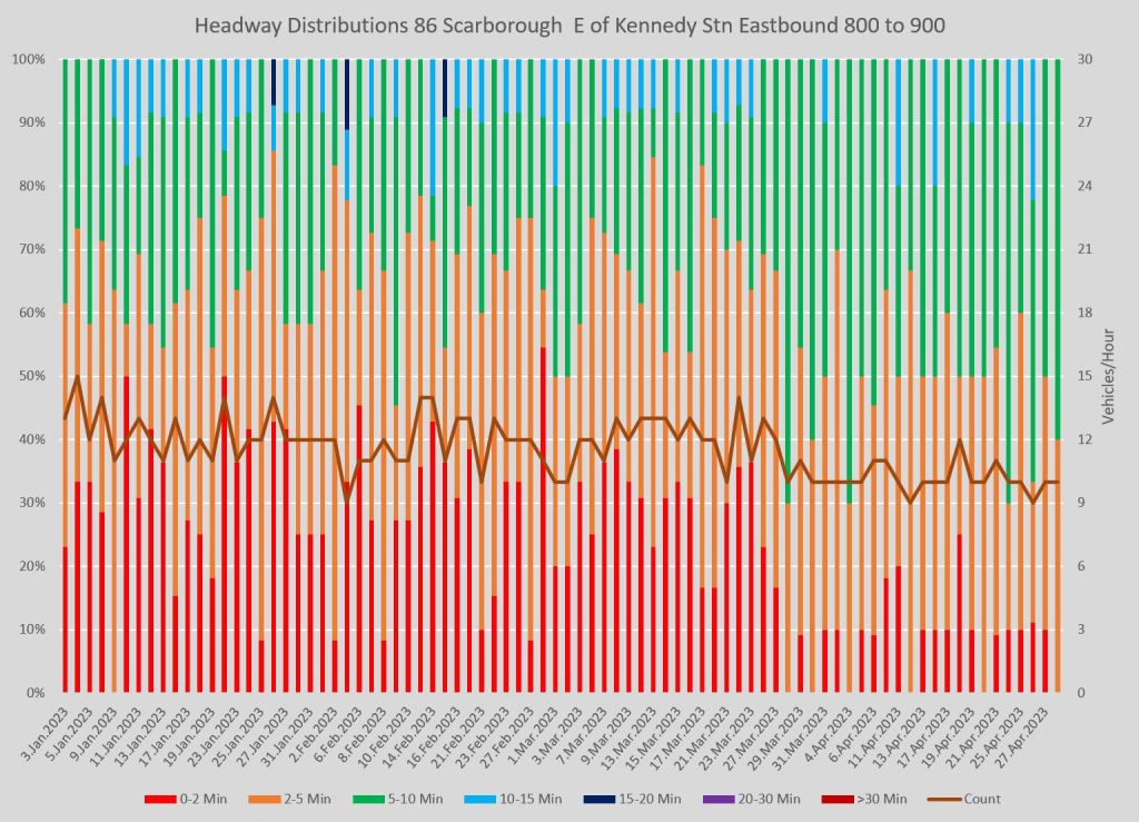
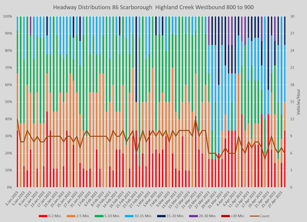
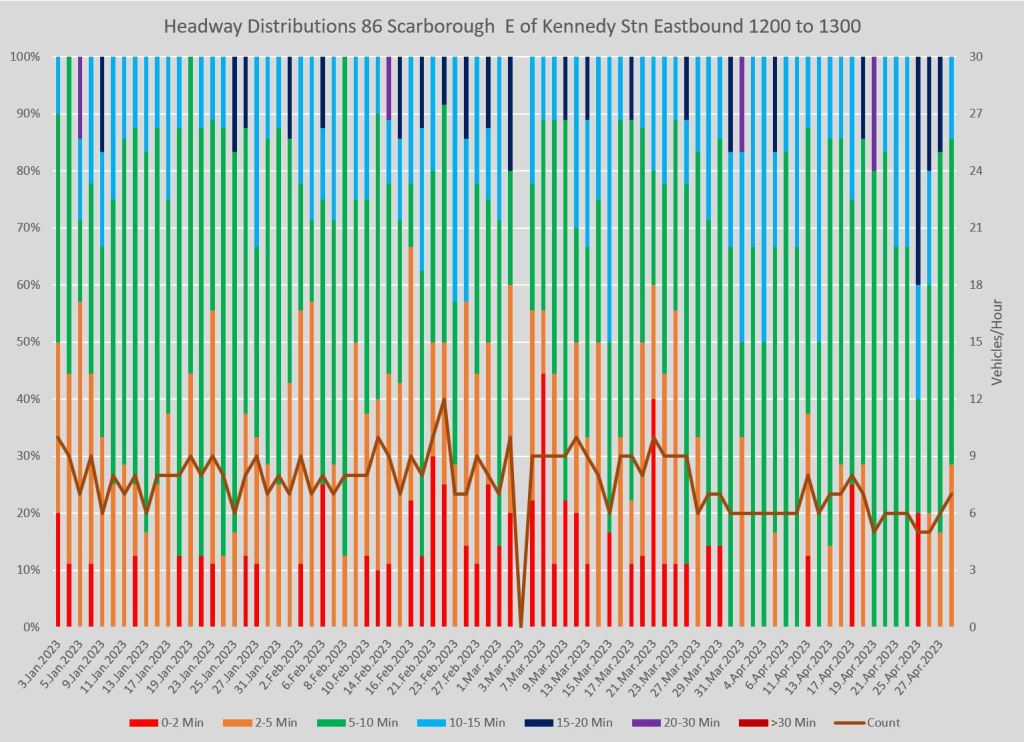
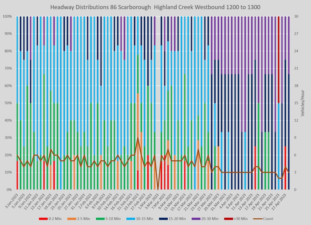
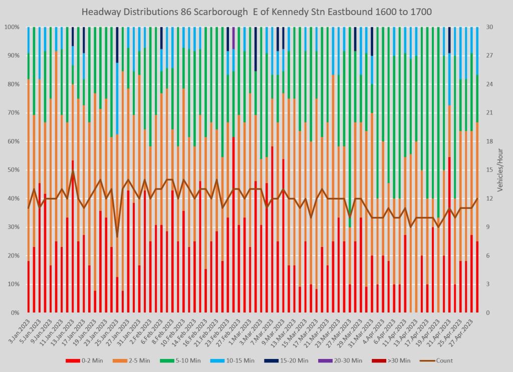
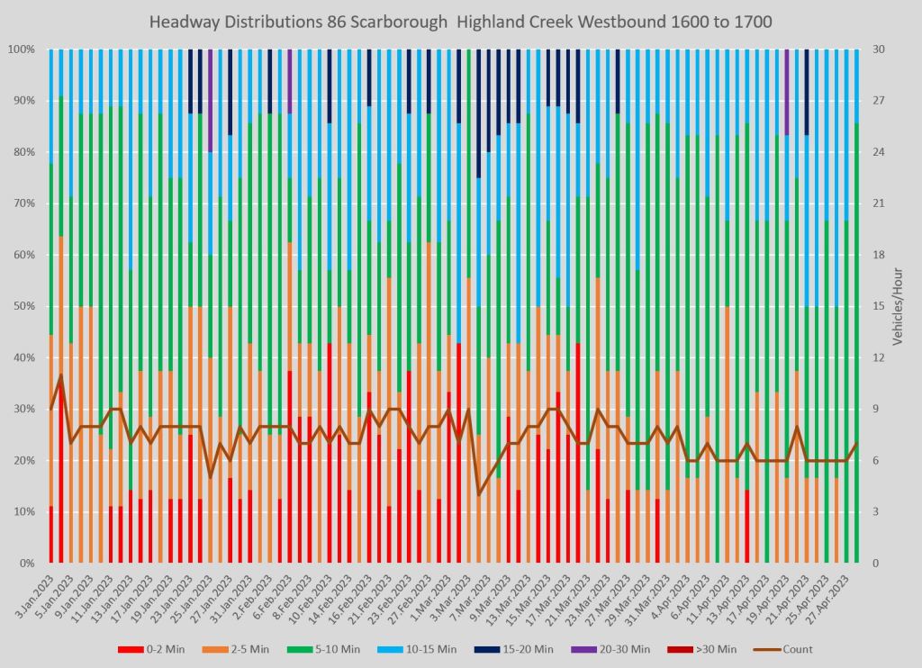
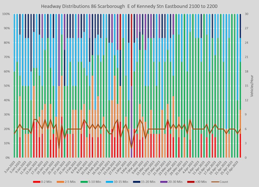
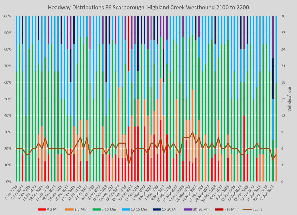
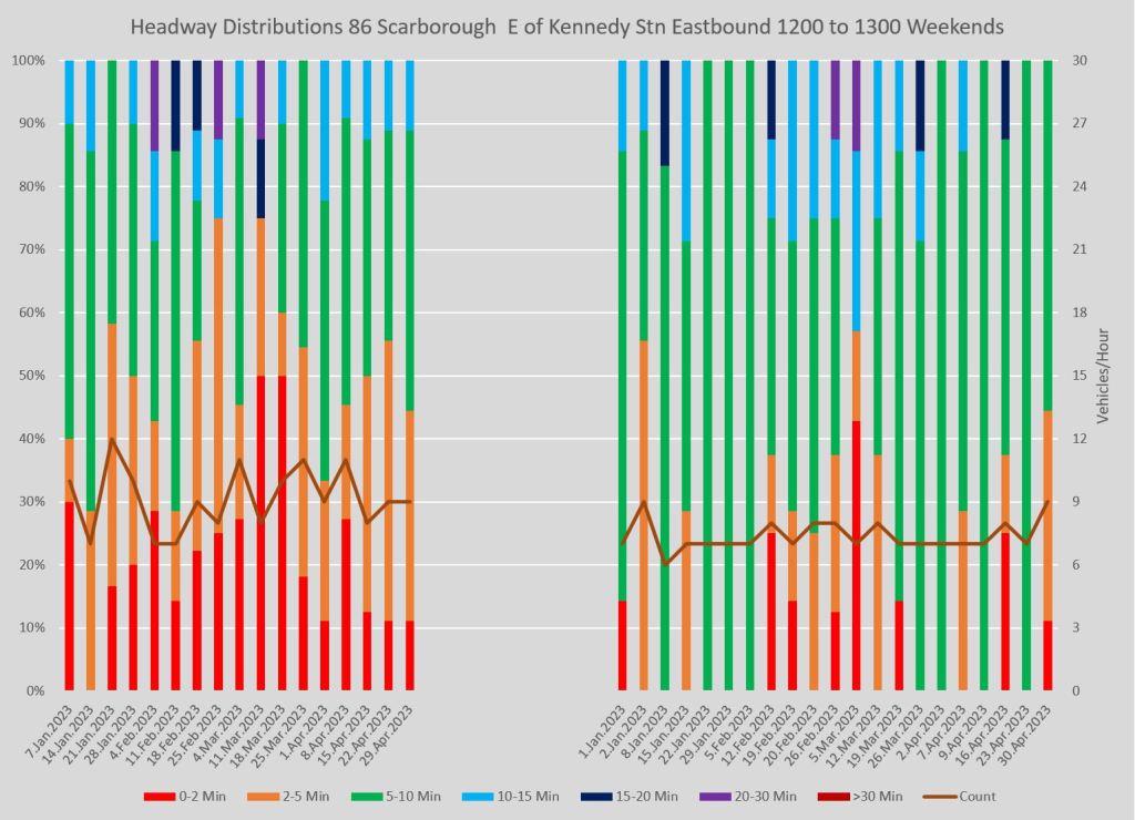
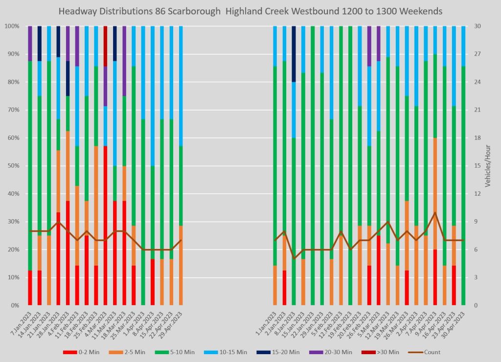
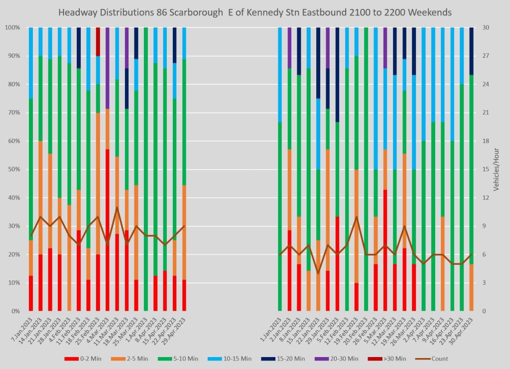
Full chart sets:
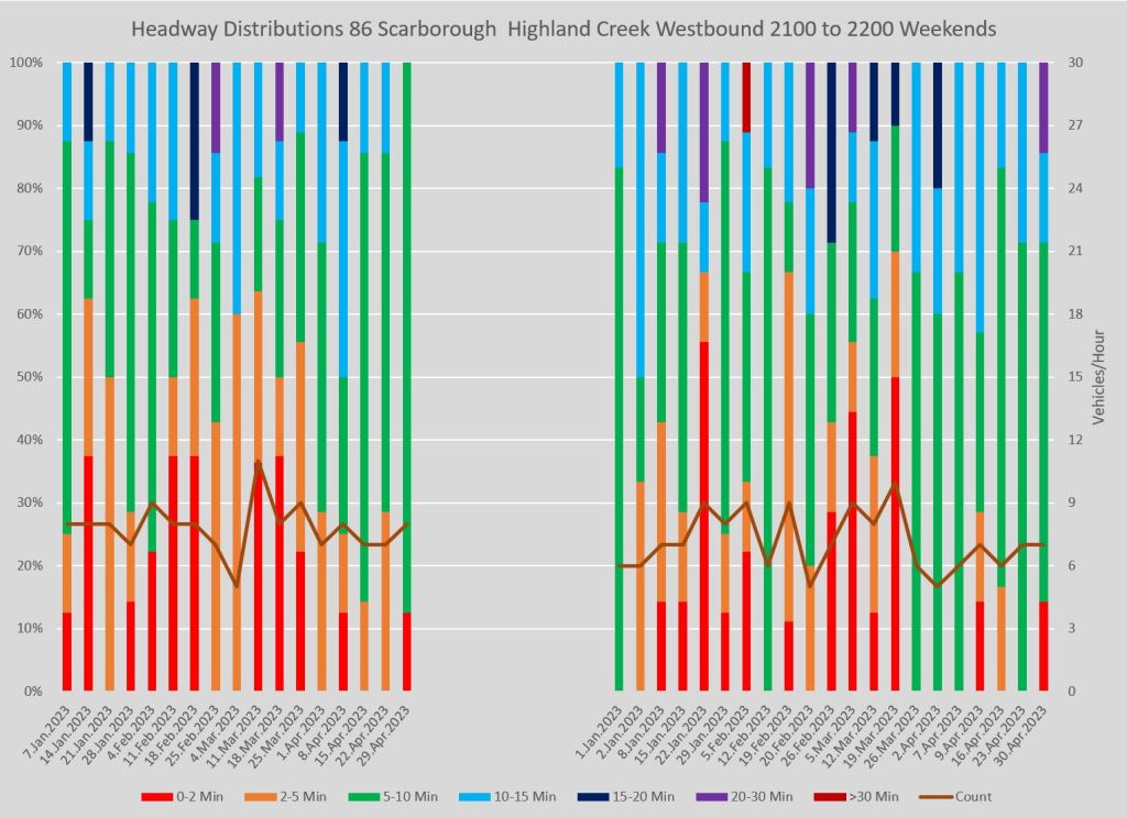
116 Morningside
The 116 Morningside bus has operated with the same schedule throughout the January-April period.
Bunching and wide gaps are common especially in the PM peak, evening and weekends.
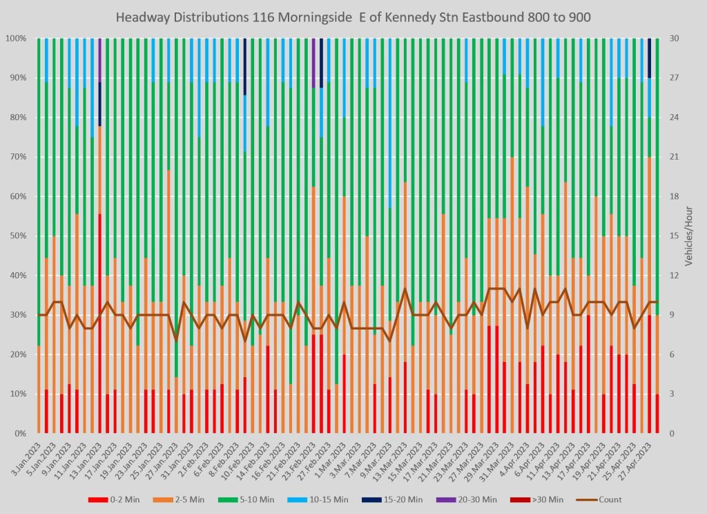
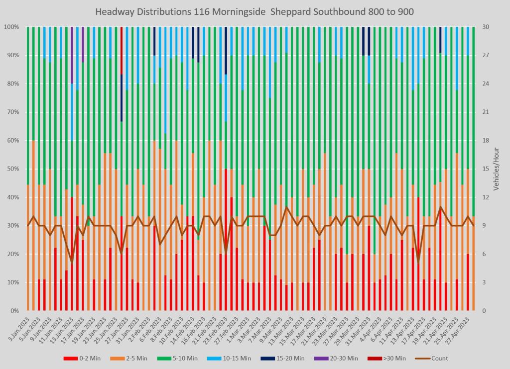
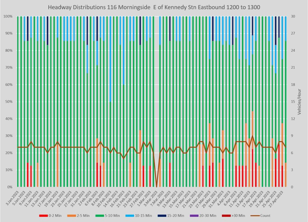
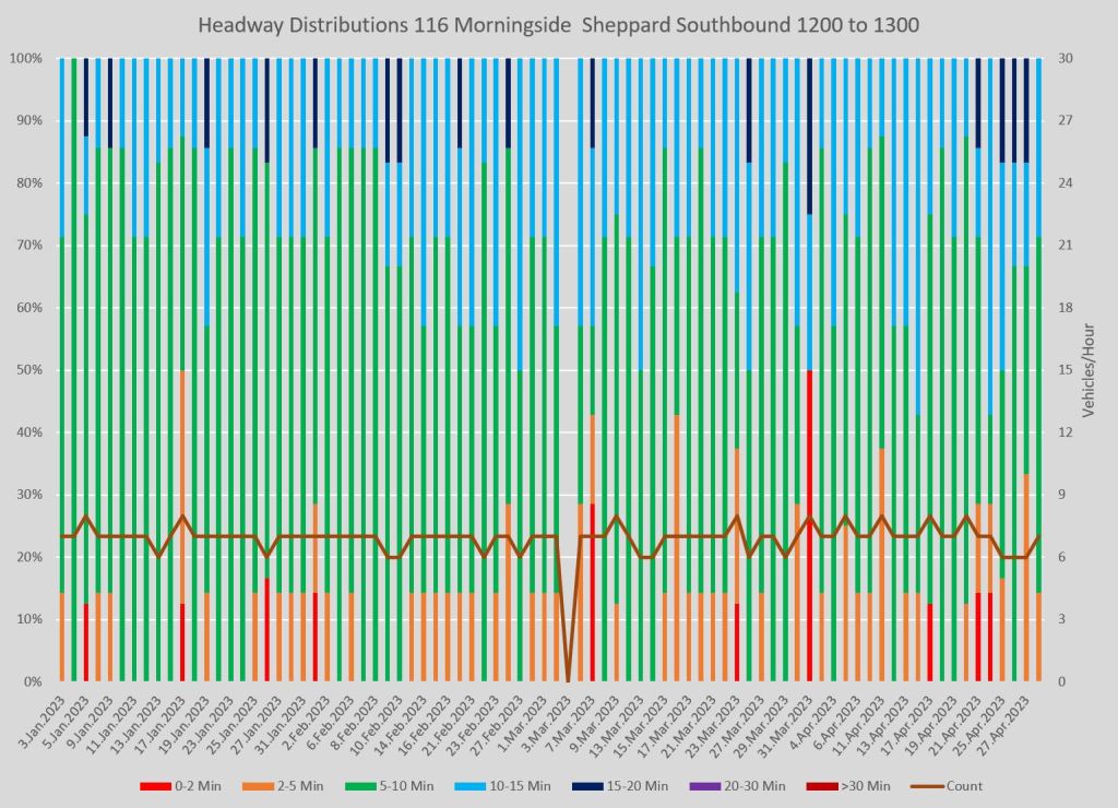
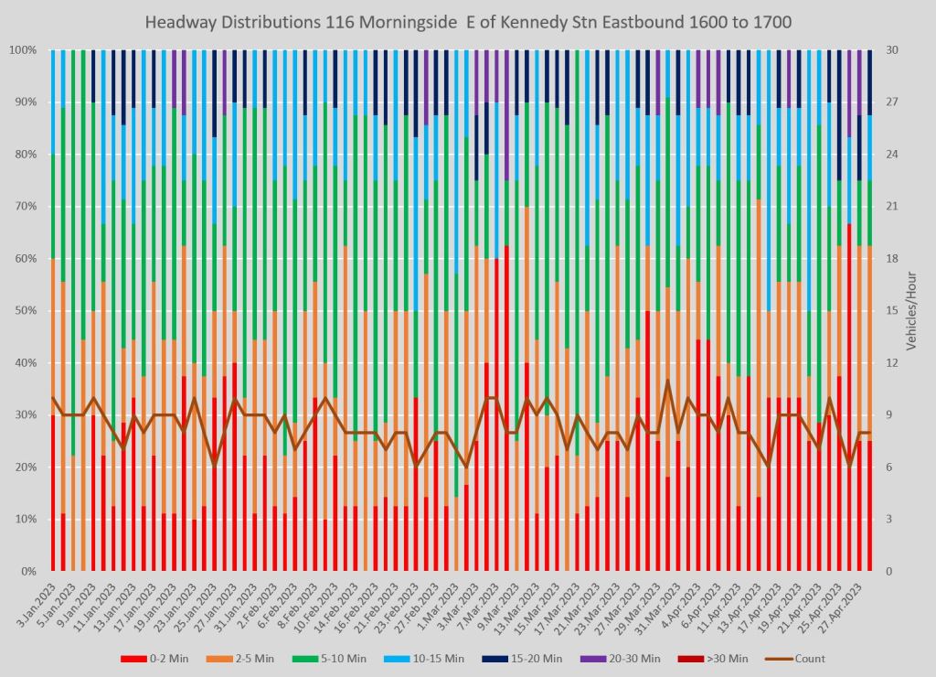
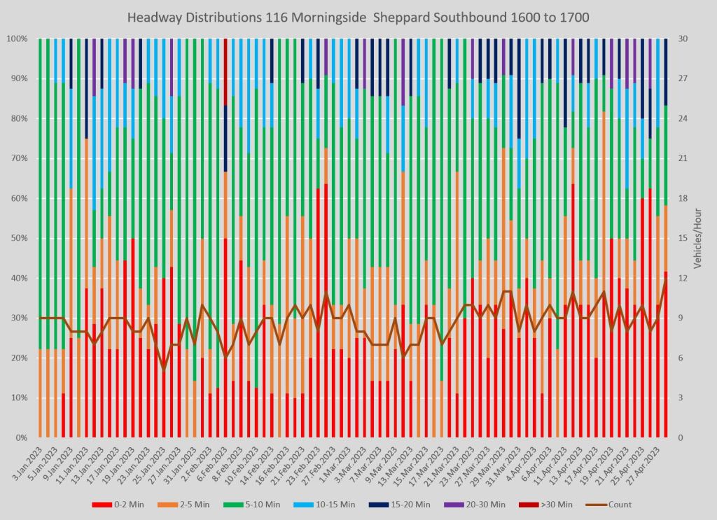
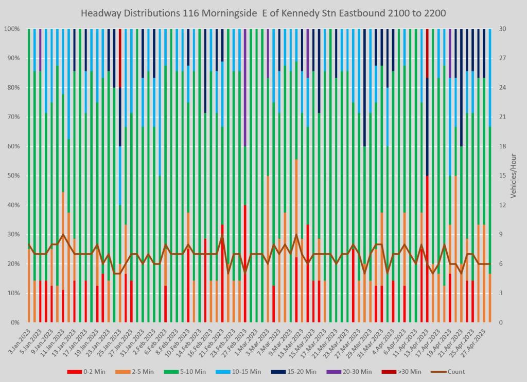
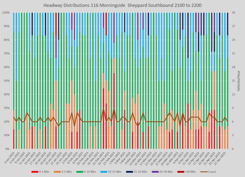
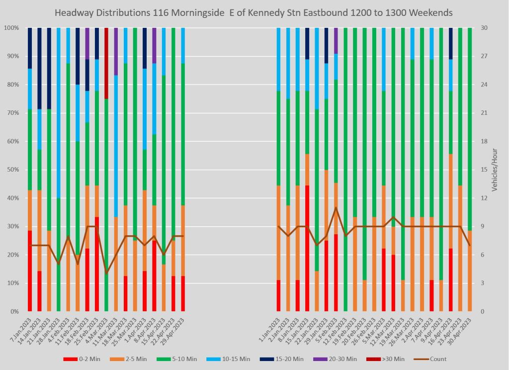
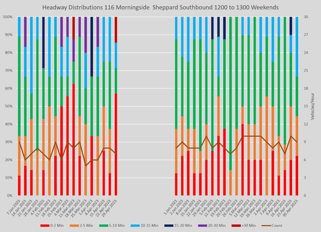
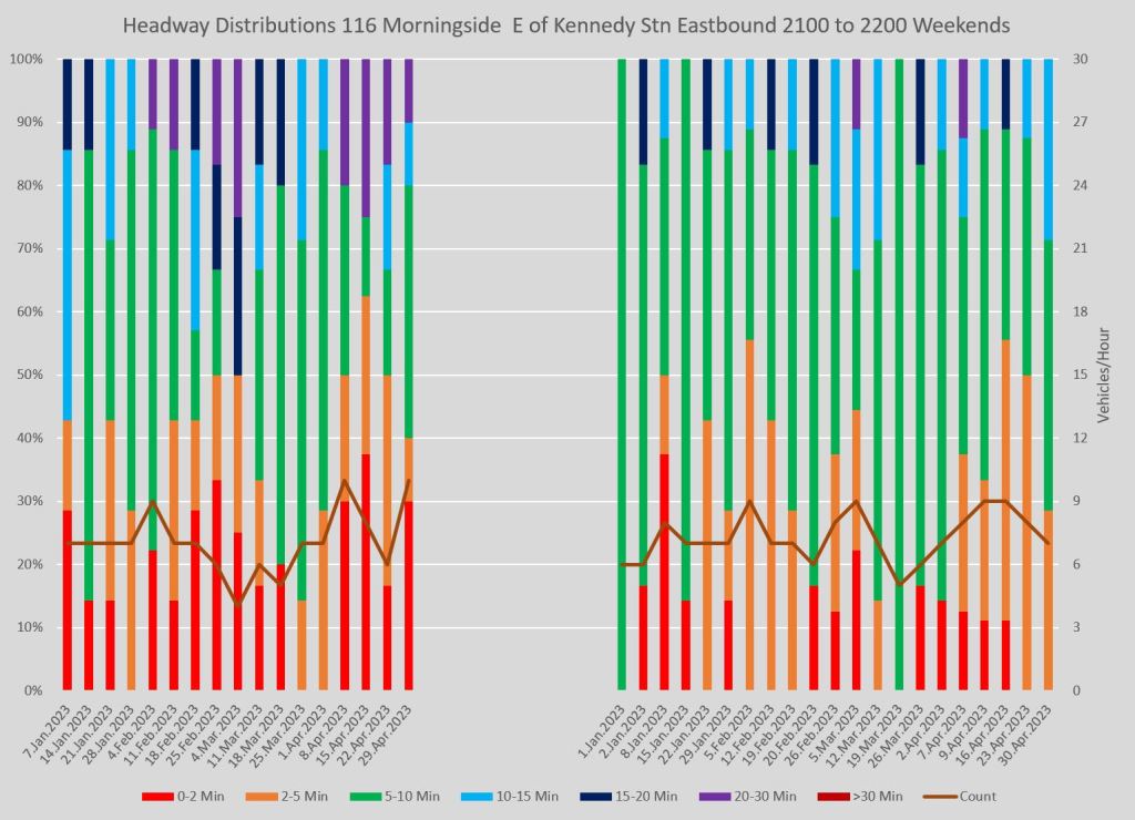
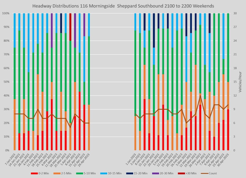
Full chart sets:
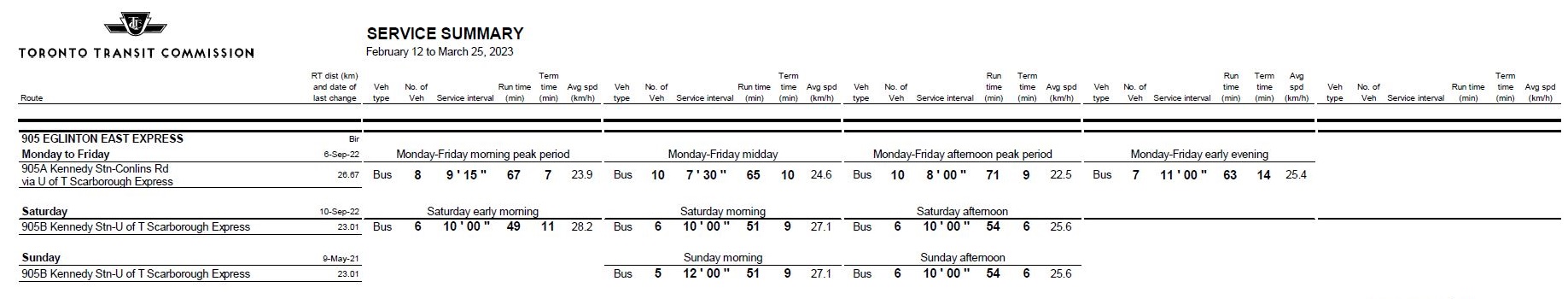
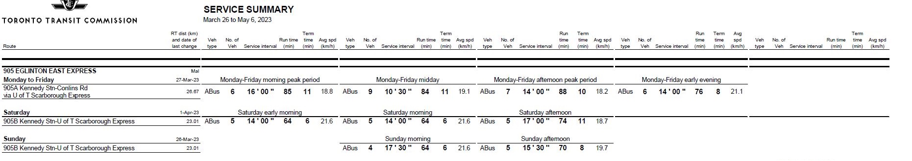
905 Eglinton East Express
905 Eglinton East Express had a major change in the service design on March 26:
- Standard sized buses were replaced with articulated buses.
- Headways were widened roughly in proportion to the vehicle capacities.
- Running times were substantially increased to improve reliability. This offset much of the vehicle savings that articulated buses would otherwise have provided.
Bunching is much less common after the March 26 schedule change because the scheduled headways are so wide. However, wide gaps (20+ minutes) become more common.
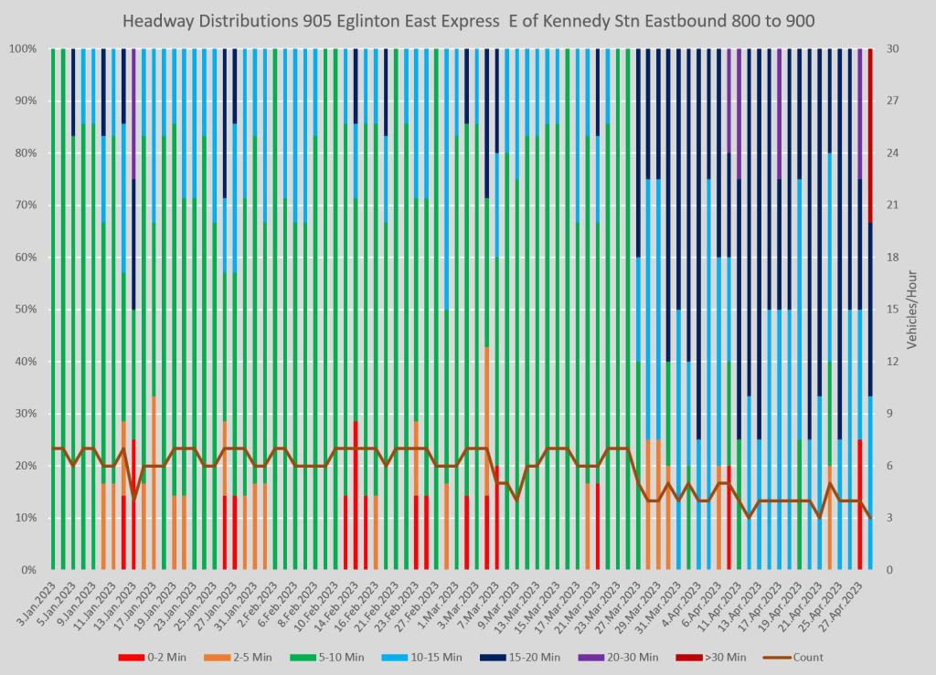
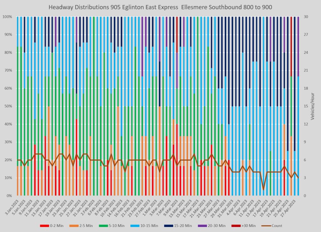
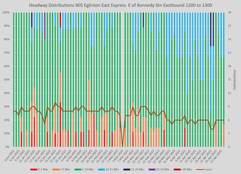
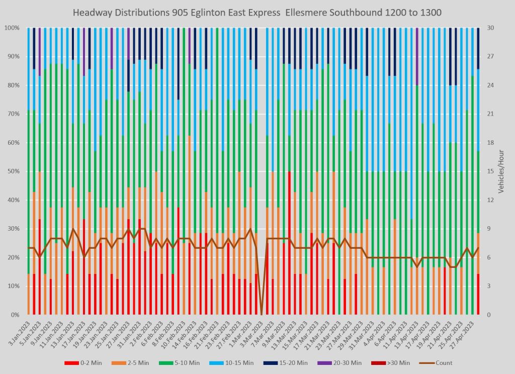
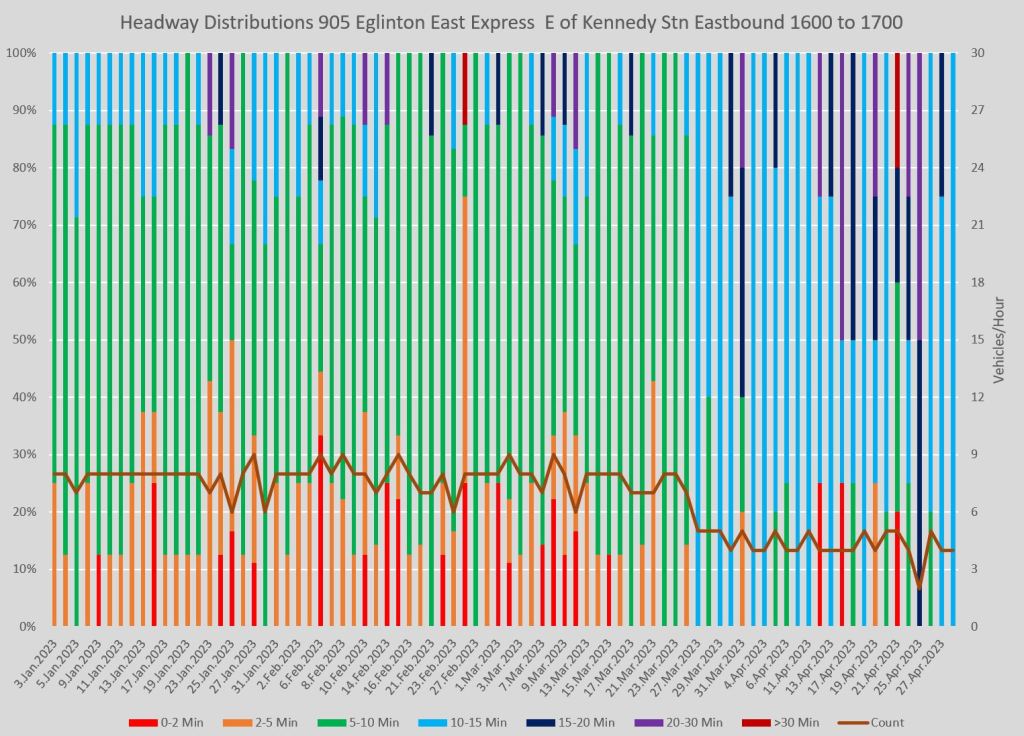
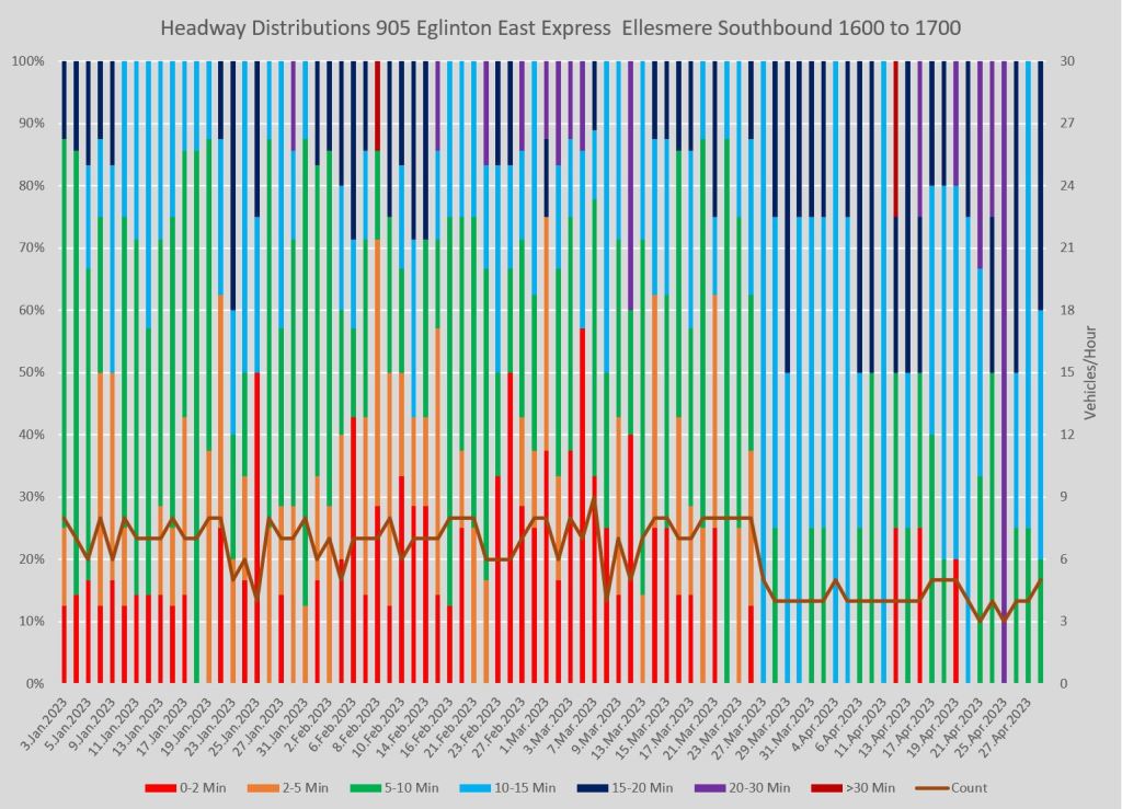
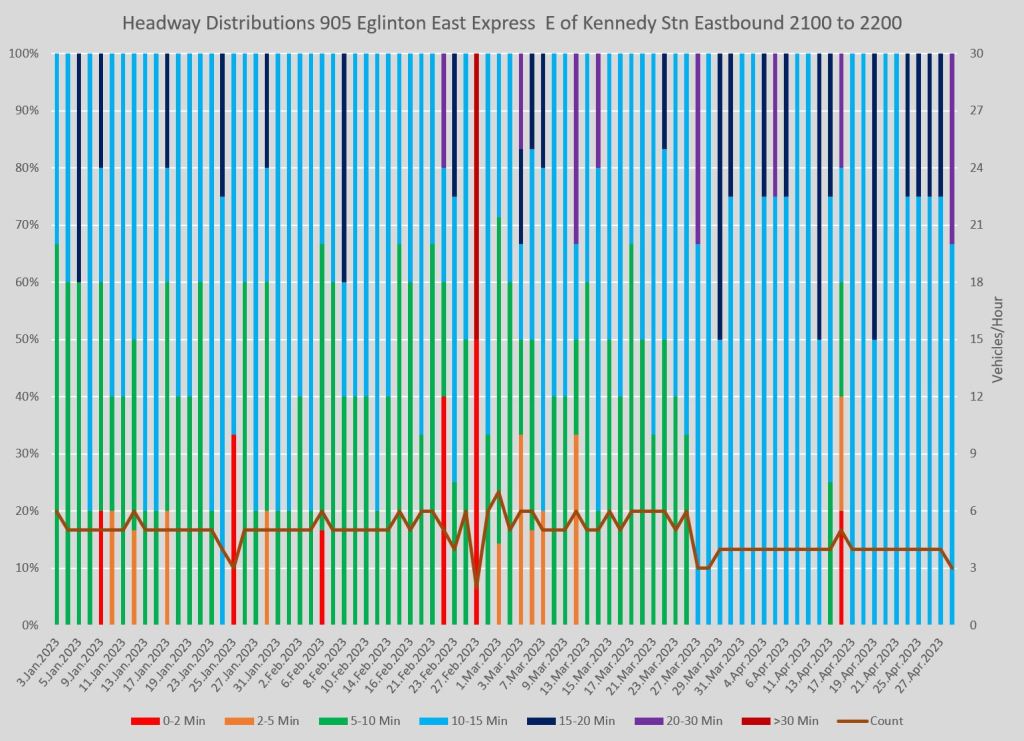
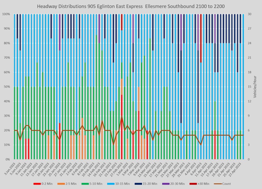
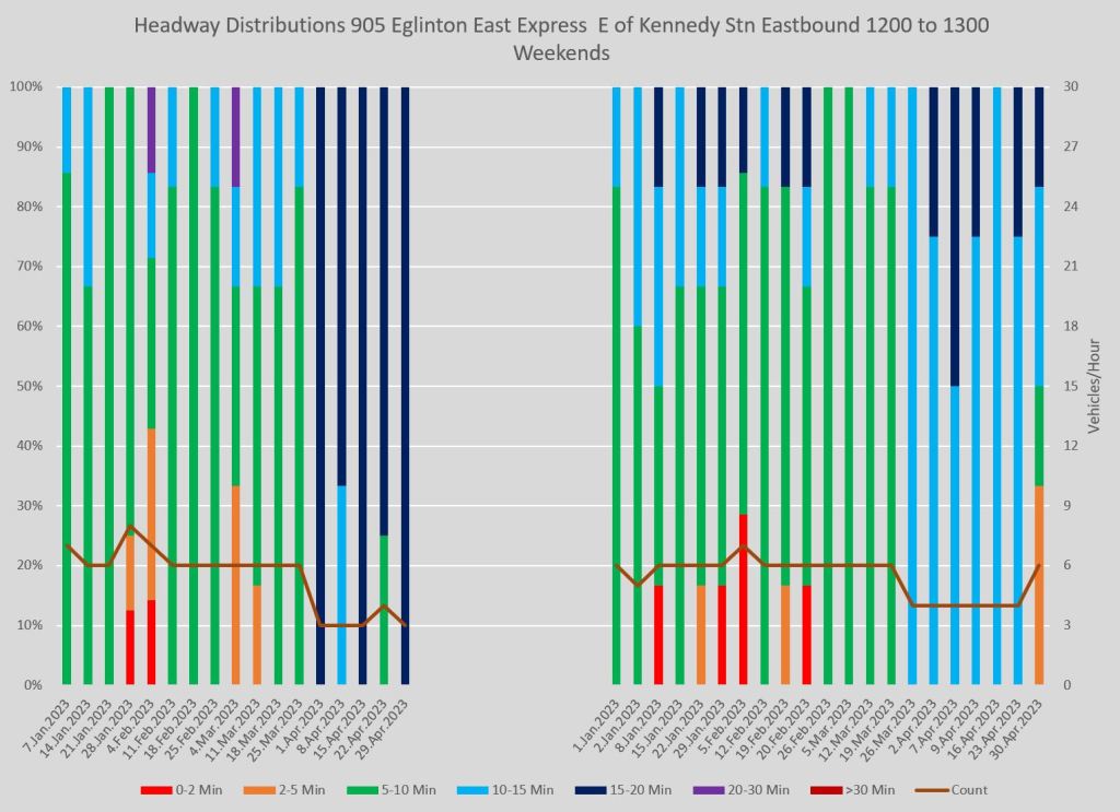
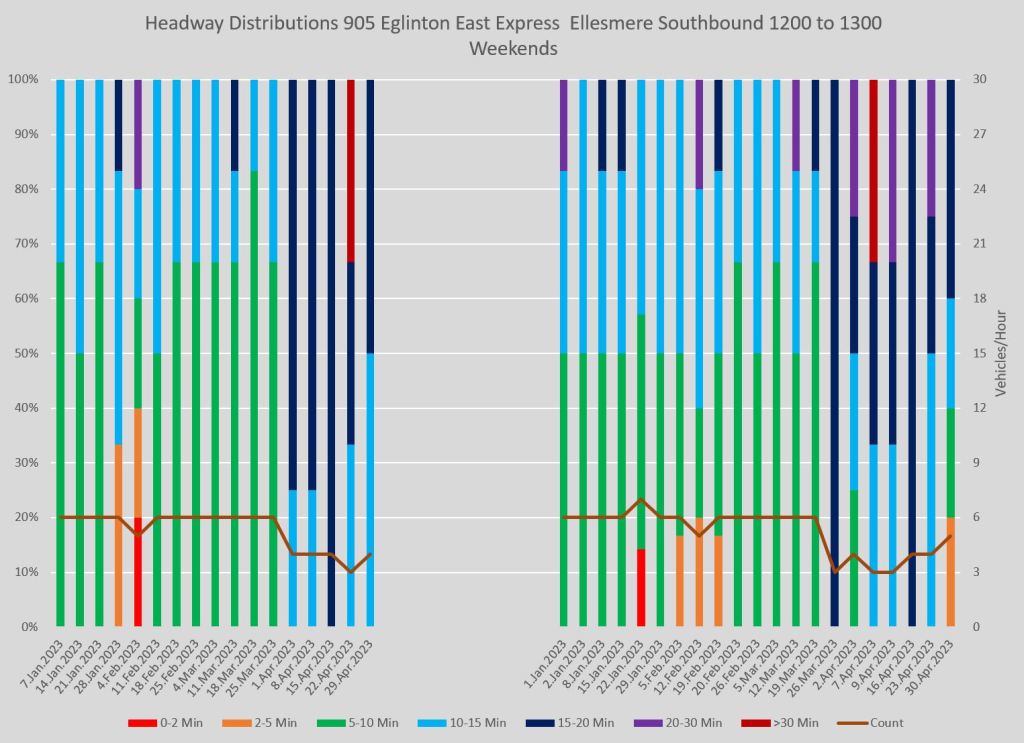
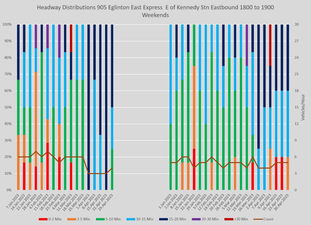
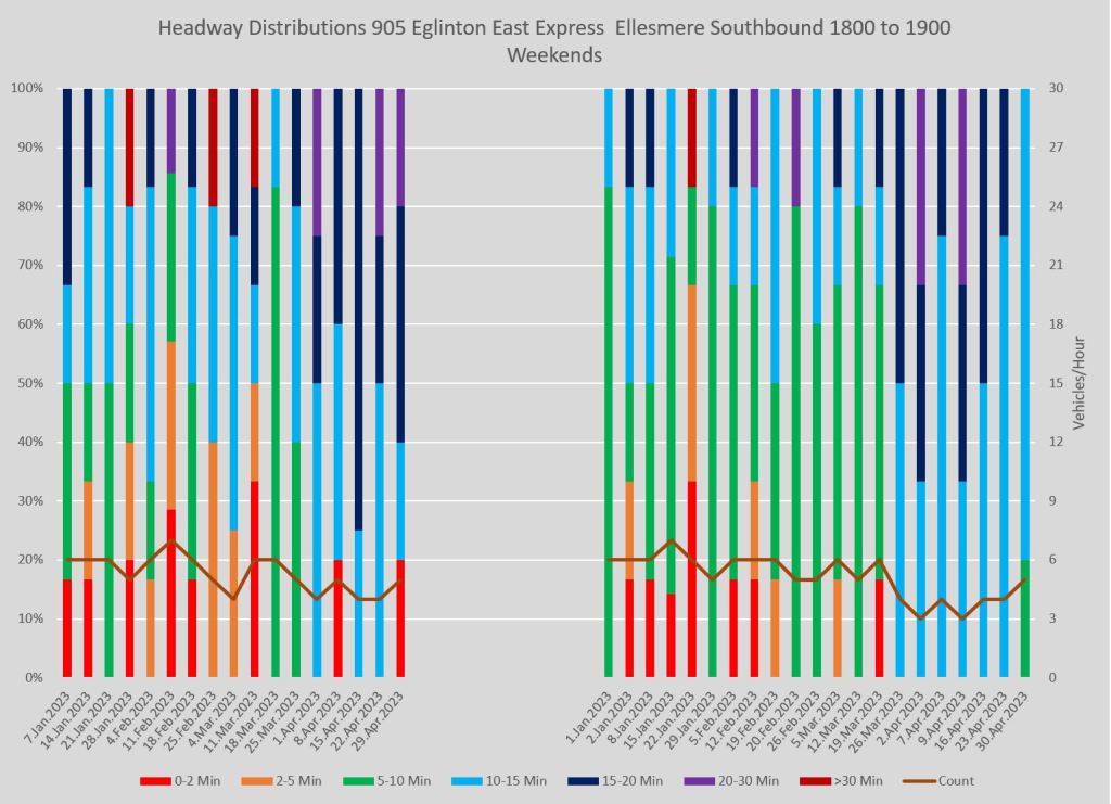
Full chart sets:
Sample Wait Time Chart
In response to a reader comment on Twitter, I have revised the chart layout with an average wait time per rider in place of the vehicles/hour count.
Here is the sample chart for 35 Jane southbound at Lawrence with the average wait time values.


Full chart set:
A few notes on the calculation are important.
In an ideal world where every vehicle arrived precisely spaced, the average wait time would be half of the scheduled headway. However, as these charts so clearly show, vehicles do not arrive on a precise spacing. Some are closer together, some further apart.
To calculate an average wait time, assume that passengers arrive one per minute. Some will wait the entire length of the gap, some almost nothing, but on average they will wait half of the gap. The total wait time they will experience is:
WaitTime = Passengers * Headway / 2
However, the assumed arrival rate is one per minute, and so the count of passengers is equal to the headway giving us:
WaitTime = Headway * Headway / 2
Very short headways will contribute almost no passenger wait time, but large gaps will contribute a lot. Summing these values for each vehicle within an hour gives the total wait time for all passengers, and this can be converted to an average wait time per passenger.
Again, because of the assumed arrival rate of one per minute, there will be 60 passengers for the sake of the calculation. Superficially, it would seem that this average is:
AverageWait = SumOfWaits / 60
However, it’s not quite that simple and there is a correction required in the calculation. Although the observed headways are sorted into hours by when they occur, it is possible for the gap between two vehicles to occur overlapping an hour. For example, if two buses pass at 9:55 and 10:05, that is a ten minute gap (and ten passengers) but all of this will be counted against the 10:00 slot because that is when the second bus is observed.
The correction for this is to treat each “hour” as slightly flexible so that its length is the sum of all of the headways recorded in that hour. This gives the formula:
AverageWait = SumOfWaits / SumOfHeadways
Typically this does not change the values much, but it is an important correction when a large gap spans from one hour into the next.
I like this presentation because the average values tend to track the shape of the colour bars, and it is a direct measure from a rider’s point of view. The variation in vehicle counts in the original charts is important too because it reveals problems with missed trips. However, you cannot get every possible bit of data onto one chart and average wait time relates directly to passenger experience.

Visualizing the current on-time performance metric by hour, day, or route in a meaningful way would require an interactive dashboard similar to the one used by New York City Transit (NYCT). Such a dashboard would allow for filtering by route, day, hour, neighbourhood, ward, etc., thereby providing a more granular and insightful view of the TTC’s operational performance. While the TTC possesses the capabilities to publish a dashboard or raw data, there is, regrettably, no appetite from the TTC or a push from the Board for such transparency.
The TTC’s current on-time performance metric, which measures vehicle departures from end-terminals, is agency-centric and does not adequately reflect the customer experience. It would be more beneficial to use this as an internal metric for the TTC.
Instead, I propose that performance metrics be separated into two categories: one for high-frequency services and another for regular frequency services. This is because customers interact differently with these services. For regular frequency services, customers consult the timetable, and a vehicle running ahead of schedule could mean a much longer wait time. For high-frequency services, it’s assumed that customers make spontaneous trips without consulting the schedule, so the focus should be on vehicle spacing/headway adherence.
For the high-frequency network (subway and 10-minute or better surface network), the following metrics are suggested:
Excess Customer Wait Time at Stops: This measures the additional time customers have to wait at stops beyond the expected wait time based on the service frequency.
Formula: Excess Wait Time = (Actual Wait Time – Expected Wait Time) x Number of Boardings
Example: If the service frequency is every 6 minutes, but the 10 customers that boarded at the stop had to wait 10 minutes, the excess wait time is 4 minutes x 10 boardings = 40 customer minutes in excess wait time at this stop. The sum of the positive values from all stations/stops is the network-wide Excess Customer Wait Time. Negative values should be excluded since it could be additional service beyond what is scheduled (very unlikely) or if there is a gap in service and the excess wait time will be captured by the next vehicle.
Excess In-Vehicle Travel Time: This measures the additional time customers spend onboard the vehicle beyond the scheduled travel time.
Formula: Excess In-Vehicle Travel Time = (Actual In-Vehicle Travel Time – Scheduled In-Vehicle Travel Time) x Average Number of Customers Onboard.
Example: If the expected travel time from timing point A to timing point B is 10 minutes, but due to delays or other factors, the 50 customers spent 20 minutes in transit, the excess in-vehicle travel time is 10 minutes x 50 customers = 500 customer minutes in excess vehicle travel time. The absolute sum from all trip segments is the network-wide Excess In-Vehicle Wait Time value. The absolute sum should be used since early arrivals at the destination indicate that the runtimes should be calibrated.
For the regular network, I suggest measuring On-Time Performance adherence similar to how the TTC measures it today but at the timing point level. The metric should penalize early departures since timetable adherence is more important than headway adherence for lower frequency service [0 minutes early, x minutes late].
Best regards,
RJL
Steve: There are a few issues with your proposal. Much of the TTC’s network falls in the “high-frequency” category, and so OTP really does not apply in most situations. That’s a fundamental problem with TTC metrics: they are measuring the wrong thing, and doing so only at terminals where it is not meaningful to most riders.
I have played with the idea of excess wait time. The formula you show as an example is in error. You assume that all of the 10 boarding passengers arrived at the stop before the extra wait time began. That is not the case and some of them could well be intending passengers for the next bus who “got lucky” by catching a late bus. Should the route be credited for giving them better than expected service? The expected wait time is half a headway and given that users of frequent services don’t depend on a schedule (and know quite well how meaningless it is anyhow), they will just show up and take their chances with whatever comes along.
As an outsider, there is a further complication in that I do not have access to vehicle loading data and so do not know how many people boarded at each stop, and hence the amount of excess wait time I should charge to them. In vehicle time requires that I know the volumes on origin-destination pairs and that’s even messier to figure out because we have know way to know where riders get off. It is easy to figure out the delta between scheduled travel time from A-to-B and then measure the deviation (which could be negative), but much harder to convert this to excess travel time. There are other problems I won’t go into, but will observe that a transit system should not be able to get away with irregular service just because there are few riders (and hence few excess minutes) at a stop. They are just as deserving of reliable service, and could well be more transit dependent and unable to avoid periods of poor service.
The average wait time calculation that I added to the article performs a similar function to the excess wait time scheme but without needing to know just what the expected wait time should be at any stop and time to make the calculation.
One important point about the TTC’s OTP metric is that it includes a six minute window (+1 to -5) for a vehicle to be “on time”. On, say, a 12 minute headway, this could allow two buses to be 6 minutes apart followed by an 18 minute gap and still be “on time”. Scheduled arrivals could be at 00-12-24-36-48-60, but actual at 05-11-29-35-53-59 which is an alternation of 5 minutes late followed by 1 minute early. That’s crappy service if you’re expecting a bus every 12, and most riders will be on the gap bus assuming a uniform arrival rate of passengers at the stop. On top of that, some of the service is allowed to fall outside of that target, and there is no constraint on when in the day this happens. Service during the peak could be a complete mess, but this could be offset by angelic behaviour in the off-peak.
I have a strong, fundamental objection to any scheme which aggregates a metric over a substantial amount of time, let alone among multiple routes. This completely submerges the variations which are the biggest annoyance to riders in a feel-good metric that, because of averaging, will hardly budge when individual time periods or routes are modified.
LikeLike
Maybe they should be measuring the passenger load per vehicle. If bus A is full but the following bus B has only 2 passengers, bus B is too close and bus A is behind schedule and bus B needs to pass bus A somehow.
Really shouldn’t be measuring vehicles. That’s the problem with Toronto’s Transportation Department (traffic signals). They count a streetcar or bus as ONE vehicle, same as a single-occupant personal pick-up truck, not the people inside the streetcar or bus.
Steve: They do actually measure the passenger load, but this info is available only to certain tracking apps on a coarse basis (light/heavy/full load). As for traffic signals there is very rarely provision for diversions which are precisely the time when vehicles need every second they can get, in particular for turns that are not part of their normal route.
LikeLike
Steve said:
Also, it is said:
Agreed, the problem is that the TTC management looks at performance stats from “top down” rather than from “bottom up”.
I am sure that it is technically possible to measure:
Looking at performance from the customers’ perspective is the only true measure.
Steve: Counting riders on board is relatively easy. Counting pass-ups and those who walked away is not.
It is appalling, in my humble opinion, that stops get removed for the sake of efficiency. Tell that to someone partially disabled (such as elderly, not necessarily in wheelchairs) who has to go to the next stop because that stop is no longer there! (Though, in fairness, the TTC bus service has a policy to let passengers out between stops in the late hours, and I have personally benefited from that.)
Bunching seems to be the #1 problem. Not just buses or streetcars, I have seen this on the subway Line 1 twice in the past week – wait a good 10 minutes or so, platform is crowded, train pulls in packed to the gills. I don’t get on because there is nowhere to hang on in these new cars if packed solid (I see people losing balance & falling regularly, not just old folks, either). So I get on the second train, which arrives one minute after the first. Then, when I have arrived at my destination station, what do you know, another train pulls into the station behind the second, before I get to the escalator! That is 3 subway trains all bunched up.
I mentioned, there is nowhere to hang on in these new cars. Remember back when, forty or so years ago, subway cars could be jammed full but there was always somewhere to hang on? Efficiency! Cost reduction!
Steve: Actually, some of the reduction in vertical poles is for manoeuvrability of mobility devices, but some comes from an increase in standing space. If some TTC designers had their way, we would have all bench seating like NYC because packing in more riders is job one.
And speaking of TTC subway station escalators, why are they set to going down much of the time? Sometimes it is easier to climb the stairs than backtrack to find the elevator. Bay Station, I am thinking of you!
Recent polling about voters concerns put transit quite low, which is disturbing. But, transit and housing are extremely intertwined. They go hand-in-hand.
I personally support a $1/day per parking spot tax, road tolls, a municipal tax on vehicles registered within, yet I also support repairing the Gardiner Expressway (to reduce congestion & improve the economy). Traffic congestion hurts public transit. Traffic congestion is caused by TOO MANY VEHICLES trying to access the existing roadways, regardless of good or bad road design, signalling, etc. Therefore, tearing down the Gardiner is a stupid solution.
There should be allowance for private auto use, but public transit should be the preferred choice for getting around town. And that means a much improved TTC.
LikeLiked by 1 person
A pet peeve I have are the passengers who MUST exit the bus through the front doors (even in summer), even with the articulated buses. I understand the wheelchairs have to use the front because that is where the ramp is located. I use a two-wheeled shopping cart, and ALWAYS use the centre doors to exit. I never use the front doors (unless the snow windrows are not cleared because of the low priority they are given by the city).
Having everyone use the front doors SLOWS down everybody. Especially if we have passengers wanting to get on.
We still have left over exit using rear doors banners on older buses, but are being ignored. Maybe we should have a recorded message when a passenger requests a STOP REQUESTED, that along with the display signal a computer voice announces that passengers please exit using rear doors.
LikeLike
I’m looking forward to further reviews of the downtown routes. The 501, 503, 504, 505, and 506 are a daily nightmare. I was out there today and saw a train of four 501s followed by a train of 505s with another set of 501s trailing. King Street is a mess due to the non-existent enforcement of the law. The 503 is the wild west with operators leaving terminals in pairs or triplets. Huge gaps are present on all routes.
Steve: Unfortunately I cannot analyze those “503”s because they run as extras and are not tracked. Yes there are big gaps. I’m planning to start a review in June once the May data, including early May service changes, is in hand.
LikeLike
L. Wall on May 30, 2023 at 8:09 pm
In my experience, if there’s only 1 or 2 people getting off, and no one getting on, it’s faster to use the front doors, because the back doors take longer to open and close.
LikeLiked by 1 person
We should be able to enter through ALL the doors, using PRESTO. Like they have in Europe, where they press the door button to open them and enter while swiping. The front doors are for those paying cash.
Steve: It is becoming common to see rear door loading on busy bus routes at the operator’s discretion. Note that buses do not have request buttons on the doors, and there is an issue with curb alignment especially in the winter.
LikeLike
I like RJL’s suggestion of making the metrics related to the number of customers. It’s too bad that the TTC isn’t making boarding data available to support that.
Steve: Yes, it would be good to know how unevenly vehicles are actually loaded. The only thing that boarding data cannot tell is the number of people who didn’t ride either because the bus was full, or because they gave up waiting for it.
LikeLike