
Updated May 26, 2023 at 5pm: In response to a reader’s suggestion, I have added a sample chart that includes average wait times for would-be riders in place of the count of vehicles. To jump directly to this update, click here.
In the many articles I have published trying to review service quality on the TTC, one topic has eluded presentation: how to chart service quality over a long period while preserving the hour-by-hour, day-by-day character of the data? That question has several dimensions because a quality metric is not simply a matter of pooling stats and saying that overall things are not too bad, or even worse that service meets some sort of standard on average.
In the past I have published charts showing headways, and others showing how organized (or not) service on a particular day might be, but it has been more difficult to condense months of data for multiple times and locations.
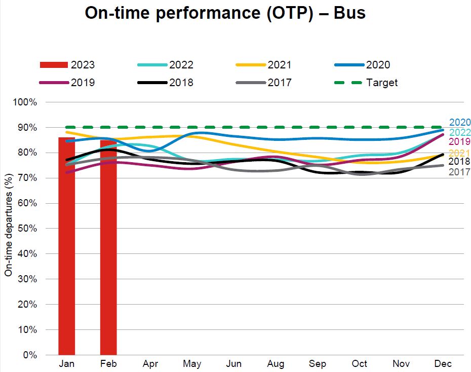
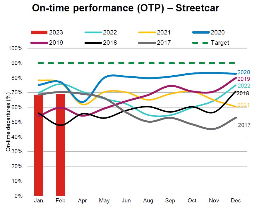
The TTC standard for surface routes is:
On-time performance measures vehicle departures from end terminals. Vehicles are considered on time if they depart within 59 seconds earlier or five minutes later than their scheduled departure time. (-1 to +5)
CEO’s Report, May 2023, p. 18
The intent is to hit this target 90% of the time, but the TTC does not achieve this with values typically falling in the 70-to-85 per cent range. At an individual route level results can be considerably worse. Streetcar routes fared worse with a 50-to-85 per cent range, and the higher end was achieved during the pandemic era when traffic and demand were light. The numbers have fallen since then.
The TTC’s metrics have big credibility problems because they bear little relation to what riders actually experience.
There are three major reasons:
- Quality is measured on an all day basis, or worse on longer periods such as months. Variation by day and time is completely obscured by this approach. Reliable service at 10 pm is cold comfort to a rider whose bus has not shown up for 15 minutes in the peak period.
- Quality is measured only at terminals, not along routes where various factors can degrade service that might begin well, but quickly deteriorates with bunching and gaps.
- Service is measured relative to schedule on the assumption that “on time” performance will automatically be reliable. However, there is considerable leeway in that standard allowing irregular service to be considered “on time”, and the TTC does not even hit their target levels in many cases.
The CEO’s Report tries to work around the limitations of the metric by noting that some routes do farly well while others encounter a variety of problems. With respect to the bus network, the report notes:
Network performance was negatively impacted by the inclement weather the weeks of February 20 to March 10, where over 60 centimetres of snow fell on the city during this time. Weekday On-time performance was 88% for Weeks 7, 11 and 12. During weekends for the period, OTP was 82%. During February, 32 of 159 weekday routes were impacted by construction for at least three weeks of the period. Overall weekday OTP was 88% for the 127 routes not affected by construction:
- 48 routes were “On-Time” (90% OTP or better).
- 53 routes were “On the Cusp” (85-90%).
- 26 routes were “Not On-time” with OTP less than 85%. In summary, 80% of the routes not affected by construction scored 85% or better.
This still does not address reliability issues at the level riders experience. Moreover, for frequent service, riders do not care if a bus is “on time”, only that service is reliable. TTC assumes that on time service will, by definition, produce reliable service, but they don’t actually operate on schedule and fail to measure service as riders see it.
Irregular service also affects crowding because passenger loads are not evenly distributed. If most riders are on full buses, the following half empty vehicles are not part of their experience (except possibly their frustration with a long wait for the advertised “frequent” service). Average crowding stats do not reveal typical riding conditions. (Analysis of crowding is complicated by the limited availability of automatic passenger counter data outside the TTC. I have tried for a few years to obtain this without success.)
The charts show that bunching (headways of two minutes or less) and large gaps (20 minutes or more) are common, and that they exist across the four months of data here. They are not occasional effects, but a basic feature of TTC service. The stats at terminals, where the TTC takes its on time performance measurements, are less than ideal, but the service degrades as buses and streetcars move along their routes. Most riders do not board at terminals.
This article presents a proposed method of charting service quality on routes to provide both the detail of day-by-day, hour-by-hour conditions and a broader overview. The charts are an experiment in condensing a lot of data into a manageable size, but I am not wedded to the format. Comments are welcome. Regular readers will recognize the format from a previous attempt, but I hope this is an improvement.
The goal is to produce something that can track the quality of service over time so that the decline or recovery of TTC routes is clearly visible along with the effectiveness (or not) of any changes to schedules, transit priority or route management.
There are a lot of charts in this article, and it is a long read for those who are interested. Feedback on this method of presentation is most welcome.
Continue reading