Goodbye to Metropass

In May 1980, the TTC introduced the Metropass giving riders the option of paying a flat fare for one month of unlimited travel. Management had resisted the idea of a pass with the classic “it won’t work here” argument. Toronto was finally embarrassed into implementing a pass when Hamilton (a working-class burg at the west end of Lake Ontario always seen as inferior to Toronto) brought in a pass. The idea that passes were some sort of unintelligible, unenforceable foreign scheme collapsed under its own stupidity.

The TTC was really fighting the idea that riders should get a discount for using transit more. For decades afterward Metropasses became the workhorse of TTC fares, the idea persisted that passholders were freeloaders on the system. This attitude continues to infect debates over flat fares versus distance or zone-based ones when the real issue is to get more people out of cars and onto transit. “Paying your fair share” rarely includes the avoided cost of building and operating a road network, let alone the economic benefits of a mobile population.

It is ironic that GO Transit, founded in 1967, was established on the premise that carrying people on trains avoided massive expressway construction as well as the personal cost and time of driving into the city. This was a rare time when the cost of providing transit was seen as a way of avoiding the much higher cost (in dollars, physical upheaval and the inevitable future congestion) of continued road-building. Debates over transit funding, fares and service have rarely been this enlightened.

The Metropass now becomes part of TTC fare history with its replacement by Presto.

Metrolinx should have begun the migration years ago to “open payment” (accepting any media), but the government and management of the day preferred to hobble along with their existing structure and attempt to fit new functionalities into a “next generation” of Presto. They are now experimenting with a smart phone app providing equivalent functions to their card, and talk openly of a move away from a proprietary card to the use of any identification system such as a credit card or app. This will require a complete rethink of Presto’s “back office” functions, but will bring much more flexibility in fare plans and billing if the political will ever exists to implement this.

The problem of pricing and of fares generally is much more than a technology issue although both the limitations and potential of electronic fare collection have been used to argue for and against various schemes. Incentives and barriers to transit use exist in the tariff region-wide, but changes have much more to do with the eternal question “who pays” rather than the fare technology. Years ago, Toronto abolished its two-zone fare structure valuing the ability to travel anywhere for one price over the premise that riders between the suburbs and the core should pay more because they “used” more of the transit system. More recently, the move to the “two hour transfer” on Presto recognizes that a transit “trip” legitimately may be broken up in small segments and riders should not be penalized for hop-on, hop-off travel as they have been for over a century.

This post includes a selection of Metropasses over the years. Recently, the Star ran a piece on Nathan Ng who is working on a site to present all of the passes from May 1980 to December 2018 drawing on my own and others’ collections. (He is missing three years in the mid-90s when I was buying annual passes.) Ng’s other sites include Station Fixation which details every station on the TTC system, Historical Maps of Toronto and the invaluable Goad’s Atlas of Toronto — Online! in which one can quickly become lost for hours exploring the city as it once was.

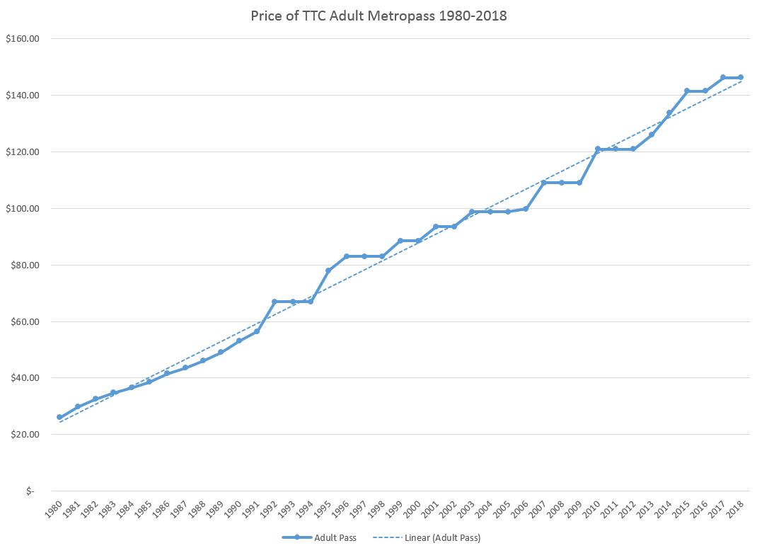
At its debut, the monthly pass was priced at the equivalent of 52 token fares which gave us a $26 pass. This price quickly escalated as the TTC’s fares and finances faced the stresses of the early 1980s. This was a period which saw the first Gulf Oil crisis, and the economic downturn brought an end to a long period of effortless growth of ridership on the TTC. Management had never dealt with a system where riders stopped showing up, and this brought the onset of “adjusting service to meet demand”, a polite way of saying “cutting service to the level we can afford”.

Despite repeated fare freezes as well as shifts in the “multiple” for pass pricing (the number of token fares represented by a pass), the actual price has risen over four decades at a quite uniform rate as the chart below shows. Fast growth in pass prices in the first decade follow the same overall trend through pricing right up to 2018. Each freeze has been followed by a jump in pricing that returns the line to the same slope it has been on since 1980. The price today, at $146.25, is 5.63 times the 1980 price of $26.

Continue reading

Brill Bus Fantrip July 29, 1972

As a holiday gift to the fans of old buses (and I know you’re out there even if you think this is really a streetcar blog), a photo gallery from a fantrip I organized many years ago using one of the TTC’s Brill coaches. Bus 1935 dates from 1955, and was retired in the mid 1970s.

For more information on the TTC’s fleet before the arrival of the GM “New Look” buses, see Before the New Looks on Transit Toronto.

King Street Update: November 2018 (Part II)

This is the second part of the November 2018 update of data from the King Street Pilot. Part I dealt with travel times and line capacity. For a detailed review of headway changes on 504 King and 514 Cherry, please refer to Part II of the October update.

With the consolidation of the King and Cherry routes, the scheduled service on each of two branches is roughly the same. When these were separate, service on the Dufferin and Cherry spurs was worse than on the main King route, and service to the outer ends of the 504 at Dundas West and Broadview Stations was better.

The revision has widened headways on the outer part of the route, but in a more troubling change, it has also widened the range of headways indicating that gapping and bunching now affect these areas to a greater degree. This is a fairly common effect on TTC routes when headways are widened. When headways are short, the gap between two cars running as a pair, or caused by a short turn, is not as noticeable to riders as the gap on a wider scheduled headway. Line management tactics, including a laissez-faire approach, that might work on short headways compound the effect of wider headways. Although one might expect some unevenness in service heading outbound to terminals after crossing the city, there are also problems with reliability inbound indicating that service is not well regulated at terminals.

As I have written many times, the TTC Service Standards allow a generous variation in “on time” performance at terminals which allows pairs of streetcars to be considered within the target. This allows management stats to look good while service to riders suffers.

(As a simple example, consider an eight minute headway where cars are to leave at 10:00 and 10:08. Within the standards, the first car can be up to five minutes late at 10:05 and the second one minute early at 10:07. This small gap would quickly collapse into a pair of cars travelling together. If the pattern repeats, the next pair of cars could be 16 minutes later, a much worse service than is scheduled or advertised, especially on the “ten minute network”.)

In the central part of the route, headways are short because two services overlap, and the spacing of streetcars is, to some degree, regulated by the combination of long cars, traffic signals and farside stop lengths. Only one car can serve a stop at a time leaving its follower on the nearside and likely held by the traffic signal. With shorter cars and nearside stops, it was common for pairs of cars to serve a stop at the same time and depart on the same signal cycle.

This is the last detailed review I will publish of the King Street pilot until March 2019 when the effects of route changes to take effect in mid-February will be visible. (All streetcar service will turn back at Dufferin for overhead and track reconstruction at Queen & Roncesvalles.) That update will include all data for December 2018 through February 2019 covering much of the winter period.

Continue reading

King Street Update: November 2018 (Part I)

This article continues the series reviewing the effects of the King Street Pilot with data up to November 29, 2018. [November 30 will be included with the December update.]

November 2018 was the first full month of the consolidated 504/514 King/Cherry services with subroutes from Dundas West to Distillery (504A) and Broadview to Dufferin (504B). The new service design does not affect running times through the pilot area, but is does have an effect on headways depending which portion of the route one is travelling.

The transition to 100% low floor operation on 504 King is now complete and there was no change in the scheduled service capacity after the mid-October route consolidation. 503 Kingston Road trippers continued to operate with the smaller high-floor cars to the Charlotte Loop at Spadina through November. In January 2019, the 503 will revert to bus operation and will loop over the standard streetcar routing via Church-Wellington-York. This will slightly reduce the capacity for short trips within the pilot area during peak hours.

This article deals with travel times and line capacity. In Part II, I will turn to headways (the time between vehicles) and reliability.

Travel Times

The following charts show the travel times between Jarvis and Bathurst (the pilot project limits) in each direction for the pm peak hour, 5-6 pm, over the past three years. The 50th percentile (median, blue) and 85th (orange) are shown. As with all previous charts, there is a small reduction in travel time compared to the pre-pilot data, but there is also a marked reduction in the range of values showing a much more consistent travel time.

The values swing upward a bit in November, although they are still slightly better than a year ago when the pilot began. Some of this change is probably seasonal, but that will be verified with data from December and January. In the sets of charts showing the data for various times of day, this rise occurs mainly in the peak period.

The rise in November travel times does not show up in the westbound data for the preceding hour, 4-5 pm.

However, an increase is visible in the following hour, 6-7 pm.

The full sets of charts are linked below.

For a more thorough discussion of past events and trends in these charts, please refer to the October 2018 update.

Continue reading

TTC Service Changes Effective January 6, 2019

Correction: In the list of new express services, I included 25 Don Mills when this should have been 86 Scarborough. Don Mills is part of the Pape Avenue water main project.

The TTC plans several service changes in January 2019, but most of these are minor and involve slight adjustments in running times and headways while keeping vehicle assignments the same as in the fall 2018 schedules.

The rebranding of Express Bus routes continues with 45/945 Kipling, 53/953 Steeles East and 86/986 Scarborough. In most cases the new schedules are identical to the old ones with only a renumbering of former “E” and “F” branches into the 900 series. Afternoon peak headways on 953 Steeles East Express will be widened slightly to provide more running time with the same number of buses.

Water main construction on Pape north of Danforth will affect the 25/925 Don Mills and 81 Thorncliffe Park services. In some cases, the only schedule change will be to shift recovery time to scheduled driving time. In others, there will be minor changes to headways.

The 501 Queen car will begin to see Flexity low floor cars in weekday service depending on availability. The only scheduled ALRVs will be five peak period trippers, three of which will restore the direct-to-downtown trips to/from Long Branch arriving/leaving Yonge Street in the peak period. (Details in the file linked below.)

The 503 Kingston Road Tripper service, which has been operating to the Charlotte Loop at Spadina due to construction on Wellington, will switch to bus operation and will resume its Church-Wellington-York loop downtown. An end date for this change has not been set.

The 510 Spadina service will be revised so that the official recovery point for the 510A service to Union Station is near the south end of Spadina, not at the route termini. Internal schedules will be adjusted so that they reflect the scheduled location of cars properly. This, in turn, will allow vehicle arrival predictions to be more accurately calculated by NextBus and related apps.

The 511 Bathurst service will remain a bus operation pending availability of streetcars later in 2019.

The 512 St. Clair car will return to Roncesvalles Carhouse as its base of operations as construction has progressed to the point that part of the yard is available for vehicle storage. Trips to/from the route will be via King and Bathurst for the January-February period, but will shift to Roncesvalles, Howard Park, Dundas and Bathurst in mid-February when reconstruction of the King-Queen-Roncesvalles intersection begins. That project will trigger bus shuttle operations on the west end of 501 Queen and 504 King and the restoration of streetcars elsewhere on the network. Details have not yet been announced.

2019.01.06_Service_Changes

504 King vs 501 Queen Speed Comparisons (Part II)

This article continues the analysis of transit vehicle speeds on King and Queen Streets downtown over the past two years. The first installment of the article compared travel times between the vehicles on each street at specific times of the day and periods over the course of two years. Here, the same data are arranged to show the evolution of travel times on each street over time both before and after the implementation of the King Street Pilot.

King Street

Westbound

Here is a sample chart showing King Street westbound in the hour from 8 to 9 am.

Three periods in 2017 (January, September and early November) are plotted in “warm” colours (pink, red, orange), while periods in 2018 with the pilot in operation (January, July and October) are plotted in “cool” colours (green, blue and purple). This makes it easy to distinguish the groups of data that belong to the “before” and “after” periods.

As this is westbound data, the chart is read from left to right. A common pattern that shows up here is the different location of low speeds corresponding to stops once the pilot is active with “before” data dipping ahead of the intersection, and “after” data dipping following. The degree to which “after” data also includes a nearside dip indicates how traffic signals can compound the stop service time with farside stops. Note especially the green line which shows data from before the re-activation of Transit Signal Priority (TSP). At Jarvis, for example, there is a decided reduction in nearside delay comparing the blue (July 2018) and purple (October) lines with the green (January) one. There is also an improvement at York Street and at University Avenue.

Continue reading

Metrolinx, New Stations and the Auditor General (Updated)

The Ontario Auditor General released her 2018 annual report on December 5. Many topics were examined by the AG, but two related to Metrolinx bear examination by anyone concerned with the future of transit planning and management with more responsibility shifting to the provincial level.

This article deals with the station selection process and the controversial recommendations for new stations at Kirby and at Lawrence East. I have written about this process and related issues before:

Updated: Links to Articles & Interviews

The Auditor General appeared on Metro Morning on December 6 speaking about, among other things, the cost of policy changes regarding LRT lines, and the evaluation of potential stations.

Former Minister of Transportation, Steven Del Duca, wrote an opinion piece in the Toronto Star claiming “I wasn’t meddling, I was building transit”. This is rich considering the effort Metrolinx went to in revising its evaluation of new stations.

Del Duca was notorious during his Ministry as using Metrolinx as an unending source of profile-building photo ops. He uses the Relief Line as an example of his intervention to get the project going despite early reluctance at the City and TTC level. This is a convenient rewriting of history and, in particular, of the huge difference between an RL ending at Danforth, and the one later evaluated by Metrolinx running north to Sheppard. The RL became popular and scored well once its extent and projected demand produced a significant dent on the Yonge line so that the Richmond Hill subway might be feasible.

A Few Thoughts About the Metrolinx Board

Although the Metrolinx Board meets in public from time to time, the legislation governing this body allows most issues to be debated and decided in private. There is no reason that this will change for the better. The chronologies set out by the Auditor General reveal situations where the Board was advised privately as issues evolved and met publicly only for the formality and patina of respectability conferred by their “approval” of matters already decided.

Throughout the station evaluation process, Metrolinx revised both published analysis and supporting documentation. This obscured the net economic costs estimated in the original business cases, making the results of the business-case analysis—both on Metrolinx’s website and in the published report to the Board—much less clear and transparent. [p. 315]

What is unclear is whether the Board actively participated in directions to staff that would lead to the rewriting of reports and recommendations, or merely chose to avert their eyes from the mechanics of political sausage making.

In any event, the process detailed by the AG throws into question everything that Metrolinx has done. Can anyone trust an organization whose professional opinion is so pliable, and which will defend recommendations, threadbare though they may be, so strongly? This is not just an issue for Metrolinx but for many public agencies involved in transportation planning notably the City of Toronto and the TTC.

To its credit, Metrolinx is developing a standard methodology for Business Case Analysis and will publish this in April 2019. However, the problem remains of just how well this will protect against hidden interference from politicians and their friends.

Metrolinx Business Cases

For many years, Metrolinx has used a methodology to evaluate projects that purports to establish the worth of a scheme, which could be negative, such as a new transit line or a significant change to existing facilities. The framework includes multiple factors examining projects from different points of view.

The Strategic Case looks at how a scheme works within the network and the wider public goals of supporting regional development. Factors include:

  • Ridership projections
  • Revenue and Operating Costs
  • Population and employment served
  • Travel time changes
  • The reach of a new/revised service
  • Effects on greenhouse gas emissions from trips shifted to transit

The Economic and Financial Cases review a proposal from two different monetary viewpoints.

  • The Economic Case measures benefits such as auto operating cost savings, reduced emissions and air pollution, travel time savings, health benefits and reduction of accidents.
  • The Financial Case looks at the cost and revenue estimates to produce a net operating cost as well as a “net financial impact” stating the total revenue over the study period minus the capital and operating costs.

The Deliverability and Operations Case concerns the implementation plan, procurement, operations, maintenance and risk management.

These factors overlap and the calculation machinery includes many assumptions such as future population and employment patterns, fare structures, operating and capital costs, trip diversion rates to transit, and the value of various benefits both to transit riders and society in general. Many of these are not published at a level of detail that would permit an outsider to understand how each factor behaves, and there is considerable leeway to affect the outcome by “twirling the dials” on factors readers cannot easily review.

A big issue with these analyses has been the question of how benefits are valued. For example, if a new transit service attracts people out of their cars, then this reduces the operating cost of those vehicles and produces environmental benefits, but it can also reduce travel time both for new riders and those on existing services. The values assigned to these and other benefits do not accrue to Metrolinx, but to the wider population. These savings, whether they be tangible (lower driving costs) or intangible (the value of time saved) are used to offset the hard costs of actually building and operating a service. While there may be an overall balance, the savings do not pay the bills which must rely on future revenue and subsidy.

A major contribution on the “benefit” side of the analysis is almost always the travel time savings for riders. For example, in the recent GO Expansion BCA, this is the overwhelming contribution to “value” in the analysis. Any factor that increases travel speed affects this measure, and in the case of stations “less is more” is the rule. Fewer stations make for faster trips and that translates to a higher modelled benefit. This has been at the heart of Metrolinx analyses for years and drives a pressure for wider station spacing even on urban lines like the Crosstown project. Adding a station to any route triggers a requirement to find an offset elsewhere such as a stimulus to riding that will drive up total rides even if they are all a bit slower.

A further problem with Metrolinx analyses is that the time period for comparison of costs and effects has grown to a 60-year horizon with the effect that far-distant benefits are shown as potentially offsetting short to medium term costs. This requires assumptions about the future of the transit system, the economy and regional development far beyond a period where anyone can reasonably know what will happen. In an effort to temper this, Metrolinx performs sensitivity analyses by changing factors to see what the effect would be. For example, if a more conservative set of assumptions goes into the model, what happens to the benefits, or does the proposal even fall into negative territory? How “successful” does Metrolinx and the region have to be in order to achieve its goals?

Needless to say, with such a timeframe, most of the readers, let alone authors, of these studies will be long gone before we could challenge their long term validity. The more subtle problem is that showing such long term benefits tends to paper over the fact that in the short to medium term, new facilities (particularly those requiring large capital investments) will not achieve anything near profitability and this shortfall must be financed. I will turn to this in more detail in a review of the Metrolinx GO Expansion BCA in a future article.

Continue reading

504 King vs 501 Queen Speed Comparisons (Updated)

Updated December 2, 2018 at 8:00 am: A sixth set of charts has been added covering the last two full weeks of September 2017. The intent is to show fall conditions before the pilot, but also before construction on King (at least some of which was to set up the pilot itself) slowed King cars in the early November 2017 data already published here.

With a year’s worth of the King Street Pilot now behind us, attention turns to two basic questions: should King Street remain as it is with a degree of priority for transit, cyclists and pedestrians; and should this scheme be extended to other major streets, notably Queen Street.

In previous articles I have reviewed the behaviour of the King and Queen routes:

This article provides a detailed look at average weekday speeds along the streets during six separate periods, and with hourly breakdowns from 6 am to 1 am.

  • January 16-27, 2017: Winter operations downtown deal with less traffic, especially on Queen Street. This is a “before” snapshot of the two streets.
  • September 18-29, 2017: Fall conditions after TIFF and before the beginning of construction at Queen & McCaul.
  • November 1-10, 2017: Just before the implementation of the pilot.
  • January 15-26, 2018: Winter operations with the pilot in place.
  • July 16-27, 2018: Summer conditions for the pilot. (2017 was a construction year on Queen and a direct comparison to 2018 is not available.)
  • October 15-26, 2018: Current fall conditions.

This gives a view of “normal” conditions, but does not capture all of the seasonal and special event variations, many of which are evident in the data in previous articles. The periods have been chosen to avoid skewing the numbers with special events such as TIFF, vacation periods and construction.

A Caveat About “Average Speed”

The values show in these charts are derived from TTC vehicle tracking data. This originates in GPS format, and after cleaning up the “rogue” points that are off route due to GPS errors, what is left is mapped onto a version of the route broken into 10m segments. The speed of a vehicle at each segment is determined by the “before” and “after” locations of adjacent GPS observations and the time difference (usually 20 seconds) between them.

These values give the average speed within each segment of all vehicles whose GPS data placed them there. This is not the same as the average speed over the entire pilot area on any given trip. What the numbers show is the locations where vehicles tend to be making good time between stops, the places where they are bogged down, and the places where they stop. Even at stops, the average is never zero because it includes observations where vehicles are just stopping or just starting up within a segment, not to mention variations in stopping location and cases where vehicles do not stop at all.

The Effect on Riders

Vehicle speeds on Queen are often comparable to those on King, but Queen is notorious for less frequent, unreliable and crowded service. Riders are very sensitive to waiting times at stops, and this is compounded if they cannot board the first vehicle to appear, let alone if they walk some distance without a streetcar ever passing them.

With the King Street Pilot there has been a reduction in the variability in travel times which has led to less irregular service. Scheduled service comes more often and the line’s capacity has been improved with new streetcars. Speed alone is not the only measure of a service improvement.

It is vital that debates about the effectiveness of changes to King are debated not just on speed but also on reliability and capacity for demand. The early focus on speed changes which were, in some cases, unimpressive, opened the field to critics who argued that there was a great upheaval for little benefit. It is the combination of more reliable travel time, increased speed, reliability and capacity that has affected the riding experience and drawn more people to use this route. Any move to expand either the scope on King or to another street must take all of these factors into account.

Reading the Charts

Each chart contains data for one hour’s operation in one direction. Here is a sample from the PM peak westbound in October 2018:

The blue line shows data for King while the green line shows Queen data. Trend lines are interpolated through the data for King (red) and Queen (yellow).

The limits of the chart are east to Parliament and west to Shaw, both beyond the Jarvis-Bathurst pilot, for a few reasons:

  • The wider scope shows conditions on the approaches to the pilot area.
  • The nature of the trend line calculation in Excel can cause misleading behaviour in the lines as Excel tries to project beyond the charts using values near the edges. Having a “buffer” area on either side of the pilot ensures that the trend lines do not include this problem through the Jarvis-Bathurst section.

Queen and King run parallel to each other with most north-south streets at the same location on both. This allows data from the two routes to be lined up on a single chart. A few notes about special cases:

  • Sherbourne Street is used as the reference point for aligning the data. The distance from Sherbourne to Bathurst is the same on each street.
    • Ontario Street is slightly offset on Queen relative to King.
    • Parliament Street is slightly further east of Sherbourne on King (measured as travel distance) than on Queen due to the shift in King’s direction just west of Parliament at Berkeley.
  • Victoria Street has a small jog at Adelaide. The line on the charts reflects its location on Queen which has a transit stop and traffic signal.
  • The stop and traffic signal at Queen and Augusta have no equivalent on King.
  • Niagara Street curves eastward between Queen and King, and so the crossing points are different on the two streets.

Westbound charts as above are read from left to right. Eastbound charts are in the same format and should be read from right to left.

Comments on the details of these charts are included later in the article.

Continue reading

501 Queen and the Effect of the King Street Pilot (Updated)

Updated November 27, 2018: A major section has been added comparing travel times between Jarvis and Bathurst on Queen and King Streets.

With the King Street Pilot a year old, one area that also deserves a review is the effect it has had on transit service on Queen Street. The short answer is “very little” with the usual caveats about seasonal variations and unusual events that complicate direct before and after comparisons.

The charts presented here cover the period from March 2016 to October 2018, the same period as King Street charts in recent articles. Selected images are included in the post, and more extensive sets are linked in PDFs.

(Note that the level of detail in the three-year charts is such that they suffer when reduced in size to the scale of a blog post. Click on any of them to open a full size version in a new browser tab.)

Major Events on Queen Street

More so that on King Street, Queen has been affected by many construction activities over the three years, and of course it also has more special events disrupting service in the area parallel to the pilot on King. The major events affecting travel times between Jarvis and Bathurst Streets are highlighted in these charts.

  • April 2016: Reconstruction of King and Charlotte diverted service onto Queen adding to streetcar running times there primarily through delays where King cars turned off of Queen without assistance from traffic signals.
  • May to December 2016: Water main reconstruction on Queen west of Spadina triggered a long-running diversion of service via Spadina to King. The times shown are measured between King and Bathurst and Queen and Jarvis for this period where vehicles were diverted.
  • September 2016: Although TIFF closed part of King Street, the service was split rather than diverted. There is no effect on Queen running times beyond that already seen for the diversion of the 501 route.
  • May to August 2017: Construction continued for another summer on Queen including completion of work started in 2016 and replacement of the pedestrian bridge at Queen and Yonge. Buses operated on 501 Queen.
  • September 2017: Streetcars returned to Queen. Reconstruction of Dundas from Church to Yonge caused some traffic to shift south to Queen. King services diverted onto Queen during the opening weekend of TIFF.
  • October 2017: Reconstruction of Queen & McCaul caused Queen service to divert via King between Church and Spadina.
  • November 2017: King Street Pilot begins.
  • June 2018: Construction delays.
  • September 2018: TIFF diversions delay Queen service.

Chart Format

As with the King Street analysis, the charts here show the 85th percentile values for travel times in orange. This includes most trips across the area parallel to the pilot on King. The median value (50th percentile) is shown in blue. Half of the trips took longer and half shorter than this value. When these values track close together, most trips will lie in a fairly narrow band of values (see details for October 2018 later in this article). Where the lines pull apart, travel times seen by riders will have more variation in length.

Where the route was on diversion in 2016, the time shown is measured between Bathurst & King to Jarvis & Queen via Spadina.

For the diversion in 2017, the time is measured between Bathurst and Jarvis on Queen, but includes the diversion both ways via Spadina, King and Church.

Where a value drops to zero, this indicates that no car was observed between the two points usually due to a short-term diversion around a major blockage.

AM Peak 8 to 9 am

Westbound

The beginning of the pilot in November 2017 had no effect on AM peak travel times. The spike in late June 2018 was caused by construction delays according to TTC eAlerts.

Eastbound

Continue reading

King Street Update: October 2018 (Part II)

This is the second part of the October 2018 update which began with a review of travel times and capacities on the combined 504 King and 514 Cherry routes. (514 Cherry was merged into the King service with a route redesign in early October and no longer exists as a separate route number.) This article looks at the evolution of scheduled and actual service levels on King from March 2016 to October 2018.

The purpose of this article is to show that many factors affect service reliability, and this varies both by location, date and time of day. In evaluation of the King Street Pilot it is important to distinguish between changes due strictly to the pilot and changes that occurred separate from it such as schedule updates.

There are a lot of charts in this article, with more in linked collections. As this is the anniversary of the King Street Pilot’s introduction, I am publishing a large amount of data here for reference by those who are interested in the details.

The King Street Pilot has had some effect on headways (the interval between vehicles). This has been more in the “shaving” of peak values which translates to more regular service even if the scheduled frequency changes little if at all. The TTC’s ability to add service has been constrained by its aging streetcar fleet that only recently has been sufficiently replaced by new cars that service on King is now, with few exceptions, fully provided by the larger Flexity low flow cars.

The table below [click to expand] shows the level of scheduled service over the past three years on the 504 King and 514 Cherry routes. The pdf linked below this table also includes information on the changes in scheduled travel times over the two routes.

504514_2016_2018_HeadwayHistory

Aside from the service reorganizations related to the 514 Cherry car, many of the changes from one schedule period to another relate to changes in the provision of trippers. These are vehicles that make one trip across the route intended to coincide with the peak of the peak periods. The level of tripper service is dictated partly by the season, but much more so by vehicle availability. With the merger of the two routes and the full conversion to Flexity operation, the trippers have vanished from the schedule.

The major changes over the period were:

  • June 2016:
    • 514 Cherry introduced.
    • Service levels on 504 King (and hence on the outer part of the shared route) were reduced except during the AM peak.
  • September 2016: 514 Cherry midday service improved. This change was reversed in May 2017 coinciding with the formal change of this route from CLRV to Flexity cars.
  • September 2017: Running times on 504 King were reduced to claw back an excess that had existed for a few years. Headways during all periods were improved slightly as a result.
  • November 2017: Pilot begins. Transit signal priority (TSP) is disabled at several intersections in the pilot zone where it had previously been active.
  • February 2018:
    • 514 Cherry service improved during the midday and early evening.
    • Roncesvalles Carhouse closes for major renovations causing the patterns of service build up/down to change as all cars now operate from east end carhouses.
  • May 2018: Running times on both 504 King and 514 Cherry were reduced to incorporate the benefit of the King Street Pilot. Headways were improved on both routes to varying degrees during most operating periods.
  • June 2018: Temporary consolidation of the routes for the construction season and the replacement of streetcar service on Broadview Avenue by a bus shuttle to Parliament Street.
  • July 2018: TSP is re-activated within the pilot zone.
  • September 2018: Temporary return to the traditional route structure.
  • October 2018: Permanent consolidation of the routes.

In the table of running times included in the pdf above, round trip scheduled values are shown in an “A+B” format where the first value is driving time and the second is recovery time. TTC has generally not provided a formal recovery time based on the length of trips, but rather simply used this as a way to pad out the total time to an even multiple of the headway. This can create situations where there is minimal or zero recovery time. With the new schedules in fall 2018, there has been a considerable increase in recovery times, and they can be longer than the scheduled headway. This has a few related effects:

  • There is a good chance that more than one car will be at a terminus at the same time. With the longer Flexity cars, this can produce congestion at Broadview and Dundas West Stations. The TTC attempts to offset this by scheduling the recovery time at Distillery and Dufferin Loops, although this is not always successful in avoiding on-street queuing of streetcars at the subway stations.
  • When schedules are “padded” either with excess driving time, or with recovery time, the concept of “on time departure”, already a flexible idea at the TTC where Service Standards allow a six minute window for “on time”, to be erratic because operators know they can make up time over a trip. Conversely, writing schedules too tightly leads to problems both with the variation in route conditions from day to day, not to mention the basic need for breaks from driving continuously.
  • Dufferin Loop has an operators’ washroom, but Distillery Loop does not (although a nearby theatre is used by some in a pinch, provided that it is open). This forces washroom breaks on the 504A service to be taken at Dundas West Station even though the recovery time is supposed to be taken at the Distillery terminus.

The balance of this article reviews changes in actual headways at various points along the route both for inbound and outbound services. The effects vary by location and time of day.

Continue reading