
Updated December 2, 2018 at 8:00 am: A sixth set of charts has been added covering the last two full weeks of September 2017. The intent is to show fall conditions before the pilot, but also before construction on King (at least some of which was to set up the pilot itself) slowed King cars in the early November 2017 data already published here.
With a year’s worth of the King Street Pilot now behind us, attention turns to two basic questions: should King Street remain as it is with a degree of priority for transit, cyclists and pedestrians; and should this scheme be extended to other major streets, notably Queen Street.
In previous articles I have reviewed the behaviour of the King and Queen routes:
- King Street Update: October 2018 (Part I) : Travel times and service capacity
- King Street Update: October 2018 (Part II) : Evolution of scheduled and actual service
- 501 Queen and the Effect of the King Street Pilot : Effects of the pilot on Queen Street travel times, and comparisons of travel times on King and Queen Streets
This article provides a detailed look at average weekday speeds along the streets during six separate periods, and with hourly breakdowns from 6 am to 1 am.
- January 16-27, 2017: Winter operations downtown deal with less traffic, especially on Queen Street. This is a “before” snapshot of the two streets.
- September 18-29, 2017: Fall conditions after TIFF and before the beginning of construction at Queen & McCaul.
- November 1-10, 2017: Just before the implementation of the pilot.
- January 15-26, 2018: Winter operations with the pilot in place.
- July 16-27, 2018: Summer conditions for the pilot. (2017 was a construction year on Queen and a direct comparison to 2018 is not available.)
- October 15-26, 2018: Current fall conditions.
This gives a view of “normal” conditions, but does not capture all of the seasonal and special event variations, many of which are evident in the data in previous articles. The periods have been chosen to avoid skewing the numbers with special events such as TIFF, vacation periods and construction.
A Caveat About “Average Speed”
The values show in these charts are derived from TTC vehicle tracking data. This originates in GPS format, and after cleaning up the “rogue” points that are off route due to GPS errors, what is left is mapped onto a version of the route broken into 10m segments. The speed of a vehicle at each segment is determined by the “before” and “after” locations of adjacent GPS observations and the time difference (usually 20 seconds) between them.
These values give the average speed within each segment of all vehicles whose GPS data placed them there. This is not the same as the average speed over the entire pilot area on any given trip. What the numbers show is the locations where vehicles tend to be making good time between stops, the places where they are bogged down, and the places where they stop. Even at stops, the average is never zero because it includes observations where vehicles are just stopping or just starting up within a segment, not to mention variations in stopping location and cases where vehicles do not stop at all.
The Effect on Riders
Vehicle speeds on Queen are often comparable to those on King, but Queen is notorious for less frequent, unreliable and crowded service. Riders are very sensitive to waiting times at stops, and this is compounded if they cannot board the first vehicle to appear, let alone if they walk some distance without a streetcar ever passing them.
With the King Street Pilot there has been a reduction in the variability in travel times which has led to less irregular service. Scheduled service comes more often and the line’s capacity has been improved with new streetcars. Speed alone is not the only measure of a service improvement.
It is vital that debates about the effectiveness of changes to King are debated not just on speed but also on reliability and capacity for demand. The early focus on speed changes which were, in some cases, unimpressive, opened the field to critics who argued that there was a great upheaval for little benefit. It is the combination of more reliable travel time, increased speed, reliability and capacity that has affected the riding experience and drawn more people to use this route. Any move to expand either the scope on King or to another street must take all of these factors into account.
Reading the Charts
Each chart contains data for one hour’s operation in one direction. Here is a sample from the PM peak westbound in October 2018:
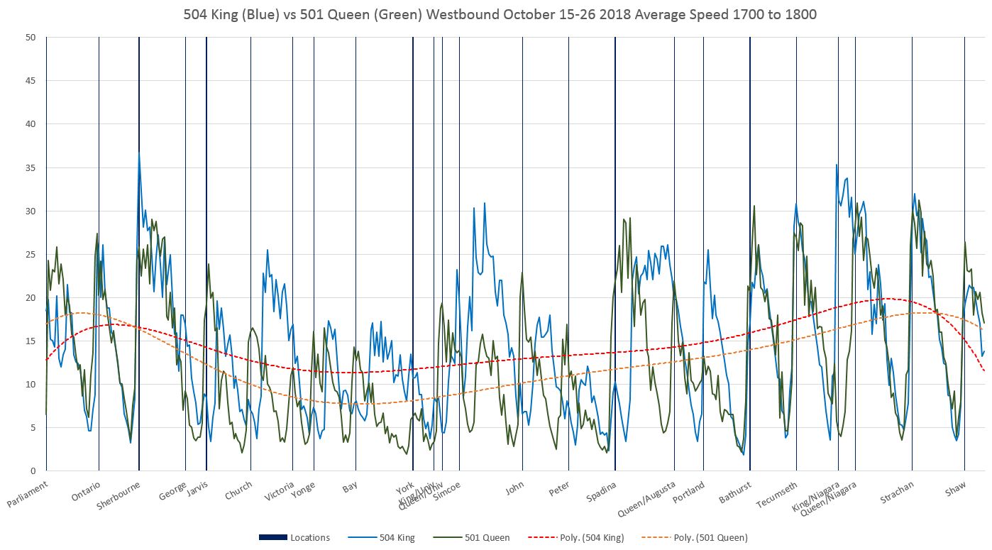
The blue line shows data for King while the green line shows Queen data. Trend lines are interpolated through the data for King (red) and Queen (yellow).
The limits of the chart are east to Parliament and west to Shaw, both beyond the Jarvis-Bathurst pilot, for a few reasons:
- The wider scope shows conditions on the approaches to the pilot area.
- The nature of the trend line calculation in Excel can cause misleading behaviour in the lines as Excel tries to project beyond the charts using values near the edges. Having a “buffer” area on either side of the pilot ensures that the trend lines do not include this problem through the Jarvis-Bathurst section.
Queen and King run parallel to each other with most north-south streets at the same location on both. This allows data from the two routes to be lined up on a single chart. A few notes about special cases:
- Sherbourne Street is used as the reference point for aligning the data. The distance from Sherbourne to Bathurst is the same on each street.
- Ontario Street is slightly offset on Queen relative to King.
- Parliament Street is slightly further east of Sherbourne on King (measured as travel distance) than on Queen due to the shift in King’s direction just west of Parliament at Berkeley.
- Victoria Street has a small jog at Adelaide. The line on the charts reflects its location on Queen which has a transit stop and traffic signal.
- The stop and traffic signal at Queen and Augusta have no equivalent on King.
- Niagara Street curves eastward between Queen and King, and so the crossing points are different on the two streets.
Westbound charts as above are read from left to right. Eastbound charts are in the same format and should be read from right to left.
Comments on the details of these charts are included later in the article.
AM Peak Hour 8 to 9 am
Much comment arose from critics of the King Street Pilot because there was so little change in travel times during the AM peak. This arose from a few factors:
- King Street is relatively uncongested during this period, and the potential benefit of “clearing the way” for transit vehicles was limited.
- Transit signal priority (TSP) was turned off when the pilot began, and (as previously reported here) this cost 1 to 2 minutes in travel time across the pilot area offsetting some of the gains the physical changes to the road gave to transit. In July 2018, TSP was reactivated and there was an immediate drop in travel times, notably in the AM peak where traffic signals had been contributing to transit delays with the farside stop arrangement.
Westbound
In January 2017, all of the stops on King were nearside, and so the dips in speeds on Queen and King line up. During the peak hour, Queen has the advantage just west of Sherbourne while King does better from Church to Yonge (there is no Victoria stop or traffic signal on King) and west of University Avenue.

In September 2017, King consistently betters Queen in part because speeds on Queen have dropped.

In November 2017, King falls below Queen west of John and this relative standing remains even after the pilot begins.

In January 2018, the effect of streetcars being forced to stop both nearside and farside shows up as a double-dip for King at its stops at Jarvis, Church, Yonge, Bay, University, John, Peter and Spadina.

In July 2018, the double-dip problem is reduced at Jarvis, Bay, York (not a carstop, but previously a location where streetcars were caught by red signals), John and Peter.

The reduction in double-dips for King continues into the fall of 2018. An important distinction here (and in other charts) is that King’s performance has been improved relative to Queen (compare the location of the red and yellow trend lines in January 2017 with those in October 2018).

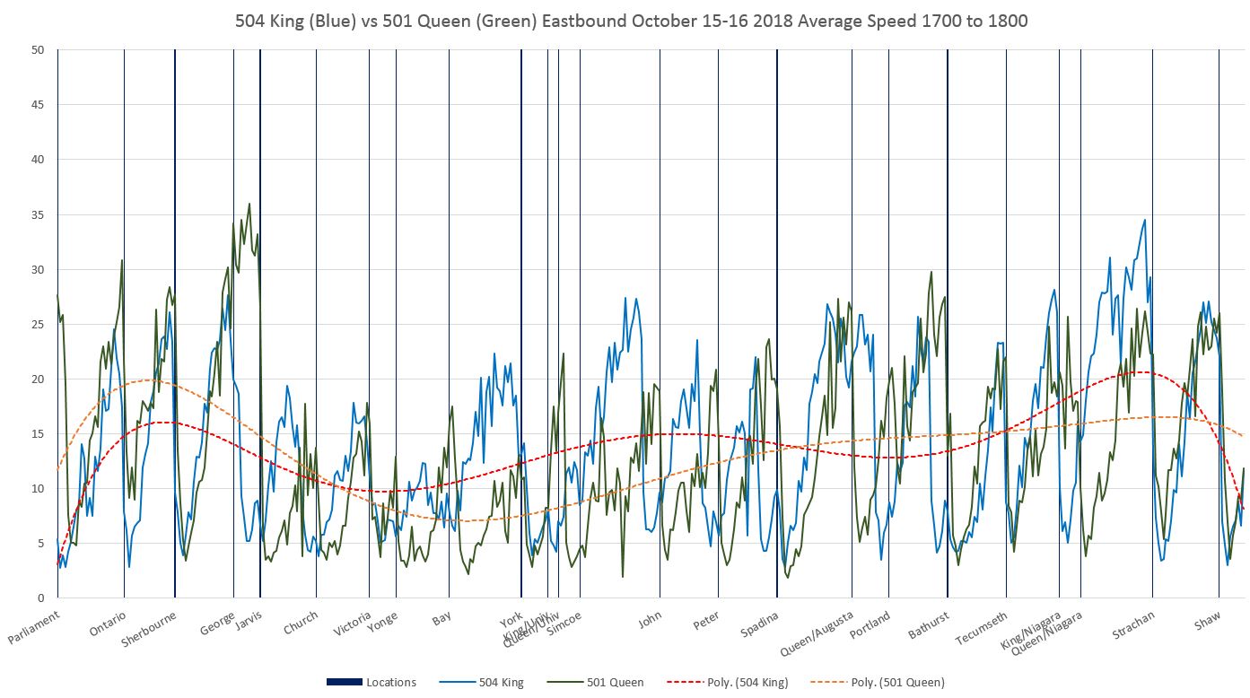
Eastbound
January 2017 sees the eastbound service running slower on King until Spadina, then picking up to Yonge mainly because of the better speed from John to University, and then roughly paralleling Queen from Yonge eastward. King is particularly affected by congestion west of Bathurst, although this condition lessens in 2018 following changes to signal timings at Bathurst..

In September 2017, Queen has fallen quite dramatically compared to King east of Yonge and west of John Street.

By November 2017, the trend line for Queen west of John has improved from September values.

In January 2018 with the pilot in place, the effects of double-stops on King are visible at Bathurst, Spadina, University, Yonge, Church and Jarvis. Queen’s trendline east of Yonge has improved because whatever effect caused delays from Yonge to Church has disappeared. Meanwhile, King’s trendline has fallen because it no longer makes as good speeds (as pre-pilot) after leaving farside stops at Yonge, Church and Jarvis. In various places west of Yonge, improvements in King speeds compared with Queen are visible.
From this point onward, Queen’s trendline east of Church sits higher than King’s because of (a) the farside stops on King and (b) the fast running on Queen particularly east of Jarvis at Moss Park.

By July 2018, double-stopping effects have been reduced eastbound at Church and at Jarvis

The summer pattern continues into the October 2018 data.

Midday 1 to 2 pm
Westbound
By early afternoon, congestion effects begin to set in, and the relative performance of the two streets changes, especially once the pilot is underway.
In January 2017 and, to a lesser extent, in November 2017 speeds on King are slightly better than on Queen, but between University and Spadina, Queen wins out.


In January 2018, with the pilot in place, King’s improvement is mainly in the Entertainment District west of Simcoe. This pattern continues into the summer.


In October 2018, King is doing consistently better, although this is mainly due to a decline in Queen Street speeds between University and Bathurst.

Eastbound
Before the pilot, King and Queen run at close to the same speeds with some variation along the routes eastbound during the midday. As with westbound data, King values lie below Queen west of University Avenue.


After the pilot begins, King’s performance improves west of University, but actually declines further east mainly due to double-stopping delays.

By July, King’s relative standing has improved through a combination of slower speed on Queen west of University and faster King speeds from there to the east.

In October 2018, King has lost a bit of ground due to slower operation east of Yonge due in part to construction affecting the eastbound curb lane.

PM Peak 5 to 6 pm
Westbound
Before the pilot began, King’s suffered from congestion delays westbound to Spadina as well as slower operation east of Bathurst compared to Queen Street. These conditions change once the pilot is operating (see January 2018 and later). Queen, for all if its problems with service reliability and capacity, was the faster route once it crossed University Avenue.


Conditions on King are particularly bad in early November 2017 thanks to construction.

With the pilot in operation, King’s performance improves and is considerably faster across the pilot area. The data here are consistent with other reports that there has been a big improvement in travel times during the PM peak.

King’s performance gains continue into the summer of 2018 including the reduction of some double-stopping effects seen in the January data above.

In October 2018, the speed on Queen west of University declines giving King a stronger lead.
Eastbound
Queen has always been quite slow eastbound through the core and this extends from west of University over to Yonge Street. Pre-pilot, King has the advantage in this area, while Queen does better west of Spadina.


With the pilot in place, King’s performance improves in places.

In July 2018, Queen is particulary bad in the core. This is a seasonal issue where a congested area gets even worse. Note in the October 2018 chart how Queen’s speed picks up again around Bay Street.
Compared with January 2018, eastbound double stop problems have been reduced at some locations.

Late Evening 10 to 11 pm
Late evening service on King was regularly delayed through the Entertainment district by a combination of post-show traffic on most days, and club traffic on the weekends. This has improved with the pilot configuration, although moreso in the westbound than the eastbound direction. The main area for delays is also shifting westward from the theatre district east of Spadina to the new club district between Spadina and Bathurst.
Note that these data include all weekdays and so the effect of particularly severe congestion late in the week is less evident in these charts than those in previous articles showing a regular “heartbeat” spike in travel times for King and, to a lesser extent, Queen. The improvement with the pilot configuration on King is particularly good, but in these charts this is muted by inclusion of days where the club district is not a problem for transit vehicles.
Westbound


Eastbound


Full Chart Sets
Each PDF linked here contains 20 pages, one for each hour from 6 am to 1 am. Paging through a file (as opposed to scrolling) will show the evolution of values over the day in the manner of flip chart animation.
Westbound
- 504v501_201701_AvgSpeed_ParliamentShaw_WB
- 504v501_201709_AvgSpeed_ParliamentShaw_WB
- 504v501_201711_AvgSpeed_ParliamentShaw_WB
- 504v501_201801_AvgSpeed_ParliamentShaw_WB
- 504v501_201807_AvgSpeed_ParliamentShaw_WB
- 504v501_201810_AvgSpeed_ParliamentShaw_WB
Eastbound

With respect to the downtown segment of the 501, there’s still some legal left turns at all times on Queen into the parking garages at St. Michael’s Hospital, City Hall, and to the Sheraton drop off space. These all have access points from other streets or directions that do not require Queen be blocked for left turns. Has there ever been an investigation into whether that should be implemented? Or at least make the left turn illegal on weekdays?
Steve: No. The only review I know of looked at hours for on street parking and turns at signalled intersections.
LikeLike
I was on the 501 westbound approaching Victoria St. on Tuesday morning about 10.45, and the streetcar got stuck behind a driver trying to turn left into the parking garage. Eastbound traffic wouldn’t yield, and the driver wouldn’t give up and use the Richmond St. entrance, or didn’t know about it. There was quite a traffic backup behind the streetcar. It was quite a wait. I’ll be looking for it on your charts.
Steve: I was looking for this effect, but the garage entrance is close enough to Victoria Street that backlogs from this point are hard to distinguish from other congestion in the area related to the main entrance at St. Mike’s as well as the construction site at Victoria.
LikeLike
Is it possible to tell if the “double stops” are bad enough to prompt a rethink of the farside stop arrangement?
I would think that, if it was a transit mall only, with no car traffic, nearside stops would be the preference.
Either might work with a pretty aggressive signal priority, but setting up sensible signal programming appears to be a mystery to Toronto Traffic Operations – signals are set up according to rote formulas. (For example, the streetcar signal at the Lake Shore exit of Humber Loop will only show green after cross traffic has gotten its green, even though the streetcar has been waiting for a while. It could reasonably give a green signal to waiting streetcars at any time after it’s red in all directions; whether that is before or after the cross-traffic green should be irrelevant.)
Steve: Where TSP has been turned back on, the extra nearside delays have been substantially reduced. The problem is at major intersections where there is no TSP because of the volume of north-south traffic. At these, during peak periods, more would be solved with a “traffic warden” preventing north-south motorists from entering intersections they cannot cross and thereby blocking east-west traffic.
LikeLike