In a series of articles, I reviewed the quality of service on many bus routes during a period, the lull in traffic and demand during the pandemic, when it should have been relatively easy for the TTC to operate reliable service.
- TTC Bus Service Frequency and Reliability in 2020 (Introduction)
- TTC Bus Service Frequency and Reliability in 2020 (Part I)
- TTC Bus Service Frequency and Reliability in 2020 (Part II)
- TTC Bus Service Frequency and Reliability in 2020 (Part III)
- TTC Bus Service Frequency and Reliability in 2020 (Part IV)
- TTC Bus Service Frequency and Reliability in 2020 (Part V)
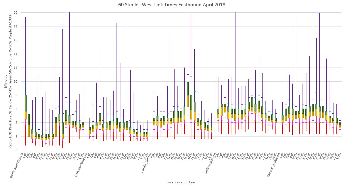
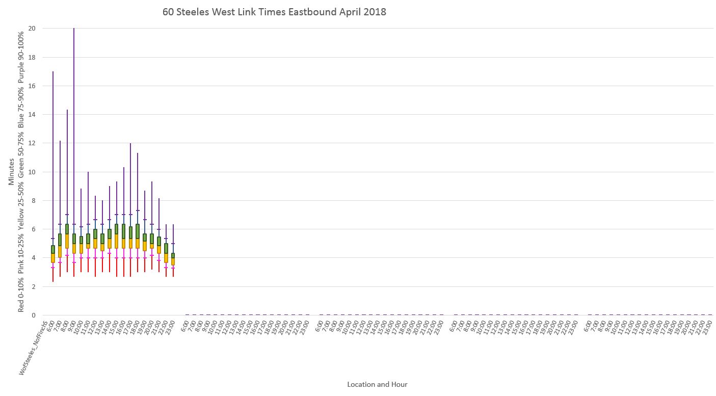
A consistent factor on almost every route was that buses are running in bunches with wide gaps between them. Those gaps translate to crowded buses followed by lightly-used ones, and riders rightly complain about long waits and an uncertain arrival of the next group of vehicles.
The TTC argues that service is not really that bad because they have a large number of unscheduled extras (aka “RAD” or “Run As Directed”) buses that do not show up in vehicle tracking records. Leaving aside the obvious need to track all service, not just the scheduled buses, this does not explain why buses run so close together so much of the time. These are tracked vehicles that have a schedule that should keep them apart.
Or so one might think.
TTC Service Standards include provisions for headway quality (the reliability of spacing between vehicles), but this is fairly generous, and it is never reported on as an official metric of service quality.
However, another problem is that on some routes, the service is actually scheduled to come at uneven headways. This arises from three issues:
- Some routes with more than one branch have different frequencies on each branch. This makes it impossible to “blend” service with, for example, alternating “A” and “B” destinations.
- In response to the pandemic, the TTC quickly adapted schedules by cancelling all express buses, and selectively cancelling individual runs as a “quick fix” to avoid complete schedule rewrites across the system. Where local trips were cancelled, this created gaps in the scheduled service.
- On many routes, notably those that formerly had express service, the TTC scheduled “trippers” to supplement the basic service. However, these trippers were generally not scheduled on a blended basis leaving riders with scheduled, but erratic service.
In some cases, the September and October schedules corrected some of these problems, but many persist. This article looks at a number of routes where the summer (August) schedules had uneven headways to see what, if anything, has changed by mid-October. (The most recent set of schedules went into effect on October 11, 2020.)
All of the data presented here were taken from the TTC’s schedules as they are published in GTFS (General Transit File Specification) format for use by travel planning apps. This almost exactly matches information on the TTC’s online schedule pages.
Continue reading