
This article begins a series of reviews of major bus routes in suburban Toronto based on vehicle tracking data from October 2017 (before the subway extension to Vaughan opened) and April 2018. It includes charts showing the behaviour of headways (the times between buses) and travel times in a way that consolidates more information in an overview of how these values change by time (through the day) and along the route.
Many thanks to readers who contributed to the discussion of improvements in how these data are presented. For those interested in the underlying methodology of digesting the TTC data, please refer to this article.
Data for fall 2018 operations are not available because the TTC is in the process of shifting their vehicle tracking to a new system (“VISION”) and do not yet have a data extract tool to provide the kind of archival data I have been using for these analyses. Discussions about how this will be done, including the possibility of an Open Data Portal, are in progress. Buses which have converted to the new system do not appear in the data I receive from the old “CIS” system.
This article deals with headways, the time between vehicles. In Part II I will turn to travel times.
Headways and Service Reliability
A major issue for transit riders is the dependability of service. On most routes, the scheduled frequency is good enough that “on time” is a meaningless concept, but regular spacing between vehicles will guarantee that the typical wait is fairly short and predictable. If service is supposed to be 10 minutes or better, but just missing a bus could cost someone a 20 minute wait, for that rider the concept of a frequent service network rings hollow.
For its part, the TTC only measures service quality at the ends of routes, and then only against the schedule on the premise that if vehicles are on time, regular spacing will take care of itself. This simplistic view ignores the real world of transit operations and presents a rosy picture of service compared to actual experience.
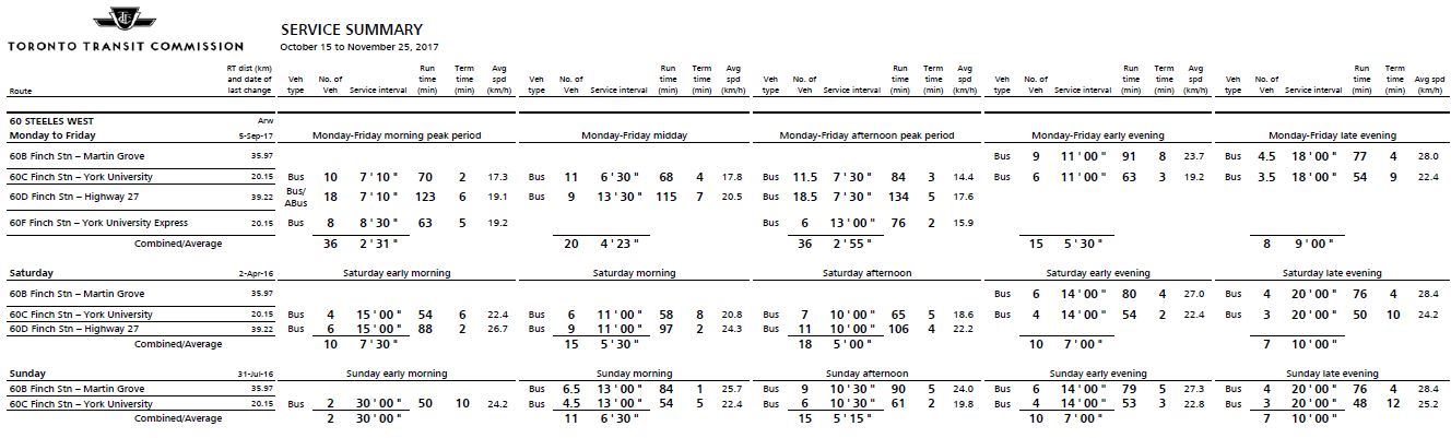
For reference, here are the scheduled levels of service on 60 Steeles West during the months covered by this article [click to enlarge]. Both before and after the opening of Pioneer Village Station on the north side of the York University campus, the route operated with three branches:
- a local service from Finch Station to York U/Pioneer Village
- a local service from Finch Station to Highway 27
- an express service from Finch Station to York U/Pioneer Village (peak periods only)
The level of service during peak periods on each of these is almost identical before and after the subway extension opened.
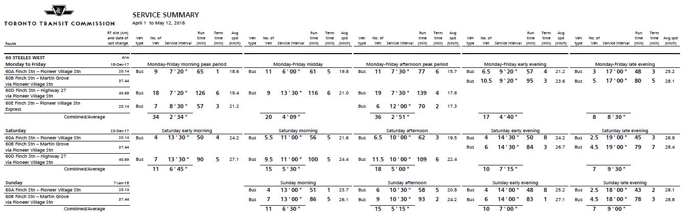
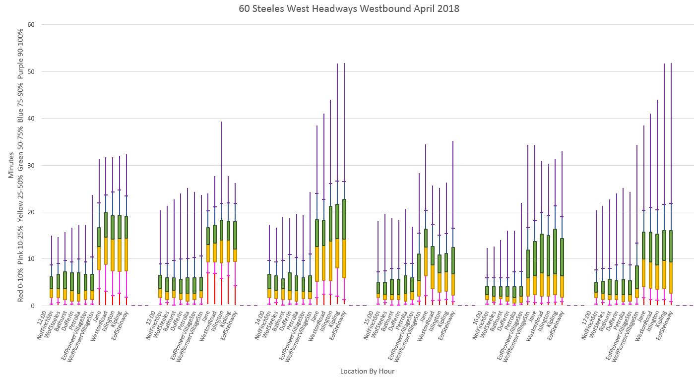
April 2018
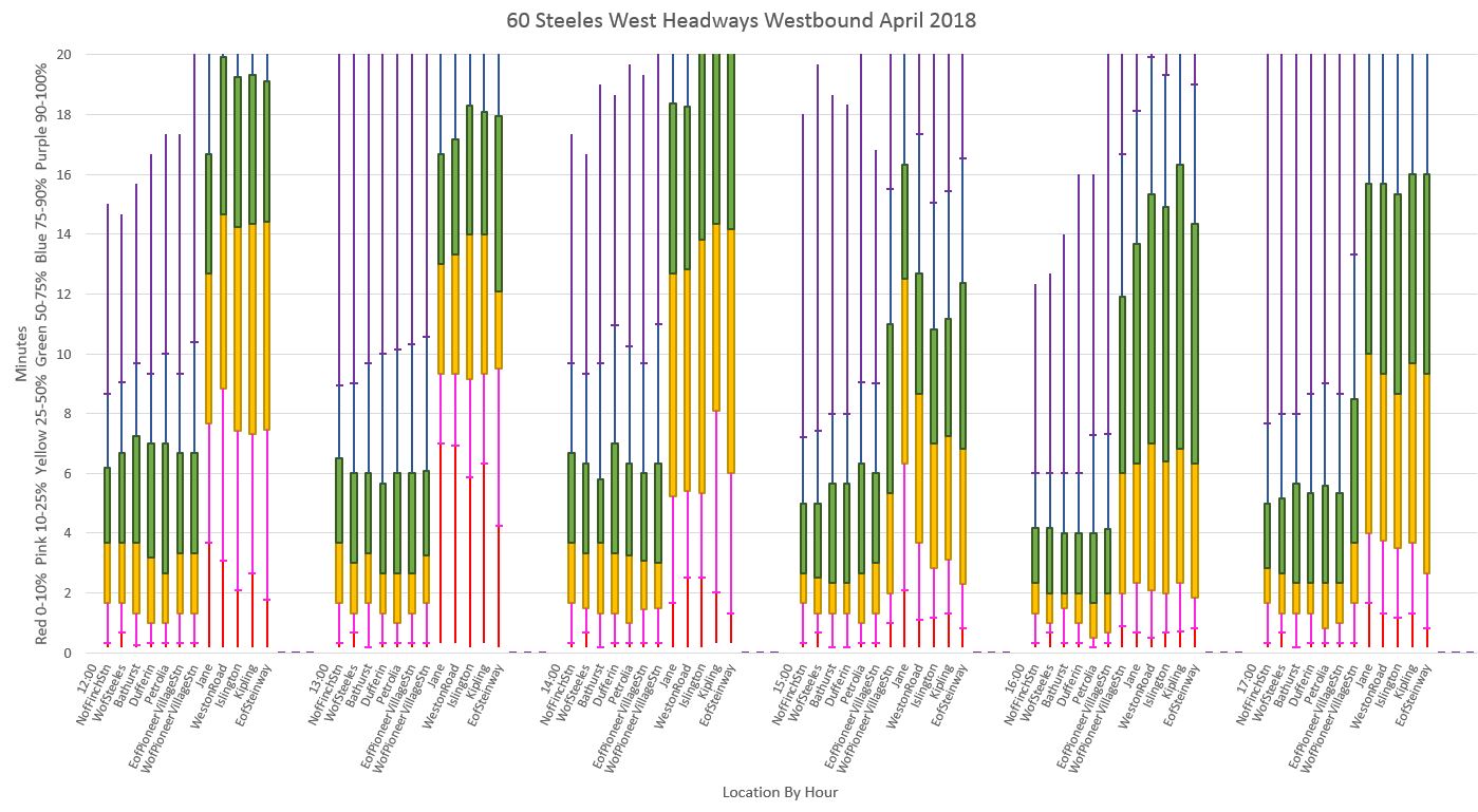
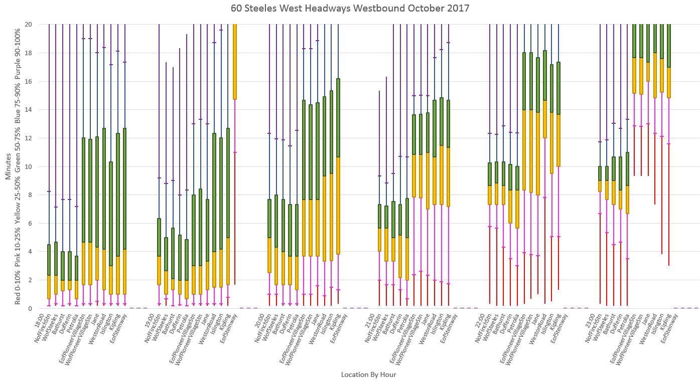
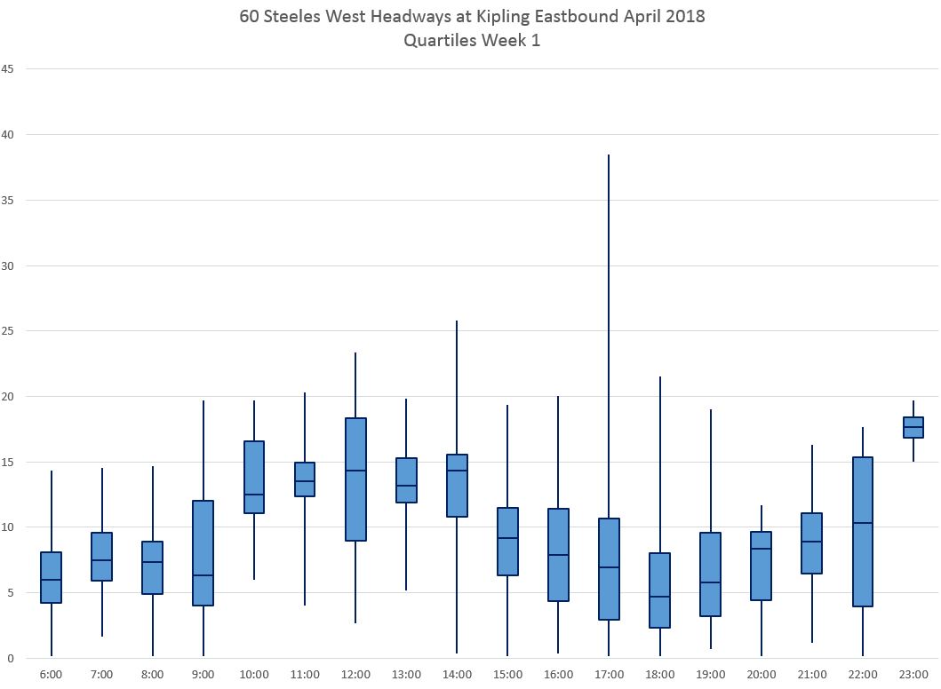
The following three charts show the evolution of headways beginning at Finch Station and progressing westward along the route in April 2018. Each group of columns shows one hour’s data beginning at 6:00 am and running through to 11:00 pm. Each column summarizes headways at a time point or screenline starting just north of Finch Station and extending to the western loop of the route. The yellow and green boxes represent the 2nd and 3rd quartiles of measured headways (25-50th and 50-75th percentiles) with the line between them being the median. Above and below the boxes are lines showing the extent of the lower and upper percentiles with a horizontal tick mark separating the outlying 10%.
Although half of the observed headways (the boxes) tend to stay in a block, the outlying values representing the other half can be well away from the median (and by extension from the scheduled headway). Of particular note are locations where the 10-25th percentile range (pink) extends to quite low values, with the 0-10th percentile range (red) even lower. This represents bunching where vehicles arrive quite close together even though the median headway might be considerably wider. This problem exists across the route in all time periods.
For the most part, headways on the inner portion of the route east of Pioneer Village Station and York University stay within a band about 4 minutes wide for half of the service. The problem lies in the considerable proportion of headways well outside of that band.
During much of the day, the width of the 25-75th band stays fairly constant along the route. In the first hour of service and beginning mid-evening, an effect begins to appear where the spread in values gets wider the further west the buses travel, although for the inner part of the route this stays within a band under six minutes wide.
One caveat about this method of presenting the data: during transitional periods when scheduled service shifts between peak and off peak levels (or between early and late evening), it is possible for the 25-75th percentile band to be wide legitimately because there would be a mix of service at each level captured during the transitional hour. This does not, however, explain wide ranging headway values when scheduled service should be uniform.
Note also that during some parts of some days in April 2018, service did not operate into Pioneer Village Station, but rather looped on street due to the strike at York U. This contributes to lower values for the “West of Pioneer Village Station” time point than would normally be expected during the affected hours.
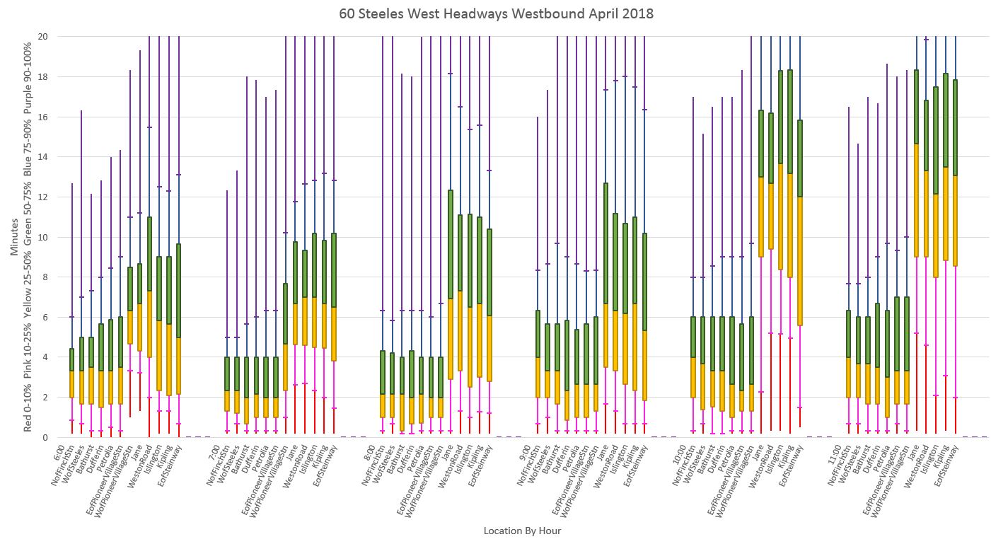
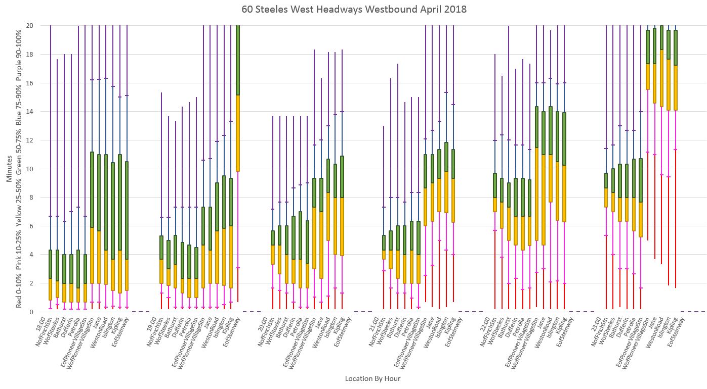
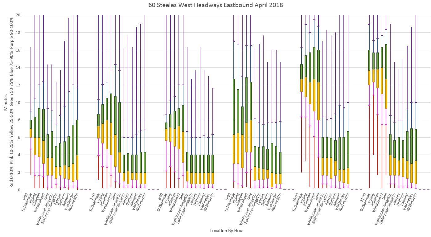
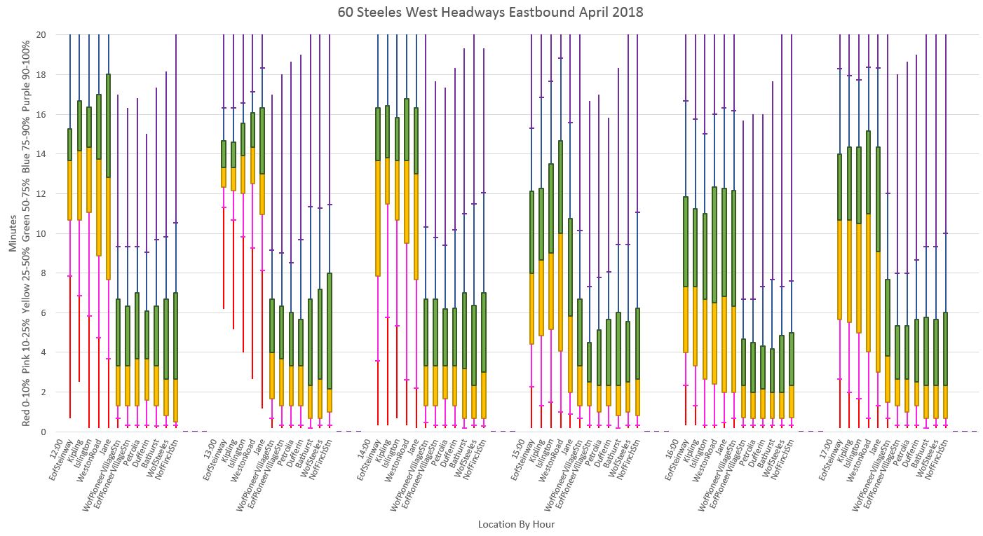
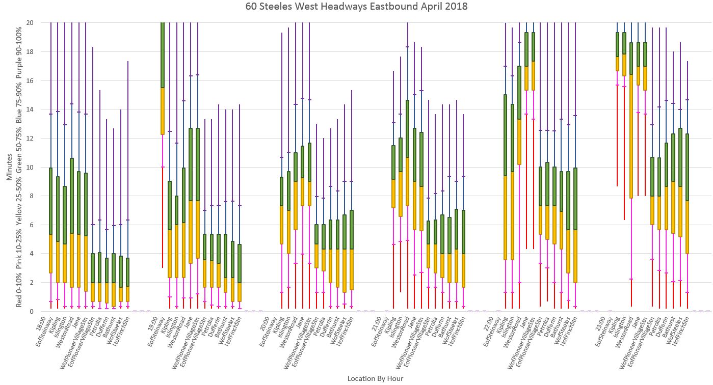
The situation eastbound is similar.
West of Pioneer Village Station, the situation is not as good especially in the afternoon where the 25-75th band opens up to 10 minutes and more, and the spreads of the outlying 0-25th and 75-100th bands are even wider. The charts above are shown with a maximum time of 20 minutes, but these values can be much larger as seen below with the maximum time set at 60 minutes to show the full range of outlying values.
The situation eastbound is even worse.
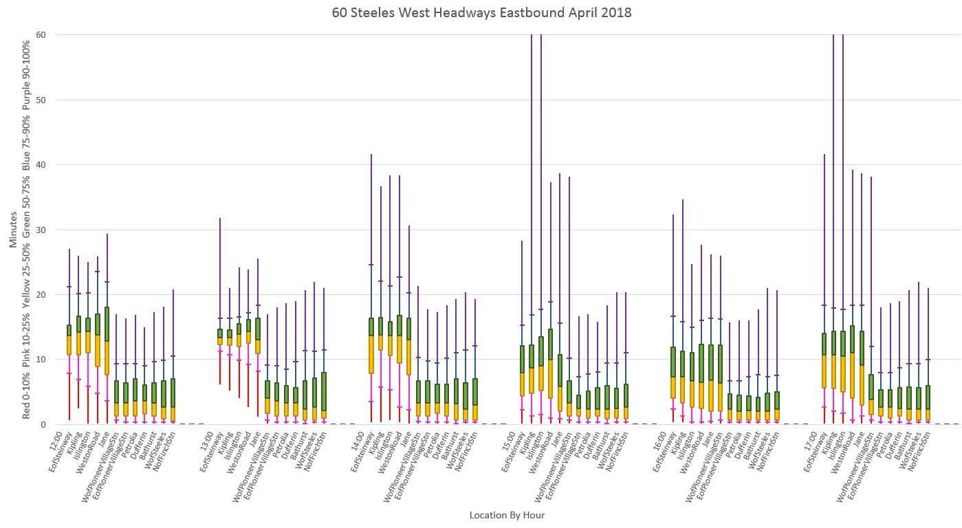
When the top 10 percent of trips are operating on headways over 20 minutes with some cases going well above this value, the advertised service every 7’30” is something of a joke for those unlucky to be caught in one of those gaps. “Only one in 10” might sound good, but this means that in a typical week’s travel, a rider is guaranteed to hit one of those gaps at least once, probably more often. It is precisely this unreliability that forces riders to plan for longer trips as if they will happen all of the time.
A further problem with gaps, of course, is that (assuming a uniform arrival rate of would-be riders) more riders will “see” the wide gap than the narrow ones because more people will accumulate at a stop wondering if their bus will ever show up. Although the 20+ minute gaps may represent only 10% of trips, they affect a higher proportion of riders, and this reinforces the perception that service is routinely less frequent that advertised.
The cumulative wait time for passengers goes up as the square of the headway. Doubling the headway causes a fourfold increase in wait time measured in passenger minutes because twice as many riders wait, on average, twice as long for a bus to show up. Conversely, a pair of closely spaced buses does little to reduce wait times overall.
This analysis treats all buses equally in that various branches of the service, including express trips, are combined together. Where a rider can only use part of the service offered, the erratic wait times can be even more frustrating.
As for the express services, on Steeles West the scheduled travel time for the express branch 60E is only slightly shorter than for the local service. The saving, such as it is, can be eaten up in wait time to which transit riders are more sensitive than in-vehicle travel time.
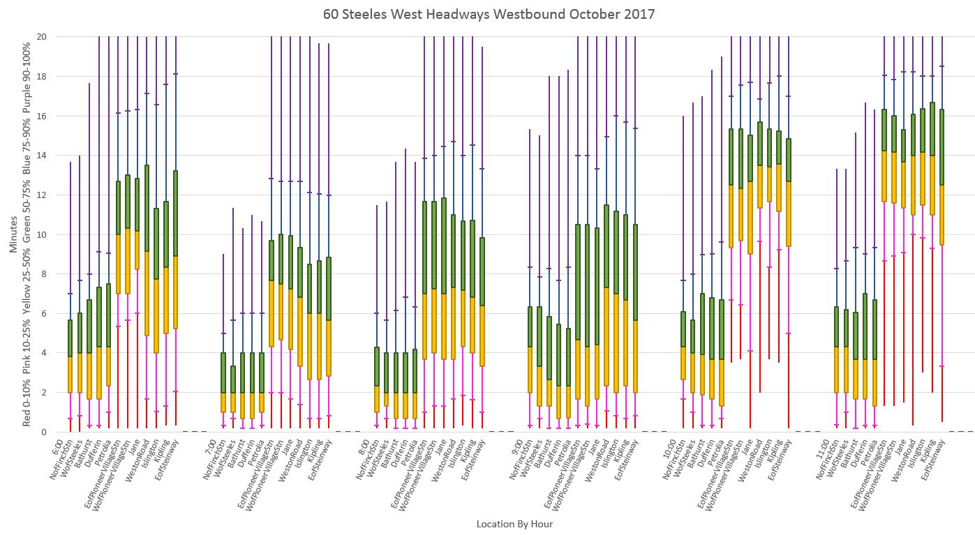
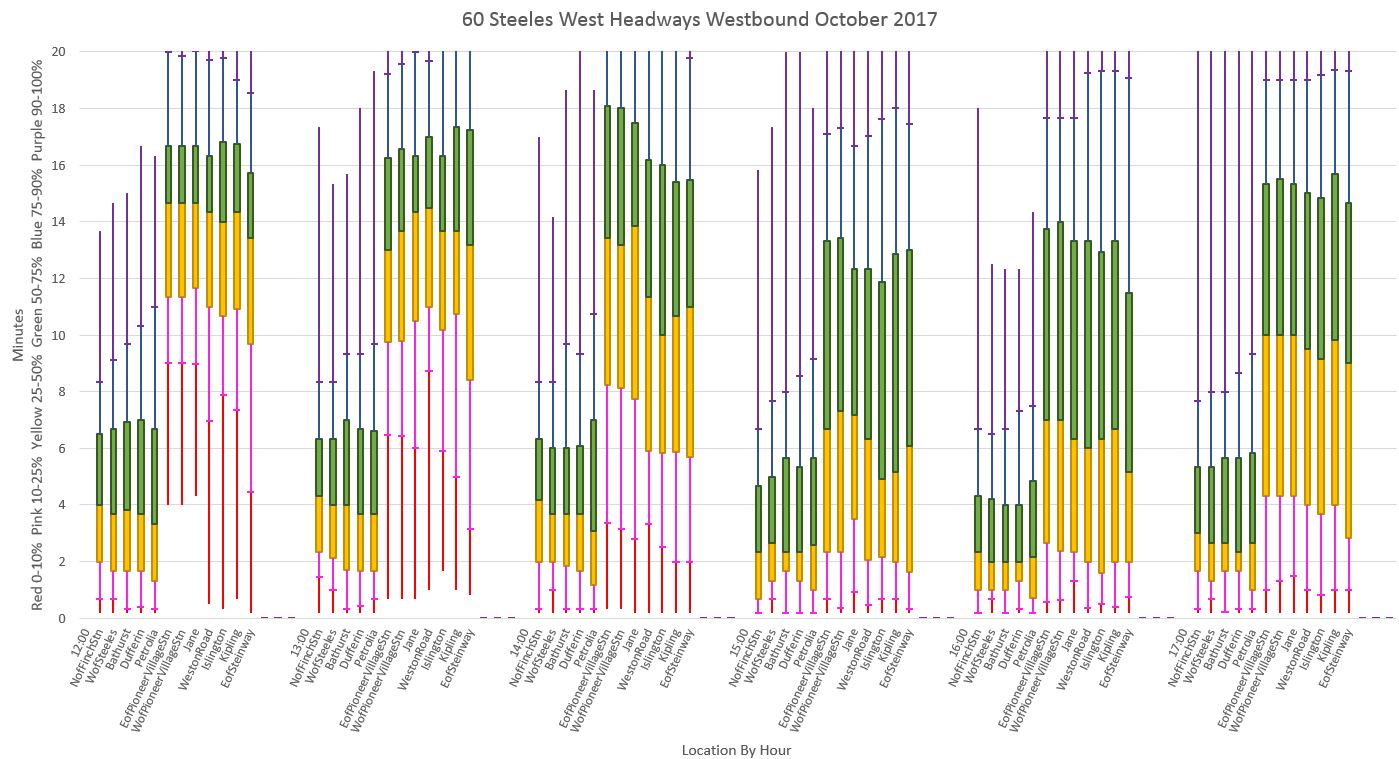
October 2017
For comparison, here is the service from October 2017 before the subway extension opened. These charts are quite similar to what we see six months later (above). Service east of York University has about half of the trips within a band of 4-6 minute headways, while further west the spread can be wider, especially later in the day. As with the April data, the outlying bands reach down to bunching territory and up to the level of gaps much wider than the median headway.
Eastbound data show a similar pattern.
Charts of Headway Distributions
- 60_201710_ConsolMonthHeadways_WB
- 60_201710_ConsolMonthHeadways_EB
- 60_201804_ConsolMonthHeadways_WB
- 60_201804_ConsolMonthHeadways_EB
Each set of charts contains six pages. The first three present the data with a y-axis (headway) maximum of 20 minutes, while the others show the same data with a 60 minute cap. This allows the changes in the main part of the data to be clear (20 minute scale) while also showing the extent of the outliers (60 minute scale).
Looking in More Detail
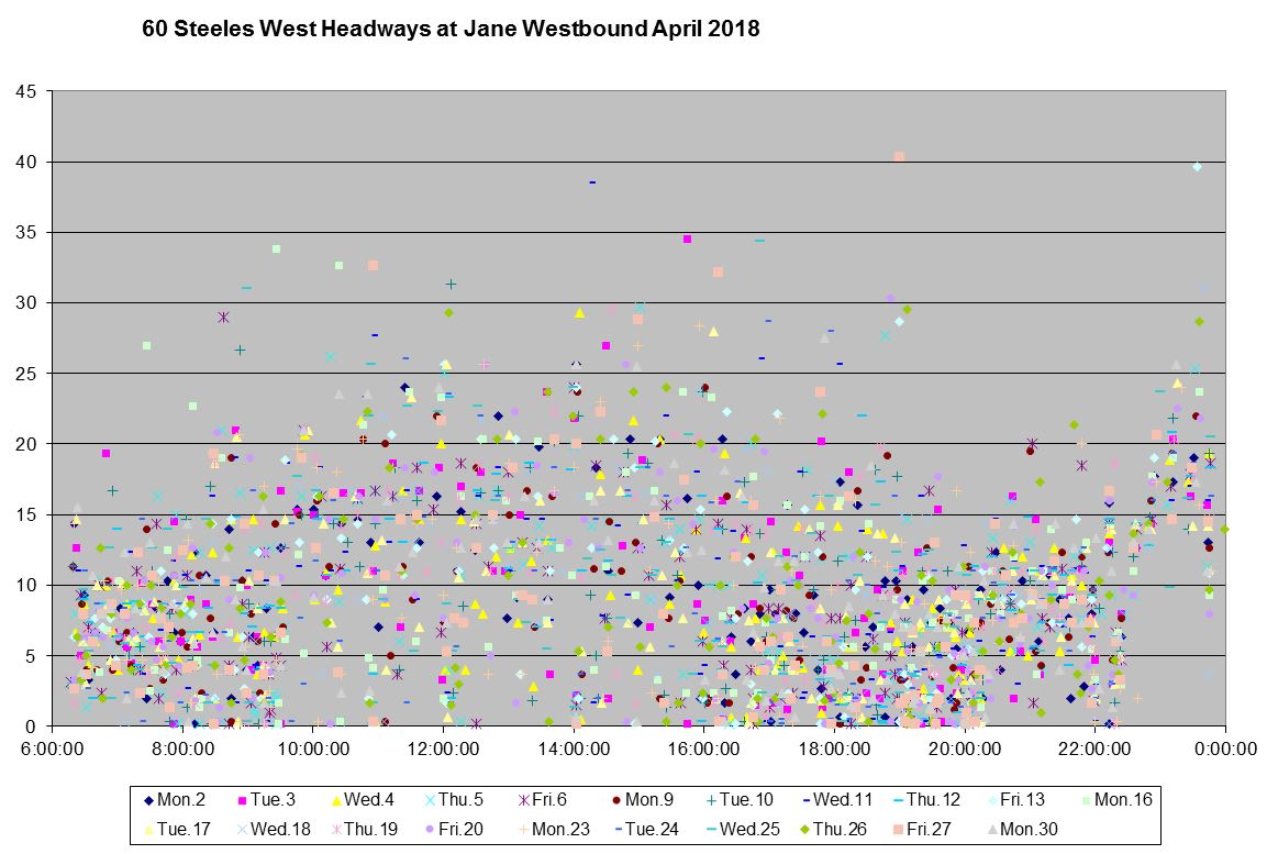
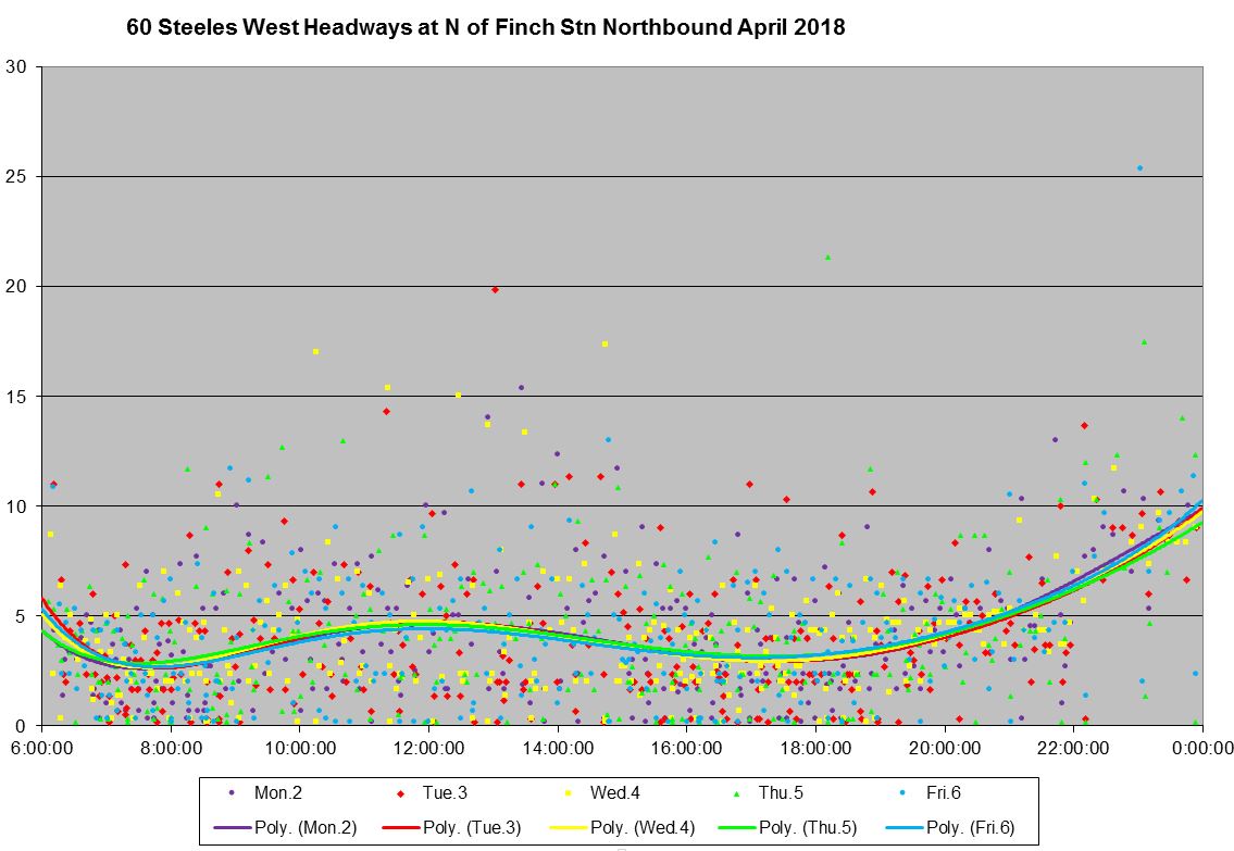
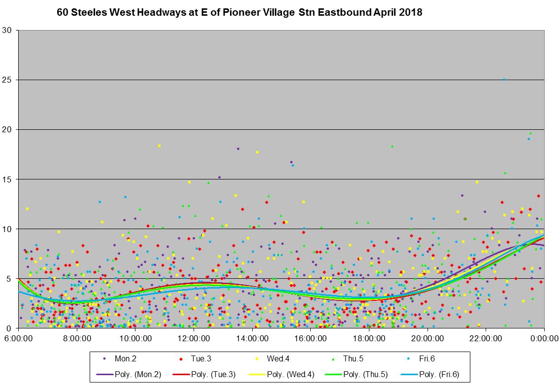
The following chart is one I do not usually publish as part of these articles because it can be quite messy. It is a scatter diagram of all headway values for westbound service at Steeles and Jane for the month of April 2018. The vertical axis shows the headway value in minutes, and the horizontal axis shows the time of day. The shape and colour of the dots varies by day of the month. Normally, I would use this to quickly see whether there were any particularly unusual days or times worth a more detailed review.
What this chart shows is that the actual service headways are scattered all over the place all of the time. This is a far cry from the TTC’s claims of well-managed “on time” service. Given that this is just west of a point where service could easily be regulated (Pioneer Village Station), it is quite clear that nobody is “minding the store”.
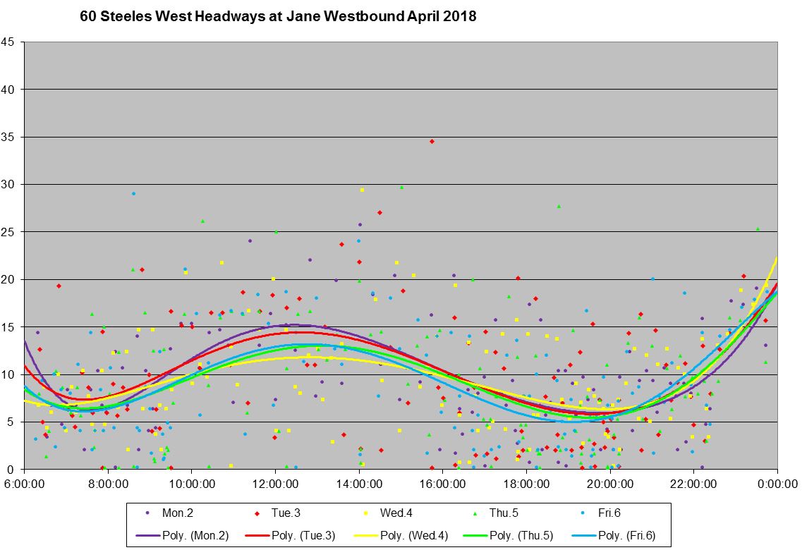
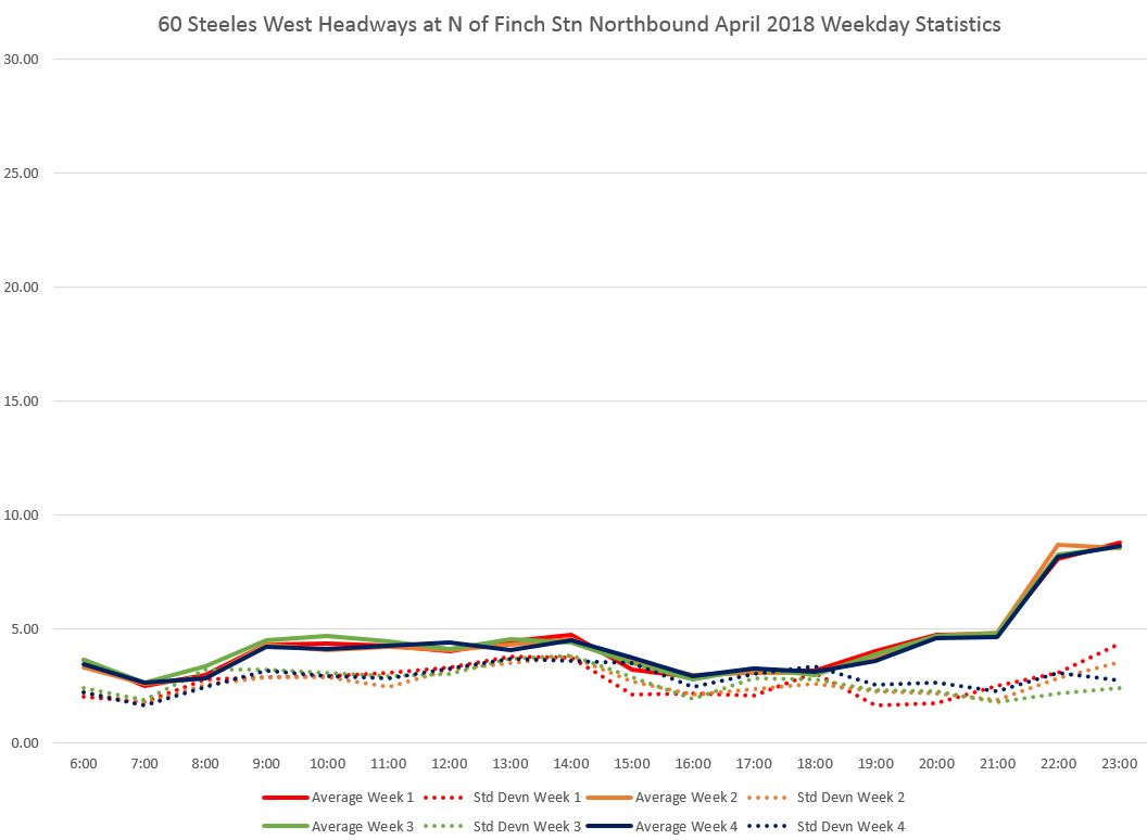
These data can be seen in other ways to get a sense of how they behave at the weekly and daily level.
The chart below shows the data points for the first week including a trend line for each day
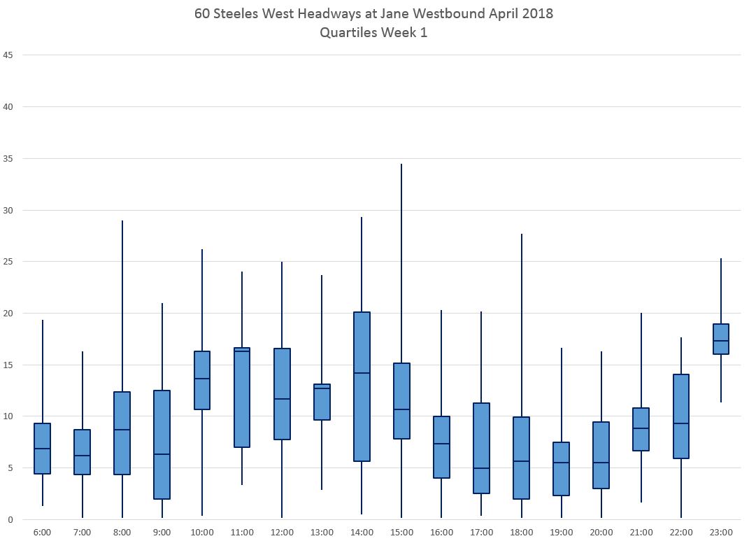
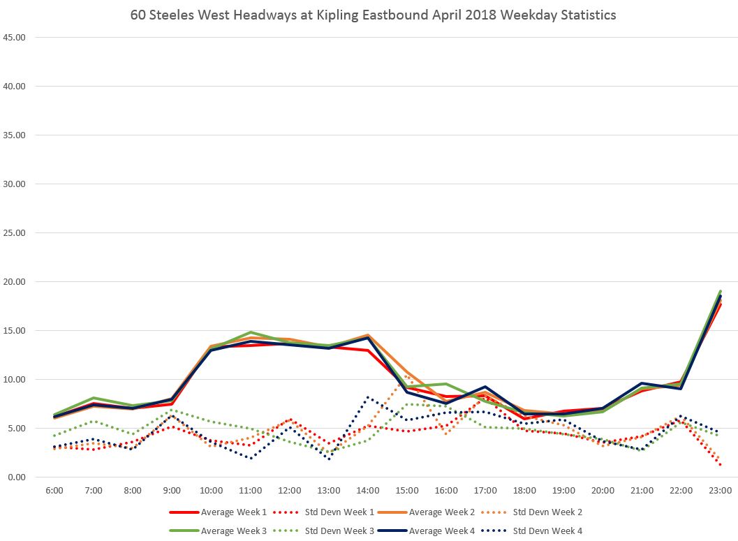
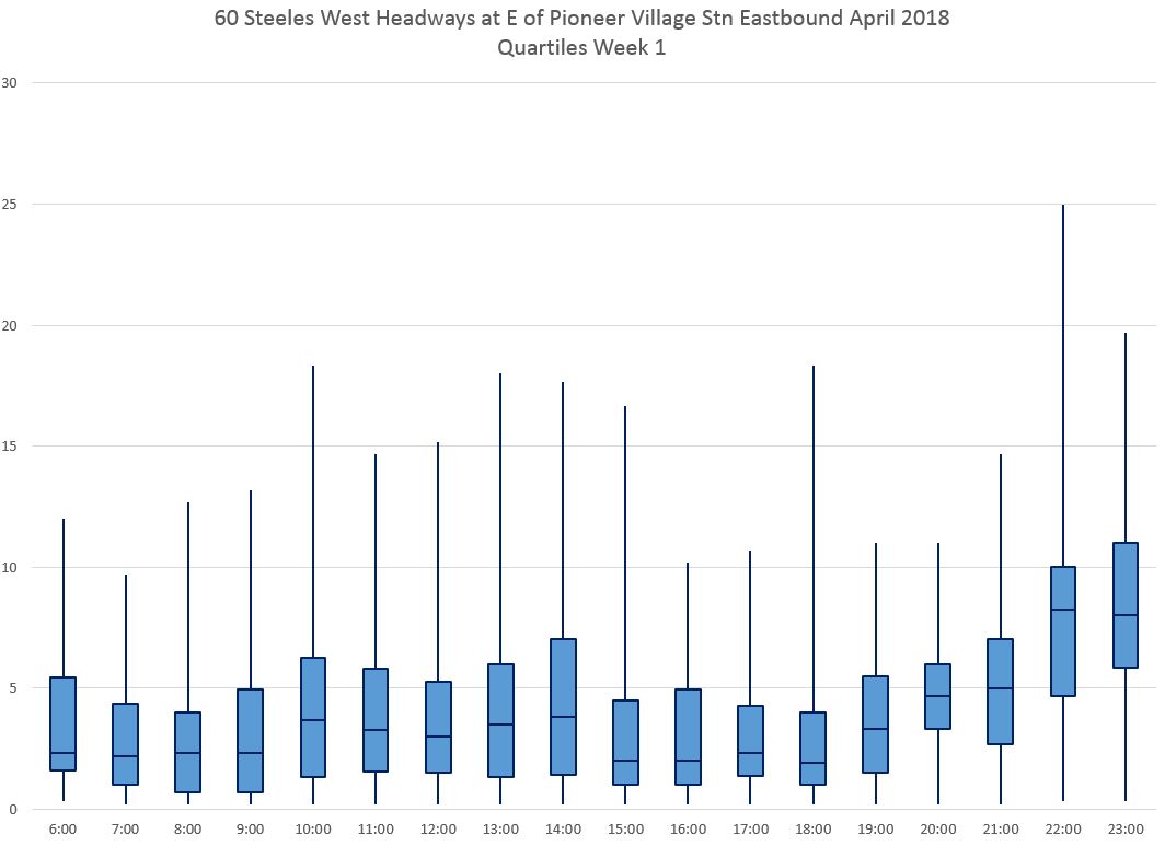
The next chart shows the same data in quartile format with the central boxes covering the 25-75th percentiles and the horizontal line at the median value.
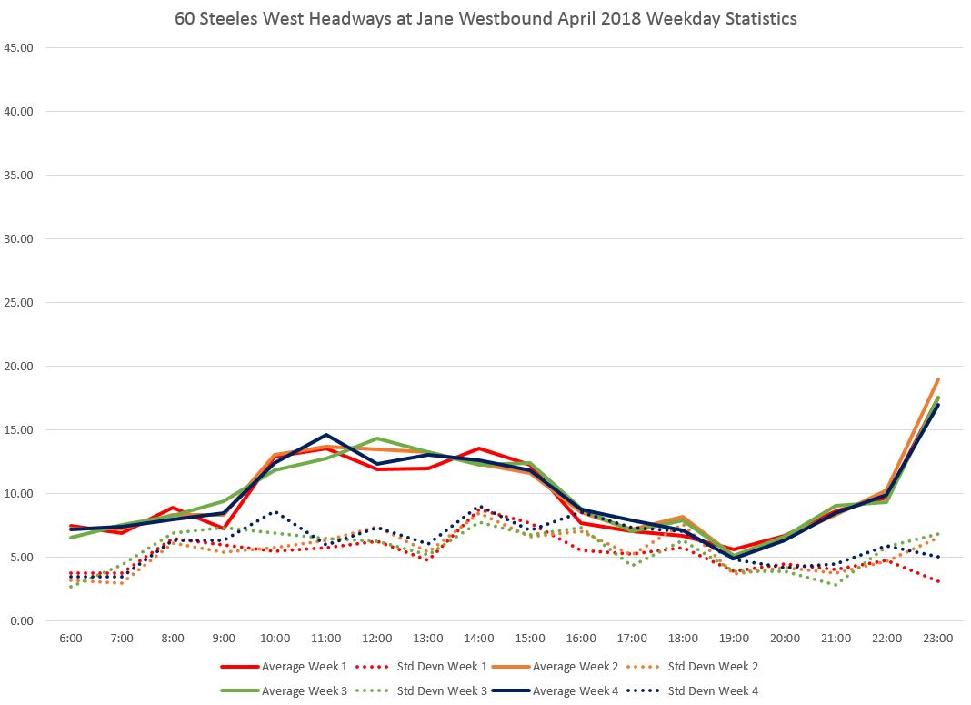
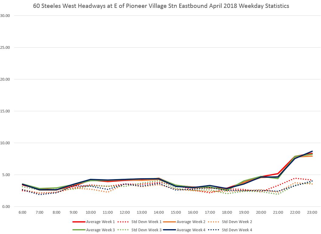
This chart shows the average and standard deviation values for all four weeks. Note that the SD value is usually at or above five minutes indicating that there is a wide range in data values around the average, something we see in other formats above. Averages and SDs for the four weeks are similar showing that the problem is pervasive, and not the result of service disruption on a few days.
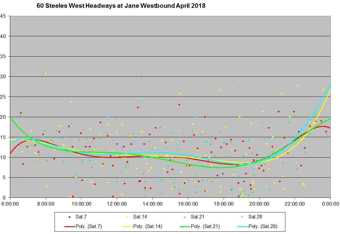
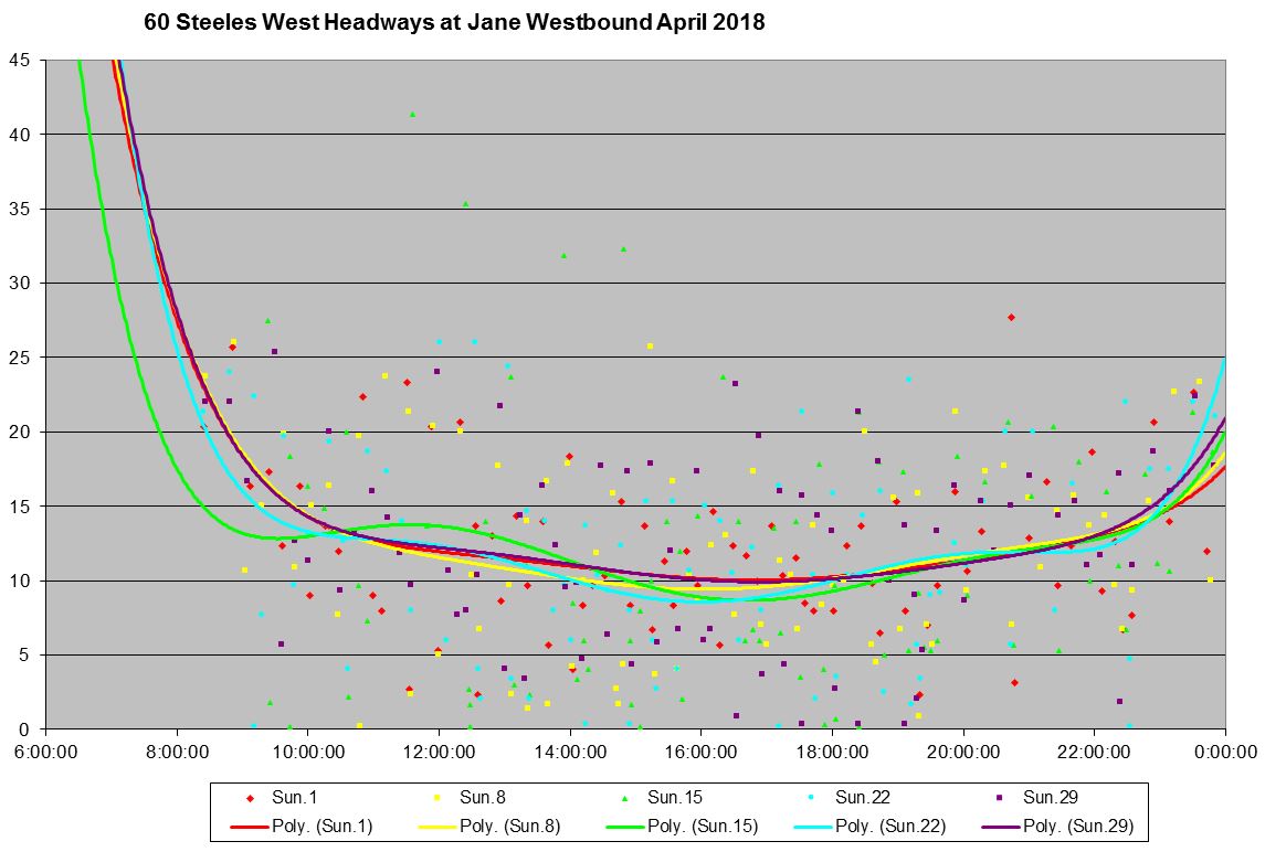
The situation on weekends is just as bad with quite erratic service westbound at Jane Street.
The situation eastbound at Kipling is only marginally better. The scatter of headway values here is not quite as terrible as at Jane westbound, but it is still quite bad particularly in the late afternoon and evening.
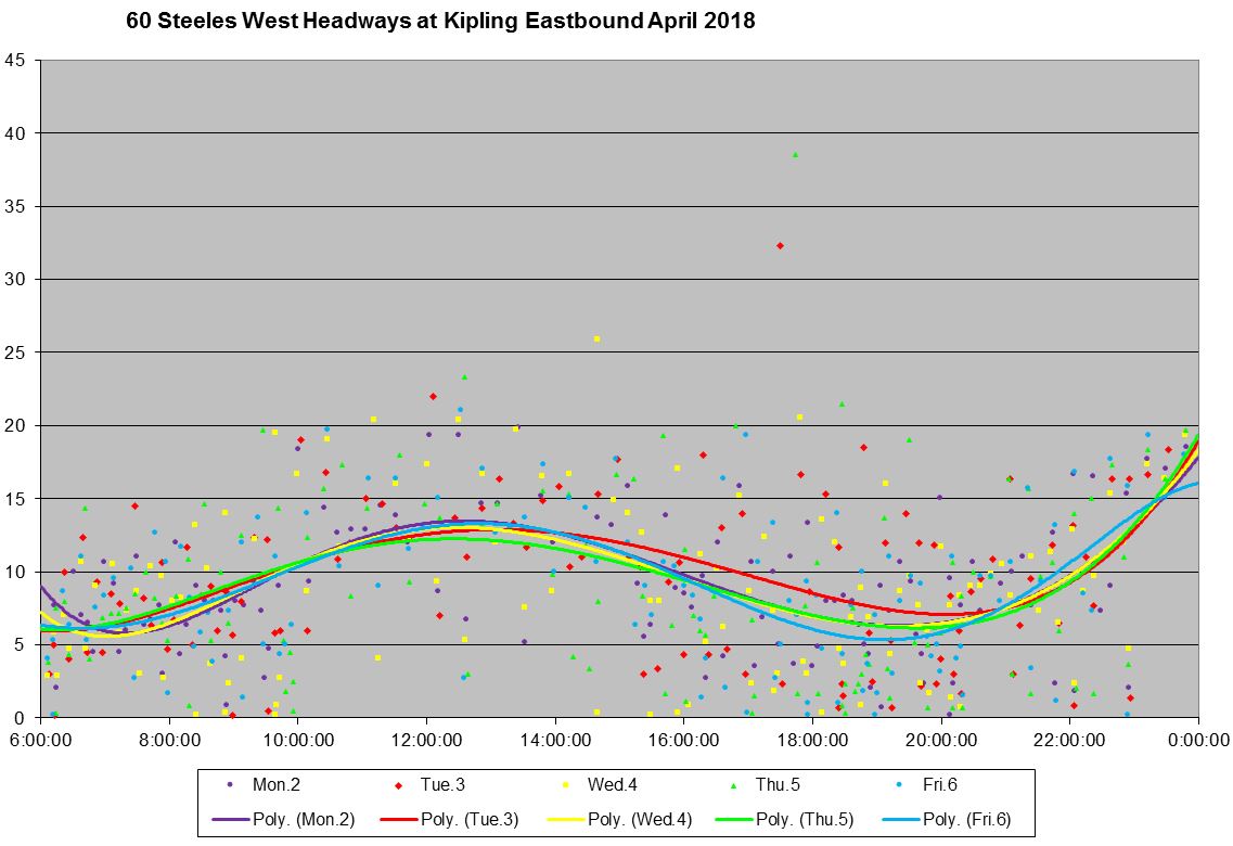
The weekly average values are, as at Jane, quite consistent, but the SD values are high reflecting the degree of scatter seen above. When the SD values reach ten minutes, service is in appallingly bad shape.
The full sets of charts for both locations are available here:
Between Finch and Pioneer Village Stations
The inner part of the route has more frequent service because so much turns back from Pioneer Village (York U) especially during peak periods. However, the headways in this section of the route are spread over a wide range just as in the more lightly served segment to the west with the only difference being that the range of values is lower.
Service leaving Finch Station has headways spread over the band from zero to ten minutes for much of the day with outliers above the ten minute line.
Although half of the trips are clustered in a fairly short range, the other half lie well away from the median, including the particularly high outliers and short, bunched departures.
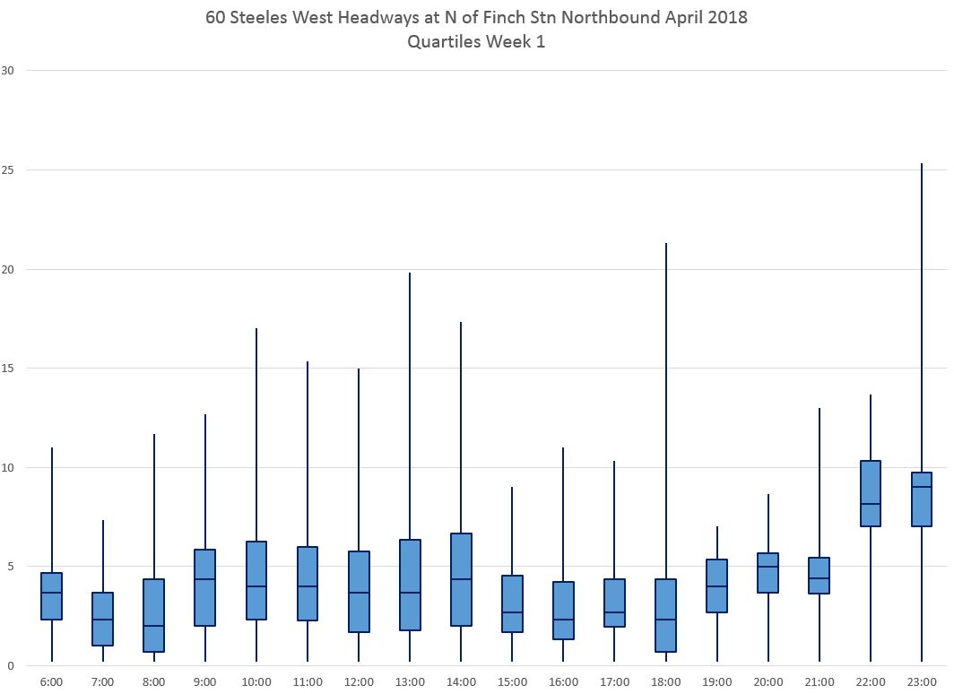
The degree of bunching is reflected in the SD value which lies close to the average headway for much of the day.
Eastbound from Pioneer Village Station, the situation is similar. Headways are spread over a ten minute range with considerable bunching. Both Finch and Pioneer Village Stations are locations where service can be regulated, but given the TTC’s tolerance of a six-minute window for “on time” performance, the result is bunches and gapping.
The full sets of charts for both locations are available here:

Did they account for the articulated rush hour runs in the headways? I know some 960 runs and some runs of 60 get artics, I’m not sure if it makes a difference in terms of headways. What is your opinion on them? Also, I’ve noticed the traffic alone at Keele and Steeles during rush hour is AWFUL! I was reading in one of the pdf documents on the ttc site for the future they want to convert 960 to artics? I can’t remember it said something about tier 1 and tier 2 express services.
Steve: The Express Bus Study defines a Tier 1 route as having service through most of the day and on weekends, while Tier 2 routes are peak period only. Steeles West is listed as Tier 1, but obviously the actual service level has not yet been implemented for this. The move to all day service and artic buses is listed as a 2021 change. Steeles West from Yonge to Pioneer Village Station is also listed as a future site for traffic signal priority.
LikeLike
Thanks Steve for the analysis of the 60. As a daily user of the service between Signet Drive and Pioneer Village I can tell you the service leaves a lot to be desired, quite often there will be 3 or more buses together followed by 25 minute gap. I have to thank the Rocketman app to prevent me from having excessive wait times, now whether I can get on that next bus that shows is another matter as I said in a previous post 90% of the time I have to stand. I have to see what you have come up with travel times, but from my experience on that relatively short stretch travel they can’t be good. There no day to day consistency with eastbound traffic going across Jane, we can get straight through, yet other days it can reach past the 400 overpass, on the few occasions even past where I get on at Signet. There has been a couple of occasions going east I got off the bus at Petrolia and started walking and got back on the same bus at Dufferin!!!. Westbound can be a nightmare again at Jane, where the three lanes cram into two traffic can be significantly backed up to the top of the hill. As a side issue to that it would be interesting to see the ‘on-time performance” of the 84D since it moved to Pioneer Village. I suspect Steeles is suffering from excess traffic due to “transit” construction on Finch (LRT) and Highway 7 (Viva Next), I anticipate that while the Finch West LRT is being built the Steeles service will suffer considerable hardship with increased traffic. I don’t know what can be done about the traffic on Steeles other than putting bus lanes on all the three lane stretches but I feel that it has a big contribution to the poor level of service during the rush hour. Weekends are are a different matter.
LikeLike