504 King vs 501 Queen Speed Comparisons (Updated)

Updated December 2, 2018 at 8:00 am: A sixth set of charts has been added covering the last two full weeks of September 2017. The intent is to show fall conditions before the pilot, but also before construction on King (at least some of which was to set up the pilot itself) slowed King cars in the early November 2017 data already published here.

With a year’s worth of the King Street Pilot now behind us, attention turns to two basic questions: should King Street remain as it is with a degree of priority for transit, cyclists and pedestrians; and should this scheme be extended to other major streets, notably Queen Street.

In previous articles I have reviewed the behaviour of the King and Queen routes:

This article provides a detailed look at average weekday speeds along the streets during six separate periods, and with hourly breakdowns from 6 am to 1 am.

  • January 16-27, 2017: Winter operations downtown deal with less traffic, especially on Queen Street. This is a “before” snapshot of the two streets.
  • September 18-29, 2017: Fall conditions after TIFF and before the beginning of construction at Queen & McCaul.
  • November 1-10, 2017: Just before the implementation of the pilot.
  • January 15-26, 2018: Winter operations with the pilot in place.
  • July 16-27, 2018: Summer conditions for the pilot. (2017 was a construction year on Queen and a direct comparison to 2018 is not available.)
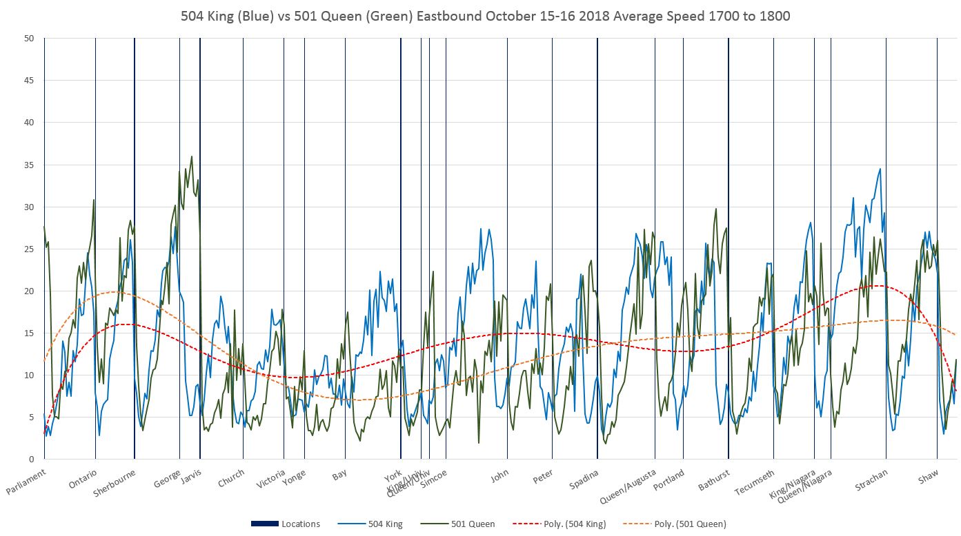
  • October 15-26, 2018: Current fall conditions.

This gives a view of “normal” conditions, but does not capture all of the seasonal and special event variations, many of which are evident in the data in previous articles. The periods have been chosen to avoid skewing the numbers with special events such as TIFF, vacation periods and construction.

A Caveat About “Average Speed”

The values show in these charts are derived from TTC vehicle tracking data. This originates in GPS format, and after cleaning up the “rogue” points that are off route due to GPS errors, what is left is mapped onto a version of the route broken into 10m segments. The speed of a vehicle at each segment is determined by the “before” and “after” locations of adjacent GPS observations and the time difference (usually 20 seconds) between them.

These values give the average speed within each segment of all vehicles whose GPS data placed them there. This is not the same as the average speed over the entire pilot area on any given trip. What the numbers show is the locations where vehicles tend to be making good time between stops, the places where they are bogged down, and the places where they stop. Even at stops, the average is never zero because it includes observations where vehicles are just stopping or just starting up within a segment, not to mention variations in stopping location and cases where vehicles do not stop at all.

The Effect on Riders

Vehicle speeds on Queen are often comparable to those on King, but Queen is notorious for less frequent, unreliable and crowded service. Riders are very sensitive to waiting times at stops, and this is compounded if they cannot board the first vehicle to appear, let alone if they walk some distance without a streetcar ever passing them.

With the King Street Pilot there has been a reduction in the variability in travel times which has led to less irregular service. Scheduled service comes more often and the line’s capacity has been improved with new streetcars. Speed alone is not the only measure of a service improvement.

It is vital that debates about the effectiveness of changes to King are debated not just on speed but also on reliability and capacity for demand. The early focus on speed changes which were, in some cases, unimpressive, opened the field to critics who argued that there was a great upheaval for little benefit. It is the combination of more reliable travel time, increased speed, reliability and capacity that has affected the riding experience and drawn more people to use this route. Any move to expand either the scope on King or to another street must take all of these factors into account.

Reading the Charts

Each chart contains data for one hour’s operation in one direction. Here is a sample from the PM peak westbound in October 2018:

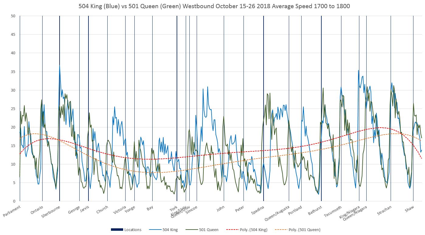
The blue line shows data for King while the green line shows Queen data. Trend lines are interpolated through the data for King (red) and Queen (yellow).

The limits of the chart are east to Parliament and west to Shaw, both beyond the Jarvis-Bathurst pilot, for a few reasons:

  • The wider scope shows conditions on the approaches to the pilot area.
  • The nature of the trend line calculation in Excel can cause misleading behaviour in the lines as Excel tries to project beyond the charts using values near the edges. Having a “buffer” area on either side of the pilot ensures that the trend lines do not include this problem through the Jarvis-Bathurst section.

Queen and King run parallel to each other with most north-south streets at the same location on both. This allows data from the two routes to be lined up on a single chart. A few notes about special cases:

  • Sherbourne Street is used as the reference point for aligning the data. The distance from Sherbourne to Bathurst is the same on each street.
    • Ontario Street is slightly offset on Queen relative to King.
    • Parliament Street is slightly further east of Sherbourne on King (measured as travel distance) than on Queen due to the shift in King’s direction just west of Parliament at Berkeley.
  • Victoria Street has a small jog at Adelaide. The line on the charts reflects its location on Queen which has a transit stop and traffic signal.
  • The stop and traffic signal at Queen and Augusta have no equivalent on King.
  • Niagara Street curves eastward between Queen and King, and so the crossing points are different on the two streets.

Westbound charts as above are read from left to right. Eastbound charts are in the same format and should be read from right to left.

Comments on the details of these charts are included later in the article.

Continue reading

501 Queen and the Effect of the King Street Pilot (Updated)

Updated November 27, 2018: A major section has been added comparing travel times between Jarvis and Bathurst on Queen and King Streets.

With the King Street Pilot a year old, one area that also deserves a review is the effect it has had on transit service on Queen Street. The short answer is “very little” with the usual caveats about seasonal variations and unusual events that complicate direct before and after comparisons.

The charts presented here cover the period from March 2016 to October 2018, the same period as King Street charts in recent articles. Selected images are included in the post, and more extensive sets are linked in PDFs.

(Note that the level of detail in the three-year charts is such that they suffer when reduced in size to the scale of a blog post. Click on any of them to open a full size version in a new browser tab.)

Major Events on Queen Street

More so that on King Street, Queen has been affected by many construction activities over the three years, and of course it also has more special events disrupting service in the area parallel to the pilot on King. The major events affecting travel times between Jarvis and Bathurst Streets are highlighted in these charts.

  • April 2016: Reconstruction of King and Charlotte diverted service onto Queen adding to streetcar running times there primarily through delays where King cars turned off of Queen without assistance from traffic signals.
  • May to December 2016: Water main reconstruction on Queen west of Spadina triggered a long-running diversion of service via Spadina to King. The times shown are measured between King and Bathurst and Queen and Jarvis for this period where vehicles were diverted.
  • September 2016: Although TIFF closed part of King Street, the service was split rather than diverted. There is no effect on Queen running times beyond that already seen for the diversion of the 501 route.
  • May to August 2017: Construction continued for another summer on Queen including completion of work started in 2016 and replacement of the pedestrian bridge at Queen and Yonge. Buses operated on 501 Queen.
  • September 2017: Streetcars returned to Queen. Reconstruction of Dundas from Church to Yonge caused some traffic to shift south to Queen. King services diverted onto Queen during the opening weekend of TIFF.
  • October 2017: Reconstruction of Queen & McCaul caused Queen service to divert via King between Church and Spadina.
  • November 2017: King Street Pilot begins.
  • June 2018: Construction delays.
  • September 2018: TIFF diversions delay Queen service.

Chart Format

As with the King Street analysis, the charts here show the 85th percentile values for travel times in orange. This includes most trips across the area parallel to the pilot on King. The median value (50th percentile) is shown in blue. Half of the trips took longer and half shorter than this value. When these values track close together, most trips will lie in a fairly narrow band of values (see details for October 2018 later in this article). Where the lines pull apart, travel times seen by riders will have more variation in length.

Where the route was on diversion in 2016, the time shown is measured between Bathurst & King to Jarvis & Queen via Spadina.

For the diversion in 2017, the time is measured between Bathurst and Jarvis on Queen, but includes the diversion both ways via Spadina, King and Church.

Where a value drops to zero, this indicates that no car was observed between the two points usually due to a short-term diversion around a major blockage.

AM Peak 8 to 9 am

Westbound

The beginning of the pilot in November 2017 had no effect on AM peak travel times. The spike in late June 2018 was caused by construction delays according to TTC eAlerts.

Eastbound

Continue reading

King Street Update: October 2018 (Part II)

This is the second part of the October 2018 update which began with a review of travel times and capacities on the combined 504 King and 514 Cherry routes. (514 Cherry was merged into the King service with a route redesign in early October and no longer exists as a separate route number.) This article looks at the evolution of scheduled and actual service levels on King from March 2016 to October 2018.

The purpose of this article is to show that many factors affect service reliability, and this varies both by location, date and time of day. In evaluation of the King Street Pilot it is important to distinguish between changes due strictly to the pilot and changes that occurred separate from it such as schedule updates.

There are a lot of charts in this article, with more in linked collections. As this is the anniversary of the King Street Pilot’s introduction, I am publishing a large amount of data here for reference by those who are interested in the details.

The King Street Pilot has had some effect on headways (the interval between vehicles). This has been more in the “shaving” of peak values which translates to more regular service even if the scheduled frequency changes little if at all. The TTC’s ability to add service has been constrained by its aging streetcar fleet that only recently has been sufficiently replaced by new cars that service on King is now, with few exceptions, fully provided by the larger Flexity low flow cars.

The table below [click to expand] shows the level of scheduled service over the past three years on the 504 King and 514 Cherry routes. The pdf linked below this table also includes information on the changes in scheduled travel times over the two routes.

504514_2016_2018_HeadwayHistory

Aside from the service reorganizations related to the 514 Cherry car, many of the changes from one schedule period to another relate to changes in the provision of trippers. These are vehicles that make one trip across the route intended to coincide with the peak of the peak periods. The level of tripper service is dictated partly by the season, but much more so by vehicle availability. With the merger of the two routes and the full conversion to Flexity operation, the trippers have vanished from the schedule.

The major changes over the period were:

  • June 2016:
    • 514 Cherry introduced.
    • Service levels on 504 King (and hence on the outer part of the shared route) were reduced except during the AM peak.
  • September 2016: 514 Cherry midday service improved. This change was reversed in May 2017 coinciding with the formal change of this route from CLRV to Flexity cars.
  • September 2017: Running times on 504 King were reduced to claw back an excess that had existed for a few years. Headways during all periods were improved slightly as a result.
  • November 2017: Pilot begins. Transit signal priority (TSP) is disabled at several intersections in the pilot zone where it had previously been active.
  • February 2018:
    • 514 Cherry service improved during the midday and early evening.
    • Roncesvalles Carhouse closes for major renovations causing the patterns of service build up/down to change as all cars now operate from east end carhouses.
  • May 2018: Running times on both 504 King and 514 Cherry were reduced to incorporate the benefit of the King Street Pilot. Headways were improved on both routes to varying degrees during most operating periods.
  • June 2018: Temporary consolidation of the routes for the construction season and the replacement of streetcar service on Broadview Avenue by a bus shuttle to Parliament Street.
  • July 2018: TSP is re-activated within the pilot zone.
  • September 2018: Temporary return to the traditional route structure.
  • October 2018: Permanent consolidation of the routes.

In the table of running times included in the pdf above, round trip scheduled values are shown in an “A+B” format where the first value is driving time and the second is recovery time. TTC has generally not provided a formal recovery time based on the length of trips, but rather simply used this as a way to pad out the total time to an even multiple of the headway. This can create situations where there is minimal or zero recovery time. With the new schedules in fall 2018, there has been a considerable increase in recovery times, and they can be longer than the scheduled headway. This has a few related effects:

  • There is a good chance that more than one car will be at a terminus at the same time. With the longer Flexity cars, this can produce congestion at Broadview and Dundas West Stations. The TTC attempts to offset this by scheduling the recovery time at Distillery and Dufferin Loops, although this is not always successful in avoiding on-street queuing of streetcars at the subway stations.
  • When schedules are “padded” either with excess driving time, or with recovery time, the concept of “on time departure”, already a flexible idea at the TTC where Service Standards allow a six minute window for “on time”, to be erratic because operators know they can make up time over a trip. Conversely, writing schedules too tightly leads to problems both with the variation in route conditions from day to day, not to mention the basic need for breaks from driving continuously.
  • Dufferin Loop has an operators’ washroom, but Distillery Loop does not (although a nearby theatre is used by some in a pinch, provided that it is open). This forces washroom breaks on the 504A service to be taken at Dundas West Station even though the recovery time is supposed to be taken at the Distillery terminus.

The balance of this article reviews changes in actual headways at various points along the route both for inbound and outbound services. The effects vary by location and time of day.

Continue reading

King Street Update: October 2018 (Part I)

The King Street Pilot will celebrate its anniversary in mid-November after a year of some controversy but unquestionable success in the improvement of transit service downtown. The results for October 2018 continue the pattern shown through the pilot period of a substantially more reliable service on King Street. This reliability is the heart of the King Street project.

October 7 brought a permanent change in the route’s structure to merge the former 514 Cherry operation into 504 King with two separate branches overlapping from Sumach Street to Dufferin Street.

  • 504A operates from Dundas West Station to Distillery Loop on Cherry Street.
  • 504B operates from Broadview Station to Dufferin Loop.

The intent of this change is to give each branch a terminus where operators can have a rest break without blocking following service, something that the former 504 King from Dundas West to Broadview could not manage with the route’s conversion to the longer Flexity vehicles.

This change has also reduced the level of service between Dufferin Street and Dundas West Station, and from Sumach Street to Broadview Station, although this is partly offset by the increase of capacity with the new larger vehicles. However, service reliability on the outer parts of the route is an issue because any bunching or short turns produces a larger gap than would occur with the old service design.

Route 503 Kingston Road Tripper continues to operate to Charlotte Loop at Spadina rather than via Wellington to York Street due to construction on Wellington. This is expected to continue until mid-2019. Service on the 503 is provided by CLRVs and, with rare exceptions, these are the only old cars now seen on King Street.

In this article, the format of some charts has been adjusted to provide more information while maintaining continuity with previous articles in this series.

Part I of this review covers travel times and route capacity. In Part II, I will turn to headway reliability.

Continue reading

Superlinx: A Big Solution or A Big Con? (Updated)

Updated November 7, 2018 at 1 am: Details of the Environics poll conducted for the Toronto Region Board of Trade have been added to the end of the article. The content does not change my argument here, namely that the specifics of a new agency, its potential benefits or problems, were not presented in detail. The poll only measures a response to a generic scheme for provincial control to the extent that respondents might know about it. Of particular note, the Superlinx proposal came out in fall 2017 and had little media coverage in the period preceding the poll conducted almost a year later.

The Toronto Region Board of Trade published a proposal in November 2017 for the amalgamation of all transit agencies and operations in the “Toronto Corridor”. Ostensibly, this was written as input to the updated Metrolinx Regional Transportation Plan aka “The Big Move”. However, the guiding policy framework is clear in the first paragraph of “The Board’s Vision”:

The Toronto Region Board of Trade (the Board) has a vision for a modern transit authority that is best in class globally. This regional transit authority would plan and oversee a system that pays for new lines and superior service enhancements substantially through commercialized transit related assets—not new taxes. This modern transit authority would quickly deploy smart technologies and service features systemwide, thanks to its unified planning and operations platform. It would ensure public transit land is maximized to meet housing and commercial needs. It would plan and fast‐track the delivery of a super regional transit network to meet the needs of Canada’s most populous and economically active region—the Toronto‐Waterloo Corridor (the Corridor). [p. 3]

The key point here is that transit improvements, both capital and operating, would not require new taxes. This is a political holy grail, the “something for nothing” of political dreams in any portfolio. However, at no point does the Board of Trade actually run the numbers to show that this would actually work, that the money available from “commercialized transit assets” would actually pay “substantially” for the transit the Toronto region so desperately needs.

The Board speaks of the “Corridor” with an emphasis on the Toronto-Waterloo axis, but this simply restyles a region made up of what we now call the GTHA into a larger unit, and it includes substantial areas that remain rural where transportation needs and planning policy options are very different from those of the urbanized parts of southern Ontario.

At the time, I did not comment on the scheme, but with the change in government at Queen’s Park and the arrival of dogma as the central driver of policy choices, another look is in order.

On October 31, 2018, the Board of Trade published the result of a survey which claims to show overwhelming support for complete amalgamation of transit systems. Their press release is entitled “Greater Toronto and Waterloo region voters support Superlinx concept”. However, it is by no means clear that their panel is made up of actual voters, only adults. The spin begins before we even get into the substance of the release.

This was duly covered by the media, including The Star and The Globe and Mail.

The Environics poll of 1,000 adults in southern Ontario claims:

The concept of a single regional transit agency funded by the provincial government received support from 79 percent of regional respondents and 74 percent of Toronto respondents.

It is worth noting that the article on Environics’ site, identical to the Board of Trade’s press release except for the title, is not a detailed analysis of the results. It does not include the context in which questions were placed, and so it is impossible to know exactly what people thought they were “supporting”. No margin of error is cited because of the poll methodology, according to Environics. With only 1,000 responses that are further subdivided among seven municipalities, the sample for any one of them will be quite small. The sample size and demographics for each municipality are not included, nor is there any indication of transit usage patterns among the respondents, only car ownership. With the relatively low transit usage outside of Toronto, one can reasonably assume that the poll overwhelmingly reflects the opinion of people who do not use transit as their primary or only means of travel.

Among the measures polled was “satisfaction with the local transit system”, and this ranked second lowest at 59% in Toronto with York Region, at 55%, bringing up the rear. The high, at 71%, was in Peel Region. Ironically, Toronto and York also have the lowest agreement that the “commute has worsened in the past 12 months”. There is widespread support for the concept that “regional transportation systems require a significant overhaul”, but there is no sense of what this might entail. The Superlinx scheme also has strong support, but again we do not know how it was described to respondents.

Continue reading