
Back on July 20, I began a series to review the operating speeds of TTC streetcar routes.
I hoped to get through the system fairly quickly with a separate detailed article for each route. After a few of these it was obvious that there was too much detail and not enough overall analysis. Readers quickly let me know that something else was needed.
Hence a pause during which little has happened on this site beyond editing of comments. Behind the scenes I have pulled together the route-level articles, for which this intro provides an overview and general comments. Readers interested in specific routes can refer to the articles below:
- 501 Queen / 507 Long Branch
- 504 King
- 505 Dundas
- 506 Carlton
- 509 Harbourfront
- 510 Spadina
- 511 Bathurst
- 512 St. Clair
505 Dundas is a special case because it was not operating with Flexitys prior to the retirement of the CLRV fleet, but ran with buses thanks to a shortage of working streetcars. In place of a 2026 vs 2020 comparison, the Dundas article looks at 2026 vs 2023 before transit priority changes were implemented in 2024 and 2025.
Through all of the route analyses there are several consistent observations:
- Travel speeds in many locations and time periods are slower in 2026 than they were in 2019/20 with the same vehicles (new Flexity streetcars) operating on the system.
- Slower operation occurs not just at intersections but along routes. Any program to speed up streetcars has to include the “in between” areas.
- Transit signal priority is absent or ineffective at many locations including streets where there is no transit stop, but streetcars can be held anyway.
- Farside stops often entail extra delay with streetcars held nearside before they can cross to and serve the stop.
This article includes a section on the methodology behind the charts, a brief review of proposals to improve streetcar operations published by Fast-Track.to, and comments on TTC special track maintenance (junctions) and technology.
The Charts
For a now-and-then comparison, data from the period June 1-5, 2026 are presented together with data from late 2019 or early 2020. This compares operation with the new Flexity cars for both periods (the last of the CLRVs were retired at the start of 2020), and provides pre-pandemic “then” data before traffic conditions and ridership changed drastically in Spring 2020.
Generally speaking, the speeds recorded in 2019-20 were faster than in 2026, and this applies to most of these charts. The dotted (“old”) lines are almost always above the solid (“new”) ones. This is pervasive across the system, although there are a few exceptions (e.g. the effect of red lanes on parts of 511 Bathurst).
Travel Speeds Over a Section of a Route
This chart shows the east end of 504 King subdivided into segments south and westbound from Danforth to Jarvis. The solid lines show 2026 data, while the dotted lines show values for 2020. The same colour is used for the “now” and “then” data for each segment. In each case, travel is slower in 2026 than it was in 2020, although the amounts vary.

Speed Profiles
Travel speeds and dwell times are charted for six one-hour periods through weekdays beginning at 8am, noon, 3pm, 5pm, 8pm and 11pm to get representative data for the main periods of operation.
The charts below are for the eastbound and westbound service on the eastern part of 504 King in the 8-9am hour. The direction of travel in the eastbound chart (left below) is west to east, right to left on the chart. Valleys in the speeds are generally before intersections (to the right) as most stops on King are nearside. Where they are farside, slow operation on the near side approach shows how streetcars do not control signal priority notably at downtown intersections from Jarvis to Spadina. For the westbound service (right below), the direction is left to right.
For the long east-west routes, the speed profiles are divided into two charts for each half of the route with an overlap downtown, except for 501 Queen which is on a separate diversion route in 2026 compared to 2019/20.
The blue and orange solid lines track average speeds, while the dark blue and yellow dashed lines show a 20-segment (200m) moving average. Fairly consistently, the 2020 values are higher than 2026 although they generally stay on a similar profile of peaks and valleys across the chart.
The higher values correspond to areas where traffic is free-flowing, and the low values to areas of congestion. (See the 504 King article for a more detailed review.)
Note in particular that the speed difference lies not just at stops and junctions, but all along the route. “Fixing” slow operation will require more than operational and signal changes at stops and intersections.


Dwell Time Profiles
The dwell time charts show locations where streetcars spend extended periods going nowhere. This is in contrast to the travel time chart above which can show a drop in average speed, but not how long a car might be stationary.
The chart below shows 510 Spadina from Union Station to Spadina Station in the 8am to 9am period for June 1-5, 2026. Problems with long dwells are clearly between Queens Quay and Front as any regular rider of the line will know.
There are examples of double-stops at traffic signals. At Bremner, the dwell time waiting for a clear traffic signal is almost as long as the stop service time farside north of the intersection. Similarly at Front, there is more dwell time nearside waiting for a signal than at the farside stop. This pattern repeats at signalled locations along the route where there are farside stops. Dundas is particularly interesting because it has three peaks rather than two. The third is for a signalled intersection at St. Andrew north of Dundas where there is no transit stop, but streetcars are regularly held. At Nassau, with a nearside stop, there is only one peak. (See the 510 Spadina article for more details.)
These charts reveal locations where transit priority signals are either not installed or not working to the advantage of transit service.
As with the speed profiles, the charts are read in the direction of travel with westbound or northound left to right, and eastbound or southbound from right to left.

For routes in mixed traffic, stopping locations are not as precise as there could be a few autos between the streetcar and the “official” stop. The dwell time peaks can be more spread out in these cases, especially where congestion forces streetcars to creep up to stops slowly. The chart below shows the 505 Dundas car westbound from Broadview Station to Bathurst in the 5pm to 6pm hour.

Methodology
For these charts, the vehicle tracking data are mapped to a standard format with distance in 10-metre segments, and time in 20-second intervals. That interval was the standard reporting interval in the tracking system (CIS) that was replaced in 2019 by a newer version (Vision) that reports more frequently but irregularly.
(Note: because the timestamps on the data are rounded, it is possible for the speed calculation to be slightly off. Because the intervals vary, the proportional effect on calculated speed affects very short intervals where rounding has a greater effect. However, the overall pattern remains valid.)
On a broad scale, each route is divided into sections with “screenlines”, locations where the passage of each vehicle is noted to produce an “as operated” schedule of a day’s service. In turn, these are digested into headway charts at each screenline, and travel times between them. Those times, in turn are converted to speeds within the section to give an overview of a route’s behaviour. (These values were plotted for all routes in the original How Slow Is My Streetcar? article.)
At a fine scale, adjacent tracking values are used to convert the distance between travelled to a vehicle speed. These values are collected for each 10m segment along the route by hour, and divided by the number of vehicles passing in that hour to obtain an average speed.
Although the speed charts show the dips in average speed at stops, traffic signals and congested areas, they do not identify locations where there are long dwell times. These are found by counting how many repeated 20-second intervals have a streetcar in the same place. On private right-of-way routes like St. Clair, streetcars tend to pull up to a standard stop location and all of the dwell time shows up in one 10m segment. In mixed traffic, the stopping positions are uneven, and dwell times might be spread among two or even three adjacent segments (20-30m).
As mentioned earlier in the Travel Speed section, to simplify analysis of the tracking data, the route is divided into 10m sections and time into 20s intervals. These charts show locations where vehicles were in the same section for more than one time interval and the average time spent there. Note that a streetcar might be stopped to serve riders, or waiting for a traffic signal, or waiting for traffic to clear (including queuing for an occupied farside platform). There is no way to tell from the tracking data which factor contributes the most.
The values are calculated as the number of intervals above 1 a car is at the same point, and this is multiplied by 20. Cars that spend only one interval at a location do not contribute to the total time, but do add to the vehicle count. In effect, the formula is:
Dwell time = (Interval count at a location – 1) * 20 seconds
If anything, this undercounts dwell time by not charging any part of the first 20 seconds against the value. The values charted for each 10m segment are:
Average = Sum of Dwell times / Vehicle Count
As with the travel time charts, read northbound from left to right, and southbound from right to left. Where a stop is farside, traffic signal delays will be on the approaching side of an intersection (left of the vertical line northbound, right southbound) and stop service time will be on the other side.
The Fast-Track Proposal
Much commentary and debate has appeared on various social media regarding streetcar speeds and how they can be improved. A 10-point plan courtesy of fast-track.to proposes many changes, although some of them apply only to the new LRT Lines 5 and 6, or to long-range possible changes to the “legacy” streetcar system. The items of short-to-medium interest are:
- A substantial improvement in transit priority signalling including route selection over longer distances and well in advance of a streetcar’s arrival at a signal or junction.
- Eliminate speed restrictions through intersections and allow driving at traffic speed.
- Eliminate unnecessary left turns by autos that block streetcar service.
- Eliminate the stop-check-go procedure at every facing point switch to ensure correct alignment.
- Install double-point switches to allow operation at “full speed” through junctions.
- Optimize stop spacing.
TTC relaxed its speed restrictions for streetcars in late May 2026, but not at junctions.
As for stop spacing, I will not belabour this topic here beyond noting that few stops on most streetcar routes fall into the “unduly close” category. Moreover, work already done by TTC as part of the Service Standards Review (not yet published) shows that only by extending the maximum distance between stops from 400m to 600m could a substantial number of them be eliminated. This, of course, would come at a cost of convenience and accessibility to riders with the nominal goal of speeding travel for those already on board.
Oddly enough, the TTC does not propose to widen the spacing of bus stops, a change that would affect far more riders.
I will comment on this in more detail if the proposal survives to the public consultation period which is supposed to occur in September 2026. (See the Service Standards Review page for more details.)
Switching and Track Maintenance
The major problem with switches for three decades has been the unreliability of automatic switch controllers originally introduced for the longer ALRV streetcars. The stop-check-go and slow operation through junctions (among other practices) arose directly from a concern that operators verify their route, and proceed slowly in case a switch threw under the car. This policy applies even to manual switches.
There is supposed to be a program underway to replace the controllers, but its end date in the capital budget keeps drifting into the future with no change to operating practices in sight.
As for double-blade switches, although they are in common use world-wide, Toronto still uses single-blade switches that were standard in the North American street railway industry for a century. Double blade switches do little for stability in the straight direction at a junction, but improve wheel-rail dynamics for curves. Anyone old enough to experience CLRV and PCC operations up to the mid-80s will remember streetcars crossing junctions without tiptoeing through them at a walking pace.
A greater problem at junctions has been the condition of track which at some locations was dangerous in its own right beyond the condition or technology of track switches. It was easier for the TTC to impose a blanket slow order on all junctions, unlike the subway where slow orders come and go depending on track condition and maintenance programs.
One challenge both for route selection and transit priority is that Toronto’s system, common in North American street railways, only detects a car and its requested direction just before it reaches a switch. This was originally due to the position of the overhead contactor through which route selection was transmitted, a system replaced in the 1980s by loop antennae in the pavement. This design prevents any priority for turns until a streetcar is able to pull right up to a switch.
A further Toronto issue is that most electrified switches do not have any TSP functionality. This affects many locations where turns are common but not scheduled, typically for diversions and short turns.
Advance knowledge of streetcar locations and their planned route is possible with modern GPS-based tracking, although there remains a problem at nearside stops just before junctions where the “priority” might not be required until after stop service.


Will it be possible that the 510 SPADINA and 512 ST. CLAIR will ever reach speeds approaching the Line 5 or Line 6 speeds of today or beyond? Under what conditions or prerequisites could they? And if not, what is needed to do so?
Steve: I very much doubt we will ever see jack-rabbit operation on Spadina given the nature of the street, intersections, road and pedestrian traffic. For the record, the Spadina bus had a scheduled speed of 6.6 m/h between Bloor and Wellington (10.6 km/h) which is faster than the 510 streetcar. As for St. Clair it manages bursts of speed, but overall is slower than pre-right-of-way times. I am not holding my breath for major improvements.
LikeLike
A few thoughts:
1. We really need more data from the TTC on location, expected speeds and status of existing priority devices (loops, cameras) and which switches have dual blades.
One of the questions I have is regarding the location of existing priority devices given the changes made 5-10 years ago (and ongoing) with regards to the length of yellows (they lengthened them to ensure elderly folk wouldn’t get stuck in intersections). Did they move the detector loops back.
It would be really interesting for someone to do some on the ground work and determine their locations, timing and what speeds the streetcars need to be going to hit the light…the yellow extensions may be the reason they are going slower between signals…they know they will have 1-2 seconds of yellow if they go at speed.
Steve: There are dual blade switches only in Leslie Barns. No, the detector loops were not moved. There is an utterly impenetrable “open data” file with info on traffic signal timings, but not with geometric information about detector locations. Note that some transit priority calls originate in TTC switch controllers, not from loops further from the intersection.
2. We need to end the blanket go-slows for intersections…new intersections should be maintained and speed limits eliminated…this is low hanging fruit…
Steve: At the very least, the slow orders should be lifted for straight-through moves where the question of double-blade switch dynamics is not at issue. Obviously this also requires reliable controllers for electric switches.
3. The solution for the nearside stops is to have a countdown, and aim for about 20 seconds of red when the streetcar is arriving (this can be dynamic if you have sensors to detect the number of people on the platform (add another 10 seconds if there is a crowd))…15 seconds from stop->door open->close->ready to go…with 5 seconds buffer, and then you have a full green for 40 seconds or whatever…essentially your yellow doesn’t happen until the doors have been open for a few seconds – so relatively straightforward if your vehicle can communicate with the on street equipment….
4. It would be very helpful to find the “worst intersections” in the city…any improvements should be focused initially on solving the worst problems…as they will be the easiest to sell, and likely result in the biggest gains…
Steve: I suspect that many of these would also be challenging to trade off between transit priority and other road traffic. However, I agree that we need to know where “the worst” are so that we can make them “poster children” for improvement projects. More generally, there is no point in putting a lot of effort into changes that will have little overall effect. One reason for this series is to show how widespread the problems of slow operation are. A few tweaks here and there, though they might make good sound bites, will not address systemic issues.
5. We need to be open to mid block stations and non-uniform stations (ie there is a north station, but the south station may be somewhere else or non-existent)…
There are drawbacks with this – obviously with walking for transfers, but there are likely some places where they would be appropriate to eliminate stations that are close together…
During the midlife rebuilds of the Flexities, there needs to be a discussion of what equipment needs to be added to ensure that roadside equipment can be aware of things like door and ramp status, location, routing. Likewise what changes are needed for the vehicle to become aware of roadside status (switch position, max speeds, acceleration curves, light status, etc.). There should be a big push to ensure that they are setup for whatever new tech is needed for the next 20-30 years.
Steve: Although it is a never-ending challenge for TTC equipment dispatchers, we need to focus changes on specific routes as initial demonstrations. Both the infrastructure and the assigned vehicles should be upgraded. We cannot wait for 264 cars to be overhauled before starting work on infrastructure and priority changes.
LikeLike
Please do an article comparing the speeds of the Scarborough BRT (when it opens this fall) with the Spadina LRT so that the public can decide which mode of transportation to support with our hard earned tax dollars, we should not be spending even one penny on new LRT lines without first evaluating alternatives that are available to us.
Steve: I already have plans to compare the STC-Kennedy bus routes via Midland and Kennedy with the busway when it opens. As for Spadina, if it had no cross-streets and only a handful of stations, of course it would be much faster. You are making an apples-to-oranges comparison.
Ellesmere to Eglinton is about 4km, while Bloor to Queens Quay on Spadina is about 3.35. If Spadina were designed like the SRT busway, there would probably be stops only at Bloor, College, Queen and Front. Not much use to many of the riders on that route.
The SRT busway is a good idea. I was supporting it when TTC staff were downplaying the possibilities of that corridor. But it’s an express link primarily to get people from STC to Kennedy, a very different demand pattern and service from what Spadina needs.
LikeLike
Comparing the Scarborough busway with the Spadina streetcar is not a useful thing to do. The purpose and location of the two are vastly different.
It’s like asking Steve to compare a box of clementines with a jug of regular Tide detergent. About all you can say is that both are pretty orange. Which one is prettier orange is a matter of opinion.
LikeLike
Increasing stop spacing would be very beneficial for Toronto Streetcars.
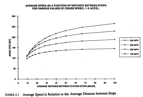
Wider stop spacing directly correlates with faster speed, as shown in the diagram from your stop spacing post four months ago.
The same is true for metro/heavy rail.
And for S-Bahn/RER/regional rail:
And high speed rail:
And busses (note in this diagram the x-axis is stops per mile not stop spacing, so it slopes down, but wider spacing (fewer stops per mile) still correlates with higher speed):
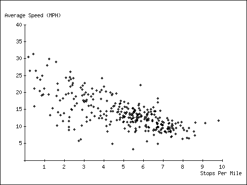
Wider stop spacing increases speed; this holds true across several modes at multiple scales, it is effectively a law of transit. Neither Toronto or its streetcars are special in this regard.
I can’t directly evaluate the TTC Service Standards Review since as you note it is not published, however I assume you are stating that it said stop average must be moved up to somewhere between 400m to 600m (not that it is at 400m now and needs to go to 600m). For the streetcars, with a current average stop spacing of 300m, going to 400m would reduce one quarter of stops, which is absolutely substantial and would make a difference. This is entirely possible. Your stop spacing math post said that with four stops over 900m (at 0/300/600/900) eliminating one would result in spacing of 300m and then 600m, but this is not at all a requirement. One can easily eliminate the stops at 300m and 600m and replace them with one at 450m. To suggest otherwise would be like TTC claiming double-blade switches can’t be used on a route that currently has single-blade installed – obviously double-blade switches can be used after you install them, and obviously stops can be both added and closed.
The impact of such a re-spacing is actually very minimal. To our hypothetical 900m or route, closing the two middle stops and putting in one at 450m would mean that for 35% of the route walking distance does not change, for 17% it gets SHORTER (people near the new stop), and for 48% it gets longer. But longer doesn’t mean burdensomely so. Someone 160m from the first stop used to walk 140m to the second stop, so now their walk increased by 20m, which is not a big deal. Only 26% percent of the route sees its distance to a stop grow by 100m or more, and the max increase is only 150m.
What does this mean in practical terms? An average person walks at 100m per minute, so the max added time to get to a streetcar is just 90 second. The average increase for all locations on the line is just 22 second, and the median is actually zero seconds, because again, some places see their access distance/time get shorter. What about the elderly? Their walking speed is about 50m per minute, so the longest time increase is 3 minutes, and the average is 45 seconds. Given that peak streetcar headway is 6 to 10 minutes, for almost all riders the effect is nil; they walk slightly farther but still arrive at a stop and wait a few minutes before the next car arrives.
But this evaluation still overstates the effect because ridership is not equal across all stops. Major stops (big destinations, intersections with other lines) contribute significantly to ridership. Assuming that these are the 0m and 900m stops in our hypothetical, then the number of people having that max 150m/90 second increase is far fewer than those who see their walk time change by zero. I can’t exactly evaluate this since I do not know of a source that gives ridership by stop (perhaps you know of one) but from another city I know that taking every other stop such that you include most of the busiest can contribute 60% of ridership, while the 10% least used stops can be only 2-4% of ridership.
But for riders who have a longer walk, even if there are not a lot of them, there is a penalty. What savings do they get in return? Again per the chart in your prior post, average speed for streetcars with 300m spacing is ~15kph, rising to 17kph at 400m. Toronto currently averages 12kph with 300m spacing, so we can assume 14kph from 400m spacing. At 12kph it takes 5 min to travel a kilometer, but at 14kph it takes ~4m17s. So for every kilometer on the journey a rider saves 43 sec. Recall from above that the average increased walk time with 450m spacing is just 22 sec, so any journey over ~500m (i.e. any journey of more than one stop) saves the rider time. The max increased walk for adults was 90 sec, so a very modest 2km journey breaks even.
The average surface trip length on the TTC network is 4.2km (I could not find a statistic specific to streetcars, perhaps you know of one) which would save 3 minutes. Recall that the max increase in walk time *for the elderly* was three minutes, so even in the worse case scenario total trip time is a wash. And this worst case effects just 1/6th of the route, with at least half the route (and more than half the riders) seeing their walk the same or shorter.
But even for riders in the worst case added walk, the time before boarding may not increase at all. If you walked one minute to a stop and waited 4 minutes for a car to arrive, but now you walk four minutes and wait one minute, then your journey does not get any longer. *But you still get the savings on your trip time once you board!* The biggest flaw in your reasoning is that the loss of convenience is only offset by the speed of those “already on board.” This would be true if you eliminated one single stop with no other changes. But if you uniformly increase spacing on a route then those riders which had a loss of accessibility (a minority) get the increased speed as well (along with everyone else).
Best practice everywhere in the world is to space local service (bus, streetcar) stops 400-500m apart. This is the proper middle ground that balances accessibility and trip speed. Raising spacing from below this affects a minority of riders a small amount, but provides an advantage of shorter trips to all riders. There can be no justification for keeping a larger benefit from all riders to avoid a smaller impact to a few riders.
LikeLike
Argument without specifics is just hot air, so to back up my analysis above here is a plan for 501 Queen. The legend:
Stop stays the same
(Stops removed, replaced by new stop)
[[Stop removed, no replacement]]
*New Stop*
This plan takes average spacing between Neville and Roncesvalles from 244m to 333m. The longest distance between stops goes from 417m to 451m. Only 10 out of 49 stops have a spacing longer than the existing 398m from Coxwell to Woodfield.
20 stops are removed, and 5 new stops added.
Every intersection with another line gets a stop, even when it leads to shorter than optimal spacing; i.e. the 203m from Leslie (meeting the 31) and Jones (meeting the 83).
Neville Park
(Silver Birch)
*Willow*
(Beech)
*Maclean*
(Glen Manor)
Winerva
(Bellefair)
*Waverly*
(Elmer)
Woodbrine
Lockwood
Kingston
Coxwell
Woodfield
Greenwood
Leslie
Jones
Brooklyn
[[Pape]]
Carlaw
(Logan)
(Empire)
*Jimmie Simpson Rec*
(Boulton)
Broadview
Carrol
River
[[Sumach]]
Sackville
Parliament
Ontario St
Sherbourne
Jarvis
Church
[[Victoria St]]
Younge
Bay
[[York]]
University
[[St Patrick]]
John
[[Soho]]
Spadina
Augusta
Brathurst
(Palmerston)
*Manning*
(Claremont)
Strachlan
Shaw
Ossington
[[Dovercout]]
Abell
[[Gladstone]]
Dufferin
Brock
[[O’Hara]]
Landsdowne
Sorauren
[[Triller]]
Roncesvalles
Glendale
Parkside
Colborne Lodge
Ellis
Windemere
South Queensway
Humber Loop
Steve: Aside from the fact you misspell and misname several streets, your reorganization at some locations moves stops from places with traffic signals to intersections that don’t have them. For obvious reasons, TTC prefers signalled locations, or at least those with crosswalks, for rider safety. Also, you might not have noticed that there no longer stops at Victoria or Bay, although the latter will likely be restored when the 501 goes back to Queen Street as this is a major intersection.
Very clear from my analyses of all routes is that there has been a general slowdown in speeds not just at (or because of transit stops), but between stops. Some of this is due to increased congestion, some to more cautious operating practices and padded schedules. The fetish for stop removal puts all of the effect on riders who will have longer walks to and from stops, while doing nothing to improve transit’s ability to move faster along roads.
LikeLike
My apologies for any misspellings.
For traffic signals, they could be moved to the locations of the streetcar stops as well. If not, what about people who cross the street at these intersections while out walking? What about a streetcar rider from who crosses at Maclean to stop at Beacher Cafe before catching a ride downtown at Glen Manor? If the intersection is not safe for people to cross it needs to be made so, for everyone. ‘It’s not safe for people to cross here’ cannot be an excuse for keeping streetcar stops in the wrong locations.
My list includes Bay as a stop both because of the intersection with route 19 and the spacing from Younge and University. It was included in your stop spacing analysis, but if would be a ‘new’ stop because it is currently closed it should still be there.
There may very well be a slowdown from issues other than spacing, but as shown at the start of my comment wider spacing always leads to faster speeds. Toronto’s streetcars have similar spacing to Melbourne, but are 3kph slower on average. But Melbourne’s are more closely spaced than Budapest/Warsaw and are 2-3kph slower than them. Fix both the other problems and also increase spacing to ~400m and you would bring the average up by ~5-6kph. This is 40-50% faster and would provide enormous benefit to every rider, including the many new riders who would be attracted by the shorter trips and the decreased headway (instead of 6-10 min between cars, you would have 4.5-7 min without spending any extra on operations). The effect of longer walks: a) applies only to a minority of riders b) is offset by those riders getting the same trip time and headway benefits as everyone else.
“The fetish for stop removal . . . doing nothing to improve transit’s ability to move faster along roads.”
This is patently false. As the numerous charts I showed make clear, increasing stop spacing always leads to faster speeds. There may be other things slowing down vehicles that can also be worked on, but reducing the number of stops will always increase the speed. Placing stops at an appropriate 400m spacing is not a fetish, it is best practice.
Steve: There is a basic issue with the premise of a speed reduction: it only occurs at specific locations. Riders whose trips don’t include these don’t get any benefit. I will give you credit for at least looking at the route as a whole rather than a handful of stops that are “low hanging fruit”.
Moving traffic signals is not a trivial change and has to take into account the function of the cross streets. As for protection for those who don’t cross at signals or crosswalks, that’s no excuse either way. Many riders however have mobility issues, take longer to cross and need added protection. You cannot rearrange things just to suit your stop consolidation project.
A 40-50% increase in travel speed that is simply not credible because streetcars are constrained by factors other than stop service times. Stops might be further apart in other systems, but I suspect you will also find very different road configurations including signal placement/spacing and operating speed between stops. Streetcars on Queen are routinely limited by the prevailing traffic speed in The Beach, and on Queen West. An interesting point of comparison is the 507 Long Branch route which has a higher scheduled speed of 30-40% higher than 501 Queen (May 2026 schedules), in spite of an average stop spacing just over 300m. It’s the ambient conditions, not just the stops, that make the difference.
As for rapid transit speeds, this is a very different situation where stop spacing directly affects average travel times because the only other variable factors would be added dwell times at busy stops, and the dynamics of operations at terminals and junctions that could be affected by very close headways and poor scheduling. We see this in Toronto where there are backlogs of trains approaching terminals in peak periods.
You talk of “best practice” being 400-500m. There is a difference between using this as an average where actual spacing could be wider, and using 400m as a target maximum. The actual practical spacing depends on the local geography. There are easy pickings at a few stops, but not on a widespread basis.
LikeLike
The addiction for stop removals is funny. 500m minimum stop distances?
How are you gonna spin that to commuters? “Sorry, you gotta walk twice as far to the bus… but it’ll get there faster!” Meanwhile now they’re more likely to miss their bus/streetcar. Amazing.
LikeLike
You are correct that fixing problem areas causing unnecessary slowing only helps those would only help passing through the problem area. With stop spacing, however, that is not the issue. Every stop causes a vehicle to slow down and come to a halt and thus reduces speed. While a problem area only helps a few riders, optimizing stop spacing across a whole route helps every single rider. My 501 plan removes a stop every 2-4 stops everywhere except the already well-spaced sections Woodbrine-Brooklyn and Ronscevalles-Humber Loop (note, I should have marked Ontario as a stop to close). Everyone who rides more than the shortest trip gets a benefit.
Steve: You seem to have missed that I also commended you for making a whole route review, even though I disagree with it.
Many non riders have the same issues. Many riders cross at intersections that are not stop for various reasons. Either the intersections are safe for these people and can be safe for riders accessing a stop, or the intersections are not safe and should be made so.
Steve: Your proposed relocation of traffic signals does not fix this issue, merely shuffles the locations where there is crossing protection.
I should be clear the 40-50% increase assumes both increasing stop spacing and affecting whatever issues cause Toronto to be slower than Montreal. Stop spacing alone should see a 15-25% increase.
Steve: You did not make that clear previously. A 25% increase is not credible given the effects of traffic congestion and signal timings.
The chart you provided in the stop spacing post and the one I provided above on Washington DC busses show that increasing stop spacing increases speed for surface transit as well as rapid transit. You cannot escape the mathematical fact that every time you stop you are giving up time compared to continuing to move, no matter what other factors cause you to move slower between the stops.
Steve: Note that while I included that chart (from the Melbourne study), I do not agree that there is a direct causal link without considering other factors on a route in whatever city is studied.
The plan I provided for 501 Queen has a minimum stop distance of 203m (Leslie to Jones) / 205m (Jarvis to Church). Average stop distance is 333m Neville-Ronscevalles, and the longest stop distance created by stop removal is 451m (Ossington to Abell – there are longer existing stops out at the end near Humber Loop). None of this approaches 500m as a minimum, or even a maximum, and the overall average is right within the TTC’s stated target range of 300-400m.
If your walk to the stop is 10m right now, you can make someone walk *TEN TIMES AS FAR* . . . and it will only be 100m and take them one minute. I analyzed the route between Neville and Broadview, where my plan closes 9 of 22 stops, adding 4 in exchange. Of the 5.5km of route, 70% sees no change to walking distance or a DECREASE. Of the 30% that sees a longer walk, only 600m of length, 11% sees an increase of more than 100m/1 minute walk. The longest increase is just 190m (less than 2 minutes) and only for a single 20m stretch at Logan station. The average walking change factoring some increases and some decreases is a whopping 19.32m, or some 12 seconds of walking time. This will deter no-one from changing their commute, the vast number of riders will never notice the change, including the majority of those who do walk farther. EVERYONE will see the benefit of the faster trip times however. Assuming they are a downtown commuter, riders on this stretch are making trips of 3-8km, so if speed goes from 12kph to 14kph they are saving 2.5 to 6 minutes each way, every day.
I think that my plan for 501 Queen shows that there ARE stops that can be closed on a widespread basis. I identified 20 of them without eliminating any stop that serves as a transfer, while keeping average spacing right within TTCs 300-400 range, and with no stop more than 8% farther than the already acceptable 417m between Beech and Glen Manor (and only 6 of those). This was not a particularly aggressive consolidation; I already mentioned that Ontario could be closed while still leaving a reasonable spacing, Greenwood provides a connection to the 31 so Leslie is not required, etc.
LikeLike
No stop at Pape? No stop at Logan? No stop at Dovercourt?
These are all major cross streets.
There are usually reasons for stops being where they are. Schools, churches, dense residential, etc.
You might want to keep in mind that the stops don’t just serve Queen Street.
This means two things:
1. You have to look beyond the simple “paper clip maximization” of stop spacing on Queen itself. What’s in the neighbourhood?
2. People may already be walking several hundred metres along a side street just to get to Queen.
In my case, I am about 470 m from Lake Shore Blvd. There’s a bus stop right there. Yay! But if I want to catch the streetcar (or the replacement bus — it does not stop at the “bus” stop), I can either hoof it 230 metres “upstream”, including two signalized crossings, or I can hoof it 300 metres in the “downstream” direction. Whether or not I will just miss a streetcar is up to chance. But it’s quite frustrating to see one go by as you are only a few metres from the stop.
By the way, this is because they….removed a stop! Which is the one I used, that added less than 100m to my 470m necessary walk.
Steve: Our reader’s comment and proposal show the folly of saying “of course it can be done” while leaving out vital details such as the distinction between major and minor streets.
LikeLike
And it’s not like minor streets can’t be major stops. The suggestion to eliminate the 501 stop at Triller looks good on paper because it’s close to Roncesvalles. Except there’s a 20-storey apartment building 100 metres up Triller, the most direct density along that part of the route. It’s probably a more useful stop than Roncesvalles (there’s not much transfer traffic between 501 and 504)… if not for the fact Roncesvalles is used for crew changes.
LikeLike
Late comment, but wanted to address some concerns that were raised.
The 72C bus moves off of Pape to run on Carlaw south of Riverdale and is still on Carlaw at Queen. A quick view on Google Maps shows that Carlaw is wider than Pape and lined by large multi-story buildings, while Pape has small single family homes. By definition, this makes Carlaw the major cross street in this location. The situation is different to the north, which is why the Bloor-Danforth Subway station is on Pape. Also, Pape to Carlaw is 153m, which means someone on Pape trying to get to the streetcar would have to walk . . . 1 minute and 32 seconds. With a peak scheduled headway of 8.5 minutes, that means the average rider has a 4m15s wait after a walk to the stop on Pape. Making them walk to Carlaw in the same situation just means their wait becomes 2m43s.
Once again, at Queen, Logan is lined with single family homes, it is not a major corridor in this location. Logan is also 190m from the entrance to Jimmy Simpson Rec; 1m54s added walk.
As before, Dovercourt has no bus and is entirely residential at Queen. It appears that it widens and becomes more significant north of Dufferin, gaining the 161 bus north of Bloor. But it is not a “major” cross street at Queen, Ossington is without a doubt the major cross street in this area. And again, 156m from Dovercourt to Abell, 1m34s added walk.
Steve jumps in: I think you mean Dundas, not Dufferin.
I didn’t look at stops on Lake Shore so can’t stop specifics. But pointing out that people not on Queen have to walk farther than people on Queen is both a tautology and a canard. Studies clearly show that people will walk about 400m to a local transit stop. Placing stops about 400m apart means only a 200m walk along the street, and gains you everyone living at least within 200m on a cross street, and up to 400m on the cross streets that have stop. Unless you are arguing for a stop at each and every cross street, then you are always giving away some riders at the ends of cross streets that are not stops. I have seen no one arguing against stop consolidation argue that stops need to be added (for instance between Beech and Glen Manor or Coxwell and Woodfield). If you are 470m from Lake Shore, then you are already at the distance where most people won’t use that transit, even if there was a stop right at your street.
Steve: I and at least some others have not argued against the 400m maximum spacing which is the TTC’s standard. The challenge is that they are contemplating increasing this to 500m or 600m. There will always be cases where in major areas like the core some stops are spaced more closely, for example at Yonge and Bay both of which are major streets. Some stops have already been dropped and I am amused when advocates of wider spacing cite them as if they still exist. This does not help with credibility.
As for wandering routes, the Pape bus and the Harbord car before it have always jogged from Pape to Carlaw because of the railway line (originally a crossing) at Gerrard. The Dovercourt streetcar ran up Ossington to College, then jogged west to Dovercourt where the street was wider. The track on Ossington still remains.
“Triller”
Transfer stops at ALWAYS more useful than non-transfer stops. This is a basic fact of transit planning. I will say again that TTCs lack of detailed ridership statistics by stop hinders us here. I have seen this data for San Francisco, and it becomes immediately clear how little used minor stops are compared to major stops. I would be shocked if Triller received more ridership than Roncesvalles, even with that one tall apartment building. However, if we had actual stop boarding data, I could reassess and see if the closures/additions I propose are best optimized to actual ridership patterns.
The apartment building on Triller is 100m/1m walk from a stop today. If going to Roncesvalles it would be 300m/3m. You will loose exactly zero transit riders because they have to make a 3m walk to a stop. Again, real world data shows easily shows that the busiest 7 our of 10 stops (the approximate number that my plan leaves unchanged) carries ~93% of your ridership. Asking 7% of riders to walk an extra 2 minutes so everyone (including the people walking farther!) can save an average of 3 minutes is an absolute win-win. In most cases the extra walk doesn’t even lengthen the trip (those people still arrive at a stop then have to wait for a streetcar). And once again, you are not even asking all of those 7% to walk farther with my plan. Some of them will end up walking shorter because the new stop replacing their old stop will be closer!
LikeLike
I brought up moving signals only as a possibility if TTC wants stops at signals for some non-safety reason. All intersections are used by pedestrians, both riders and non-riders, all of the time. They all need to be safe. If a signal makes an intersection safe then unsafe intersections need signals added.
Increasing average streetcar spacing by 100m increases average speed by ~2.5kph. 501 Queen has an average spacing of 300m and an average speed of 11 kph. Change this to 400m and the average speed becomes 13.5 kph. Between Neville and Roncesvalles average spacing is 245m, assume average speed is still 11kph. Under my plan it would become 335m with an average speed of 13.25kph. 13.5 is 22% greater than 11, and 13.25 is 20% greater. It doesn’t matter if you deem it credible or not, the facts are what they are.
Whether you agree with the Melbourne chart or not, the factual information that it presents, along with the other charts I showed, cannot be discounted. Wider stop spacing results in faster speed. Period. All places, all modes of travel. This is true between cities (Budapest, Warsaw and Prague and wider spacing than Melbourne, and all have faster average speed) and within cities (the slowest street car route in Amsterdam, Budapest and Prague are all one of the 2-3 most closely spaced, the faster route in each of those three cities is either the most or second most widely spaced). This tend is immediately obvious and undeniable. If the issue were some “other factor” in a city then all of a given city’s routes would have the same speed, rather than being clearly distributed by stop spacing.
Yes, Toronto has something slowing its street cars down besides stop spacing, because it is slower than Melbourne with similarly placed stops. But fixing all of that and reaching average Melbourne speeds does not mean prudent stop consolidation would not increase speeds further, because average European speeds with wider stop spacing are faster than Melbourne.
LikeLike