
This article should be read in conjunction with Headway Quality Management: A Proposal for which this is a response to some questions and suggestions in the comments, and adjustments of my own in the interim. Specific routes discussed here are:
- 52 and 952 Lawrence West local and express services
- 504 King streetcar service (December 2020 before the diversions now in place for construction work)
Changes in format include:
- Better spacing of the columns in the headway distribution charts for clarity,
- Separation of the AM and PM peak periods for an express service that only operates for a few hours of each period, and
- Changes in the layout and colour scheme of the headway distribution charts to emphasize the portion of service that lies within the target band of headways.
Both routes reviewed here show the problems of branching services and wide differences in scheduled service. A service may look “good” where all of it branches overlap, but be much less reliable on the unique segments. Vehicles may or may not be “on time”, but service riders experience does not accord with the TTC’s claims of high reliability. Indeed, there are cases where schedules contain built-in gaps that exist as part of blending services and managing transitions between service periods. They “work” for the schedule, but not for the rider.
One can argue that my proposed methodology should be adjusted with narrower or wider target bands. That’s easy to do, but the important issue here is to measure service as riders actually experience it, looking at various points on routes and all times of the day. The TTC’s scheme of looking only at terminals and averaging results over all time periods buries variations in service quality that riders know all too well.
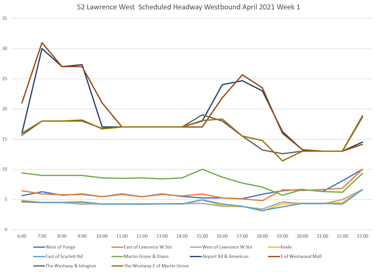
52 Lawrence Weekday Service
The 52 Lawrence West bus is a complex route with overlapping services. Most services originate from Lawrence Station at Yonge, but with different western routes and termini. The 52G to Martin Grove and The Westway operates from Lawrence West Station.
- 52A to Airport via Dixon Road
- 52B to Westwood Mall via Dixon and Airport Roads
- 52D to McNaughton via Dixon and Airport Roads
- 52G to Martin Grove via The Westway
- 52F to Royal York
With many overlapping branches, the schedule is not always blended to begin with causing uneven headways to be built into the service plan. For the purpose of this analysis, the target headway is assumed to be the average over each hour with a three minute target band calculated on either side.
When the combined service frequency is short, a small variation in individual headways remains within the band. Given what we have already seen looking at other routes, it is probably hard for riders to tell the difference between intentional and unintentional headway variations at this level of service.

The scheduled westbound headways are quite different depending on which portion of the route one considers. In the charts below, note that the dark gray and taupe lines are for service on The Westway which runs independently of the Dixon Road branches west of Scarlett Road. Scheduled service west of the airport (the dark blue and brown lines highest on the chart) is less frequent during peak periods than off peak.
The average headways during the first week of April 2021 are similar to the scheduled values.
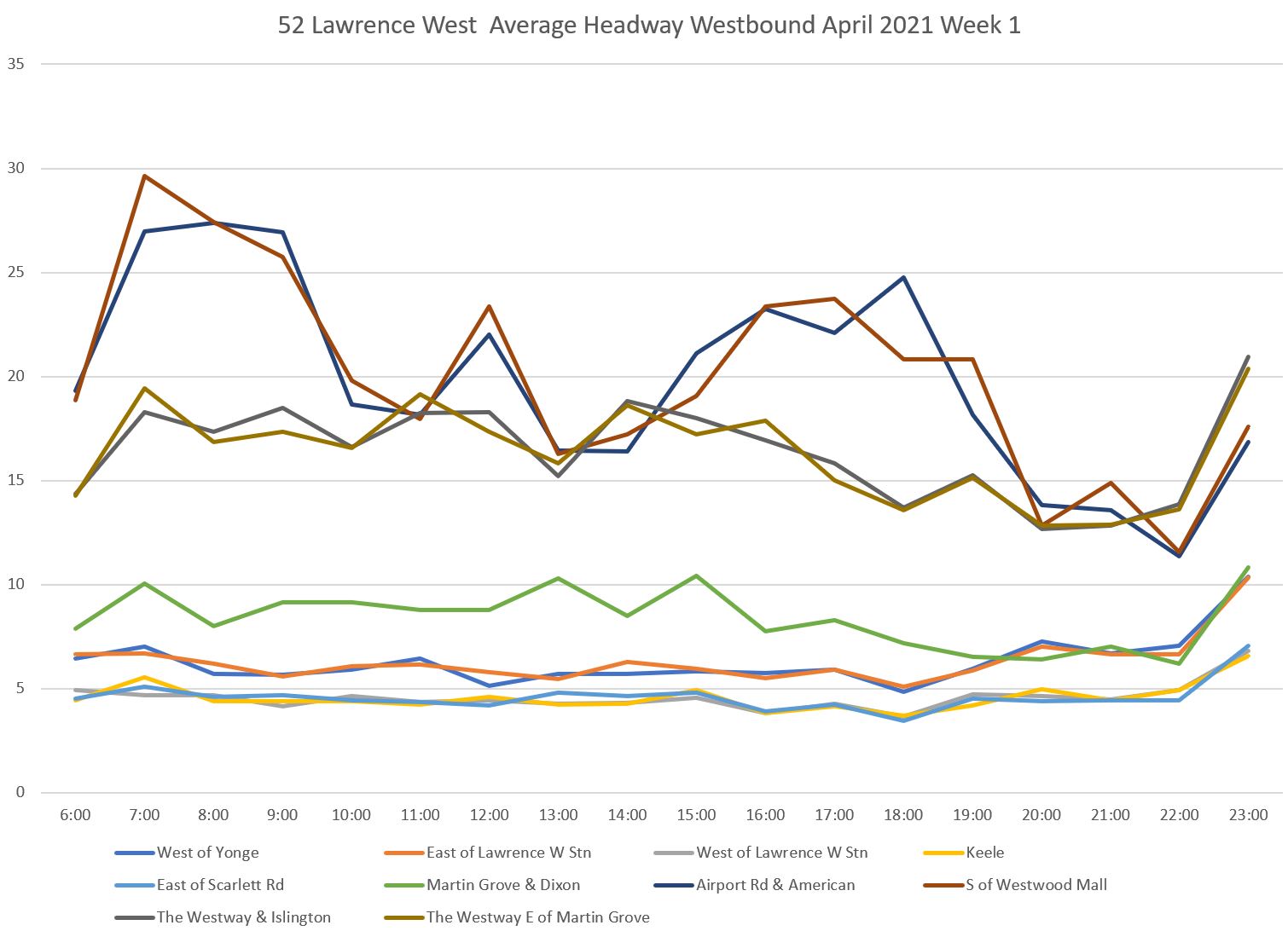
As in the previous analyses, the issue is not that the averages look “ok” but how much the headways vary from bus to bus. Note that in considering all buses equal for the purpose of this exercise, there is no measure of the service from the point of view of a rider who must board a specific branch (for example the Westway service, or a bus headed beyond the airport). That is a separate refinement for the future.
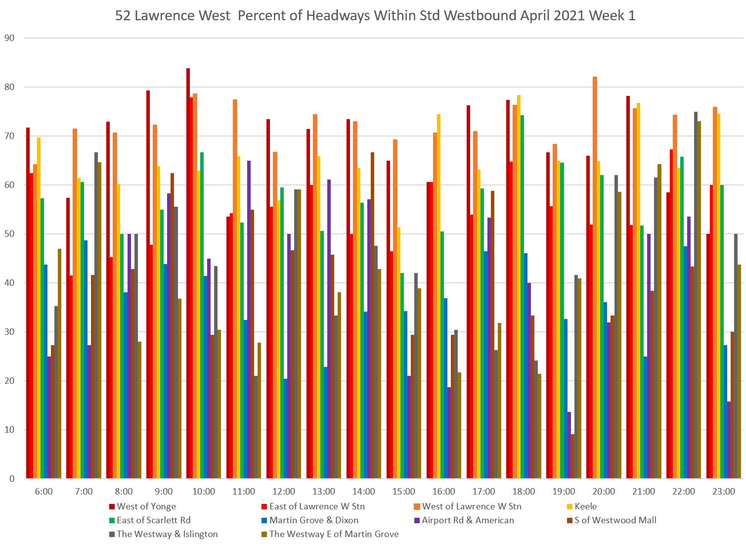
As on other routes, the percentage of service within the target band is high leaving the terminal, but deteriorate the further out one goes. Because the service is very frequent, the band for “under target” is quite narrow (generally less than two minutes), and so the proportion within the target band is good until the route splits. At that point, the benefit of having many overlapped services disappears, and less than half of the service operates within the target band of headways.
As I mentioned in the previous article, charts like the one above are rather “busy” and take some getting used to for interpretation. An alternate format for the same data is to organize it by bands, as done in that article, so that the values look like this:
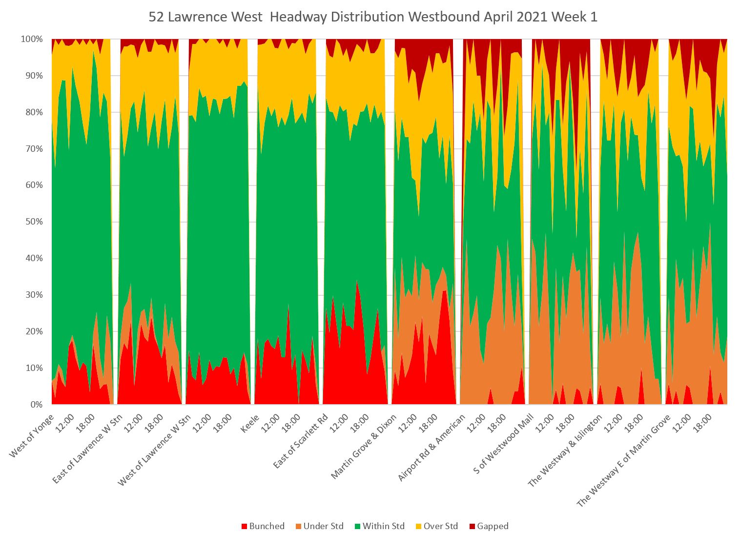
The version above is the one used in the first article with the target green band in the middle, short headways on the bottom, and long headways on top. A reader suggested reordering the bands so that green was on the bottom and the combined space occupied short and long headways was more evident. The result is below (I have changed the colour scheme for clarity).
Note that the two segments on the right hand side of the chart are for the service on The Westway measured at Islington and at Martin Grove.
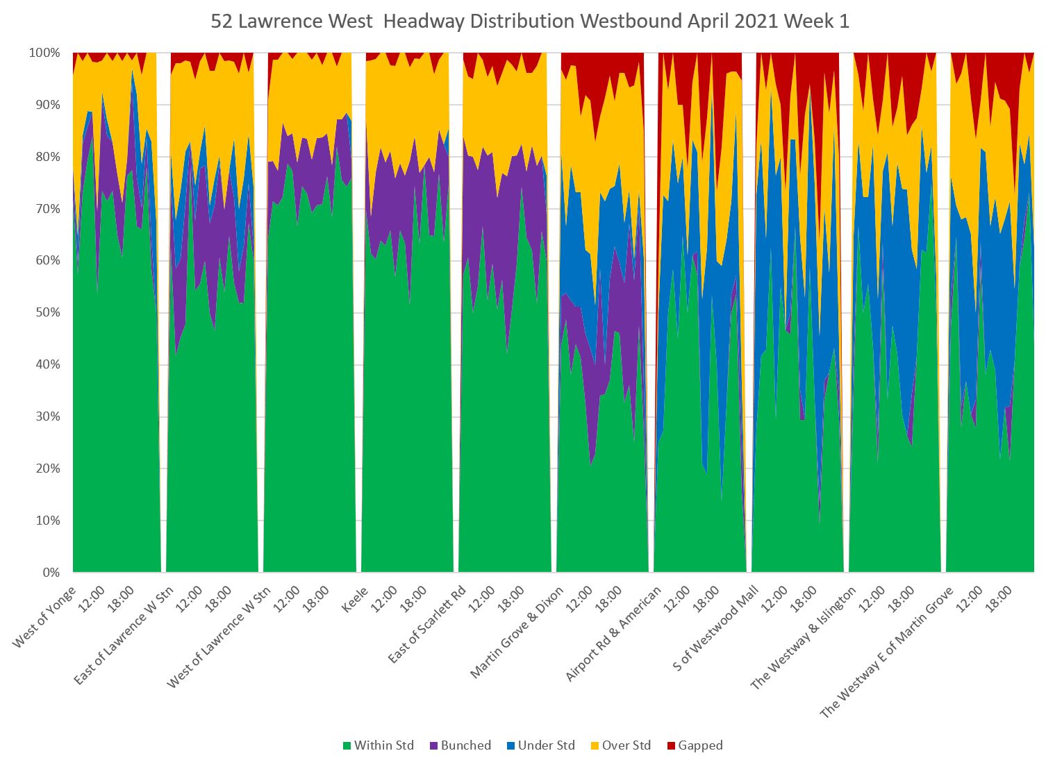
In this version the decline in on-target performance across the route is evident.
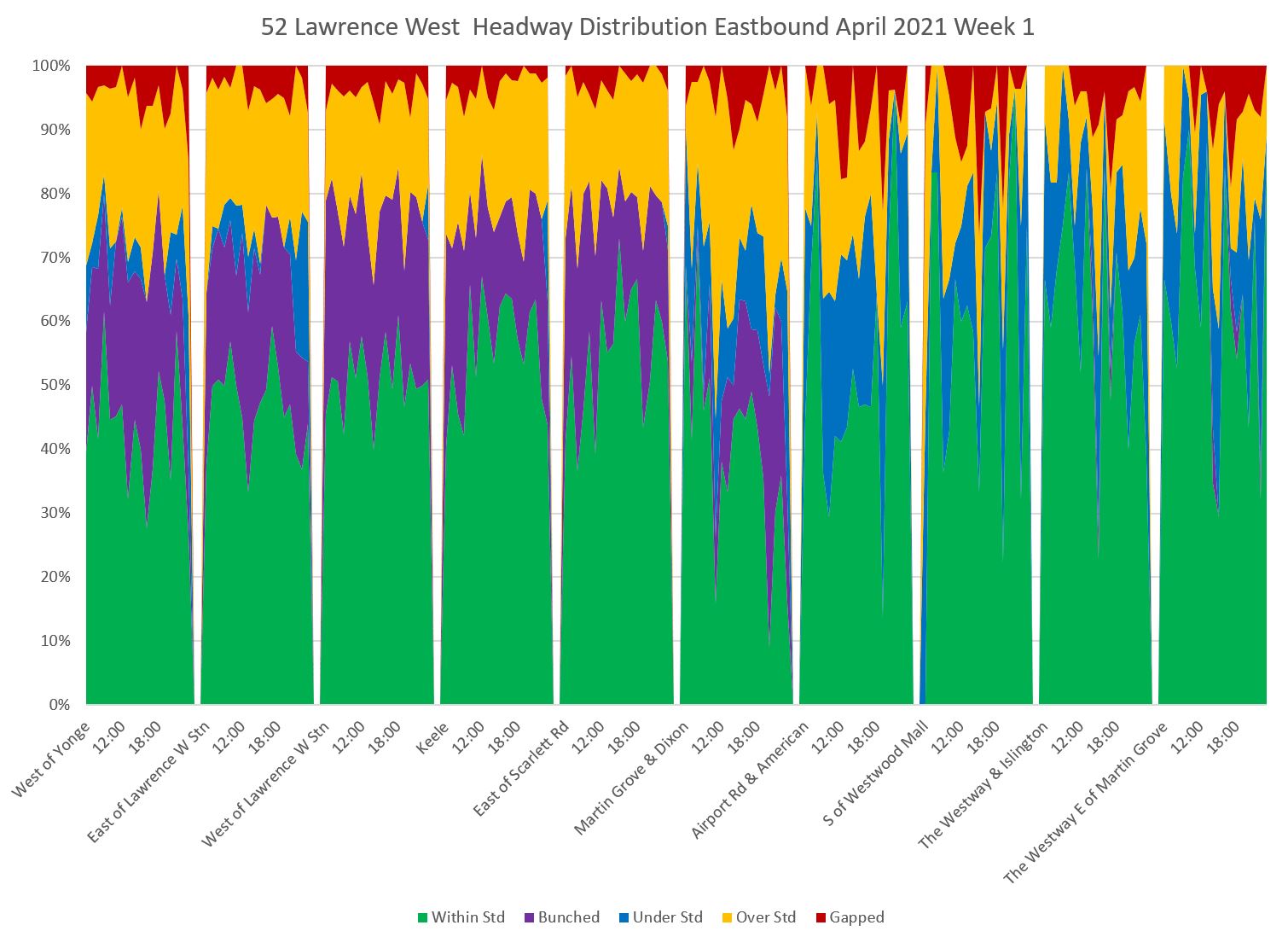
The situation eastbound is similar, although there is a better on-target performance on the outer ends of the two branches because there is some recovery of spacing at the terminals. However, once the branches start to merge, only about half of the service lies within the target range.
Saturday service is somewhat better but still far from ideal. Note that through the afternoon and evening, much service does not even leave Lawrence Station on a regular spacing, and there is severe bunching and gapping on the Westway branch.
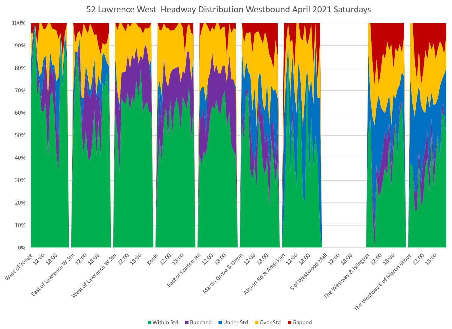
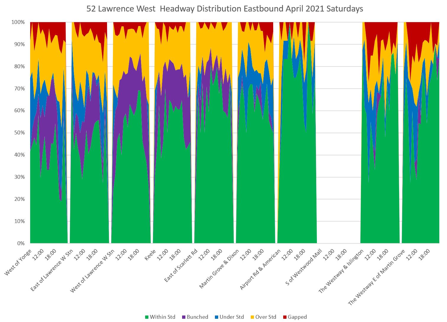
Eastbound on Saturdays, there is the familiar pattern of a high proportion within the target band at the origin of trips (reading right to left), but service deteriorates as buses move east to Yonge.
I will spare readers the detailed headway charts, but they are not pretty. Headways are scattered over a wide range even for terminal departures. There is no possible way that these could be considered to be “on time” no matter how rosy the TTC’s official stats might be.
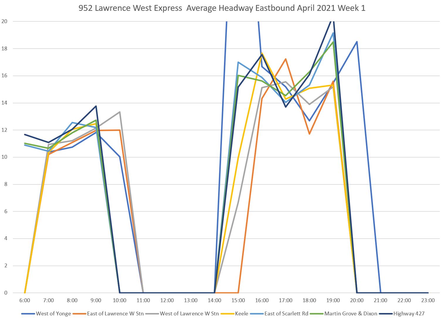
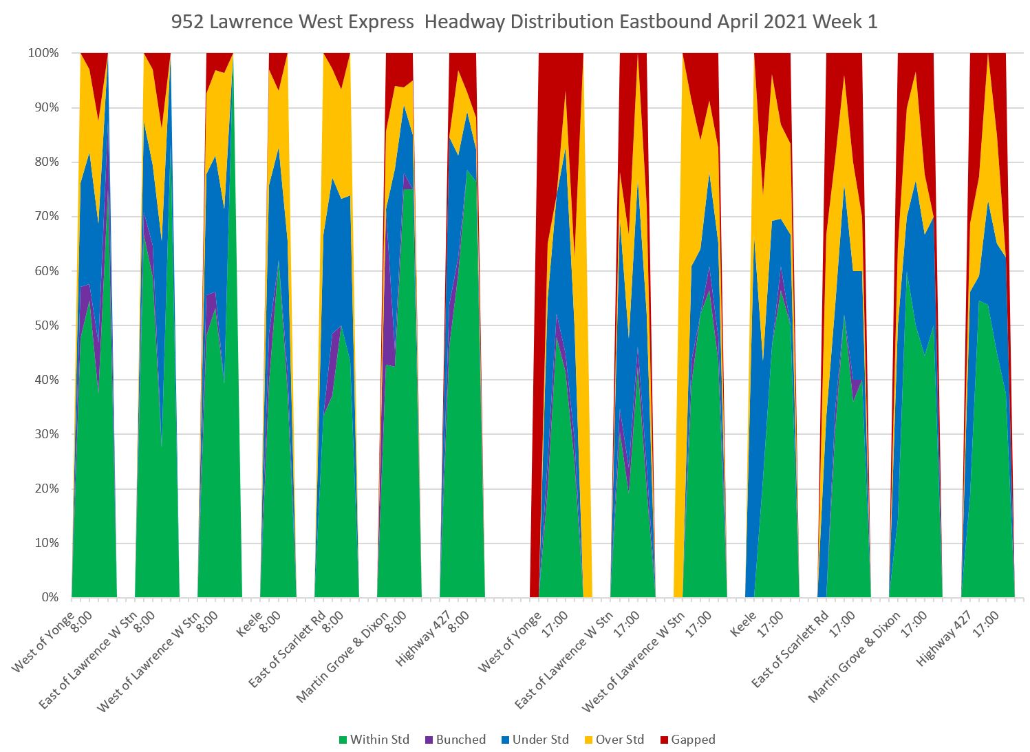
952 Lawrence West Express
The express service on Lawrence operates only during peak periods between Lawrence Station and Pearson Airport.
Here is the westbound scheduled service level:
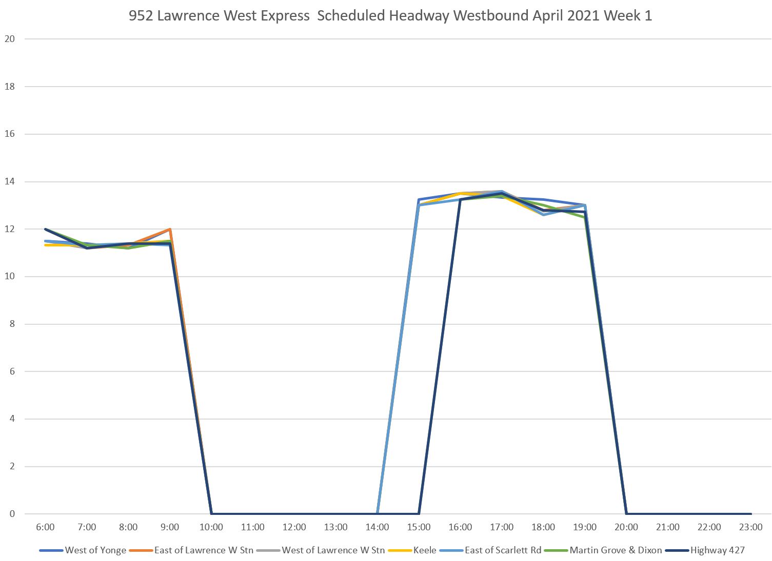
The actual service in week 1 of April 2021 is somewhat different from the schedule especially in the PM peak. Among the effects here are that some buses show up in later hours than actually have scheduled service.
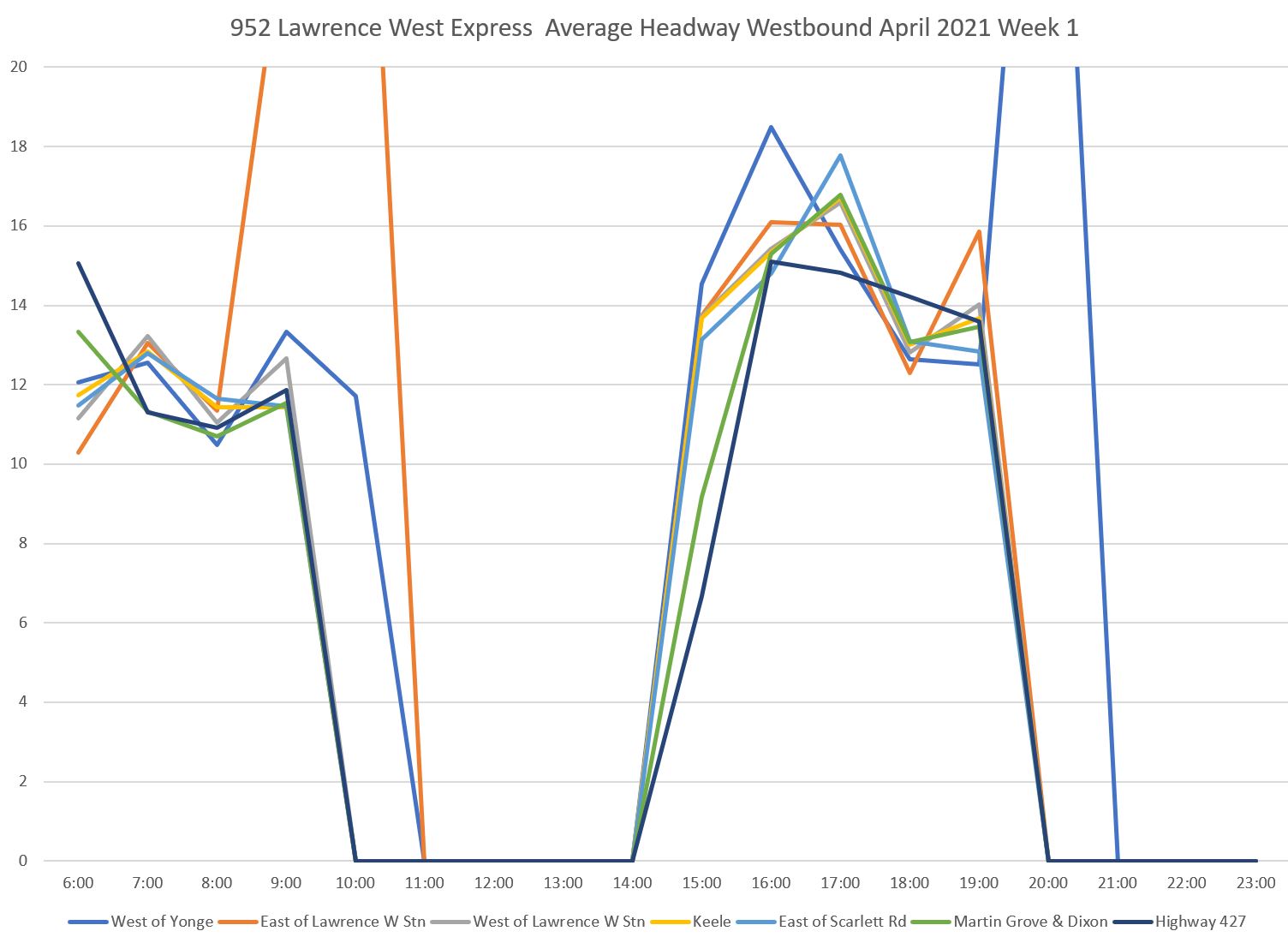
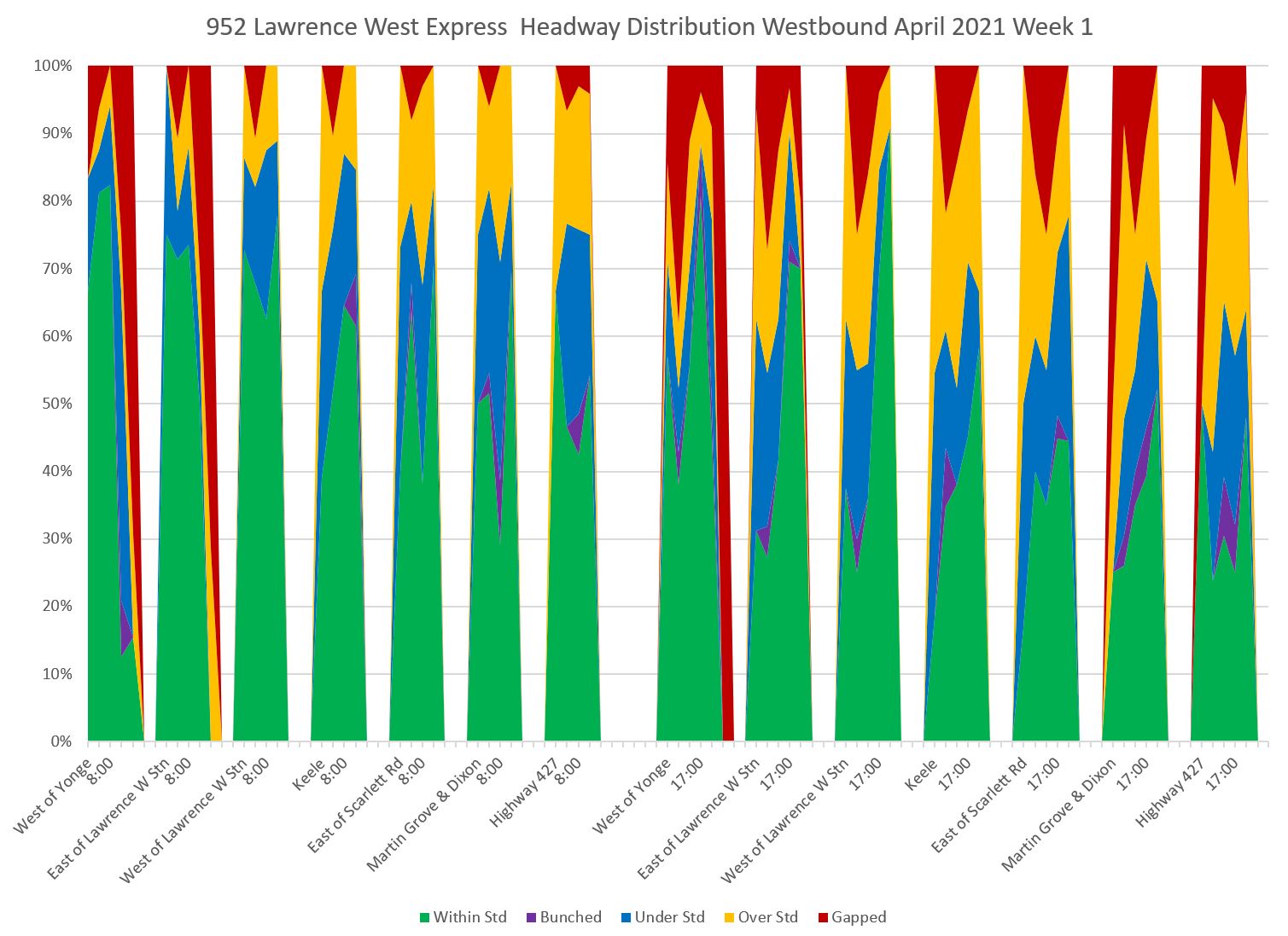
The headway distribution chart show that much of the service operates at headways outside of a target six minute band particularly in the PM peak. Note that unlike earlier charts with all-day data, the two peaks have been separated here for clarity.
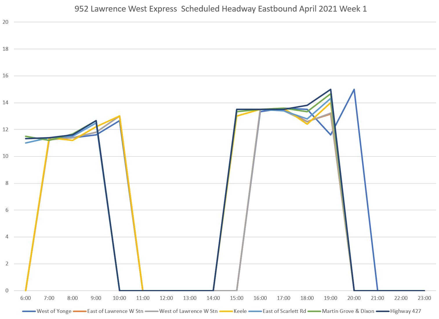
The eastbound service shows a similar pattern.
I will turn to an analysis of travel times and congestion effects on routes 52 and 952 in a separate article.
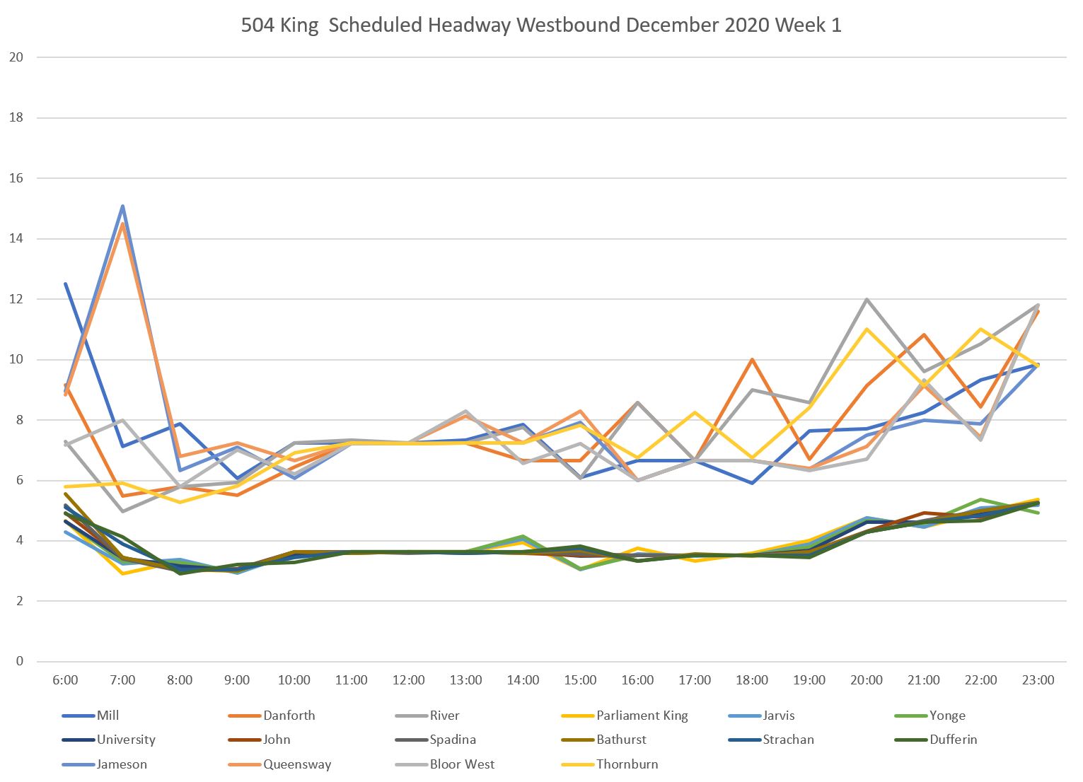
504 King Weekdays
The data shown here are from December 2020 before the closure of the King-Queen-Queensway-Roncesvalles intersection for construction in January.
As it then operated, the 504 King route consisted of two services overlapping between Dufferin and Sumach Streets:
- 504A from Dundas West Station to Distillery Loop
- 504B from Dufferin Loop to Broadview Station Loop
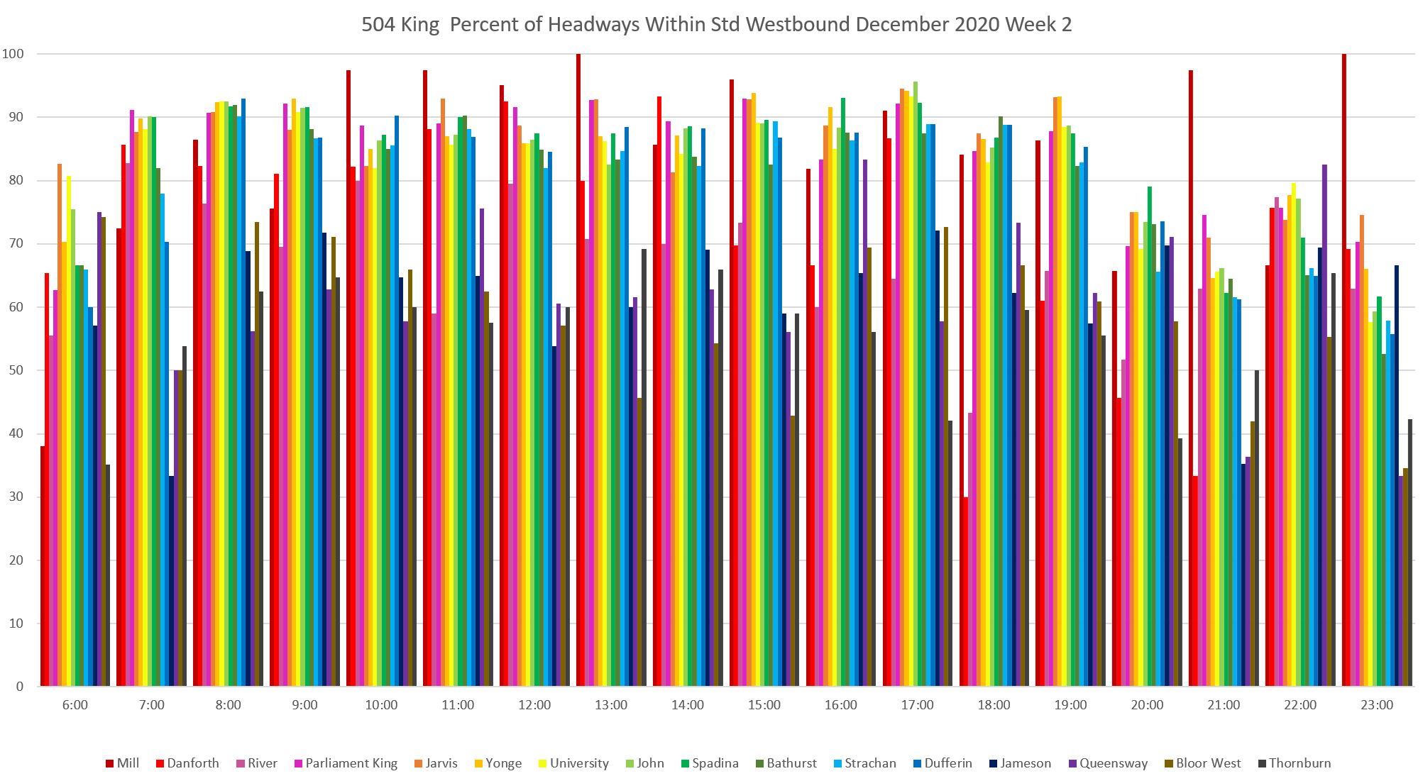
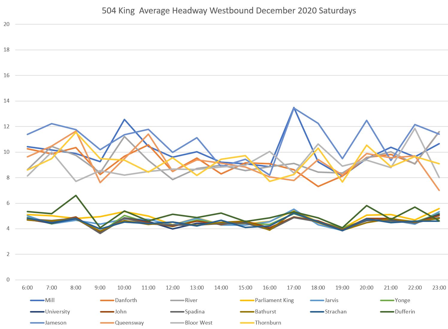
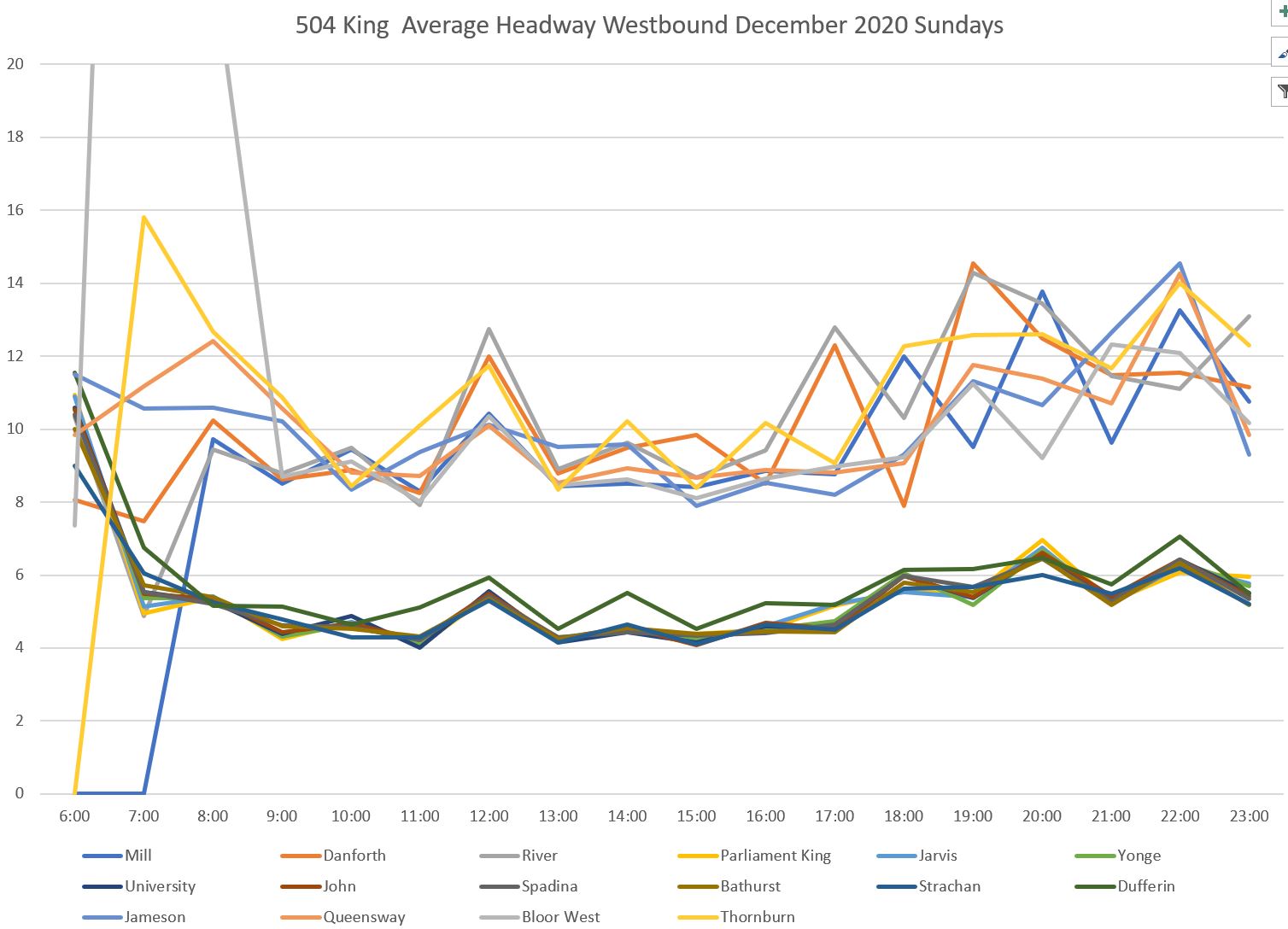
On the central section of the route, the scheduled headway is about 4 minutes for much of the day. This makes the six-minute “target” band reach down close to zero. Some service might operate very closely spaced, but this is often within the acceptable range for this scheme. Putting it another way, the difference between “frequent” and “bunched” service is small and almost unavoidable with short, random delays.
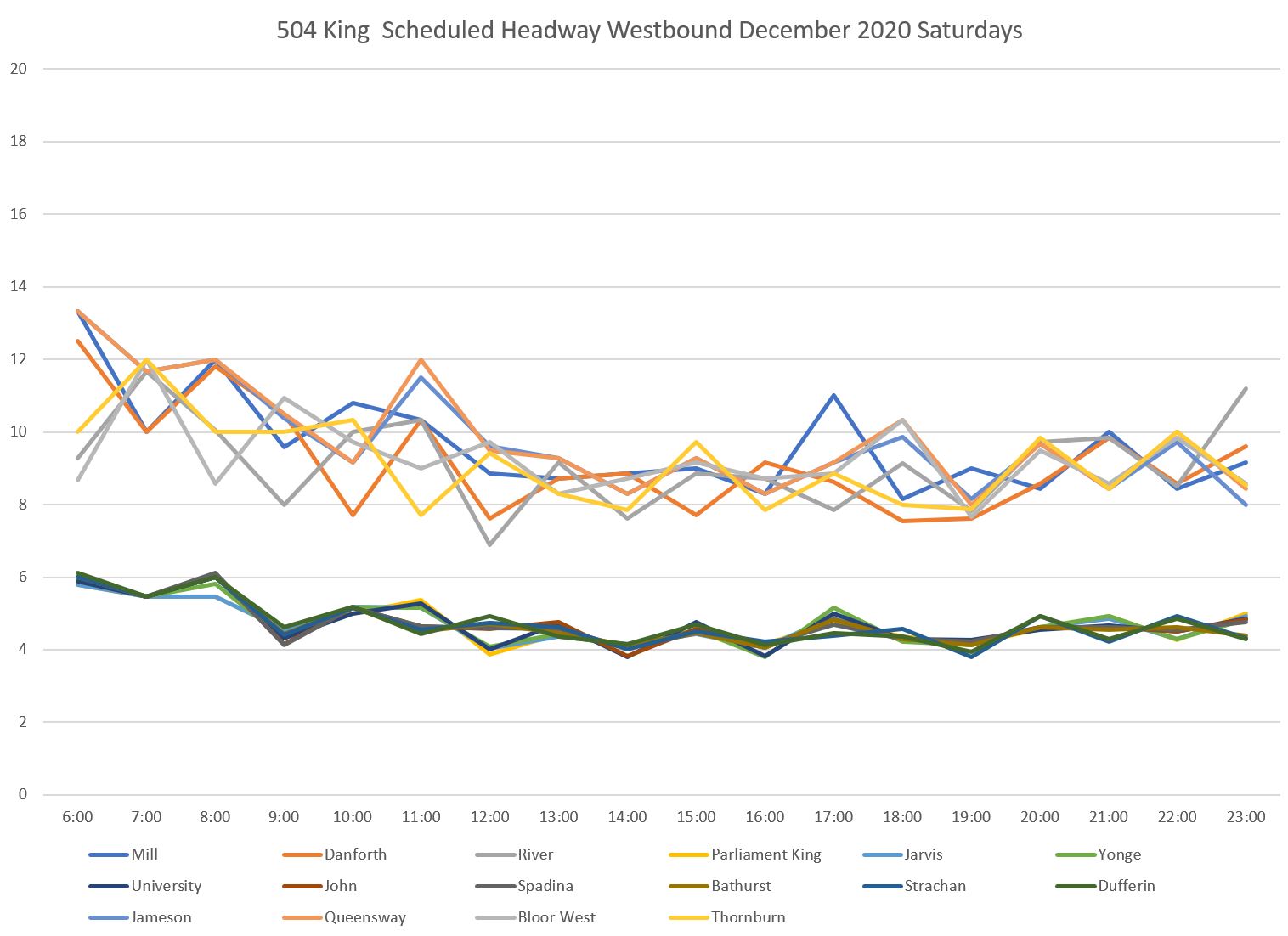
Here is the weekday scheduled service. The values are erratic at certain locations due to transitions between schedule periods. These affect the outer ends of the line more because there are scheduled gaps at terminals.
In the 7-8 am hour an infrequent service originating in the east is not supplemented until additional cars come out of Roncesvalles Carhouse northbound to Dundas West Station. The spike in 7-8 am headways at Jameson and at Queensway westbound is not present in the values at Bloor.
This is an example of the challenges in devising a one-size-fits-all metric. A related problem is that when there are scheduled gaps in service, the cars might all be “on time”, but not for the best convenience of riders.
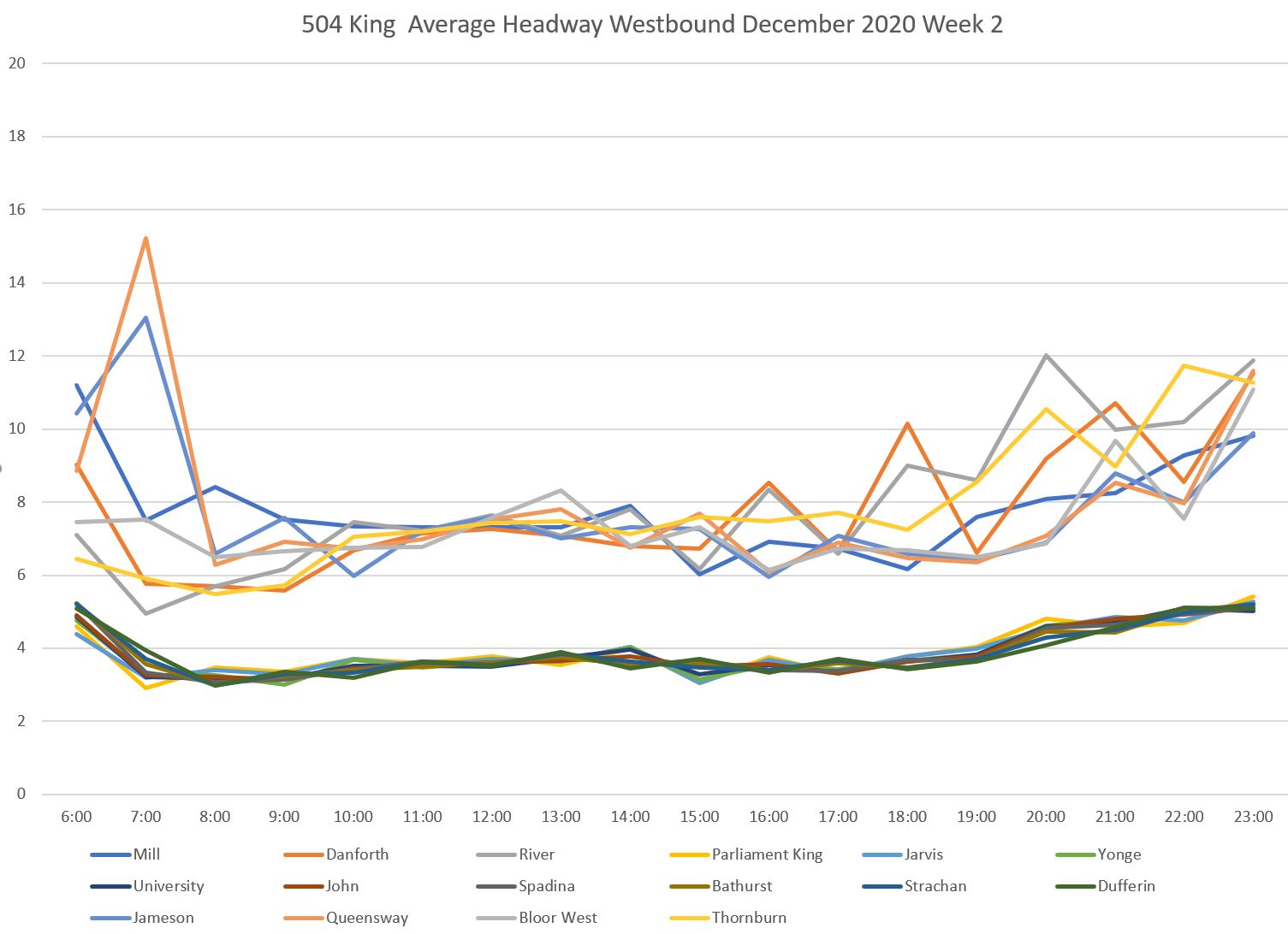
[In this article, I have included only the westbound scheduled and average headway charts as the eastbound versions are similar. The full chart sets are linked in PDFs at the end.]
The average headway values follow the scheduled ones fairly closely.
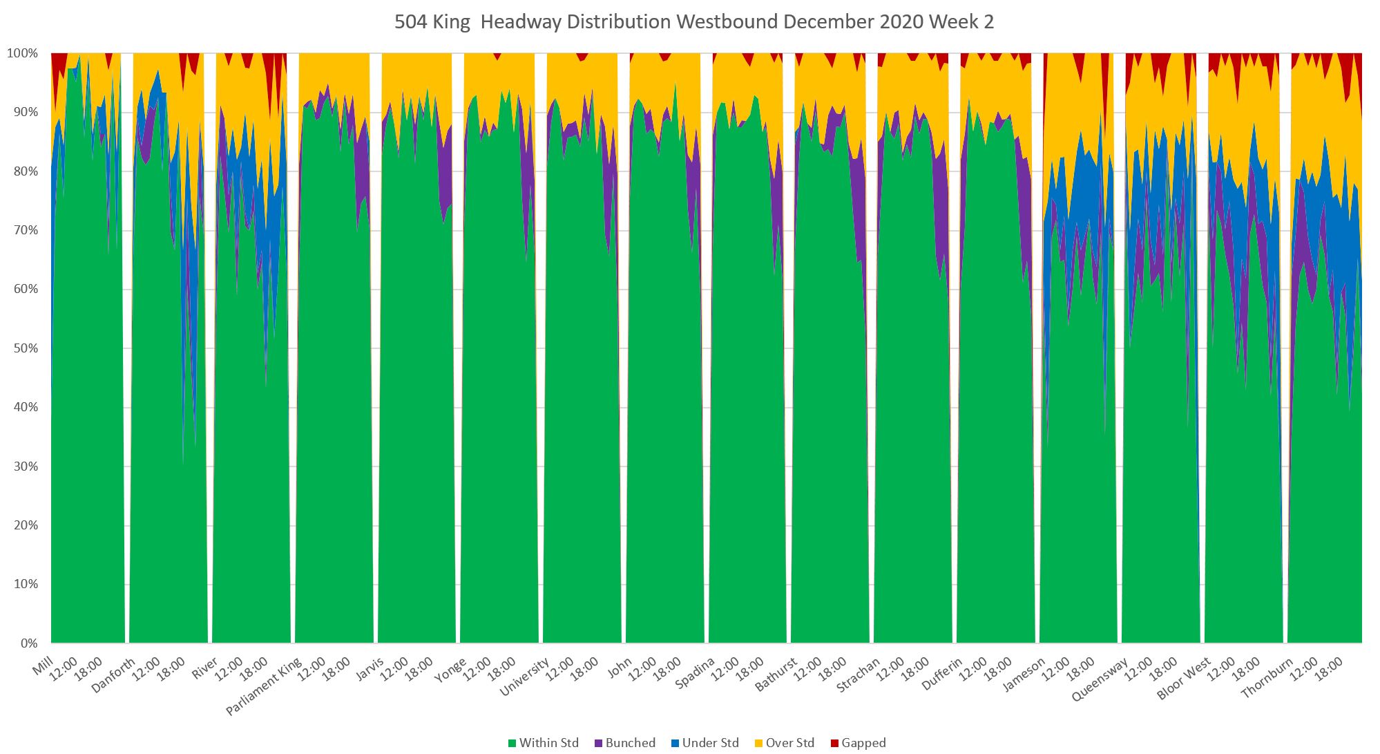
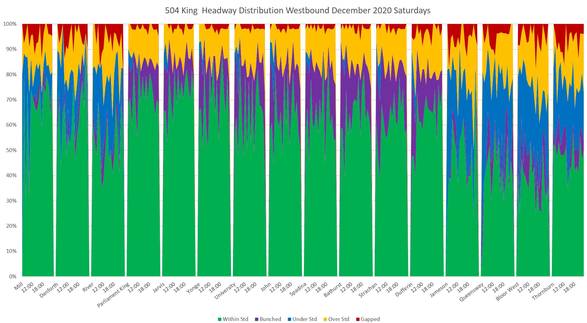
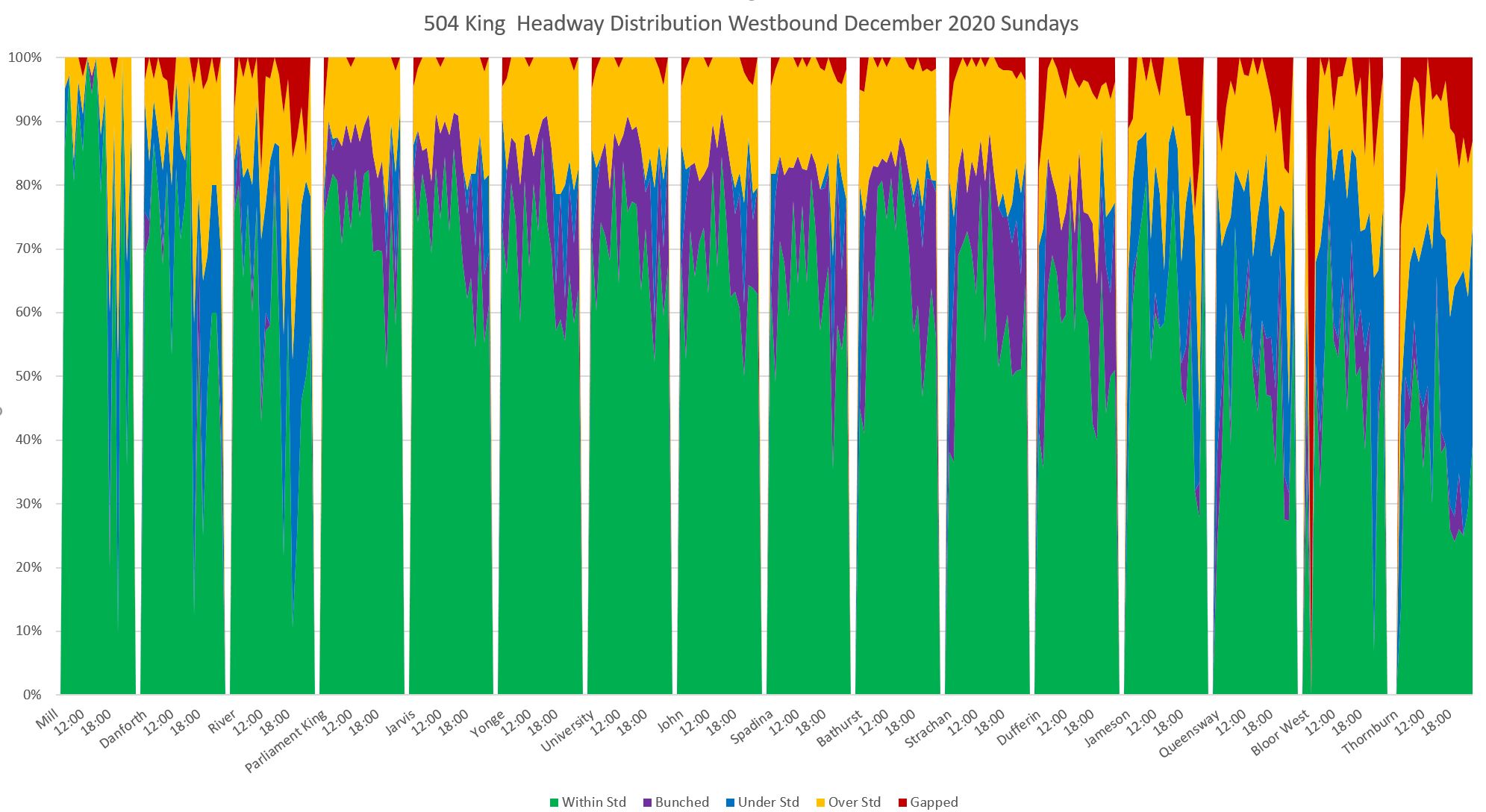
The detailed breakdown of headways shows a high value for the central part of the route where the “under target” band is very thin or non-existent. On the outer ends of the route, however, a much lower proportion of service falls within the target band because short headways count as bunching, not as normal service.
Here are the data presented to show the proportion of service that is within target and how this evolves over the route.
The leftmost three blocks correspond to the eastern branches (504A: Mill; 504B: Danforth and River) while the rightmost four blocks correspond to the western branches (504A: Jameson, Queensway, and Bloor West; 504B: Thornburn, north of Dufferin Loop).
Service in these areas shows more “bunched” and “under standard” values because the wider scheduled headways are high enough that these bands are not crowded out. In the central section, the “bunched” group appears in the evenings when even the combined 504A/B services are on a wider headway.
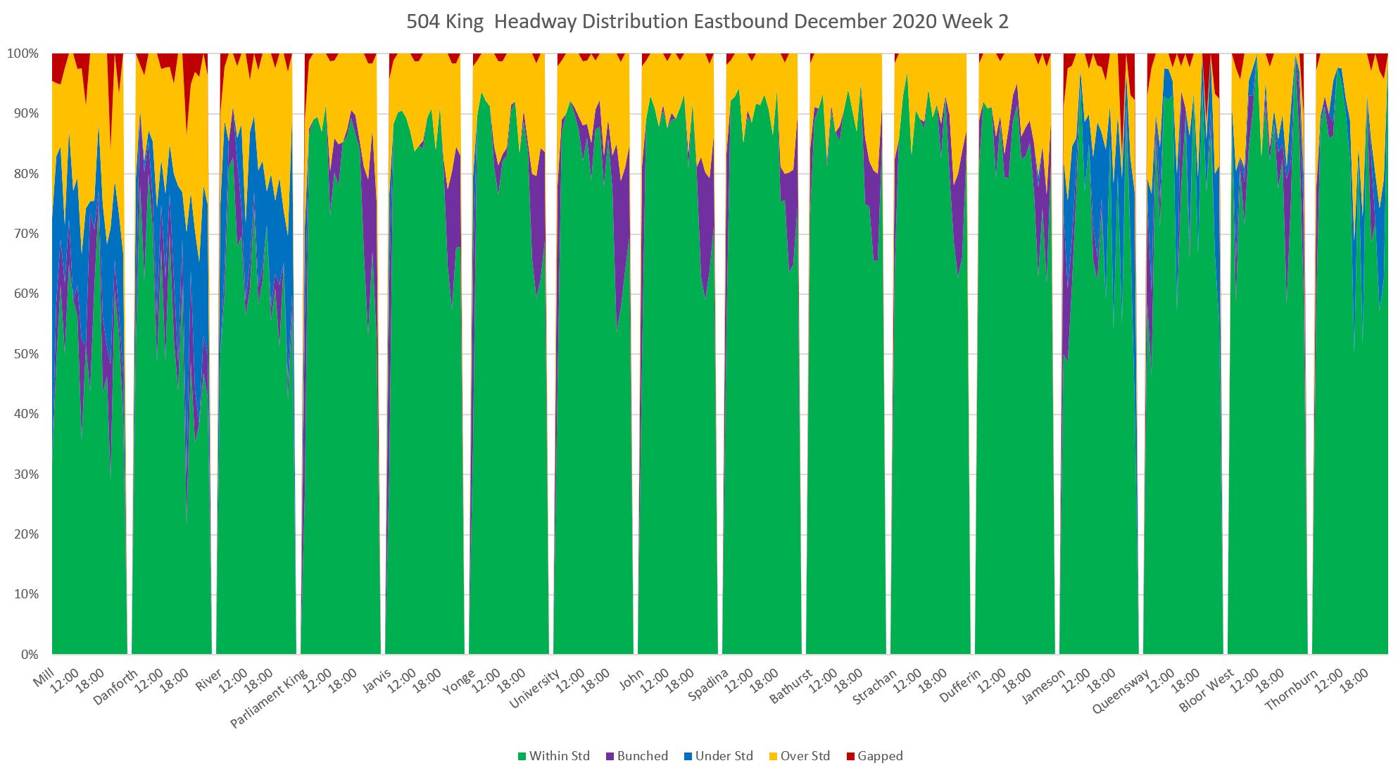
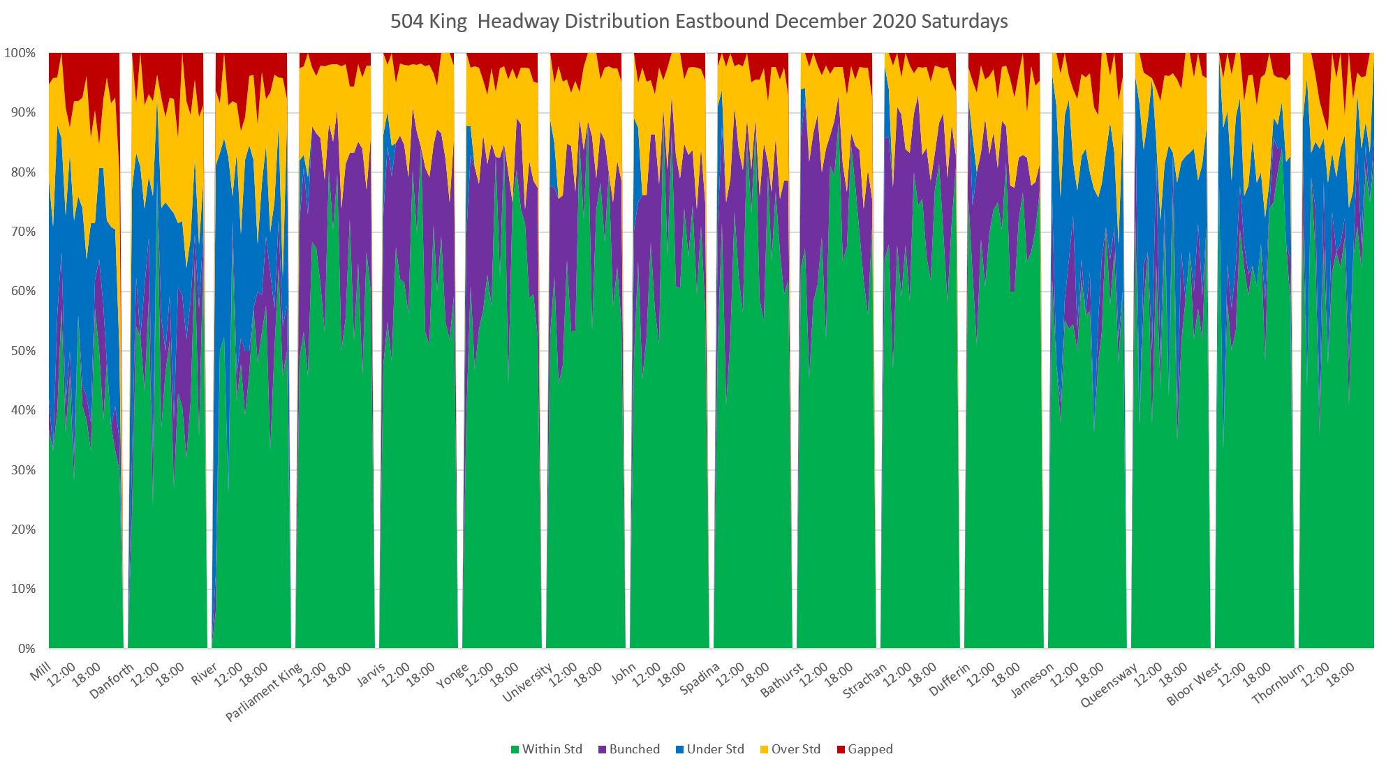
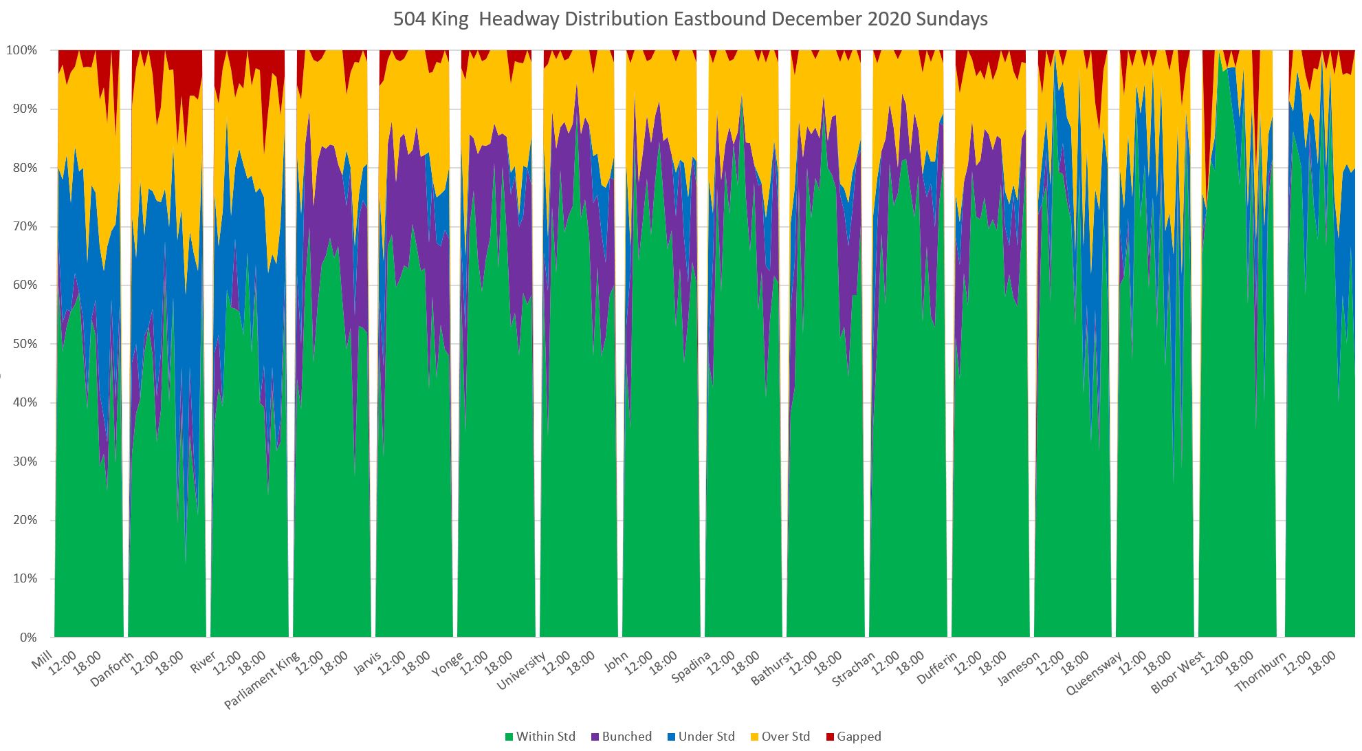
The eastbound service behaves similarly (read locations from right to left).
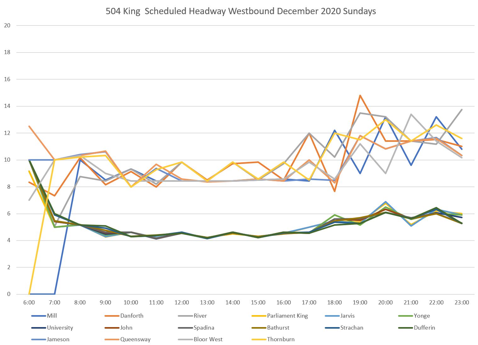
On weekends, scheduled service is less frequent and this opens up room for the below-standard bands. Moreover the actual averages drift from scheduled values more on weekends.
The headway distributions show the difference in headway adherence with a much deeper incursion of the off-target bands especially on the outer parts of the route. As seen on other routes, the destination ends fare worse than the origin ends because whatever regularity might exist at the start of trips degrades as vehicles work their way across the city.
As on Saturdays, the wider Sunday headways give room for “under target” bands.
Sundays show the decline in headway reliability quite strikingly in the westbound (left to right) and eastbound (right to left) data, particularly in the evenings when service is less frequent.

Am I reading the map correctly that the Airport services serve Terminal 1 then Terminal 3? Wouldn’t it be a lot easier to serve them in the other order? My recollection of the pattern of the access roads is that there is a pretty much direct path from 3 to 1 but to do the reverse requires a certain amount of looping around.
Steve: The route description on the TTC’s site says:
LikeLike
Thanks for putting on a graph that the 52/952 on the Lawrence West corridor has no concept of scheduling. It seems like they really don’t care about riders west of the branch split.
LikeLike
How much smoothing is used for the headway distribution charts? I don’t know if the spikiness makes them easier or harder to read. And I’m not sure if, in the bigger scheme of advocacy, the fact that there was a huge gap at a certain point at a certain time is that important.
Steve: The smoothing is done by Excel and there are no “knobs” to adjust this. Remember that the charts show percentage of trips in each band, not the absolute number. The goal is for the green acceptable band to be as wide as possible. Incursions by the other colours show that the service is not running within a reasonable variation, and the colours for gaps and bunching indicate things are really out of whack. I have played with other formats and that’s the best compromise between detail and legibility I have found so far. I’m open to suggestions but with worked examples, please, or at least instructions on which alternate format that is actually available and how I might use it.
There were two goals in creating these charts, and it’s important that they are not seen as the “definitive” versions. One was to find a way to show the gradual degradation of service moving along a route. The other was to propose a mechanism that would “work” over a range of headways. The latter goal is challenging for reasons discussed in the article. An obvious “to do” might be to tweak the model that drives the parameters, or to report data on a more fine-grained basis than hourly, at least for periods when there are enough vehicles that this is meaningful (if the interval is close to the headway, strange things can happen).
Note that one huge gap will not produce as much of an effect as if there were medium sized gaps all of the time, assuming that several days’ data (but not too many) are collected together. Also a single big delay will show up a certain times and locations, whereas perennially bad service will show up all day everywhere.
From a management point of view, what is needed is a mechanism to scan for chronic problems and flag changes for further investigation. No charts will ever replace detailed level review, but they will show where that review should occur, and will also allow comparison of “then” and “now” conditions.
As a rider, I don’t really care if the service is within standard, bunched, or under standard, what I want is a streetcar/bus to arrive pronto. What I would look for is a lot of yellow or red gaps where nothing would come.
Steve: Yes, definitely. However, the charts are not intended as a “real time” monitor (although one could construct something like that), but as a summary of historical behaviour that does not destroy the detail in the data as TTC’s present charts do.
The King car charts show another thing that may be an issue, when branching makes the scheduled headway different at different points. What might be a gapped headway in the common part of the route can suddenly become an acceptable scheduled headway in the outer part of the route, making it suddenly perform better, or at least look like it is performing better.
Steve: Yes, there is something of a catch-22 here on routes with very frequent service. The use of a ±3 minute band around the average scheduled headway means that there is no “below standard” band if the scheduled headway is 3 minutes or better. Bunching is indistinguishable from normal service. However, gaps and gaps.
The portion beyond a route split has a higher scheduled headway, and so a larger value for the point where the definition of “gap” begins (at +9 minutes in my model). It’s still the same distance from the average, but at a higher (and possibly less acceptable) value. This is one of the “tweaks” that might be needed in the scheme – narrowing the target and shoulder bands when headways are wide to begin with.
Finally, on routes like King, where the 504 A/B alteration doesn’t always happen that regularly, the fact that a streetcar has shown up in the central section may not help someone who specifically needs an A or a B variant. Inevitably, it seems, a few of the wrong variant always show up first. So even if the headway between streetcars is fine, the headway between useful streetcars may not be. Have you considered showing each branch separately, to see how they perform for the people who need that branch? I am not sure whether, in the common section, the headway should be referenced to the branch headway or the blended headway. After all, when someone says “what’s your problem, look at all these streetcars,” what if your answer is “yeah, but none of them are going where I’m going.”
Steve: Yes, another future variation to look at, although to some extent this is already covered by looking at service beyond the branch points. It’s a bigger problem on routes like 52 Lawrence where individual branches are far less frequent than the 504 King services. There is also the problem that the express 9xx services on routes tend to have wildly erratic headways, and the wait time can undo the benefits of an “express” trip especially if this also leads to overcrowded gap buses carrying most of the demand.
I am trying to get access to historical automatic passenger counter data so that I can blend this with the headway information, but have been told that this won’t be available for several months.
Of course the TTC should be doing this kind of work itself, but the received wisdom is that the service is just fine, thank you except for a few locations, and the RAD buses fix those. Never mind that there is no useful record of the RAD buses in the tracking data, and what I have looked at suggests that they spend a lot of time like the “Maytag Repairman” waiting for something to do.
LikeLike