
For regular readers of this site, it will be no surprise that my opinion of the TTC’s reporting on service quality is that it is deeply flawed and bears little relationship to rider experiences. It is impossible to measure service quality, let alone to track management’s delivery of good service, with only rudimentary metrics.
Specifically:
- The TTC reports “on time performance” measured only at terminals. This is calculated as departing no more than one minute early and up to five minutes late.
- Data are averaged on an all-day, all-month basis by mode. We know, for example, that in February 2020, about 85 per cent of all bus trips left their terminals within that six minute target. That is all trips on all routes at all times of the day.
- No information is published on mid-route points where most riders actually board the service.
Management’s attitude is that if service is on time at terminals, the rest of the line will look after itself. This is utter nonsense, but it provides a simplistic metric that is easy to understand, if meaningless.

There are basic problems with this approach including:
- The six minute window is wide enough that all vehicles on many routes can run as pairs with wide gaps and still be “on time” because the allowed variation is comparable to or greater than the scheduled frequency.
- Vehicles operate at different speeds due to operator skill, moment-to-moment demand and traffic conditions. Inevitably, some vehicles which drop behind or pull ahead making stats based on terminal departures meaningless.
- Some drivers wish to reach the end of their trips early to ensure a long break, and will drive as fast as possible to achieve this.
- Over recent years, schedules have been padded with extra time to ensure that short turns are rarely required. This creates a problem that if a vehicle were to stay strictly on its scheduled time it would have to dawdle along a route to burn up the excess. Alternately, vehicles accumulate at terminals because they arrive early.
Management might “look good” because the service is performing to “standard” overall, but the statistics mask wide variations in service quality. It is little wonder that rider complaints to not align with management claims.
In the pandemic era, concerns about crowding compound the long-standing issue of having service arrive reliably rather than in packs separated by wide gaps. The TTC rather arrogantly suggests that riders just wait for the next bus, a tactic that will make their wait even longer, rather than addressing problems with uneven service.
What alternative might be used to measure service quality? Tactics on other transit systems vary, and it is not unusual to find “on time performance” including an accepted deviation elsewhere. However, this is accompanied by a sense that “on time” matters at more than the terminal, and that data should be split up to reveal effects by route, by location and time of day.
Some systems, particularly those with frequent service, recognize that riders do not care about the timetable. After all, “frequent service” should mean that the timetable does not matter, only that the next bus or streetcar will be reliably along in a few minutes.
Given that much of the TTC system, certainly its major routes, operate as “frequent service” and most are part of the “10 minute network”, the scheme proposed here is based on headways (the intervals between vehicles), not on scheduled times.
In this article, I propose a scheme for reporting on headway reliability, and try it out on the 29 Dufferin, 35 Jane and 501 Queen routes to see how the results behave. The two bus routes use data from March 2021, while the Queen car uses data from December 2020 before the upheaval of the construction at King-Queen-Roncesvalles began.
This is presented as a “first cut” for comment by interested readers, and is open to suggestions for improvement. As time goes on, it would be useful for the TTC itself to adopt a more fine-grained method of reporting, but even without that, I hope to create a framework for consistent reporting on service quality in my analyses that is meaningful to riders.
The Proposed Scheme
For any service, there would be five bands of headway measurements:
- “Within Standard” would, in most cases, be a band six minutes wide around the scheduled headway. This would be a ±3 measure.
- “Below Standard” would be the band between the lower measure of “standard” and upper limit for “bunched”. For very frequent service, this band would be squeezed out.
- “Bunched” would be a headway of 2 minutes or less, except for very frequent service.
- “Above Standard” would be a band 6 minute wide above the upper limit for “within standard”.
- “Gapped” would be any headway greater than the high end of “above standard”.
The chart below shows how this works out.
For example, for a 10 minute scheduled headway, the ranges are:
- Bunched: 2 minutes or less
- Below standard: 2 to 7 minutes
- Within standard: 7 to 13 minutes
- Above standard: 13 to 19 minutes
- Gapped: 19 minutes and above
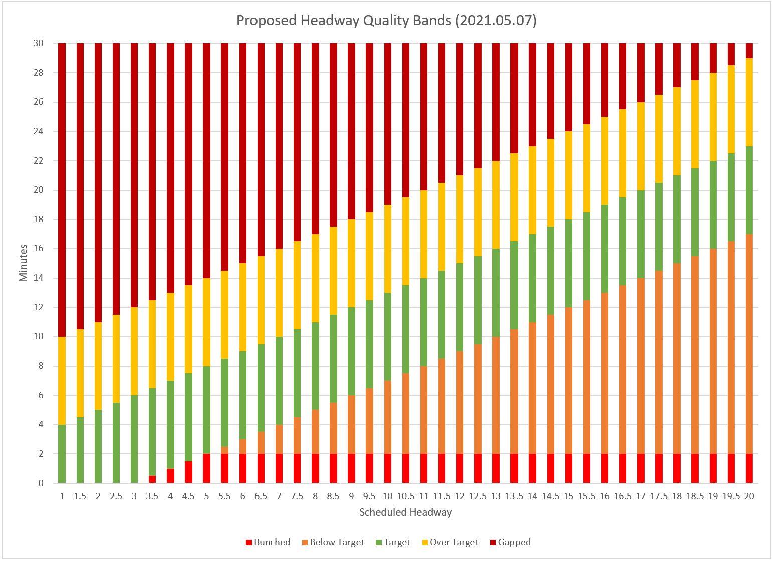
I am quite sure that some would argue that these ranges are rather generous, but they are the values I used as a starting point to test the methodology.
The spacing between bands is constant (except for low headways) rather than being calculated as a percentage of the scheduled value. This means that the proportion of variation allowed for wider headways is actually smaller than for short headways.
These bands are not applied to all day values, but to subsets of data calculated on an hourly basis. The acceptable range at 8 am is not the same as the one at 10 pm, and performance within the bands is calculated separately for each interval. Moreover, weekend and weekday data are not mixed together because they represent different operating conditions and scheduled service levels.
(Specifically, data are consolidated for hourly intervals among all weekdays in each calendar week to distinguish between weeks with unusual events and to avoid all-month data from swamping smaller scale effects. This also allows for schedule changes that might occur mid-month. Weekend data are consolidated as “all Saturdays” and “all Sundays”
because there are many fewer data points.)
There are a few wrinkles in this scheme worth noting:
- During transitional periods between, for example, peak and off-peak, the scheduled headway will vary over the course of an hour, and this change will occur at different times along the route. (This problem could be partly offset by shortening the reporting interval to, say, half-hourly rather than hourly, but this creates other problems for routes with infrequent service and few vehicles/hour.)
- Major service interruptions can create effects that are counter-intuitive. For example, the scheduled service might be every 6 minutes (10 buses/hour), but a major delay could create one very large gap followed by many bunched vehicles. This would show up in stats as a service with most buses in a bunch, but as few as one in a gap.
- Conversely, service that is pervasively running in pairs of vehicles should have a roughly equal number of gaps and bunches.
- If some vehicles are missing, most headways will be longer than the scheduled value even if the vehicles are evenly spaced. In this case, a larger proportion of headways will fall outside of the target range.
I mention these examples because it is just about impossible to construct a magic formula that will “work” all of the time without some filtering to distinguish exceptional cases from ongoing problems. Familiarity with any route’s behaviour and interpretation of its data are needed to put any metrics in context.
Express and Local Services
The charts in this article include only the local service on 29 Dufferin and 35 Jane. One can argue either way for presentation of consolidated data:
- Consolidated data would show service available to riders travelling between both the local and express services.
- Showing only consolidated data would mask service issues faced by riders who must use a local bus whose frequency was reduced as part of the express service implementation.
- Showing only express data would show the degree to which the benefit of an express trip might be offset by unpredictable service and long waiting times.
I will leave this to future articles reviewing individual routes in detail.
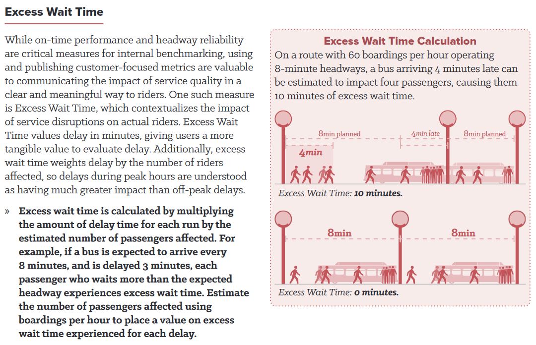
Excess Waiting Time
Some cities calculate a value that represents the degree to which riders are inconvenienced by irregular service. The methodology works roughly like this:
- If the headway for a vehicle is equal to or less than the headway, then there cannot be any “excess waiting time” because no would-be rider had to wait longer than they would have expected based on the schedule.
- If the headway is greater than scheduled, then the difference is multiplied by the anticipated number of riders who would board at a stop under normal conditions.
This scheme has a few important effects:
- There is no “bonus” for vehicles running on shorter-than-scheduled headways because the wait time for them is always less than the advertised value.
- If a parade of vehicles arrives at a stop, there is a big penalty for the excess wait time due to the gap.
- Gaps at busy stops and times of the day affect the total score much more than at lightly used locations.
This type of calculation can be tricky when there are multiple services at a stop and the first bus to show up may not serve the destination of all waiting riders.
In the scheme proposed here, I have not attempted to calculate this value because the TTC does not [yet] publish detailed historical loading data that could be used to calibrate the model.
The illustration below is taken from Making Transit Count by the National Association of City Transportation Officials (NACTO).
Scheduled vs Average Headways
The scheduled headways can be calculated from the GTFS format schedules which are published approximately every six weeks by the TTC. These contain the same data that builds the TTC’s online timetables and drives various trip planning apps.
The actual average headways vary somewhat from the scheduled values because buses and streetcars are rarely exactly “on time”. Even without the effect of short turns or diversions, the number of vehicles per hour (and hence the calculated average headway) can be slightly off because one of more vehicles were counted in the “wrong” hour. For example, a bus scheduled to arrive at 2:58 might show up at 3:01. It would be part of the “3 o’clock” vehicle count, and would be missing from the “2 o’clock” count. This has a larger effect for services on wide headways because the effect of one added or missing vehicle is to change the average headway more than on routes with frequent service.
All of the headway adherence values shown here are calculated against the scheduled averages for the hour regardless of what the average headway might be. This means that the divergence of actual service is measured against the advertised value.
When the average and scheduled headways differ considerably, this probably means that there was a major disruption causing fewer vehicles (and hence wider headways) passing the screenlines where headways are monitored. This is a simple “flag” that bad performance should be expected at the time and location involved, and that it is not a pervasive problem.
Location of Monitoring Points
Readers familiar with route analyses on this site will know that I have divided routes into segments (or “links”) for analytical purposes. These have been kept constant over many years so that comparisons with old data are easily made. The spacing is generally tighter on the downtown streetcar routes and further apart for the longer suburban routes. This has no effect on the analysis other than to give it more granularity in watching how headways evolve as vehicles move along a line.
Format of Charts
Some of these charts will look familiar to readers because I have been down this path before.
I will admit that some of these charts are “busy”. Part of this review process was to see what things look like as a guide to what works, and what does not. Different presentations show different aspects of the data. I will explain how the charts work as they are introduced. The intent is to get comments about both the proposed way of measuring headway quality and the methods of presenting the data.
In the analysis of 29 Dufferin, I have included a fairly large collection of charts to show alternative ways of displaying the data. For other routes, the proportion inline in the article drops, and this more or less signals my favoured chart style for this purpose. Full sets of charts for those who want to download them are at the end of the article.
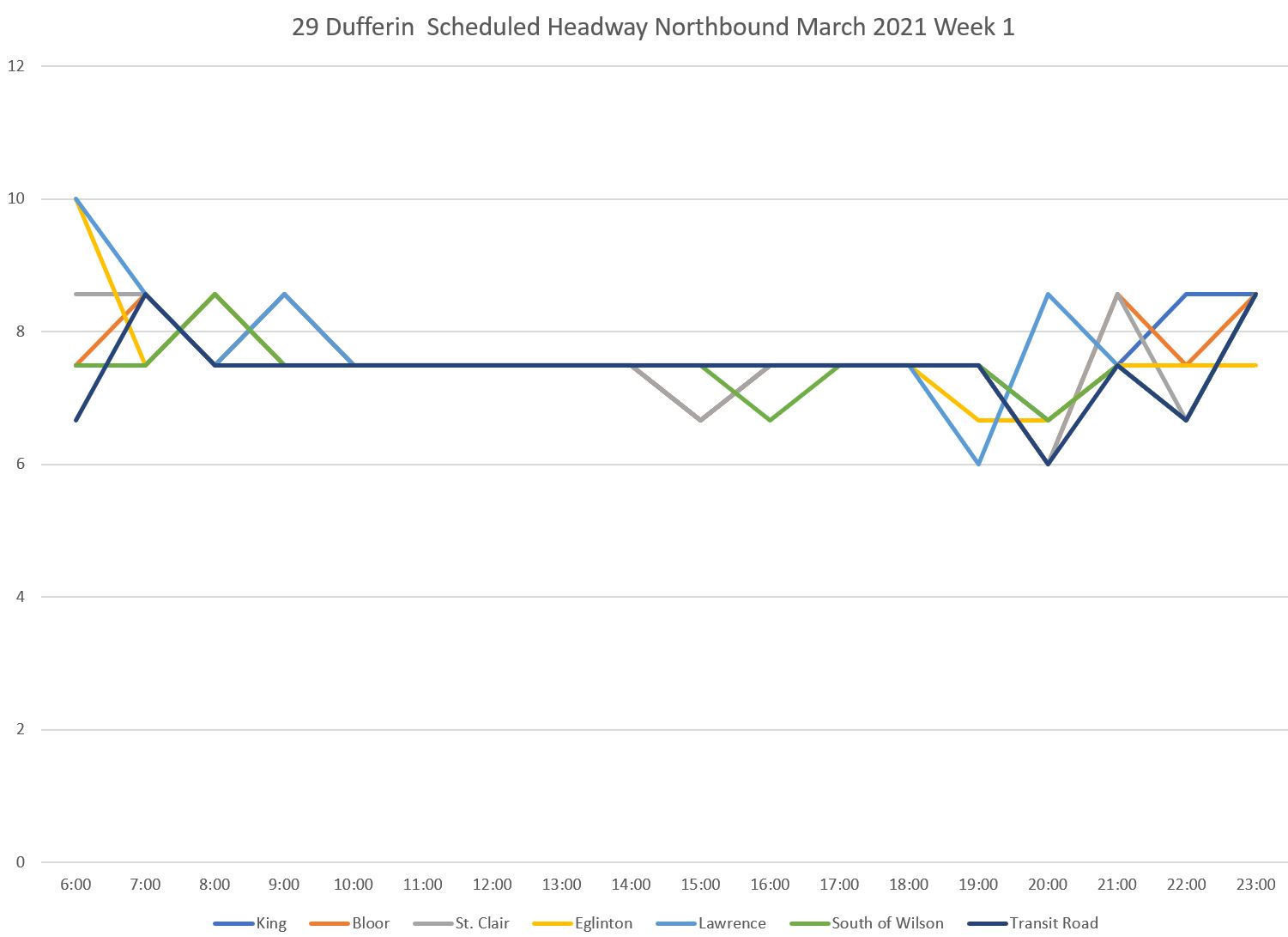
29 Dufferin Weekdays
The scheduled service, averaged for each hour of the day on 29 Dufferin looks like this. Each line in the chart below represents screenline (headway monitoring point) along the route. Averages are calculated as 60 minutes divided by the number of vehicles scheduled to pass in each hour. These values will “wobble” a bit especially during times when headways transition between different frequencies. Note that there is no peak period because of covid-era scheduling.
This analysis covers only the local 29 service, not the 929 express.
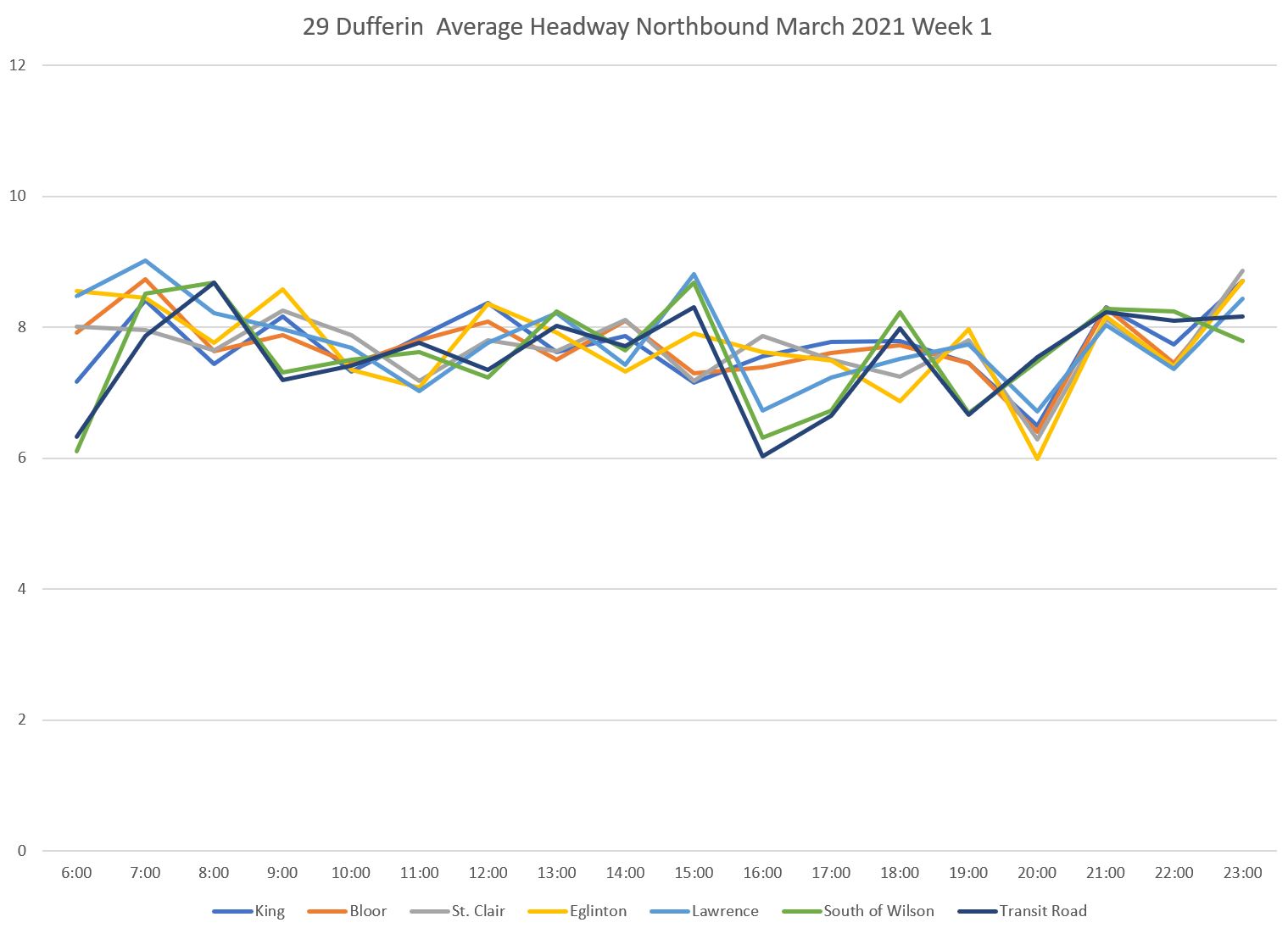
The actual average headways observed are a bit more ragged. They generally follow the scheduled pattern but do not hold strictly to it. Each line represents one location, and the values are the average headways of all vehicles passing that point within the same hour Monday-Friday in the first week of March.
The proportion of headways within each of the five bands tells a story that is typical across the entire system. First, here are the values for service that operates within 3 minutes of the scheduled average headway. Within each hour’s values (the rainbows of vertical lines), the south end of the line is dark red and the north end is purple.
A common pattern is that running close to the scheduled headway occurs at the start of the trip (dark read), but the proportion of trips falls off as the service moves along the line. Note that by the time service reaches Bloor Street, fewer trips are within the target window.
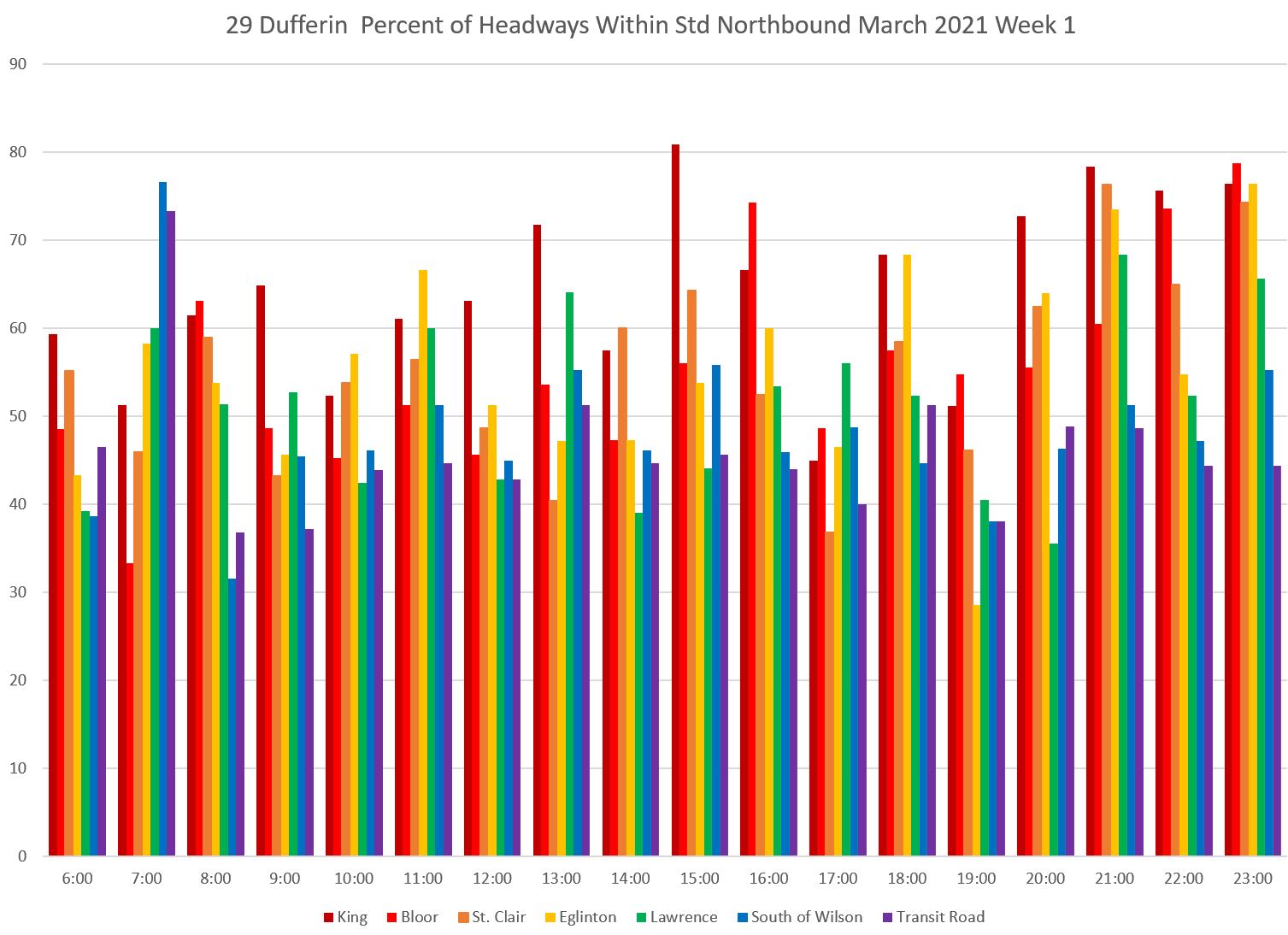
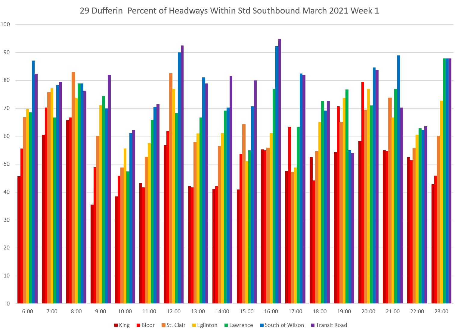
The southbound service shows the same pattern, but in the opposite direction with a higher proportion of trips running within the target band and a decline as buses move south (right to left within each column).
It is self-evident that if the headways are not evenly spaced, then the buses cannot possibly be “on time” to the schedule. However, this value is only calculated by the TTC at the terminal where the service is usually as good as it will be over the entire trip.
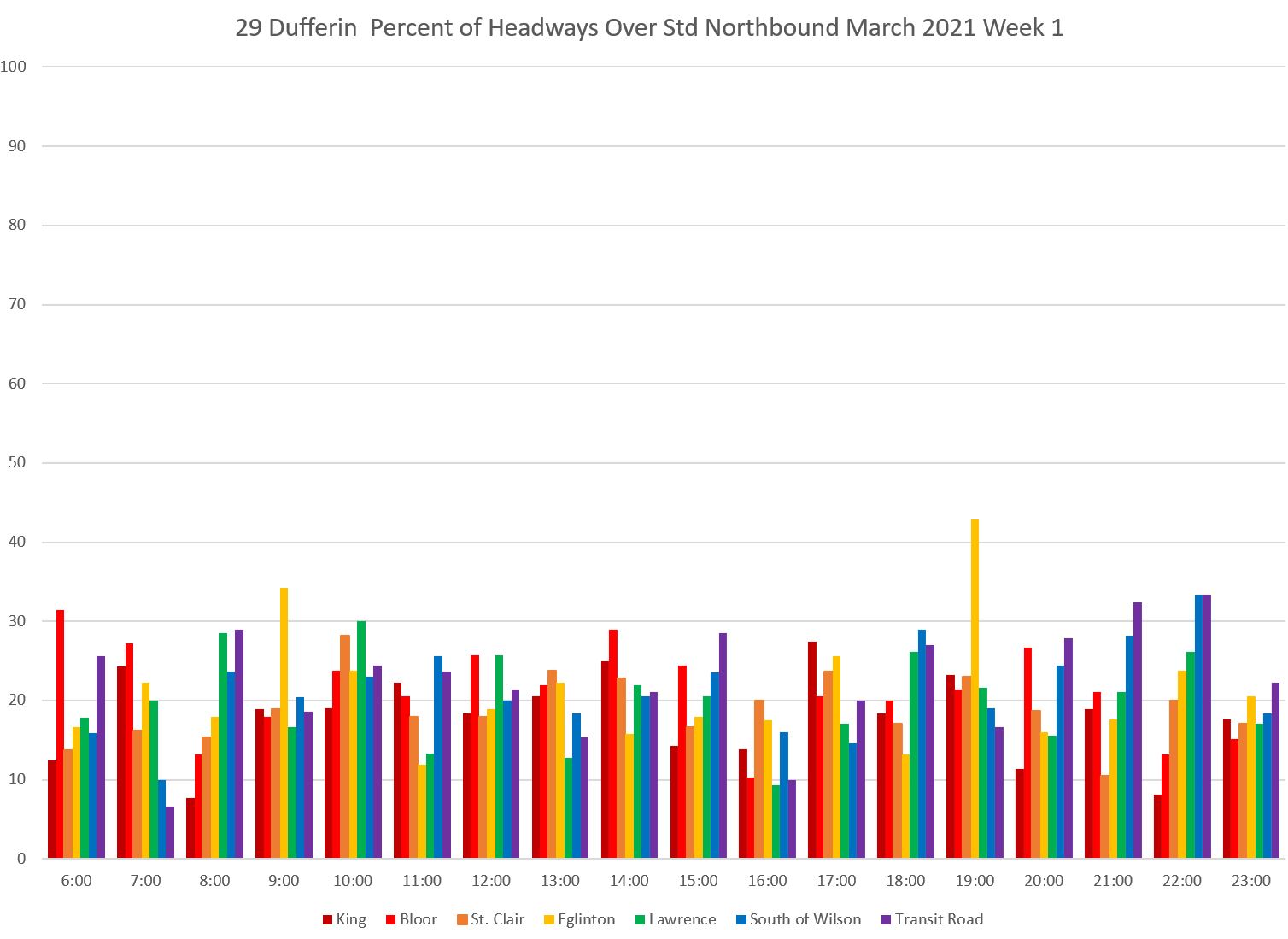
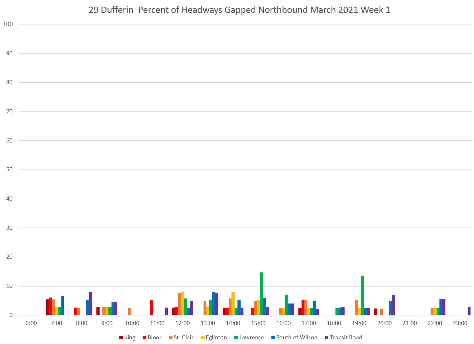
With an all-day scheduled headway of about 7 minutes, the bands for monitoring are:
- 0-2 minutes: Bunched
- 2-4 minutes: Below standard
- 4-10 minutes: Within standard
- 10-16 minutes: Over standard
- 16+ minutes: Gapped
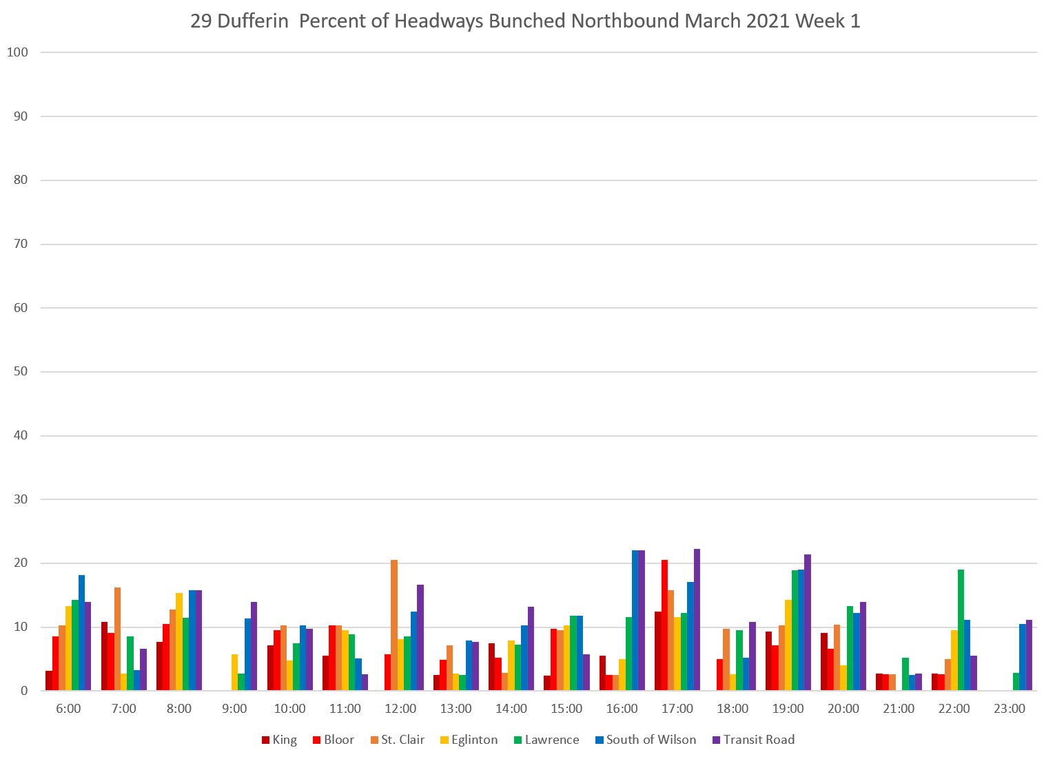
The bunching stats look like this for northbound service. Note that it is generally worse on the north end of the line, but during the PM peak hour (5-6 pm), over 10 percent of trips are running close behind their leaders over he full route. At Bloor Street, the value exceeds 20 percent. One in five buses is running as part of a pack, although this drops off further north probably because buses are spaced leaving Bloor by stop service times.
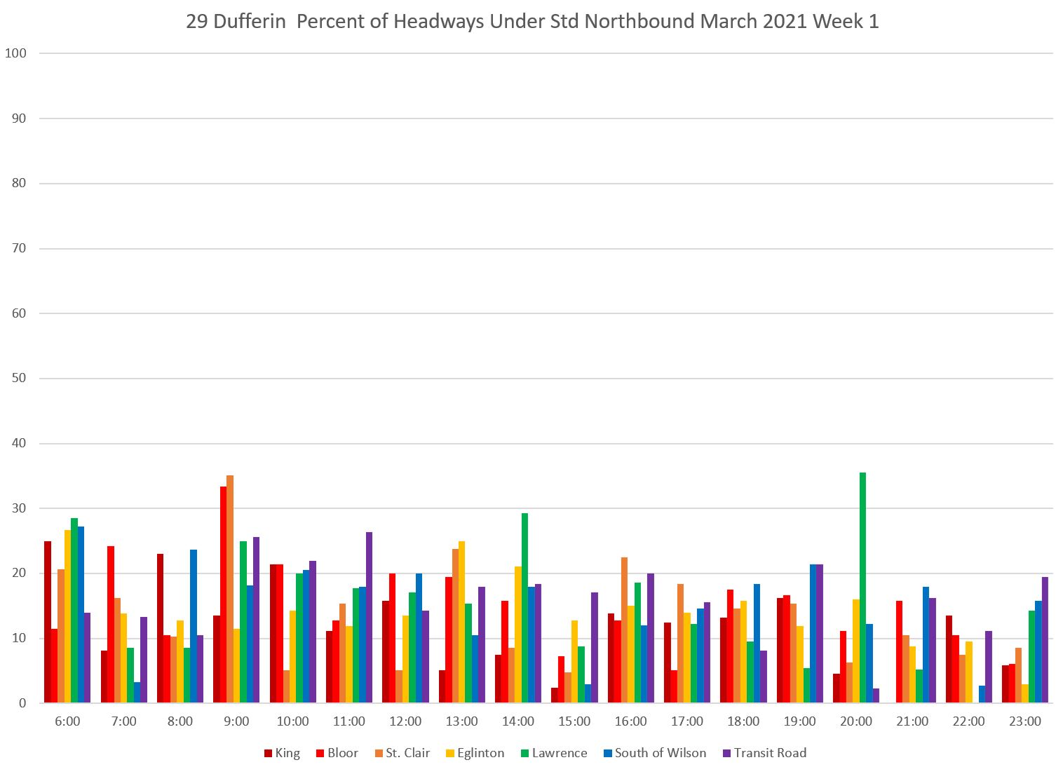
The “below standard” chart looks like this. These are buses that are not strictly bunched, but are more than three minutes below the scheduled headway. Combined with the “bunched” buses above, a lot of the service is not operating close to the scheduled headway.
The “over standard” chart echoes the problem with headways on the low side of the target band. For every short headway, there is likely to be a matching long one.
Finally, there are the “gap” buses. They are a relatively small proportion of trips, and there is not necessarily a 1:1 ratio between gaps and bunched buses. A one-bus gap can be followed by more than two closely-spaced vehicles.
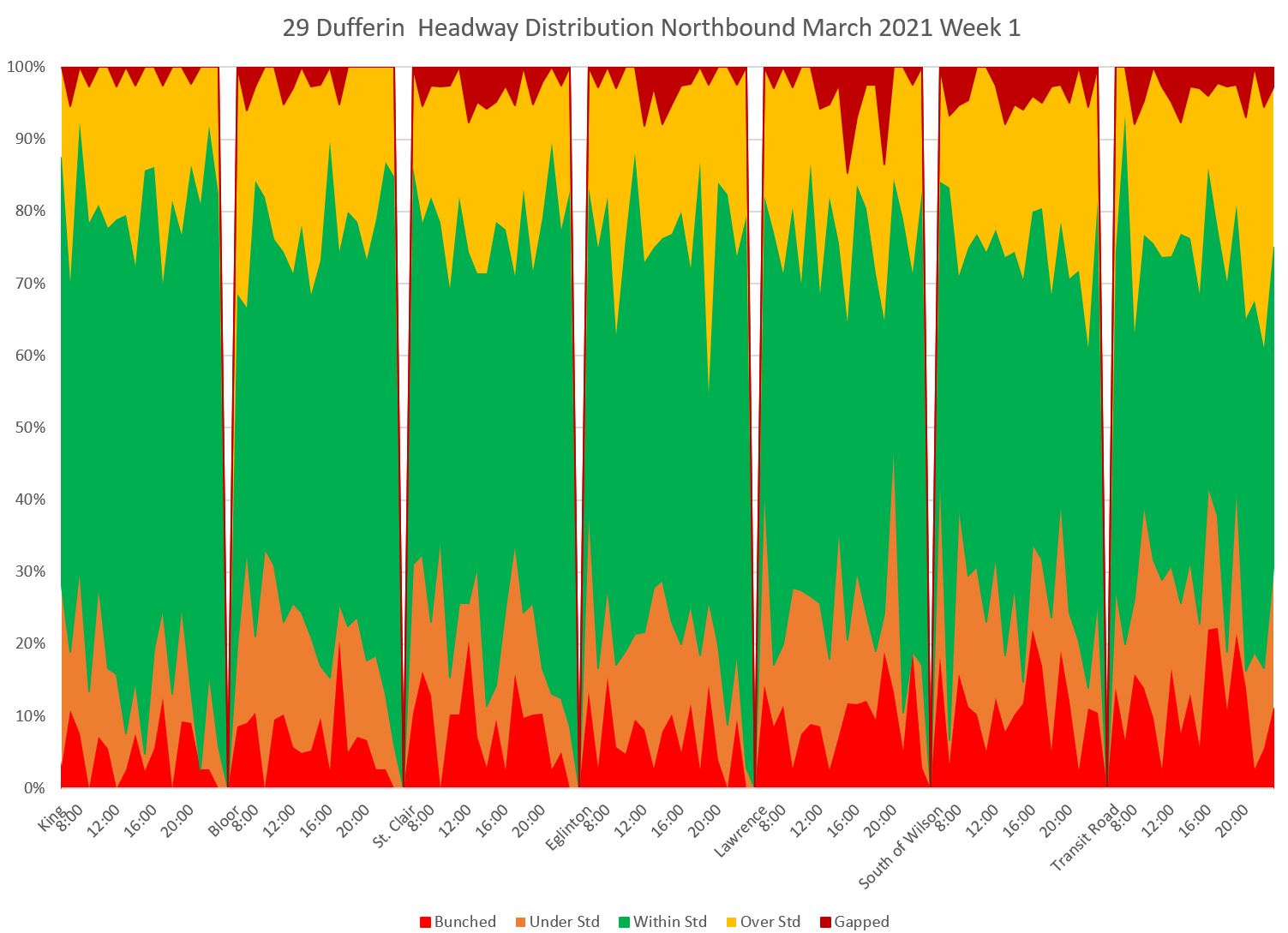
Another way of looking at the same data is to group by location and hour into the five bands. Each group of values shows the data at the various screenlines running from King at the left to Transit Road at the right. The green “within standard” band rarely occupies more than 50 per cent of the chart, and the band is at its widest for data at King when the service is still relatively well-spaced. As the service moves north, the proportion of below and above target values grows in from the bottom and top of the chart.
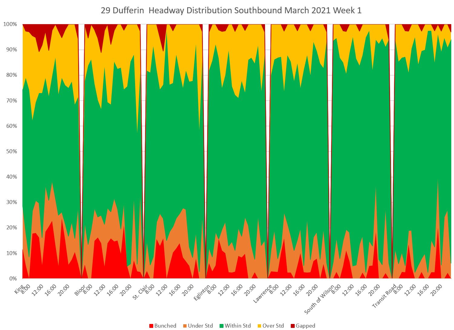
The southbound data mirrors the northbound with a wide green band at the north end (right) of the chart that narrows as the service moves south.
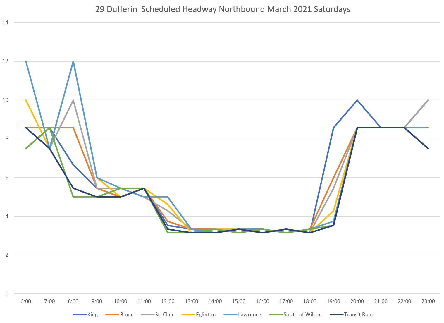
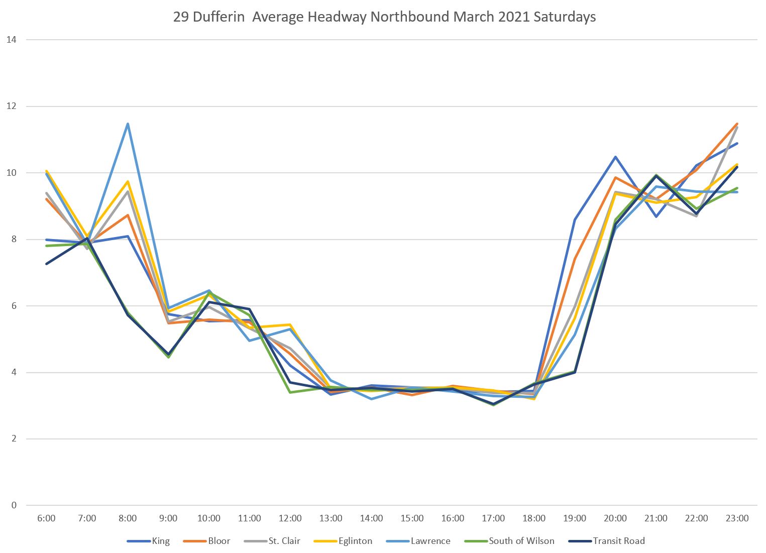
29 Dufferin Saturdays
Weekend service on Dufferin Street operates with all vehicles running local. Therefore the scheduled headways on the route are much lower than on weekdays when the 929 express serves the route from 6 am to 10 pm.
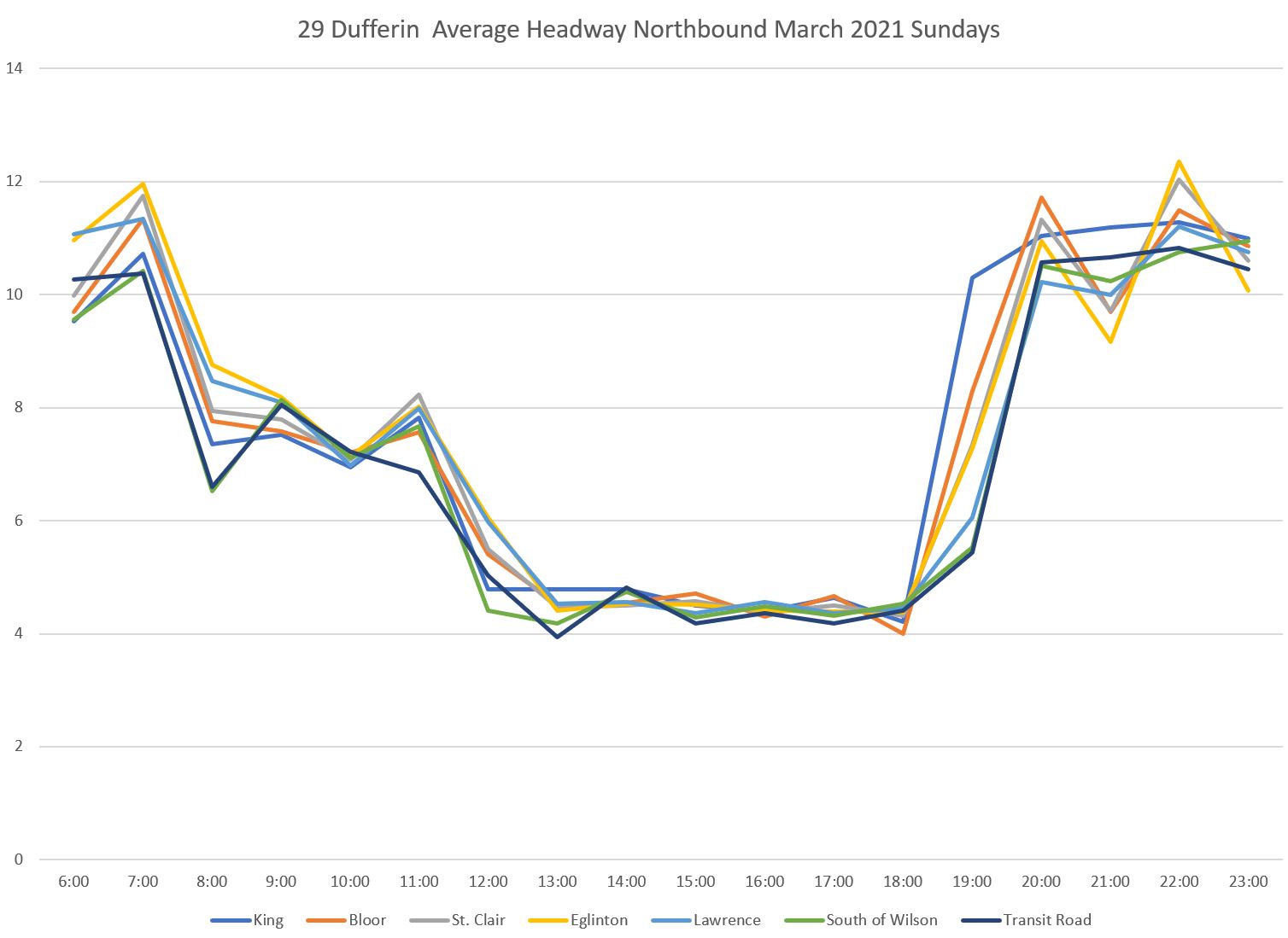
Here are the scheduled and actual average headways:
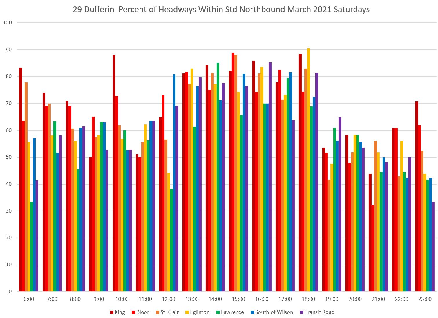
The proportion of service that lies within the six minute target window is shown below. With the scheduled headway being less than 4 minutes during the afternoon and early evening, most very short headways lie within the target band. This raises the proportion of trips counted as “within standard”. As the scheduled headways widen in the evening, closely spaced trips fall into the “below standard” and “bunched” categories.
This is an example of how the result of an analysis scheme must be understood in the context of the individual route characteristics. Local service is better on weekends because there are no express trips bypassing minor stops.
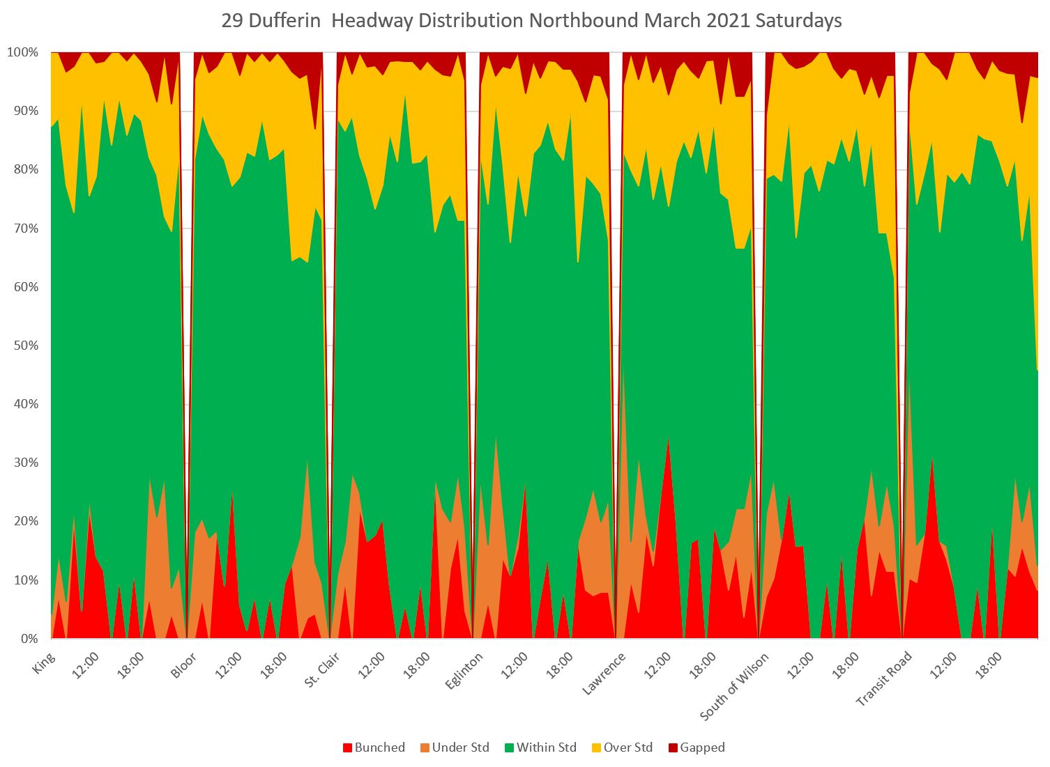
The headway distribution chart echoes this situation. The green “within standard” band is wider at the bottom because so little service during the afternoon counts as “bunched” or “under standard”. Even so, there remain a large proportion of trips that lie outside of the target six-minute band for headways. The southbound data are similar.
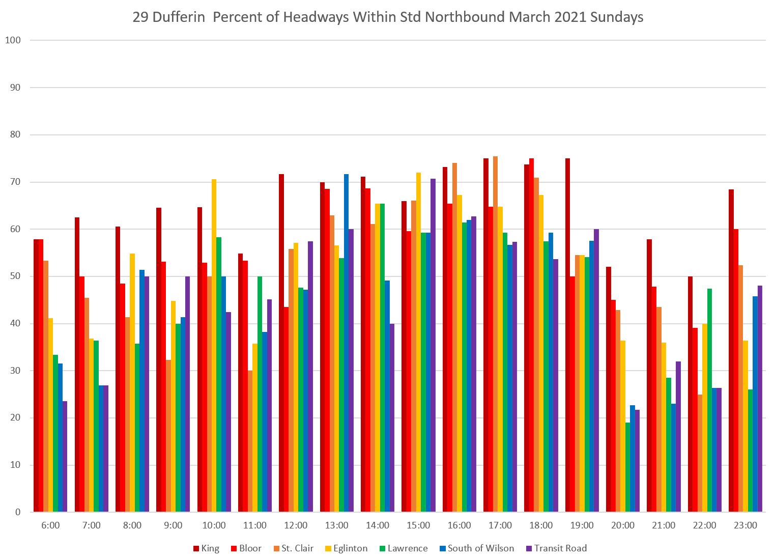
29 Dufferin Sundays
As on Saturdays, there is no 929 express service on Sundays and so the scheduled headway is lower than on weekdays. During the afternoon, the scheduled service is slightly less frequent than on Saturdays, and this widens the “bunched” band to and catches more closely-spaced buses in that category.
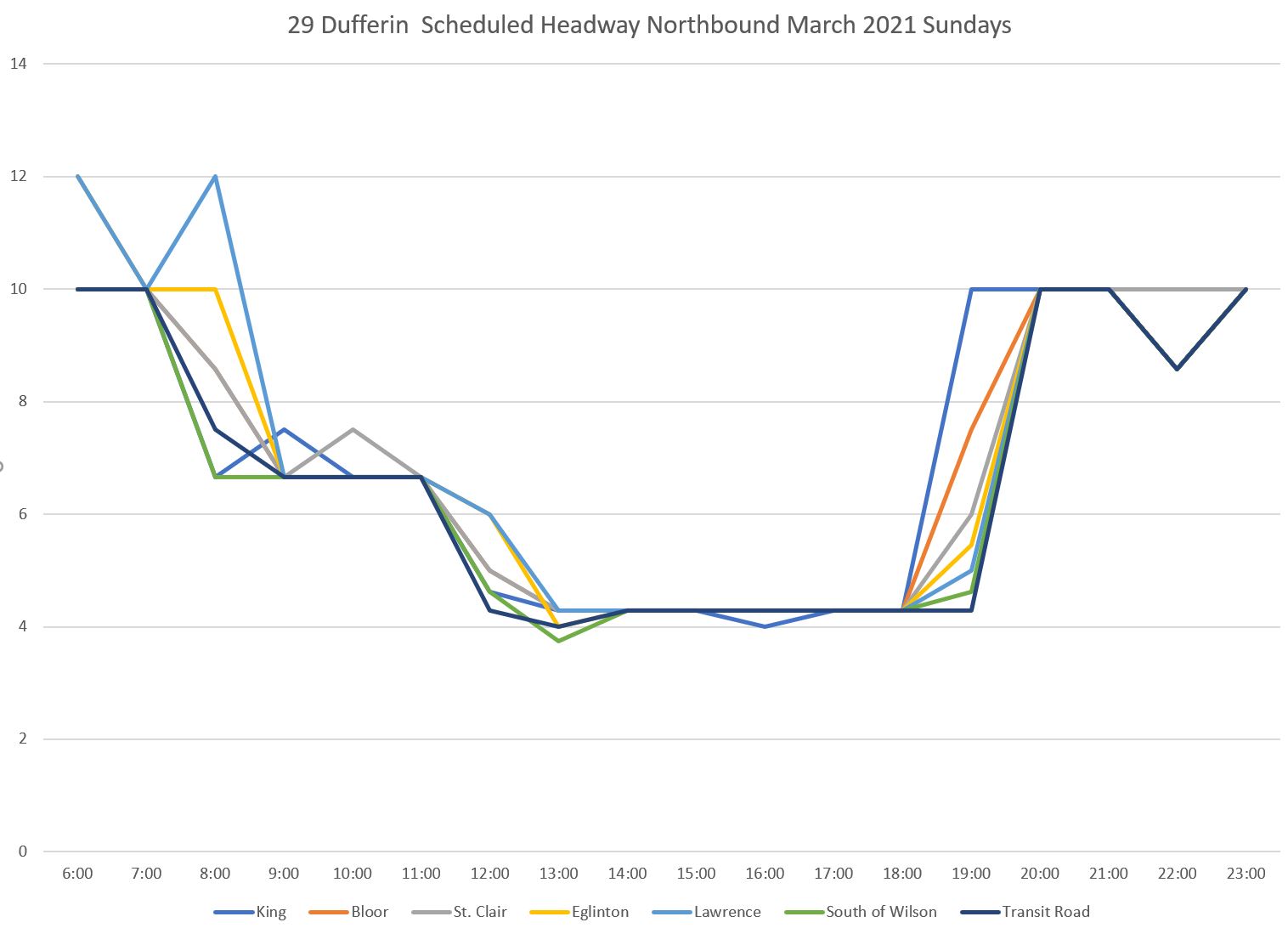
With wider scheduled headways on Sunday than Saturday afternoon, more short headways fall outside of the target range. This causes the proportion of service “within target” to be lower on Sunday than on Saturday.
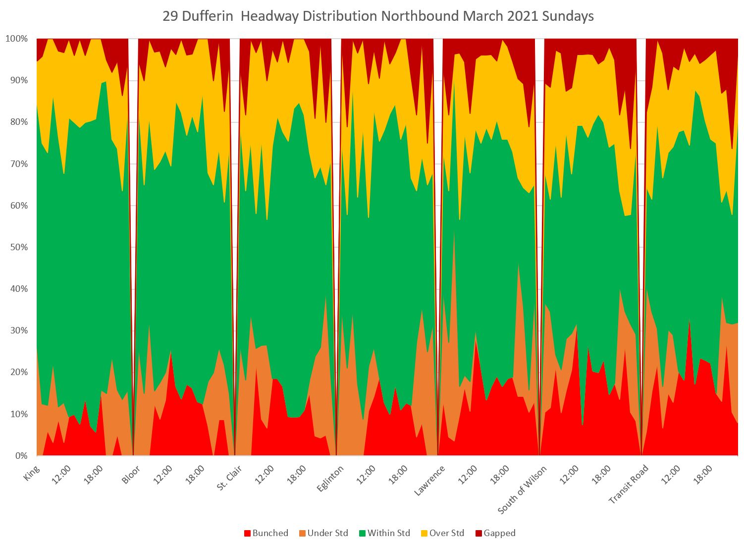
In the distribution chart, note that the red “bunched” band climbs higher as service moves north along the route. This is a typical problem especially with scheduled frequent service. Minor disruptions such as a surge load, missed traffic signal or short-lived traffic delay on a narrow portion of the route can allow a following bus to catch up creating a “bunched” headway.
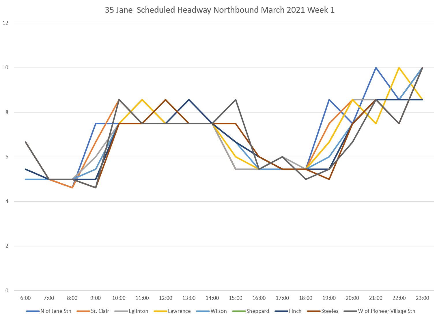
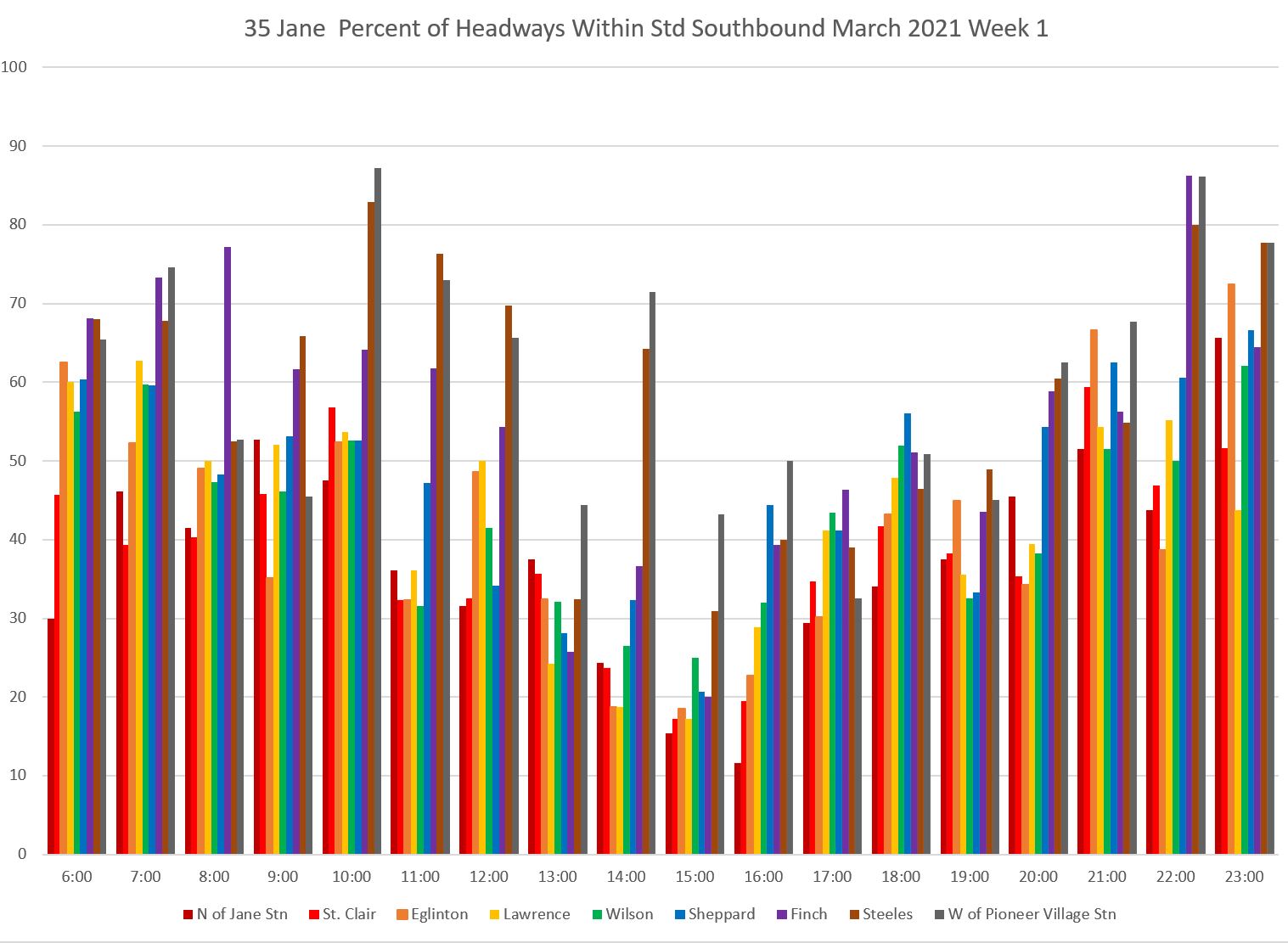
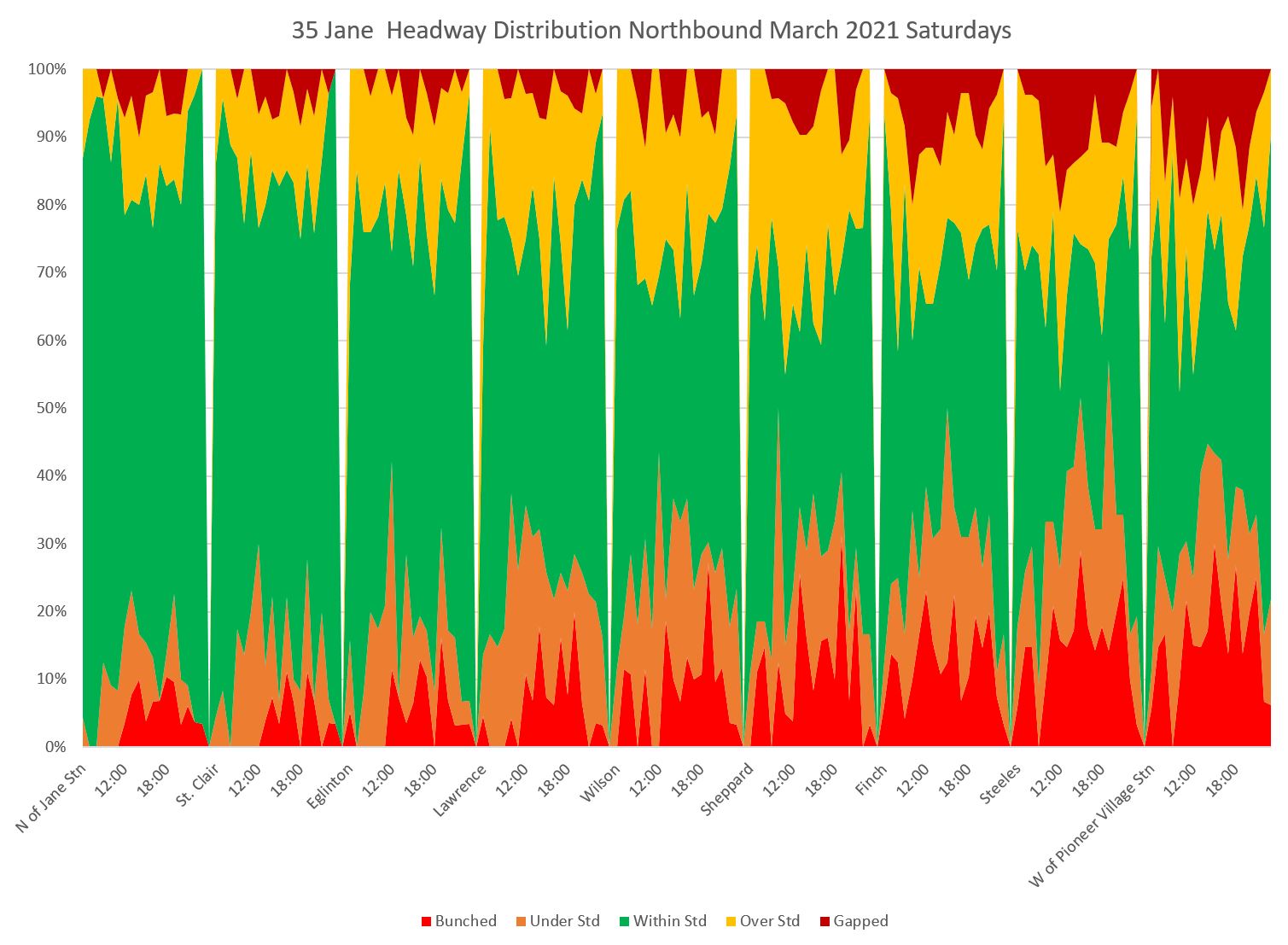
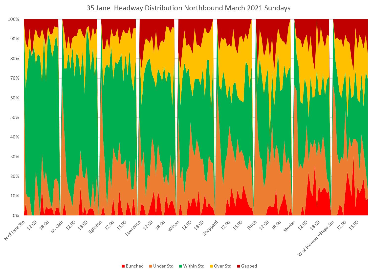
35 Jane Weekdays
Unlike Dufferin Street, the Jane route has express service seven days/week from 5 am to 9 pm weekdays, 7 am to 7 pm Saturdays, and 8 am to 7 pm Sundays. Therefore, it does not have the dip in weekend afternoon scheduled headways on the local service seen above on 29 Dufferin.
This analysis includes only the 35 Jane local service. Note that fewer charts are included here than for Dufferin to save space, but the full collection is available in PDFs linked at the end of the article.
Here is the scheduled service level.
Here is the actual average headway along the route.
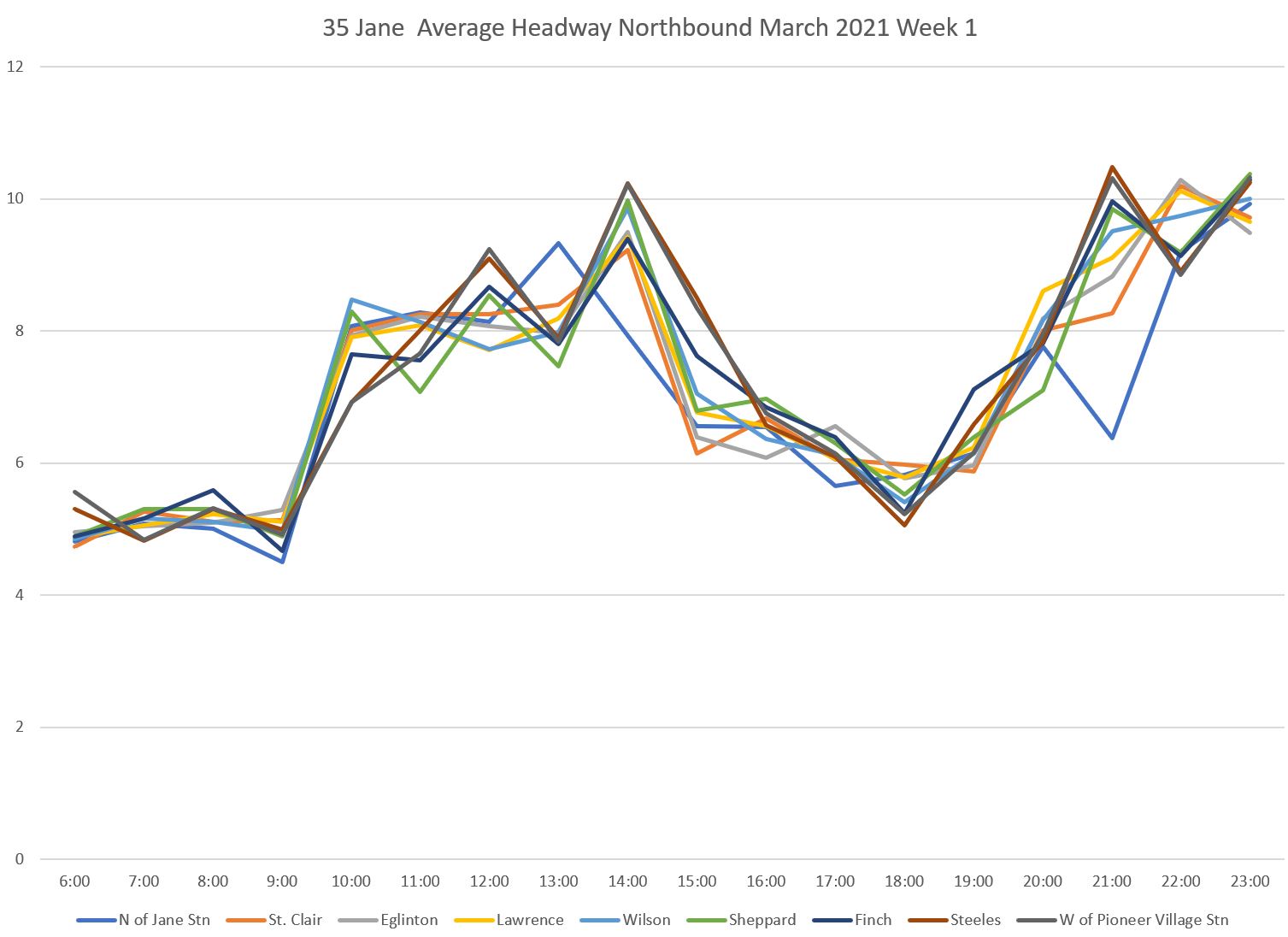
Jane even more than Dufferin shows a progression of degrading headway quality from the terminal departures along the route.
Here is the chart of headways within the six minute target window by time and location. The proportion of trips within the range is high at the south end of the route (the red bars) but it declines as buses travel further north.
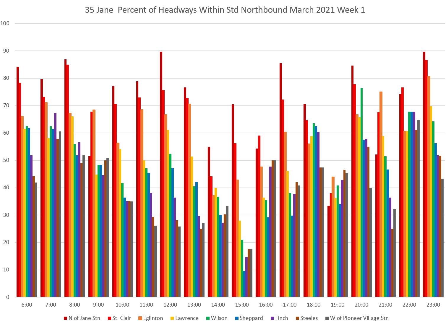
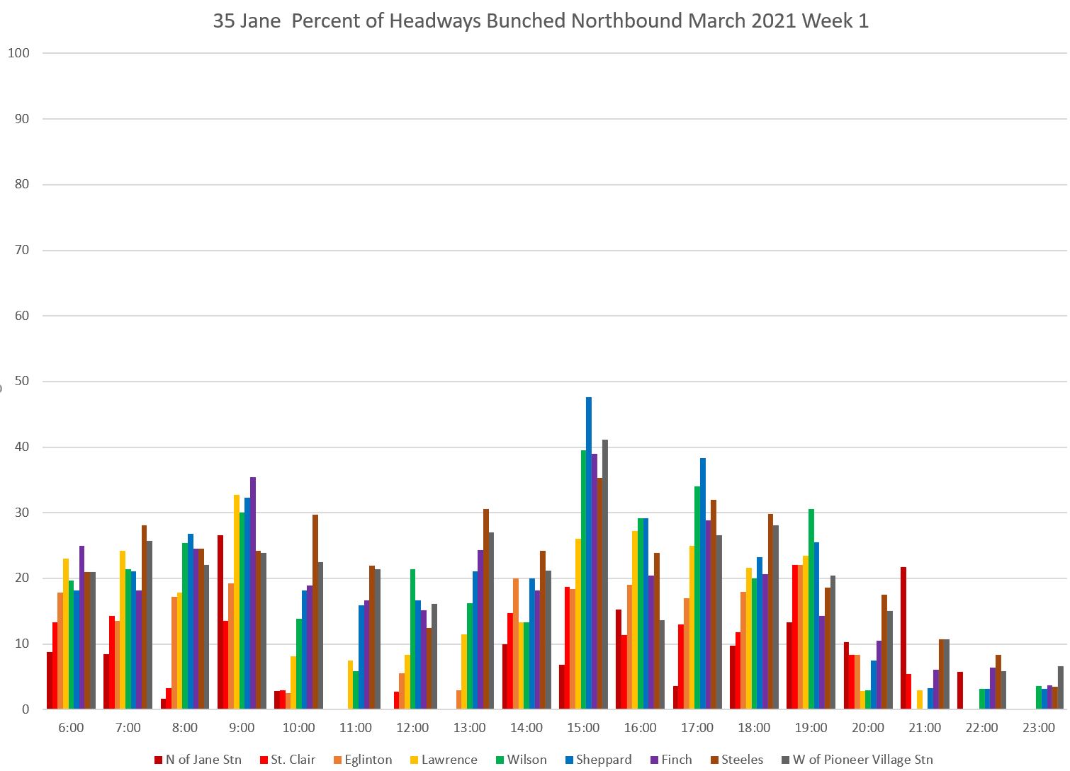
The proportion of bunched trips shows a complementary pattern, and there is a similar issue with gaps. A large proportion of the service, over 20 percent of trips, is running with buses very close together over much of the route during some schedule periods.
The headway distribution consolidates the route’s behaviour in one chart. The green “within target” band gets progressively narrower as we move north along the route, and the proportion of headways that are either too short or too long is quite striking.
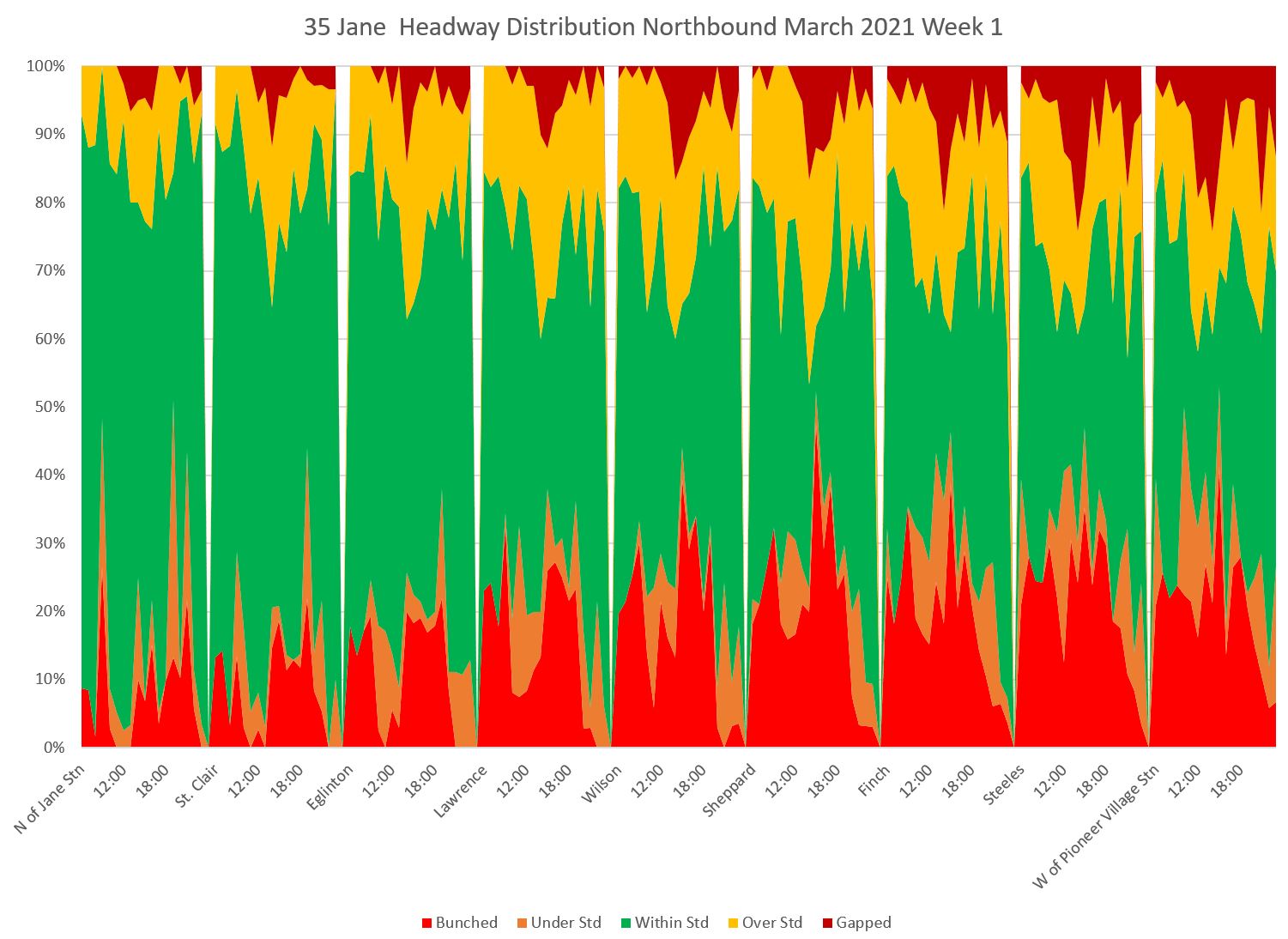
Construction on Line 6 Finch reached Jane Street in mid-March, and this affected travel times. The headway distribution was also affected. However, what is really striking about this chart is the proportion of the service leaving Jane Station, never mind further north, that was bunched and gapped right at the terminal especially during peak periods.
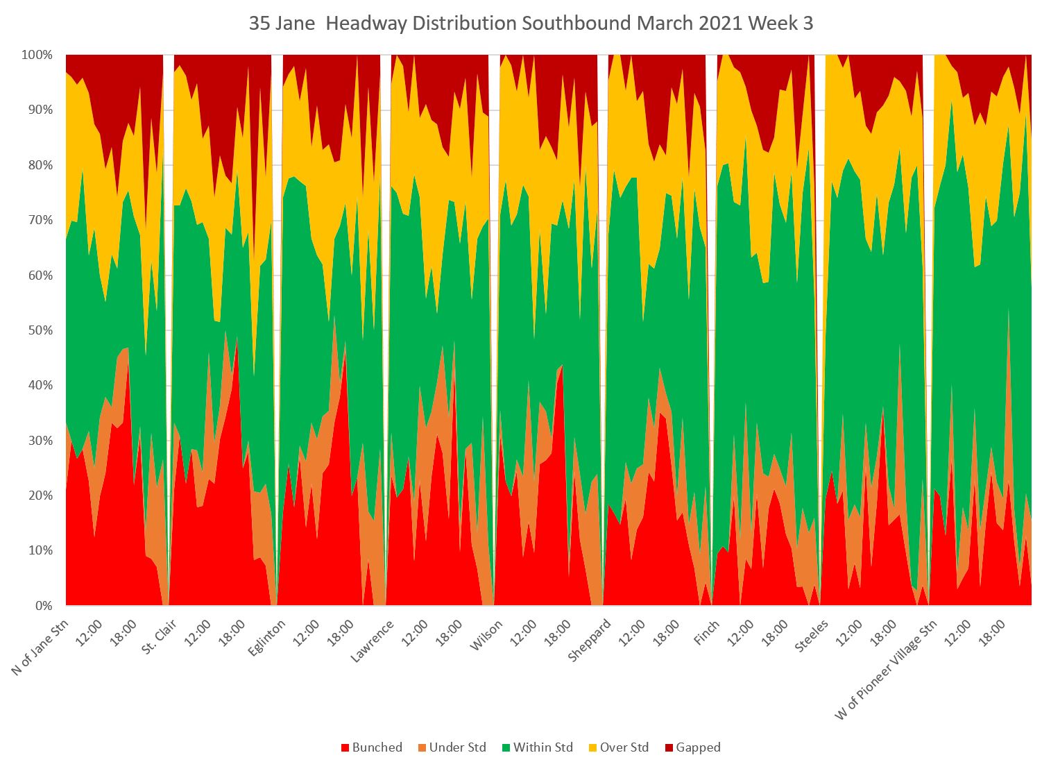
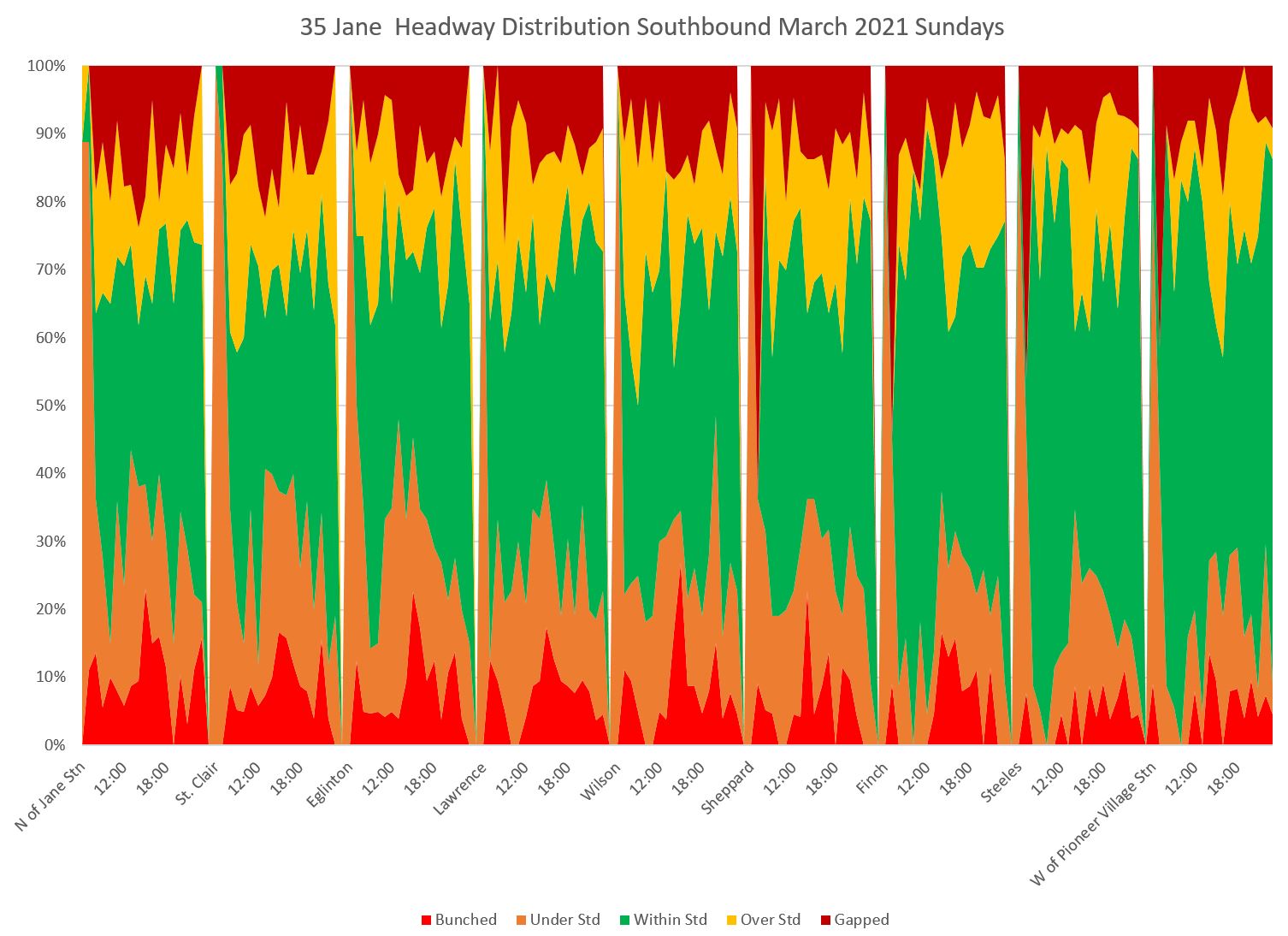
The situation for southbound service was if anything worse than for northbound.
Here is the chart of service within the six minute target window. In this case, the service is most reliable at the north end of the line (dark colours) and gets worse as one progresses south. (The southbound chart should be read right-to-left.)
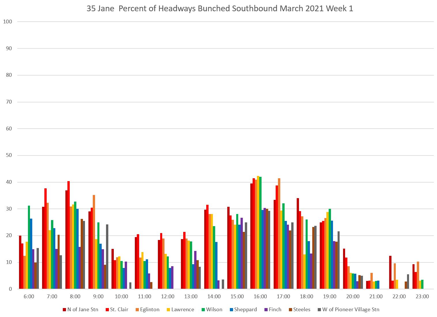
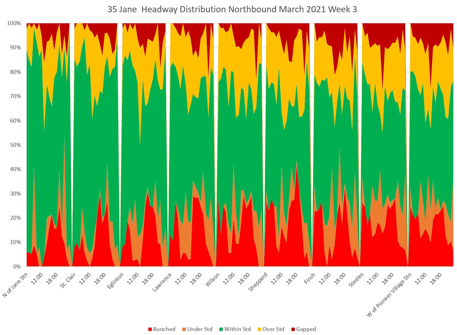
The bunched service chart is also bad for southbound service. A large portion of service is running bunched, especially in the afternoon, over much of the route. The headway distribution chart shows how this progresses from north to south (remember that the values shown for Steeles reflect only half of the scheduled service in the peak periods).
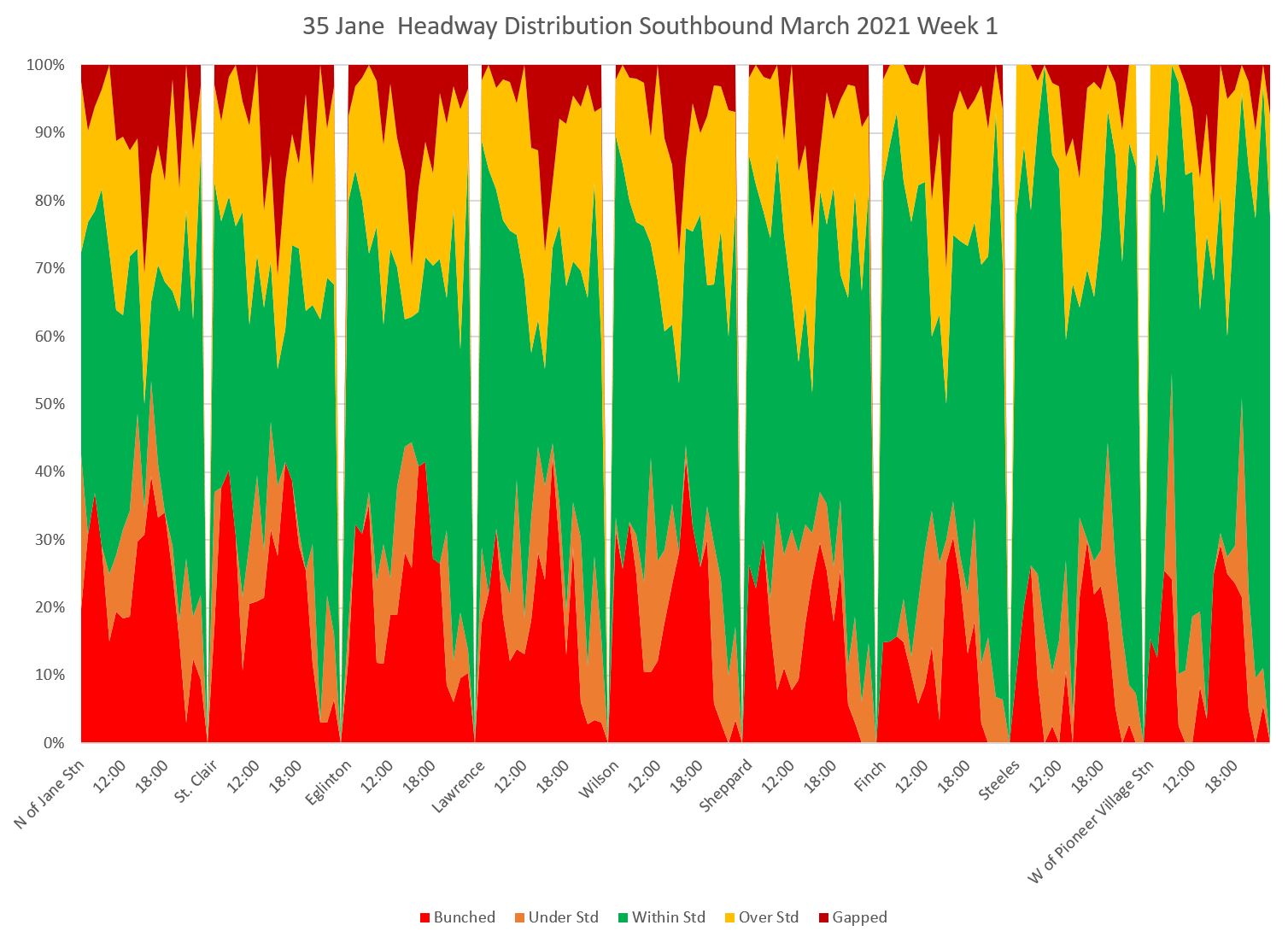
As with the northbound service, southbound was affected by construction starting midmonth. Note that the green bands are narrower in week 3 than they are above in week 1.
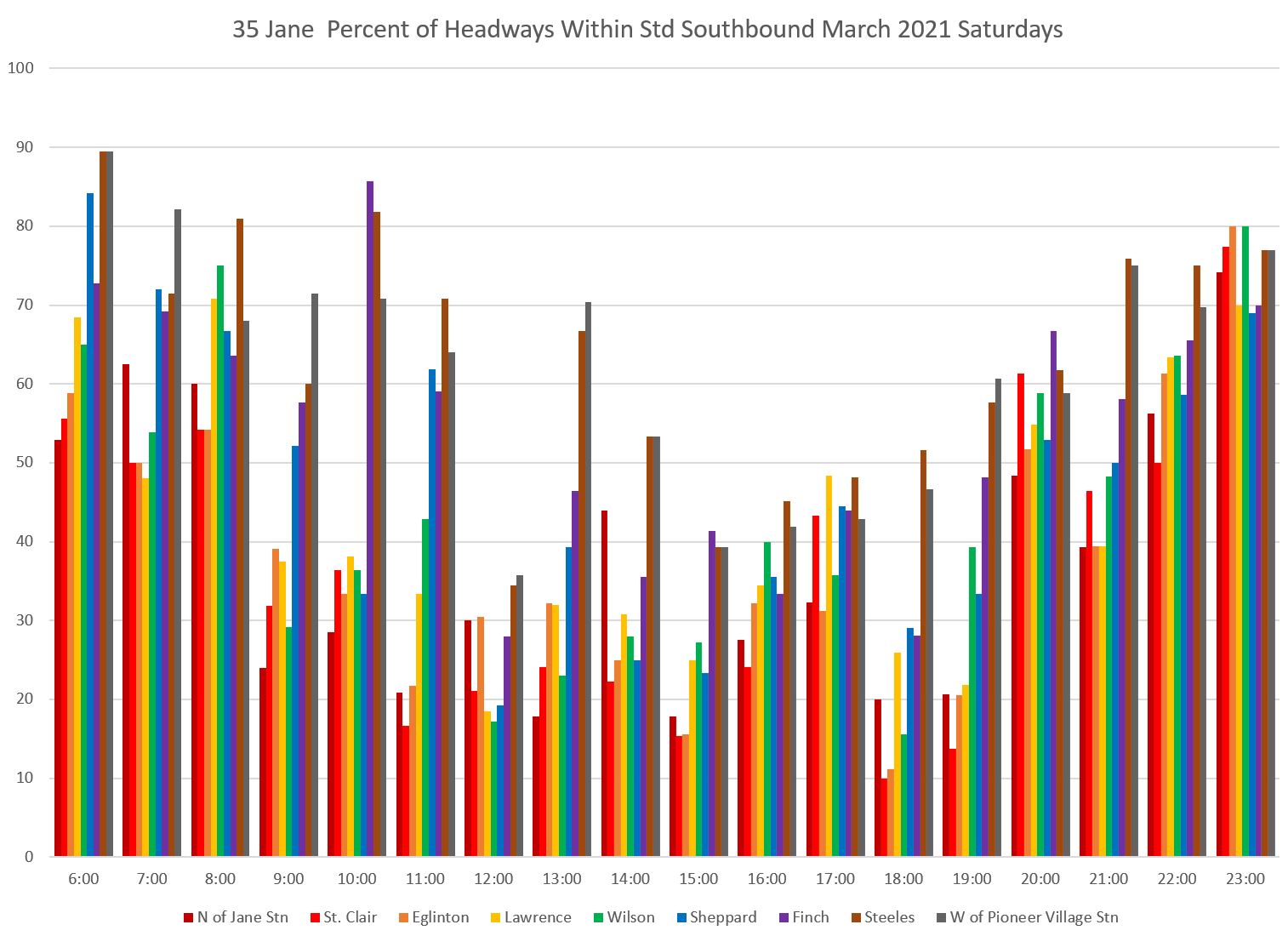
35 Jane Saturdays
Headway reliability on Saturdays is just as bad as on weekdays with a big dropoff in headways within the target range after service leaves Jane Station northbound, especially between roughly 10 am and 7 pm.
There is a corresponding rise in the proportion of bunched service.
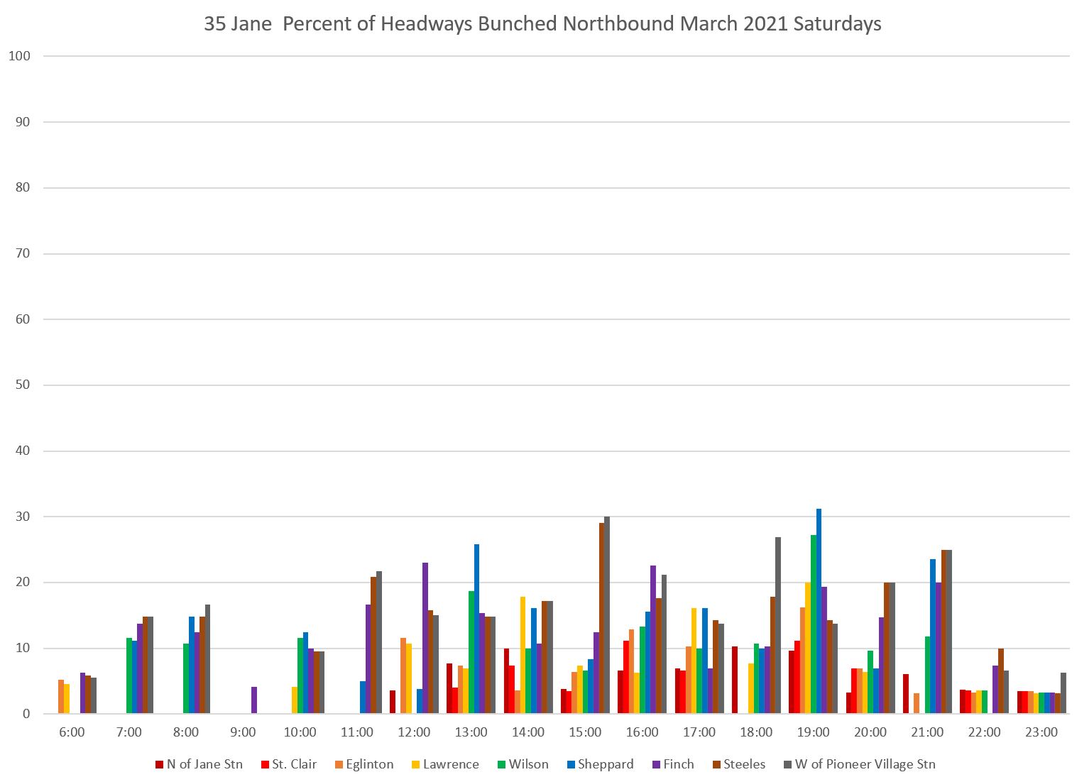
The headway distribution charts show that much of the service is bunched or gapped. Note that there is no 35B service on the weekend, and so the data for Steeles includes all of the service.
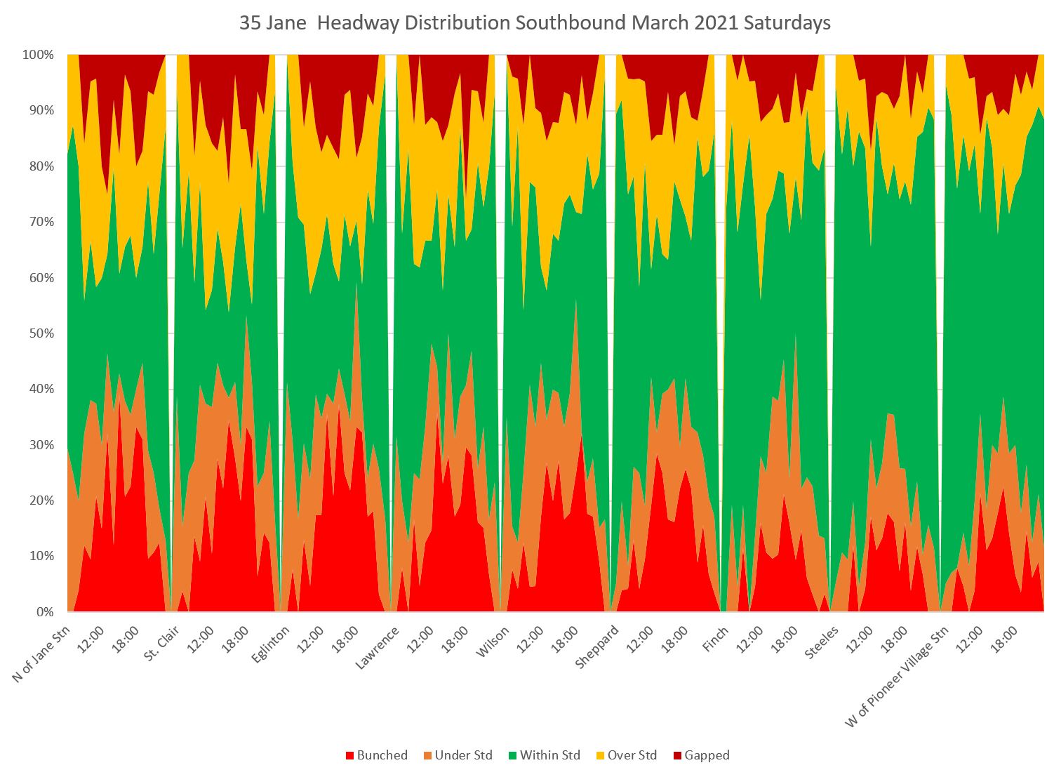
Southbound service echoes the problems seen northbound. A low proportion of headways lie within the six minute target range once service has moved away from the northern terminal.
Service is more likely to be bunched or gapped than within the six minute target window as buses move south along the route.
35 Jane Sundays
The situation on Sundays is better than on Saturdays, but there is still a lot of bunching and gapping in the service.
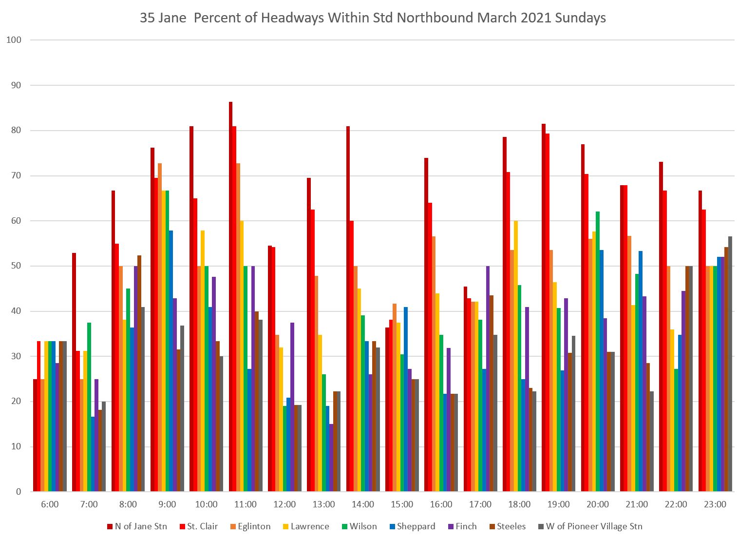
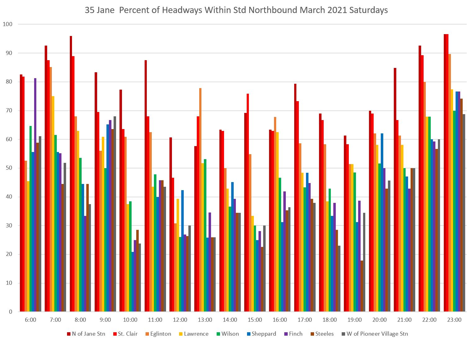
The headway distribution charts show the familiar pattern in both directions of most service running in the six-minute target headway band at terminals, but this declines as buses move along the route.
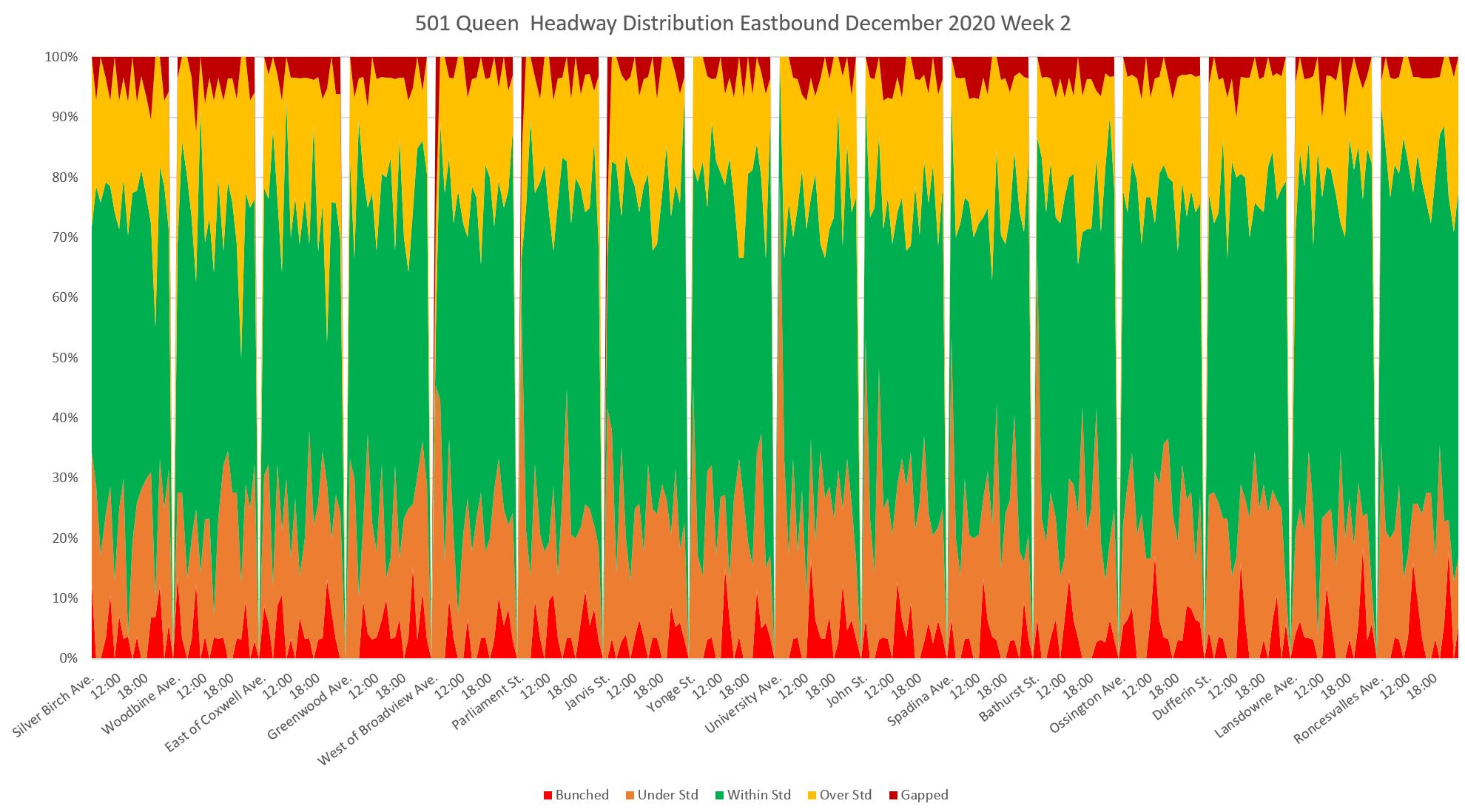
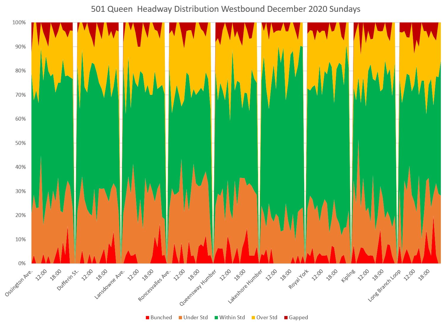
501 Queen Weekdays
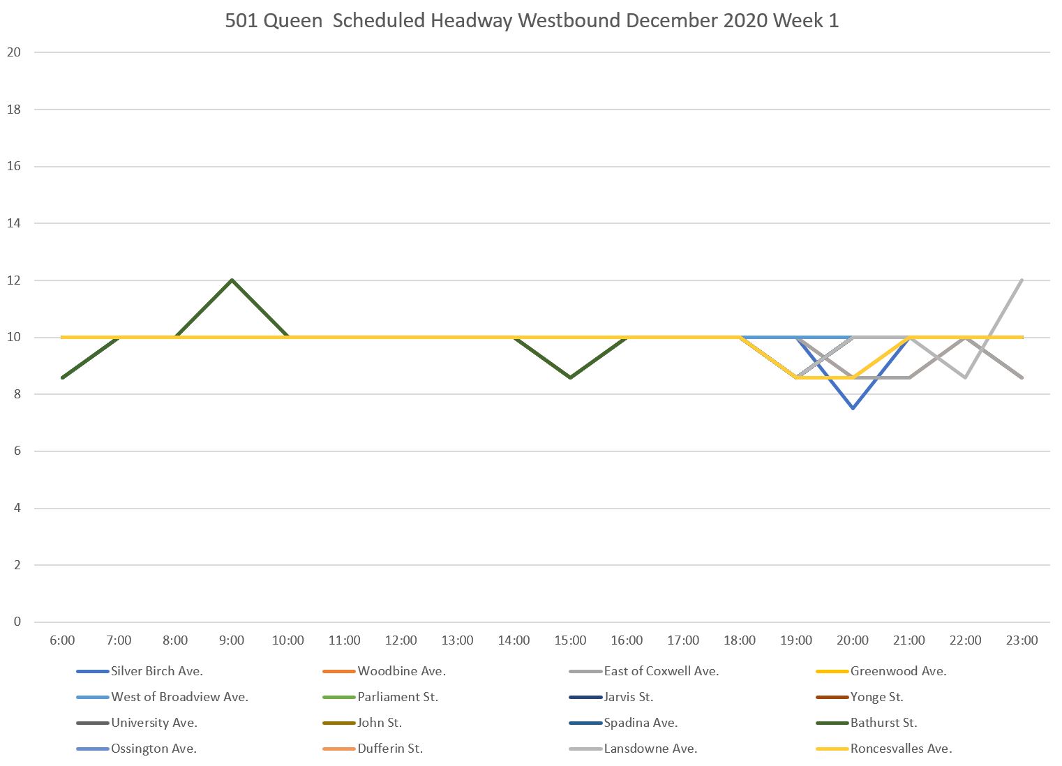
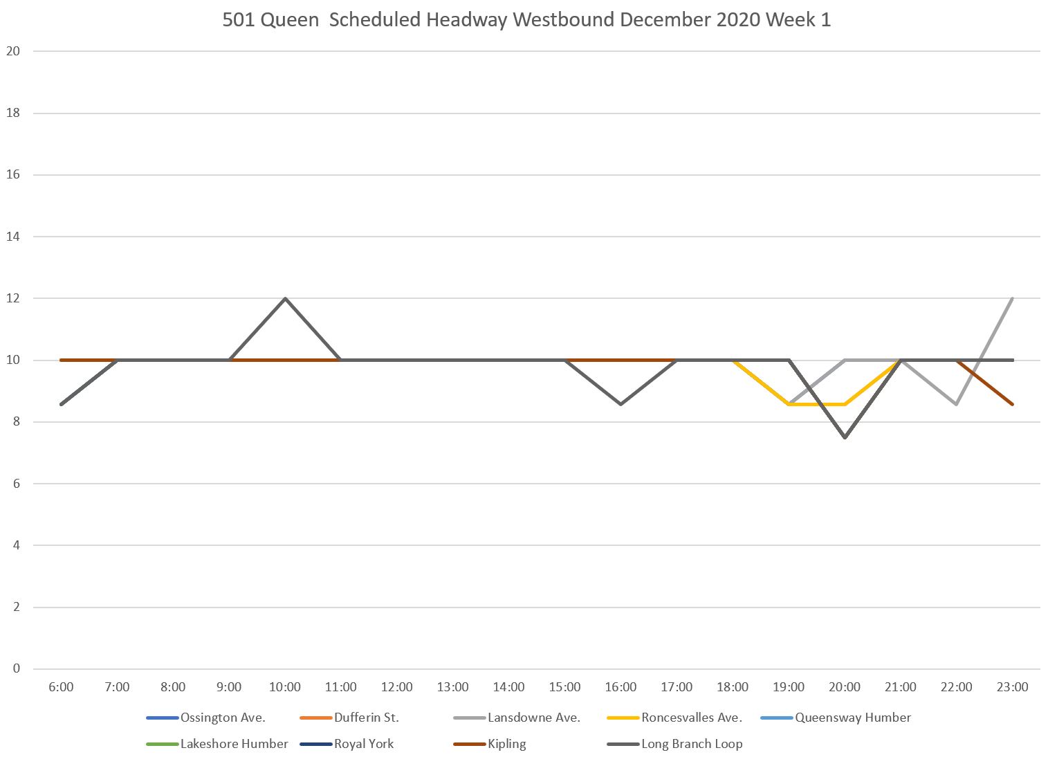
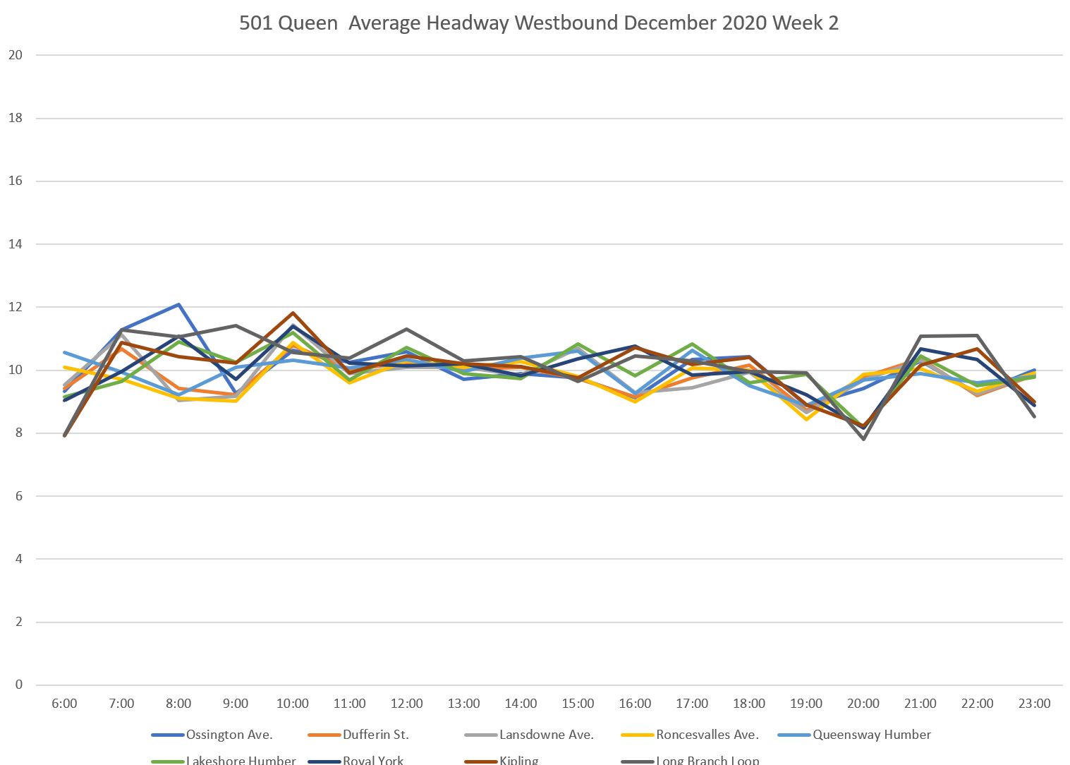
Scheduled service on Queen Street is less frequent than on Dufferin or Jane because the vehicles are larger, and because streetcar ridership has not recovered to the same extent as bus ridership. In brief, there is a 10 minute headway over the entire route from Neville to Long Branch all day, every day
This analysis uses data from December 2020 before the west end of the route was converted to bus operation for track and water main construction between Roncesvalles and Parkside. I have used data from Week 2 because there was missing data in the first week of December.
The route is very long and over twenty screenlines are included in my “map” of the route. This can produce very crowded charts, and therefore I have split the route east and west with a central overlap between each chart. (Neville to Roncesvalles in the east, Ossington to Long Branch in the west)
Here are the scheduled and average service levels westbound for both halves of the route. The average headways hold close to the scheduled value along the 10-minute line. However, as we will see later, the distribution of headways are all over the map. Simply reporting that all of the trips showed up (i.e. the actual and scheduled values match) says nothing about the quality of service.
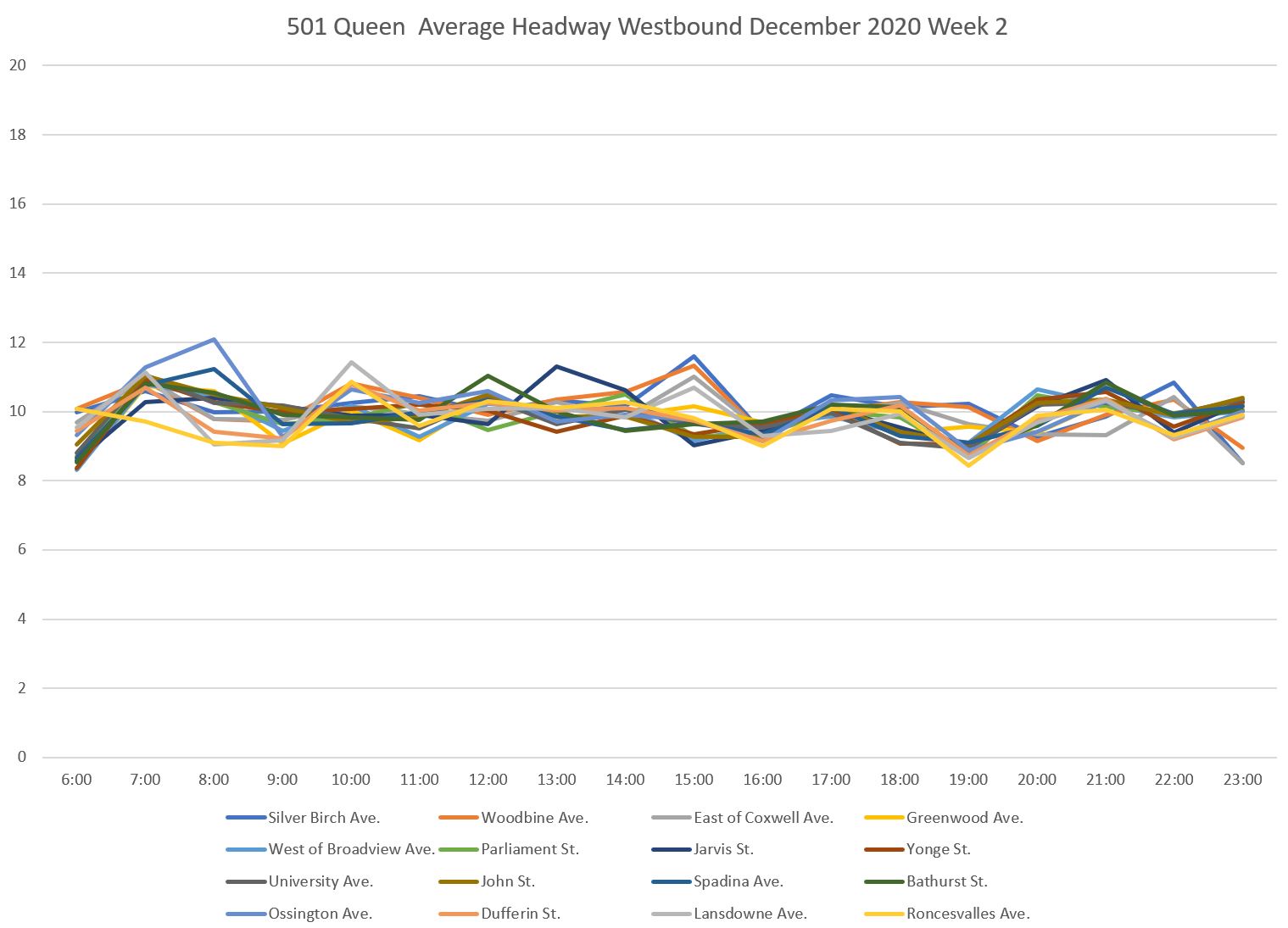
As on other routes, the service starts out well enough at Neville Loop with a high proportion of headways within the six-minute band (a value that for the 501 stays constant at 7-to-13 minutes all day). However, that proportion falls off quickly as the service moves west. The percentages are high at Silver Birch (one stop west of Neville), but quickly fall off.
It is important to note that the degradation of headway quality occurs long before the westbound service reaches downtown where the usual culprits of busy stops and traffic congestion could be cited as explanations
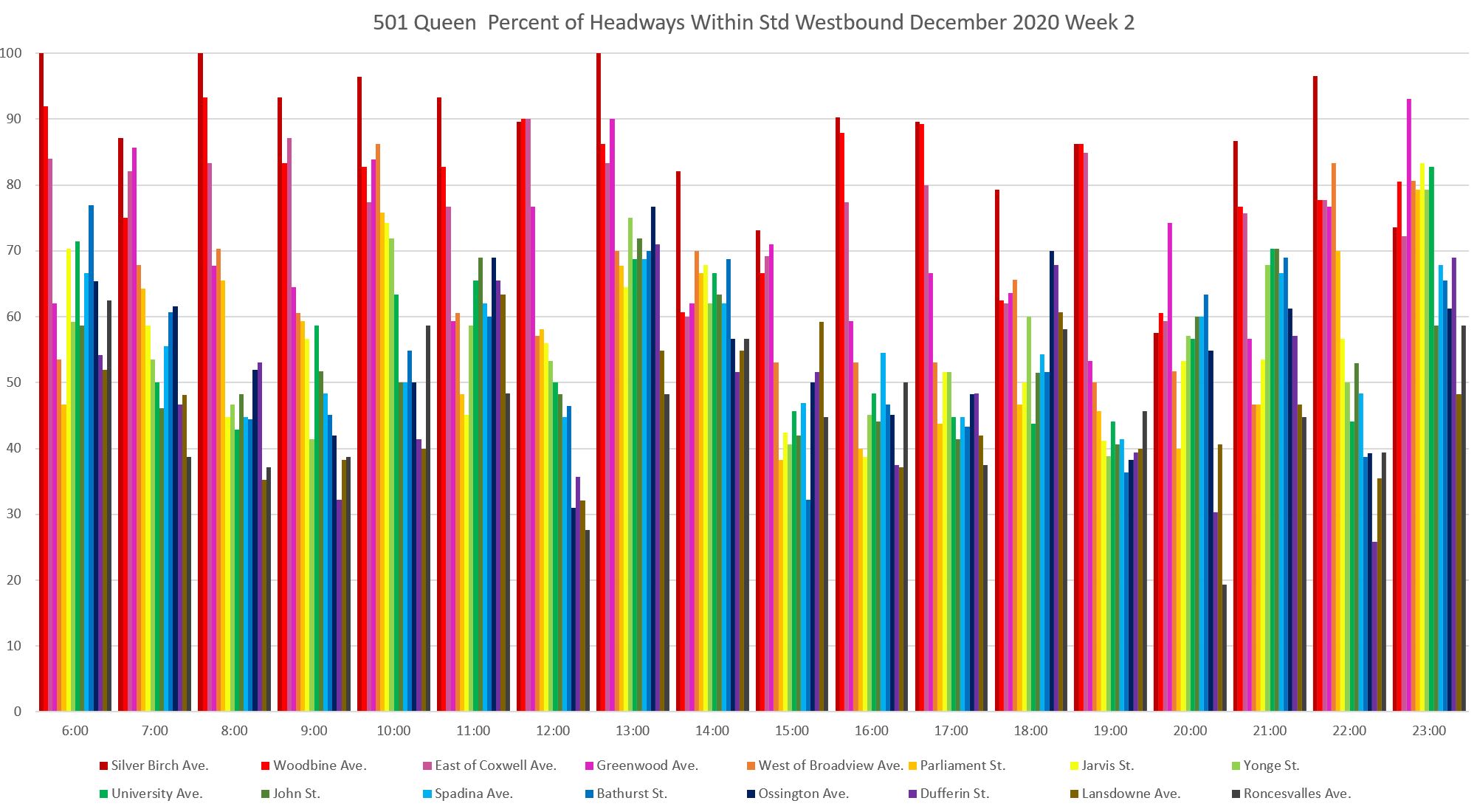
The chart for the west end of the route picks up at Ossington. Much of the service outbound from here westward falls below the 50 per cent line for staying within the six-minute target range. This simply carries over the condition of service inherited from the eastern portion of the route.
Note that the percentage of service within the target range jumps up in many cases at the Lakeshore exit from Humber Loop (light blue) indicating that cars stopped for a time in the loop and left on a better spacing than they arrived (green). However, this quickly falls off by Royal York (purple) and Kipling (brown).
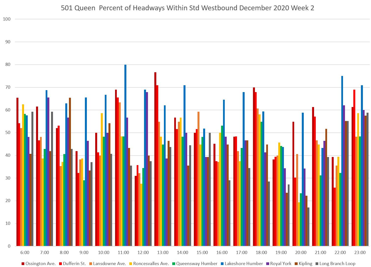
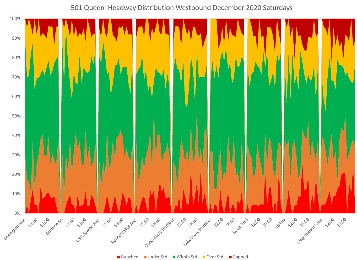
The headway distribution charts for the two portions of the route show the rapidly dwindling proportion of service within the six-minute window westbound from Neville.
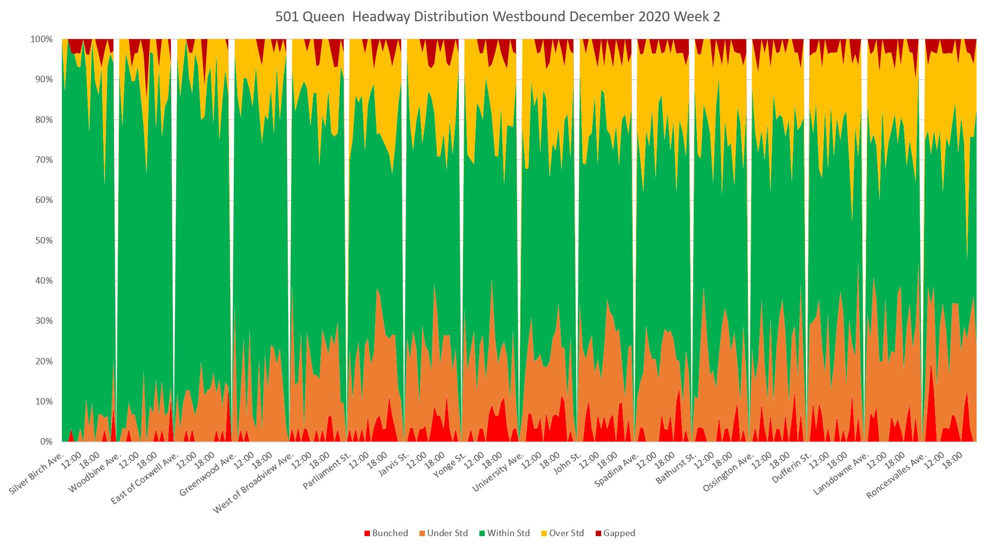
The green band widens slightly at “Lakeshore Humber” as noted above, but then closes down again enroute westbound to Long Branch.

Eastbound service shows the same characteristics as westbound. A very large proportion of service leaving Long Branch is within the target range, but this dwindles as service moves eastward.
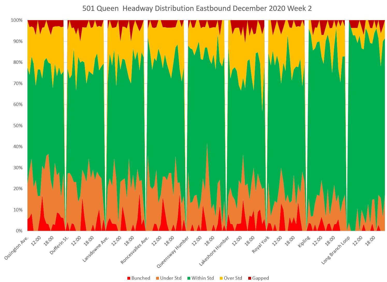
East of Roncesvalles and across the route to Neville, headway distributions stay the same, and only about half of the service operates within the 6-minute target headway window. Again, as with the westbound service, note that this condition already exists at Roncesvalles, before the headways can be affected by traffic conditions in Parkdale and downtown.
501 Queen Saturdays
On the eastern part of the line, there was a diversion in place for two weekends between Church and Parliament. This affects the stats shown for Parliament and Jarvis in both directions and on both Saturdays and Sundays because the vehicles (and hence headways) counted there were shuttle buses, not streetcars, and they only to the extent that they were recorded by the tracking system. This is an example of how “statistics” must be read in the context of actual operations.
Westbound headways on Queen on Saturdays show the same pattern as weekdays with a high on target band at the eastern end that narrows before the service reaches the core. If anything, service west of the core is worse on Saturdays than on weekdays.
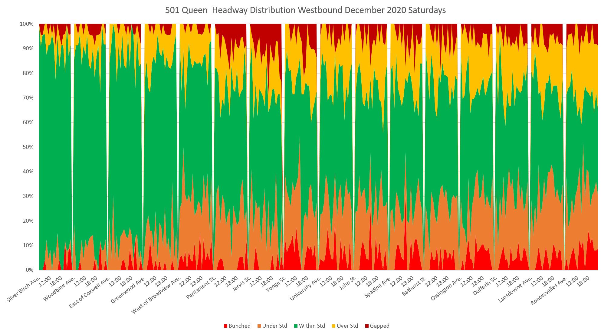
This pattern continues out to Long Branch, but unlike the weekdays, there is little improvement visible west from Humber Loop. This could be due to less headway regulation at Humber, or to more cars arriving westbound with little time to spare.
Eastbound service departs Long Branch with most trips inside the six minute target, but as on weekdays, this quickly declines. By the time the service is running through Parkdale, only about half of it is within the target.
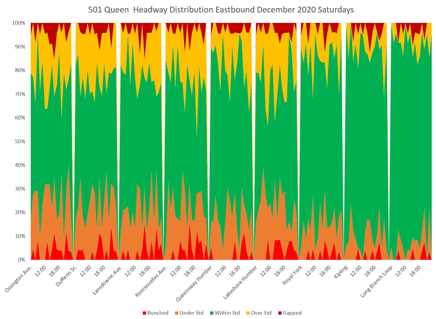
By the time the service reaches Coxwell, over half of the trips are outside of the target band and service to the Beach is quite irregular. The effect of the diversion is quite clear here.
501 Queen Sundays
As on Saturday, the service begins well enough at Neville, but by the time it reaches Broadview only half of the headways lie within the target band. The diversion from Parliament to Yonge affects headways in this segment of the line, although there is some recovery westward from Yonge.
On the western part of the line, there is a slight improvement leaving Humber Loop, but it is short-lived.
Eastbound from Long Branch, headways lie in the target band for a while, but by the time the service reaches Roncesvalles, only about half of the trips lie in that band.
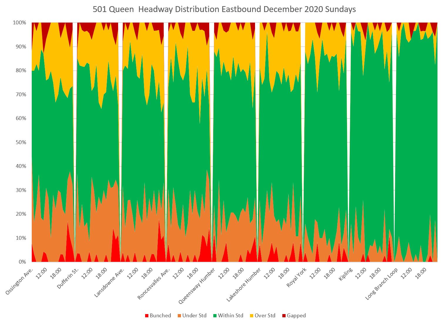
The pattern continues eastward, and only about 40 per cent of service to the Beach lies within the target six minute range of headways.
Full Chart Sets
In the PDFs linked below, there are 8 charts for each of weekdays, Saturdays and Sundays. They include scheduled and average headways, bar charts showing the proportion of trips in each band from “bunched” to “gapped”, and the area chart consolidating the five bands.

Since we no longer have “boots on the ground” in the form of Inspectors keeping control I fear we will never have proper schedule adherence until such time as we have autonomous vehicles.
Steve: And since autonomous vehicles are more pipedream than fact when it comes to mixed traffic, we will wait a long time.
LikeLike
This is an interesting way to present data in an easy to read visual format. Bravo!
One can see how quickly service deteriorates within the first quarter of the route.
It would be interesting to see the 952 Lawrence West Express on one of these charts. I really think the schedule is way out of sync with reality with buses regularly arriving 15-30 minutes early westbound in the afternoon.
Steve: Thanks!
I had a quick look at the 952 for April, and yes, headways there are a mess showing the same progression from the terminal onwards, although on the 952, they don’t even start out well-behaved. I plan to do a series of route/corridor reviews particularly on lines where traffic congestion has returned (as on Lawrence).
LikeLike
Back when I was looking at doing stats for transit, one of the schemes I came up with was a point in time (every 30 seconds at the time) % of vehicles that are within each of your zones…basically I would create a screen line at each vehicles location for a specific time, and then “fast-forward” to see how long it took for the next vehicle in the route to cross that screen line….so for every 30 seconds you would see 10% of the vehicles are bunched, 30% are within the headway and 60% are gapped…then you do it for each 30 seconds all day and get a pretty graph of the percentages over time with a resolution of 30 seconds…you can then average that over the hour, or further filter it to just vehicles that are close to stops, or at end points, or at specific locations…and obviously then you can average those graphs over days/weeks and change the resolution to maybe 5 or 30 minutes….
It would be interesting to have the ridership info now, because you could weight vehicles/stops that are “busy”….who cares if the line isn’t performing well at a stop that is hardly used? It really only matters what the majority of customers see….
I kinda wish that someone would just open source a HTML5 version of what I was doing in silverlight back in the day….where people could just go in and plug in whatever route/day they wanted to see and make some pretty graphs in realtime…save them, embed them, etc.
Steve: Have you visited Darwin O’Connor’s Transsee website? The interface is not exactly beautiful, but there’s a lot of info available including some on-demand charting. Some features are part of a “premium” subscription, but they are free on the streetcar lines so that you can see how they work.
LikeLike
Great proposal, but I think that excess wait time should be calculated without using the APC data. The validity of the metric is based on the assumption that customers don’t use the schedule to plan their trips, so headway is an accurate measure of the average customer’s likelihood of getting on any particular bus that comes. While it is true that long headways (generally) lead to more crowding, some variation will always exist, so there is a risk of overfitting if APC data is used for weights for EWT.
If the goal is to measure the average customer’s experience, headway-based weights should be used.
Steve: One important problem with APC data is that it does not measure riders who never boarded a vehicle because it was full, or at least was crowded to a point where they considered the idea uncomfortable. However, the very term “excess wait time” implies that some part of that time would be normally expected by riders. If we calculate the total wait time, rather than the excess there still needs to be some measure, some target of what constitutes “good service”. A further problem with counting all wait times is that shorter-than-target waits can dilute the effect of long waits in the total.
Even with an excess wait time value, this still needs to be measured relative to something, not simply be stated as an all day value with no reference to location, route length or service level. There is also a bias in downplaying the effect at lightly-used stops which could also correspond to outlying parts of a route. In effect, we would be saying that it’s “ok” for riders in these areas to have poor service because there are fewer of them. That’s a formula for pushing people away from transit.
LikeLike
The scheme of showing on time versus off-time across a route’s extent is good.
The one thing I found a little harder to grasp is the ratio between green “good” and not-green “not good”. I mentally compare the green to the not-green on either side. So if green is only 33%, it’s as much as the not-green on either side, so “looks okay”.
Maybe a more visually impressive display would be to have green along the bottom axis, and not-green all above it, whether that is running too early or too late. I can appreciate why you put too early on the bottom and too late on the tip, but if the idea is to show how little green there is, then having it the baseline element makes it very easy to track how it drops off.
Steve: I will show examples of this and a few other changes in an update to the article soon. Thanks for the idea. Yes, the green does look better across the bottom, and the consolidated red, orange and yellow are more threatening when merged. I may change the colour scheme to better distinguish between the under and over target bands.
LikeLike