
This article is a followup to two previous analyses of the 506 Carlton route’s behaviour:
- 506 Carlton Streetcars vs Buses: Part I – Travel Times
- 506 Carlton Streetcars vs Buses: Part II – Headway Reliability & Capacity
Based on feedback from readers, I have experimented with alternative presentations of the data that better illustrate what is happening on the route. These versions will be added to the repertoire of charts I will use in future analyses, notably for the 505 Dundas route which is the next one in line for review.
Travel Times
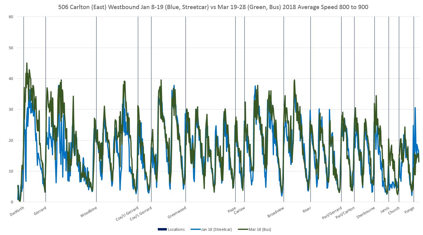
In Part I, the speed of operation across the route was presented as a series of charts showing bus and streetcar speeds along the route. In the chart below, the eastern segment of Carlton is shown for the period from 8 to 9 am. Because the speed of buses and streetcars are often close to each other, the two lines on the chart obscure each other, and the pattern of the difference over the route is not immediately obvious.
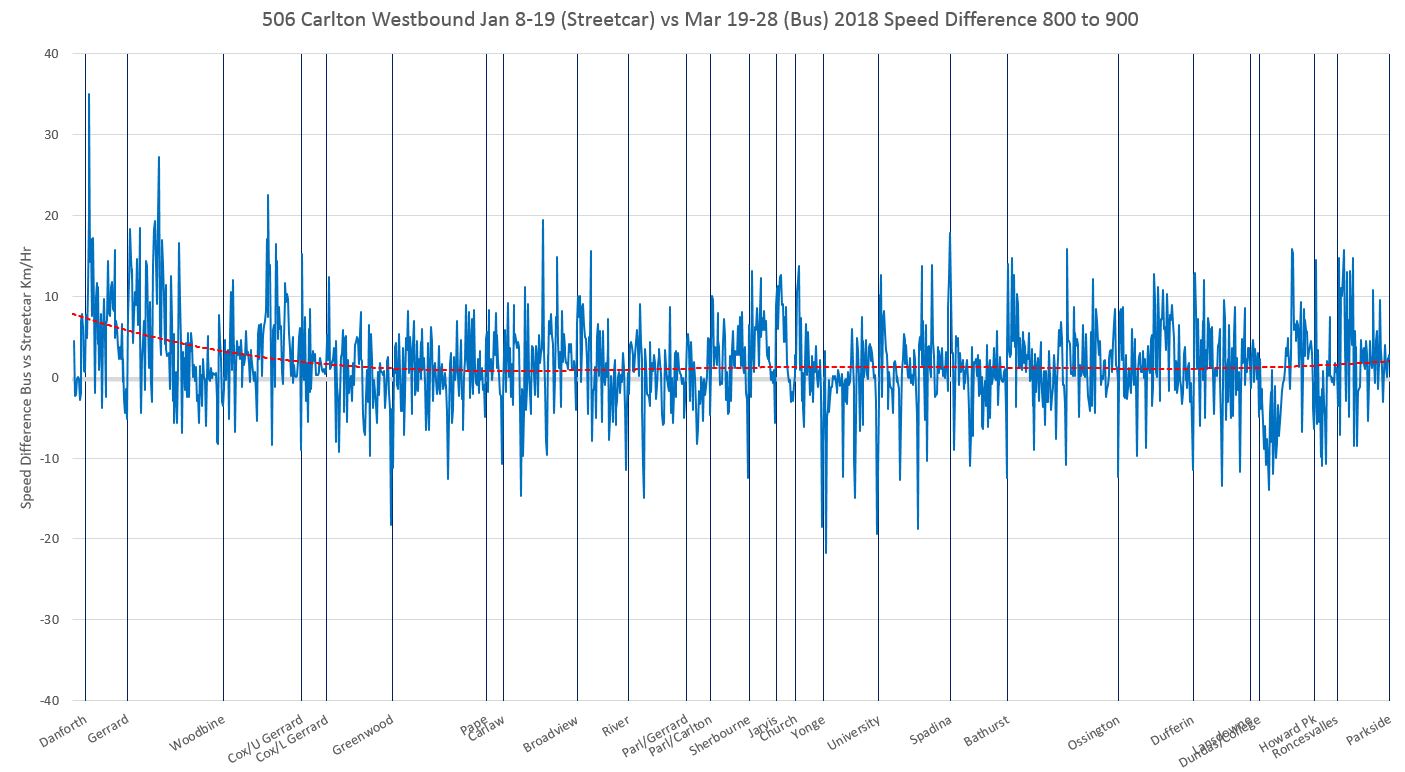
The revised version of this chart is shown below. The changes are:
- The thickness of the lines has been reduced so that there is a bit less of a problem with overlap.
- The chart shows the entire route rather than only half so that the evolution of values over the route can be seen.
- Trend lines have been added for the streetcar and bus values.

A second set of charts based on the same data show the difference values, and includes a trend line.
Another chart that was included in Part I was a comparison of end-to end travel times by time of day.
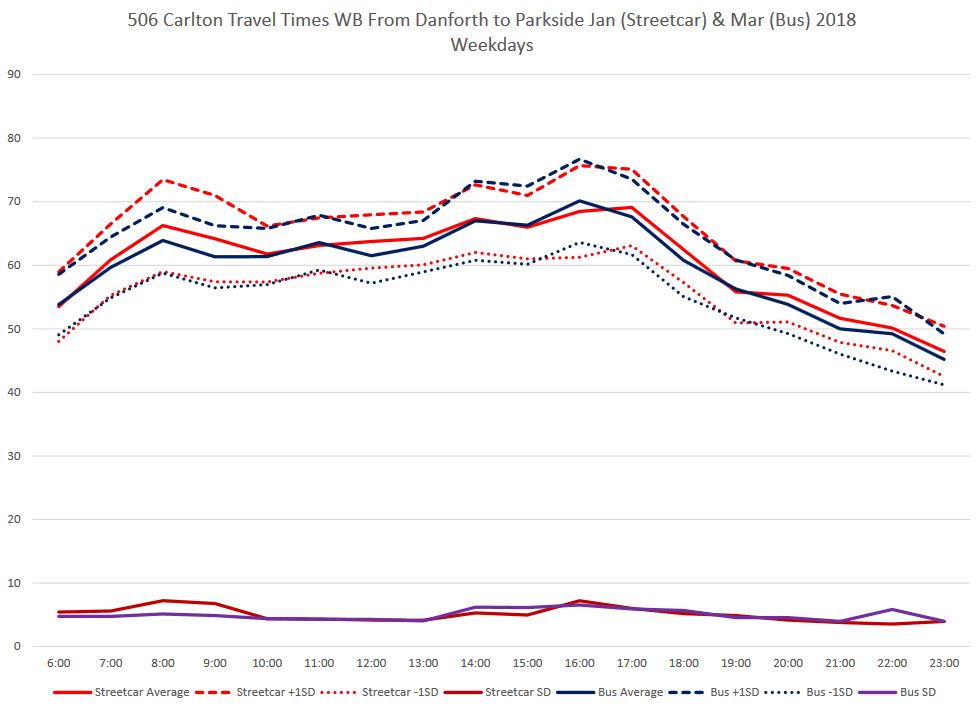
Note that this shows a fair amount of bus/streetcar overlap while the speed chart trend lines does not. There is an important difference between the two measurements.
The end-to-end times are just that – the arrival time at one end minus the departure time at the other.
The speed comparisons, by contrast, show the average speed for all vehicles observed at each point along the line. For the purpose of the analysis, the Carlton route is subdivided into 10m segments, and if a vehicle sits at one for a long time, that will contribute a lot of “zeroes” to the average speed calculation there, but only at that one point (i.e. a transit stop). This will pull down total travel time across the route, but will not have as severe an effect on the trend lines for the speed comparisons that are calculated separately for each point along the way.
The speed difference charts have a lot of downward spikes where the average bus speed is considerably lower than the average streetcar speed, and these generally correspond with transit stops suggesting that buses spend more time stopped serving passengers than the streetcars do. A very fine-grained review of the data will be needed to confirm this, but the pattern in the charts is quite regular and I believe this is a valid hypothesis. In other words, the buses manage to go faster than streetcars between stops, but spend more time at stops with the result that total travel times do not differ as much as the subjective “feel” that “buses are faster” might indicate. This situation varies by time of day and location as the relative position of trend lines on the speed charts shows.
Stepping through the westbound comparisons, one can see the space between the trend lines change over the course of the day and the location on the route. The lines lie closer together in the west end indicating that conditions there do not give the buses much advantage except very late at night. In the east end, particularly east of Coxwell, the buses are not delayed as much by other traffic. The eastbound data show a similar pattern, and there are even a few cases where the bus trend line drops slightly below the streetcar line.
(One important caveat about the behaviour of polynomial trend lines: If there is a substantial change near either end of the series, this will be interpreted as an inflection point in the curve and it could veer quite substantially away from the values further from the ends. This is part of the tradeoff for the smoother polynomial trend lines versus moving averages.)
- 506SpeedStats_WB_Full_Comparison_3
- 506SpeedStats_WB_Full_Comparison_3_Deltas
- 506SpeedStats_EB_Full_Comparison_3
- 506SpeedStats_EB_Full_Comparison_3_Deltas
Headway Reliability
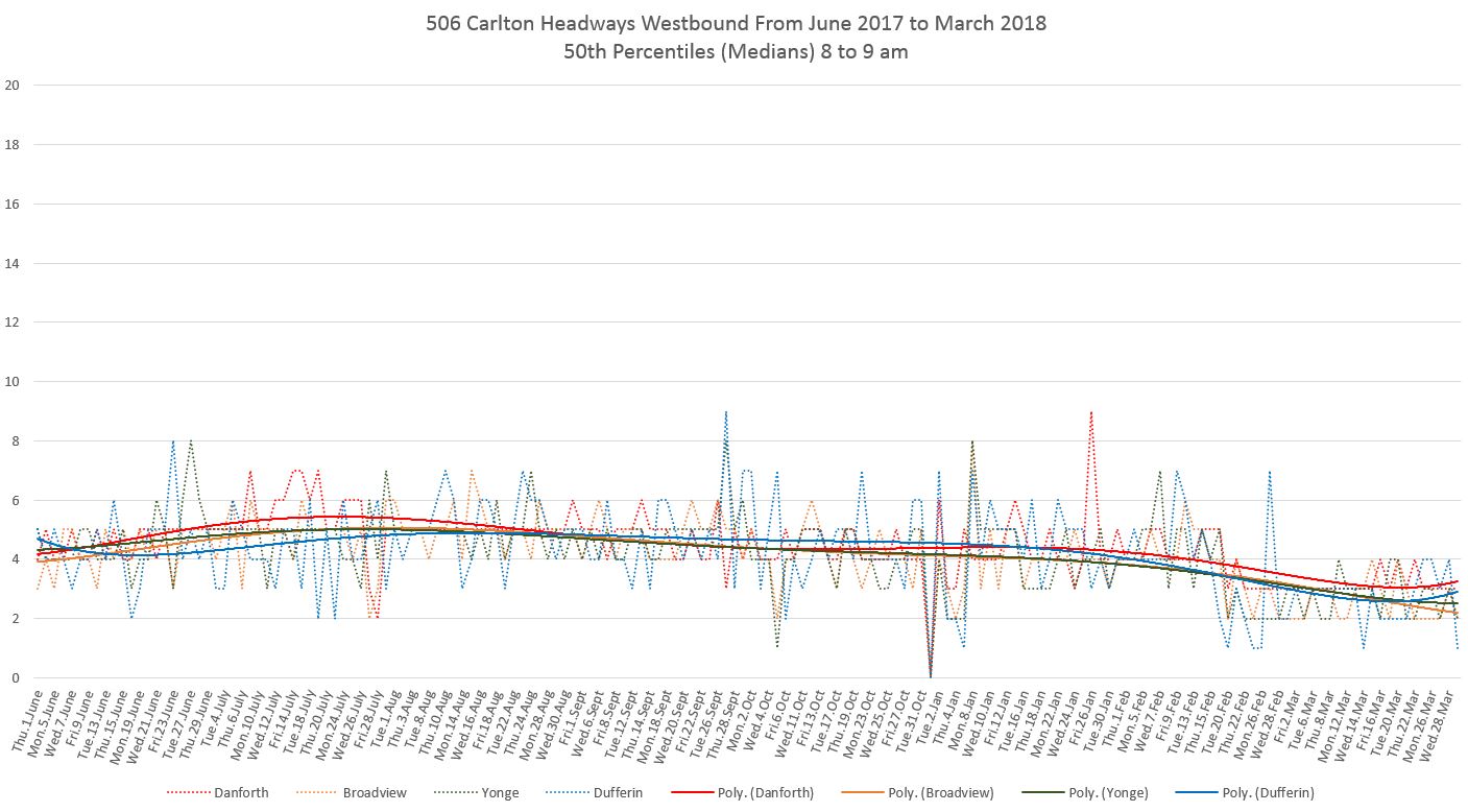
In Part II, the headway reliability data were presented as a set of percentiles for data at individual points such as Yonge Street eastbound. However, the issue is not simply the dispersion of headways at one point, but how these values change as vehicles make their way from one end of the route to the other.
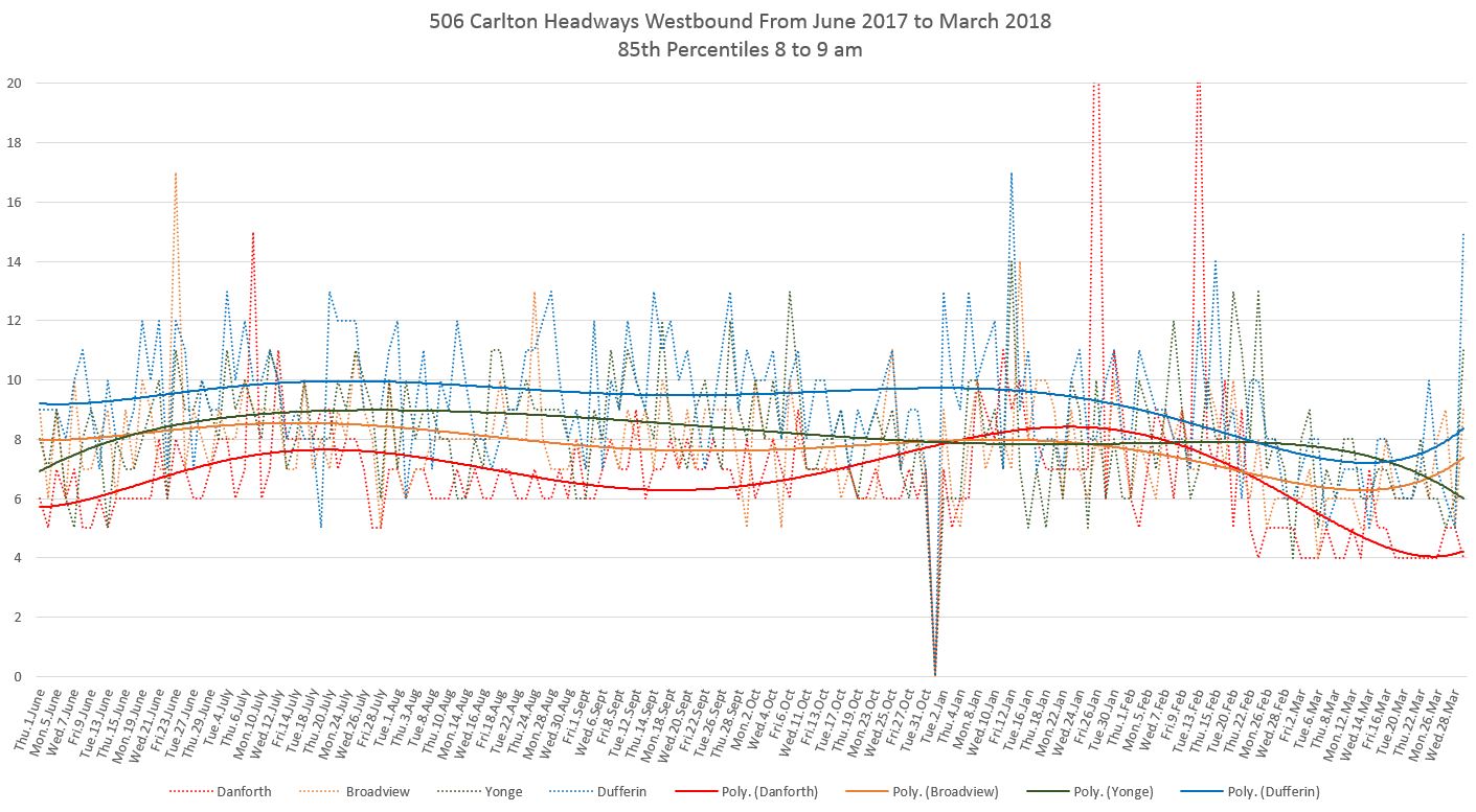
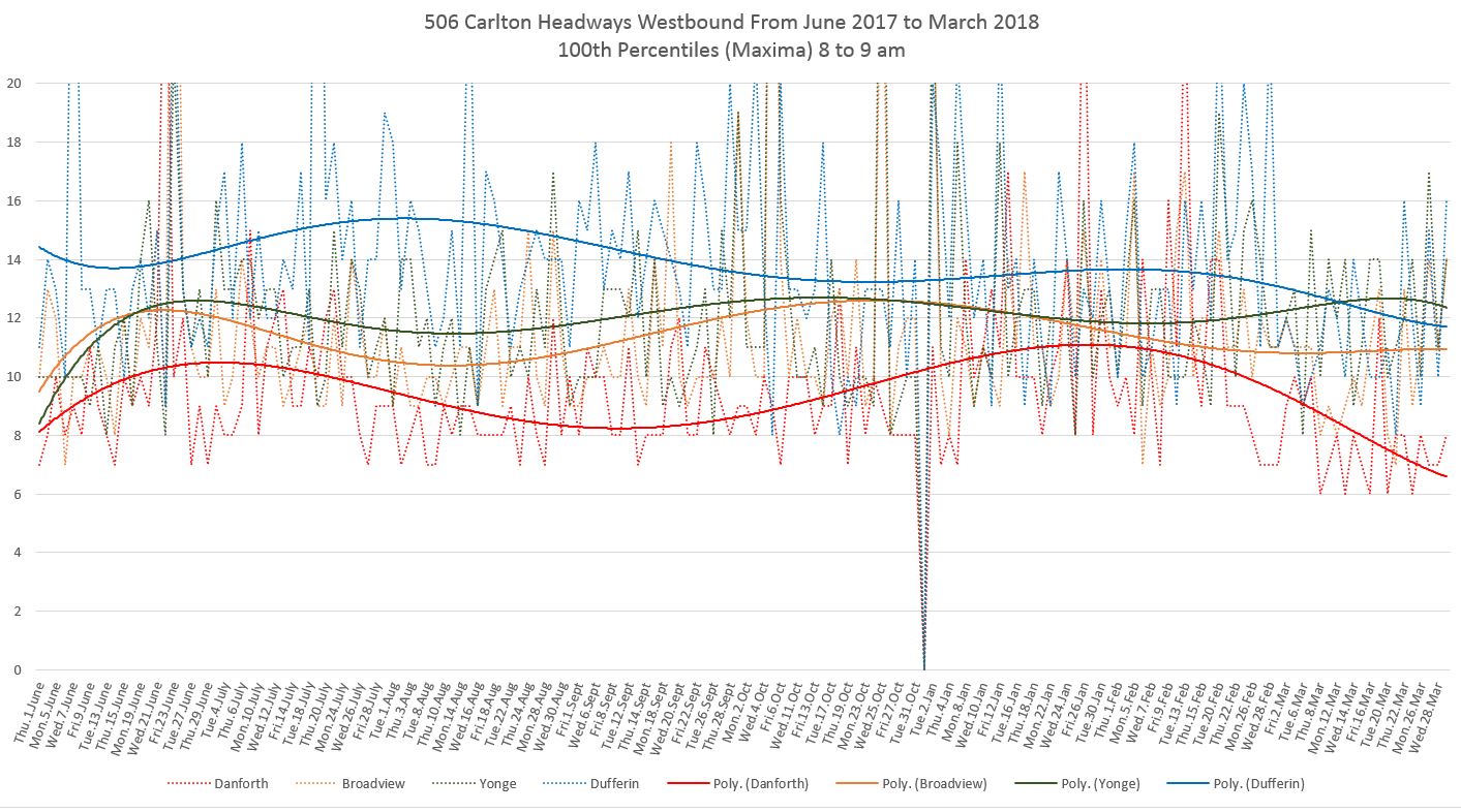
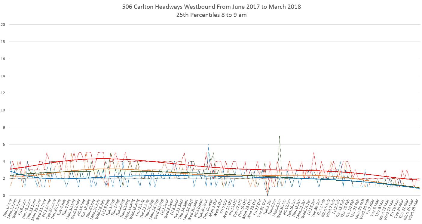
The new chart sets linked below group the data by time period for a specific percentile. In this example, the median headways (50th percentile) in the 8-9 am hour are shown at four locations:
- Main & Danforth
- Gerrard & Broadview
- Carlton & Yonge
- College & Dufferin
These values stay close together for all four locations as shown by the trend lines. These lines have the advantage of smoothing out the daily fluctuation, something that becomes even more important in later charts.
The 85th percentiles tell a different story from the medians. As service moves from east to west, the 85th percentile values grow showing that more riders will experience wider than scheduled headways. Note also that the daily swings in values are larger, and so there is greater variation in the day-to-day experience.
In the worst case, the maximum headways can be even worse and the trend line shows that these sit in a range well above the scheduled value especially for the western part of the route.
Finally, the 25th percentiles show that short headways and shorter not far west of Main Station, and by the time service reaches Broadview bunching is common. This is especially so for the bus service that has operated since mid-February. (Note that a polynomial trend line shows the change in values over a longer period and although the individual daily values drop at the February 18 schedule change, the trend line takes longer to fall to the lower level.)
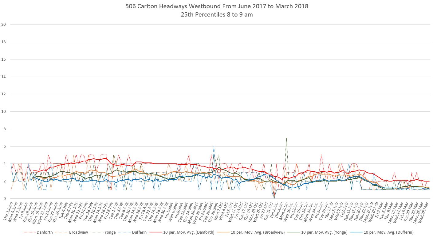
If the trend lines are changed to 10-day moving averages, they show more of the fine-grained variation, but the message of the charts is roughly the same: bunching gets worse as one progresses across the route.
These charts show that headway reliability deteriorates inbound from terminals where, according to TTC’s stated goals, service should be very regular, but in practice, is already ragged and gets worse along the line. By the time vehicles reach Yonge Street, the service quality is considerably worse than the condition in which it left the terminal, let alone compared to the scheduled service. This problem continues on the outbound trip.
The situation is similar for buses and streetcars with the only notable difference being that buses, which start with more vehicles and shorter scheduled headways, in theory should provide shorter gaps even when the service is disorganized. But those gaps are still wide and the associated bunching remains at closer headways that with the streetcars.

I think it’s a fair assessment that buses are dwelling at stops longer, then driving fast to make up.
It also shows the problems with data-driven analysis. Without really drilling down and looking for this, it’s not obvious in the data. Yet it’s almost trivial to notice for anyone on the bus, or any operator on the route. “The data can show us patterns that we wouldn’t otherwise notice” is a true enough saying. However, this often leads to an MBA-style approach where the numbers in a spreadsheet or database are all that matter.
Clearly, as in this case, there can be patterns that we can easily notice, but the processed and reduced data won’t. show. And for the “if it can’t be measured, it’s meaningless” crowd, the patterns don’t exist.
Steve: This is a big reason I keep looking for different ways of presenting the data to bring out different aspects of route behaviour. The TTC has a bad habit of reducing metrics to averages over long time periods, and not particularly well-thought-out metrics at that. Riders do not experience averages, they experience the variations.
LikeLike
When are the 506 cars due to return?
Steve: “Late in 2018” is the most detailed description the TTC has put out. Much depends on new car deliveries and the rate at which old ones are withdrawn from service.
LikeLike
Many thanks Steve.
LikeLike
What is latest delivery of Flexity?
Steve: 4474 is the highest trackable car on the system, although it is not yet in revenue service. 4475 is physically in Toronto. You can use the following link, adjusted for car number, to check on this sort of thing yourself.
https://www.transsee.ca/fleetfind?a=ttc&q=4474&Go=Go
You can follow news on the deliveries on the Canadian Public Transit Discussion Board.
LikeLike
I think east of Coxwell the buses are moving a bit faster because they are able to navigate some of the turns better compared to streetcars. i.e. Right turn onto Gerrard from Coxwell and right turn onto Gerrard from Main.
Steve: If you look at the speed comparison charts, you will see that the buses have the strongest advantage in this section. Not so much further west where the route is much more congested.
LikeLike
It seems TTC removed a few 506 westbound stops, east of Greenwood. The TTC website doesn’t seem to mention anything. Where else could I look for this?
Steve: I have been trying to get a definitive list on this out of the TTC for a few weeks without success. “Keeping people informed” the TTC Way.
LikeLike
I am not sure what is happening with the stops on King.
This morning my streetcar announced a stop at York Street going westbound, however the driver did not actually stop there. I don’t know if it’s another case of that announcement worming its way back into the system by accident, or if it’s a future planned change.
The stops on King at Trinity appear to have been removed from Nextbus. That’s a bit east of where I board on a regular day so I don’t know if those are actually gone or not, but an observation of NextBus shows the cars skipping past them.
Steve: I too have noticed that some cars have discontinued stops still in their list as if an old version has somehow been loaded during an “update”.
Trinity both ways appears to be the only stop on 504 King that was dropped in this round. I will be publishing a list for other streetcar routes, compiled from various sources, soon.
LikeLike