
Updated February 5, 2018 at 2:30 pm: Charts showing comparative travel times between Jarvis and Bathurst for the period from March 2016 to January 2018 have been added to give a longer context to the effects of the King Street Pilot. Scroll down to the end of the article for the charts and commentary.
This article updates previous posts about the effect of the King Street Transit Pilot on TTC vehicle movements.
Please refer to previous articles for commentary on the transition from the pre-pilot to pilot results and for the period up to the end of 2017.
- Analysis of Route 504 King: November 2017 (Part 1: Preliminary King Street Pilot Review)
- Analysis of Routes 501 Queen and 6 Bay: November 2017 (Part 2: Preliminary King Street Pilot Review)
- The King Street Pilot: Sorting Fact from Fiction (Torontoist)
- The King Street Pilot: Sorting Fact From Fiction (Part II: Travel Times)
- The King Street Pilot: Sorting Fact From Fiction (Part III: Service Capacity)
- The King Street Pilot: Sorting Fact From Fiction (Part IV: Headway Reliability)
Weather
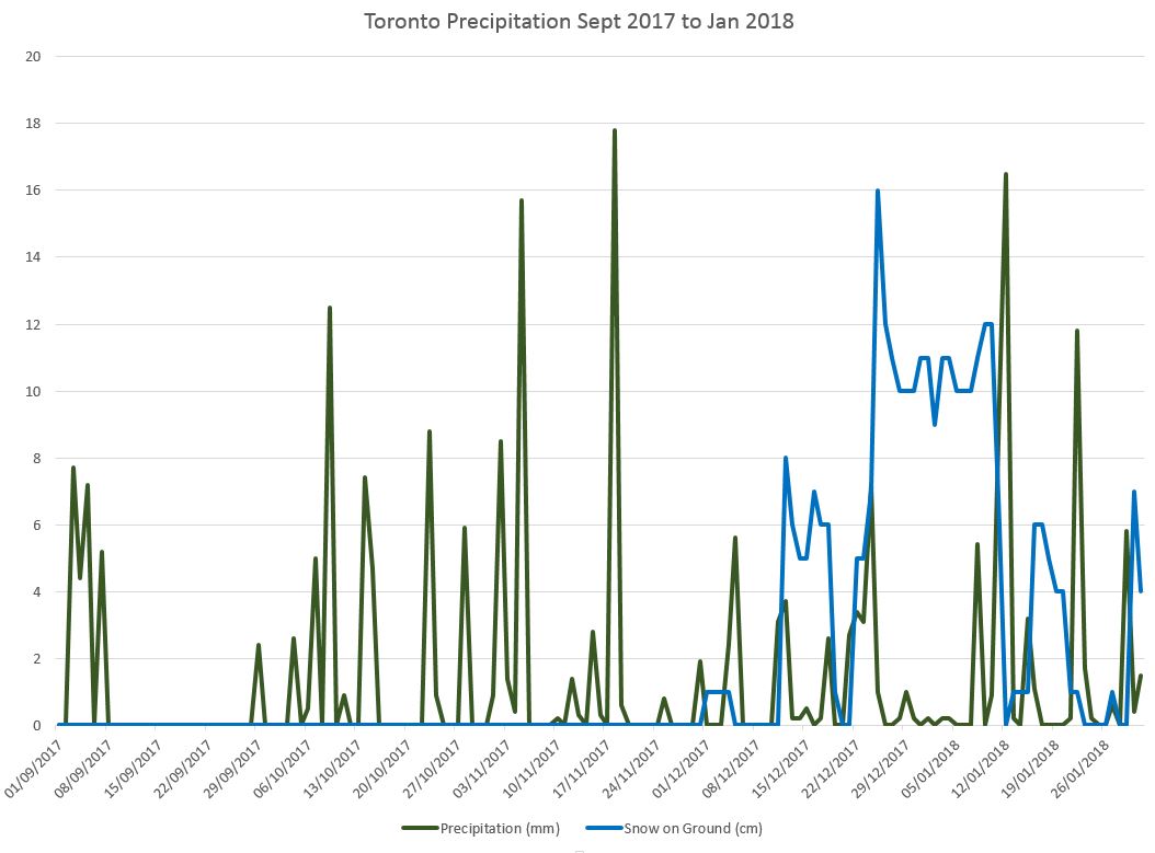
Toronto’s weather has been much harsher this winter than in previous years, and this affected some aspects of service quality through late December and early January, notably headway reliability. Low temperatures were not kind to the older streetcar fleet, and snow affected traffic conditions over the full route, not just in the pilot area. [Source, Environment Canada historical data for “Toronto City”]
WeatherStats_201709201801 [PDF]
Travel Times
Data for January 2018 show that the travel times through the pilot area between Jarvis and Bathurst Streets continue to be both below the pre-pilot values, and generally without the day-to-day “spikiness” in the range of typical travel times.
The sample below shows the travel times for westbound vehicles crossing Jarvis Street between 5:00 and 6:00 pm from September 2017 through January 2018. Horizontal lines give the daily values, while vertical lines bound periods where conditions changed.
- The orange line is the 85th percentile below which most times fell, but it must be remembered that 15% of trips lie above this.
- The blue line is the 50th percentile where half of the trips are above and half below.These two lines are close together because the data values are clustered over a short range in most cases, and so one gets from the 50th to the 85th percentile with a small increase in travel times.
- The vertical red lines show the bounds of TIFF. For September 7-8, the travel times are tracked over the planned diversion via Queen Street and so they are much longer than trips via King.
- The vertical yellow lines bound the period when Queen was closed at McCaul.
- The green vertical line shows the beginning of the King Street Pilot. (Although it is green, this band may show up as black depending on your display.)
- Where there is a gap or the value drops to zero (no examples on this chart), there were no vehicles making the trip on the day and hour in question due to a long delay or diversion.

The two sets of charts linked here contain data for five representative hours of operation starting at 8:00 am, 1:00 pm, 5:00 pm, 8:00 pm and 10:00 pm. These are in the same format as previous charts except for the addition of one month’s data.
