Where Should A Relief Line (East) Go? (Updated)

Updated February 24, 2016 at 10:40 pm: A map showing the various options for a Pape-Queen routing to downtown has been added at the end of this article.

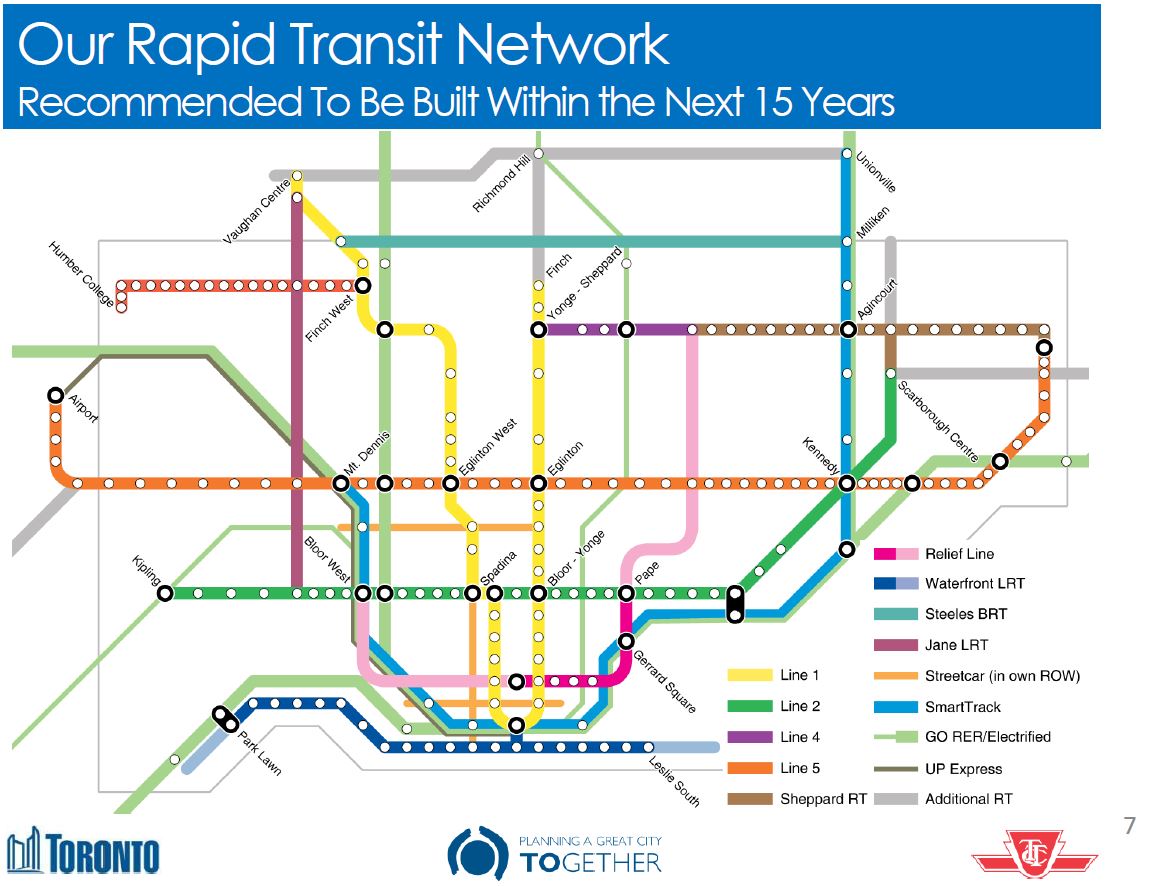
The City of Toronto Planning Division has released the detailed technical scoring for evaluation of six possible routes for a Relief Line linking the core area to the Danforth subway.

The possible routes that survived a preliminary cull were:

  • A: Broadview to Queen crossing the Don River at Queen
  • B1: Pape to Queen crossing the Don River at Queen
  • B2: Pape to Queen, dodging south to serve the Unilever site before crossing the Don and swinging back to Queen Street
  • C: Broadview to King crossing the Don River at Queen
  • D1: Pape to King crossing the Don River at Queen
  • D2: Pape to King crossing the Don River at the Unilever site

Of these, the two Broadview options don’t fare very well, and the real debate is between the four remaining Pape options.

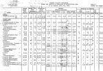
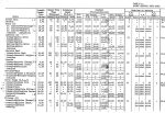
The scoring extends through many categories and pages, but to simplify things and understand just how each factor was ranked, I have consolidated the scores into a spreadsheet. (For the detailed evaluation, refer to the scoring document linked above.)

ReliefLineAlignmentScoringSummary

In place of the scoring system used in the city summary, I have converted each of the symbols to a numeric value:

  • Full moon = 4 points
  • 3/4 moon = 3 points
  • Half moon = 2 points
  • 1/4 moon = 1 point
  • New moon = 0 points

Within each major grouping of scores, the values were totalled and then normalized to the range of zero to one. For example, if a group contained 4 topics, then the maximum possible score is 16, and each alignment’s score is divided 16 to get a normalized value. This allows the scores from each group to be compared with each other.

At the end, the scores can either be summer individually (each topic counts equally), or the group averages can be totalled (each group count equally regardless of how many topics it contains) and normalized.

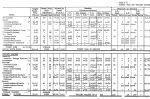
On a grand total basis, both the city’s technical evaluation and public feedback came to the same conclusion: even though there are variations between the four alignments, they all average out to a 3/4 score.

The point scores also come out close to the same with higher values on one item balancing lower values on others for, overall, an even ranking.

Quite simply, all other things being equal, the four alignments are more or less equivalent using this scoring system. However, the City opted for alignment B1 because, among other things, is is claimed to be cheaper and simpler to build.

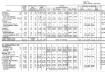
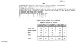
The costs estimates in the City’s evaluation [at p.19] are:

  • $3.7-billion for either of the Pape via Queen options regardless of whether they follow Queen or King to the core
  • $4.0-billion for the Pape-Unilever-King option
  • $4.1-billion for the Pape-Unilever-Queen option

The ridership estimates are generally higher for the via King options, and higher still for the routes serving the Unilever site. In all cases, off-peak riding tends to be low compared to the rest of the network with roughly 2/3 of all boardings on the Relief Line being during the AM or PM peak. The effect is even more striking for configuration where frequent SmartTrack service at 12 trains/hour competes with the Relief Line for customers. This demonstrates the problem of a line aimed at primarily peak period “relief”. As and when we see projections for longer versions of the RL (to Eglinton or Sheppard), the balance of off-peak travel may change because the route will serve new subway territory, not simply provide an alternate route for existing trips.

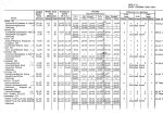
Despite the even scoring overall, the preferred corridor was selected based on giving some criteria additional weight as shown in the table below.

201602_ReliefLineB1Selection

This evaluation, like so much other recent work, depends very much on the presumed presence of frequent SmartTrack service in the rail corridor. If that is found to be impractical, then the relative importance of the RL changes along with its appropriate alignment to serve the core. This is particularly critical at the Unilever site which would have only SmartTrack serving it if the RL stays on Queen Street.

One point above misrepresents the technical evaluation: both of the Queen Street crossing routes have the same cost estimate regardless of which route they take to the core area (Queen or King) and they share the same river crossing characteristics.

In summary, the choice “makes sense” in the limited context that a frequent SmartTrack service will actually be feasible and will be built. If SmartTrack cannot be provided on a five minute headway with a low fare, then the entire planning process will require a major rethink.

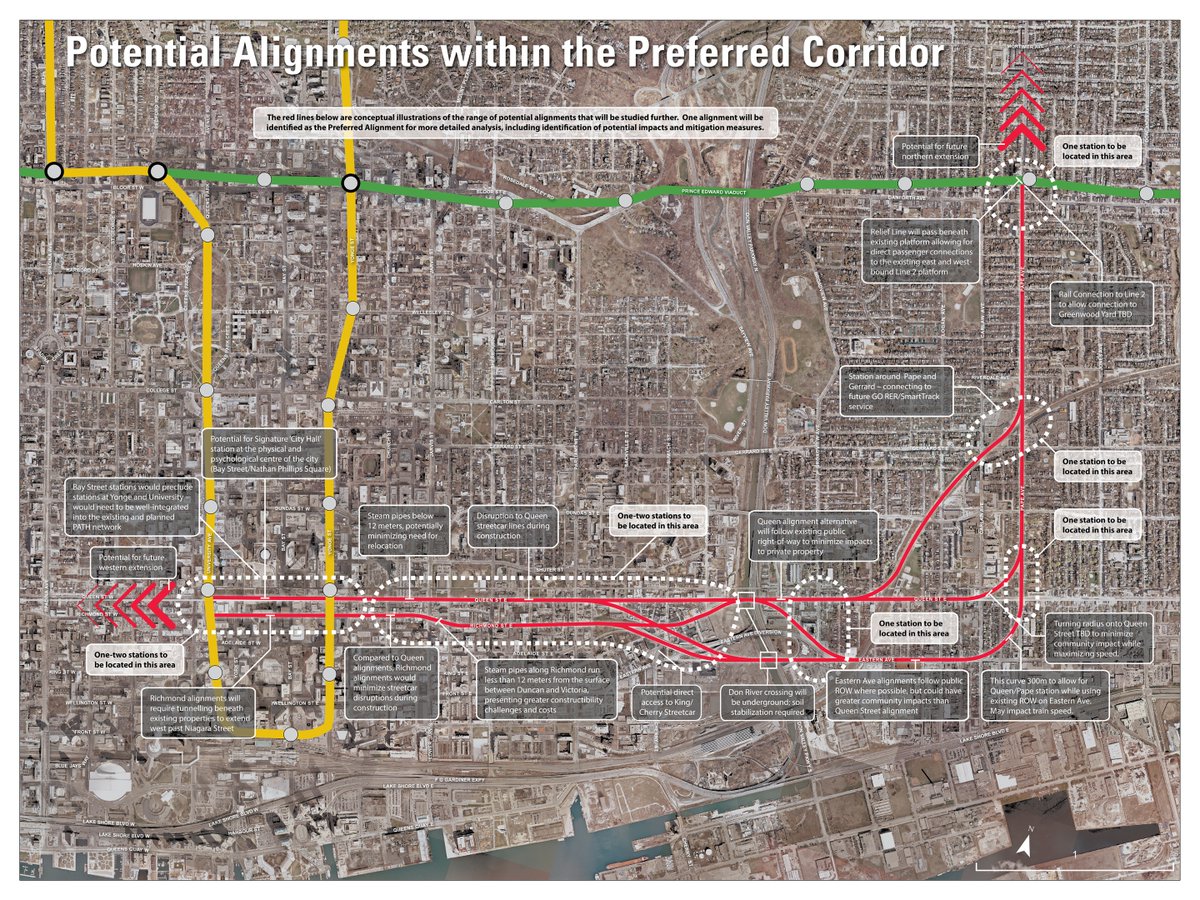
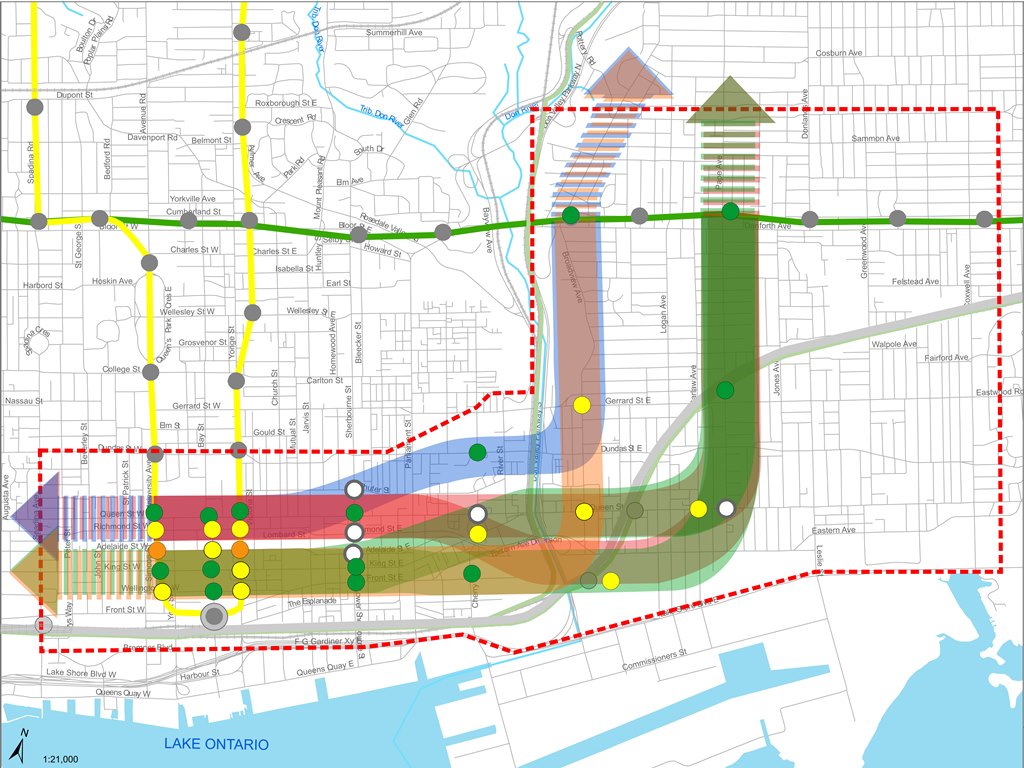
Updated February 24, 2016: The following map shows possible alignments for a route from Pape & Danforth to the core area. Notes on the map talk of a track connection at Danforth to provide access to Greenwood Yard. The technical scoring paper also mentions a southerly route under the rail corridor from Gerrard & Pape eastward. While this is longer, it would avoid the complexity of adding linking curves at Danforth.

201602_ReliefLinePapeOptions

There’s A New Subway On The Way (6)

From time to time, the question of just what constitutes “subway demand” comes up in various threads on this site. As a matter of comparison, here is the TTC Scheduled Service Summary for April 7, 1964.

Headways on the Bloor-Danforth service itself were quite impressive. Two-car trains of PCCs, roughly the equivalent of the new Flexity cars, ran throughout the day until mid-evening, and the peak headways shown below are for trains.

                          AM Peak         PM Peak
                          Hdwy   Veh      Hdwy   Veh
Bloor route                      100             110
  Jane to Luttrell        2'30"           2'30"
  Jane to Bedford                         4'00"
Danforth route                    30              48
  Bedford to Hillingdon   3'20"
  Bedford to Luttrell                     3'00"
Combined                         130             158
  Bedford to Hillingdon   1'26"
  Jane to Bedford                         1'32"
  Bedford to Luttrell                     1'22"

Jane Loop was at Bloor & Jane.
Luttrell Loop was on Danforth between Main and Victoria Park at the old city boundary.
Bedford Loop was at St. George Station.
Hillingdon Loop was at the east side of Danforth Carhouse east of Coxwell.

The Bloor-Danforth streetcars could not carry all of the demand into downtown, and that work was shared with many parallel routes.

  • 2’00” Bathurst car from Vaughan Loop (at St. Clair) to Church & Adelaide
  • 1’30” Carlton car
  • 1’40” Dundas car from Runnymede & Dundas to City Hall
  • 2’30” Harbord car from Lansdowne & Davenport to Pape & Danforth via Dundas & Yonge
  • 1’20” King car
  • 2’00” Kingston Road car (now “Downtowner”)
  • 5’00” Kingston Road Tripper car (Victoria Park to Roncesvalles & Queen)

The streetcar system required 640 cars in the am peak, 684 in the pm peak.

UPX Fares are Falling Down, Falling Down

After months of ignoring the obvious, Metrolinx and their Queen’s Park masters will lower fares on the Union Pearson Express.

UPXFares_20160309

Although the Board does not meet to ratify the change until 6:00 pm February 23, 2016 (as I write this), the report has been online for a few hours, and the change was announced by Minister of Transportation Stephen del Duca earlier in the day.

Not shown in the chart above is a reduction in the monthly pass for workers at the airport. It will fall from $300 to $140, according to The Star.

The official story told both in the management report and accompanying presentation is that UPX did everything it set out to do – it was built on time and on budget, it ran (mostly) on time, and its customers were highly satisfied with the service. Only one small problem – not enough customers.

The low ridership is attributed to four problems.

People Don’t Know It’s There

It has been more challenging then expected to reach both local and non-local markets to ensure they are aware of the service. Notwithstanding the significant media focus on the service and the marketing efforts that have been undertaken, more effort is required to build awareness of the service. [p.2]

This is just a tad hard to swallow given the amount of puffery around town about the new service beginning well before the line opened. Metrolinx now talks about a variety of strategies including staff not just at Pearson Airport to lure travellers to their service, but even with marketing further afield including the ability to buy UPX tickets at airports like Montreal that originate a lot of Toronto-bound traffic. One cannot help wondering what the effective cost per passenger will be.

People Use The Service They Know

Second, engrained habits on how people travel between Pearson Airport and downtown Toronto have proven to be difficult to change. Individuals are used to driving, taking a taxi or limousine to the airport, and with the recent rise of car/ride sharing services, more effort is required to incent people to change their past practice and test the new service.

What is completely ignored in this statement is any concept of convenience, the possibility that auto-based travel (shared or otherwise) provides point-to-point service, whereas UPX by definition is a transit service one must access where it actually stops. This is a major impediment. The demand modelling done for Metrolinx included a fairly wide catchment area, but most of the trips from the various modelled zones required a transit journey just to reach a UPX station. If someone is already on transit, especially the Bloor subway, then continuing to Kipling and the 192 Rocket is not a difficult choice. The problem lies in getting an airport traveller onto public transit in the first place.

People Don’t Know How To Find It

Third, there is uncertainty among potential customers about the beginning and end portions of their trip. This includes the “first mile/last mile” topic, in terms of the total trip time experienced by customers, and navigating at Pearson Airport and Union Station, both of which are complex visual environments, and with ongoing construction at Union Station making wayfinding and signage more complex.

That “first mile” also includes getting to the UPX station, never mind navigating through it, and yet Metrolinx looks only at the last leg of such a journey as the source of problems. Without question, Union Station is a challenging place these days for anyone who doesn’t know it well. Regular commuters adjust as the paths change, but for would-be airport travellers, this could be a first journey. As for the airport, bad signage has been an issue since the line opened. Trotting out this among the excuses begs the obvious question of why this had not been fixed months ago.

People Think It Costs Too Much

The fourth barrier to ridership growth has been perceptions about price. The research indicates that there is a view that UP Express is expensive, without knowledge among potential customers what the exact price is.

This is really the most bizarre explanation for corporate failure I have ever seen. It’s like saying that people don’t buy a Rolls Royce because they think it would cost too much, but they’ve never been into a dealership on the off chance of a one-day sale. Instead of just saying “the fares are too high”, Metrolinx proposes to jetison the “business class” fare structure and go after a completely different market.

As evidenced by the large turnout on the recent Family Day Weekend, when more than 43,000 riders waited in line up to 2-3 hours in order to ride for free, there is a great deal of interest in and curiosity about UP Express. Management is proposing a multi-faceted strategy to build on this interest. A key part of this strategy is a new fare structure.

The proposed new fare strategy is designed to attract new riders, change air travellers’ ingrained travel habits around ground transportation, provide a viable new travel option for travel between downtown Toronto and communities served by UP Express, and reinforce UP Express as a high-quality component of the region’s transportation network.

In otherwords, rather like Porter Air, the UPX is going to have a never-ending sale, although whether it will feature daily adverts with cuddly critters exhorting us to fly UPX remains to be seen.

Let us be honest: you can have the greatest engineering and project management and the nicest trains (even with a drab colour scheme), but without customers, you have failed. The new fares will generate more riding, although how much effect they will have on the bottom line is quite another matter. Fares for non-airport trips will sit at the same level as GO Transit which remains uncompetitive, except on speed, for local travel within Toronto.

A huge, obvious, and totally missing part of the equation is fare integration with the TTC. If, like the 192 Rocket, a trip on UPX included free transfer to the TTC for inbound riders, and a discounted outbound fare with the same effect for outbound trips, then UPX would truly be part of the transit system, not a tantalizing, but annoying service that looks nice on the map, but isn’t worth the effort.

After Metrolinx spent months telling us that the line just had to find its market, the market proved Metrolinx wrong. All the brave talk about success on other fronts is a nice show, but it is meaningless because the service was not properly designed from the outset. I wonder how many awards they will collect from the Air Rail Association for that little blunder?

There’s A New Subway On The Way (5)

The new subway would bring major changes in travel throughout the transit network.  The TTC produced a large poster, the size of a two-page foldout in newspapers of the day explaining many features of the line and its operation.

BDNews1

Probably the largest reorganization of routes in the TTC’s history accompanied the opening of the new subway including the change or removal of several streetcar lines. This was to be the beginning of a gradual dismantling of streetcar operation leading to the opening of a Queen Street subway in 1980.

BDNewsRoutesw

Lest passengers be confused about the destination of their trains with the integrated subway service, platform signs would indicate where the next train was headed. The signs remain on many platforms with their displays fixed to the now-standard destinations.

BDNewsDestSignsw

The two-zone fare system still existed, although its boundary would not be punctured by the subway until the extensions beyond the old City of Toronto opened. The fine boundary line is visible in the route map below.

BDNews2

Adult tickets were still a common method of fare payment, and the TTC exhorted travellers to switch to the mode used by “seasoned subway riders”, tokens, at the princely price of 6 for $1 in handy cardboard holders.

TokenHolder6

For the opening, a special commemorative token holder was issued.

TokenHolders1

The subway had its own pocket route map.

BDMap660226B

BDMap660226A

Six months later, this would change to the routes we know today.

BDMap660904B

BDMap660904A

Demand Projections for Relief Lines

The City of Toronto Planning Department has published a set of demand projections for various combinations of the (Downtown) Relief subway line, SmartTrack, and the proposed northern extension of the Yonge line to Richmond Hill.

This document makes interesting reading because it shows both the status of the evolving master transit plan that went into the modelling, and the vital point that additional capacity into the core area is essential to prevent complete gridlock on the subway system. Both SmartTrack and the Relief Line are essential to a future transit network.

That said, the report raises several issues in part by what it does not talk about, specifically some of the network configurations that have already been presented in various studies.

Alignment Options for the Relief Line, and Other Model Variations

This question of the Relief Line’s alignment is subdivided into two parts: what is the scope of the line, and which route will it take to link Danforth to the core area.

The big options include:

  • A “little J” route from Yonge Street to Danforth
  • A “big J” route from Yonge Street to at least Don Mills & Eglinton, possibly beyond
  • A “little U” from Danforth to Bloor West via downtown
  • A “big U” with northern extensions of one or both arms of the “little U”

Work has focussed on the “little J” because that is the scope for a Relief Line so long discussed, and approved for study by Council. Therefore the model numbers do not show any effect of taking the “little J” further north to intercept more traffic bound for the Yonge line. This has already been reported by Metrolinx as a very beneficial extension to the RL.

Within all of the options, there are permutations of a Danforth to Downtown route:

  • The north-south segment could lie on either Pape of Broadview.
  • The Don River crossing could be at Queen, or further south to allow the line to serve the Unilever site.
  • The route into the core could be via Queen or King.

A northern route via Queen makes for a simpler river crossing, but the southern route picks up a major new employment district. The King Street route into downtown also attracts more riders than a Queen route.

City Planning staff have erroneously talked of a King route as if it could only exist as part of the southerly Unilever site alignment, when their own study clearly shows the option of a route crossing the Don at Queen, and then veering into King Street. The more northerly crossing is preferred because it will be easier to build under the river at a narrower point.

RLAllCorridorsWeb

The following permutations were modelled to see how they would perform:

  • Broadview to Queen
  • Broadview to Queen to King
  • Pape to Queen
  • Pape to Queen via Unilever
  • Pape to Queen to King
  • Pape to King via Unilever

Of these, the two most promising were the Pape to Queen options with the only variation being whether the line ran to downtown via Queen or via King after crossing the Don at Queen Street. For this article, these are the only two whose demand projections I will discuss.

Further east, there is the question of the Scarborough Subway extension and SmartTrack. Model runs were performed with three variations:

  • No SmartTrack
  • SmartTrack on a 15 minute headway (4 trains/hour)
  • SmartTrack on a 5 minute headway (12 trains/hour)

The SmartTrack cases used a modified land use plan that assumed SmartTrack itself would cause growth that would not otherwise occur. This causes increases for the Relief Line’s projected demand when it is matched with a the lower level of SmartTrack service (4 trains/hour) because the latter does not attract as much riding as the Relief Line.

All model runs used a Scarborough Subway (SSE) with its original three stops, not the “optimized” version serving only Scarborough Town Centre. The disconnect between what is modelled and what is proposed indicates that some of the plan’s elements have changed very recently. The model is supposed to catch up to the plan in future iterations.

None of the SSE or ST figures are included in this report, and so we cannot see how the model divided up demand between them, albeit with the “wrong” station configuration.

Finally, the Richmond Hill extension was added to the model networks to see how it would affect demand on the critical downtown segment and Bloor Yonge Station.

All of these numbers must be taken with awareness of the limitations on what has been modelled, notably:

  • With the RL ending at Danforth, the potential benefit (and hence RL demand) of the “big J” is unknown.
  • The five-minute service on SmartTrack, identified in a previous study as essential to attract riders, may not be physically possible given constraints on sharing the network with GO.
  • It is unclear whether SmartTrack will actually operate at no fare premium above local TTC services, another essential component of making this service attractive to riders.
  • The effect of SmartTrack in the downtown segment, including the degree to which it would duplicate an RL at the Unilever site, depends on the ability to operate frequent ST service.
  • The relative roles of the Scarborough Subway and SmartTrack in attracting riders is unknown because the now-proposed station layout has not been modelled.

That is a long list of variables. Many of these will be addressed in updated model runs expected in coming weeks, but readers should be careful not to take the current model output as definitive.

Nonetheless, the report concludes that treating SmartTrack and the Relief Line as options is misguided because both will be required to accommodate future demand to 2031 and beyond. Addition of the Richmond Hill extension to the mix will exhaust the Yonge line’s capacity by 2041. This makes further study of the “big J” quite important.

The findings in this Summary Report make clear the importance of the Relief Line. It is apparent that both the Relief Line and SmartTrack will be required in the future to ensure the efficient operation of the existing and proposed future transit networks. Additional work is required to assess the potential benefits of extending the proposed Relief Line north of the Bloor-Danforth subway to Eglinton Avenue and potentially to Sheppard Avenue. [p 3]

Continue reading

There’s A New Subway On The Way (4)

February 1966 saw the opening of the Bloor-Danforth’s Keele-to-Woodbine stretch, and an extension to North York was already in the cards, albeit only to Sheppard Avenue. Like the BD extensions to Scarborough and Etobicoke, this segment would itself grow another two kilometres. The original plans called for the line to be built parallel to and west of Yonge Street just as the route south from Eglinton had been, but demolition of a swath of homes through North Toronto was not in the cards. The alignment eventually chosen lay directly under Yonge with a bored tunnel north to Sheppard. (The Finch extension would later be built cut-and-cover through the then much less-developed Willowdale.)

Progress Report 6 includes a few choice items including the coin changer at an automatic entrance (fares were 6/$1.00), the speed ramp linking the temporary Bloor streetcar shuttle platform at Keele Station to the eastbound platform, and a reference to Metro Toronto’s “balanced transportation system”. That was the standard buzzphrase used to sanitize a combination of subway and highway building in the 60s, and the Spadina Expressway project was very much in the foreground at the time.

The integrated service with trains running through the wye between the BD and YUS routes was now described as a six-month trial to be followed by a similar test period for separate routes.

The extensions were well underway, and the original balance of lengths east and west had been abandoned in favour of a more sensible Etobicoke terminal at Islington.

There’s A New Subway On The Way (3)

By mid 1964, the University subway had been running for over a year, and the Bloor-Danforth line’s opening was set for early 1966. Extensions to the east and west were already approved, although the Etobicoke segment ended at Montgomery Road on the east side of Mimico Creek. This would later be changed to Islington, and the stations at Prince Edward and at Montgomery were consolidated into a single stop at Royal York.

With most of the line built by cut-and-cover, work was underway in many locations simultaneously, aided by the final added funding contribution from the Metro Toronto government. Unlike more recent projects, where political wrangling and tax saving measures dictated that construction run as slowly as possible, the BD line’s construction was a high priority in its day.

Yorkville became the centre of Toronto’s 60’s culture, complete with an endless stream of tourists driving through to gawk at the hippies through closed windows. The name had such an unsavoury reputation for up-tight pols that in time the station would be renamed “Bay” with “Yorkville” as a subheading. Now it is one of the poshest areas in the city.

A fleet of 164 subway cars was on order. These were the “H-1” trains as they would be known after their manufacturer, Hawker-Siddeley, at what is now the Thunder Bay plant of Bombardier.

A Rainbow of Rapid Transit

In Toronto’s never-ending fascination with new transit maps, the City Planning department has released a vision for our rapid transit network as it will be in 15 years.

201602_15YrPlan

Despite much talk of “evidence-based” planning, this is a very political map, and I cannot help remembering then-Premier David Peterson’s announcement of 1990 (not long before he lost an election and Bob Rae wound up as his much-surprised replacement) that amounted to a chicken-in-every-pot map.

There is nothing wrong with network-based planning, and indeed I have been beating a well-worn drum on that subject for years. But let us also remember that the Scarborough Subway exists because of the political clout of Brad Duguid, a former City Councillor, now Ontario’s Minister of Economic Development. Mayor John Tory, in Toronto Life, cites Duguid as saying that “if anyone tries to cancel the [Scarborough] subway, they’ll do it over his dead body”. “Evidence” apparently includes having a large cudgel to keep wandering pols in line.

The map also includes the Mayor’s pet project, SmartTrack, and it’s no wonder that he steers clear of the Minister’s position given the need for a provincial agency, Metrolinx, to accommodate SmartTrack on their network.

All of this is part of the “Motherlode” of public consultation sessions now running in various places around the City, and through Metrolinx in the wider GTHA. Background information and links to related material are available at Toronto’s TransitTO web site.

Continue reading

There’s A New Subway On The Way (2)

As construction progressed on the Bloor-Danforth-University subway, the TTC issued progress reports from time to time.

Progress Report 3 predates the opening of the University leg of the project. By this time, a funding contribution from Queen’s Park brought the then estimated completion date back from 1969 to 1967.

The first batch of aluminum 75-foot cars, a form that would become standard for Toronto, came from Montreal Locomotive Works. All subsequent orders went to the plant in Thunder Bay now owned by Bombardier.

There’s A New Subway On The Way

With all the hoopla about yet another new transit plan for Toronto, it’s time to remember that the 50th birthday of the Bloor-Danforth subway is coming up in a week’s time. Depending on which event you consider the “real” birthday, it will either be Thursday, February 25 (the anniversary of the ceremonial opening) or Friday, February 26 (the first day of revenue service).

Over the next week I will post some ephemera from that era when Toronto launched on a major subway building project.

The handout below was a publicity piece for the Bloor-Danforth-University subway project. Among items of interest are:

  • The expected construction time was 9 years broken down as the University Line (3.5), Greenwood to University including Greenwood Yard (4), and the remaining pieces east from Greenwood to Woodbine, and West from St. George to Keele (2.5). Almost all of the line was built cut-and-cover , and the city expropriated a swath of houses along most of the route to the north of Bloor Street and Danforth Avenue. This strip is now home to parking lots, a few parks, subway entrances, and the occasional new building sitting right on top of the subway.
  • The original completion date to the terminals at Woodbine and Keele was planned to be 1969, but work was accelerated thanks to additional funding from the Metropolitan Toronto government and Queen’s Park.
  • The paintings showing what the new stations would look like date from 1956 and 1957, before the project had been approved by Metro Council.
  • The map of the route includes the original names for most of the stations including Vincent, Walmer and Yorkville. By the time this was printed, “Willowvale” Station had already changed to “Christie”, but the park to the west retained its original name.

The station illustrations are by Sigmund Serafin whose work also shows up in samples of the original Yonge line station designs. Of the four stations shown here, none was built exactly as shown. You can see the full set on Transit Toronto. The eight water colours were rescued from a housecleaning binge at the TTC in the late 1960s when much material went into various private collections lest it simply disappear. These paintings are now back with the TTC who plan to issue them as posters later this year, and the originals will go to the City Archives.

Here is Bloor-Yonge Station in all its mid-50s glory, with Gloucester trains, no Hudson’s Bay building and a lot of Bloor-Yonge streetscape that has vanished over the years.

Yonge_Station_Serafin_1957w

For a detailed history of the Bloor subway, visit Transit Toronto.