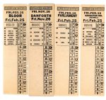
February 25, 1966, saw the ceremonial first train operate over the Bloor-Danforth line, but it was also the last day of service on many streetcar routes.
The fans, of which I was a very junior member in those days, were out in force trying to ride as many “last cars” as possible. This took some careful planning, and it was not physically possible to be everywhere.
The Bathurst service to Adelaide and the St. Clair service to Weston Road were rush-hours only, and so these were the first to be visited. It was a very dim late February afternoon as people photographed the last car to Avon Loop at Rogers Road. The destination signs said “Northland”, the name of a loop further south that had been replaced by Avon years earlier (before I was born), but the roll signs were never changed.
Next to go was the Parliament car, a route that operated until just after midnight. It was a short shuttle from Bloor at Viaduct Loop to King at Parliament Loop, but it was an important line it its day. The trackage was also used at times to route some King cars to Broadview & Danforth avoiding the congestion of streetcars at eastbound Queen & Broadview that could back up from the intersection to the Don Bridge on a bad day.
That Parliament car on its trip in to Danforth Carhouse conveniently crossed Pape & Danforth just before the last westbound Harbord car whose operator faced an unexpected surprise waiting at his first stop. Harbord wandered through the city in a vaguely U-shaped route from Pape & Danforth (see description below) to Davenport & Lansdowne. The running in trip down Lansdowne to the carhouse brought us to Bloor Street where it was time for a 3 am snack and a wait for what would be one of the two “last” Bloor cars.
The Bloor trip took us to both Jane and Luttrell Loops, and the car became so crowded as the night wore on that we started to leave passengers at stops. It was not quite dawn when the car pulled in to Lansdowne Carhouse, and everyone walked down the street to the brand new subway entrance where the Bloor night car transfer got us on to complete the night’s entertainment.
Many routes were affected by the subway’s opening.
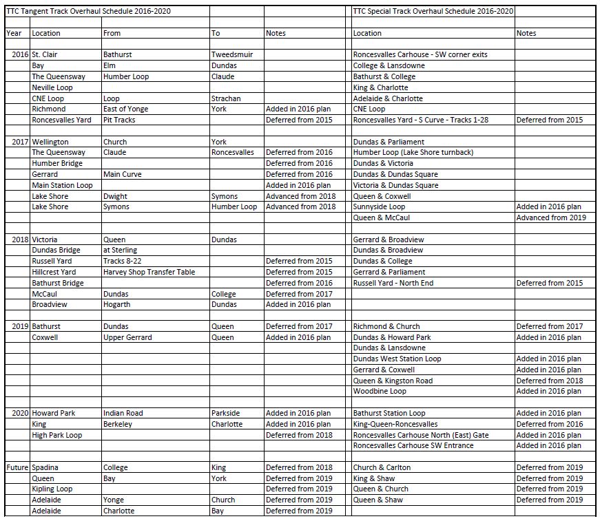
The Bloor and Danforth routes vanished except for shuttles on the outer ends that would operate until the first of the BD extensions opened in 1968.
Jane Loop has been replaced by a new office building and parking lot, although the TTC history is still visible from the old traction pole sporting a Canadian flag on Google Street View. Bedford Loop, a terminus for peak-only services on Bloor-Danforth has vanished under the OISE building and a parkette. Hillingdon Loop (a peak-only short turn at Danforth Carhouse) now hosts a branch of the Toronto Public Library. Luttrell Loop is now occupied by housing that is newer than its surroundings, but the role as a TTC loop is clear from the road layout and the still-present traction pole.
The Parliament car was replaced by the 65 Parliament bus operating to Castle Frank Station at its north end. Viaduct Loop was abandoned and is now a parkette. Parliament Loop at King was for many years the terminus of the bus until it was extended south and west to serve the St. Lawrence district. The loop is now a parking lot for a Porsche dealership.
This was part of a complicated land swap some years ago between the TTC, the dealership and the Toronto Parking Authority. The TTC had plans to build a new streetcar loop on Broadview north of Queen where there is now a parking lot, the City wanted the land south of Front once occupied by the dealership as part of the “First Parliament” site, and the TPA wanted replacement parking if the TTC built on its lot. The dealership moved to the TTC lands, the City got the land south of Front, and the TTC bought a vacant lot on Broadview for a new TPA lot to replace the capacity that would be lost when the loop went in. The loop has never been built.
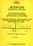
Much of the track used by the Coxwell car (daytime route, just like 22 Coxwell today) and Kingston Road-Coxwell (weekends and evenings, again just like the bus) remains in place from Coxwell & Gerrard south, east via Queen, and northeast via Kingston Road to Bingham Loop. Coxwell cars used a very small loop on the southeast corner at Danforth now occupied by a commercial building, and Coxwell-Queen Loop which still exists. The track north of Gerrard remained operational for some months after the subway opening and Carlton cars preferentially used it to loop at Danforth Carhouse rather than Coxwell-Queen when short-turning. Eventually, the power was cut and overhead removed. The carhouse remained active as a storage site for PCCs that were rotated into the pool used by Russell Carhouse, but the link was via Danforth, not Coxwell.
The Harbord car, whose route I described earlier, ran from Pape and Danforth at Lipton Loop (replaced during station construction by Gertrude Loop) to St. Clarens Loop at Lansdowne and Davenport. The route meandered a lot running south to Riverdale & Pape, a block west to Carlaw (jogging around the railway), then south to Gerrard (at the corner now home to the “Real Jerk” restaurant), west along Gerrard to Broadview, south to Dundas, west to Spadina, north to Harbord (finally on the street from which the route took its name), west on Harbord to Ossington, north to Bloor, west to Dovercourt, north to Davenport and west to Lansdowne. There had been track on Pape north of Lipton Loop for a proposed extension into the Leaside industrial district south of Eglinton, but this was never built due to the recession.
The Dundas car operated from Runnymede Loop to City Hall and service further east was handled by Harbord. With the subway opening, the routes were consolidated, and Dundas was extended east to Broadview Station. Various chunks of Harbord became other routes including the 72 Pape bus, 94 Wellesley, 77 Spadina (now 510 Spadina). Service on Dovercourt and Davenport was abandoned not to be replaced by bus routes until decades later.
The Carlton car, the only “zone 1” streetcar route in 1966 to retain the red ink from the days of multicoloured transfers, still operates over its old route much as the King car does although loops at Vincent and Erindale were replaced by Dundas West and Broadview Stations respectively.
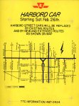
The St. Clair and Earlscourt services were reorganized (this would happen a few times over the years until the “Earlscourt” route simply became a short-turn variant of St. Clair), and service to Weston Road was dropped. The 89 Weston trolley coach extension south from Annette to Keele Station provided a direct subway link for riders on Weston.
Bathurst and Fort were consolidated into a single route from Bathurst Station to Exhibition Loop which, in those days, was located where the Trade Centre (whose name changes with its sponsorship) is today. Service between St. Clair and Bloor was taken over by 7 Bathurst and 90 Vaughan which formerly shared Vaughan Loop at St. Clair with the streetcars. Service on Adelaide to Church (returning westbound via King to Bathurst) was abandoned. Active track remains on Adelaide today only from Spadina to Charlotte, and from Victoria to Church.