
Recent months brought much hand-wringing to TTC meetings where the mysterious decline of ridership threatens the stability of budgets and undermines planned service improvements.
In reality, ridership is not dropping, but for years the rate of increase has been in decline and this caught up with the TTC in 2016 when they overestimated potential growth. Politically, an optimistic projection is useful because this inflates anticipated revenue, provides the basis for planning service increases, and sets the stage for chest-thumping claims that the disasters of a previous administration have been reversed.
The problem is that when the projections fail, there is a budget shortfall. This is small on the scale of the overall TTC budget, but large in its potential effect on subsidy needs and pressure for more fare revenue.
The debate always looks at recent years and asks why ridership growth that once appeared almost as reliably as the sunrise has fallen off. It is worthwhile, however, to take a longer view and examine how ridership has been changing over decades.
There are two sources of data for this review. Neither is perfect, but at least the numbers exist over an extended period.
- TTC’s Ridership Analysis spreadsheet available from the City of Toronto’s Open Data Website. This file gives annual breakdowns of the type of fares sold, the location where these are paid, and a subdivision of weekday and weekend riding.
- TTC Service Plans and related reports for many years included tables of route-by-route performance. These were once published annually, but in the past decade less frequently at least in part because the idea of improving service was not on the Ford-era agenda. Information for 2011, 2012 and 2014 can be found on the TTC’s Planning page. I have been collecting this information for years since its publication originated as an outcome of the Service Standards process established four decades ago. The format changes from time to time, but the basic information remains.
Each of these sources has its challenges.
The Ridership Analysis is based on fare collection at the point of trip origin. If I pay my fare at a subway station, but later transfer to a streetcar or bus, I count as a “subway” rider. In theory, I will be a “streetcar” rider on the return trip and so things should even out, but this breakdown does not reveal the modes used in the course of multi-hop journeys.
Another recent problem is that ridership is assigned by vehicle type in this analysis, not by route. A rider on a 504 King bus counts as a “bus” rider, not as a “streetcar” user.
Passes are a particular challenge because they are only actually counted on entry to a subway station through a turnstile. Passes flashed at operators (including station collectors) leave no trace for the statistics.
The Route Performance figures come from two sources: counts of riders on TTC vehicles, and scheduled service mileage. (Much of the data in this series is stated in miles, and for recent years I have converted kilometres to miles for consistency. The unit of measurement is less important than the trend in service provided.)
Riding counts are not conducted often on busy routes because of the resources required, and it was common to see the same values reported on streetcar routes like 501 Queen for many years in a row. In theory, this should not be a problem once the entire fleet has Automatic Passenger Counters, and assuming that these produce reliable data, but we are years away from that.
Mileage is a standard unit for transit maintenance planning because many aspects of vehicle repair depend on how far the vehicle travels. In practice, some factors are really more time than mileage sensitive, but in a system where most routes operate at comparable speeds, time and mileage are interchangeable. However, a bus garage serving mainly slow inner-city routes will see different performance figures from its fleet because the time-sensitive factors will occur more frequently on a mileage basis.
From the point of view of service, vehicle capacity affects the meaning of “mileage” as a surrogate for the quantity of service. With the shift to low-floor vehicles, about 10% of the fleet capacity has been lost, and so 100 bus miles are not the same as they were two decades ago. There is also, of course, the question of varying mix of vehicle sizes in the bus and streetcar fleet.
The Ridership Analysis gives full year figures, while the Route Performance numbers come from counts conducted on a wide variety of dates. They are daily figures, but they do not represent a single point in time. The Ridership Analysis figures were recently updated to include 2016, but there are no Performance figures after 2014.
Ridership Analysis 1985-2016

TTC ridership took a big hit in the mid 1990s thanks to a recession, and has been climbing back ever since. Although the total riding in 2016 was up over 2015, this was not uniform across all modes with higher bus ridership offsetting a drop on the other modes.
Detailed route statistics have not been published yet for 2016, and the degree to which the drop in “streetcar” riding reflects substitution by buses on several routes is unknown.
These values can also be compared using a reference year as a basis. In the chart below, 1990 is the reference, just before the steep fall in TTC demand when about 20% of the ridership evaporated.

All modes fell after 1990, but bus ridership was the least affected probably because suburban growth brought new riders to that part of the network even while the rest of the system lost a huge amount of riding. There was also some backfilling of bus usage counts as the trolleybus system was replaced. Recent problems with the SRT are evident in its ridership drop.
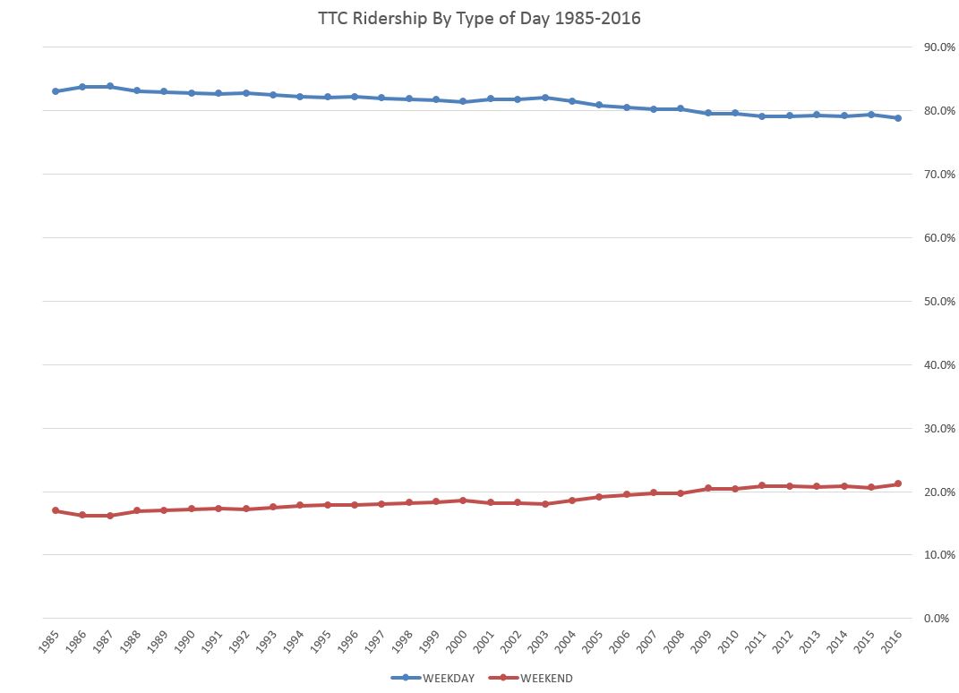
Ridership on the weekends has been growing slowly but consistently as a proportion of the system total and now stands at 21.2%.
The three charts above are available in this PDF.
Route By Route Performance 1976-2014
The route by route numbers tell a very different story from the overall system figures. Most striking throughout these data is the decline in ridership on many routes across the system. This is masked, at least for the bus network, by strong growth on selected routes. This, plus growth on the subway, has allowed the TTC to think of a robust, growing system when in fact demand has been declining in many areas. A few of these are due to route reorganizations, but many are long slow declines accompanied by service reductions. This is quite noticeable on the streetcar network where a shortage of vehicles has prevented service increases for almost two decades.
The last of the “spare” cars were used to open the 510 Spadina route in 1997, and the fleet has been aging and shrinking ever since. The TTC was able to open Spadina because recession-era service cuts of the early 1990s had freed up enough cars, and the remaining old PCCs rebuilt for Harbourfront could be retired.
In the charts below, note that the horizontal axis is not adjusted to allow for the missing years. Changes since 2005 therefore appear “steeper” than they would be if the years were proportionately spaced.
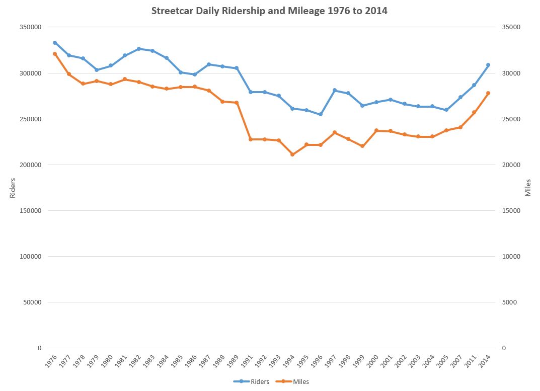
Streetcar route ridership and mileage declined slowly from 1976 to 1990, and then fell along with system riding overall. Note that the drop in mileage of service provided was proportionately greater tan the decline in ridership. The numbers have improved in the past decade, but we do not know what 2015-16 look like.
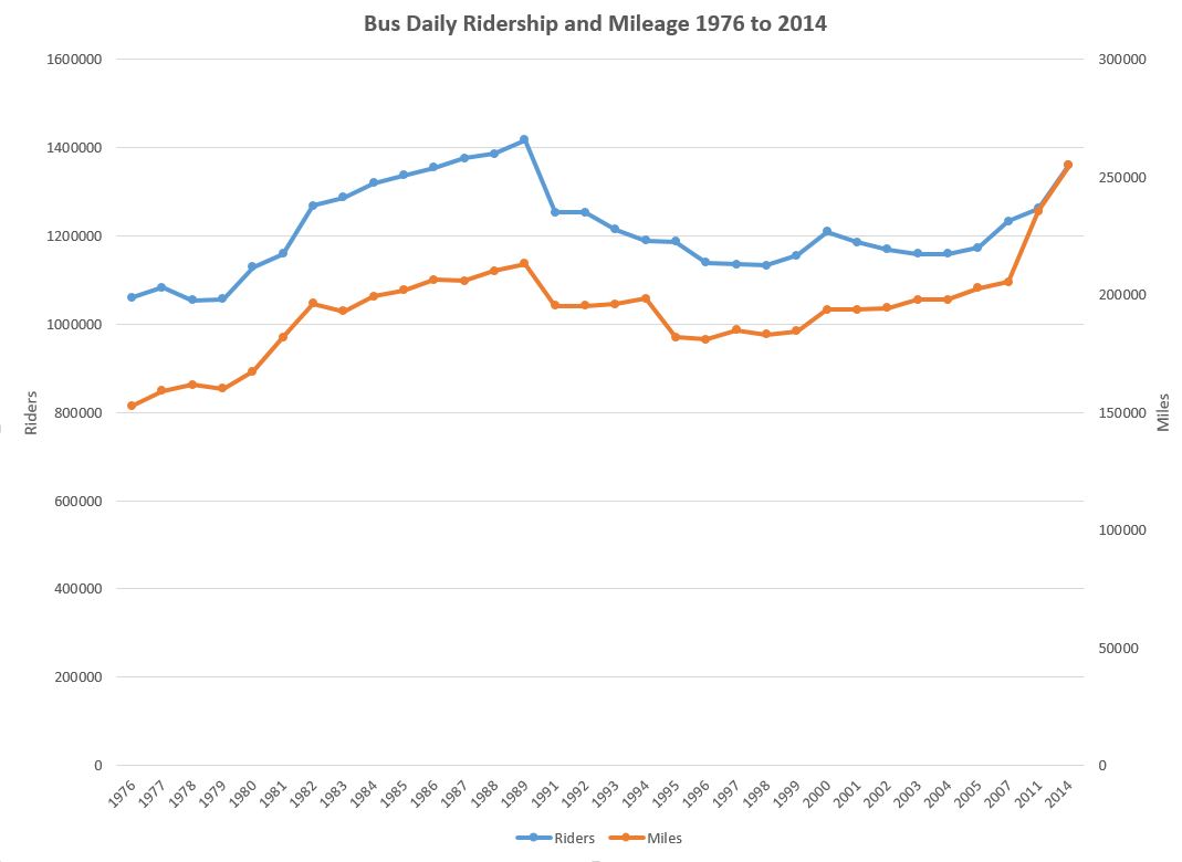
Unlike the streetcar system, the bus network saw riding growth thanks to suburban expansion. However, following the 1990s dropoff, the riders took a long time to return to the system and the 2014 number is still below the high point. Meanwhile, the amount of bus mileage has climbed relative to ridership as a result of reduced vehicle capacity with low-floor buses.
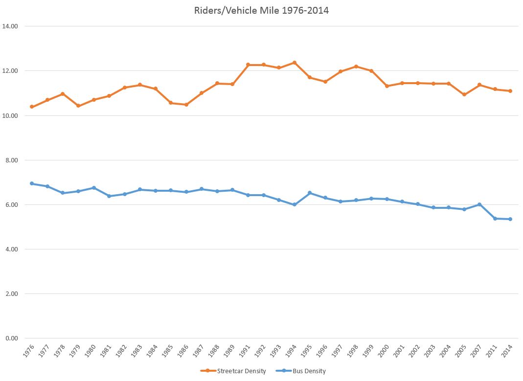
The density of ridership – how many riders board per vehicle mile – has always been higher for the streetcar network than for buses. This results from a combination of factors including vehicle capacity, the relatively longer trips taken by riders on many of the long suburban bus routes, and the strong off-peak ridership on many of the streetcar lines.
Ridership on the streetcar routes was once much stronger than today, although there are signs of growth over the past decade.
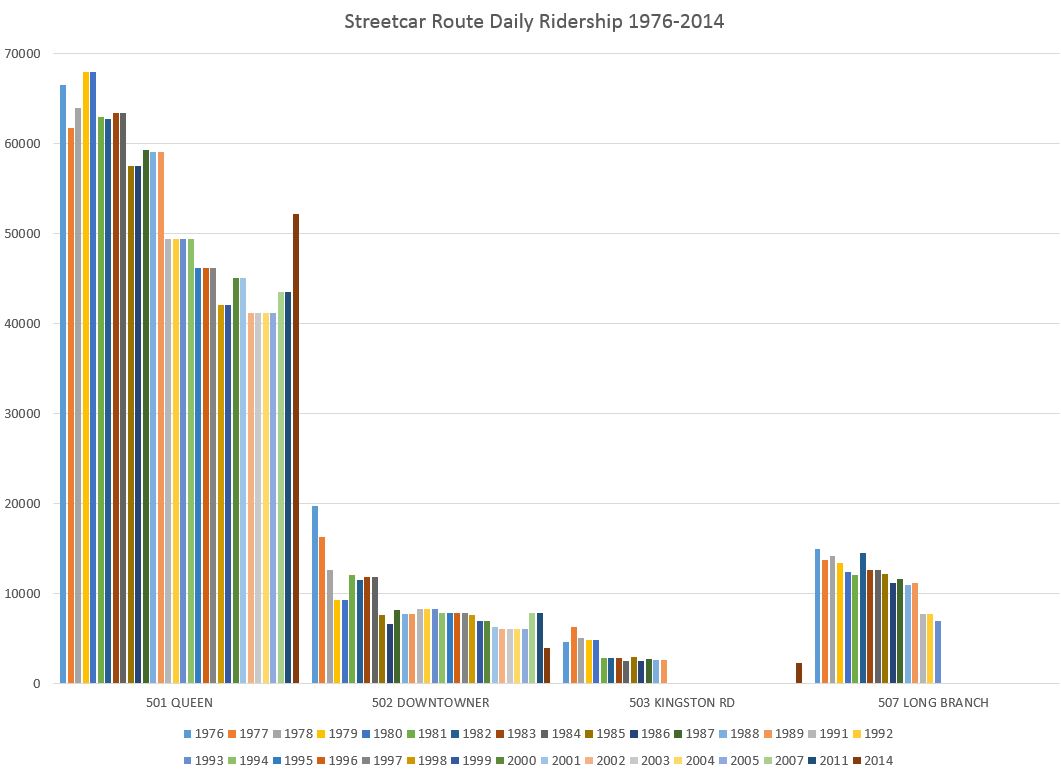
Riding on routes serving the Queen Street corridor fell by about one third since 1976, although the 2014 number shows a strong rebound. This has not been matched by service because what streetcars are available are stretched to cover increasing travel times rather than to provide more service. A few notes about each route as it appears here:
- 501 Queen converted from standard sized CLRV cars to articulated ALRVs in the late 1980s. At the time, the focus was on reduced operating costs, not added capacity, and the longer cars were scheduled on an equivalent capacity basis. This led to wider scheduled headways, longer stop service times (all-door loading was not in effect) and greater effect on riders from short-turns.
- 507 Long Branch operated as a separate route until the mid-1990s when it was combined with 501 Queen. The service west of Humber declined severely, and this has only recently been corrected by operating that part of the route separately with streetcars in 2016 and now with buses in 2017. From the viewpoint of riding counts, the Long Branch riders “disappeared” because they no longer were counted as new boarding with transfers at Humber Loop. This contributes to the overall decline in streetcar numbers.
- During some years, the TTC reported the two Kingston Road services (503 is a peak period tripper) separately, and others on a consolidated basis. In 2014 they resumed separate reporting.
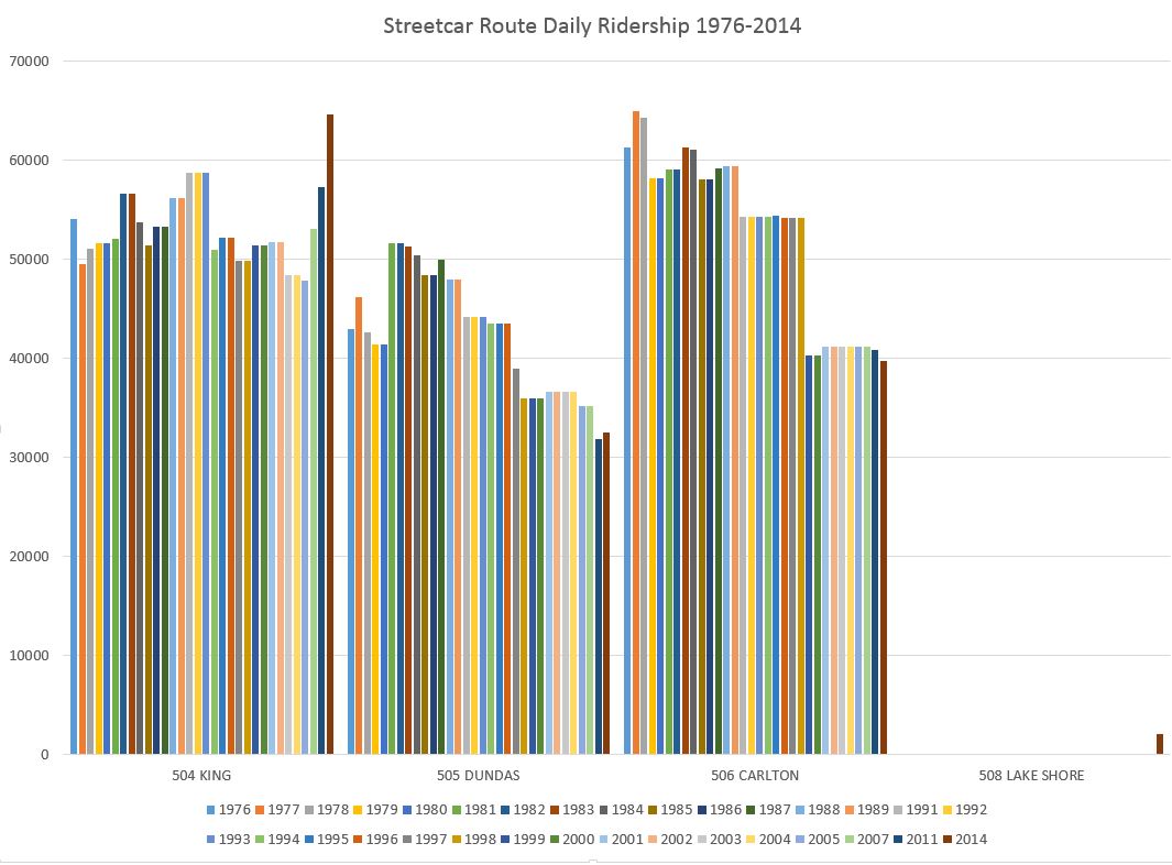
Ridership on King has stayed fairly steady and is now rapidly growing thanks to development along the route. The situation is different on Dundas and Carlton, although new development is starting to show up along them. However, this is mainly townhouse and midrise style, not the high rises of the King Street corridor.
508 Lake Shore numbers were reported together with 504 King up until 2014 when they were broken out. This route is not currently operating due to the streetcar shortage.
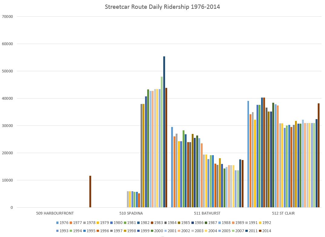
Ridership on 509 Harbourfront was included with 510 Spadina until 2014. The early period for “510” above is all ridership on the Harbourfront portion of the route.
510 Bathurst and 512 St. Clair both lost riders in the 1990s, but have been recovering, somewhat, in recent years.
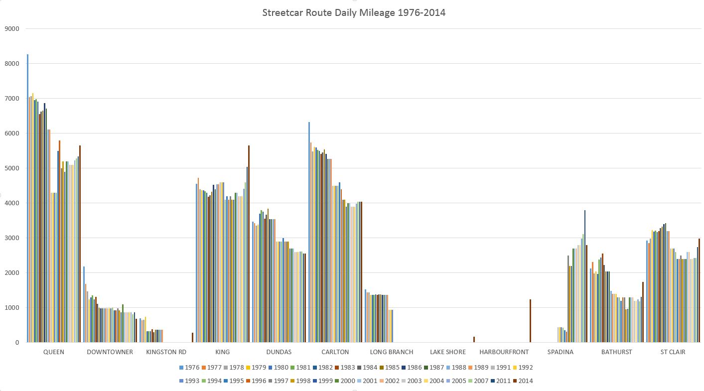
This chart shows the vehicle mileage operated on each route over the period with declines evident on many routes. 504 King remained strong throughout the period and had more service operating in 2014 than back in 1976.
For the bus network, I will leave readers to browse the PDF linked below which contains all of the ridership charts.
Note that in these charts, some routes have changed name and number. I have attempted to keep a consistent usage so that, for example 2 Anglesey and 48 Rathburn appear under the latter (current) name as do 4 Annette and 26 Dupont. Where a route has split (34 Eglinton East and 116 Morningside), I have left them separate.
The scale for all of the bus charts is set at the same maximum (60,000) so that values for routes are directly comparable among the sheets.
Many routes show long term declines in ridership. Some of these are in the old city, but many are in the suburbs. Bus ridership may be climbing, but by 2014 it had still not regained the level of the late 1980s. This cannot be explained away by the opening of the Sheppard Subway (2002) or the conversion of the Spadina bus and its 30,000+ riders to streetcar (1997).
Riding habits are changing, and transit growth comes mainly in areas where there is strong population growth. Where the system must compete for existing riders, it is losing, and this bodes ill for the system’s future.

The Mt. Pleasant streetcars was replaced by a bus in 1976 and onwards. Shows in the route charts for the 74 Mt. Pleasant. Only the first year (1976) did the route have a good ridership, before a BIG decline. I used streetcars in plural and bus in singular deliberately. The use of the trolley bus until 1992 slowed the decline, but with diesel bus ridership dropped noticeably.
Steve: There were two factors that really hurt the route. First, before the bridge at the Belt Line closed for reconstruction, there was a strong north-south demand pattern both with students coming north to the schools at Davisville and at Eglinton, and riders going south and west to St. Clair Station. Second, service on the streetcar was frequent and competitive with the east-west bus route.
After the street reopened, the transit service was much worse than what had been before. The buses (trolley and diesel) could not make the streetcar running times (!) and the TTC in its usual way responded simply by stretching the headway. What had once been a frequent service dropped off and even reached a point where evening and Sunday service was killed in the Ford round of cuts. The line has never recovered.
It is a cautionary tale for planners who close routes for construction and then wonder where all of the riders have gone.
LikeLike
A lot of old neighbourhoods in the old city have had declining populations in previous decades due to shrinking average household sizes. The recent condo boom downtown has been injecting new density into these areas and reversing the trend so the TTC better be prepared to address the new demand for more service.
Steve: Another change is that the population now living in the old city does not necessarily work there in locations traditionally well-served by transit. This creates an out-commuting pressure that neither the TTC, GO or the regional agencies in the 905 are addressing.
LikeLike
If you want to increase ridership, then simply reduce the fares.
As an aside, airport is getting BRT instead of LRT unlike what you would prefer I assume.
Steve: I would prefer one decently done east-west line in Hamilton rather then overreaching with something that could be hard to justify at least in the short-to-medium term.
LikeLike
In the early years of an out-commuting shift, it would seem that going against the flow would guarantee a relatively easy private trip; preventing the need for intensive public transit.
Steve: Yes, and the effect builds up reaching a point where there is a crisis, but no easy solution because the commute pattern is so hard to serve with transit.
LikeLike
Some of the declines in bus ridership look to be attributable to new routes or subways. 96 Wilson ridership drops as 165 Weston Road North opens; 63 Ossington ridership drops as 161 Rogers Road opens. The 29 Dufferin bus takes a big hit in 1978 as the Spadina subway opens.
Three ex-trolley coach routes have really declined: 4 Annette (and its Dupont offspring), 6 Bay, and 40 Junction. I wonder how much of that is due to much worse service with diesel buses. In the TC days, 40 Junction buses seemed twice as frequent as the King and Dundas cars. I remember plenty of times waiting for a streetcar to pull into Dundas West, while the Junction buses were coming and going like clockwork. And Bay was a relief line for the Yonge subway in the late 1980s, complete with “urban clearway”. The trolley coaches moved right along. Today, even with massive condominium development along Bay, the ridership just isn’t there.
LikeLiked by 1 person
And there’s the competition from that disruptive technology of the bicycle. If we did have a better/complete network of safe and maintained bikeways (we’ve made some progress, thanks, but it’s truly incomplete to kinda disable the competition we can be to the TTC, and done on a network vs. ward-by-ward basis), the TTC would have fewer riders I think. No, bikes don’t work for everyone, and won’t, but there are evermore cyclists, and it’s an excellent way of doing in that first/last mile problem. Over time, the cyclist may often cut out transit. We are pretty steadfast in ignoring bikeways as some cheap transit relief, especially for Bloor/Danforth as it’s virtually flat, therefore pretty ideal, and was found to be best for an E/W bikeway in merely 1992. However, we haven’t even managed to do a tiny bit of Bloor St. E. between Sherbourne and Church in the 2001 Bike Plan for a whopping $25,000, though it’s a clear missing link in an exceedingly obvious/needed place. Painted bike lanes don’t use quite enough concrete and cost enough I guess….
LikeLike