Lest anyone think that these routes were “cherry picked” as particularly bad examples of service, no, they simply happen to be busy routes I chose to examine. The problems illustrated here are pervasive on the TTC’s system as future articles in the series will show.
One “benefit” of being cooped up at home more than usual is that I have a lot of time to devote to rummaging around in TTC data. This article begins a series that I am sure most people will not read in its entirety, but instead concentrate on routes of interest to them. I will not feel bad if you don’t read every word, and there is no test at the end.
A common complaint about TTC service in pre-covid days was that it was inadequate to demand and unreliable. Complaints like this go back decades, and one of my earlier advocacy projects was a review of streetcar service back in 1984 conducted jointly by the Streetcars for Toronto Committee, some members of Council and volunteers from local community groups.
The covid era brings its own challenges including reduced vehicle capacity for distancing, plus a scramble by the TTC to adjust service across the system on very short notice. On some routes, riders still complain about crowding and the inability to distance, and we are now in a period where higher load factors will be part of TTC service. The TTC neither has enough vehicles, nor enough revenue to operate a service with generous distances between riders as the demand slowly returns across the network. This build-up has been strongest on surface routes in the suburbs where work-from-home is not an option for many jobs, and where fewer trips can easily be taken by alternate modes such as walking or cycling. The TTC has reported riding on some routes at forty per cent of per-covid levels and growing.
Suburban routes pose a special problem because travel demand does not necessarily fit into the classic patterns of time and direction for core-oriented commutes, Service that is designed to get people downtown (or at least to the subway) does not necessarily serve other demands well. In “normal” times, this problem can be masked, but when core-bound and academic travel patterns are stripped away, the mismatch between suburban demand and capacity, especially allowing for distancing, becomes evident.
Service designs have evolved over past months.
Through January and February 2020, there were few changes to scheduled service, but by the March 29 schedule changes, the effects of covid were showing up across the city with much lower demand and reduced traffic congestion.
There were actually two versions of the March 29 schedules, and the big difference in the second was the disappearance of almost all premium and express services. This allowed the TTC to reduce total service in response to increased employee absence, and to redirect some of the express buses as unscheduled supplements to local service.
By the May 10 schedule changes, further cuts were implemented, although many were on an ad hoc basis to avoid complete rescheduling of routes. Instead of writing new schedules, selective crews were cancelled leaving gaps in service that were supposed to be managed on the fly by route supervisors. A separate pool of standby buses and crews was allocated to be dispatched as needed as the TTC learned where services were overstretched based on new loading standards.
The TTC did not issue a “Scheduled Service Summary” for May 2020 because of the number of ad hoc changes, but some of the planned schedules can be inferred from the June-August summary where effective dates for some schedules are in May.
These standby buses did not appear in the published schedules for routes nor on the vehicle tracking apps, and they may or may not show up in historical tracking data depending on how operators “signed on” to the system. For example, a bus running on 35 Jane has to sign on to a run that exists in the schedule to show up in NextBus (and all of the apps using the NextBus feed), and it must at least sign on to the route to have any hope of being tracked after the fact to analyze the service actually operated.
A further problem is that the TTC does not publish information about where these unscheduled buses are used. They have issued a list of routes that are monitored for overcrowding, but no information about specific actions on these or other routes.
300 Bloor-Danforth Blue Night
320 Yonge Blue Night
29 Dufferin
35 Jane
37 Islington
39 Finch East
41 Keele
44 Kipling South
52 Lawrence West – (Airport trips)
96 Wilson
102 Markham Rd
117 Alness-Chesswood
119 Torbarrie
123 Sherway
165 Weston Rd North
(The list above might be adjusted based on TTC’s monitoring.)
Regular readers might recall a series of articles about the 70 O’Connor bus and its erratic service. The TTC claimed that there were run-as-directed buses added to the service, but these do not show up in the tracking data. One could ask why, after the expenditure of millions on a new vehicle monitoring system, the TTC is unable to demonstrate where they operate this type of supplementary service.
Finally, the June 21 changes returned some of the buses that had been cut in previous months to scheduled service, but on a different basis from the pre-covid arrangements. Instead of a roughly three-hour AM and PM peak period with added vehicles, the extra vehicles are scheduled for two seven-hour periods from the very early hours of the AM peak starting between 5 and 6 AM and running until noon to 1 PM. A second batch of extras enters service between 2 and 3 PM running until 9 to 10 PM. The affected routes are:
7 Bathurst
24 Victoria Park
29 Dufferin
34 Eglinton East
35 Jane
39 Finch East
41 Keele
52 Lawrence West
54 Lawrence East
86 Scarborough
102 Markham Road
165 Weston Road North
This has two effects on the routes where the extras are used:
One effect is that the headway (time between buses) for the block of extras is generally not the same as for the regular service. This can cause erratic headways and uneven loading. For example, if an 8 minute “A” service and a 10 minute “B” service are mixed on the same route, the pattern of departure times (minutes after the hour) could look like this. Sometimes the “B” service nicely splits the headway of the “A” service, but at others the two leave close together or at the same time.
Time
Branch
8:00
A
8:04
B
8:08
A
8:14
B
8:16
A
8:24
A
8:24
B
8:32
A
8:34
B
8:40
A
8:44
B
8:48
A
8:54
B
8:56
A
This sort of thing is unavoidable when headways on any mixed service are not the same. However, the TTC has a six-minute window (from 1 minute early to 5 minutes late) for a bus to be considered on time. When the scheduled headways are in single digits, bunched service is inevitable even if the schedule does not have built in gaps and bunching. However, if the scheduled headways are wider, but uneven, this builds uneven service into a route’s operation.
The other effect is that there is a two-hour period between each set of “trippers” on the affected routes where headways are much wider than at other times, and this can be compounded by uneven headways for the vehicles that do remain over the bridge period.
The cancelled runs cause scheduled gaps where one or more buses are missing, but the times of adjacent runs have not been adjusted to compensate. It is not clear how much effort the TTC is putting into fixing this problem, and the generally uneven level of service can make it hard to distinguish this from other problems with headway reliability.
The situations are unique to each affected route, and I will go into the details in the route-by-route review.
A Note About Data Sources
All schedules for the TTC are available in GTFS (General Transit Feed Specification). The current version is on the City of Toronto Open Data site, but archived version for the TTC and many other transit systems are available on the transitfeeds site. These data contain the same information that is published on the TTC’s timetable pages, but in a format that lends itself to analysis and presentation.
Tracking data for TTC vehicles is archived by the TTC from two systems: the 30+ year old “CIS” (Communications and Information System) and its replacement “VISION” which has more extensive capabilities for line management. As of early July 2020, most of the surface fleet has been converted to VISION with only a portion of the streetcars remaining to be completed.
[The tracking data are not published for general access, but are available to me and others by arrangement with the TTC. The data sets are very large and require substantial reworking to permit analysis and presentation. For a general discussion of analyses with these data, please see Understanding TTC Service Analysis Charts: A Primer .]
Route Analyses
In the articles to follow, I will divide the major routes into geographic groups. This is an arbitrary split both for reasons of size, and to allow readers to home in on specific routes of interest by area.
As an introduction, here is a review of route 54 Lawrence East.
The King Street Transit Priority “Pilot” has been in place since fall 2017, and is now a permanent fixture. Long time readers will know that I have tracked the changes in travel times through the affected area between Bathurst and Jarvis Streets for many years.
For some time, there has been little “news” because conditions on King were stable and the travel times were not changing even as the number of scofflaws grew. Basically, the street did not reach the “tipping point” where there was enough traffic, whether it should be there or not, to push conditions “over the edge” into the pre-pilot congestion. One notable exception was the effect of major sports events and traffic jams that plugged (mainly) University Avenue causing north-south traffic to back through the intersection preventing east-west movement.
With the steep decline in traffic downtown through the combined effect of work-from-home and the shuttering of much of the Entertainment District, I took another look at King to see what was happening.
Note: For one week in April 2020, track repairs at Church Street prevented King cars from running through, and no data appear for those days in the charts.
From time to time I get requests to explain how the service analysis charts work in more detail, but without getting into the gory bits of how the data are actually manipulated.
To that end, I have added a new article Understanding TTC Service Analysis Charts: A Primer that goes into a fair amount of detail but leaves out much of the technical nuts of bolts. It includes examples to show the progress from mounds of detailed data to summary formats, and shows the challenges of what to display and how depending on what aspect of service one wishes to examine.
The intent is to have an “explainer” with the details to avoid duplicating this information in every service analysis article.
The article is long, but is divided into section with hotlinks from an index near the beginning so that readers can jump to each section directly.
If you have comments or questions, please leave them on that article, not here. (Comments here are disabled.)
Streetcar service on Mt. Pleasant Road ended at dawn on Sunday, July 25, 1976. To mark the occasion, a group of transit enthusiasts (or railfans if you prefer) chartered Peter Witt 2766 for an overnight tour around the city. We stopped at many places for photos, something that is only possible in the middle of the night, and then finished up with two round trips on the Mt. Pleasant line before calling it a night.
Here is a gallery of photos from that journey. I have published some of these before, but here is the full set.
Some of what we photographed remains, other views have disappeared or changed substantially.
There are more buildings in the way of the CN Tower than in 1976 and getting a clean shot top-to-bottom is much harder now than it was when the tower was new.
The buildings on Spadina have not changed too much, but it would take almost two decades from the photo here before we would see streetcar service return in 1997.
Bay Street is utterly transformed, now a condo canyon, including the stripped and repurposed Sutton Place Hotel.
The tail track at Bingham Loop that allowed a brief excursion into Scarborough was removed years ago as were spurs and tail tracks almost everywhere else.
The variety store beside Coxwell-Queen Loop disappeared under a condo in the past few years.
Dundas at Trinity-Bellwoods Park
Dundas St opposite the AGO
Dundas St opposite the AGO
Dundas E of Bathurst WB
Spadina & Baldwin SB
Adelaide W of Church EB
Bay and Gerrard SB
Exhibition Loop
King St W at the Bank of Commerce building
Tail track on Kingston Rd E of Victoria Park
Tail track on Kingston Rd E of Victoria Park
Coxwell-Queen Loop
Coxwell-Queen Loop
Coxwell-Queen Loop
Now it was time to venture up to St. Clair for the last runs on Mt. Pleasant. Our first pass took us along St.Clair past the subway station over track used only by the night cars. Up at Eglinton, it was still quite dark although the deep blue of the dawn sky had begun to show. We returned south and west to St. Clair Station and then looped back east to Moore Park Loop where we met the first bus on the new Mt. Pleasant route. Another trip through St. Clair Station brought a meet with the last night car, and then we headed off for the final trip with the line all to ourselves.
As we were posing in front of the coal silos at Merton, a TTC Supervisor came by to chase us off of the line as they wanted to cut off the power. Our operator, Charlie Price, a veteran of many charters, was not too worried about getting back to the carhouse on time.
At Eglinton and Mt. Pleasant, nothing that was on the four corners remains today. A bus loop, currently unused, sits inside a seniors’ building on the northeast corner that once held a gas station and the streetcar loop. The bank on the northwest will return some day as the shell of the main entrance to Mt. Pleasant Station on Line 5 Crosstown. Eglinton Public School on the southwest was replaced with an ugly building whose architects assure me was the product of cost cutting by the Board of Education. The south east corner, formerly a typical 1920s-era row of stores with apartments above, now has a midrise commercial building that, like other developments along Eglinton, added nothing to the local character. It is sad to think that the bank, when it returns, will probably be the most distinguished building there.
At St. Clair and Yonge, even the “modern” towers don’t last forever. Updates and replacements are already in the pipeline.
The subway station had the distinction of being the first to have a restaurant inside of the paid area, a counter-example to the “though shalt not eat in the subway” bylaw that was never implemented. It eventually became a McDonalds.
Moore Park Loop is now a local parkette little changed except for the removal of the streetcar tracks.
Dominion Coal is long gone, and the area between Mt. Pleasant and Yonge along Merton is almost all condos in what was once an industrial area.
The cemetery, founded in 1873 when it was out in the countryside among farms, goes on, an oasis with the city’s best collection of trees.
St. Clair & Avenue Rd EB
St. Clair E of Yonge EB
St. Clair E of Yonge EB
Mt. Pleasant & Eglinton looking N
Mt. Pleasant & Eglinton looking N
Moore Park Loop with the first Mt. Pleasant bus
Moore Park Loop
St. Clair Station.
St. Clair Station
St. Clair & Inglewood looking W
St. Clair & Mt. Pleasant looking W
Mt. Pleasant & Heath NB
Northbound at Mt. Pleasant Cemetery
Northbound at Merton
Northbound at Merton
Mt. Pleasant N of Belsize at the Crest Theatre
Eglinton & Mt. Pleasant looking SE
Eglinton & Mt. Pleasant looking SW
Mt. Pleasant Loop. Last car.
Mt. Pleasant Loop
Mt. Pleasant Loop
SB at the much-loved Dominion Coal towers at the Belt Line bridge
Mt. Pleasant Cemetery SB
Mt. Pleasant Cemetery SB
Last crossing of the bridge at the Avoca Ravine
Updated July 27, 2020: Service east of St. Clair Station to Moore Park Loop continued until October 2, 1976 but only for the St. Clair night car (and occasional daytime cars killing time because they were off schedule). Thanks to Philip Webb for sending me a copy of an article by Mike Roschlau in Rail+Transit, January 1977, with this info.
This article continues a series looking at the travel times on routes where bus lanes have been proposed to compare pre-covid “normal” conditions with those after traffic volumes were substantially reduced by the pandemic. The intent is to show what are probably the “best case” conditions for transit priority with relatively little traffic congestion to illustrate the locations and times when bus lanes would bring a saving, if any, on each route.
Reserved lanes are proposed for Steeles Avenue West between Yonge Street and Pioneer Village (aka Steeles West) Station. This stretch contains segments that are badly congested and not just in the peak periods. However, the remainder of the route west of Pioneer Village Station and on Yonge south to Finch also have severe congestion which this proposal does not address.
Yonge from Steeles south to Cummer has “diamond” HOV lanes marked with paint and signs, but travel times are very slow suggesting that these are more decorative than serving to actually marshall traffic. This is a cautionary tale for those who think that physical lane reservation to achieve true priority is excessive. Buses also face the need to make left turns northbound at Steeles and southbound at Finch Station.
West of Pioneer Village Station, the service level is much lower than to the east and the route will continue to operate in mixed traffic. However, this is also an area of severe congestion, and I have included a review of the western segment here for those who are interested. Steeles is a good example of the fact that “congestion” is not just a downtown phenomenon, and given the growth patterns and transportation plans of the suburbs, it is unlikely to disappear.
Steeles Avenue has split jurisdiction between York Region and Toronto, and any change in lane usage or street geometry requires agreement by both of them. During the debate at Toronto’s Executive Committee, one member suggested that York Region might be asked to contribute to the cost of implementing bus lanes on Steeles because their services would benefit. This idea did not find its way into the approved motions. That is just as well considering the infrequent service on almost all YRT routes operating on portions of this section of Steeles, and the limited savings bus lanes would bring to them. (There are no VIVA services here.)
Updated July 20, 2020 at 5:00 pm: A comparison of travel times for local 39 and express 939 service on Finch East has been added at the end of the article.
This article continues a series comparing travel times on proposed bus priority routes in the “pre-covid” era of what we once thought of as “normal” traffic with the conditions since mid-March 2020. The latter probably represent the best case for any future prioritized transit operations and a comparison can set some expectations on what might, or might not, be achieved.
It is easy to draw a line on a map and say “Put transit priority here!”, but this quickly runs into the fact that others, notably motorists, also use the road and one must be able to make a pro-transit case based on evidence that there actually will be an improvement, at least for transit riders.
Such a case must deal with several factors:
The benefit to running time is usually location and direction sensitive, not to mention varying by time of day.
Locations where congestion is a problem are also those where taking road space away from motorists will be most difficult.
The level of service on some routes during off peak periods coupled with low potential time savings makes permanent reservations hard to argue for especially where lost parking would be an issue.
Even in the less congested conditions of recent months, the reliability of TTC service leaves a lot to be desired. (I will turn to this aspect of service in a later article for all of the bus lane proposals.)
The offsetting benefits are:
Reduced and more reliable running times with the worst case delays “shaved off” in the manner seen on the King Street pilot.
A small reduction in the number of vehicles required to provide service, or conversely, the ability to improve service without adding vehicles.
Better service can result from a combination of more frequent scheduled vehicles and more reliable headways. Indeed, riders could see more benefit simply from buses showing up regularly than from actual in-vehicle travel time. Sadly, the TTC’s focus is on saving money first, not on improving service reliability and capacity, and this will potentially undermine the entire transit priority project.
This article reviews data from 39 Finch East, and will be followed by reviews of 60 Steeles West and 54 Lawrence East in future articles.
Technical note: Finch East is a route whose behaviour I have been following on and off for several years, and I therefore have a sampling of data going back to 2011.
Updated July 9, 2020 at 8:10 am: A table comparing existing and proposed stops has been added adjacent to the service plan map in this article.
Updated July 9, 2020 at 12:30 am: A section has been added at the end of the article examining headway reliability for 86 Scarborough and 116 Morningside just east of Kennedy Station, and at Guildwood. This section complements an observation by the City of Toronto about unreliable headways, and hence uneven loading, on buses running on Eglinton.
Headway management is at least as important as improved travel time for these routes. There is not much point in saving a few minutes riding a bus if the waiting time is unpredictable and the bus may be full when it arrives in a gap. This aspect of TTC service management has been a chronic problem that is always put down to “traffic congestion”. In fact the post-covid data show that even with the much less congested conditions, headways are still spread over a wide range of values. This is a problem that will not be fixed by painting the pavement red.
The TTC Board will consider a report on reserved lanes for BRT-lite operation on several corridors at its July 14, 2020 meeting. Although there was a political desire to get all of them up and running as quickly as possible at the June board meeting, the proposed schedule strings this out over a longer time.
Fall 2020: Eglinton East from Kennedy Station, Kingston Road, Morningside to UTSC
2021: Jane from Eglinton to Steeles
2022 and beyond:
Steeles West from Yonge to Pioneer Village Station
Finch East from Finch Station to McCowan
Dufferin from Wilson to Dufferin Gate
Lawrence from east of Victoria Park to Rouge Hill
A key point is that TTC expects to save money on reduced travel times. Whether this would be reinvested in service on the affected streets or elsewhere in the system is hard to know. Some of the reduction will come from the reserve lanes, but some will also come from the consolidation of closely-spaced stops.
Experience on King Street showed that the travel time savings, such as they were, were eaten up by operational changes that added more running and recovery time to schedules in an attempt to eliminate short turns.
Bus lanes on the Eglinton East corridor are anticipated to increase transit reliability and reduce transit travel time on average between two-to-five minutes per trip. These time and reliability savings present an opportunity to achieve operating budget savings of 500 fewer service hours per week, equivalent to about $2.5 million per year and a capital cost avoidance of seven fewer peak buses equivalent to approximately $6.3 million. [p. 4]
The problem here is that any kind of “savings” has an allure that is much stronger than service improvements. Buses will not run more frequently, although service might be more reliable if the worst of periodic “bad days” can be avoided with the reserved lanes. This is similar to the results on King where the reliability effect was much more important than the actual change in average travel time. Better reliability means shorter waits for vehicles and a better chance that loads will be evenly distributed.
However, King Street had the added advantage that the actual capacity of the route was increased by running larger vehicles as the new Flexitys replaced the smaller CLRVs, ALRVs and bus trippers on the route. A similar opportunity is not available, at least in the short term, on Eglinton. The TTC has no spare articulated buses, and only modest plans to acquire more in future years. (Note that changes in the overall fleet mix have effects on bus garages which must be modified to service the longer vehicles, or purpose-built with this in mind just as Leslie Barns was for the new streetcar fleet.)
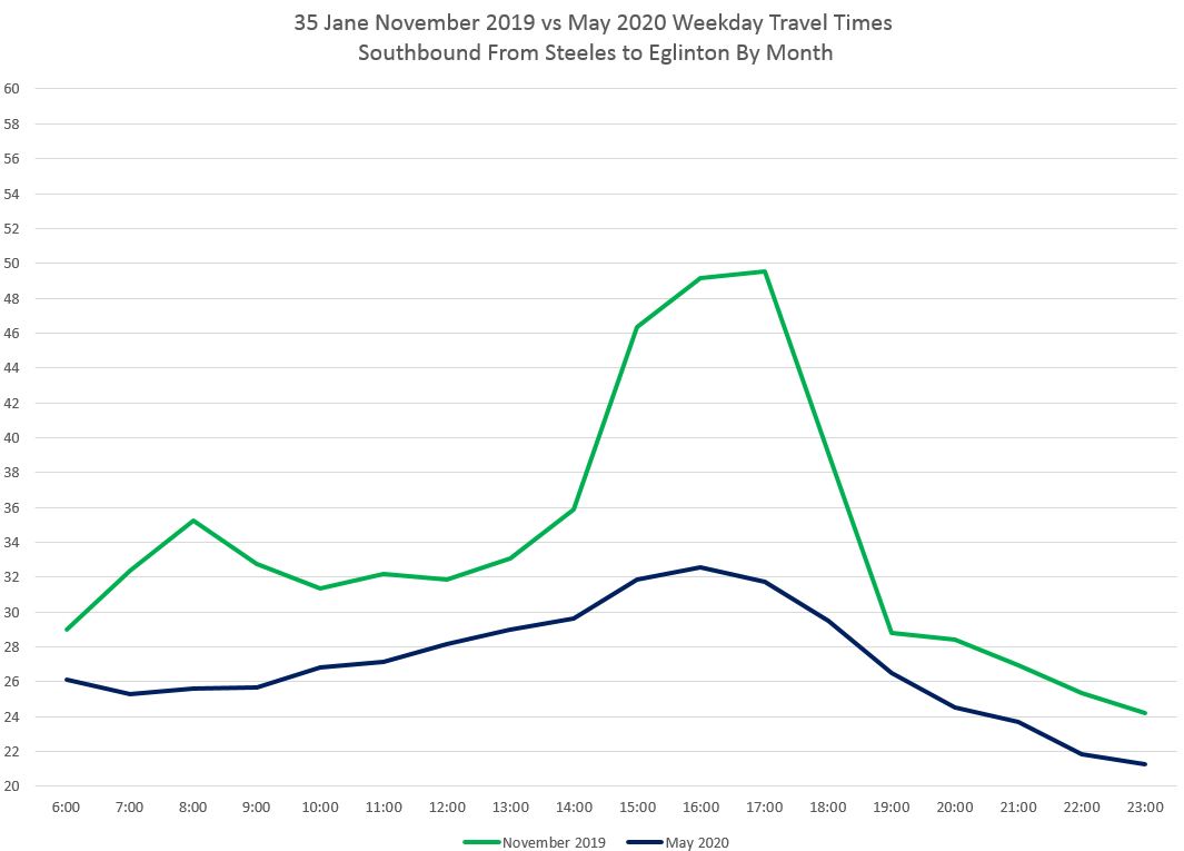
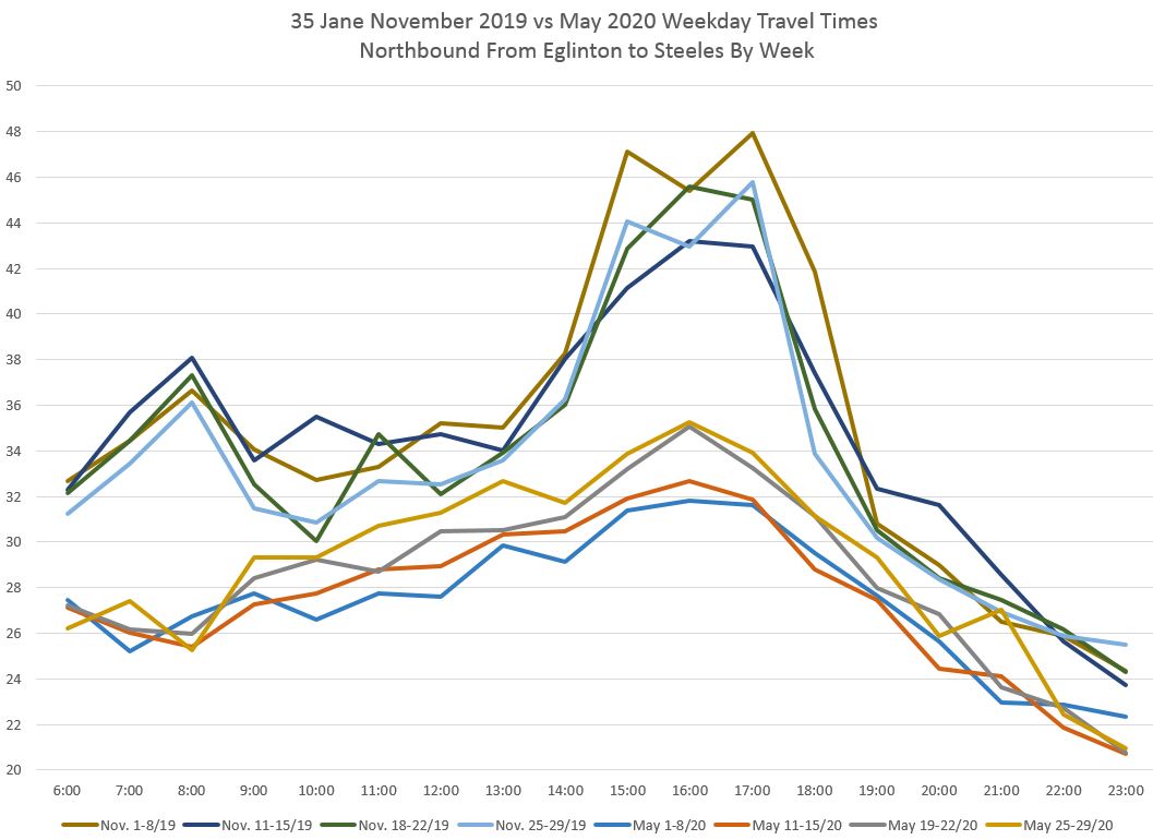
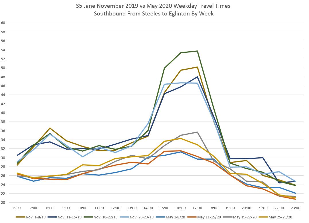
On June 17, 2020, the TTC Board will consider a proposal to implement transit priority lanes on several corridors including Finch East, Steeles West, Dufferin, Jane and Eglinton-Kingston-Morningside. This article reviews travel times and speeds for the Jane Street corridor comparing November 2011 and May 2020 data with the underlying premise that the May data show the best case for congestion-free operation.
The proposal for Jane Street run north from Eglinton to Steeles. Roadway widths and adjacent land uses vary along the corridor, and the removal of traffic lanes will have different effects along the street. A related problem will be the provision for cyclists, if any.
Note: When this article was first posted, some charts erroneously had some data labelled as “April 2018” rather than “November 2019”. This has been corrected.
Travel Times Between Eglinton and Steeles
Northbound
As on Dufferin, but to a greater degree, Jane Street has a high PM peak travel time and an extended peak period. The difference between November 2019 and May 2020 is quite striking.
Looking at the weekly breakdowns, there is the same pattern here on Jane as on Dufferin – although May 2020 times are shorter than those for November 2011, they have been rising over the four weeks showing a growth in some combination of traffic congestion and stop service time.
Southbound
The southbound peaks are similar to northbound and the PM peak extends over a considerable period.
The weekly breakdown shows the same pattern with growth in travel times through May 2020.
Updated July 18, 2020 at 2:00 pm: 29 Dufferin is a route that I have been tracking for much longer than most bus routes. To give a longer perspective into travel times on the Dufferin corridor, I have added a section looking back to 2011.
Route 29 Dufferin is one of five corridors proposed for rapid implementation of reserved bus lanes in a proposal that will be at the TTC Board on June 17. Others include Finch East, Eglinton-Kingston-Morningside, Steeles West and Jane.
In this article, I will review travel times and speed data for Dufferin comparing conditions in April 2018 and May 2020. (2018 is used because I do not have any more recent pre-covid data.) The premise of this comparison is that May 2020 represents conditions on the route with all or most traffic congestion removed revealing the underlying conditions that would apply in a best case transit priority lane implementation.
Dufferin Street is very different from the other proposed corridors because for much of its length it is only four lanes wide with houses and businesses fronting onto the street and little or no opportunity for widening. On the northern portion where the street allowance is wider, there is a combination of four through traffic lanes with bays for right turns and bus stops.
Creation of a reserved lane will involve both a reduction of capacity for non-transit traffic and removal of parking. Depending on whether the lanes are in effect only during peak periods or longer, parking will be a big political issue as it was for attempts to improve transit operations on streetcar routes.
Before the King Street Pilot was proposed, the City reviewed parking regulations on the shoulders of peak periods to determine whether they should be extended. (Full disclosure: I worked on this project as a consultant.) With the growth of traffic over many years, the peak had expanded beyond its traditional 7-9 AM, 4-6 PM periods. Travel time charts would clearly show two super-peaks on either side of the official two-hour period as transit vehicles were fighting peak level congestion when parking and turn restrictions were not in effect. From this study, many areas had their peak periods extended by 30 or 60 minutes on either side of the original hours so that the period could be as long as 7-10 AM and 3-7 PM.
There was a lot of push back on this scheme from local businesses who regarded parking as essential to their operations, and there were tradeoffs in the final scheme to limit the expansion of peak restrictions. For example, a proposed no parking restriction on Broadview near Danforth was changed to end at 6:30 pm instead of 7:00 pm. It is worth noting that on Queen Street in The Beach there are no extended restrictions and the traditional two-hour windows apply. It would be intriguing to know whether Councillor Bradford, the author of the motion, would agree to elimination of parking in his ward in the name of speeding up the Queen car.
Parking is already banned in some locations on Dufferin Street from 7-10 AM and 3-7 PM, but the traditional hours are more common, and some locations have no restrictions at all. There are many locations where motorists would routinely move into a “reserved” curb lane to access off-street parking and laneways, as well as for right turns.
There is also the question of how bicycles would fit into any new street design.
Overall, the challenges on Dufferin Street are not straightforward and, like the much shorter King Street Pilot, they will require detailed block-by-block review.
Travel Times Between King and Wilson
In the following charts, note that changes in travel times will be due to a combination of two factors: the level of traffic congestion and the time spent at stops loading and unloading passengers. Transit priority can reduce the effect of congestion, but stop service times are a function of service level and demand, and especially of the degree to which crowding prevents a speedy movement of passengers onto and off of buses.
Budgetary constraints drive the TTC to run as close to its capacity standards, if not over them, as a routine practice. The degree of crowding is only rarely reported, and the cost in terms of service delays is not considered. A vicious circle can develop where headways are widened and travel times stretched in response to this type of delay, but this reinforces crowding problems while providing a “no cost solution” so beloved by simplistic political analysis.