35/935 Jane: Service Levels and Travel Times 2019-2025

This article is an update from a previous review of travel times on the Jane corridor which is currently under study in the RapidTO program. Red lanes are proposed between Eglinton and Steeles both ways. The southern limit is defined both by the change in roadway cross section in the older part of the city, and by the future split in bus service at Eglinton to feed into Line 5 Crosstown.

Scheduled Service and Ridership

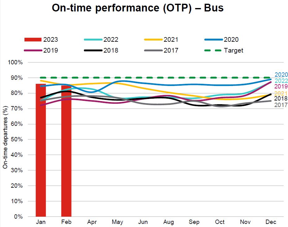
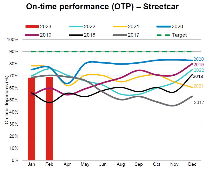
A common claim by the TTC and City is that service on the bus network is restored to or better than pre-pandemic levels. This is not true.

The measurement used is bus hours, but actual frequency of service is the metric riders experience. Total bus hours might be “back to normal”, but these are distributed differently now than in 2019 with some of the restoration going to longer travel and recovery times. These might contribute to service reliability, but with lower scheduled capacity (buses/hour).

Service in November 2019 compared to February 2025 (the schedule in effect in August 2025) was generally better than it is today.
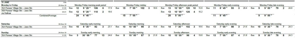
Buses / Hour
L Local
X Express
2019.11
M-F
2025.08
M-F
2019.11
Sat
2025.08
Sat
2019.11
Sun
2025.08
Sun
AM Pk M-F12.9L 8.0X10.0L 5.0X
Midday MF8.6L 6.3X8.0L 4.0X
PM Pk M-F12.0L 6.2X10.0L 5.0X
Early AM
S-S
7.1L 6.0X6.0L2.0L3.0L
Late AM
S-S
6.0L 6.7X6.0L 6.0X6.0L 6.7X6.0L 6.0X
Afternoon
S-S
8.0L 6.7X8.6L 8.6X6.0L 7.1X7.5L 7.5X
Early Eve6.9L 6.7X8.0L 4.0X8.6L 6.7X7.5L8.6L7.5L
Late Eve6.7L6.0L7.1L6.0L6.3L6.0L

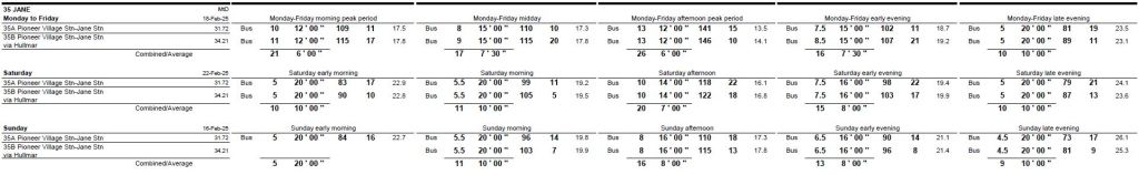
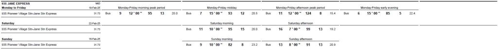
The tables below are taken from the November 2019 and July 2025 TTC Scheduled Service Summaries show the corresponding service designs. Within each group, the fields are:

  • Number of assigned vehicles
  • Frequency of service
  • Travel time
  • Terminal recovery time
  • Scheduled speed (km/h)

Changes in service levels are affected by scheduled speed, frequency and recovery time. Note that recovery times in 2025 are more generous than in 2019, and travel times have also increased with a corresponding drop in scheduled speeds. In some cases, the number of buses (and hence bus hours) goes up, but the level of service goes down because of slower operation.

RapidTO plans for Jane seek to shorten travel times between Steeles and Eglinton, but the benefit varies. Terminal departures are irregular, although much of that variation is permitted under the Service Standards. RapdTO’s supposed contribution to regularity is that buses will be able to stay more or less “on time”, but unless departures at terminals are better managed, service will still begin trips irregularly. On the current 6′ peak headway, the standards allow a 50% fluctuation from 3-to-9 minutes, and this can make a huge difference in wait times and vehicle crowding.

All-day ridership reported in past years is summarized below. As of Fall 2024, ridership was still well below the 2019 level.

All-day Riders201920202021202220232024
35 Jane31,08526,08220,33424,84028,80825,820
935 Jane Express13,7497,96510,64510,03411,644
Total44,83426,08228,29935,48538,84237,464
Source: TTC Planning Web Page

We do not know how much ridership growth might be constrained by service capacity and reliability, as opposed to changes in actual demand. The TTC projects large growth from improvements in travel time and reliability with RapidTO, but with no commitment to increased capacity. This claim is difficult to believe.

I asked the TTC for the methodology behind its calculation of RapidTO ridership growth on July 28, but have received no details as of August 11. (The request was for Dufferin and Bathurst corridors where the TTC makes similarly optimistic projections, but the same issue applies to Jane.)

The remainder of this article updates previously published data about travel times on Jane starting just before the pandemic in November 2019 up to July 2025.

Continue reading

Night Bus On Time Charts: Request For Comment

In a recent article, I detailed the headway reliability of night buses on several routes. In a comment, a reader asked if I could relate that data to “on time” performance.

There are a few problems with that concept, not least that the TTC’s own standard is so lax. The charts presented here are an attempt to show the degree to which departure times on two routes are scattered (307 Bathurst) or more closely bunched in a more-or-less reliable group (335 Jane).

Depending on reader feedback, I will include these charts, or possibly a modified version of them, in future articles about night services.

Updated June 20, 2025: The charts for 307 Bathurst Night Bus have been modified to show the advertised times of buses to show the degree to which service is “on time” or not.

A separate set of charts has been added to show the evolution of departure times northbound over the route from Front to Steeles.

Continue reading

A Review of Blue Night Services May 2025 (Part I)

This article begins a series to review the TTC’s overnight services, aka the Blue Night network. Most of these are bus routes, but a few of the older lines still operate with streetcars.

Included in this article are:

  • 307 Bathurst
  • 329 Dufferin
  • 332 Eglinton West
  • 335 Jane
  • 336 Finch West
  • 341 Keele
  • 352 Lawrence West

Other routes will follow in future installments.

It’s worth reviewing the TTC Service Standards regarding their Blue Night network.

Purpose of night service:

The overnight network is designed so 95% of the population and employment is within a 1,250 metre walk (15 minutes) of transit service. Consequently, overnight services may be provided on different routes than the base network in order to meet these requirements. Where possible, however, overnight routes will follow daytime routing and be identified in a manner consistent with the daytime route. The overnight network is an important part of the TTC’s commitment to maximizing the mobility of people in the City of Toronto and meeting all of their diverse travel needs.

  • Hours of service: 1:30am to 6:00am (8:00am Sunday)
  • % of population and employment served: 95%
  • Within walking distance: 1250 metres
  • Within walking time: 15 minutes
  • Minimum service frequency: 30 minutes
  • Headway performance: Service is considered to be on time if it is no more than 1 minute early and no more than 5 minutes late. TTC’s goal is to have 60% of all trips meet the on-time performance standard.

The one minute early standard was informally dropped in early 2025 and on time performance is now measured by TTC against a -0/+5 scale. That applies to on-time departure at terminals, but not to headways. The standard allows a swing of headways between 25-35 minutes for a half-hourly service as shown below. The service is “on time”, but unreliable, especially when the compounding effect of the swings is considered at transfer points.

Moreover, the “standard” need only be achieved 60% of the time, and then only at terminals. Almost half of the service is held to no standard at all.

TripScheduled Time / HeadwayActual Time / Headway
12:002:00
22:30 / 30m2:35 / 35m
33:00 / 30m3:00 / 25m
43:30 / 30m3:35 / 35m
54:00 / 30m4:00 / 25m

The TTC does not have any planned meets in its night network, and these would require scheduled, protected departure times enroute, not the current catch-as-catch-can arrangement. On a half-hourly base and with long routes, the gaps between buses can vary a lot, and riders cannot count on their arrival. This is a common annoyance on the daytime network, but on the night routes where a missed bus can make a large difference in trip time, this should be unacceptable.

Most night services operate every 30 minutes, although there are exceptions on both the bus and streetcar networks. That service level is provided generally from 2am onward to about 4am, later on some routes depending on when demand begins to build up for the morning. There is also some overlap of daytime and night time route number usage, although the TTC has been sorting out its schedules for consistency in past months.

Some routes do achieve a narrow band of headways around 30 minutes for terminal departures, although this band widens along the route just as it does with daytime service. However, some routes have erratic headways even near their terminals, but the standards are lax enough that these still can count as mostly “on time” in reports of service quality.

For all that the night services are supposed to be for shift workers and the night economy, reliability leaves much to be desired because, like so much TTC service, the time a vehicle will arrive is unpredictable. The situation varies from route to route as the sample in this article will show. Some routes are not too bad, but still leave riders vulnerable to missed trips and connections. Others are a real mess with 307 Bathurst taking the prize here. (There are likely competitors for that title, but I have not worked through every route yet. Be patient, gentle reader.)

May is an ideal month usually free of major storms, hot or cold, and conditions are about as good as one can expect. Service in February will not be as good as the examples shown here.

The TTC’s common bugbear/excuse for erratic service, traffic congestion, does not apply to these night services. Uneven headways are caused by lack of line management, the absence of a policy to maintain on time performance along routes, and in a minority of cases by schedules that are too tight to allow for terminal recovery time.

Through this series, I will review the quality of night service provided on the TTC system. This will take a while, and the articles will appear as time permits in between other topics.

Note: This is a long article with a lot of charts. I don’t expect most people to read every word or review every route. For some, this might validate their own experience. For others, it will show the variations across the network. Happy reading.

Continue reading

Request for Comment: Charting Crowding vs Location and Time (Updated)

Updated Oct. 29 at 2:35pm: The service chart showing crowding levels has been revised with adjusted colouring, and to give emphasis to lines so that they stand out better. See the end of the article for a sample.

Updated Oct. 27 at 8:45pm: Sample charts have been added at the end incorporating some suggested changes.

This article continues my search for clear ways to display vehicle crowding data that I now receive as part of my data feed from TTC. In previous articles, I have shown vehicle tracking charts colour coded for the crowding index.

These charts show the regularity (or not) of service, locations of delays, bunches and gaps, and the resulting crowding pattern. This is useful for fine-grained analysis, but one must look at many charts to see the overall patterns.

In an attempt to “zoom out”, I developed a new chart format that shows the proportion of service at each crowding level seen at screenlines along a route by time of day. This article presents the results for the routes already published, but I wanted to nail down the format before publishing more. (I have many more in the wings including 25/925 Don Mills, 29/929 Dufferin, 36 Finch West, 39/939 Finch East, 41/941 Keele, 52/952 Lawrence, 53/953 Steeles East, 60/960 Steeles West, 85/985 Sheppard East, 86/986 Scarborough, 89/989 Weston, 116 Morningside, 129 McCowan North, 903 STC Express, and 905 Eglinton East Express).

Regular readers will know that I abhor the TTC’s practice of reporting service stats on monthly averages with every trip combined to give an overall picture. This hides a lot of things, notably the variations by hour and location, not to mention variations between routes. The chart format proposed here attempts to strike a balance between a hyper-detailed view and one where readers can see how routes behave at a level they can relate to their own journeys.

Does the new format shown here work for readers? Please let me know in the comments. I can do a lot of preparatory work on the other routes, and then drop their stats into whatever the final chart template looks like.

Many thanks to those who have sent suggestions regarding other charts I have published.

Continue reading

Service Reliability and Crowding on the TTC

First off, an apology to regular readers for the lack of posts in the past week or so. I have been working on new ways to present service reliability data together with information on bus crowding. This is now possible because the TTC includes crowding info in the data I receive from them.

Updated October 21, 2024 at 7:45am:

  • The scheduled service levels for 35/935 Jane have been added.
  • Charts showing the distribution of weekday headways by hour and location have been added.

TTC service metrics suffer from a lack of detail, and an inability to see what is happening to “my bus” or “my streetcar” as opposed to average service conditions over many hours, weeks and vehicles. Statistics purport to show that average loads and service lie within so-called Service Standards (about which more later) while riders wait glumly for buses that arrive in packs and have little room on board.

In past articles, I have presented charts showing the behaviour of many routes, but there are limitations of how many charts I can publish. With the advantage that I can review all of the data, patterns are more evident than might be the case with only excerpts.

One important pattern is the spacing of vehicles along a route. TTC standards assume that if service is “on time” (itself a rather loose concept) at terminals, the rest of the line will look after itself. Flatly, this is not true, but it is an assumption that lets managers collect gold stars they do not deserve.

Even on days when there is no adverse weather, traffic or special events, tracking data show that a reasonably spaced service might leave a terminal, but can degenerate into pairs (or worse) along the line. Instead of a steady “tick .. tick .. tick” of service promised by the schedule, riders experience “tick …… tick tick ….. tick .. tick ………. tick tick tick” like a drunken clock. All of the promised buses might eventually arrive, but unevenly. Of course, riders in the real world know that even at terminals, departures can be uneven, and this worsens across a route.

This contributes to crowding because the buses in wide gaps tend to have more riders, and the problem compounds as stop service times for these buses rise.

Although the TTC has released vehicle tracking data since 2007, crowding data are much more recent. Initially they showed up in the real-time data feed used by various apps, and now in the archival data I receive each month. This allows analysis of the relationship between vehicle spacing and crowding, as well as a better view of when and where routes are heavily used.

Buses have automatic passenger counters with infrared beams at doorways to keep track of entries and exits. Work to install them on the streetcar fleet is still in progress, and crowding data for streetcars is not yet available.

This article looks at bus tracking data showing crowding levels. This is a preliminary view of 35 Jane to show and explain the new chart formats. In future articles, I will dive into this and other routes in more detail.

If you have suggestions to improve these charts, please leave a comment.

Continue reading

Travel Times on RapidTO Corridors – December 2023 Update – Part I

This article updates tracking charts of travel times on three proposed RapidTO bus corridors with data to the end of 2023. The routes covered are:

  • 29/929 Dufferin from King to Wilson
  • 35/935 Jane from Eglinton to Pioneer Village Station
  • 39/939 Finch East from Victoria Park to McCowan
  • 54 Lawrence East from Victoria Park to PortUnion

I will turn to other RapidTO corridors including the existing Eglinton-Kingston red lanes in Part II of this series.

Without going into a lot of interpretive detail, the purpose of these charts is:

  • To show the travel times under “best case” conditions of low road traffic in Spring 2020 (the covid pandemic onset), and the changes since that time.
  • To show the variation in travel times day-by-day and at varying times of the day.

If RapidTO can flatten out variations in travel times and get the typical time to a consistently lower level, bus service should not only be faster but more reliable. That was the goal on King Street which, for a time, achieved it’s purpose of improving transit.

The focus of too much transit politics is on saving time getting from point “A” to “B” and not enough on ensuring that this time is consistent from day-to-day, hour-to-hour. This includes both on-vehicle travel time and reliability of the interval between buses, a frequent topic on this site.

Toronto’s Executive Committee will consider a report RapidTO: Surface Transit Network Plan at its meeting on January 30, 2024. I will report on the full document after their discussion and additional information, if any, from the meeting.

Continue reading

Charting Service Frequency (2)

In a previous article, I presented a proposed way to display service frequency on a route in a manner that, I hoped, would convey the pervasiveness of irregular service, be clear to casual readers, and in a consistent format. Several readers commented on this either on Twitter or via email, and I thank all for their contributions.

One immediate change, which I included in an addendum to the article, was to replace the vehicles/hour counts (which indicated how many buses or streetcars passed a point each hour) with an average wait time for a would-be rider. That time was calculated on a weighted basis to penalize long gaps in service.

The average wait time stat has other uses which I will explore later in this article.

My intent in developing this new type of chart is to add to the repertoire of charts I publish when reviewing a route’s performance and to show how, or if, changes the TTC makes to schedules affect service riders actually encounter.

For those interested in the details, read on. Again, comments are welcome. I would like to nail down the format before launching into a series of route reviews.

Continue reading

Charting Service Frequency: A Request for Comment (Updated)

Updated May 26, 2023 at 5pm: In response to a reader’s suggestion, I have added a sample chart that includes average wait times for would-be riders in place of the count of vehicles. To jump directly to this update, click here.

In the many articles I have published trying to review service quality on the TTC, one topic has eluded presentation: how to chart service quality over a long period while preserving the hour-by-hour, day-by-day character of the data? That question has several dimensions because a quality metric is not simply a matter of pooling stats and saying that overall things are not too bad, or even worse that service meets some sort of standard on average.

In the past I have published charts showing headways, and others showing how organized (or not) service on a particular day might be, but it has been more difficult to condense months of data for multiple times and locations.

The TTC standard for surface routes is:

On-time performance measures vehicle departures from end terminals. Vehicles are considered on time if they depart within 59 seconds earlier or five minutes later than their scheduled departure time. (-1 to +5)

CEO’s Report, May 2023, p. 18

The intent is to hit this target 90% of the time, but the TTC does not achieve this with values typically falling in the 70-to-85 per cent range. At an individual route level results can be considerably worse. Streetcar routes fared worse with a 50-to-85 per cent range, and the higher end was achieved during the pandemic era when traffic and demand were light. The numbers have fallen since then.

The TTC’s metrics have big credibility problems because they bear little relation to what riders actually experience.

There are three major reasons:

  • Quality is measured on an all day basis, or worse on longer periods such as months. Variation by day and time is completely obscured by this approach. Reliable service at 10 pm is cold comfort to a rider whose bus has not shown up for 15 minutes in the peak period.
  • Quality is measured only at terminals, not along routes where various factors can degrade service that might begin well, but quickly deteriorates with bunching and gaps.
  • Service is measured relative to schedule on the assumption that “on time” performance will automatically be reliable. However, there is considerable leeway in that standard allowing irregular service to be considered “on time”, and the TTC does not even hit their target levels in many cases.

The CEO’s Report tries to work around the limitations of the metric by noting that some routes do farly well while others encounter a variety of problems. With respect to the bus network, the report notes:

Network performance was negatively impacted by the inclement weather the weeks of February 20 to March 10, where over 60 centimetres of snow fell on the city during this time. Weekday On-time performance was 88% for Weeks 7, 11 and 12. During weekends for the period, OTP was 82%. During February, 32 of 159 weekday routes were impacted by construction for at least three weeks of the period. Overall weekday OTP was 88% for the 127 routes not affected by construction:

  • 48 routes were “On-Time” (90% OTP or better).
  • 53 routes were “On the Cusp” (85-90%).
  • 26 routes were “Not On-time” with OTP less than 85%. In summary, 80% of the routes not affected by construction scored 85% or better.

This still does not address reliability issues at the level riders experience. Moreover, for frequent service, riders do not care if a bus is “on time”, only that service is reliable. TTC assumes that on time service will, by definition, produce reliable service, but they don’t actually operate on schedule and fail to measure service as riders see it.

Irregular service also affects crowding because passenger loads are not evenly distributed. If most riders are on full buses, the following half empty vehicles are not part of their experience (except possibly their frustration with a long wait for the advertised “frequent” service). Average crowding stats do not reveal typical riding conditions. (Analysis of crowding is complicated by the limited availability of automatic passenger counter data outside the TTC. I have tried for a few years to obtain this without success.)

The charts show that bunching (headways of two minutes or less) and large gaps (20 minutes or more) are common, and that they exist across the four months of data here. They are not occasional effects, but a basic feature of TTC service. The stats at terminals, where the TTC takes its on time performance measurements, are less than ideal, but the service degrades as buses and streetcars move along their routes. Most riders do not board at terminals.

This article presents a proposed method of charting service quality on routes to provide both the detail of day-by-day, hour-by-hour conditions and a broader overview. The charts are an experiment in condensing a lot of data into a manageable size, but I am not wedded to the format. Comments are welcome. Regular readers will recognize the format from a previous attempt, but I hope this is an improvement.

The goal is to produce something that can track the quality of service over time so that the decline or recovery of TTC routes is clearly visible along with the effectiveness (or not) of any changes to schedules, transit priority or route management.

There are a lot of charts in this article, and it is a long read for those who are interested. Feedback on this method of presentation is most welcome.

Continue reading

35/935 Jane Travel Time and Headway Reliability

This article is a companion to Red Lanes for Jane Street? with a review of the behaviour of local and express service both in travel time and in headway reliability. The area covered is that of the proposed RapidTO Red Lane implementation between Eglinton and Steeles, and the time period is late 2019 to February 2023.

This is a long read with many charts. My intent is to establish how the route operated over the past three years with a detailed look at recent data. This will provide a base level to compare with any changes when and if transit priority measures are implemented. More importantly, the data show how headway reliability, the uneven and unpredictable spacing of buses, is a severe problem contributing at least as much variation in total travel times as the in-vehicle portion of a rider’s experience.

The high points are:

Travel times:

  • Travel times on Jane between Eglinton and Steeles dropped by about 10 minutes in peak periods at the beginning of the covid pandemic in 2020, and by lesser amounts at other times. That saving gradually disappeared over three years and travel times grew beyond pre-pandemic levels thanks to construction projects on the route most recently in the second half of 2022.
  • The covid drop likely represents the greatest saving possible through red lanes that would eliminate or at least reduce traffic delays to transit.
  • Buses on the 935 Jane Express take about 5 minutes less to make the trip than the 35 Jane locals, but the amount varies day-to-day and during different time periods with the greatest saving during the pm peak and the smallest during the early evening.

Headways:

  • The median values of headways generally lie near the scheduled service level for 35 Jane local service indicating that most trips do operate. This is not true for 935 Jane express where the statistics indicate that, especially in the afternoon and pm peak, service is very erratic and some of the service does not operate.
  • During some periods, the 85th percentile of headways is very high, especially for the 935 express, showing that riders can encounter long waits for their bus to appear.
  • Service leaving terminals is not well spaced with pairs, or worse, departing together particularly later in the day. As buses progress along the route, gaps become wider and bunching tightens up, a common behaviour on transit routes.
  • Examples of service details in February 2023 show a generally laissez-faire approach to service management with little intervention to regulate bus spacing and break up bunching.
Continue reading

Red Lanes for Jane Street?

The TTC and City of Toronto work on the RapidTO proposal for Jane Street has reached the public consultation stage. There will be an online session on Wednesday, March 8, 2023 from 6-8 pm, and in person Drop Ins on March 22 and 28. Details are on the City’s RapidTO page for the project.

The proposed area for transit priority lies between Eglinton and Steeles Avenues with varying degrees of transit separation.

Options For Discussion

Stop Removals

As with the Eglinton-Kingston-Morningside RapidTO lanes, the Jane Street proposal includes the removal of some bus stops in the name of speeding transit.

The TTC proposes removal of 7 of 38 stops (18%) even if no transit priority is implemented. For options 2 and 3 which provide a relatively high level of priority, there would be a total of 16 stops (42%) removed. For options 4 and 5 which provide a lesser degree of priority, 9 stops (24%) would be removed.

Of the 38 stops, 13 are shared by the local and express services and they are not affected. This means that there are 25 local stops, of which Options 2 and 3 would remove 16, or two-thirds of these stops.

The premise for the Option 1 locations is that these have no crossing protection and, therefore, create a risk for jaywalking pedestrians. The additional stop removals for Options 2 and 3 are justified as “optimizing” the spacing. The proposal changes the route substantially to the spacing of express stops.

The unanswered question is why these stops exist in the first place, and what local traffic pattern to they support. Should the change be to improve pedestrian protection and access rather than simply telling riders they must walk further to reach their bus?

Another important question here is how much of the supposed benefit of the project will be gained from stop removal as opposed to provision of an all-day reserved lane for transit. The TTC touts the travel time saving through transit priority, but does not net this out against increased walking distance to and from stops.

The City’s page includes maps showing the changes in the 4-minute walking distance catchment areas for transit stops. They do not include information about stop usage, population density or the effect on major traffic generators such as schools.

Revised Lane Allocation

Jane Street is different from the Scarborough RapidTO implementation in important ways:

  • Part of the Scarborough RapidTO area already had reserved bus lanes in peak periods.
  • Eglinton Avenue and Kingston Road are six lanes wide plus a median/left turn lane in places. Jane is generally a four-lane street with a shared left turn lane.

Here is the typical existing layout.

Options 2 and 3 reserve the curb lane for transit as well for vehicles turning onto and off of Jane Street.

Option 4 assigns the curb lane for high occupancy vehicles, and Option 5 leaves the street as is with selected widening for queue jump lanes where right turns delay traffic today.

How well any of this will be enforced is anyone’s guess, and the situation on King Street does not inspire confidence.

Travel Time Changes

The anticipated changes in travel time are summarized in the table below. Note that these are for trip over the full distance between Steeles and Eglinton.

The change in stop access times is averaged over the entire route. This dilutes the effect on riders at specific stops by including many riders whose access distance is unaffected. This understates the impact on those who are directly affected. (Note that at an assumed walking speed of 1m/sec the change in distance is equivalent to the change in walking time in seconds.)

The TTC has beaten the transit priority drum for queue jump lanes for years, with only a few examples to show for their efforts. In this case, the provision of such lanes is by far the most expensive option, the longest to implement because of road reconstruction, and the least beneficial to riders. This is really a tactic that should be reserved for key areas with very high transit vehicle congestion where there is very frequent service and a clear payback.

Option 1Option 2Option 3Option 4Option 5
Change in bus travel times (mins)0-5-4-2 to -3-2
Average change in stop access (m)None+55+55+45+44
Change in auto travel times (mins)0+3 to +4+2 to +3+2 to +3Minimal
Estimated Cost ($m)N/A$4.7$3.9$2.5$10.7
Time to Implement (years)N/A1 to 21 to 21 to 23 to 4

In a separate article, I will review the behaviour of the Jane 35/935 local and express services. A few key points from that review are worth making here:

  • The variation in headways (time between buses) can substantially exceed the travel time savings shown here. Operation of reliably-spaced service would improve the rider experience today with any priority savings coming as gravy on top. Conversely, if headway reliability is not improved, then the benefits of red lanes will be undermined by erratic service.
  • The difference in travel time for express and local buses over this section of Jane is comparable to the travel time saving foreseen in Option 2 (full bus priority). It is not clear whether this difference would persist especially in Options 2 and 3 where over 60% of the local stops are removed.