The Next Big Move (II): Where Is The Plan?

Two months ago, I wrote about the Regional Transportation Plan that Metrolinx had put out for public comment, and that period for online feedback has now closed. In the interim, I had hoped to see more details in the new plan, more analysis that could inform debate and feedback, but very little has appeared on the website where one might expect to see a wealth of background. Instead, there are three studies:

The last of these drew my attention first both because of its size and because this would be the place one would expect to learn how the draft network came to be, and what the benefits are expected from its components. Alas, that information is not just missing, it is not even hinted at as if it might exist in some deeper background study. Metrolinx provides a very general overview of the anticipated effect of their network, but little sense of the relative value of its components.

The purpose of the regional network study is quite clear:

This will serve as one of several technical background reports that will provide a foundation for the RTP Update.

The purpose of this Phase 1 report is to describe the preliminary recommendations for a 2041 strategic transit network for the RTP Update. This includes the identification, analysis and evaluation of potential transit projects and the development of a regional transit network to effectively meet existing and future transit needs across the region. Together, these activities comprise Phase 1 of the Regional Transit Network Planning Study.

Phase 2 of the study will support the RTP implementation plan, and will include the preparation of refined alternatives, specific recommendations, potential roles for various service providers, and a preliminary phasing strategy for the proposed strategic transit network. [p. 1]

In other words, don’t look for specifics here because they’re still working on the details.

Only one paragraph later comes a vital comment under the heading of “Regionally Significant Transit”:

While the provision of effective transit is dependent upon a fully integrated system with local transit supporting regional routes, this study focuses on transit projects
that are considered regionally significant. The resulting regional network is intended to link seamlessly with municipal transit services that are planned and operated
by GTHA municipalities. [p. 2]

Local municipally-provided services are an integral part of any network, but they are assumed to “be there” and are not the focus of this study. However, the funding and expansion of local transit is essential to the “last mile” problem where most regional network users access it via park-and-ride lots, a mode that is not sustainable for an expanded system. This is particularly important for trips that are not anchored at one end by a major destination node, or very good local transit. There is no point in making a trip through a “regional” station if there is no “local” service to complete the journey.

Continue reading →

TTC Service Changes Effective January 7, 2018

There are few changes planned for the January 2018 schedules.

2018.01.07_Service_Changes

14 Glencairn is the latest of many routes to get additional running time compensating for the Crosstown LRT construction. Oddly, the end date shown for this change is December 2022 where all other Crosstown-related end dates are in 2021.

Supplementary service on 32 Eglinton West is being reorganized. There are currently several Service Relief buses operating from Mt. Dennis during most operating periods. These will be replaced by peak-only buses from various garages.

75 Sherbourne trips at the start and end of service are being changed to begin/end at Sherbourne Station rather than at South Drive in Rosedale.

The official route and stopping arrangements for various lines serving Finch West and Pioneer Village Stations have been clarified for periods when these stations are closed.

The TTC has already confirmed through the media that due to the late delivery of Flexitys from Bombardier, there will be bus substitutions on 505 Dundas and 506 Carlton starting with the February 18, 2018 schedules. This is also related to service reorganization to boost capacity on King Street. I will report the details when they are available.

(Bus trippers originally planned for 504 King are now actually operating on 505 Dundas replacing CLRVs that have been redirected to King Street for extra capacity.)

It should be noted that due to track construction on Broadview planned in 2018, there will be effects on the Carlton, Dundas and King routes that will probably last two schedule periods.

Metrolinx Board Meeting and Town Hall: December 2017

Metrolinx held a Board meeting on December 7, followed on December 12 by a Town Hall.

Public questions to the Town Hall were submitted in advance and in real time during the Town Hall online, and in person by attendees. Metrolinx plans to put answers to all questions, including those that could not be handled during the Town Hall itself online in coming weeks. That record is now available at MetrolinxEngage.

My interest in both events was as much to see how the new CEO Phil Verster would handle himself especially during an open Q&A session which has not, to be kind, been part of the corporate culture at Metrolinx.

Continue reading →

A Gallery of Throwback Thursdays for 2017

As a Christmas gift to all my readers here, this post is a gallery of the photos I put up on Twitter (@swanboatsteve) for “throwback Thursday” this year. I know that not everyone follows me on social media, and in any event, I wanted to assemble all of the photos in one convenient place.

There is no particular rhyme or reason to this collection beyond whatever happened to be a topic appropriate for the occasion.

Also, an apology to regular readers for the lack of updates, beyond promoting comments, recently. I have been distracted and many articles and ideas are marooned “in progress”. Over the holidays there should be no new political crises to attend to, and I hope to catch up.

Best wishes for the holidays to everyone!

Continue reading →

Early Days of the CLRVs (Updated)

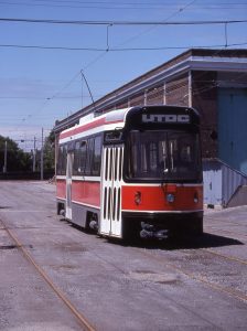
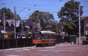
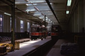
With the demise today of car 4000, the first of the Canadian Light Rail Vehicles, a look back on the prototypes when they were brand new.

The photos here were taken on June 4 1978 at St. Clair Carhouse. I don’t know which fleet numbers the cars shown here wound up with, but I’m sure there is a reader who knows these details and will supply feedback.

Updated December 25, 2017 John Bromley has provided additional information about the prototype CLRVs:

The car in the photos you posted is 4003 II.  The photo op was June 4 1978, I was there and have a few photos.  Perhaps the July date is the processing date on the slides?

Steve: Thanks for the correct date. I had neglected to write it on the slides at the time.

Below pic shows 4000 II from the rear June 29 1977 at SIG, taken from inside the unfinished carbody of 4003 II.  Even then 4000 II had the all-white top on front rather than the black just visible in 4001 II behind it.  Do I need to mention the pantograph?

Sorry for the delay in sending, we’ve been in Europe for three weeks.

TTC Board Meeting: Monday, December 11, 2017

The TTC Board will hold its final meeting of 2017 on December 11 at the usual time and place, 1:00 pm in City Hall Committee Room 2. The agenda contains a few items of particular interest.

Updated December 13, 2017 at noon: The section on the Ridership Growth Strategy has been updated with comments about the staff presentation.

Continue reading →

Analysis of Routes 501 Queen and 6 Bay: November 2017 (Part 2: Preliminary King Street Pilot Review)

This is the second article reviewing the effects of the pilot King Street transit priority scheme. Part 1 looked at the behaviour of the 504 King streetcar route, and Part 2 concerns the operation of 501 Queen and 6 Bay during the same period.

Among the effects anticipated from the pilot was an increase in traffic on parallel streets with the effect reaching as far north as Queen Street. Queen suffers badly during the shutdown of King for TIFF in September, and by extension some problems were expected to show up with the pilot’s changes changes on King.

Another effect that was expected was congestion on the north-south streets crossing King. Only one transit route in mixed traffic, 6 Bay, operates on such a street.

The City of Toronto is monitoring traffic behaviour on many streets in the study area and will publish their own preliminary findings in mid-December.

The charts presented here are in the same two formats as those in Part 1:

  • One pair of charts shows the travel times between Bathurst and Jarvis on Queen, and between Dundas and Front on Bay, both ways. Each day’s data are plotted individually to show the difference between individual trips, the evolution of travel times over the day, and the degree of dispersion in travel time values (i.e. the predictability, or not, of travel time for any journey).
  • One pair of charts shows average times, by hour, for each day to illustrate daily fluctuations and any before/after changes concurrent with the King Street Pilot.

For both routes, there is almost no change in the average travel times after the pilot began. Values on Queen bounce around a lot, but they do so both before and after the pilot began.

There is a quite striking weekly pattern with much higher than usual averages during the PM peak eastbound on Queen and southbound on Bay with low values usually on Mondays, and much higher values later in the week. This shows the importance of studying route behaviour over several days, while remaining aware that external events can create patterns in the data, or can create one-time disruptions for special events such as parades or sporting events.

501 Queen:

6 Bay:

Analysis of Route 504 King: November 2017 (Part 1: Preliminary King Street Pilot Review) (Updated Dec. 5, 2017)

Updated December 5, 2017 at 8:15 am: Charts showing travel speed profiles in the pilot area have been added at the end of this article.

Updated December 3, 2017 at 10:50 am: Charts showing hourly average travel times by day have been added in a section at the end of this article.

The pilot operation of King Street as a transit thoroughfare began on Sunday, November 12 and will continue for the next year.

This post is the first in a series of articles reviewing the effect of the new configuration on the operation of 504 King and related routes.

The methodology behind the processing and presentation of TTC vehicle tracking data is explained in Methodology For Analysis of TTC’s Vehicle Tracking Data on this site.

The first sets of charts show the running time for 504 King streetcars westbound and eastbound between Jarvis and Bathurst Streets.

Within each set, there are five pages corresponding to weeks (or partial weeks) of the month with Monday-Friday data, and separate pages for all Saturdays and all Sundays.

Worth noting:

  • The break between “before” and “after” data occurs at Week 3, Monday, November 13. There is a clear difference in running times over the pilot segment after the implementation.
  • Sunday, November 5 was a home game at BMO field for the Toronto FC, and its effect on King Street traffic is clear.
  • Sunday, November 19 was the Santa Claus parade.

The change in running time also had an effect on the quality of service provided on the route. This showed up in more reliable headways (less scatter in the actual values around the average) which, as with the link time charts, is visible starting in week 3. The benefit is visible both at the terminals and at Yonge Street. I have also included a chart for Dufferin eastbound to show service coming into Liberty Village.

The charts are in the same format as for the link times above, but show headways between cars at various locations on the route, not travel times between them. Note that 514 Cherry cars are not included here.

Westbound:

Eastbound:

The improvements in travel time are not uniform across the study area, but are concentrated in certain segments of the route.

(Note that for these calculations the screenlines are in the middle of the cross street. This means that dwell time at stops will shift to a different segment if a stop at a screenline was nearside before the change, but farside after the change.)

The afternoon of November 2 saw severe congestion across the west end of the route, and this appears consistently for all segments.

Westbound:

  • From Jarvis to Yonge there was never much congestion except when triggered by construction or a similar event that blocked the curb lane. There is little change here in running times.
  • From Yonge to University running times are very slightly reduced, but again this is a segment that was not severely congested before the pilot.
  • From University to John there is almost no change.
  • From John to Spadina there is a quite noticeable change in both the length and the consistency of travel times. A considerable amount of this is due to the elimination of delays from turning traffic at Spadina.
  • From Spadina to Bathurst there is also a change in running times, but mainly in the evenings when the club district is active. This change also varies by day of the week.


Eastbound:

  • From Bathurst to Spadina there is a change in running times which, like the eastbound data, is mainly in the evening.
  • From Spadina to John, there is little change.
  • From John to University, there is an improvement, although on Wednesday and Thursday, November 29-30, there are extended running times during the pm peak period. This backlog was west from University Avenue implying that something was preventing streetcars from crossing quickly to the east. (Some readers here and on social media have commented that there are days when north-south traffic crossing King prevents service from clearing intersections.)
  • From University to Yonge, the running times are more consistent after the pilot began, but the averages stay roughly the same.
  • From Yonge to Jarvis, running times are slightly higher. This reflects the shift of the busy Yonge Street stop east of the screenline at Yonge.


In future articles, I will review:

  • Details of specific days when the line was disrupted.
  • Detailed speed profiles in the pilot area.
  • Operation of 501 Queen and 6 Bay before and after the pilot.
  • Operation of 514 Cherry.
  • Capacity of service provided on King Street.
  • The effect of TIFF on the King, Cherry and Queen cars.

My thanks to TTC staff for pushing the November data out the door on December 1 to permit early publication of these results.

Updated December 3, 2017

Average Travel Times

The charts above show data for the individual trips across portions of the route together with trend lines showing the overall pattern through each day.

The following charts are organized to present hourly averages for each day of the month to illustrate the contrast between the “before” and “after” conditions. The times on the charts refer to the hourly periods when vehicles entered the segment westbound at Jarvis or eastbound at Bathurst.

Each set contains four pages corresponding to the AM peak, midday, PM peak and evening periods, followed by all Saturdays and all Sundays.

  • In the AM peak, there is not much change in average travel times before and after the pilot.
  • During the midday, travel times are lower on average by 2-3 minutes.
  • During the PM peak, average travel times are lower, and dramatically so compared to some days early in the month. Note that November 6 is a Monday, and these are typically the least congested weekdays on King.
  • During the evenings, average travel times are lower and more consistent after the pilot begins.
  • Results on weekends are less dramatic than for weekdays. The effect of the Santa Claus parade is visible on the 19th and this is particularly striking for eastbound service.
  • In some cases there were no cars for specific days and times due to a major blockage or diversion. These show up as “zero” values for the averages in the charts.

I have created but did not include charts of Standard Deviation values. Although they do show some improvement after the pilot begins (lower SD values indicate less scatter in the individual travel times), the values are rather “noisy” because the number of data points for each day and hour is small.

Another issue for service capacity is that the number of vehicles crossing the pilot area varies quite a bit on a day-to-day basis for each hour of the day. If the service were “on schedule”, these values should not change much (±1 vehicle), but this is not the case. I will review this as part of the service capacity analysis in a later article.

Updated December 5, 2017

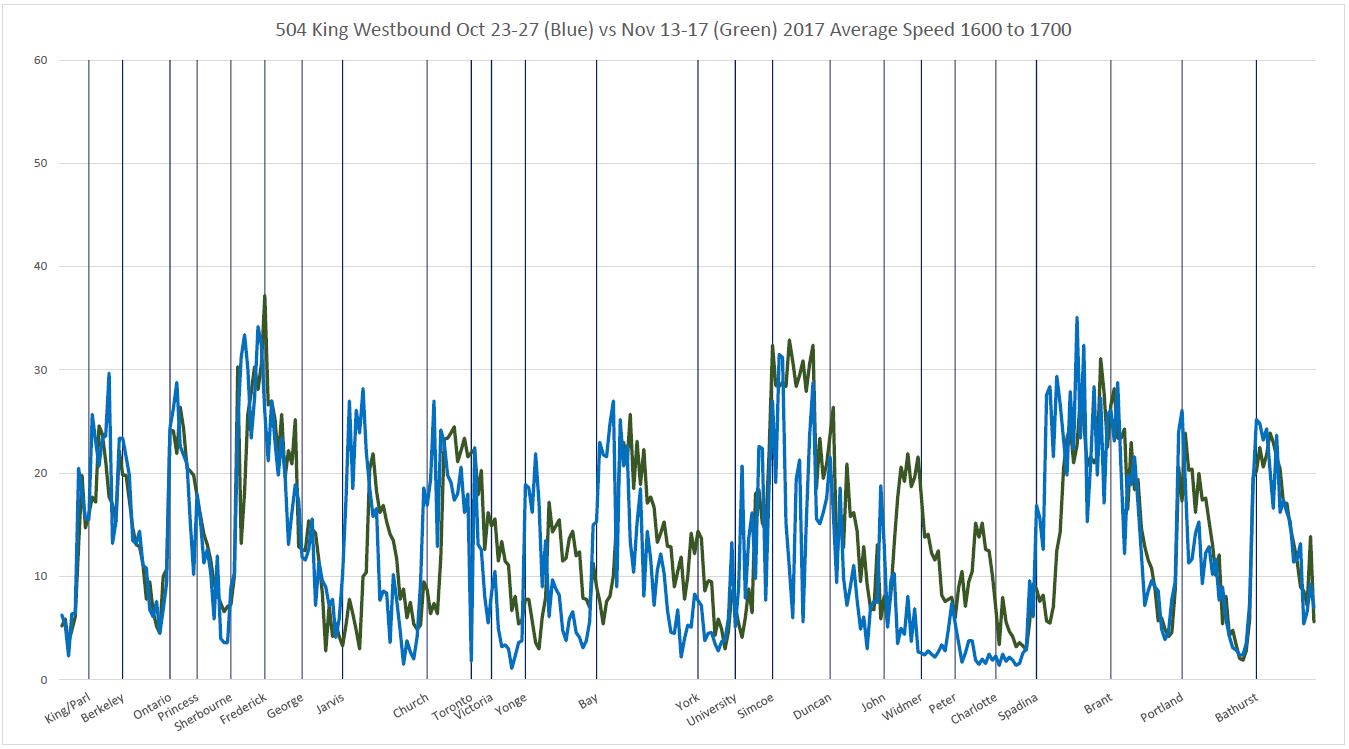
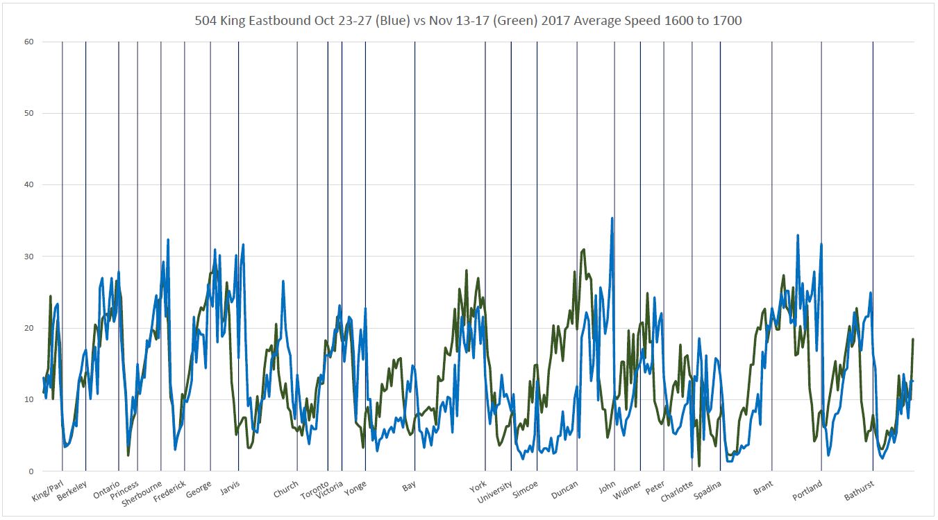
The charts in this section compare the travel speed through the pilot area in detail for the week of October 23-27 (pre-pilot) to November 13-17 (first week of pilot). Early November was not used for “before” data because the route was diverting around bridge repairs on Queen at the Don River, and travel speeds downtown could have been influenced by operators driving faster than usual to make up time.

As a guide to reading these charts, here are two sample pages showing travel speeds in each direction for the hour beginning at 4:00 pm. The blue lines show the “before” data and the green lines show “after” data. The charts should be read in the direction of travel with westbound going left to right, and eastbound going right to left.

Where the pilot speeds are faster than before the changes, the green line is higher than the blue one. One immediately obvious change is that the dips in average speeds at stops shift from the nearside to the farside of interesections. However, delays caused by traffic signals at some locations are common to both sets of data.

A common problem on King before the pilot was a backlog of traffic from certain intersections, notable Spadina westbound. This shows up in much lower speeds not just at Spadina but for a considerable distance east of it. These dips are wider in periods when congestion backed up from problem intersections is the worst.

By paging through the full sets of charts linked above, one can see the evolution of travel time patterns over the day rather like a flip chart animation. Areas and times that were not congested before the trial generally show the same travel speeds for before and after except to the degree that stop placement affects behaviour at intersections. Where speeds are improved by the pilot, the green line rises above the blue one, and the separation changes through the day.

There is a marked difference between the patterns in the AM peak, midday, PM peak and evening hours.

As other charts have shown, the average travel times through the pilot area are not affected as much in the AM peak when competing traffic is less of a problem, but later in the day, problem areas show up in the “before” data. There is a peak at midday when travel times have now been considerably improved and another, of course, in the afternoon rush. During the evening, the benefit in the financial district drops off, but it remains west of University Avenue.

At the beginning of the pilot, all transit signal priority was turned off to see how the street would operate without it, although this mainly affected crossings with less important streets. This shows up as “double stops” at locations where there is now a farside stop and approaching streetcars can be caught without extended green time to clear an intersection.

As the pilot continues, this type of chart will provide a base for comparison of the effect of various changes and of seasonal effects.

TTC Board Meeting: November 28, 2017 (Updated)

Updated December 1, 2017 at 11:15 am:

The preliminary City of Toronto operating and capital budgets were presented at Toronto’s Budget Committee on November 30, 2017.

Operating Budget

To no great surprise for seasoned budget watchers, the Two Hour Transfer was not included in the funded budget, but instead appears among a long list of unfunded new or enhanced services. The total value of these proposals is $41.3 million (after considering any associated revenue), and they are competing for a much smaller amount of available headroom in the operating budget. (The list is on pp 12-14 in the appendices linked above.)

Although Council may approve many wonderful initiatives and the Mayor may hold many press conferences and photo ops exulting in the decisions, the money to pay for them is often not part of Council’s decision. What actually happens is that these are “nice to haves” thrown into the coming year’s budget hopper on the off chance funding will materialize by budget time. This has the effect of throttling the will of Council and feeding all of its decisions through the much more conservative outlook of the Budget and Executive Committees.

Council further limits this process by passing a budget directive early in the cycle (usually late spring) directing that property taxes for the coming year not rise by more than the rate of inflation. The actual increase is below inflation because commercial property rates are on a long downward trend thanks to rules imposed by Mike Harris to rebalance the relative tax levels for commercial and residential properties in Toronto. This will not complete until, probably, the 2021 budget after which tax increases will apply equally across the board.

Of the new revenues Toronto will receive in 2018, property taxes are actually only a small component, but Council debates inevitably turn on this source as a benchmark. The actual tax increase anyone sees is the result of several factors:

  • the tax rate change for their property class;
  • changes, if any, in separate levies such as the Scarborough Subway tax and the Mayor’s Infrastructure tax;
  • updated and/or phased in changes to the assessed value of property;
  • policy directions such as rebalancing rates between property classes (e.g. commercial vs residential).

Other new revenues can flow to the City through various rate structures notably TTC fares, although these have been frozen for 2018. A small increase in fare revenue is expected compared to the 2017 budget thanks to a changes in the relative number of fares paid of each type (passes, tokens, cash).

As things stand today, the funding to pay for the Two Hour Transfer simply isn’t there, but it may be found, almost like magic, as the budget process unfolds from now through February 2018 at Council. Another transit fare proposal, the first phase of the “Fair Fare” scheme in the Poverty Reduction Strategy, is also not funded.

This process creates a drag on implementation of new programs unless there is strong political support from the Mayor and his voting block on Council, and should serve as a warning to advocates for schemes such as the Ridership Growth Strategy. With luck, there will be proposals before the TTC Board before the hiatus of meetings for the 2018 elections, but anything the Board approves will be considered as an “enhancement” going into 2019 and could well be derailed. Add to this the chronic problems of vehicle and garage space shortages at the TTC, and there is a recipe for seeing little real growth in service until at least the 2020 budget year if not later.

This is the combined effect of a process that has valued capping spending above all other goals for many years. Infrastructure that would be needed to support growth doesn’t exist and has a multi-year lead time, and even the vehicles the TTC owns run less service than they could because improving service never comes with enough revenue to cover costs.

Passengers who have shorter waits or are less crowded do not represent extra revenue, and the marginal gain lies only with new fare-paying trips attracted to the TTC. On a grand scale this is seen for 2018 with the Vaughan subway extension where net new revenue does not come close to paying for the added operating cost of service, but this happens at a smaller scale whenever a bus runs more often and less crowded, but mainly with passengers who were already on the system.

A further problem for constrained budgets is that the cost of existing service goes up through inflationary pressure, and the population requiring municipal services including transit continues to grow. City management use that growth to show how the tax burden is actually declining on a per capita basis from $4,480 in 2010 to $4,262 in 2018 (presentation, p 17), and this is considered to be virtuous when in fact it shows not just “efficiency” but also a decline in service provided. The effect on individuals varies depending on which municipal services they consume, and the program-by-program effect is never reported.

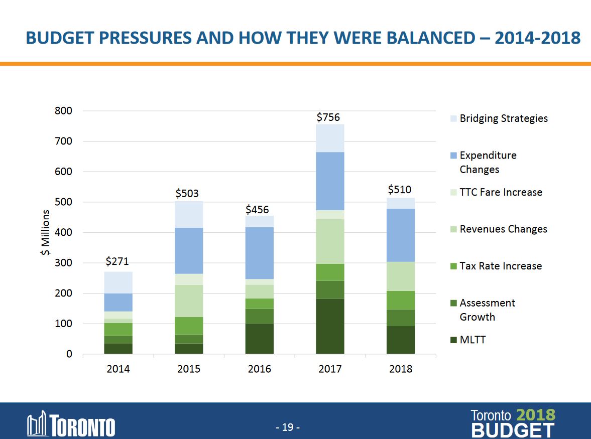
Every year, the budget is hauled into balance through a combination of new revenues, reduced expenditures and “bridging”, a term for various accounting “fixes” that get the City past short-term problems. (Apologies for the subtlety of the colour changes in the chart below. It is from the City presentation.)  Note that the values below are “deltas”, the change from year to year, not the total revenue or spending in each category. Expenditure cuts (darker blue) have been a large chunk of the savings in recent years. By comparison, TTC fare increases are small change within the larger City context and, of course, there is no increase in 2018, a policy direction endorsed during the 2017 budget cycle.

However, City budgets are debated at the margin in that any fine tuning is achieved by tweaking revenue sources to accommodate new spending, and the proportional effect on thinks like fares, property taxes and other user fees tends to be higher than for the budget as a whole. The reason for this is that much of the City’s revenue comes from sources that Council cannot “tweak” in the course of setting its budget, and so the effect on what remains is higher.
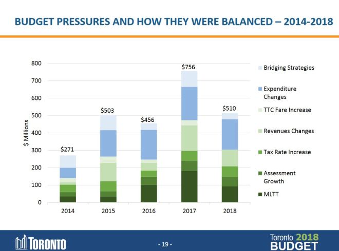
The TTC Board decided that it would include the money sitting in the Transit Stabilization Reserve as 2018 revenue, just as they did in 2017 (although in fact this was not needed because of better-than-budget results). This keeps the year-to-year subsidy increase down to $24 million paying mainly for the new cost of the TYSSE and for transitional increases in fare handling while Presto and the legacy fares both remain in place. Using that reserve is an example of a “bridging strategy” because the reserve will not be available in 2019 if it is depleted  in 2018, and new revenue will be needed to replace it. That $24 million pressure from the TTC (with more to come from unfunded proposals) crowds other City departments and agencies by taking the lion’s share of new spending.

Among the factors listed in the revenue and expenditure changes for 2018 (p 27), there is a section headed “Prior Year Decisions”. This includes the TYSSE effect, but does not include the cost of the fare freeze decision on the 2018 revenues.  Had there been a fare increase, politicians would be forced to explain to riders how opening a new subway is not free and how York Region gets a free ride on Toronto taxpayers.

The City’s overall revenue and expense budget is summarized in the chart below. The TTC’s total expenditures of $1.974 billion consume about 18% of the budget, but 63% of this is paid for through the farebox. (Note that there is a common problem when “farebox” recoveries are cited for the TTC because other revenues such as advertising and parking are sometimes erroneously included as if they were rider contributions. Also, occasionally, the TTC funds some capital costs from current revenues and these do not properly belong in the “operating cost recovery” calculation.)
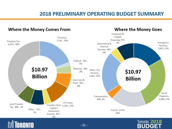
When the available revenue including assessment growth and inflation in property taxes are considered, the City has a small surplus of $3.4 million in the preliminary budget. A further $5 million will be available from a pending change in taxation of vacant property, although Council has already directed that this go toward the Poverty Reduction Strategy. Without further adjustments, these are the only funds now available to pay for the $41 million in approved but unfunded initiatives including the Two Hour Transfer.

Capital Budget

On the Capital side, there are a few points worth noting in the City Budget that bear on the TTC’s funding.

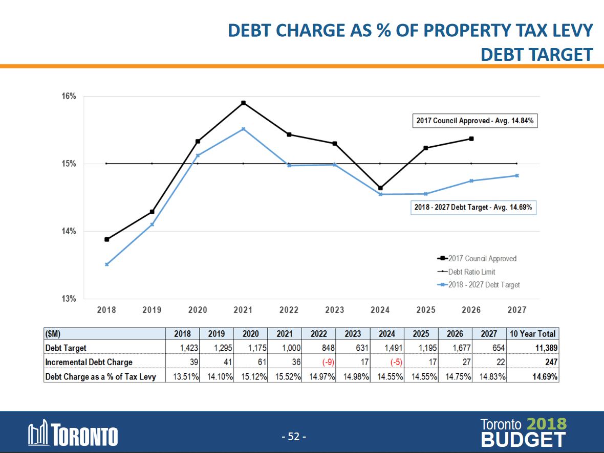
The City of Toronto has a policy that total debt service payments should not exceed 15% of property taxes. This was changed in recent years from a hard cap to one that considered the 10-year average debt ratio mainly to deal with a bulge in borrowing that will peak in 2021. That bulge would affect projections well into the next decade as lower-than-average borrowing in 2018-19 slips off of the chart but must be replaced by comparably low numbers in 2028 and beyond to hold down the average while the 2021 peak is “digested”.
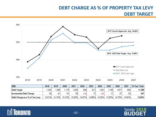
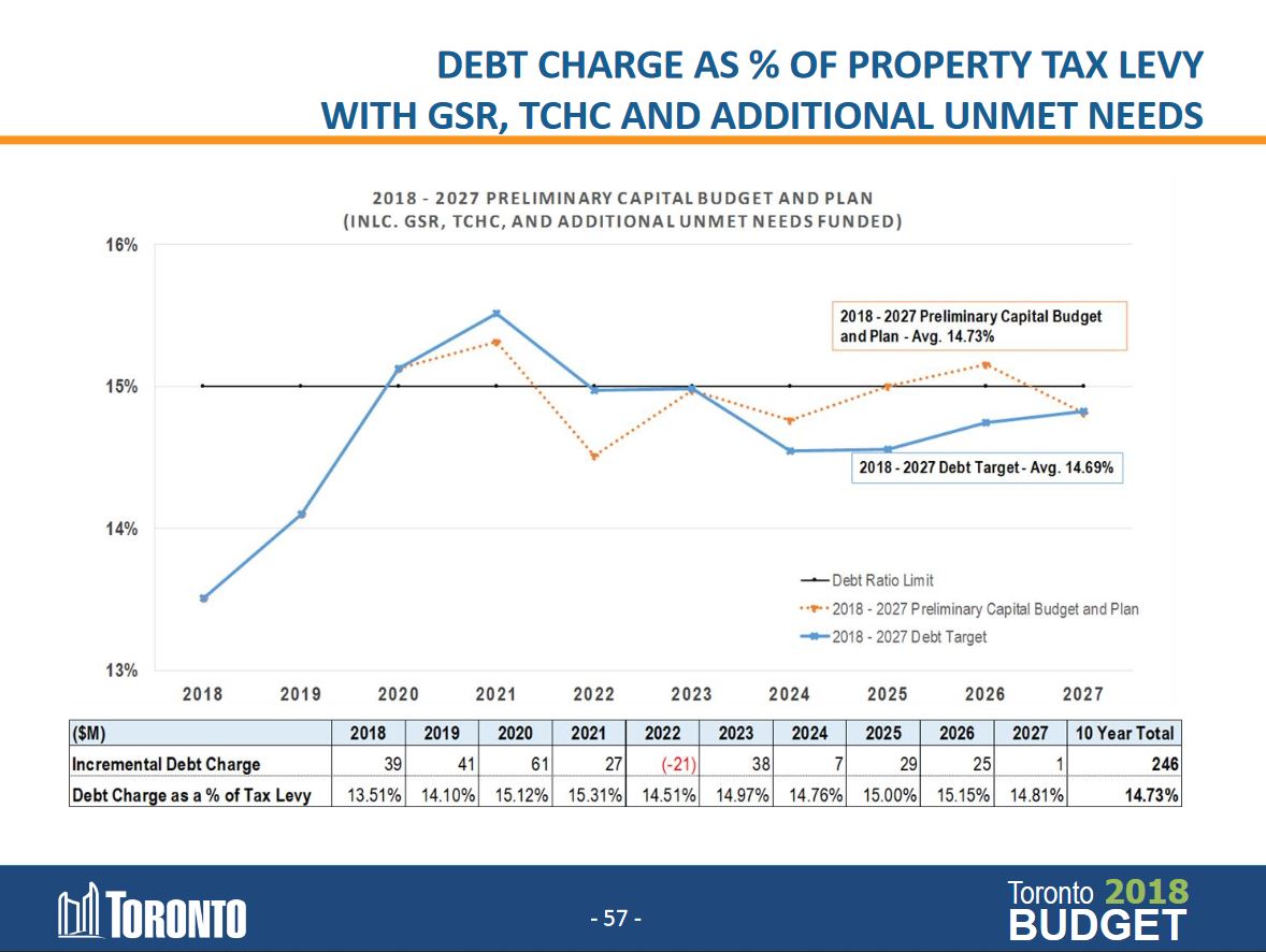
Various adjustments to the budget change the shape of this chart and somewhat tame the peak. There are additions (funding for TCHC repairs and other unspecified “unmet needs”), but new provincial gas tax revenue announced in 2017 allows a reduction in the debt load producing the revised chart below.
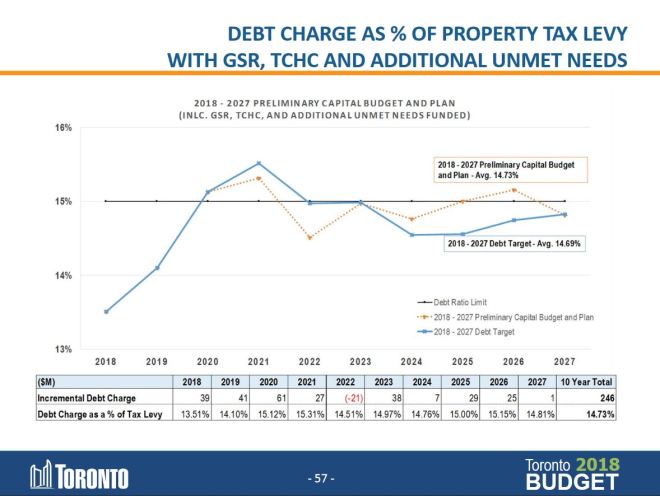
The debt limitation, together with limited provincial and federal funding, is directly responsible for the TTC’s enormous list of unfunded projects. The new gas tax revenue will generally not go to transit projects (except possibly under “unmet needs”), but will offset other City borrowing needs.

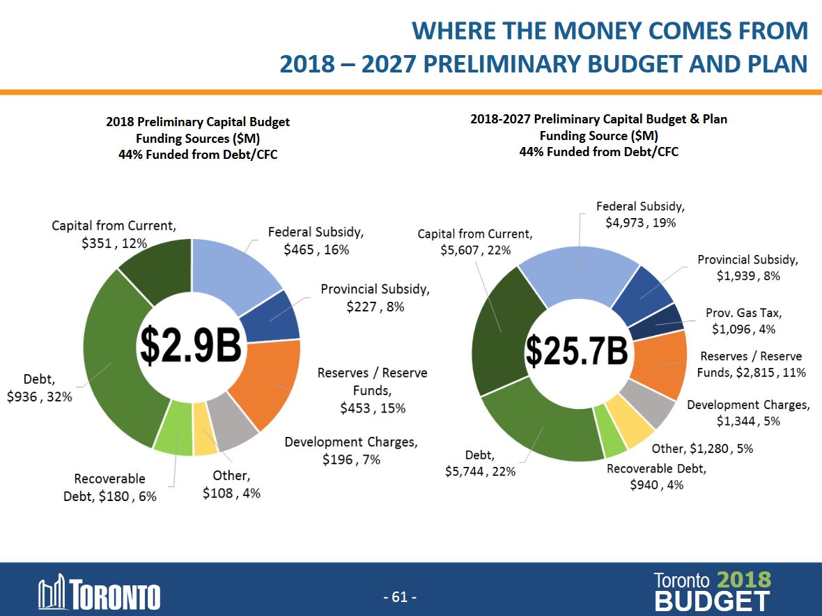
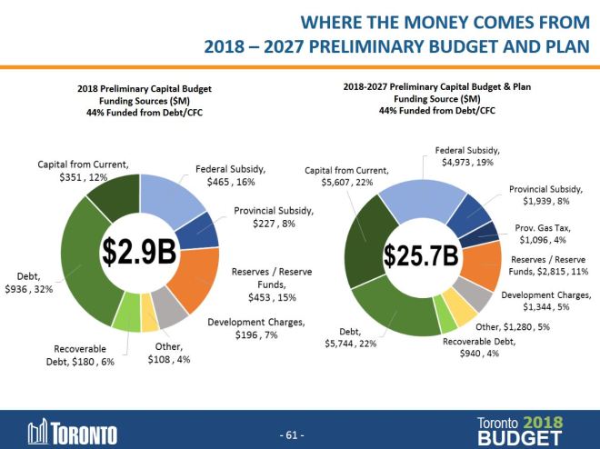
Another change in projected City financing will be an increase in the “Capital from Current” amount. The proportion of funding provided by this source will rise from 12% of the 2018 budget to 22% in the ten year plan while debt falls from 32% to 22%. This will shift more of the spending in later years of the plan into the operating budget, although the dollar increase may be offset by a reduction in total annual funding needs assuming no major projects are added without dedicated revenue sources and/or subsidies from other governments.

Even with all of this spending, the “state of good repair” backlog across the city will continue to grow, notably at the TTC. This plan understates future funding requirements by its failure to include the TTC’s SOGR projects that are known to exist, but not included in the City’s plans. (Some other City departments, notably Transportation and Facilities Management, also have large unfunded repair backlogs. See p 63 of the presentation.)
Updated December 1, 2017 at 9:15 am:

The budget presentations, which contain slightly different information from the budget reports, are now online.

The Capital presentation has a more detailed breakdown of the “Capacity to Spend” reduction, and I have added this, plus a few comments, to that section of the main article (scroll down to the end).

Continue reading →