
The operation of Toronto’s streetcars is under considerable fire for what is portrayed as the slowest cars in the world. Ironically, the very slowest of Toronto’s routes operates on a private right-of-way: 510 Spadina. The usual excuses about mixed traffic operation do not apply here.
Recently, I published charts showing the speed of each streetcar line over various segments and by time of day. 510 Spadina did not show well, although the actual speeds vary from one place to another. This article looks more deeply at the data including a comparison with September 2019 before the pandemic. but after service was operating with the new Flexity cars.
There are three sets of charts in this article:
- Travel times by segment comparing June 2026 to September 2019 values. The 2026 numbers are the same as those in the previous article, but the 2019 numbers show how in almost every case travel times are longer today than seven years ago.
- Travel speeds over the route showing the relationship to stop locations and intersections, and contrasting 2019 values with 2026. This shows the areas with the greatest change in travel speeds.
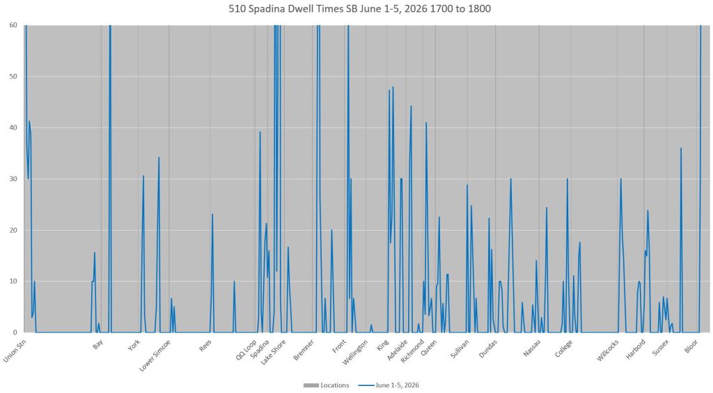
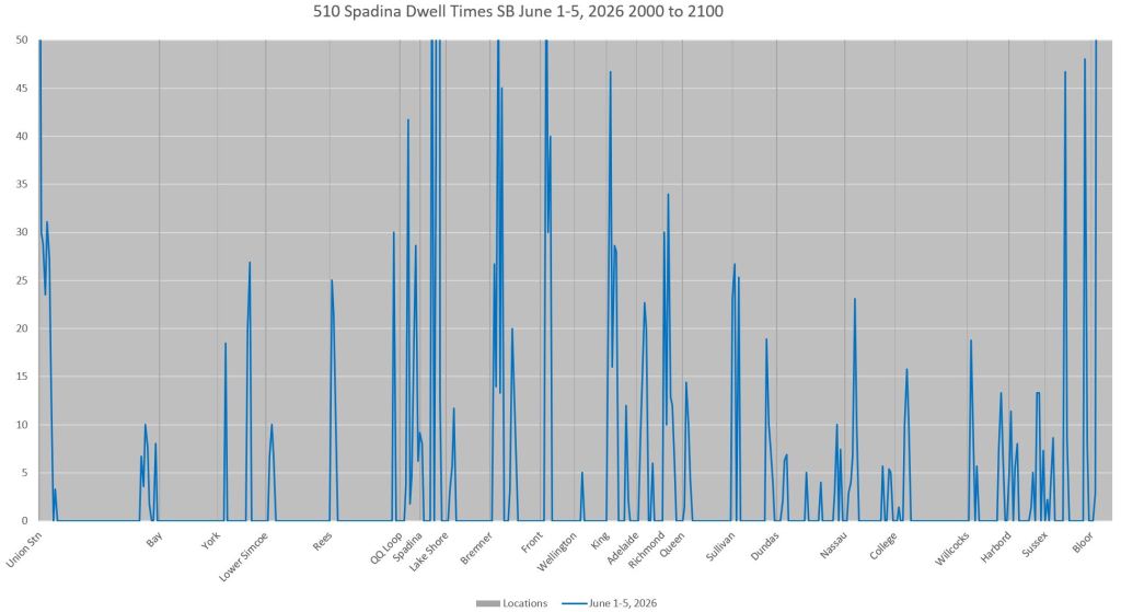
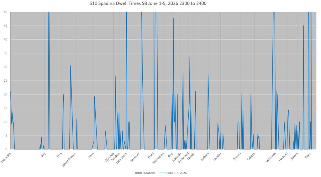
- Locations of long dwell times by streetcars. Some of these are at stops, but many are at traffic signals. Some dwell times have grown since 2019 (not shown) in spite of recent transit priority changes at some locations.
The charts in this article are fairly dense, and readers should click on them to view details, preferably on a device larger than a phone.
I do not offer a “magic bullet” to deal with slow operation, but note that it occurs at many locations along the route. Some are at traffic signals, and some but definitely not all are at junctions.
This is the first of a series of articles that will review each route’s performance.
Updated Aug. 16 at 11:10pm: Dwell time charts and commentary have been added for off-peak periods.
Service Designs
June 2026:

September 2019:
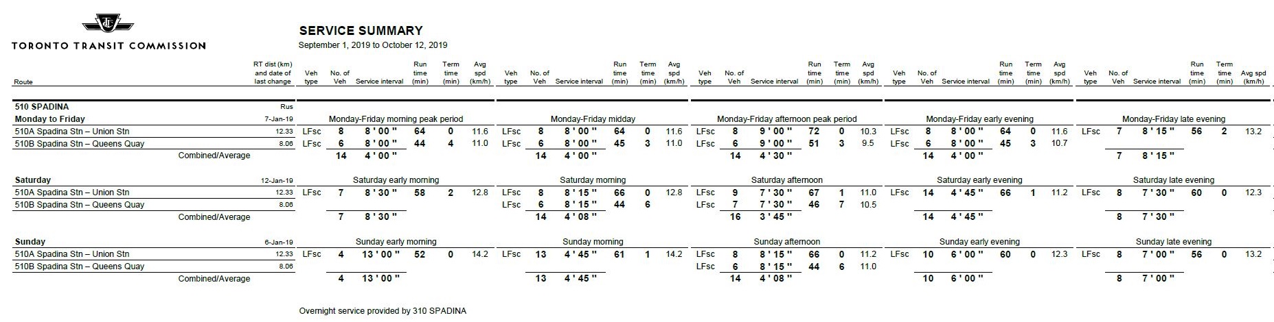
Comparative Travel Speed by Route Segment
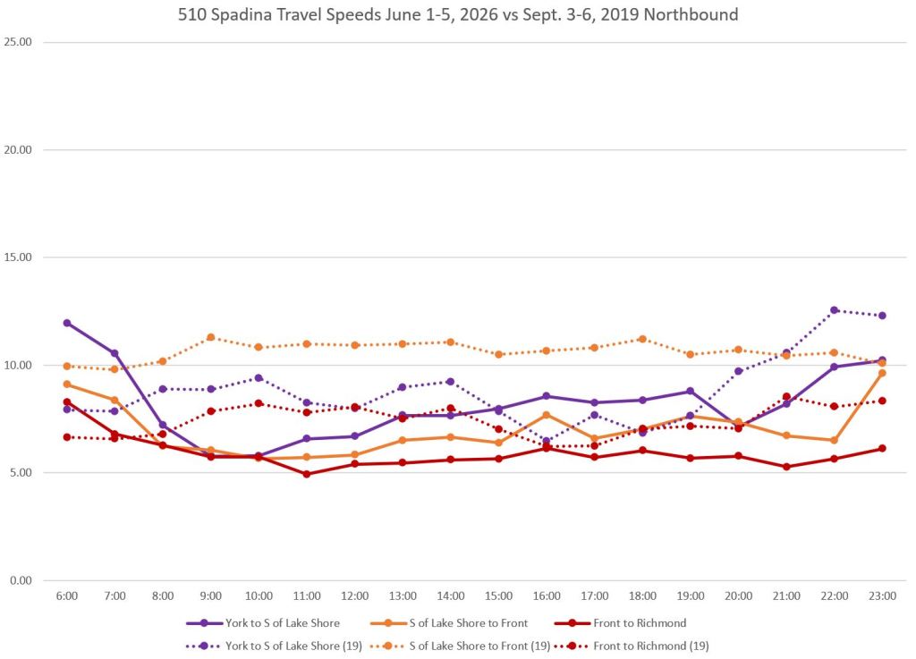
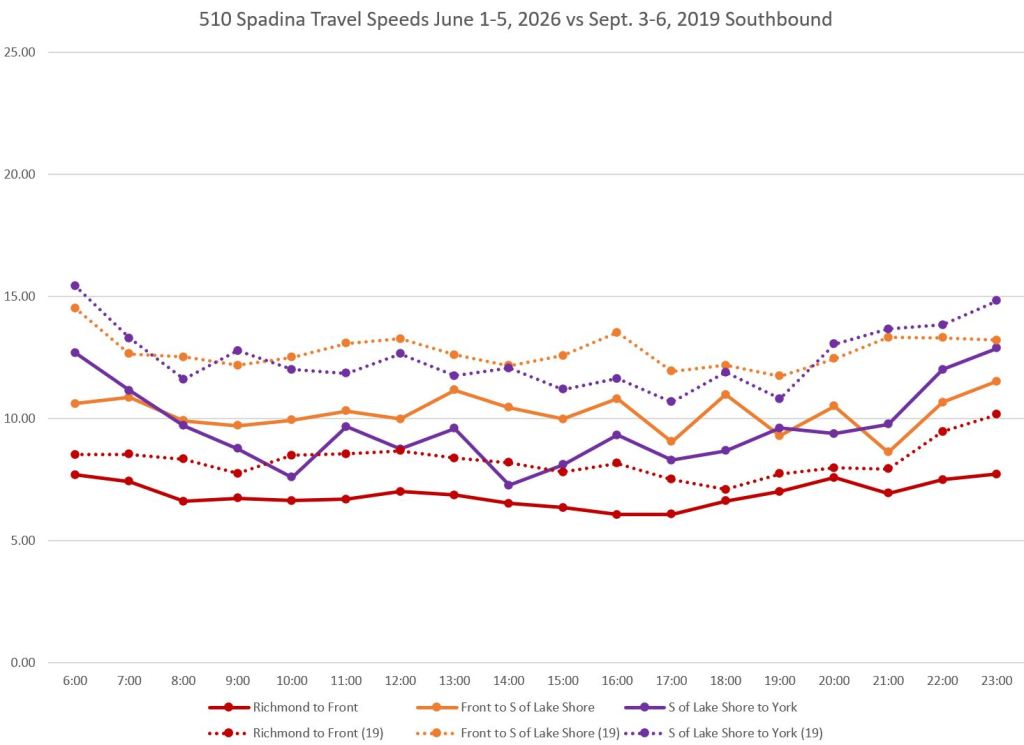
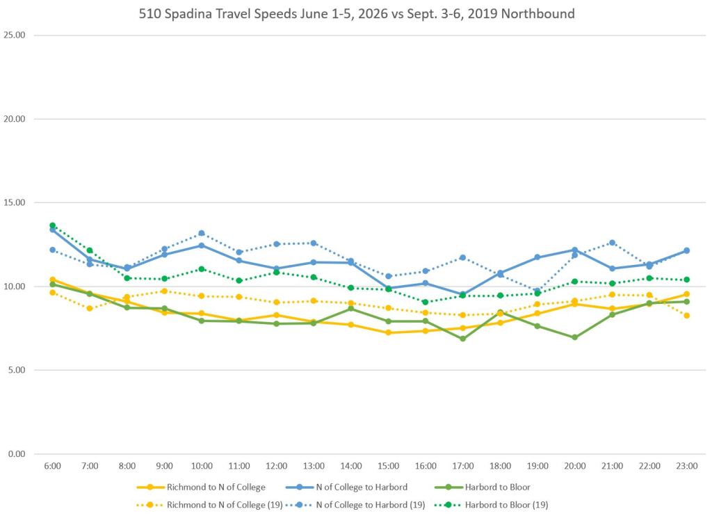
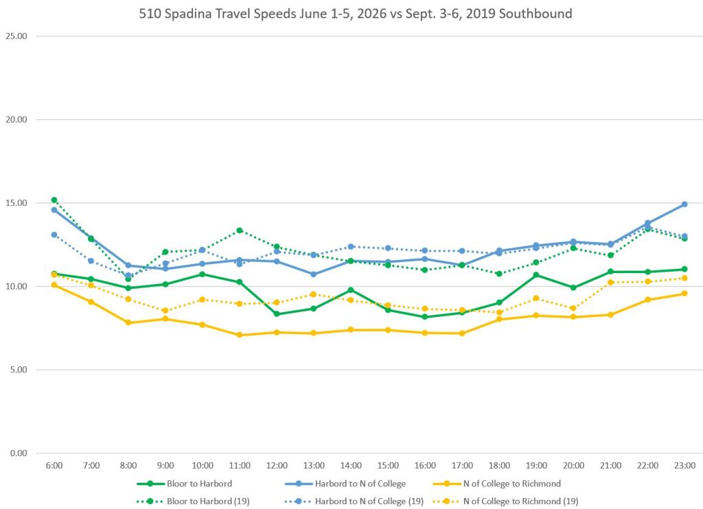
For clarity, the data shown in the previous article have been split into two sets of charts dividing the line at Richmond Street.
Solid lines show the June 2026 speeds, and dotted lines show the September 2019 values. The dotted lines are almost always above the solid lines (e.g. faster in 2019) , sometimes by a substantial margin. The south end of the route is a particular problem notably between Front and Richmond (red), and between Lake Shore and Front (orange). Note that some northbound speeds are different from the southbound values.
Speed along 510 Spadina has dropped over the entire line and during all time periods. This is not a localized issue, nor is it one of peak period congestion and demand, to the extent that can interfere with transit service.
Detailed Speed Profiles
Methodology
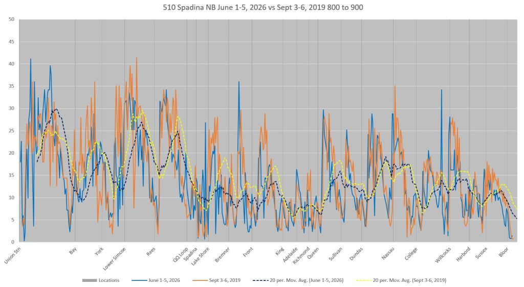
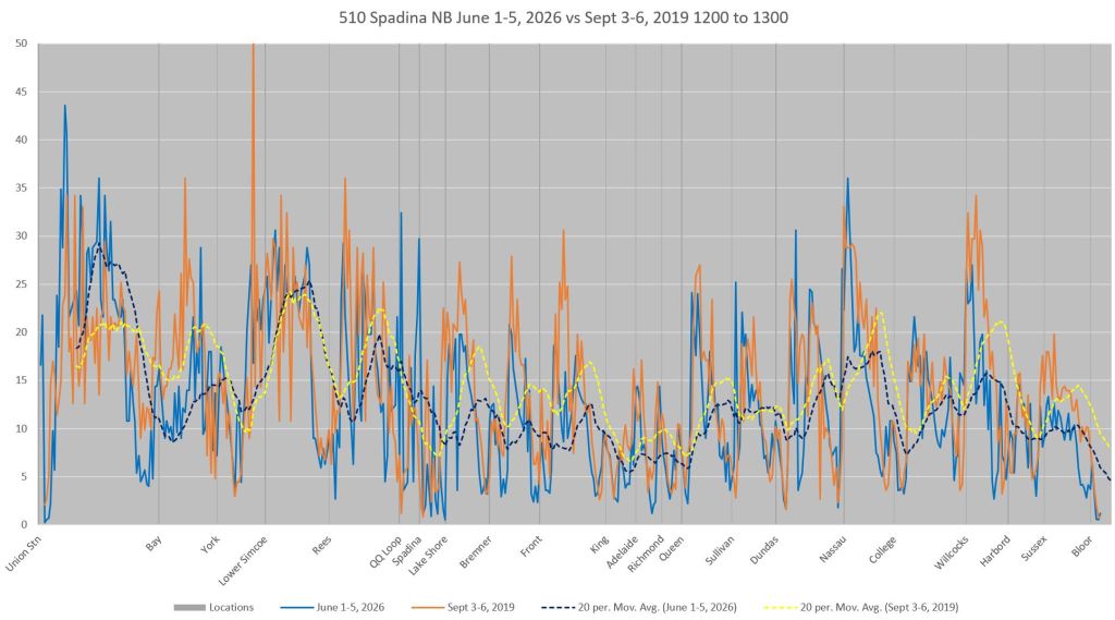
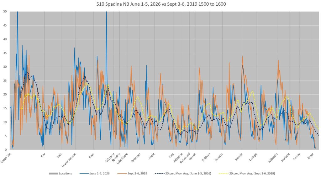
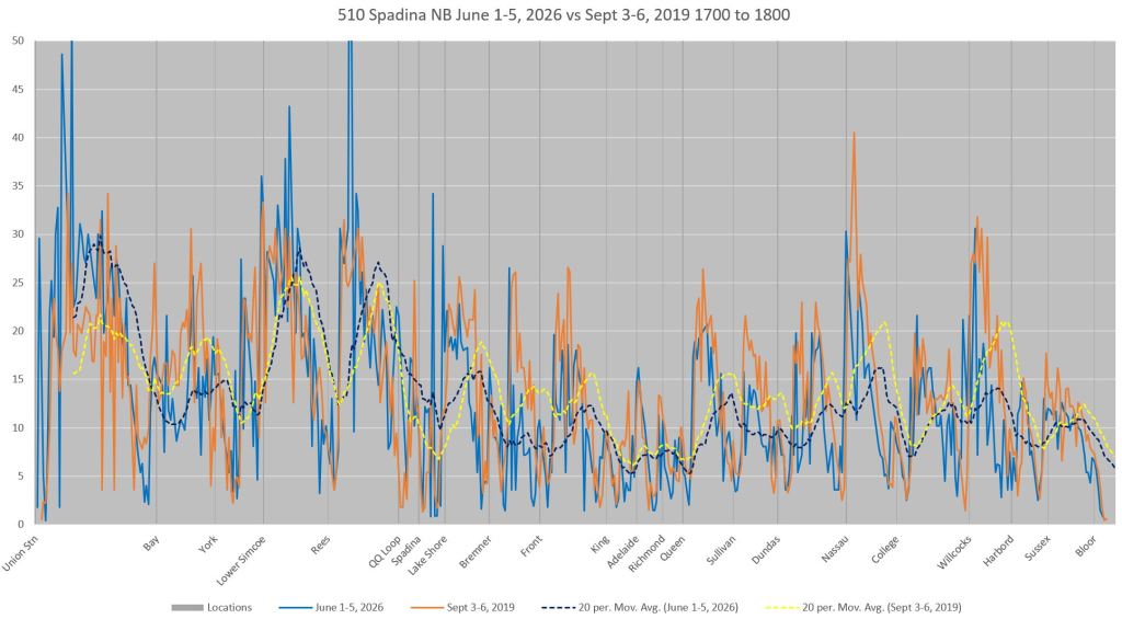
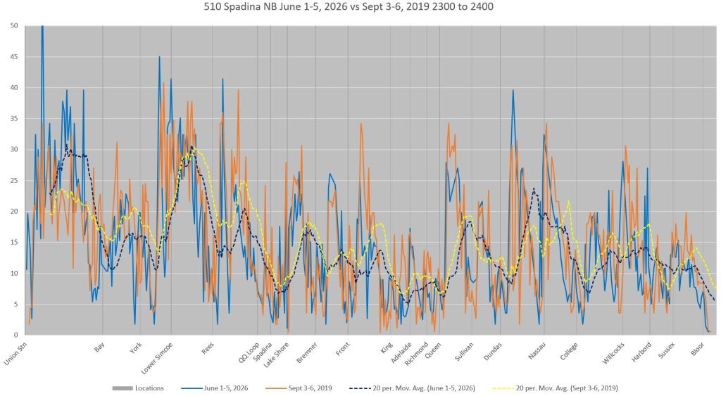
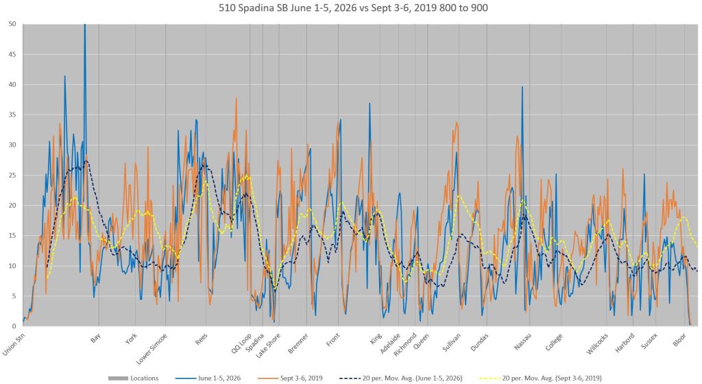
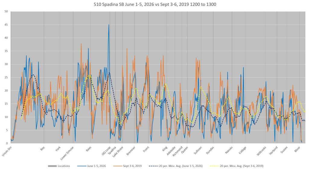
For these charts, the vehicle tracking data are mapped to a standard format with distance in 10-metre segments, and time in 20-second intervals. These values are used to convert the distance travelled between adjacent items to a vehicle speed. These values are collected for each 10m segment along the route by hour, and divided by the number of vehicles passing in that hour to obtain an average speed.
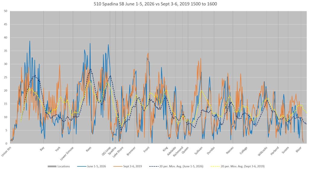
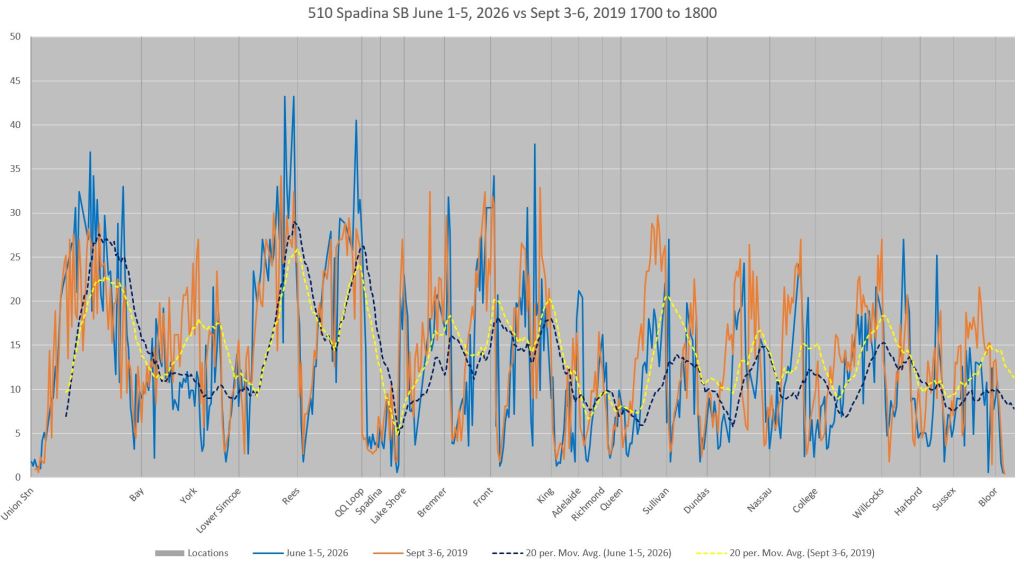
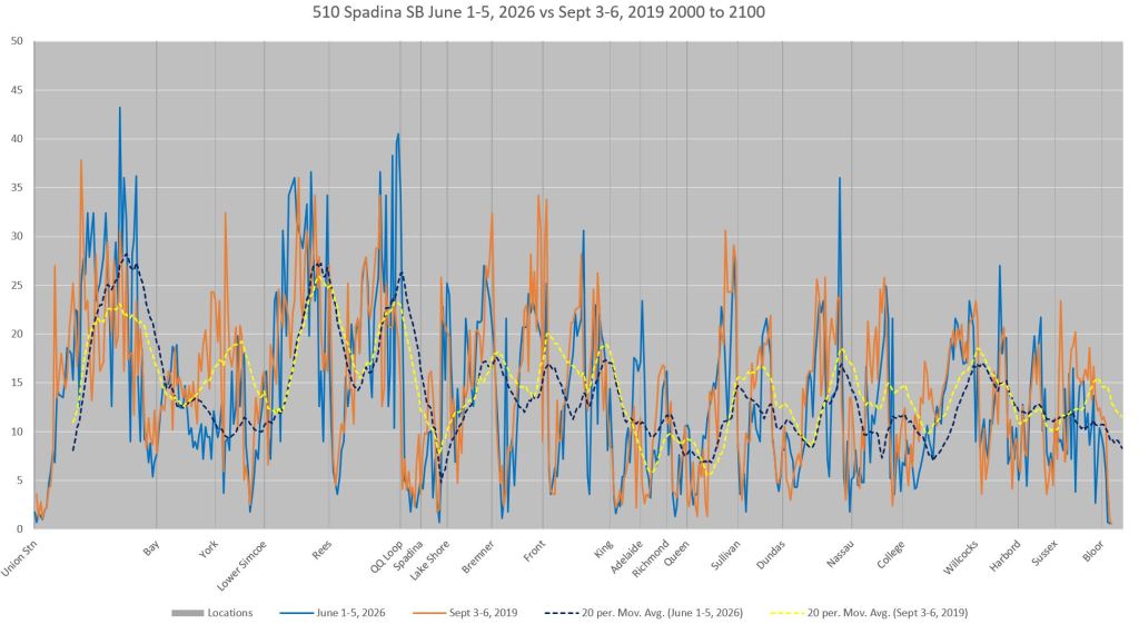
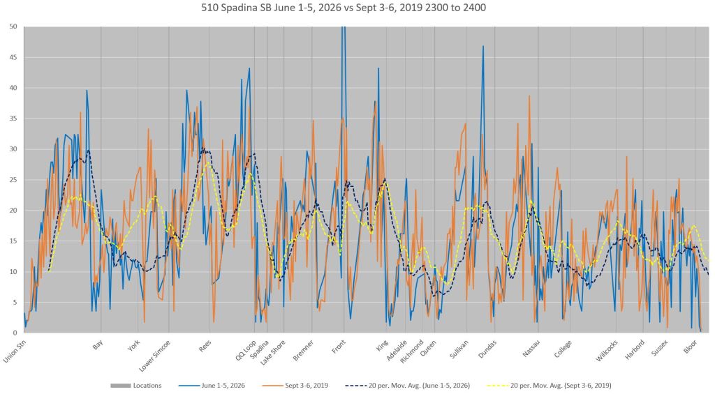
In these charts, there are four lines:
- June 2026 values: Blue
- June 2026 moving averages: Blue dashes
- September 2019 values: Orange
- September 2019 moving averages: Yellow dashes
The moving averages smooth out the values to show the overall shape of the data, but the lowest points show up in the solid lines which are not averaged.
Northbound
Northbound charts are read from left to right. Very clear throughout them are the yellow (2019) moving averages sitting higher than the blue ones (2026). Slower operation does not occur just at stops and intersections, but along the route.
Intersection locations are marked by vertical lines. Where the speed drops to the left of a line, this shows cars slowing if not stopping on the near side. Drops on the right side of a line show cars making farside stops. Cases where cars stop both near and farside are clearly obvious by the double dip in speeds on on either side. (These tend to be smoothed out in the moving averages because they blend the nearside and farside values.)
The charts show values for the AM peak hour, midday, mid-afternoon, PM peak, early and late evening showing the differences in speed at a more granular level along the route. Cars might hit top speeds of 30+ km/hr, at least on Queens Quay, but their progress is glacial south of Queen on Spadina where holds are common at every intersection even in the late evening data.

Southbound
Southbound charts are read from right to left. Where the speed drops to the right of a vertical location marker, this is a nearside stop; to the left it is farside.
The segment from Queen southward has slightly higher speeds southbound than northbound (above), but it is still a slow part of the route. At the south end of the route from Lake Shore to Queens Quay, speeds are quite slow, slower than the northbound service. This is an area where traffic signals quite strongly favour east-west travel and streetcars are regularly held here for lengthy periods.
Dwell Times
Methodology
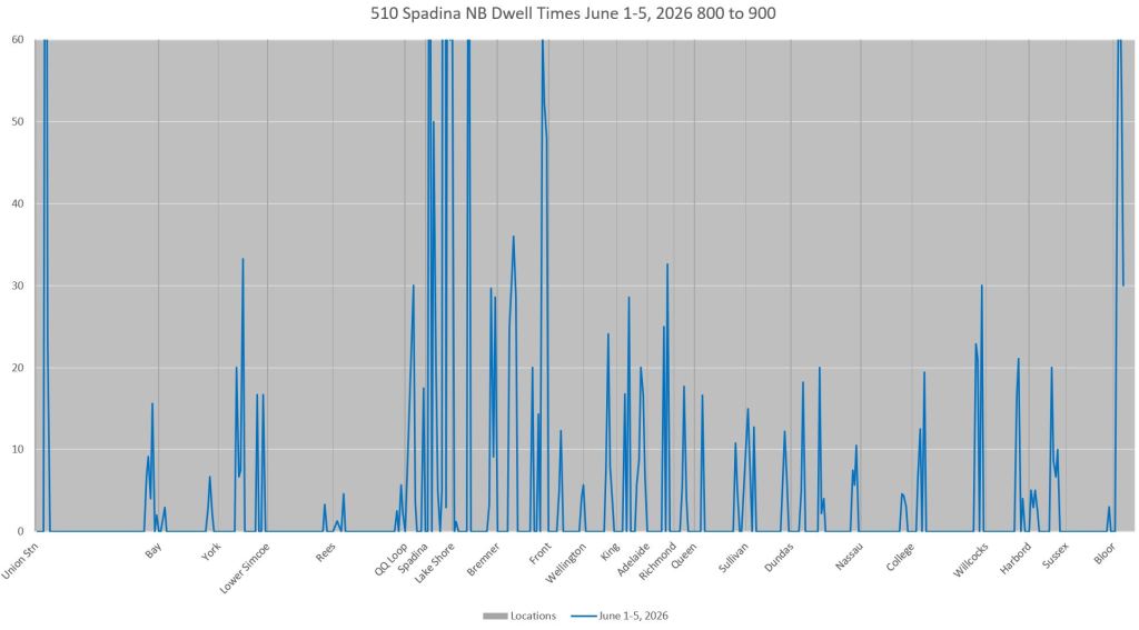
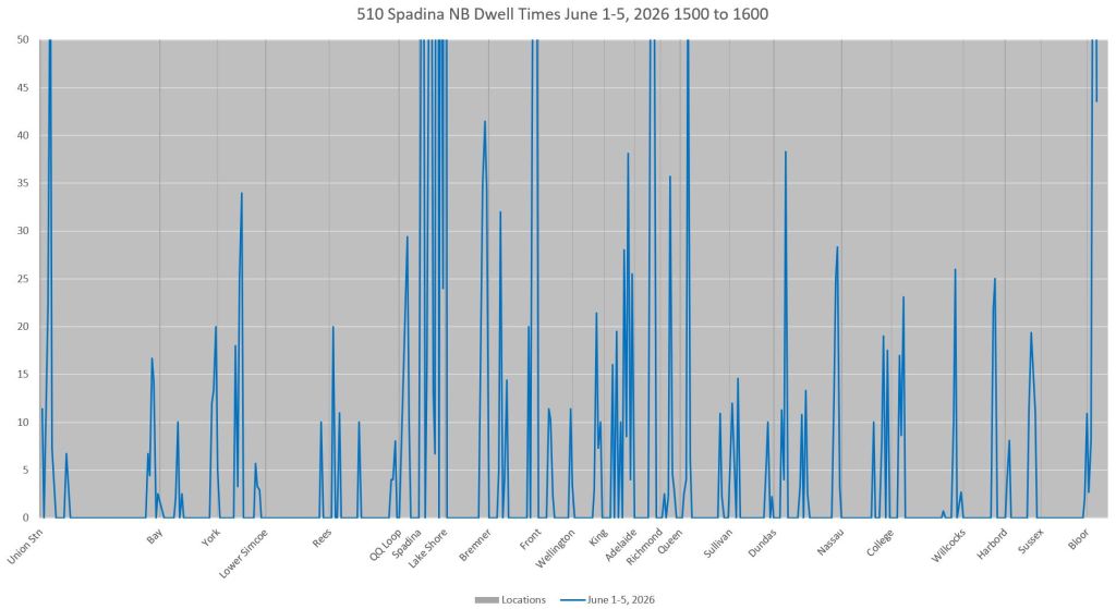
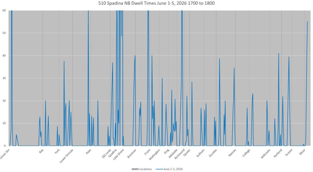
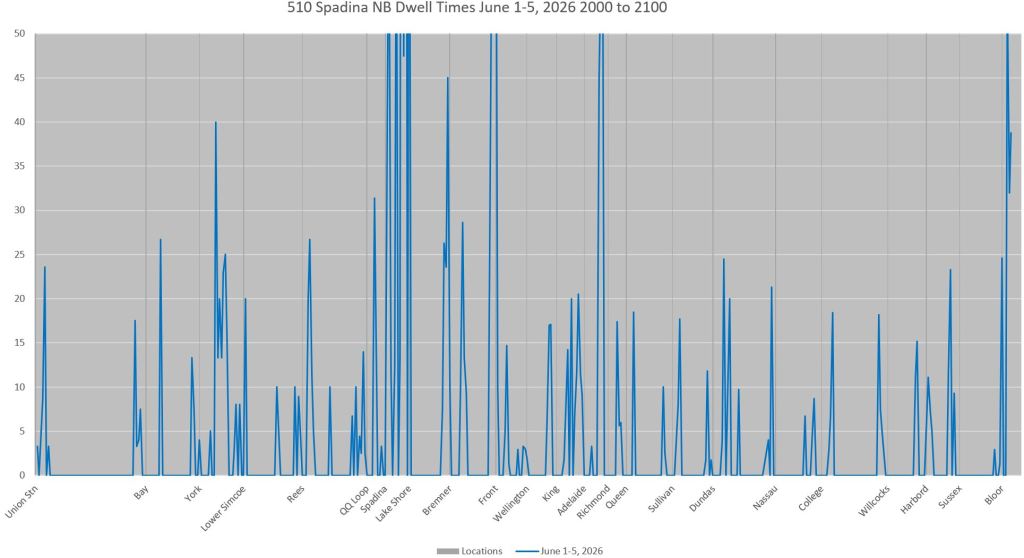
As mentioned earlier in the Travel Speed section, to simplify analysis of the tracking data, the route is divided into 10m sections and time into 20s intervals. These charts show locations where vehicles were in the same section for more than one time interval and the average time spent there. Note that a streetcar might be stopped to serve riders, or waiting for a traffic signal, or waiting for traffic to clear (including queuing for an occupied farside platform). There is no way to tell from the tracking data which factor contributes the most.
The values are calculated as the number of intervals above 1 a car is at the same point, and this is multiplied by 20. Cars that spend only one interval at a location do not contribute to the total time, but do add to the vehicle count. In effect, the formula is:
Dwell time = (Interval count at a location – 1) * 20 seconds
If anything, this undercounts dwell time by not charging any part of the first 20 seconds against the value. The values charted for each 10m segment are:
Average = Sum of Dwell times / Vehicle Count
As with the travel time charts, read northbound from left to right, and southbound from right to left. Where a stop is farside, traffic signal delays will be on the approaching side of an intersection (left of the vertical line northbound, right southbound) and stop service time will be on the other side.
Northbound
These charts show quite clearly that the longest northbound AM peak dwell times occur between Front and Queens Quay. The problems worsen in the PM peak with longer average dwells further north. Note that for a nearside stop such as Richmond, the dwell will include stop service time. The effect of double-stops nearside and farside at intersections is also quite obvious.
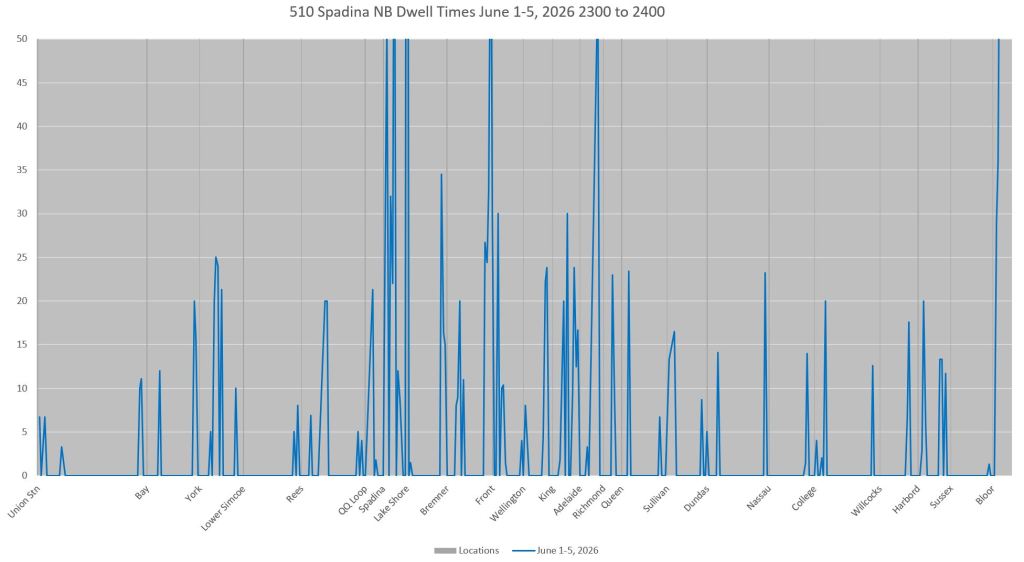
Longer dwells are not confined to the peak periods, but also occur between the peaks and into the evening. They continue late evening with the double peaks at traffic signals remaining even though there is more slack in overall traffic for transit priority.

Southbound
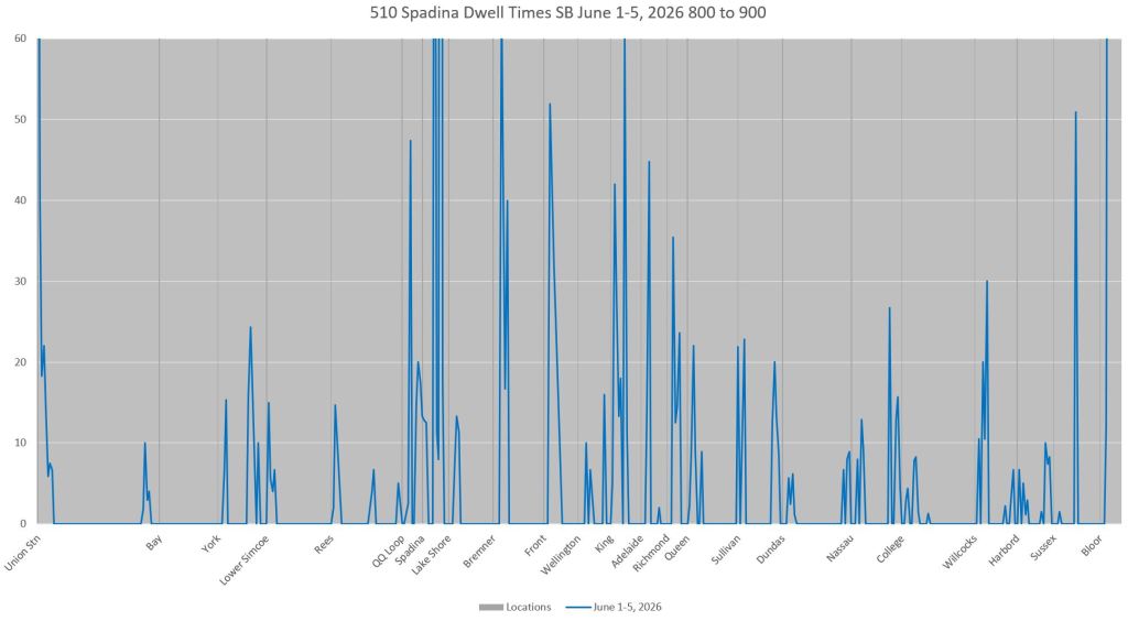
Southbound dwell times between Queen and King are noticeably longer in the AM peak than in the northbound chart above. Richmond, Adelaide and Wellington are not transit stops, but they are locations of delay.
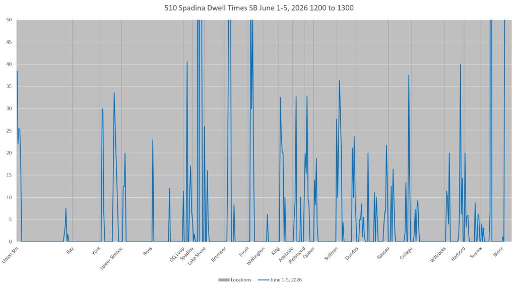
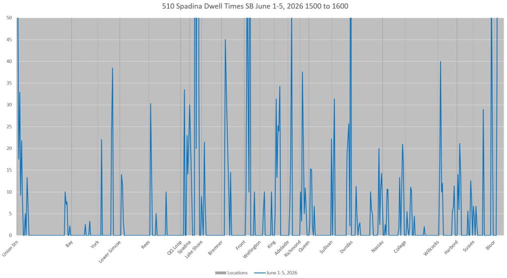
As with northbound travel, dwells are longer in the PM peak, but they are also a severe problem outside of peak periods. Any “fix” that only addresses the peaks will not deal with most of the problems on this route.
 Steve Munro
Would really love a distribution chart of the few bits of Spadina that don’t have intersections or traffic or the longer segments. I’m mostly curious to see if drivers are accelerating fast out of the stop and braking fast at the next one, or if they are taking a lazy approach, even though there is no risk…one would hope they all get up to max speed and to the next stop in the same short period of time…but from experience that never happens…curious what the distribution is…
Steve: There is also the problem of padded schedules which encourage less than full speed operation.
LikeLike
Here is an excellent article by Reece Martin on how to fix the Spadina streetcar line.
I have already written to Mayor Olivia Chow that if she gets re-elected, then she should appoint Reece Martin to fix up Toronto’s broken streetcar/LRT system.
Steve: The article in question is from October 2025. Some intersections already have changes to their traffic signals, although the effect is not great. The reference to analysis that has shown how the service is unreliable is, of course, to my own work which the authors chose not to credit. They mention delays for slow orders over switches at intersections. This is not a “new” problem and certain not one which only Reece, Jonathan & co. have flagged. Their “solution” includes replacement of all switches and control systems, something that should definitely happen anyhow, but which should not be a pre-requisite for faster operation straight through intersections. As the charts in my current article show, there is a major problem with slow operation at the south end of the line, in some cases at locations with no track junction. A major problem lies with the emphasis on east-west green time and road capacity for traffic to/from the Gardiner Expressway.
LikeLike
Steve: The reference to analysis that has shown how the service is unreliable is, of course, to my own work which the authors chose not to credit.
Do you have any proof of your allegation? Reece Martin does his own analysis and does NOT read your blog. You are very good at making unfounded claims, do you have any proof to back them up? Go ahead and delete this comment because you have no response and then falsely claim that you only delete abusive comments.
Steve: Many people who don’t always agree with me read my blog. It’s a matter of staying informed. When I see a generic reference to “data analysis”, it is very likely that it’s based on my work, especially considering how often I have documented irregular terminal departures as a chronic problem. Moreover, setting up the machinery to do this sort of analysis is not trivial. I will leave it to Reece to set the record straight if he is using another source.
LikeLike
Sam: Do you have any proof of your allegation? Reece Martin does his own analysis and does NOT read your blog. You are very good at making unfounded claims, do you have any proof to back them up? Go ahead and delete this comment because you have no response and then falsely claim that you only delete abusive comments.
I suppose I’m speaking outside school here, but have you any proof of your own allegations? Can you cite, for example, half a dozen unfounded claims Steve has made this calendar year?
And how is what you wrote, full of innuendo and devoid of proof, not abusive?
Steve: “Sam” is a troll who posts under a variety of names. Every so often I let one of his comments through to set the record straight.
There are a few anti-streetcar people who masquerade under various ids, but have a very recognizable style and set of arguments. Others claim to be pro-transit, but don’t think I’m advocating for the “right” implementation.
LikeLike
With so many cross streets, it’s a shame our forbears saw fit to use a dedicated right-of-way for at-grade transit instead of elevated transit. We’re now stuck with something that, even in the unlikely even that they do every improvement possible, will still be at the mercy of car and pedestrian traffic, and disconnects the street grid to boot. At all times of day, people walk/run across the tracks where there used to be intersections, especially south of College, because it’s very hard to refute desire paths. Cars also drive on the tracks and get stuck.
Steve: Our forebears had a much smaller city with nowhere near the population of a major metropolis like New York. Putting an elevated above, say, Queen Street would have placed he street below in permanent shadow, especially at stations with the need for platforms and vertical access. The streetcar system ruled the roads with far more frequent service than today. The problem now is that we let car-oriented decisions determine road usage and layout attempting to handle a suburban car mentality on streets that were not designed for it.
Politically we keep trying to pretend that some magic fix will unlock road congestion rather than saying “Enough! Transit comes first.” Even basics like traffic wardens are a relatively recent addition, and thy benefit motorists who are otherwise too concerned with their own trips to avoid blocking roads. This might be “low tech”, but it works.
LikeLike
Heck, if you want to go “low tech”, the replacement buses we had in 2025 were usually faster than the streetcar! If “transit comes first”, then we wouldn’t let having shadows stop us from having something faster. It actually provides shade that is sorely needed on Spadina in the summer. I’d love to wait in station instead of standing on the current platforms, baking in the summer heat, or soaked in the rain, or freezing in the winter. It also reconnects the street grid which improves pedestrian and car flow.
Steve: Well you should get used to a station at Bloor, College, Queen and Front. And Spadina, being wide, would not be in shadow. Enjoy the long walks to transit.
LikeLike
The current right-of-way was built in 1997, when the (current) city of Toronto had 2.3 million people. That’s only 400k less than today.
Steve: The downtown streets, including the wide Spadina Avenue, were laid out in the 19th century. It is the exception to the standard 66-foot (4 surveyor’s chains) British road width that dominates old streets in Toronto. It was a busy bus route, but replacing it with an elevated would have grossly overbuilt the replacement.
LikeLike