
Updated December 11, 2021 at 6:30 pm: A chart showing the total hours in service for each eBus for 2021 has been added to the article.
Updated December 16, 2021 at 7:00 am: Charts showing fleet usage on a percentage basis for each vendor have been added to the end of the article.
Updated January 9, 2022 at 10:15 am: Charts including December 2021 data have been replaced to include day to the end of the year.
This article is an update on my previous review of stats for the eBus fleets from July to December 2021. Readers coming to this thread for the first time should read both articles.
The intent here is to go back six more months in the data to see whether there has been a change in the usage patterns of the three eBus fleets over the full year.
A complete set of charts for the year is linked at the bottom of the article in PDF format.
The year’s data show that the New Flyer eBuses were in service the most, although a few of the BYD buses managed daily periods in service that were longer. Many of the Proterra and BYD buses spent extended periods out of service, a much less common issue with the New Flyers.
The hours of service logged by a comparison group of Hybrids and Artics were consistently higher than the eBuses, although individual vehicle ranges overlap.
How Much Was Each Bus In Service
The table below shows for each of the 60 Buses the number of hours per month that they were tracked in service on a route, as opposed to sitting in the garage, or not visible to the tracking system. As before, all data have been extracted from logs on the TransSee website (Premium version), and those data in turn comes from the TTC’s vehicle tracking feed.
For comparison, 25 Hybrids and 25 Artics are shown for September 2021. Any vehicle which showed no activity in the month is flagged with a pink stripe.

In graphic format, here are the values for the Flyer fleet.
- Each group of columns has one month’s data.
- Within each month, each column represents one bus.
The variation in hours/month is clear between vehicles and in different months through the year. Note that December is an incomplete month and so the values are much lower. Also, there is no adjustment for the length of months (31, 30 or 28 days).

Here are the values for the Proterra fleet. Note that the columns are shorter and the data sparse compared to Flyer above. This is due to the number of vehicles that were out of service (missing columns) and the lower utilization of those that did operate.

The data for BYD show some higher individual values than the Flyer fleet, but also a lot of gaps and low values indication vehicles that were out of, or only minimally in service, especially late in the year.
Some of the higher values are due to BYD buses that managed to remain in service for more consecutive hours rather than having either a split day, or only one 4-5 hour tour. To what degree this reflects inherently better performance, and how much of the difference is due to dispatching practices at each garage (each fleet is at a different garage) is hard to know. When they run, some of these buses rack up considerable hours, but only one bus logged hours in all twelve months (3755) and one bus was out of service for eight month in the year (3750).

Another way to look at these data is the total in service hours for each vehicle. On this basis, Proterra fared the worst. BYD was better for selected vehicles, not for the fleet as a whole.

Concurrent Buses in Service
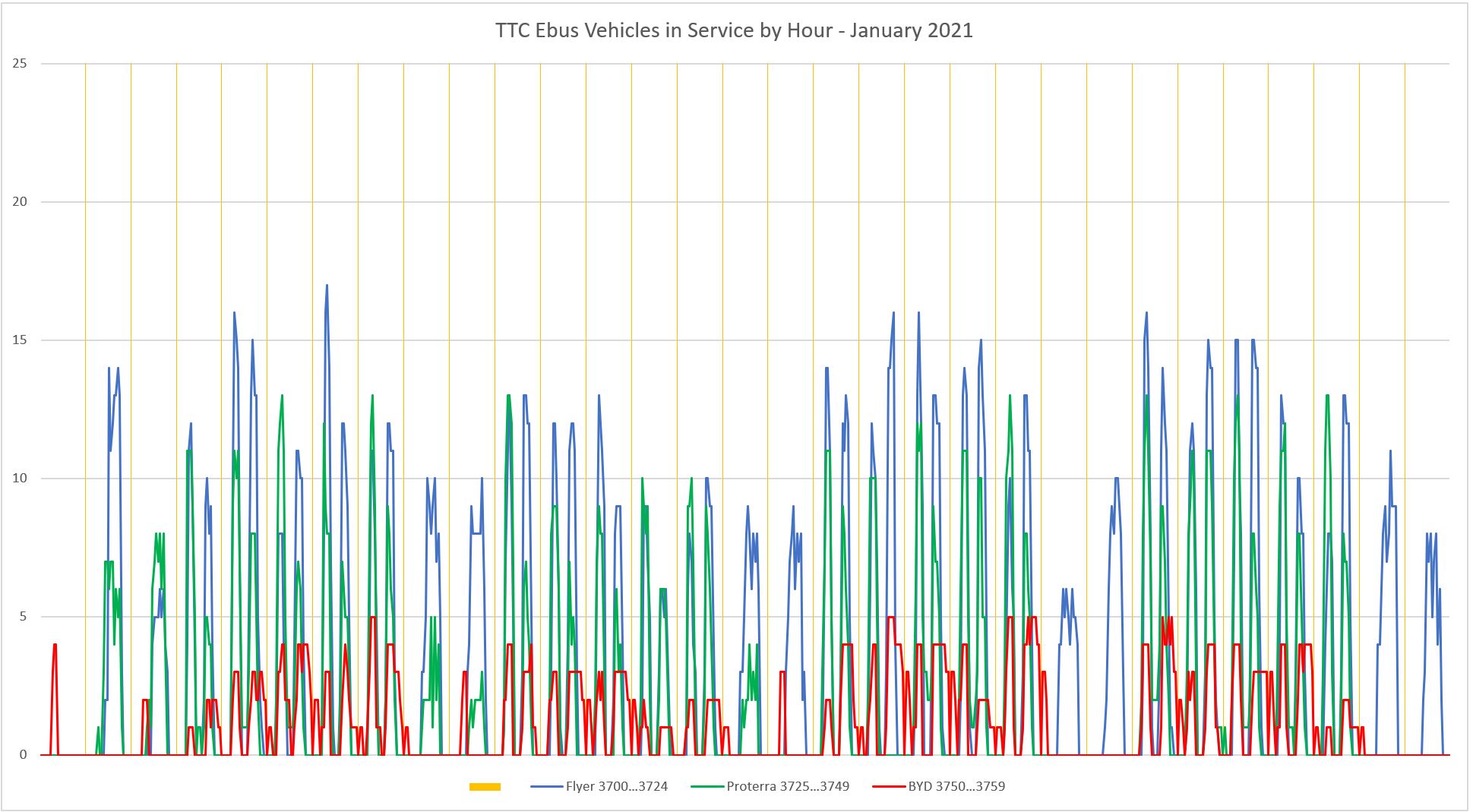
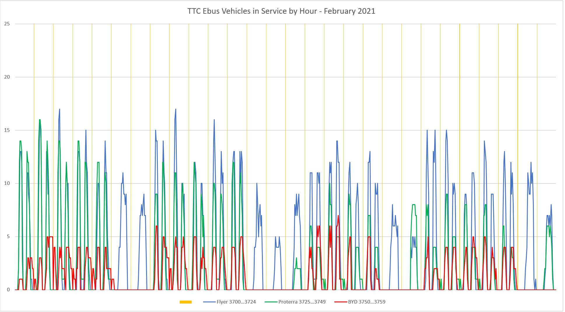
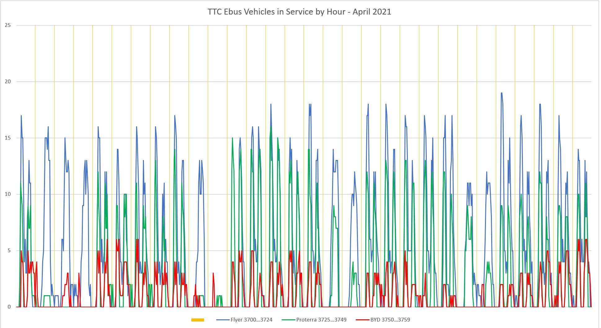
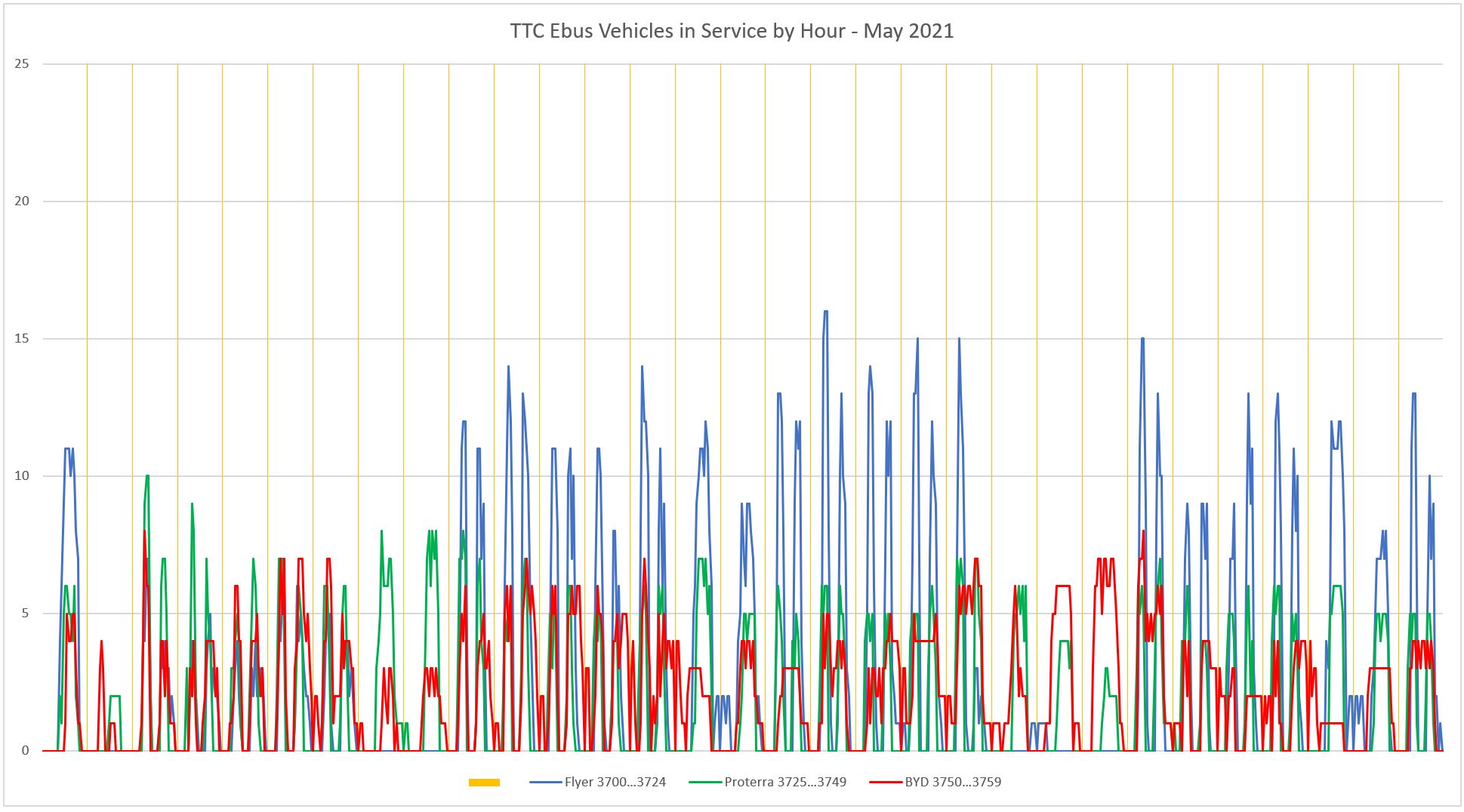
As in the previous article, I produced charts showing the number of buses, by type, in service each hour through the period. Three things show up in these charts:
- There is a characteristic double spike on weekdays showing that many vehicles returned to the garage between peak periods.
- The number of Flyers in service at peak is consistently higher than the number of Proterras.
- BYD rarely fielded more than half of its 10-bus fleet.
January 2021
February 2021
March 2021

April 2021
May 2021
There was almost no usage of the Flyer fleet between May 2 and 9, and the Proterra fleet was also less-used than in previous months. BYD availability picked up in May.
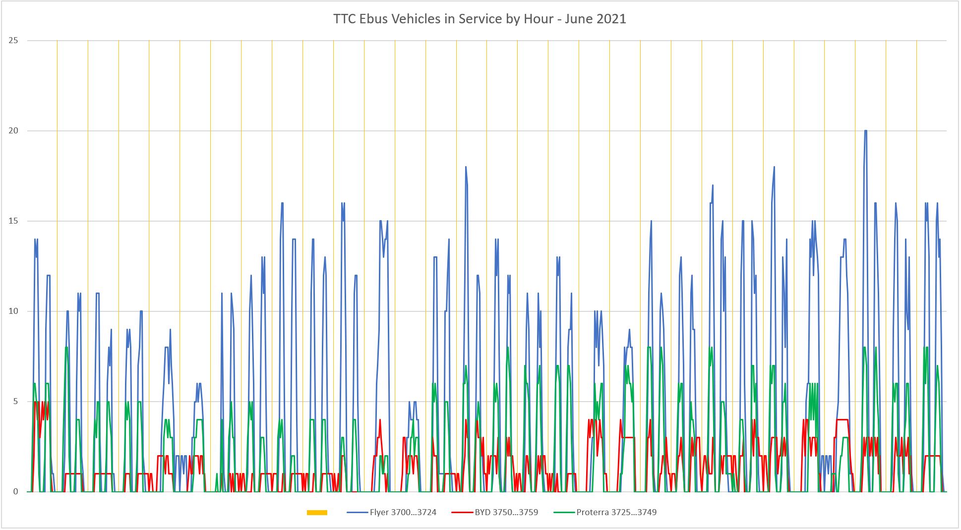
June 2021
June saw a return to the typical usage pattern with the Flyers in service the most. In all three cases these are not impressive figures considering that most of the time even the Flyers barely reach 60 percent usage at peak. To what degree this reflects TTC service levels that are far below total fleet capability, and to what degree it shows a reluctance to use the vehicles, is hard to tell. The relative numbers, however, are hard to argue with.
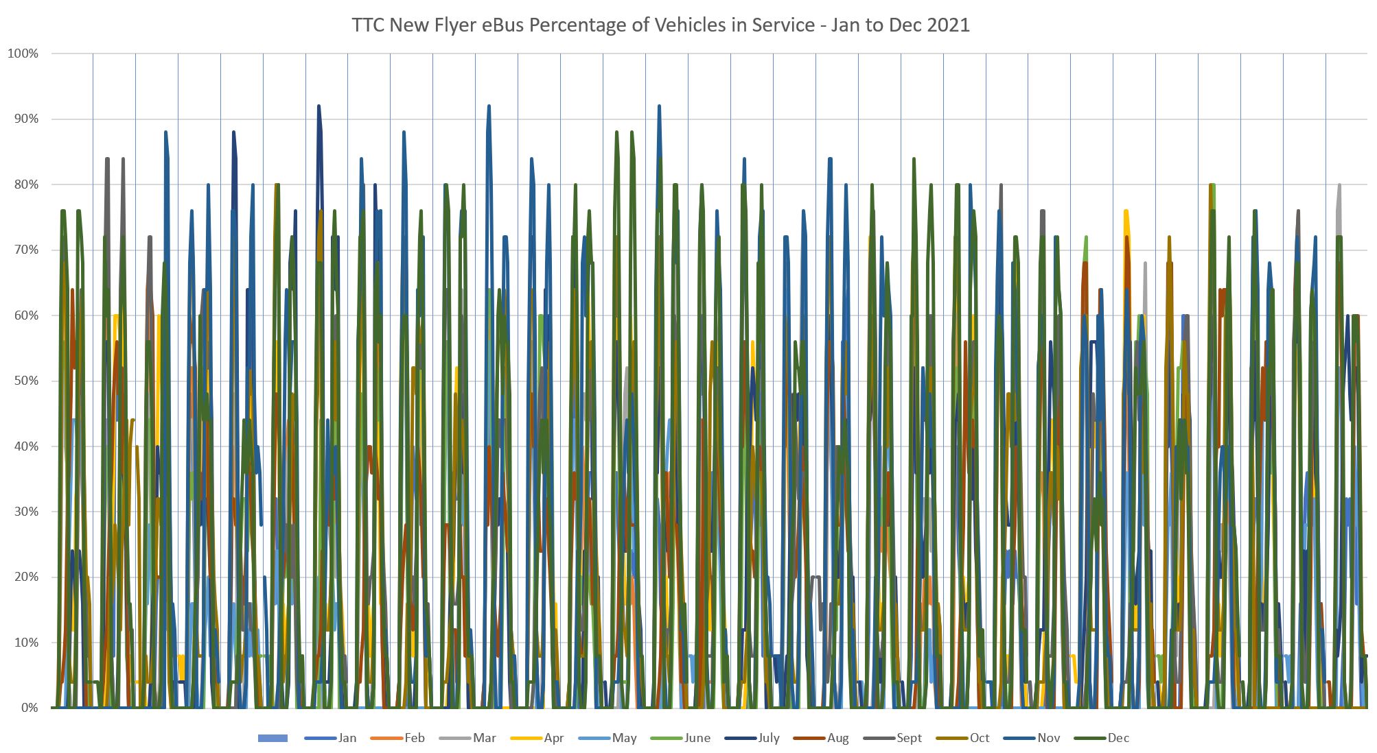
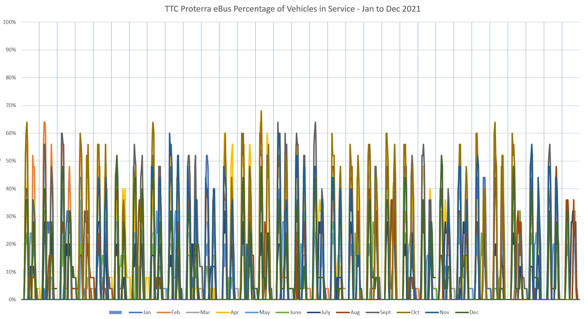
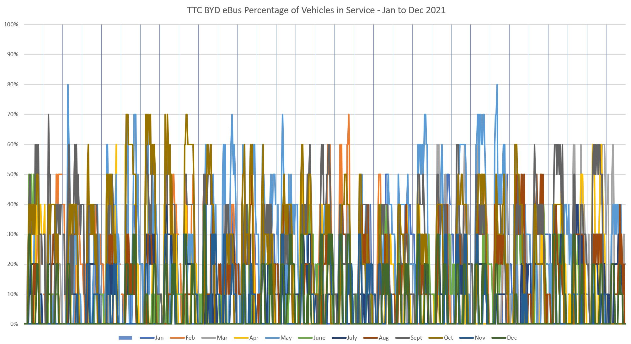
Fleet Utilization Percentages
In response to a desire to see fleet utilization numbers on an equalized basis, here are three charts showing the percentage of each fleet in service throughout 2021. There is a clear difference between the chart for New Flyer compared to the other vendors.
PDF for the full set of charts.

Continues to sound like New Flyers are the best. Don’t know how they compare to conventional diesels (several different makes). Cheers, Andy
LikeLike
From the first chart, it looks clear to that the Flyers are by far the best. Even initially they seem good and they have far fewer problems after a few months than either Proterra or BYD. Though I could do it myself, any chance you could have Excel calculate an average hours / month for each vehicle? I would say the Flyers would top that list too.
Steve: Do you mean a 12-month average across the board?
LikeLike
Yes, either the total hours per bus for the months you report or the average per month. A bus that is out for many miles over the year or out about for 11 months of 12 (even if monthly mileage is low) is probably better than a bus that is out of commission for 2 or 3 whole months but is out for longer hours the other months.
Steve: The table already has the total hours per bus for each month. I have added a chart that shows the annual hours for each vehicle. BYD has a few buses that are in the same league as Flyer, but the TTC should not have to buy ten buses to get four good ones.
LikeLike
Thanks, it was the annual hours I wanted! Your first chart really gives a great visual showing which buses are ‘best’.
LikeLike
One interesting thing is the Flyers often get dispatched on weekends mostly on their close to home route, 36 Finch West. The Proterras and BYDs rarely see weekend service. They would help drive up service hours.
Also what are the chances that management and dispatcher preferences have a significant influence on their service hours? It’s might not be that the buses can’t run longer but they decided to just keep them home. The buses could be coming home with the battery at 40-60% full. Or perhaps operators don’t want to drive them and they excess regular buses for them.
Steve: Yes, these are both issues, and there is no way to sort this out simply from the hours used. However, if the staff don’t like the buses for whatever reason, the reasons need to be understood and factored into any plans for fleet changes. Also, if it were simply a case of preferring “conventional” buses, then the usage across the eBuses should be uniform even if it’s below the level of hybrids. The big variations between vehicles in the Proterra and BYD fleets is a fairly strong indication that there are vehicle-specific problems, not just a dislike of the vehicle type.
My hope in publishing this was to stimulate some debate and feedback on what is actually happening with these buses rather than the “everything is beautiful” attitude implied by TTC management. If we get lumbered with a large fleet of unreliable buses, that will bite us hard in the future as overall utilization goes up and the large spare pool vanishes.
LikeLike
In this several years long push for battery buses, has there not be any evaluation of including trolley buses, such as on the busier routes? Or has lobbying left the TTC with blinders on?
Steve: What’s a trolley bus? The problem is that eBuses are all the rage and there are plenty of vendors and their lobbyists hard at work. No such luck for TBs.
LikeLike
Just. String. Wires.
LikeLike
The “problem” with tried and true existing technology is that it just isn’t sexy for politicians to brag about implementing. I clench my teeth whenever I hear some politician talk about us being “cutting edge.” Or successfully building new technology in Ontario that we will sell throughout the world.
Given the lead times for transit projects in Ontario (see Hamilton LRT), any successful new technology will have had its patents expire so the new world-wide business it creates will be made in China. But we really do not have to worry about that because past experience in Ontario shows that this new technology will probably be a very expensive failure.
Steve: But unlike the SRT, it will have a far bigger effect on transit. We cannot afford to have large chunks of the bus fleet out of service, or costing far more than existing vehicles to run.
LikeLike
Your analysis is WRONG because the number of buses for the three manufacturers is not equal. You need to multiply the height of the BYD graph by 2.5 or divide the heights of the NFI and Proterra graphs by 2.5 and if you do that, then you will see that BYD is the clear winner and Proterra is the clear loser.
Steve: No, you are wrong. I am looking at the proportion of the three fleets that are well used and how far an average bus travels. On that basis, BYD has a few buses that do better than Flyer, but they have a lot of lemons too.
Charts showing the values as percentage of fleet active through the year have been added, and Flyer’s values are clearly highest among the three vendors.
LikeLike