Several weeks ago, when Metrolinx began publishing its Neighbourhood Updates and Station Profiles, I asked for a consolidated set of ridership estimates. The material originally presented varied slightly from location to location, depending on each profile’s author. Most importantly, the numbers showed the utilization of each station, but not the projected loads on trains.
The stations might be a nice place to visit, but the real purpose of a transit line is to move people. For that, an important planning question is how many people actually want to ride in the peak period.
Metrolinx has now supplied this info (the have also updated some of their online information), and I present it here for readers’ interest.
The table below combines information from two Metrolinx sources:
- The station-by-station projections sent in reply to my request, and
- The projected numbers of transfer passengers, population and jobs taken from the station profiles.
To this data I have added a few extra columns to show the degree to which demand originating at each station is in the “inbound” direction heading toward downtown, and the proportion of demand at a station that walks in or out rather than transferring from another route. (Click on the image below for a larger version.)

A few things leap out of this table, notably the variation in usage at each station, and the large variation in whether traffic originates from or transfers to other transit routes, or is “local” to the neighbourhood.
Science Centre Station is particularly striking because 86 per cent of riders boarding or alighting there in the AM peak hour are projected to transfer to or from the Eglinton Crosstown line or from the local bus routes. Considering the scale of development projected for Don Mills and Eglinton, both commercial and residential, 14% for local walking access is a surprisingly low proportion.
Pape Station also has a low proportion of walk-in trade because activity there is dominated by transfers to and from Line 2 Bloor-Danforth.
Transfers to/from GO Transit are projected at 8,600 for East Harbour and 6,300 for Exhibition, and almost all of these are GO-to-Ontario Line given the highly directional nature of GO’s demand. These are the riders that Metrolinx hopes to divert from Union Station.
Metrolinx commonly cites the 14-15k total of GO-OL transfers for the two stations as if this were the benefit for each of them. The Exhibition Station Profile claims:
Giving customers another way to transfer between GO Transit’s regional rail services and the local subway system will take pressure off of Union Station, the country’s busiest transit hub. This new interchange will help reduce crowding at Union by about 14 per cent – or 14,000 fewer people – during rush hour.
Similar text is used for East Harbour Station. Moreover, this claim did not change after the much-vaunted “across the platform” transfer connections and their supposed convenience were dropped from the plans.
Where Are Riders Going?
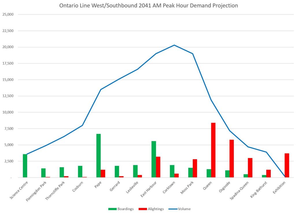
Published Metrolinx data do not contain cross-tabs of origin-destination pairs and so we cannot see the details of where these riders are going, but one can get an idea of the popular locations by charting the boardings, alightings and accumulated loads on the Ontario Line for each direction of travel.
Westbound demand is the strongest in the AM peak hour accumulating to just over 20k on-train passengers in the peak direction during this hour. The overwhelming sources of riders in this projection are, in declining order:
- Line 2 at Pape Station,
- Riders boarding at East Harbour, primarily from GO Transit, and
- Riders boarding at Science Centre, mainly as transfer traffic from Line 5.
The primary destinations are Queen, Osgoode and Exhibition Stations in that order.

Eastbound traffic will originate mainly at Exhibition Station. This demand is comprised partly of transfers from GO Transit, and partly of walk-in trade from Liberty Village. There is no local transit transfer component.
East Harbour is the principal destination along with the two downtown subway stations.

These charts show how important both the East Harbour development and the anticipated transfer of riders from GO onto the Ontario Line are for counterpeak demand. The inbound traffic is far more oriented to Queen and Osgoode Stations (showing the “relief” function of the corridor) than it is to East Harbour.
Continue reading