
In the first part of this review, I extended previous charts showing travel times through the Jarvis-Bathurst “pilot” area to the end of March 2019. This installment turns to the question of headway reliability – how regularly do streetcars arrive – as opposed to how long they require to cross the pilot district. A rider’s experience is affected by both of these factors, not to mention the basic question of “can I get on” when a streetcar does show up.
Although one end of a journey might be within the pilot, many trips on the King car begin or end beyond the pilot’s limits. They are affected by service quality along the whole route, not just in the core. This article begins by looking at March 2019 service at Yonge Street, and then moves further afield including the termini of the route.
The weather varied considerably over March 2019, but this did not play a big factor in the data overall, and statistics for most weeks and locations are similar. The larger issue is that service at the terminals is irregular most of the time, and this makes it impossible to have a properly “blended” service in the central part of the route.
The measurement shown in this article are taken at various screenlines along the route.
- Southbound on Broadview crossing Danforth (leaving Broadview Station)
- Northbound on Cherry crossing Mill (leaving Distillery Loop)
- Westbound on King crossing Parliament (blended service from 504A/B). Note that any short turns coming south on Parliament are not included.
- Westbound on King crossing Yonge
- Southbound on Dundas crossing Bloor (leaving Dundas West Station)
- Northbound on Dufferin crossing Springhurst (leaving Dufferin Loop)
- Eastbound on King crossing Strachan (blended service)
- Eastbound on King crossing Yonge
Headway Reliability at Yonge
The service at Yonge Street includes both the 504A and 504B branches of the King route. Their schedules normally have the same headway and so in theory this should be a blended service of cars alternating between destinations on a combined headway half that of each branch.
There are various ways of presenting the headway data each of which reveals a different aspect of the operation.
Headway Scatter Chart
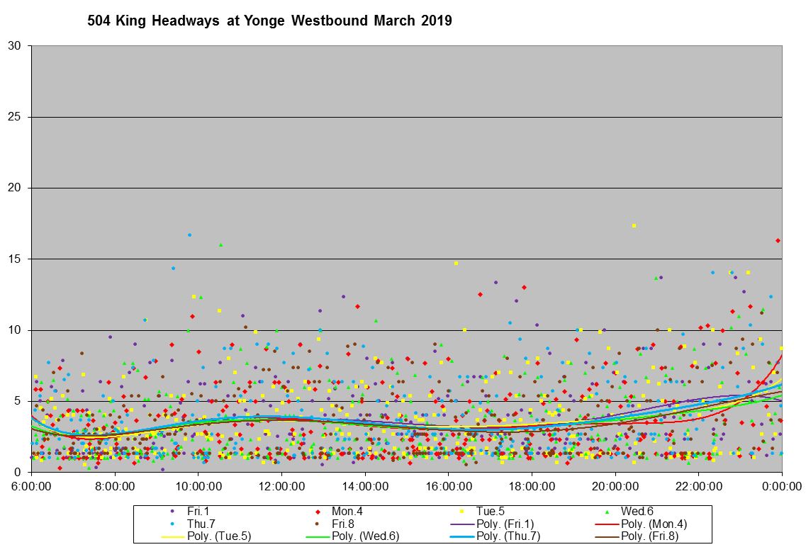
Each dot on the chart represents one car with different colours for each day. The horizontal position is the time of day, and the vertical position is the headway in front of the car when it crossed Yonge Street. Note that because of the farside stop, few values are right at the zero line because cars tend to wait their turn and do not cross within the same 20-second interval used by the vehicle tracking system.
The wavy coloured lines are best fit curves threaded through the data to show how the values behave over the course of the day. Note that even though the dots for each day may be in different locations, the overall values as shown by the trend lines is quite similar for each day. In other words, one day is very much like another.
The scheduled combined headways of the King branches in March were:
- 2’38” in the AM peak
- 3’30” in the midday
- 3’00” in the PM peak
- 3’15” in the early evening
- 4’30” in the late evening
The trend lines lie generally on the scheduled values as one would expect at the middle of the route where there should be no effects from short turns and all service is present.
The full Service Summary for 504 King is shown below.

Averages and Deviations
Another way to look at the same data is to see the hourly averages and standard deviations (a measure of how dispersed the values are around the average).

On this chart, each week’s data is displayed in a different colour (the red line corresponds to the week 1 data on the previous chart). The solid line shows the hourly average values and the dotted lines show the standard deviations. The latter values are of some concern because they lie close to the averages. This indicates that the band of data values around the averages for over half of the headways is close to the scheduled headway itself. In other words, many cars are running two headways apart, and by implication others are running very close together. This is evident in the scatter diagram, but the chart of averages and SDs shows that this is a consistent pattern for all weeks in the month.
Note that “week 1” actually is six days long because March 1 is a Friday and is included with the following week.
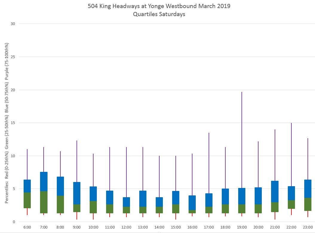
Quartiles
The chart below shows the week 1 data in “block and whisker” format breaking down the range for each of four quartiles.
Each column displays the data for one hour within week 1. The green and blue boxes show the range of the second and third quartiles with the dividing line being the median value for the data. The red “whiskers” at the bottom show the range of the first quartile data, while the upper purple whiskers show the fourth quartile.
This chart shows that one quarter of the service operates well below the median headway, close to zero, and another quarter operates well above reaching values of 10 minutes and more throughout the day. The other half of the service lies within the green and blue boxes. The shorter this box is, the closer to the scheduled headway half of the service is operating, but the “whiskers” ideally should not be so long.
This is a simplified view of the scatter chart above. From a rider’s point of view, wait times are important and more people will accumulate at a stop during a wide headway than a narrow one. More riders “see” the gaps (and following bunches) even though the average and median headways might be close to the scheduled values. This also affects crowding on cars.

Weekends show little difference. The Saturday data are shown below, and the Sunday data are quite similar except for the early morning hours.
All of the charts above are for westbound service. The eastbound charts are quite similar. Full sets for both directions are available below.
A classic argument about transit service is that bunching is inevitable given the vagaries of traffic and the impossibility of running precisely to a schedule. By the time the service reaches Yonge in either direction, what might have been a well-behaved service has fallen apart. At least that’s the story. However, when we look further away, this is not born out by the data.
