
Updated December 5, 2017 at 8:15 am: Charts showing travel speed profiles in the pilot area have been added at the end of this article.
Updated December 3, 2017 at 10:50 am: Charts showing hourly average travel times by day have been added in a section at the end of this article.
The pilot operation of King Street as a transit thoroughfare began on Sunday, November 12 and will continue for the next year.
This post is the first in a series of articles reviewing the effect of the new configuration on the operation of 504 King and related routes.
The methodology behind the processing and presentation of TTC vehicle tracking data is explained in Methodology For Analysis of TTC’s Vehicle Tracking Data on this site.
The first sets of charts show the running time for 504 King streetcars westbound and eastbound between Jarvis and Bathurst Streets.
- Westbound: 504_201711_Jarvis_Bathurst_MonthLinks
- Eastbound: 504_201711_Bathurst_Jarvis_MonthLink
Within each set, there are five pages corresponding to weeks (or partial weeks) of the month with Monday-Friday data, and separate pages for all Saturdays and all Sundays.
Worth noting:
- The break between “before” and “after” data occurs at Week 3, Monday, November 13. There is a clear difference in running times over the pilot segment after the implementation.
- Sunday, November 5 was a home game at BMO field for the Toronto FC, and its effect on King Street traffic is clear.
- Sunday, November 19 was the Santa Claus parade.
The change in running time also had an effect on the quality of service provided on the route. This showed up in more reliable headways (less scatter in the actual values around the average) which, as with the link time charts, is visible starting in week 3. The benefit is visible both at the terminals and at Yonge Street. I have also included a chart for Dufferin eastbound to show service coming into Liberty Village.
The charts are in the same format as for the link times above, but show headways between cars at various locations on the route, not travel times between them. Note that 514 Cherry cars are not included here.
Westbound:
Eastbound:
- 504_201711_BloorWest_MonthHeadways
- 504_201711_DufferinEB_MonthHeadways
- 504_201711_YongeEB_MonthHeadways
The improvements in travel time are not uniform across the study area, but are concentrated in certain segments of the route.
(Note that for these calculations the screenlines are in the middle of the cross street. This means that dwell time at stops will shift to a different segment if a stop at a screenline was nearside before the change, but farside after the change.)
The afternoon of November 2 saw severe congestion across the west end of the route, and this appears consistently for all segments.
Westbound:
- From Jarvis to Yonge there was never much congestion except when triggered by construction or a similar event that blocked the curb lane. There is little change here in running times.
- From Yonge to University running times are very slightly reduced, but again this is a segment that was not severely congested before the pilot.
- From University to John there is almost no change.
- From John to Spadina there is a quite noticeable change in both the length and the consistency of travel times. A considerable amount of this is due to the elimination of delays from turning traffic at Spadina.
- From Spadina to Bathurst there is also a change in running times, but mainly in the evenings when the club district is active. This change also varies by day of the week.
- 504_201711_Jarvis_Yonge_MonthLinks
- 504_201711_Yonge_University_MonthLinks
- 504_201711_University_John_MonthLinks
- 504_201711_John_Spadina_MonthLinks
- 504_201711_Spadina_Bathurst_MonthLinks
Eastbound:
- From Bathurst to Spadina there is a change in running times which, like the eastbound data, is mainly in the evening.
- From Spadina to John, there is little change.
- From John to University, there is an improvement, although on Wednesday and Thursday, November 29-30, there are extended running times during the pm peak period. This backlog was west from University Avenue implying that something was preventing streetcars from crossing quickly to the east. (Some readers here and on social media have commented that there are days when north-south traffic crossing King prevents service from clearing intersections.)
- From University to Yonge, the running times are more consistent after the pilot began, but the averages stay roughly the same.
- From Yonge to Jarvis, running times are slightly higher. This reflects the shift of the busy Yonge Street stop east of the screenline at Yonge.
- 504_201711_Bathurst_Spadina_MonthLinks
- 504_201711_Spadina_John_MonthLinks
- 504_201711_John_University_MonthLinks
- 504_201711_University_Yonge_MonthLinks
- 504_201711_Yonge_Jarvis_MonthLinks
In future articles, I will review:
- Details of specific days when the line was disrupted.
- Detailed speed profiles in the pilot area.
- Operation of 501 Queen and 6 Bay before and after the pilot.
- Operation of 514 Cherry.
- Capacity of service provided on King Street.
- The effect of TIFF on the King, Cherry and Queen cars.
My thanks to TTC staff for pushing the November data out the door on December 1 to permit early publication of these results.
Updated December 3, 2017
Average Travel Times
The charts above show data for the individual trips across portions of the route together with trend lines showing the overall pattern through each day.
The following charts are organized to present hourly averages for each day of the month to illustrate the contrast between the “before” and “after” conditions. The times on the charts refer to the hourly periods when vehicles entered the segment westbound at Jarvis or eastbound at Bathurst.
Each set contains four pages corresponding to the AM peak, midday, PM peak and evening periods, followed by all Saturdays and all Sundays.
- In the AM peak, there is not much change in average travel times before and after the pilot.
- During the midday, travel times are lower on average by 2-3 minutes.
- During the PM peak, average travel times are lower, and dramatically so compared to some days early in the month. Note that November 6 is a Monday, and these are typically the least congested weekdays on King.
- During the evenings, average travel times are lower and more consistent after the pilot begins.
- Results on weekends are less dramatic than for weekdays. The effect of the Santa Claus parade is visible on the 19th and this is particularly striking for eastbound service.
- In some cases there were no cars for specific days and times due to a major blockage or diversion. These show up as “zero” values for the averages in the charts.
I have created but did not include charts of Standard Deviation values. Although they do show some improvement after the pilot begins (lower SD values indicate less scatter in the individual travel times), the values are rather “noisy” because the number of data points for each day and hour is small.
Another issue for service capacity is that the number of vehicles crossing the pilot area varies quite a bit on a day-to-day basis for each hour of the day. If the service were “on schedule”, these values should not change much (±1 vehicle), but this is not the case. I will review this as part of the service capacity analysis in a later article.
Updated December 5, 2017
The charts in this section compare the travel speed through the pilot area in detail for the week of October 23-27 (pre-pilot) to November 13-17 (first week of pilot). Early November was not used for “before” data because the route was diverting around bridge repairs on Queen at the Don River, and travel speeds downtown could have been influenced by operators driving faster than usual to make up time.
As a guide to reading these charts, here are two sample pages showing travel speeds in each direction for the hour beginning at 4:00 pm. The blue lines show the “before” data and the green lines show “after” data. The charts should be read in the direction of travel with westbound going left to right, and eastbound going right to left.
Where the pilot speeds are faster than before the changes, the green line is higher than the blue one. One immediately obvious change is that the dips in average speeds at stops shift from the nearside to the farside of interesections. However, delays caused by traffic signals at some locations are common to both sets of data.
A common problem on King before the pilot was a backlog of traffic from certain intersections, notable Spadina westbound. This shows up in much lower speeds not just at Spadina but for a considerable distance east of it. These dips are wider in periods when congestion backed up from problem intersections is the worst.
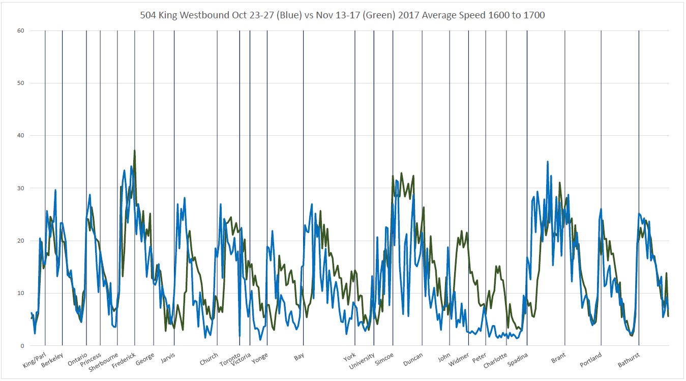
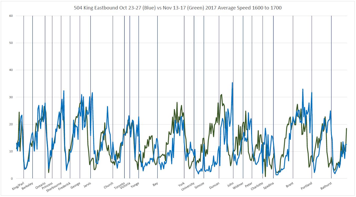
By paging through the full sets of charts linked above, one can see the evolution of travel time patterns over the day rather like a flip chart animation. Areas and times that were not congested before the trial generally show the same travel speeds for before and after except to the degree that stop placement affects behaviour at intersections. Where speeds are improved by the pilot, the green line rises above the blue one, and the separation changes through the day.
There is a marked difference between the patterns in the AM peak, midday, PM peak and evening hours.
As other charts have shown, the average travel times through the pilot area are not affected as much in the AM peak when competing traffic is less of a problem, but later in the day, problem areas show up in the “before” data. There is a peak at midday when travel times have now been considerably improved and another, of course, in the afternoon rush. During the evening, the benefit in the financial district drops off, but it remains west of University Avenue.
At the beginning of the pilot, all transit signal priority was turned off to see how the street would operate without it, although this mainly affected crossings with less important streets. This shows up as “double stops” at locations where there is now a farside stop and approaching streetcars can be caught without extended green time to clear an intersection.
As the pilot continues, this type of chart will provide a base for comparison of the effect of various changes and of seasonal effects.

Won’t somebody please think of the one point three people in each automobile?
Yet there are those who get upset that the one automobile cannot park in front of a restaurant and fill up said restaurant.
Steve: It is possible that the automobile is blue, and is bigger on the inside …
LikeLiked by 1 person
This generally matches my experience commuting from Parliament to University that there is relatively little change on that side. There is an issue with farside stops when service is bunched that operators can no longer open the doors on the nearside if they are close enough to the intersection. You have to wait for the farside to clear and the streetcar to go through the lights. This is especially irritating at University Avenue where the green time for north-south traffic is very long. If you are heading west and hit a red light at York, then have a green light at University, but still have to wait and then through another north-south green cycle, it eats up all the time you saved on parts further east.
Steve: Yes, there are certain locations like this where the interaction of various factors was not well thought out, and of course there is no signal priority for streetcars at University Avenue. The TSP design, where it even exists, assumes near side stops, and that long north-south green at University Avenue can be very annoying.
LikeLike
This was a big mystery, but my friend Mr. Google seems to suggest that each of these automobiles is a Tardis.
Steve: Shhhhhh! Don’t tell Queen’s Park. They will try to invent their own from scratch and who knows where riders will end up!
LikeLike
I was walking through the area at the time. Traffic was jammed southbound on University, and the eastbound tracks were getting blocked by southbound cars that couldn’t clear the intersection. This was happening at southbound Yonge too, and at one point I noticed a queue of about 5 streetcars waiting to cross Yonge. Earlier in the week, this same thing occurred at southbound Jarvis. Traffic wardens are needed to control southbound traffic through University, Bay, Yonge, and Jarvis – too many selfish drivers blocking tracks, which ironically was a bigger problem than offenders on King itself.
Steve: Thanks for the info. It was obvious that streetcars were holding west of University in the data, but not why.
LikeLike
TTC planning has been somewhat reticent about their plans for TSP on King, other than to say they are “adjusting it.” In my opinion, it is one of the most cost-effective strategies for improving streetcar service and I certainly hope they pursue an aggressive implementation (to the extent permitted by the powers that be…) Any idea about the potential for improvement once they have TSP “optimized”, and how long it will take for them to sort it out?
Steve: I don’t know, and suspect that there is an inter-agency tiff about just what should be done. This is not helped by the fragmented responsibility within the TTC where he department that is responsible for TSP is not the department that actually operates the service.
LikeLike
Regarding the problems at Yonge and University, one wonders if the city should revert to nearside stops. At least it would expedite passengers travel times for riders who are transferring to the subway. In the nearside stop configuration, there would be no private vehicular traffic on King between Emily and York, Melinda and Victoria. That doesn’t solve the problem of Yonge/University traffic blocking their respective intersections -but law enforcement can perhaps alleviate that problem.
Steve: An unused design for the subway interchanges (the second round of designs) was to have a pedestrian/transit mall between University and York, and between Yonge and Victoria. No traffic except streetcars. Period. No exceptions. That was killed off unfortunately.
What is definitely needed if stops stay farside is enough room for more than one car to use them at a time.
LikeLike
I am operating on King in the PM this period. On Wed and Thurs Nov 29 and 30, I can attest to multiple autos failing to clear intersections. University, Simcoe, Yonge, Jarvis, and even Church Street! My run passes through the core EB at about 515pm during the peak of the peak, both days I lost 20 minutes compared to schedule. Also, a big problem is the queue of cars waiting to turn right from east King to south Simcoe was so long, it backed up past the point of where they put the flower boxes in the EB curb lane, preventing streetcars from proceeding. Overall it has been a vast improvement. It is frustrating seeing motorists still sailing through intersections either from ignorance, or in a lot of cases willful ignorance. Police presence varies, sometimes I pass through without seeing any police, sometimes they have one or two teams. On Thursday Nov 30 there was a team ticketing drivers at University EB for going straight through, when their help would have been better deployed at preventing cars from blocking the intersection.
LikeLike
Blue and bigger on the inside? Oh. no! Is this the start of the TTC’s War on the Tardis?
LikeLike
In addition to the averages, I’d be interested in the variance / standard deviation as well. One thing when planning trips (regardless of mode of transportation) is ‘how long will it take to get there’. Now, if it’s a one-off trip, you can add some extra time.
But if you want to make it part of a daily/weekly routine, then there’s a different between average of 30 minutes +/- 15 minutes, and 40 minutes +/- 5 minutes. And it’s made worse if there are transfers / connections as well, and they have large variances too. (See also news reports about that Japanese train leaving 20 seconds too early–which I’m not expecting on surface routes obviously, but use for the general point of predictability.)
Steve: It’s a bit trickier than that. The SD, for example, can be good on some days and not so good on others for specific hours, but not consistently. In other words the question is whether to look at the SD on a large set of values, which will tend to minimize the worst of the short term effects, or to see how much things bounce around. Other effects include uneven headways which add to wait time, and the behaviour of the route outside of the pilot area.
LikeLike
Traffic wardens are coming!
Steve: Assuming that TPS actually consents to having someone other than their constables issue tickets.
LikeLiked by 1 person
I’m curious if you received any before/after data showing travel time approaching the entrance to the priority zone EB at Bathurst and WB at Jarvis — or if anyone has at least any anecdotal evidence about whether streetcars are getting held up behind cars turning left and right where the general traffic section ends.
Steve: I have data for the entire route going back several years, and will review the operation of the approaches to the pilot areas in a separate article.
LikeLike
It just occurred to me: the restaurant was not being filled up by the one automobile, but by the hordes of people delayed on a streetcar to the point of starvation that they bailed and headed for the restaurant! 🙂
LikeLiked by 1 person
I would wonder if the current notions for King were to become permanent, if there would not be some way to create intersection designs that made proceeding straight through a signal very awkward. If there was something in the pavement of the right lane that made a nasty bump for traffic proceeding through the intersection, and simply trenching a little of the left lane at either side of the intersection, so that it would be equally uncomfortable if you were not actually on the tracks. (not enough to strand a car, however, enough to cause concern regarding repair bills.)
Steve: Attempts at stopping people from driving into the Harbourfront tunnel have failed, and that’s where we don’t have to worry about pedestrians and legitimate traffic sharing the street. “A little trenching” will not work, I’m afraid.
LikeLike
I see in today’s Toronto Star that they are quoting TTC sources that reliability is up and travel times are down. And people have responded to the pilot project with a higher passenger volume on King Street.
This is an excellent example of the phenomenon of Induced Demand. The article states that the TTC is trying to put more streetcars onto King, but Bombardier… Sigh…
LikeLiked by 1 person
Looking at other media, I was please to be able to listen to Global News’ interview with Steve Munro at:
According to the U of T data, not only did travel times drop 20-25%, but the reliability is way up. Before the pilot project, 19% of trips during the evening peak hours took longer than 25 minutes. This fell to just 1.3% after the pilot started.
Steve: Similar results appear in the data I published.
Unfortunately, I then subjected myself to the experience of listening to their interview with councillor Giorgio Mammoliti. Who does not represent this ward.
Mr. Mammoliti described this pilot project as “It is going to be one of the biggest disasters that I think the City of Toronto is going to witness.” He then called Steve Munro “that so-called specialist on traffic.” He finished his remarks by saying, “It’s going to be a disaster on King Street.”
Steve: I can’t help it if media refer to me as an “expert” rather than as an “advocate” which is the term I use. As for Mammo, he is an expert at self-promotion, and little more. It’s almost a badge of honour to be trashed by him.
Unlike Steve, Mr. Mammoliti had no actual data to support his statements. Indeed, as a professional accountant, it was rather amusing for me to listen to his statement about the economic analysis of the Bloor Street bike lanes “it was only one credit card.” He appears to not understand that Moneris is the #1 credit and debit card processing company, and NOT a credit card.
Then he says “They didn’t talk about the cash” Of course, cash sales by definition don’t leave that kind of measurable data trail. How do we talk about something with no data? Oh yes, anecdotal evidence, also known as bovine effluent. Of which, alas, there appeared to be no shortage on display.
LikeLike
The real problem is the green signal. It should be kept at red with only the green arrow lit.
A transit signal with a colour such as white or purple would apply to TTC vehicles Only.
Further it should be ONE lens only no the stupid transit only and bike signals of double lens same colour.
Of course, it would be necessary to have the signals automatically reset to a typical pattern in late hours for taxis etc.
LikeLiked by 1 person
The Calgary C-Train has had a transit mall along 7 Avenue SE since the 1980s. Its light-rail trains seem to run faster along the mall and seem to be held up less often by red lights than along the King Street transit mall. The C-Train mall appears to disallow all private vehicles. C-Train stations are a mix of near- and far-side; however, the city blocks are short and the trains are long so that it doesn’t seem to matter.
Here is an album of C-Train photos, most of which are of the transit mall.
Don’t get excited by the “vehicle trap” in two of the photos. I think it’s to facilitate switch maintenance rather than to trap wayward drivers.
Also, rides are free on the C-Train within the transit mall, but a fare is required to go beyond the mall. Would free rides within the King Street transit mall mollify angry restaurateurs who have lost their auto-oriented customers?
LikeLike
@ Raymond
The problem with a green arrow signaling only a right turn is that it indicates an absolute permission so there cannot be any pedestrian traffic on the arrow. Ontario is the only jurisdiction that I know of that does not use the standard signals for transit and bicycles.
LikeLiked by 2 people
Every time I hear people like Giorgio Mammoliti who say it should be “King Car” rather than “KIng Car” then i suggest they move to the York Region where they can drive to their hearts content, after all there are no traffic problems up there and its easy to find a parking spot at Vaughan Mills!!
LikeLike
I really can’t get too excited about the occasional vehicle barreling straight through intersections on King – though I certainly want to see some enforcement – overall most people are following the new rules. One problem (or excuse) is that the overhead signage is none too visible in daylight and after dark is virtually invisible at many intersections (e.g. Jarvis) where the ‘coverage range’ of the streetlights is below the signs. Drivers see a bright green light and a blur of signs and assume (or hope) they can go through. Better – and less cluttered – signage is not a panacea but it certainly would help.
Steve: Illuminated signs (similar to the “no left turn” signs at some locations) would make the rules much clearer, literally, at all times of the day and evening.
My problem with scofflaw motorists is that they are getting aggressive and dangerous for pedestrians who cannot count on “the rules” to predict behaviour, not even the traffic signals.
LikeLiked by 2 people
This is a huge irritant to all riders and drivers. The drivers who enter intersections they cannot clear, blocking the roadway for all. This is especially bad, when they enter on a yellow where they know perfectly well they will not be able to clear. I wish at times that the streetcars had solid cow catcher type rams on the front so that they could just push the car clear of the intersection and leave it in a ruin blocks down the road.
LikeLike
You’ve no idea how many times I’ve imagined the same thing 🙂 Check out these old Eastern bloc beauties, they’re halfway there – there is already a place one just needs to attach said ram to.
LikeLiked by 1 person
Does the city know where the auto traffic that used King St. wound up? I hope that none of it wound up on Queen with the predictable result of what it would do to service there.
Steve: The city is monitoring traffic on all nearby streets to see what changes in volumes occur. They have not published any results. However, I am about to publish my own review of Queen car data that shows there was no change in average running times on Queen between Bathurst and Jarvis in either direction.
LikeLike
I believe that “standard signals for transit” mean a white vertical bar for “go” and a horizontal white bar for “stop”. Apparently, the Ion light rail line in Waterloo Region will use such signals when it opens in 2018. These signs are illustrated at the 29 second point of a short video produced by the project team.
In a number of places, the Ion light rail line resembles a streetcar line that uses reserved lanes. Sometimes the line goes along a not very wide residential street such as Borden Avenue west of Bedford Road, and Ottawa Street west of Courtland Avenue. Some Google Streetview captures show Ion construction. Sorry to digress, but the Ion route seems to be such a novelty.
LikeLike
@ Richard L
I know this and asked ION about it. Their answer was that the white vertical white bar is an acceptable signal under the Highway Traffic Act of Ontario. While the horizontal white bar is not in the Highway Traffic Act it is not forbidden and since in only applies to the LRT their view is too bad if the province objects because it is not a traffic signal.
LikeLike
I wonder if you could rely on the ION LRT as not being a “street car” as defined by the HTA. (For the purpose of how drivers are required to respond to traffic signals, a “street car” is included as a vehicle, and a street car operator is included as a driver. A “street car” is defined as including “a car of an electric or steam railway”. I would think that would include an LRV.
For the traffic signals on King, you could use the arrows without violating the HTA requirements, although the signal heads would need to have a fifth lens (with the vertical bar). The signals already have an advance right turn phase. You run the right turn arrow with a red ball plus vertical bar instead of with a red ball… then the arrow turns yellow and then turns off while the red ball and white vertical bar stay on. The green ball never goes on — the white bar goes off and then the signal switches to the cross street. East/west traffic can still turn right on red after yielding to traffic and to pedestrians, but it never gets a solid green light that would suggest being able to travel straight through the intersection.
(That simplifies things a bit. For example, the signals would need to run like they do now, with the green ball displayed, during the overnight period when taxis are permitted to go through. And there would need to be bike signals to legally permit bikes to travel through.)
There are a few things in the way that Ontario requires traffic signals to be configured and installed that made QQ less than intuitive, and not just the inability to use the vertical / horizontal bar signals. (For example, the left turn signals not being permitted to use red arrows.) But I think King’s signals could be adjusted to be more intuitive without violating provincial requirements.
LikeLike
Everyone is fixating on the green arrow traffic signals.
As others have posted, a green arrow, left or right, indicates a priority movement for cars receiving it. The technical term appears to be a “permissive protected” indication. It allows cars to turn in the direction of the arrow (permissive) and it indicates that there should be no confilcts (protected).
Note that conflicts include pedestrians using the crossing.
Therefore while the green right turn arrow is on, drivers need not expect pedestrians in their way, and pedestrians are not allowed to cross.
See why the green arrow is not used except at the start of the phase (while the pedestrians get a don’t walk signal)?
In other juristictions, I believe while green arrows work the same way, they also use flashing (?) yellow arrows to indicate a movement is allowed but not protected, and red arrows to prohibit movement in that direction.
Of course what with separate signals for pedestrians, transit vehicles, and bicycles already installed in many places, adding yellow and red arrows will just make the disco that much more colourful.
You can check out regulations on signals here.
I’m sure there’s more if you like to search.
LikeLike
In that video it is strange that the stop indication is on the bottom while the proceed is on the top! This is the opposite of traffic signals and railway signals. RED on top is STOP.
The next video in that ION series refers to a “driver”. You don’t “drive” a street car or a train (subway or railway) . There is no steering wheel! That is why TTC people are called “operators” they operate streetcars, subway train or buses. On railways the train has a “locomotive engineer” or engineer for short. You “run” a locomotive, you don’t “operate” or ‘drive” it. Correct nomenclature is important.
BTW Years ago TTC operators did not need an Ontario driver’s license to operate a streetcar! Why not? Because streetcars operated under the authority of the Street Railway Act and not the Highway Traffic Act!
LikeLiked by 1 person
I was just thinking of that while reading the comments on this, and was thinking of asking what year did streetcar operation get brought under the scope of the HTA.
I first learned of the distinction a number of years ago when there was some incident or accident involving a streetcar whose operator did something that would have been an HTA ticket-able offence, such as running a red light. The news story made mention that the police could not issue a ticket to the streetcar operator because their jurisdiction did not include the SRA.
Steve: The act has been amended:
LikeLiked by 1 person
@ Raymond
You have never looked at new railway signal, not the old search light ones. Green is the top signal because in the old, before electricity, signals they used a black ball on a rope. The ball was hauled to the top for a clear track, thus highballing it, placed in the middle for slow and on the bottom for stop. That is how the 3 lights in the display work, same as on the subway.
If you have an interlocking signal, 2 or 3 different heads in a vertical line, not offset, you can have a red on the top, middle or bottom head, on 2 or on all three. As the old saying goes; “It ain’t red at all if it ain’t all red.” A stop and wait signal must have all 3 heads read. If the top signal is green or yellow it is a clear signal. The heads below will tell you what the next signal is and the strange thing is if the bottom 2 are both red under a green it means the signal is clear for at least 2 more blocks. Check the you tube video.
LikeLiked by 1 person
Green on top does not go back that far. When coloured light signals were first introduced, during the first decade of the 20th century, the placement of the red indicator at the bottom was to prevent anything from accumulating on the hood over the indicator below it from obscuring the view of the signal (snow, birds, etc.). Since the bottom position had nothing below it (by definition of the term ‘bottom’), nothing could cause this problem.
The newer LED signals now commonly have the “Darth Vader” hoods that surround all the indicators, so none of the positions have this problem.
A correction to Robert’s description of ball signals: In the days of the ball signals, they only used two indications: danger (ball not raised) and clear (high ball). There was no “what the next signal is” aspect. When the need for advance indication of a signal at danger came about, two-aspect signalling used a second signal head to indicate “what the next signal is” called the distant signal. While three-aspect signals made a brief appearance (in lower-quadrant form) in the mid-1800s, they disappeared from use after the 1876 Abbots Ripton accident. It wasn’t until the start of the 20th century that 3-aspect upper-quadrant semaphores came into use in North America.
LikeLike
Thank you for the clarification. Any day when you can learn something new is usually a good day. Even if is about what my wife refers to as the rail junk.
LikeLike
LOL!
I had to jump in on the topic, having worked (professionally) on a lecture on railway signalling history. That said, looking over the Wikipedia page I cited above, there was a whole lot of other contributing factors (as there always are) that I was not fully aware of in the Abbots Ripton accident besides the lower-quadrant three-aspect semaphore that stuck in the slot of the mast in the snowy and icy conditions.
By the way, much of London Underground’s signalling continues to use two-aspect signals. 🙂
LikeLike
The first obvious question would be, could the system tolerate the induced demand? The next would be, to what degree will the reality of better service here, not actually draw people back by other means. I would think that people would be readier to ride there regardless given improved service. There was already a substantial parking issue, so to choose to drive would mean it must have been easier that riding, or you were travelling as a substantial party (so parking was less than transit). The transit habit if ride quality can be kept high enough and spread to a large enough area should compensate.
Steve: There would be big issues getting this to work properly with Presto because GPS readings downtown are a bit flaky thanks to the towers. Also, between passes and the coming two-hour fare, many people already can ride at will to some extent anyhow. The pilot should not be gerrymandered to suit a perception that may not be valid regarding how customers access businesses on King.
LikeLike
Steve: This comment by Kevin H. has been moved from another thread.
Just a general thought that is as well placed in this thread as anywhere.
Means plus/minus standard deviations are all well and good, but they don’t really capture the most useful information for a rider and they’re problematic with respect to the assumptions they make about the underlying data.
SDs anticipate normally-distributed data, for instance, which just ain’t how transit works. To take just one example, in reality there’s a hard minimum on the amount of time between buses, streetcars, and trains – zero minutes for back-to-back vehicles – but (sadly) there is no maximum time. The distribution of headways (spacings between vehicles) will almost always be skewed–not symmetric between ‘early’ and ‘late’. The usual SD calculation doesn’t deal well with that.
If I could have my druthers, I would ask for a median value (half my trips – or half my waits – are above this time and half below) with a box for worst-quintile (once a week, this is how long I wait) and a whisker for 5th/95th percentile (once a month, this is how badly I get screwed).
Unfortunately, showing mean +/- SD is just a way to smooth out and conceal the “moderately-frequent” issues: stuff that affects regular riders on a weekly or monthly basis.
Steve: I agree that SD is an imperfect way to demonstrate how headways or travel times behave and I tend not to publish those plots, but rather use them for my own reference. Other ways to look at things can be seen in charts produced by a group at UofT and I am thinking of adapting some of their presentation formats to the data I display here.
The scatter charts of headways and travel times only have a trend line interpolated to show the general pattern of the data, and this can behave strangely especially when there are very high or low values right at the start or end of the series. However, some aspects of the data are clear from visual inspection (i.e. the degree of scatter), but it would be nice to show the width of a band for quartiles and for extreme values. By the way, I once tried to chart those extremes, but the bottom value is almost always zero (a pair of vehicles is inevitable within a period such as an hour) and single very high values can occur especially on bus routes if a vehicle takes a siesta along the way. This can also happen at locations where streetcars pull off the main line such as Charlotte Loop on the King route or Russell Carhouse on Queen.
Another issue is that there is a quite marked difference between the values observed on Mondays versus Thursdays and Fridays. There is always a tradeoff to be made between consolidating data for simplicity and loss of that vital day-of-week difference. Similarly, major upsets can affect one day’s operations, but if averaged in will skew data making it appear as if “typical” operation runs slower than it does.
Stay tuned. As I develop alternate ways of displaying the data, I will publish them.
LikeLike
Steve again I am noting that there is a grouping of cars on the way, ie 5 just delivered or “on delivery”. If these all were sent into 514, plus say the next 4 replacing an equal number of CLRVs would that be enough to eliminate the no-board service issues in the core area of the route? If there was say a Flexity every 5 minutes playing clean-up after the CLRVs? Or will there need to be much more. Should this not now be the 1st place to support?
Steve: In the AM peak, the scheduled service is:
504 King: One car every 3’50” plus seven trippers running from Dundas West to Broadview.
514 Cherry: One Flexity every 8’00”.
King usually has four or five Flexitys on it, although they are not necessarily spaced uniformly. This number will grow as more cars become available. It is worth noting that the scheduled service is not as good as it once was when there was a “regular” car every 4 minutes and enough trippers every 4 minutes to provide a “wave” of 2 minute headways lasting an hour for the eastbound peak. The TTC celebrates recent service adds on King, but neglects to mention that they are still running less capacity than a few years ago.
The current service design should see a 514 Cherry Flexity roughly behind every second 504 King. To reach the point that King is 50% Flexity for the regular service (leaving aside the trippers), this would mean that 16-17 of 33 cars operated with Flexitys, or 10-12 more than we typically see today. That quantity should be made up by late January if Bombardier’s delivery plans can be believed. The next question would be whether the trippers should run over the entire route or be concentrated centrally (Ronces to Broadview/Parliament, or even as added service on 514 Cherry). When service plans for mid-February come out, we will see what the TTC plans to do with this and other streetcar lines given the shortage of equipment.
LikeLike
1:20 pm Is route monitoring slipping during the holiday season? Yesterday two 514 cars were together, one closely following the other most of the afternoon. There was a 20 minute gap behind them. They went through the terminals multiple times without one being told to wait before departure.
1:21 pm An update to my last comment, I see this is happening again today right now.
Steve: The 514 is a mess and “supervision” appears to be absent most of the time. The cars behave more like King extras than as a service that should provide a vaguely reliable headway especially to Distillery Loop. I plan an article about this route (and many others) likely after the holidays. There have been many other topics and activities pre-occupying my attention recently.
LikeLike
I fail to understand how this cannot be both seen and understood as an issue. While it is part of a blended service, when the public can quite frankly follow the issues on the system and see vehicle locations, there should be a reasonable way to manage this for the service provider, and frankly to understand there is a large gap of service behind, makes this unreal. The world today, this should be something that the TTC should be seeking ways to manage near automatically. How hard would it really be to track this and create a signal at the terminus that would look at spacing on the line and nearly automatically work towards it. It would seem the TTC lacks a culture, but perhaps going through the process of writing algorithms for line management, would also help with the culture. I have 2 cars within 2 minutes, and a 10 minute gap, would it make sense to hold the second car to the outer end of the acceptable service interval, say hold for 5 minutes. Could not such a rule simply be nearly automated? Even if this were only at the terminals would this not make a substantial difference over time in smoothing service?
Steve: Whenever this sort of thing comes up, the usual response, after “congestion”, is to talk about the new VISION monitoring system that will bring the technology into the 21st century. I am less optimistic because an essential problem in a lot of computer system design is that the prevailing ideas of “how things work” and “what is needed” are baked into the specs. The project is running late, and so I have not had a chance to see it in action, even at the level of a demo with a test route.
LikeLike
To what degree is this a question of trying to over think the problem? Trying to hard to cast into the issue, and solve all with a single stroke, as opposed to starting small, and just trying to solve the issue of headway departing terminal as a starting point.
Steve: I think more it’s a case of refusing to address the core problem that headway management is not the TTC’s strong suit, in part because the corporate culture is that it can’t be fixed.
LikeLike
I’ll have to pay closer attention to this but from my recollections, 514 runs can often enter service from the yard only minutes apart. I have personally seen eastbound 514 cars bunched together (with no 504 cars to be seen) 2 and even 3 running as a pack along King early in the morning before the peak of the AM rush.
LikeLike