Metrolinx Board Meeting Wrapup February 17, 2017 (Updated)

The Metrolinx Board met on February 17 with the following items, among others, on their public agenda.

  • Presto Update
  • Regional Express Rail Update: Level Crossings
  • Fare Integration
  • Bombardier LRV Delivery

Updated: Replies from Metrolinx to questions clarifying their process for grade separation prioritization have been added to this article.

Continue reading

The Metrolinx Fetish for Fare By Distance (III) (Updated & Corrected)

Correction: The original version of this article stated that the “Income and Transit Use” paper was the work of Steere Davies Gleave (SDG). This was an assumption on my part – that it was a continuation of their previous work. I have been advised by SDG that this paper is not their work, but that of Metrolinx staff. All references to SDG in connection with this paper have been modified appropriately. My apologies to SDG for mis-attributing work to them.

Updated: This article was updated on February 19 at 6:45 pm to include comments on the things Metrolinx should also be studying, but omitted in their review of incomes and transit use. Scroll down to the end to see the update.

In two previous articles, I have examined the February 2017 update to the Metrolinx Board by staff on Regional Fare Integration, and a June 2016 background study by Steere Davies Gleave [SDG] on fare integration concepts.

This article reviews another June 2016 study by Metrolinx Staff on income equity: GTHA Fare Integration: Income and Transit Use

The context for this study, nominally, is to determine whether a new fare scheme will affect low-income households.

In reviewing potential modifications to the transit fare system across the Greater Toronto and Hamilton Area (GTHA), the social equity implications of transit fare policy must be considered. Lower-income households rely more on transit for their mobility, are more sensitive to the fare they pay for their transit trips than higher-income households, and, as a result, fare policy choices may impact them more. [p. 1]

However, the selective examination of effects by Metrolinx staff focuses on the benefits of a lower fare for “short” trips while playing down the effect on “long” ones.

For the purpose of the analysis, Metrolinx looked at a fine-grained version of census data, “dissemination areas”, where each element contains less than 1,000 people.

[these …] typically exhibit greater homogeneity in the household incomes of their residents than larger geographic units. [p. 2]

Each of these areas would lie within one geographic section of travel surveys (the Transportation Tomorrow Survey which, at the time of writing would have been based on 2011 data), and the transit usage for each dissemination area was taken from the corresponding TTS area’s results. Census data on income was used to assign each census area to one of ten income ranges, and through this to map transportation patterns to incomes.

Note that there was no adjustment to reflect the availability of transit in any of the census areas, and the results merge data across the region. The income groupings are based on dividing a population of 6.5 million into roughly equal groups of 650,000. “Equivalent income” is a value derived from a combination of household income and household size.

fareintegration_incomedeciles_201606

The actual distribution of income shows a familiar pattern with higher incomes along the Yonge Street corridor and in some parts of the 905, notably those well-served by GO Transit.

fareintegration_incomedistribution_201606

Continue reading

The Metrolinx Fetish For Fare By Distance (II)

Back in June 2016, Metrolinx received two reports from its consultant, Steere Davies Gleave, that give some insight into the work and philosophy to that point on fare by distance schemes that Metrolinx contemplated.

GTHA Fare Integration Concept Evaluation Backgrounder

GTHA Fare Integration: Income and Transit Use

This article reviews the Concept Evaluation report. I will turn to the Income and Transit Use report in a separate post.

At that point, three concepts were under review:

  • A modified version of the existing flat fare system with adjustments to deal with the high premium for cross-border travel to and from Toronto.
  • A zone-based system
  • A hybrid system with flat fares region-wide for “local” buses (including local expresses and BRTs) and distance based fares for subways, SRT, LRTs and GO Transit (rail and bus).

The recently added fourth option, a full fare by distance tariff, was not in the mix.

The breakdown within the “hybrid” option was acknowledged to be incomplete with assumptions such as the placement of BRT and the need for additional classes of service still up for debate.

fareintegrationreferencecases_201606

The starting point for all sample fares was the then existing $3.00 cash fare on the TTC. The exact value is less important than the ratio between that base value and other proposed fares.

For Concept 1, there are only two changes. First, transfers between service providers would include a 50% discount on the second fare. This would reduce the cross-boundary fare from 200% of the base value to 150%. On “regional” service (GO), trips up to 7km in length would charge the base fare, and beyond this a distance based tariff would kick in. This would reduce the high premium now charged by GO for very short trips including those within the City of Toronto.

For Concept 2, the zone structure is built on the 7km screen used in Metrolinx proposals for “local” trips. The chart above is misleading for local trips because the chart shows a base fare of $2.60 with an additional $0.78 per zone, but because the second tier of pricing is set at 15km, it adds two extra zones. The pricing for trips that did not involve GO transit and the ratios to the “flat” fare would be:

Distance Fare Change
0 to 7 km $2.60 13.3% discount
7 to 14 km $3.38 12.7% premium
14 to 21 km $4.16 38.7% premium
21 to 28 km $4.94 $64.7% premium

For Concept 3, “local” services (buses) would retain the base flat fare, but rail modes (plus GO buses) would see an incremental fare for trips beyond 7km. The example shown here is a $3.45 trip (a 15% premium) for a 15km “rapid transit” trip, but there is no specification of how this pricing would scale for longer or shorter journeys.

Longer “regional” trips on GO would change by up to 10% because the longest trip prices (now lower on a distance basis than short trips) would have to be rebalanced to offset the reduced short trip fares.

This all looks quite reasonable from the abstract viewpoint of a “pay for what you use” philosophy, but the effects on riders are not spelled out geographically. The 7km cutoff for zone size and for the onset of distance based fares implies a fare increase for many trips. To put this in context, here are the bounds of a 7km trip from various points within Toronto. Note that these are “crow fly” distances, not trips plotted on the transit/street network.

From North South East West
Queen & Yonge .7km N of Eglinton Ave N/A .8km E of Woodbine Ave Grenadier Pond
Scarborough Ctr Stn .7km N of Steeles Ave S of Kingston Rd W of Meadowvale Rd E of Don Mills Rd
North York Ctr Stn .5km S of Highway 407 S of Eglinton Ave W of Victoria Pk Ave .7km W of Keele St
York University N of Rutherford Rd .5km N of Lawrence Ave Yonge St .2 km E of Kipling Ave
Finch & Kipling .8km N of Langstaff Rd .8km N of Eglinton Ave .7km W of Keele St .4km E of Airport Rd
Six Points Highway 401 N/A Dundas & Bloor Sts .4km E of Cawthra Rd

The “old” City of Toronto is rather compact, and a great deal of it lies within 7km of the core. This is not unlike the old “Zone 1” of the TTC before zone fares were eliminated. The suburbs are quite another thing, and 7km does not get one very far. Scarborough is 15km east-west at Ellesmere, and 13km north-south at McCowan. Cheaper “local” fares might apply to short trips within Scarborough, but not to trips anywhere else in the region. The “crow fly” distance from STC to York University is almost 20km, and to the business district downtown 17km.

With the goal of reducing cross-boundary fares, a whole new set of “long” trips that will pay a substantial premium for travel simply within the “amalgamated” City of Toronto will be created. Indeed, those cross-boundary riders will not see much of a benefit unless they live fairly close to their work locations. Scarborough Town Centre is more than 7km away from most of the area north of Steeles Avenue. Anyone working living in Rexdale but commuting to Markham faces a trip that will not bring the “cheaper” fare for short hops across the boundary. Richmond Hill is more than 7km north of Steeles.

The big savings would actually come to GO customers who now pay a full TTC fare to switch to that system. Their “local” fare would be bundled with their “regional” one at a premium of at most 10% over current fares.

Continue reading

Exhibition Loop Reopens For Streetcars

For much of 2016, Exhibition Loop was out of service, and streetcar service cut back or replaced by bus shuttles. This started with reconstruction of the north side of the loop and retaining wall adjacent to GO’s Exhibition Station, but later extended to the south side of the loop where streetcars unload and board passengers.

The track reconstruction did not finish before the winter freeze-up, and has to have set a new record for a long-running project of relative simplicity. Construction began in the fall, and then completed in mid-winter thanks to unusually benevolent weather.

Streetcars returned to the loop on February 18, 2017, although only 509 Harbourfront is a rail operation. The 511 Bathurst route will operate with buses until the matter of streetcar availability is resolved. (I suspect that once part of 505 Dundas shuts down for track construction later in 2017, this will free up streetcars for 511 Bathurst during the busier summer period, but this has not been confirmed.)

A photo gallery follows the break.

Continue reading

The Metrolinx Fetish For Fare By Distance

On Friday, February 17, the Metrolinx Board will consider yet another update in the long-running saga of its attempt to develop an integrated regional fare policy.

It is no secret that for a very long time, Metrolinx staff have preferred a fare-by-distance system in which riders pay based on the distance travelled, possibly at different rates depending on the class of service with fast GO trains at the top of the pile. The latest update tells us almost nothing about the progress their studies, but does reveal that a fourth option has been added to the mix.

fareconcepts

Option 1, modifying the existing structure, simply adds discounts to smooth the rough edges off of the existing zones between service providers. This has already been implemented for GO Transit “co-fares” with systems in the 905, but it is notably absent for trips to and from the TTC. Riders face a full new fare to transfer between a TTC route and GO or any of the local 905 services.

Option 2, a more finely grained zone structure than exists today, would provide a rough version of fare-by-distance, but would still have step increments in fares at boundaries. Note that this scheme also contemplates a different tariff for “rapid transit”.

Option 3 is a “Hybrid” mix of flat fares for local services and fare-by-distance for “rapid transit” and “regional” services for trips beyond a certain length. The intent is to charge a premium for faster and longer trips on services that are considered “premium”.

Option 4 is new, and it eliminates the “flat” section of the Hybrid scheme so that the charge for a trip begins to rise from its origin and there is no such thing as a “short” trip at a flat rate. The rate of increase would vary depending on the class of service.

fareconceptsummary

Ever since Metrolinx began to treat “rapid transit” as a separate fare class, this created an inevitable conflict with the Toronto transit network’s design as an integrated set of routes where subways provide the spine. Riders are not penalized with a separate fare for using the subway because it was built to replace and improve on surface streetcar and bus operations. This is fundamentally different from GO Transit which replaced no significant existing transit services in its corridors, and which was designed as a high speed operation to attract commuters out of their cars.

Continue reading

Transit First For King Street?

Toronto’s Planning Department and the TTC hope to transform King Street as a realm primarily for transit vehicles and pedestrians with a pilot project aimed for fall 2017. Are the plans too aggressive, too timid, or just right? Is Toronto willing to embrace a fundamental change in the operation of a major downtown street?

On February 13, a crowd of hundreds packed into meeting rooms at Metro Hall for the launch of a new vision for King Street by the City of Toronto. Chief Planner Jennifer Keesmaat introduced the session with an overview of the project’s goals and the framework for upcoming studies and implementation. Top of her list is “Transit First”, a fundamental view of the street as existing primarily to move people in transit vehicles and, by extension, to shift from a street designed around automotive traffic to one built around pedestrians. This is not just an exercise in transit priority, but also a shift in street design beyond transit lanes to expand and improve pedestrian spaces.

Transit service is beyond capacity, and fast and reliable service cannot be achieved while accommodating the existing volume of cars. For the duration of the pilot, the transit experience should be improved.

Improving the transit experience on King Street should also transform the public realm experience for increasing numbers of pedestrians to help address open space deficits along the corridor.

King Street users are overwhelmingly pedestrians, not motorists, and yet the lion’s share of space is dedicated to cars, not to transit and those on foot.

kingstreetpilot_usersvsspaceallocation

Inspired by trial street interventions by other cities, Toronto looks to take a short-cut in reaching a demonstration of what is possible with pilot configurations using a minimum of construction. This has several advantages. A trial avoids the lengthy, complex and finality of a formal proposal assessment, which can take years before anyone has a chance to learn whether a scheme actually works. A pilot can use temporary, movable installations such as planters, signs and road markings that can be quickly changed for fine tuning, to test alternate arrangements, or to undo the changes. Residents, businesses and politicians can buy into a trial hoping to see improvement, or at least to determine that side-effects are tolerable for the broader goals, without fearing they are locked into major expense and upheaval that might not work.

This is a refreshing change from endless studies producing little action, with the only downside being that some changes are simply beyond the limitations of a pilot. If a trial works well enough, then more lasting changes requiring construction can follow.

King is not a street like others in Toronto where transit priority has been attempted. Spadina, St. Clair and Queens Quay are all wider, and options for increasing road space on King are few. Traffic patterns and business needs differ on each street, and a layout that works in one place may not be appropriate for others. Equally, the benefits or horrors of these streets do not necessarily apply on King.

The city has three proposed layouts for a transit-first King Street. At this stage they exist only as general schemes, not as detailed, block-by-block plans. On that fine-grained level any new scheme will succeed or fail. Even if a plan achieves transit improvements, too many small annoyances, too many details overlooked could collectively derail a scheme. The planners flag this as a need for both a “micro and macro” view of the street – the big picture of better transit, and an awareness that every block, every neighbourhood along the street is different.

Common to all plans is a substantial reduction in the space available for cars and trucks. Some areas now used for loading, drop offs and cab stands would be repurposed either as through traffic lanes with no stopping, or as expanded sidewalk space into what is now the curb lane. Left turns would be banned throughout the area.

This demands a major re-think in how the street works for its many users both regular and casual.

The street is only four lanes wide, and along much of its length buildings come out to the sidewalk line. Only limited roadway expansion is possible, but not practically across the corridor. In any event, the focus is not on cars but on pedestrians and their transit service. Road improvements should not masquerade as benefits to transit.

In the illustrations below, the yellow areas indicate new space reserved for pedestrians while the blue lines show where cars would be expected to drive.

kingstreetpilot_blockoptions

Continue reading

2017 TTC Budget Smoke and Mirrors at City Hall (Updated)

Updated February 15, 2017 at 9:00 am: Per passenger values for revenue, expenditure and subsidy have been added on both absolute and inflation-adjusted bases.

Updated February 14, 2017 at 1:00 am: Inflation adjusted versions of the charts have been added to this article.

This morning’s Toronto Sun brought an opinion piece from Mayor John Tory about all of the wondrous new spending we would see in this year’s budget, and how our transit system would be better for it. Tory made several claims giving the impression that a great deal is happening, and that spending is just rocketing ahead under his leadership (not to mention TTC Chair Josh Colle).

Tory sets up a straw man argument with this claim:

Now there has been some misinformation out there about the 2017 budget and the TTC so I want to be clear and set the record straight. The 2017 budget does not decrease TTC service and it does not cut any bus or streetcar routes.

That is true as far as it goes, but the Mayor neglects to mention that the budget does not increase TTC service either. Indeed, if the TTC were actually able to use all of its bus fleet on bus routes, rather than making up for the shortfall in new streetcar deliveries from Bombardier, they would not have the budget headroom or staff to drive and maintain the additional service.

Tory continues by listing 10 key things the transit system will do with an added “investment” of $80m in 2017:

  • Running 800 subway cars, 200 streetcars and 1,900 buses to transport 544 million riders this year.
  • Providing funding to carry 1 million more Wheel-Trans passengers than last year.
  • Giving more powers to Transit Enforcement Officers to help keep traffic moving, freeing up police resources for where they’re needed most.
  • Buying 783 new buses.
  • Finishing the rollout of Presto across the system.
  • Upgrading signals on Line 1 so we can run subway trains more frequently and more reliably.
  • Opening the subway extension to York University.
  • Continuing the opening of the subway earlier on Sundays.
  • Keeping the provision for kids to ride free on the TTC.
  • Continuing work on the Scarborough Subway Extension.

Providing essentially the same level of service in 2017 as the TTC operated in 2016 is not an addition, it’s merely keeping the lights on. The budget contains no funding for service increases on the “conventional” system.

Wheel-Trans will see substantial growth in riding over coming years, and about $30m of the new money addresses that growth. Better WT service is long overdue, but don’t let new spending on that part of TTC operations hide the fact that regular bus, streetcar and subway routes will see no change. Indeed, crowding on the conventional system is cited by some advocates as a disincentive for people to move away from WT, or to use the conventional system for part of their journeys.

Added funding for Transit Enforcement is one of the few places where the TTC received funding for a net new service in 2017. However, looking city-wide, this is really only a transfer of duties from the police who get to show a saving in their budget. If we are serious about using transit constables for traffic management, the actual amount of spending needed will be considerably greater, and Toronto will have to take seriously a commitment to “transit first” on the roadways.

The TTC is not buying 783 new buses in 2017. The number is actually a bit over 300 according to the TTC’s 2017 customer charter (see Q4), and these are replacements for old buses that will be retired. They do not represent a net increase in the fleet to provide more peak service. Moreover, they are paid for from the capital budget, not operating, and the $80 million cited by Tory has nothing to do with this purchase.

Finishing the rollout of Presto. Oh dear, oh dear. Wasn’t that supposed to happen in 2016? Will the TTC ever have a serious discussion about fare options, the mix of subsidies and possible revisions to transfer rules, or will they simply operate as if people were still paying with tokens that have morphed into green plastic cards? During the 2017 budget debates, the TTC proposed that various discount fares could be abolished as a way to increase revenue and offset their deficit. This scheme was torpedoed by the Mayor, but the idea is still on the table and will likely resurface for the 2018 budget.

Upgrading signals on Line 1 for more frequent service? Again this is a capital, not operating, expense, and this project will not be completed until 2019 with better service to follow, eventually. That added service would entail a higher operating cost (and subsidy), and Toronto will have to pony up the funding on top of any other increases. None of the $80m has anything to do with this.

Opening the York University extension. Well, yes, although it actually does go to Vaughan, and Toronto is on the hook for paying to operate that line even in York Region. The net cost of this extension, after new fare revenue, is pegged at $7m in 2017 (mainly for startup costs) and a further $23m (for an annual total of $30m) in 2018.

Continuation of “early” Sunday openings on the subway, and associated early service on bus routes, is not an “investment”, but rather a continuation of an established service that nobody, at least until now, ever thought was threatened by budget cuts. This service began at the start of 2016, and so there is no marginal cost (year over year) to continue this in 2017.

Similarly retaining free rides for children does not represent a new cost for the 2017 budget, and hence no new “investment”.

And finally, the Scarborough Subway Extension, whatever one might think of it, is a capital project, not part of the operating budget. The funding allocated to it in 2017 is actually quite small because at this stage only planning and very preliminary design are underway.

Quoting the TTC’s CFO Vince Rodo, Mayor Tory claimed that

“$80 million is by a long shot the largest single year increase we’ve ever had”.

Sadly, that is incorrect on two counts. First, as I mentioned above, about $30m of that increase is for Wheel-Trans subsidy which is normally treated as a separate item when talking about TTC budgets. Conflating the conventional and WT increases makes the benefit look bigger than it really is.

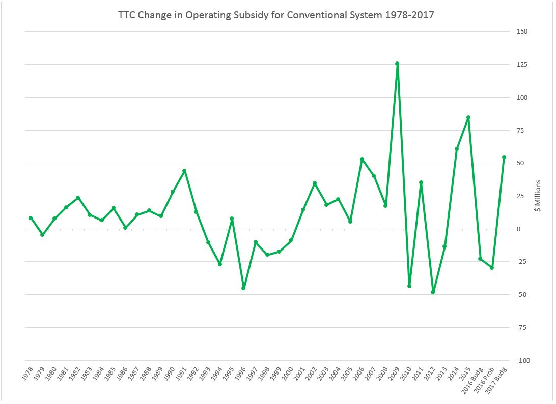
More to the point, however, the statement is simply wrong. The largest year-over-year subsidy increase for the conventional system was between 2008 and 2009 when the subsidy went up by $125.4-million. Why the big jump? 2009 brought in the Ridership Growth Strategy and a commitment to improved transit. This was undone during the Ford era and has only partly been restored under Tory.

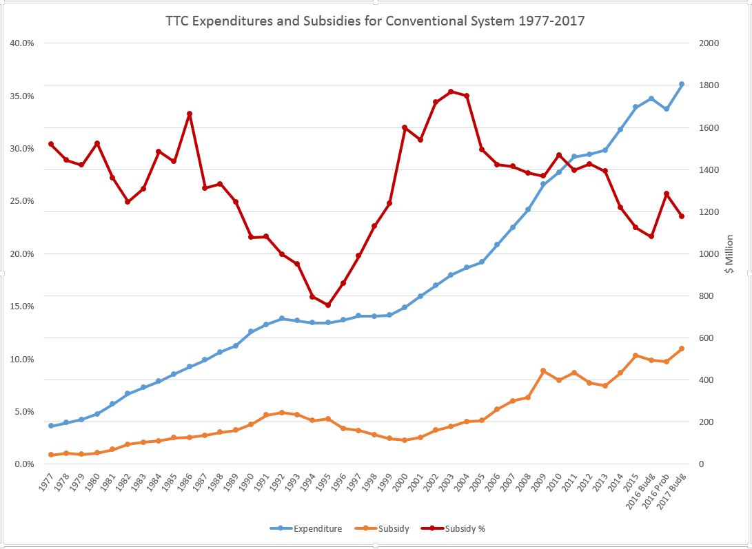
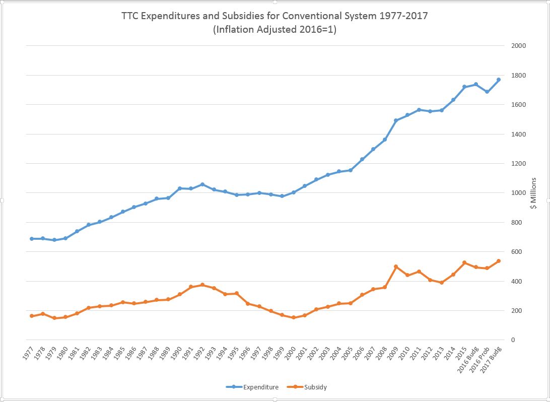
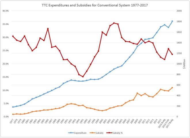
The chart below shows the growth in total operating expenses for the conventional system over the past 40 years (blue) together with the dollar value of the operating subsidy (orange) and the percentage of expenses covered by subsidy (red).

Two sets of figures are shown for 2016:

  • The original set are the approved City Budget numbers.
  • The second set is the “probable actual” results reported by the TTC.

Note the drop in projected expenses for 2016 compared with actual results for 2015. This is a result of the cutbacks imposed to rein in costs in the face of less than anticipated revenue. This is the largest year-over-year decline in TTC spending over four decades, and it is not a tribute to the City’s commitment to transit.

There is a very large projected growth in expenses for 2017 relative to the 2016 budget ($67.5m) and even more relative to 2016 probable ($108.9m). However, little of this will show up as additional service on the street. This situation is a bizarre, but not unexpected side-effect of a budget year in which cut-cut-cut is the only topic of interest at City Hall.

TTC management have planned to bring out a “Ridership Growth Strategy” report, but this is on hold due to budget concerns. A constant problem for transit and other budget areas at the city is that we rarely hear about what could be done, and how much this would cost to implement, only that it is time, again, to cut spending in the name of “efficiency”.

One important point about 2015 is that the operating budget included some “capital from current” spending that was stuffed in at the last minute to accommodate Mayor Tory’s announcement an accelerated bus purchase. This shows up as an “operating” subsidy although it really is a capital expense. Ironically, the TTC has never received full funding to actually operate these extra buses.

Sources:

  • 1977-2015: TTC Annual Reports
  • 2016 and 2017 Budget: City Budget passed by Executive Committee
  • 2016 Probables: TTC CEO Report

ttc_19972017_expsubs_v2a

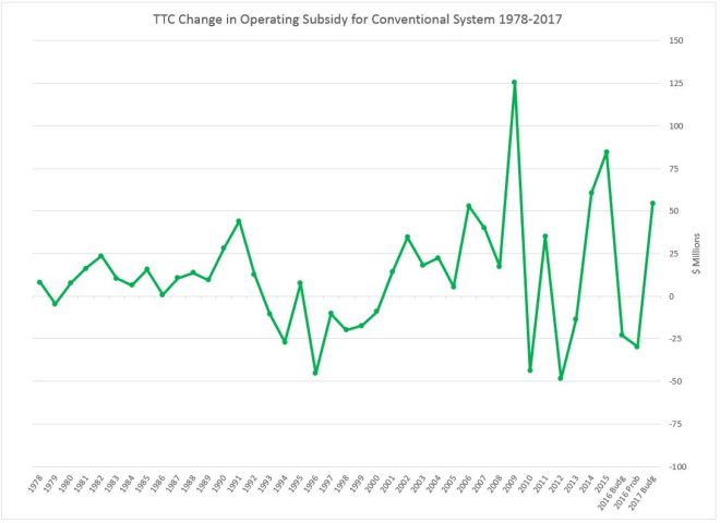
The annual changes in subsidy levels have bounced around over past decades with a big drop for the recession of the early 1990s.

ttc_19972017_deltasubs_v2

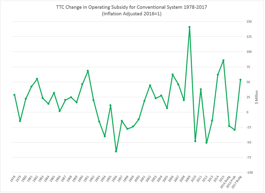
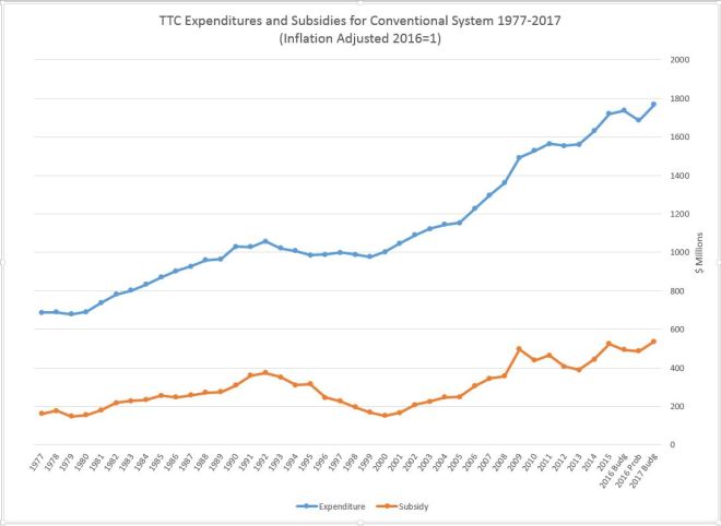
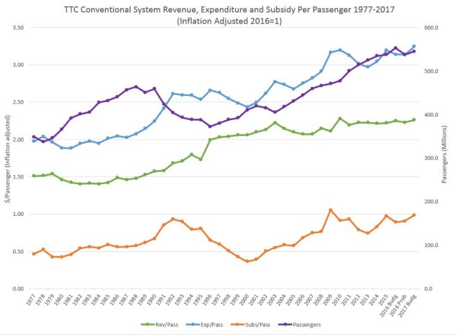
The same data with values adjusted for inflation using the Statistics Canada CPI and 2016=1:

ttc_19972017_expsubs_v2a_inflated

ttc_19972017_deltasubs_v2_inflated

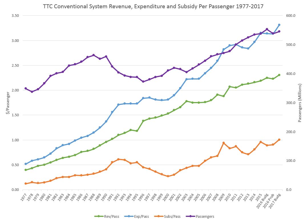
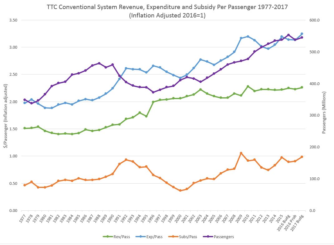
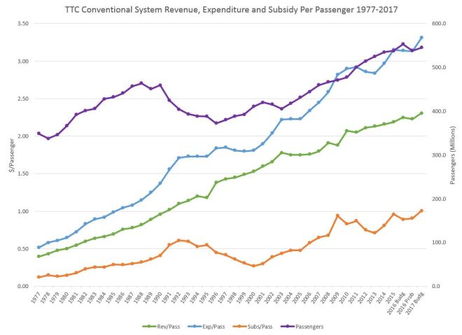
When the financial information is stated on a per passenger basis, we can see both the changes in the cost of providing service and in the subsidy each trip receives.

The chart below shows the total passenger count for each year (purple) and the associated per passenger values of revenue, expense and subsidy. Note that “revenue” includes miscellaneous items such as advertising, commuter parking and rentals that collectively amount to about 4% of TTC income.

The passenger count peaked in 1988 at 463.5 million, and then began a decline through the 1990s recession bottoming out in 1996 at 372.4m. The 1988 peak was not overtaken until 2008 with its ridership of 466.7m.

Expenditures per passenger (blue) climbed generally, but they dipped in the late 1990s, the Harris era with provincial funding cutbacks, and the Ford era.

Revenue per passenger (green) has climbed consistently with a few dips corresponding to fare freezes.

Subsidy per passenger (orange) fell through the 1990s bottoming out in 2000, and then grew to a peak in 2009 corresponding with the introduction of the Miller-era Ridership Growth Strategy. The value then fell through the Ford years, but is now back to a record level (without allowing for inflation) in the 2017 budget of $1.01 per passenger.

ttc_19972017_revexpsubs_perpax

When these data are adjusted for inflation, the picture is somewhat different.

Expenditure per passenger has had periods of growth, notably the late 1980s and the first decade of this century with a peak corresponding to the RGS implementation. The value then fell during until recent years.

Revenue per passenger took a big jump at the point where provincial subsidies were eliminated in the 1990s, but the value has only grown slowly over the past two decades when inflation is considered.

The subsidy per passenger bottomed out in 2000 and hit a high in 2009 (RGS), a point from which it has not yet recovered although the numbers have improved since a recent low point in 2013.

ttc_19972017_revexpsubs_perpax_inflated

The charts above are available as a PDF.

TTC Surface Ridership and Service: 1976 to 2016

Recent months brought much hand-wringing to TTC meetings where the mysterious decline of ridership threatens the stability of budgets and undermines planned service improvements.

In reality, ridership is not dropping, but for years the rate of increase has been in decline and this caught up with the TTC in 2016 when they overestimated potential growth.  Politically, an optimistic projection is useful because this inflates anticipated revenue, provides the basis for planning service increases, and sets the stage for chest-thumping claims that the disasters of a previous administration have been reversed.

The problem is that when the projections fail, there is a budget shortfall. This is small on the scale of the overall TTC budget, but large in its potential effect on subsidy needs and pressure for more fare revenue.

The debate always looks at recent years and asks why ridership growth that once appeared almost as reliably as the sunrise has fallen off. It is worthwhile, however, to take a longer view and examine how ridership has been changing over decades.

There are two sources of data for this review. Neither is perfect, but at least the numbers exist over an extended period.

  • TTC’s Ridership Analysis spreadsheet available from the City of Toronto’s Open Data Website. This file gives annual breakdowns of the type of fares sold, the location where these are paid, and a subdivision of weekday and weekend riding.
  • TTC Service Plans and related reports for many years included tables of route-by-route performance. These were once published annually, but in the past decade less frequently at least in part because the idea of improving service was not on the Ford-era agenda. Information for 2011, 2012 and 2014 can be found on the TTC’s Planning page. I have been collecting this information for years since its publication originated as an outcome of the Service Standards process established four decades ago. The format changes from time to time, but the basic information remains.

Each of these sources has its challenges.

The Ridership Analysis is based on fare collection at the point of trip origin. If I pay my fare at a subway station, but later transfer to a streetcar or bus, I count as a “subway” rider. In theory, I will be a “streetcar” rider on the return trip and so things should even out, but this breakdown does not reveal the modes used in the course of multi-hop journeys.

Another recent problem is that ridership is assigned by vehicle type in this analysis, not by route. A rider on a 504 King bus counts as a “bus” rider, not as a “streetcar” user.

Passes are a particular challenge because they are only actually counted on entry to a subway station through a turnstile. Passes flashed at operators (including station collectors) leave no trace for the statistics.

The Route Performance figures come from two sources: counts of riders on TTC vehicles, and scheduled service mileage. (Much of the data in this series is stated in miles, and for recent years I have converted kilometres to miles for consistency. The unit of measurement is less important than the trend in service provided.)

Riding counts are not conducted often on busy routes because of the resources required, and it was common to see the same values reported on streetcar routes like 501 Queen for many years in a row. In theory, this should not be a problem once the entire fleet has Automatic Passenger Counters, and assuming that these produce reliable data, but we are years away from that.

Mileage is a standard unit for transit maintenance planning because many aspects of vehicle repair depend on how far the vehicle travels. In practice, some factors are really more time than mileage sensitive, but in a system where most routes operate at comparable speeds, time and mileage are interchangeable. However, a bus garage serving mainly slow inner-city routes will see different performance figures from its fleet because the time-sensitive factors will occur more frequently on a mileage basis.

From the point of view of service, vehicle capacity affects the meaning of “mileage” as a surrogate for the quantity of service. With the shift to low-floor vehicles, about 10% of the fleet capacity has been lost, and so 100 bus miles are not the same as they were two decades ago. There is also, of course, the question of varying mix of vehicle sizes in the bus and streetcar fleet.

The Ridership Analysis gives full year figures, while the Route Performance numbers come from counts conducted on a wide variety of dates. They are daily figures, but they do not represent a single point in time. The Ridership Analysis figures were recently updated to include 2016, but there are no Performance figures after 2014.

Continue reading