A Rainbow of Rapid Transit

In Toronto’s never-ending fascination with new transit maps, the City Planning department has released a vision for our rapid transit network as it will be in 15 years.

201602_15YrPlan

Despite much talk of “evidence-based” planning, this is a very political map, and I cannot help remembering then-Premier David Peterson’s announcement of 1990 (not long before he lost an election and Bob Rae wound up as his much-surprised replacement) that amounted to a chicken-in-every-pot map.

There is nothing wrong with network-based planning, and indeed I have been beating a well-worn drum on that subject for years. But let us also remember that the Scarborough Subway exists because of the political clout of Brad Duguid, a former City Councillor, now Ontario’s Minister of Economic Development. Mayor John Tory, in Toronto Life, cites Duguid as saying that “if anyone tries to cancel the [Scarborough] subway, they’ll do it over his dead body”. “Evidence” apparently includes having a large cudgel to keep wandering pols in line.

The map also includes the Mayor’s pet project, SmartTrack, and it’s no wonder that he steers clear of the Minister’s position given the need for a provincial agency, Metrolinx, to accommodate SmartTrack on their network.

All of this is part of the “Motherlode” of public consultation sessions now running in various places around the City, and through Metrolinx in the wider GTHA. Background information and links to related material are available at Toronto’s TransitTO web site.

Continue reading

There’s A New Subway On The Way (2)

As construction progressed on the Bloor-Danforth-University subway, the TTC issued progress reports from time to time.

Progress Report 3 predates the opening of the University leg of the project. By this time, a funding contribution from Queen’s Park brought the then estimated completion date back from 1969 to 1967.

The first batch of aluminum 75-foot cars, a form that would become standard for Toronto, came from Montreal Locomotive Works. All subsequent orders went to the plant in Thunder Bay now owned by Bombardier.

There’s A New Subway On The Way

With all the hoopla about yet another new transit plan for Toronto, it’s time to remember that the 50th birthday of the Bloor-Danforth subway is coming up in a week’s time. Depending on which event you consider the “real” birthday, it will either be Thursday, February 25 (the anniversary of the ceremonial opening) or Friday, February 26 (the first day of revenue service).

Over the next week I will post some ephemera from that era when Toronto launched on a major subway building project.

The handout below was a publicity piece for the Bloor-Danforth-University subway project. Among items of interest are:

  • The expected construction time was 9 years broken down as the University Line (3.5), Greenwood to University including Greenwood Yard (4), and the remaining pieces east from Greenwood to Woodbine, and West from St. George to Keele (2.5). Almost all of the line was built cut-and-cover , and the city expropriated a swath of houses along most of the route to the north of Bloor Street and Danforth Avenue. This strip is now home to parking lots, a few parks, subway entrances, and the occasional new building sitting right on top of the subway.
  • The original completion date to the terminals at Woodbine and Keele was planned to be 1969, but work was accelerated thanks to additional funding from the Metropolitan Toronto government and Queen’s Park.
  • The paintings showing what the new stations would look like date from 1956 and 1957, before the project had been approved by Metro Council.
  • The map of the route includes the original names for most of the stations including Vincent, Walmer and Yorkville. By the time this was printed, “Willowvale” Station had already changed to “Christie”, but the park to the west retained its original name.

The station illustrations are by Sigmund Serafin whose work also shows up in samples of the original Yonge line station designs. Of the four stations shown here, none was built exactly as shown. You can see the full set on Transit Toronto. The eight water colours were rescued from a housecleaning binge at the TTC in the late 1960s when much material went into various private collections lest it simply disappear. These paintings are now back with the TTC who plan to issue them as posters later this year, and the originals will go to the City Archives.

Here is Bloor-Yonge Station in all its mid-50s glory, with Gloucester trains, no Hudson’s Bay building and a lot of Bloor-Yonge streetscape that has vanished over the years.

Yonge_Station_Serafin_1957w

For a detailed history of the Bloor subway, visit Transit Toronto.

Reviewing the New Schedules on 501 Queen for January 2016 (Part I)

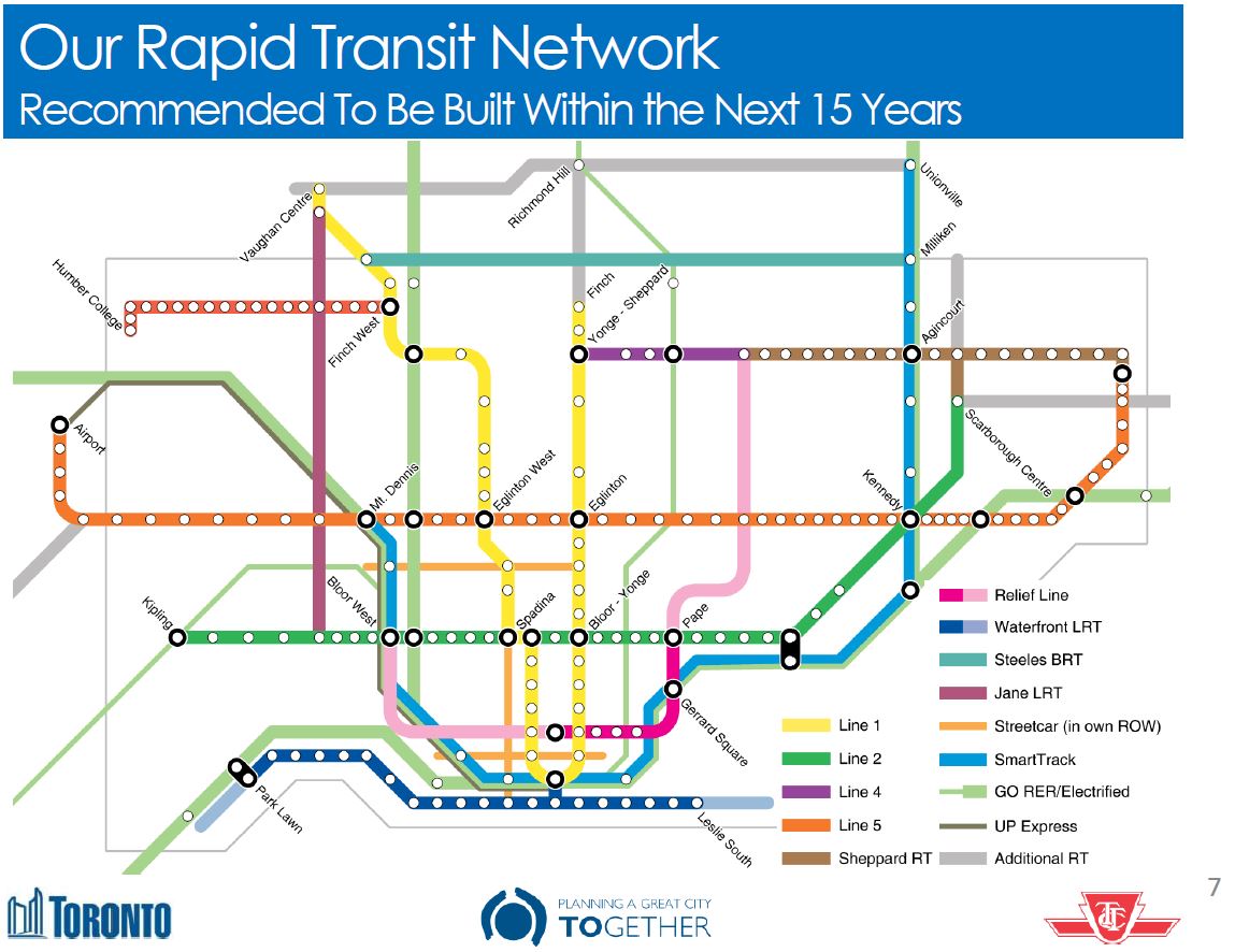
Effective January 3, 2016, the TTC introduced a major revision in service on the 501 Queen route. The changes included:

  • Substantially more running time was allocated for almost all periods so that cars would not fall late thanks to congestion and heavy demand, and most of the service could reach the terminals.
  • The route was split at Humber Loop (see note below) so that the Humber-Neville service operated independently of the Humber-Long Branch service, the arrangement that had been in place until March 1995. This is supposed to be “temporary” pending the availability of enough cars to operate the full line with the longer ALRVs or new Flexitys. Service to Long Branch operates with CLRVs (the shorter streetcars) except for some runs that are through-routed from the main part of the route.
  • The section of the route west of Humber Loop was added to the “10 minute network” so that it is guaranteed frequent service at all hours (except overnight).

(Note: Due to the condition of the “Long Branch” side of Humber Loop, the service captive to the west end of the line was discontinued for the last week of January, and “Long Branch” cars ran through to Roncesvalles Carhouse as their eastern terminus.)

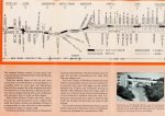
The “before” and “after” service designs are summarized in the following table.

501_ServiceHistory_201601

In this article, I will review the operation of the 501 Queen route in December 2015 and January 2016 with a focus on headways (the time between cars), reliability (variation in the headways) and the quality of service on outer ends of the line (the compound effect of reliability and short turns). In the second part of this article I will turn to the effect of additional running time in the schedules.

General Observations

Service in January 2016 is much more reliable, especially on the outer ends of the route as the need to short turn cars simply to stay on schedule is much reduced. On the west end of the line, service on Lake Shore is considerably improved both because this is now part of the “10 minute network” and because cars are now dedicated to serving the segment west of Humber.

Short turns still do occur, although for the most part this is now due more to local incidents such as collisions than congestion. In other words, short turns occasionally spike at a specific time and day rather than being chronic throughout all days and hours of service.

Weekend service was particularly bad in December partly because there is less (or no) unscheduled extra service to fill gaps, and partly because line management seems to apply to weekends with the focus being on “on time” performance rather than actual service levels. This problem is reduced but not eliminated in January.

Wide gaps in service and the complementary effect, bunching, were much more prevalent in December than in January, but unreliable headways are still a problem, albeit at a lower level. Combined with the higher likelihood that cars will run through to their advertised destinations, the length of time a rider must await a through car, and the anguish about whether one will ever appear, is improved.

Cars depart inbound from terminals more reliably, generally within the TTC’s goal of a six minute “on time” window. However, this goal still allows for uneven spacing relative to a six minute scheduled headway, and by the time cars reach Yonge Street, the unevenness of terminal departures is magnified. On Lake Shore, headways are uneven at times even with the dedicated local service simply because cars do not leave terminals on a regular spacing. A six minute “on time” window allows most of these to hit the target, but they still contribute to uneven service

The added running time allows more service to reach its scheduled destination, but during some periods it also contributes to noticeably slower operation. If the schedules are padded, then it should be possible to space service midway along the route. From a traffic viewpoint, the question then becomes whether it is better to have streetcars sit killing time at key locations rather than dawdling along the route to burn up excess time in the schedule.

Continue reading

What Would Fare By Distance Mean For Toronto? (Updated)

The Metrolinx Regional Fare Integration Study studiously avoids one of the most important questions any new fare scheme must face: what is the effect for various types of riders?

As a starting point in examining what might happen, this article looks at some of the basics of travel patterns and fares to see what various Metrolinx schemes might imply. Note that this is not a definitive, accurate-to-the-nth-degree exercise, but a general discussion. The detailed work should already have been done by Metrolinx, but if it has, they are not publishing the results.

My apologies to readers in advance as this is an article more technical than political. Some of the calculations are unapologetically “back of the envelope”, and are intended as estimates, illustrations, not definitive results.

Updated Feb. 14, 2016 at 2:00pm: Comparative information about GO Transit fares has been added at the end of the article.

Updated Feb. 14, 2016 at 4:45pm: A further observation on the relatively low fare by distance paid by GO riders has been added at the end.

Continue reading

Metrolinx Fare Integration Background Study: February 2016 Update

Recently, I reported on a staff presentation to the February 10, 2016, Metrolinx Board meeting in which it was quite clear that the provincial agency is moving inexorably toward some form of fare-by-distance not just for its GO Trains, but for all rail modes that operate on their own right-of-way including subways and LRT. Bus Rapid Transit, although a common part of The Big Move as a “solution” in the 905, is not included as “rapid transit” in their proposals.

Metrolinx has now published the background technical paper to this presentation. This is the second installment in the fare integration review. Part 1 came out in September 2015.

For background information, see:

In previous articles, I noted a strong inclination by Metrolinx toward distance or zone-based fares, and this continues into the most recent paper. What is also troubling, however, is the difference between the backgrounders which have some detail about the workings and effects of a new fare structure, and the staff summary reports where this is all treated as a complex issue to be reported on at some future date. “Have patience”, the Board is told by staff, even though answers to some of their questions can be found in the detailed reports.

A chart from the September 2015 report is worth looking at again.

201509_GTHA_Fare_BCE_QA

It is self-evident that any tests of fare effects, of the various sub-markets which might see higher or lower fares, and of revenue distribution models, could not possibly be conducted without an actual model with real numbers of riders and real fares attached to each type of trip they would make. However, even by February 2016, the staff presentation studiously avoids specifics and gives no hint of the degree by which fares might rise or fall. A related issue is that the tests used a “revenue neutral scenario”, one in which any reduction in one part if the revenue pie must be counterbalanced by an increase somewhere else.

This is the “we don’t want to pay more subsidy” view of fare integration where the “winners” are those who now face multiple fares, typically to use the TTC plus any other GTHA system, while those who now pay single fares within a system will be the “losers”. This fact has been hidden from public view throughout the exercise. We hear a lot about “fair” fares, but absent specifics, there is no way to decide which elements of “fairness” are included in the new formula.

An element that emerged from the 2015 study and now forms an important part of the 2016 update is the concept of “service class”. This is a simplistic division of all transit services into three groups and three trip lengths. The groups such as “local” and “rapid” transit are defined by mode (bus or rail), not by the actual quality of service they provide. Indeed one might argue that the higher speed of “rapid” transit can be offset by the severe overcrowding and unreliability of the service. For the purpose of the fare model, only the nominal speed and presumed comfort of rail services counts. This is very much a GO-centric view of transit service.

Even GO is having its problems with comfort and crowding. For some time, the goals for service quality included the idea that 80% of peak period riders would get a seat. GO never attained this and the metric sat at 66% the last time it was reported, September 2015. This goal appears to have quietly fallen off the service targets GO seeks to hit for the obvious reason that it is not attainable without massive expansion of service beyond the point where latent demand always backfills any new capacity GO provides.

The overall fare integration study is expected to stretch into late 2016 according to the chart below. It is hard to ignore the absence of “rider effects” in the topics listed here.

201601_FareStudyStaging

However, a more detailed chart (Fig. 1.4) clearly shows that a “Preferred Option” would be recommended by Spring/Summer with the implication that any chance to debate and influence the choice has a limited window of the next few months. The Metrolinx Board is not scheduled to meet again until June 2016. Will they be faced with a fait accompli where staff have made all the decisions and the Board’s role is merely to nod in agreement? When will local Councils and transit agency boards have their chance to be heard? In the rush to get a new fare structure, will Metrolinx management do an end run around meaningful consultation at both the general public and political levels?

Continue reading

TTC Replies to Fare Zone and Subway Premium Proposals

An obvious question about the Metrolinx Fare Integration Strategy update is whether the TTC has quietly adopted a new fare policy to suit Metrolinx.

I asked:

The Metrolinx Regional Fare Integration report on their board’s agenda for Wednesday clearly leads the way for fare zones at least on the subway within the TTC system.

There have been rumblings of this from management comments at TTC, but nothing definitive. However, the installation of fare gates with tap out capability is a clear preparation for such a change. While this might be part of the TYSSE roll out, the wider application of zoned fares (or some equivalent) within the TTC has never been a matter for public debate or decision as far as I know.

Has this matter been presented to the Commission for discussion, or are there plans to do so in the near future?

What is the TTC’s position on the Metrolinx fare integration proposals?

The TTC’s Deputy CEO, Chris Upfold, replied:

The TTC[s] sit on the various Steering Working groups for regional fare integration and I feel our voice is well heard there.

As per our report to the Board on Fare Policy TTC staff are not undertaking any more work on fare by distance or by zone within the boundaries of Toronto on service operated by the TTC. We do not feel it is an appropriate or useful policy direction in those circumstances but are working with Metrolinx on how it could work from a regional basis.

Our board has passed a number of motions, over just the few years I’ve been here, that any regional integration must not come at the expense of the TTC or our customers.

Faregates are being rolled out at subway stations for a number of reasons but primarily:

  1. The integration with a legacy turnstile with a new reader wasn’t the best technical solution and caused lots of other potential problems.
  2. The legacy turnstile (especially high gates) are nearing the end of their life and we were likely to need a wholesale replacement in the next 10 years or so.
  3. Overall the whole life cost (over 20 years) was much lower for installing new faregates.
  4. New faregates are higher capacity (and far more flexible) and do things like real time fault reporting etc.

Tap in and out functionality is necessary for the TYSSE in order to manage regional integration on how fare policy sits today. Faregates (with readers on both sides) would help to enable any zonal/distance based system.

Now it is up to Metrolinx to explain how their proposal meshes with the TTC’s stated position.

How Will SmartTrack and GO/RER Co-exist?

Metrolinx has published an update on studies of how the proposed SmartTrack service will be integrated with its own GO/RER (Regional Express Rail) offering. This will be considered at their board meeting on February 10.

This covers several issues, and begins to nail down just what SmartTrack might, or might not, resemble that is beyond the scale of postcard election literature. As we already know, major changes are planned to the western leg where the Crosstown West LRT will take over the function proposed for SmartTrack beyond Mt. Dennis. To the east, SmartTrack remains in the GO Stouffville corridor, but the Scarborough Subway Extension (SSE) has been scaled back to a one-stop line serving only the Town Centre, and the Crosstown East LRT will provide service to eastern Scarborough.

What is GO RER?

WhatIsRER

This graphic is amusing for its complete contrast with the way that Metrolinx/GO presented electrification of their services during early days of public consultation. That hit a low point when it was suggested that electric trains might not work in snow.

Note that the official line now is that lots of cities use this type of service, and that electrification is an integral part of the package.

Metrolinx owes us all an apology for their initial foot-dragging and misinformation campaign. Now if only they had been more supportive of LRT during the dark days of Rob Ford.

Continue reading

Metrolinx Fare Integration: Get Ready to Pay More For Subway Trips

One of the great mysteries surrounding the roll out of Presto on the TTC has been the whole debate about “Regional Fare Integration”. Now and then, discussion papers surface at Metrolinx, but folks at the TTC, especially the politicians, are strangely silent on the subject. “Wait and see” is the order of the day.

Well, folks, we have waited and now we are beginning to see the direction Metrolinx is heading in for a consolidated GTHA-wide fare structure. The results will not please folks in suburban Toronto or the inner 905 for whom long subway trips are a routine part of their commutes.

The Metrolinx Board will consider an update on this subject at its meeting on February 10.

The presentation is in a sadly familiar Metrolinx format: lots of wonderful talk about consultation and fairness, and philosophical musings about what a fare system should look like. One big omission is any evaluation of the relative numbers of riders who would be affected by various schemes, and even worse of any sense of calibration of the fares to produce different results.

This comes at a time when we know from SmartTrack demand studies the importance of fare levels in attracting ridership. It is important here to remember that we are not talking the relatively small differences between types of TTC fares, or year-by-year increments, but the much larger deltas between TTC fares and those on GO Transit.

The problem begins with the arbitrary segmentation of the travel market into “local”, “rapid transit” and “regional transit”.

201602_DefiningServiceTypes

This is a wonderful theoretical view of the world that might find a home in a sophomoric academic paper, but it ignores the very real world in which (a) “rapid transit” today only exists within Toronto and (b) Toronto decided over 40 years ago that “local” trips paid one fare regardless of the mode they used. The entire system is designed on this principle, one that has consistently evaded Metrolinx planners.

If only the world were so simple. Why is Bus Rapid Transit omitted from this list? Why is a streetcar (aka LRT) on right of way “rapid transit”, but not a bus? How close must subway or LRT stops be to each other for the service to drop back to a lower tier? Conversely, if someone slaps a “19x” route number on a bus, should it become “rapid transit”?

The basic problem with this world view is that transit modes, especially bus and streetcar/LRT, have a wide range of overlapping implementations.

Continue reading