
A major question facing transit advocates today is the degree to which TTC service is less frequent than in the pre-pandemic era, and more recently how it will be changing on a month-to-month basis.
As I write this on February 15, 2023, service changes were introduced a few days ago, and many more are planned for March 26, 2023. The TTC plans to release details of the March changes in its agenda for their Board meeting on February 28 for which the agenda should be available about a week in advance.
For each schedule change, I have published a detailed table showing old and new headways (the interval between vehicles), the changes in scheduled trip times, and the number of vehicles assigned to each route. This information is important for seeing that detail, but for a general audience, a simpler representation of the changes is needed.
In mid 2022, I published a comparison of May 2022 service levels with January 2020 to illustrate the degree to which service had changed between the pre-pandemic period and what, at the time, was thought to be the start of a strong recovery through 2022. This article includes tables in the same format comparing:
- January 2020 to January 2023 as an update to the previous article, and
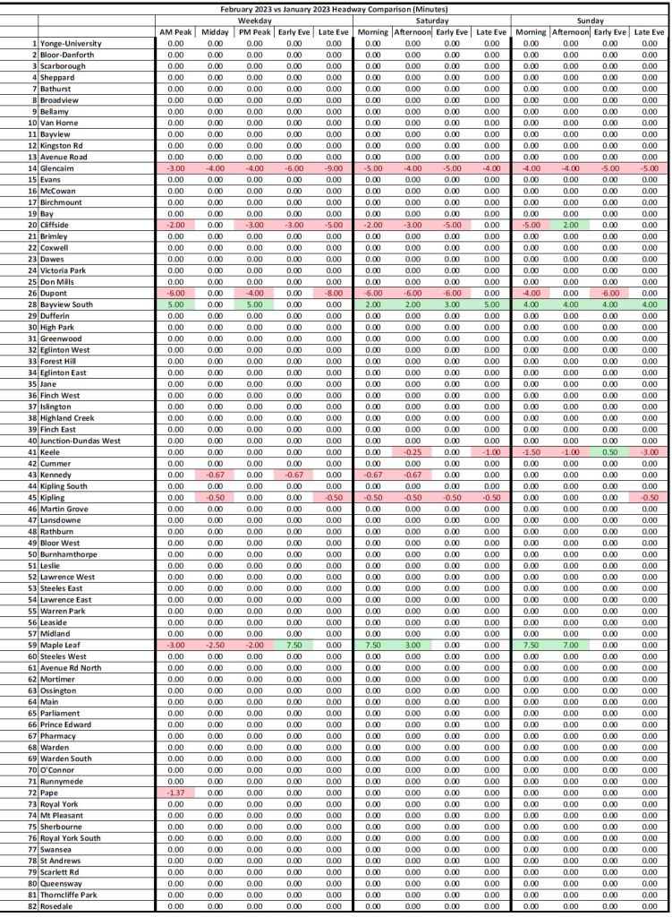
- January 2023 to February 2023 showing the changes, where they occurred, on February 12, 2023.
In future articles about service changes I will include both the usual detailed spreadsheet as well as a chart showing the changes in the consolidated view used here. This will allow readers to quickly see where major changes occur, or not.
Updated February 16, 2023 at 12:45am: The pdf chart sets and some pages within the article have been replaced to correct an error in 76 Royal York South.
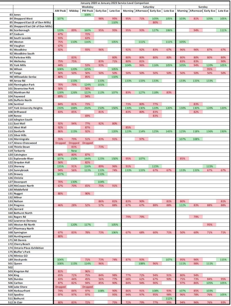
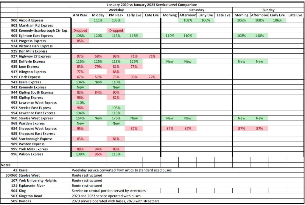
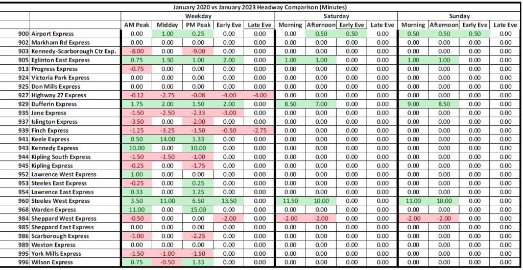
January 2023 vs January 2020
The charts in this section compare the scheduled service in January 2020, a few months before the onset of the pandemic lockdown and the riding changes it triggered, with service at the start of 2023.
A few general points should be noted:
- The values shown are based on the scheduled service frequency, not on either the speed of operation or number of vehicles assigned to a route. Schedule adjustments to reflect actual on-road conditions can reduce service level unless vehicles are added to compensate for slower travel speeds.
- Seconds in headways are converted to decimal formats so that, for example, a headway of 3’30” is shown as 3.50.
- There are a few routes where there has been a change in vehicle type (bus/streetcar or normal/articulated bus). The tables do not adjust for the change in capacity. (I plan to add this to a future version. Changes are shown in the footnotes.)
- Where service has been reduced, the cell is shaded red. Where it has been improved, the cell is shaded green.
- PDFs containing the tables from each set are linked at the end of the article.
Much of the colouring in the comparison between 2023 and 2020 is understandably red representing the cumulative service cuts although there are some improvements. It is important to distinguish between the change in headways measured in minutes and the percentage change this represents in service. Many routes operate frequent service and, as a result, a change of only a few minutes in headways can be a substantial change in service levels and capacity.
This combines with service reliability and, in case of streetcar routes, the operation of larger, less frequent vehicles, to make service change effects greater than the numeric change in headway values might imply.


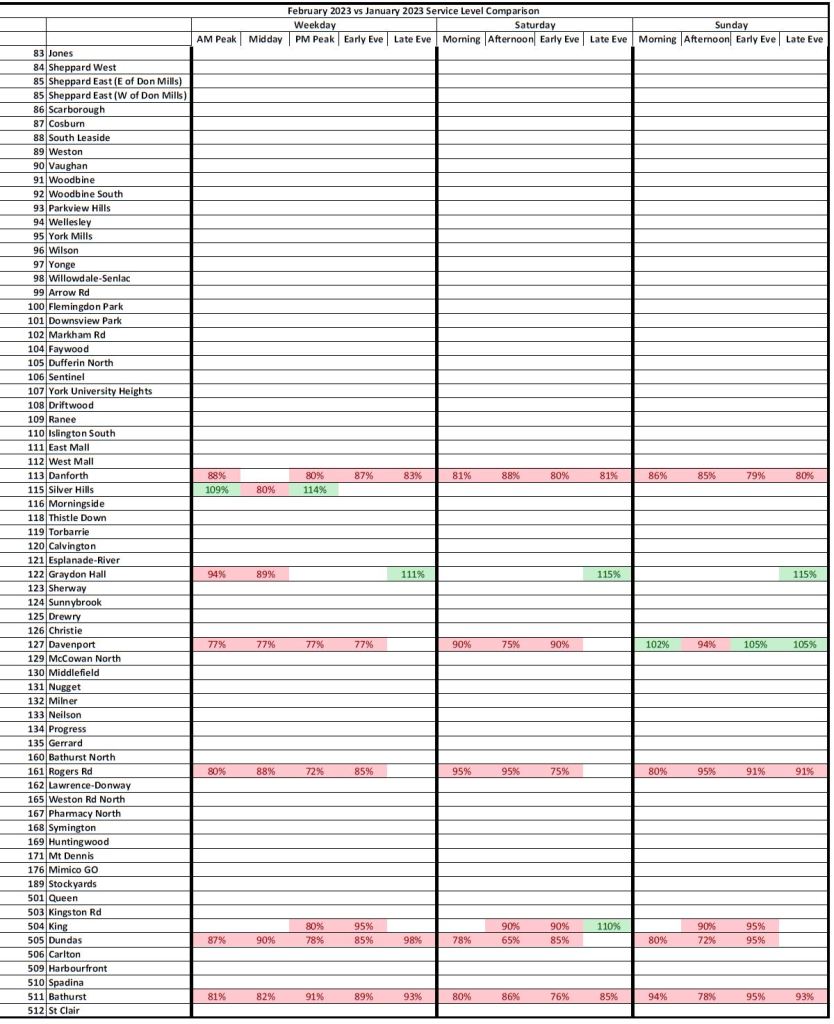
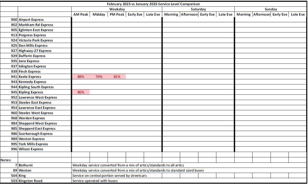
February 2023 vs January 2023
These tables show only the changes that took effect on February 12. The changes were almost all service reductions. A few improvements are in response to demand, but many are due to schedule adjustments unrelated to demand such as providing a common headway on interlined routes like 14 Glencairn and 28 Bayview South.


From my (TTC insider’s) viewpoint, I have been watching a few bus routes (which my immediate family rides and is affected by service changes) as well as the subway routes. Increased headways/wait times on subways could lead to my wife being stranded at either Kennedy Station or at Finch Station, having missed the last bus. This would force her to have to wait for the first night bus, involving transferring to another night bus to get home. As it currently stands, subway plus 2nd last or last bus is a 2 hour trip home after finishing work at midnight. Having to rely on last trains and then waiting for a night bus plus having to transfer to another night bus is ridiculous. Thankfully we will both retiring shortly, so this will be a short term annoyance.
LikeLike
These are very informative…it may be even more clear if you were to produce a heatmap…both in chart and in map form…some of these are shorter and some are longer routes…it may also be then easier to see what areas of the city are losing service.
Steve: The problem in moving to a map-based presentation is that I can only show the change for one of the thirteen time periods in the table on one map. There are cases where only individual periods are affected, and not always in the same way (some better, some worse). Yes, one could do multiple maps, even with animation to step back and forth among them, but I wanted something that was simple to produce and maintain.
LikeLike
The undercover black ops on the TTC board and City Hall are doing as directed, sabotaging public transit in favour of the automobile.
LikeLike
It will never come to pass, but there should be a requirement that ALL City Councillors who are appointed to sit on the TTC board be actual REGULAR TRANSIT USERS. Yes-men like Denzel Minnan-Wong only helped cement the backward slide of transit services because, well – what did HE care if some bus or streetcar somewhere or other was running late or part of a 3-vehicle pack, leaving a future arrival at more than “scheduled” (and I use that term VERY loosely….) and delaying the poor schmuck standing in the rain or the cold knowing they’ll now be late for work?
When John Tory was invited by a transit rider to accompany her in the non-air-conditioned subway cars along the Bloor Line (“Line 2”) he was literally – if only temporarily – feel the pain and heat that some of the voting public had to endure daily using the “Better Way” [sic].(I know John *did* ride the Bloor Line from his home to City Hall as a matter of course, but at 6:00 a.m., the trains are a lot less crowded and the heat of the day is nowhere to be found.
IF you happen to be a TTC Board councillor who does drive – like BMW*-DMW – because no other transit-using councillors were daring enough to volunteer(!) then you have to give up your car for 1 week a month to get around to City Hall and to all those other lovely constituent-based photo-ops in the respective Ward. You know, just to get a real feel of life on the ground and in the trenches – er, tunnels!
I don’t know what kind of car Denzil Minnan-Wong actually drives – I just like giving him the nickname BMW-DMW because it “works” and I would hazard that BMW drivers don’t care much for or about folks hanging out at transit stops as they whiz on by….
As I said, it’ll never come to pass but one can dream, no? I’d wager, Steve, that you’d have swan boats ferrying along the Don and Humber Rivers well before we ever saw TTC Board councillors who actually understand transit and don’t try to take the public for a ride!
LikeLike
George, what you want to show is an isochrone map at various time periods.
Transit planner Jarrett Walker often starts his bus network redesigns with describing how far you can reach from a point (like UTSG) with 45 min of public transit using an isochrone map. You can travel further the better the service. But an isochrone map is probably something an urban planner or transit engineer would use rather than a transit enthusiast as it is way too complex to model without the proper software and data inputs.
Steve: Something an isochrone does not show is waiting time separate from travel time. When considering service quality, waits “cost” a lot because riders feel they are stuck until a bus shows up, possibly for an unpredictable time. Transfers can compound this problem.
LikeLike
How many members are on the TTC Board? How many of those are Councillors? What purpose does it serve to have non-TTC riders on the Board?
Could there be a case for at least a majority of members be regular (as in daily) TTC riders?
Steve: There are nine members of whom five are Councillors and the others not. As long as we have a Mayor and his supporters who think first about taxes and then about services, such boards will be filled with people who can count pencils, but don’t know what it’s like to be a regular transit user.
LikeLike
>But an isochrone map is probably something an urban planner or transit engineer would use rather than a transit enthusiast as it is way too complex to model without the proper software and data inputs.
This statement is generally true but with GTFS (provided on the city’s open data portal), OpenTripPlanner, and QGIS someone with very modest technical skills could quickly generate isochrones for a representative sample (e.g. travel from each point on a 250m dot grid, sampled every 5 min, during a specified time period). This requires modest computing power and all the software is free.
Steve: The missing component, however, is wait times which in turn depend on supposed service reliability. I would love to see comparative isochrones for trips taken on a “working on time” (or on scheduled headway) network versus the typical scatter in headways we actually get.
LikeLike