
Revised May 21, 2022: The original tables in this article were based on headway data that was rounded to minutes. This produced distortions in comparison of 2020 and 2022 service especially on routes with frequent service where rounding substantially altered values, proportionately.
The TTC regularly reports that it is running service at “x” percent of pre-covid levels. They aim to be back at close to full service and 80% of pre-covid demand by the end of 2022 with hopes for 100% in 2023.
Like so much of the info TTC publishes, this is a system average, and the actual ratio of pre-pandemic to current-day service varies from route to route and by time of day.
The charts in this article map the ratio of old and new service by percentages, and by the change in scheduled headway (time between vehicles). The data are taken from the Scheduled Service Summaries published by the TTC.
For convenience these are available on my site:
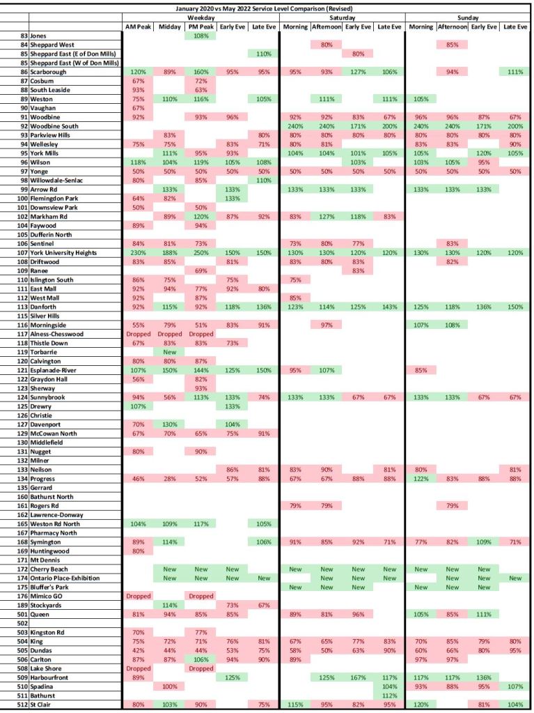
The pages below (click to open in a larger format) show which time periods and routes are operating less service today than in January 2020 (red) or more (green). Cells that are white indicate that the service is unchanged.
The key point here is that there are routes operating with considerably less service compared to January 2020 than implied by TTC claims of service recovery. It is no surprise that riders on many routes complain of less frequent service. This is compounded by the TTC’s inability to operate reliable headways making waits for buses and streetcars both longer and less predictable.
In a few cases there have been vehicle type changes on a route such as the restoration of streetcar service on 505 Dundas. The percentages are relative to the scheduled vehicles per hour with no adjustment for capacity. Similarly, a few bus routes have changed between regular sized and articulated vehicles.
This set of charts shows the percentage change in service from January 2020 to May 2022. A table at the end lists the major route changes affecting headway comparisons.


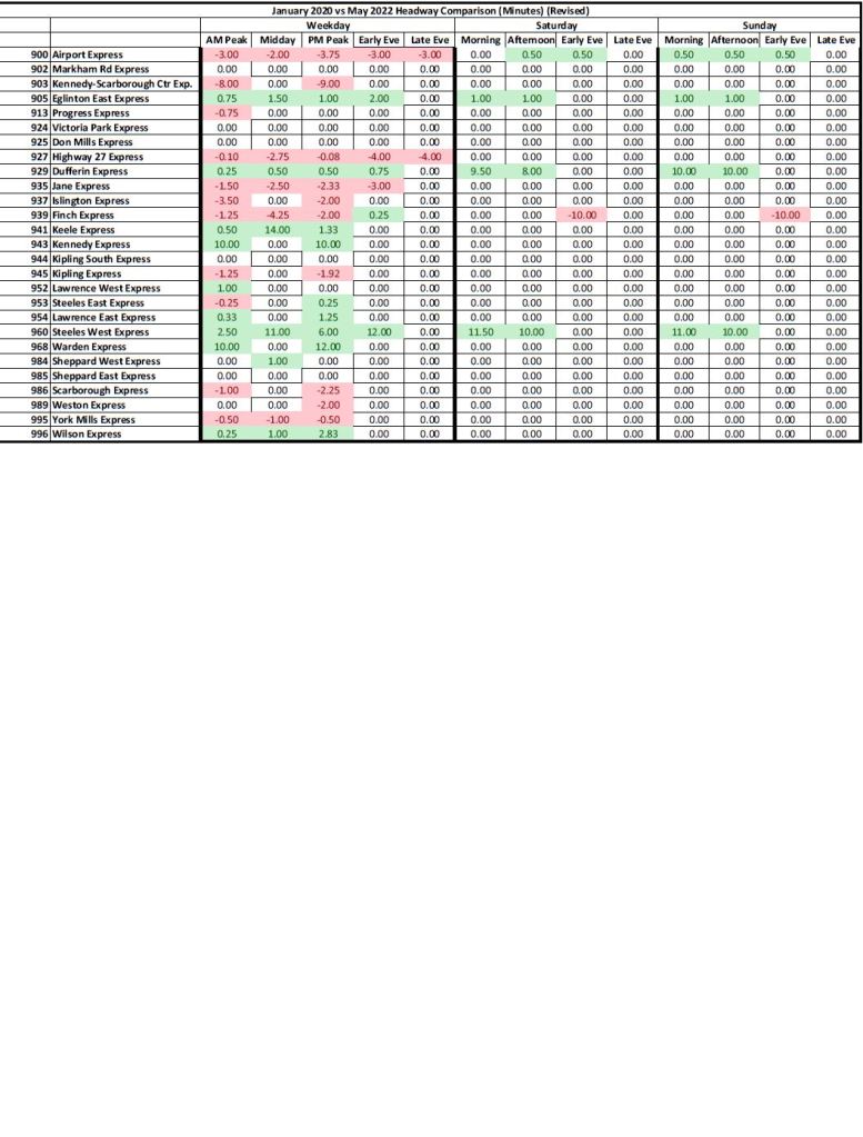
The charts below show the difference in headways (in minutes) between January 2020 and May 2022. Negative values (red) indicate vehicles that arrive less frequently while positive ones (green) show more frequent service. For example, Line 1 Yonge-University now operates every 3’36” in the AM peak compared to 2″21″ pre-pandemic, a difference of 1’15”.


The full set of charts is available in this PDF.
