
The TTC reports on its overall performance through the monthly CEO’s Report. This document is rarely discussed in detail at Board meetings, and often is the underpinning for “good news” about how well the TTC is doing, not about how it could be even better.
Regular readers here know that I often despair over the quality of the metrics used in this report. A few months ago, during a Board meeting, CEO Rick Leary mentioned that the metrics in his report were to be updated. This article is the first in a series discussing of what might be done to improve things. Future articles will review practices in other major North American transit systems, as well as the state of TTC service seen through a more rigourous reporting standard.
The pandemic era fundamentally changed the environment where the TTC operates. Ridership is down, but demand for reliable service is as strong as ever because social distancing is a new requirement. In past years, riders might complain about crowding, but this could be fobbed of with the usual excuses that things were not too bad on average – in any event, we could not improve service because either we had too few vehicles or too little budget room to operate more.
Plans were always tailored to available subsidy funding and the on-and-off-again political desire to “improve” transit by freezing fares. In spite of repeated requests from some TTC Board members, staff would never produce an aspirtional budget showing how much it would cost to plan for overall service improvement beyond a minimal level. That was the approach in the Ridership Growth Strategy, now almost two decades old, and hard fought-for in its time.
Today, a crowded bus represents more than an inconvenience – riders see crowding as a safety issue in this pandemic era.
Looking ahead in 2021 and beyond, there is a potential for resurging transit demand at a time when government support for emergency funding could wane. This could force cutbacks just at a time when transit needs to at least hold its own, if not improve.
The TTC reports superficial measures of its service that do not tell us much about rider experiences even though that is the “shop window” of the transit business. Far too few data are reported at a granular level where the variation in experiences is evident. Little data is available online for review, and much of that is not up to date.
The Tyranny of Averages
Riders do not consume “average” service. Getting to work on time, on average, is not an option. Riders have to assume that the service will be bad and build padding to compensate into their plans.
Riders usually board the first vehicle that shows up after an indeterminate wait compounded by potential crowding. Even if they allow for irregular service, they have no control over whatever shows up day-by-day. Both the physical environment and the need to be somewhere on time can add anxiety to their journey.
Many routes and trips are not crowded, considered on an all route, all day basis, but some are. A major problem here is how we count things.
If we count crowded buses, we might find that, over the day, ten percent of vehicles are crowded. However, there are more passengers on those buses and so the experience of crowding affects proportionately more riders. The same applies to long waits before a trio of buses appears at a stop. The “average” service might match the scheduled buses/hour, but the true experience is of a long wait followed by a crowded journey.
This is the basic reason why management can claim that “on average” service is pretty good, even in these difficult times, while riders complain bitterly that it is not. Service metrics are needed to reveal the variations, how often and how badly the TTC misses its targets, as well as the number of affected riders.
Big Data vs Big Reports
Over the decades, the CEO’s Report (formerly the Chief General Manager’s Report reflecting the position’s earlier title) varied in volume and complexity. This depended on the interests of the then-sitting Board and the style of the then-current management. For a time, it included detailed project status reports on everything from major subway construction all the way down to routine system repairs, but with no interpretive summary to flag problem areas.
Only the most dedicated would read every page, and the report accomplished its objective of appearing to inform while overwhelming with raw detail. Much more information was available about capital project status than day-to-day operations.
At the other extreme, performance data are consolidated to a level where Board members can digest them, but with a loss of detail.
In our time of Big Data, there is a danger of information overload. Readers who follow my route performance analyses know of the volume of charts and data published here, and those are only the tip of a very large iceberg. Nobody would read a monthly description of every route.
The point should not be to read all of the detail, but to have a summary that flags problem areas with the detailed information as a backup. If the same problems show up every day, they are systemic issues, not ones caused by occasional disruptions. The Board should know about them and about what management is doing to correct and improve affected areas. This is Management 101.
From an accountability viewpoint, riders and politicians are interested in their route, in their wards, but those responsibile for the entire system should be able to verify that overall behaviour is not consolidated beyond recognition into a meaningless average. This requires two important changes in how performance data are presented:
- The granularity of analyses in time and space (e.g. by route and location) must be sufficient that it can be related to the experience of a rider making a specific trip at a specific time.
- Exception reporting of problem areas should flag these for action and be tracked in overviews like the CEO Report, but the detail should be available online on a timely basis.
Those points as written are aimed at service reliability, but can easily apply with modifications to areas such as equipment and infrastructure.
Why Do We Measure?
The reasons for measuring things are summed up in this quotation from an extensve report on the subject that is now close to two decades old:
Agencies collect … measures to help identify how well service is being provided to their customers, the areas where improvement may be needed, and the effects of actions previously taken to improve performance. In these cases, agencies use performance measures to help provide service as efficiently as possible, monitor whether agency and community goals are being met, and—over time—improve service so that it attracts new riders. Changes in policy, procedures, and planning can result from an understanding and appraisal of certain measures.
… [D]ecision-making bodies, such as transit boards and funding bodies, need to have access to accurate information to help them make decisions on where and when service should be provided and to support actions designed to improve performance. The public is also interested in knowing how well service is being provided and may need convincing that transit provides a valuable service, for them, for someone they know, or for the community as a whole.
Performance measurement data provide transit agency management with objective assessments of current circumstances, past trends, existing concerns, and unmet needs.
A Guidebook for Developing a Transit Performance-Measurement System, Transportation Research Board, 2003, p. 4
Eagle-eyed readers will notice that I have not mentioned financial issues like fares, subsidies, cost control and “efficiency”. Too many transit discussions start with the question “how can we reduce costs” before asking “what quality do we want and are we providing it”. However, if the publicly reported data are spotty and do not address specifics rather than general averages, any political discussion of funding will be hobbled.
What might be “efficient” transit service depends on our goals, and use of that term typically implies that there is some way to do more with less, and that we should aim lower. “Good service” may not be viewed as a public good in some political circles except when the time comes to woo voters.
Finally, we must beware of metrics that allow management to “game the system” by hitting easy targets, or by measuring and reporting in a way that puts them in the best possible light.
Objectivity is another aspect of reliability. Those involved in developing measures, obtaining data, and analyzing performance should not permit their self-interests to affect the accuracy of the results. Performance measures should not be selected on the basis of which measures will make the agency look good and avoided where those performance measures make an agency look bad. Rather, selection of performance measures should be based on how accurately and fairly those measures assess agency performance and whether they can be used as a tool to measure goal achievement.
TRB, op. cit., p. 13
What Does The TTC Report Today?
The CEO’s Report is published monthly whether or not there is a Board meeting. Among the performance categories it tracks are:
- Ridership
- On-time performance
- Peak period capacity
- Service delivered vs scheduled
- Vehicle reliability
There are several sub-categories within these, but a common factor is that the data are summarized at a monthly level in most cases. This can illustrate long term trends in total values, but gives no indication of day-by-day, route-by-route variation.
A separate quarterly report from the CFO tracks the financial status of TTC operations and major capital projects.
Ridership
The most recent published ridership statistics at the route or station level date from 2018, and they can be found on the TTC’s Planning page. Data on the City of Toronto Open Data Portal are even older.
This is a striking contrast to the information available from other major transit systems which is both detailed and current.
An important distinction for reporting is “ridership” versus “boardings”. Historically, the TTC ridership numbers equated to fares paid. A trip could involve one or many routes and vehicles, but each trip counted as one ride. With the introduction of passes in 1980, this link blurred because of “trip chaining” where segments that formerly required extra fares could now occur as one continuous trip without penalty. The two-hour transfer now available on Presto further splits fare revenue from rides.
The TTC estimated the number of “trips” per Metropass from regular surveys where riders kept diaries of their movements. Toward the end of the Metropass era, it was becoming evident that the conversion factor overestimated the ridership in the conventional sense of that word. This remains a problem with the shift of monthly passes to Presto, although currently at a lower level because pass sales are down during the pandemic.
Boardings count each link in a trip separately so that transfers between routes count as new boardings. Route-level performance is already stated this way, but “ridership” is a derived number based on assumptions about the relationship between pass-based revenue and distinct rides under a now-obsolete set of transfer rules. Presto can count boardings, but only where riders actually tap on.
(There was talk of moving to tap-on, tap-off, with Presto not to mention fare barriers where there are none today in subway stations, ostentibly to get better statistics. The real underlying reason was to create the infrastruture and rider behaviour needed to implement fare-by-distance. Riding counts and crowding data are available from automatic passenger counters on buses (and eventually in streetcars), and the need for planning statistics from tap-offs remains a bogus argument.)
TTC management have already flagged problems with ridership estimates because of the effect of passes. Service planning reports flagged a decline in “rides” even though “boardings” were rising, but the distinction never found its way into the regular tracking of the CEO’s Report. The chart below, included in the five-year service plan, shows growth in boardings at a time when trips (the classic definition of ridership) were falling. The two-hour transfer was introduced in August 2018 and so results for that year do not show its full effect.
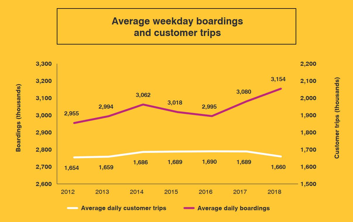
Ridership is reported on the basis of trips, and is a surrogate for revenue because the average fare per trip does not change much unless the tariff is restructured. On this basis, 2018 was not a good year even though boardings were going up. This gave the impression that the TTC was losing riders when in fact they were riding the system more, but paying fewer fares. The latter part of 2018 probably reflects the introduction of the two-hour transfer.
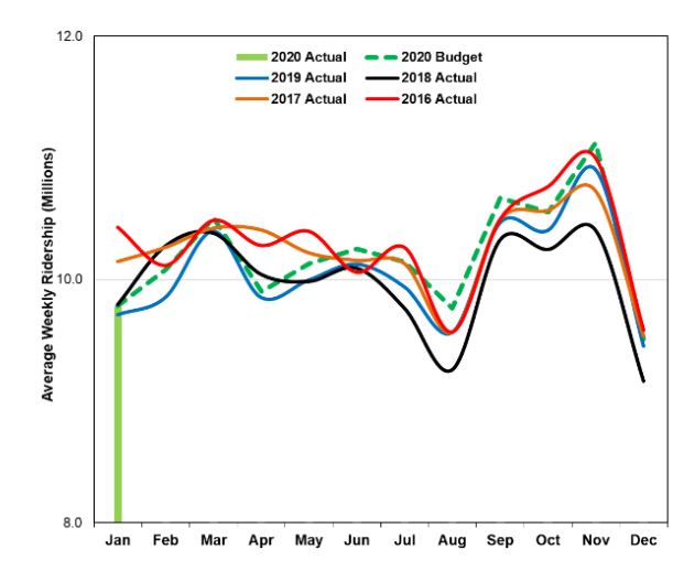
Note also that the chart above is on a daily basis while the one below is weekly, and the scales are therefore different.
When the TTC reports “ridership” for individual routes, this is necessarily based on “boardings”, not trips. Also, for rapid transit, the TTC does not count transfers between routes as new boardings. A ride from Don Mills to Yonge to Bloor to Broadview is one boarding even though it uses three separate routes. Demand for individual portions of the network is calculated from field observations.
On-Time Performance
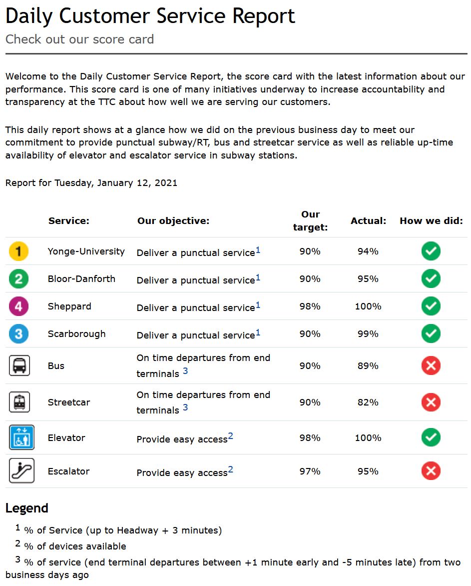
The TTC publishes a daily summary of its service online. This gives system average values for one day, but there are important caveats:
- Rapid transit line service quality is measured as trains that run within ±3 minutes of the scheduled headway (the time between trains). It is actually physically difficult except in extreme circumstances for trains to miss this target. Even for a major delay, only the “gap train” is outside of the acceptable range, with a parade following close behind.
- Surface routes are measured only at their termini where they are expected to depart no more than 1 minute early or up to 5 minutes late. Uneven service is acceptable from the end of the line where almost nobody is on board. Bunching and gaps get worse as vehicles move along their route.
- There is no indication of the consitency of service over the day or over the length of the routes. There is no exception reporting.
If the TTC is able to report “on time” performance for the system as a whole, it must have these data for individual routes, but they are not published. In bygone years, the TTC published a monthly on-time departure report at the route level. It is still linked from the Customer Service page, but the target page does not exist. It was last updated in August 2018 (this link is to the Internet Archive).
In that example, it is worth noting that the majority of routes showed a red “X” as their status. They did not achieve the target of 90% of trips being “on time” within the TTC’s six-minute window. The system averages shown above also fall below that goal. These are averages implying that at the detailed level, some values fall even further below the target, but their range and variability were never reported.
The TTC publishes service delay logs monthly through the Open Data Portal. These list every reported delay, but without any summarization. For buses and streetcars, there is only a handful of codes to indicate the type of failure, while for the subway and RT, the list is extremely long. Consolidation into a meaningful format is challenging. This is an excellent example of how simply providing raw data is not the same thing as “transparency”.
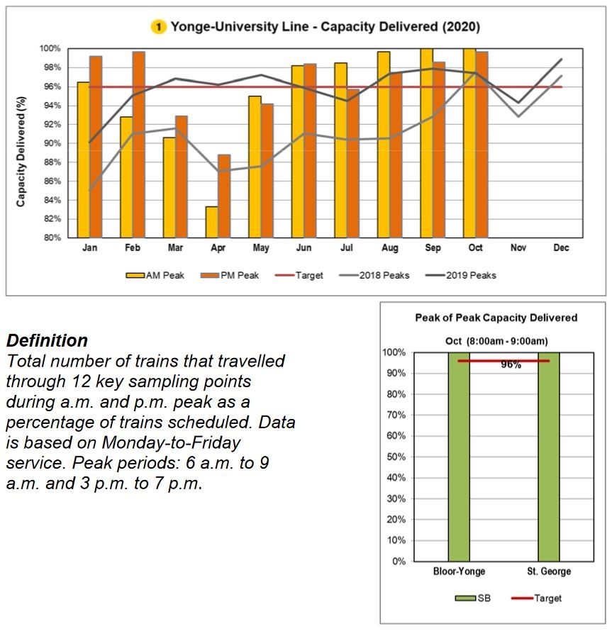
Subway On-Time Performance and Capacity
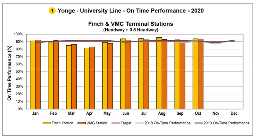
Subway on-time performance is shown in charts like this one. The scheduled service on Line 1 is every 3’30”. With a target that the headway between trains can be ± 0.5 times the scheduled value, this means that an allowable range is from ±1’45”. Trains as far apart as 5’15” or as close as 1’45” meet the target. (It is actually difficult to operate a headway below two minutes on the existing signal system at Finch Station, and even Vaughan which is in automatic train control territory is limited by terminal geometry.)
This metric has no requirement that 100 per cent of service actually operates and a constant headway of 5’15” (11.4 trains/hour) would meet the headway standard even though the scheduled service is 3’30” (17.1 trains/hour). The statistics are consolidated on a monthly basis including evenings and weekends, and there is no sense of variations in service quality or whether severe delays disproportionately affect periods of heavier demand.
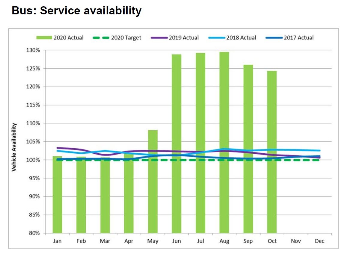
Another view presents peak period capacity. There was a big drop compared to the scheduled service in March through May because of pandemic effects on available staff to operate trains. Also, by May, the scheduled service level had been reduced, and so the target of 96% of service delivered was against a lower base. The chart does not show the actual capacity operated, nor does it show day-to-day variations.
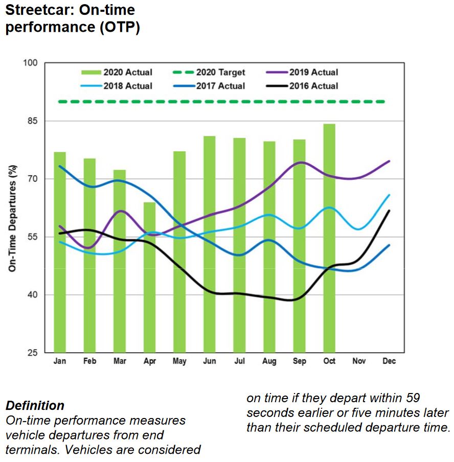
Surface Route On-Time Performance
For the surface network, on-time performance is measured only at terminals, and it is relative to the schedule, not to the headway between buses and streetcars.
For streetcars, OTP numbers have been improving since early 2019. Partly this is due to extra scheduled running time to deal with traffic, and more recently from the drop in road traffic and passenger demand in the pandemic era.
For the bus network, the situation is similar. Note that the vertical scale is not the same in the two charts.
Neither mode hits the 90 per cent “on time” target, and these values are averages over all time periods for each month. There is no indication of the hour-by-hour or day-by-day variation, but an average of 85 percent implies that there are values both above and below that level. This is the variation that riders experience, and it is compounded by the fact that most riders do not board at terminals where headways are measured and, possibly, managed.
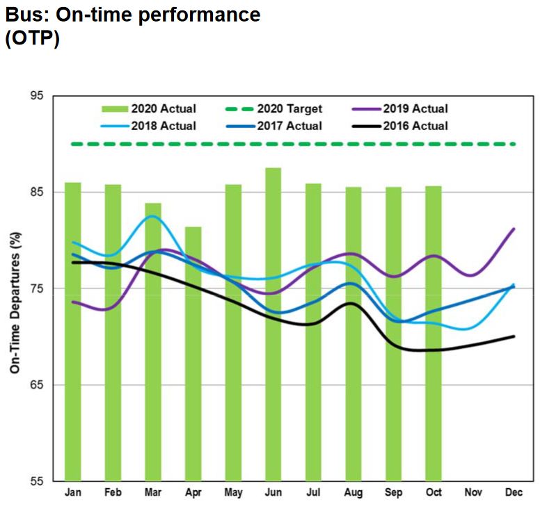
A common observation in many cities’ reviews of service quality is that for frequent service riders do not care about the schedule, only about regularity. By contrast, the TTC’s attitude is that if the service is on time at terminals, the rest of the route will look after itself, as will the headways. Leaving aside the failure to hit their target at terminals, the most cursory review of any route shows that small gaps leaving terminals quickly grow to large ones. None of this is reported nor analyzed.
Headway reliability should be measured for surface routes with on-time metrics reserved for periods of infrequent service (headways greater than 15 minutes). The metric should focus on large and small gaps between vehicles, not on overall average values, and should present a rider’s-eye view of service quality.
Among the metrics the TTC should consider are:
- Counts of “big gaps”. This is part of Chicago’s reporting scheme. It does not matter if there are 12 buses per hour if they show up in packs of three. Chicago defines a big gap as 15 minutes or more.
- Counts of small headways. Again this is a Chicago idea where headways under 1 minute indicate bunching.
- Excess wait time. New York City measures extra rider-minutes caused by gaps wider than the scheduled headway. For example, if the headway should be 4 minutes but the gap is actually 6, then the average demand is multiplied by 2 minutes to determine the penalty caused by uneven service. This adjusts automatically for varying demand and service levels, and avoids the problem of counting all buses on a route, not just those that are in gaps.
- Crowding problems should be reported as a percentage of trips by route, time-of-day and location, and this should be cross-referenced to headway reliability. Average loads measured over a peak hour are meaningless if some vehicles are very busy and others are nearly empty.
In a future article, I will review what some of these metrics might reveal based on TTC data.
Three decades ago, before the introduction of vehicle tracking technology, such detailed reporting would be impractical because much of the data would be collected and assembled by hand. Today, with GPS-based vehicle location and automatic passenger counters, not to mention data from fare collection machines, this is not a technical challenge. What is needed is the will to look more closely than traditional metrics at what is going on.
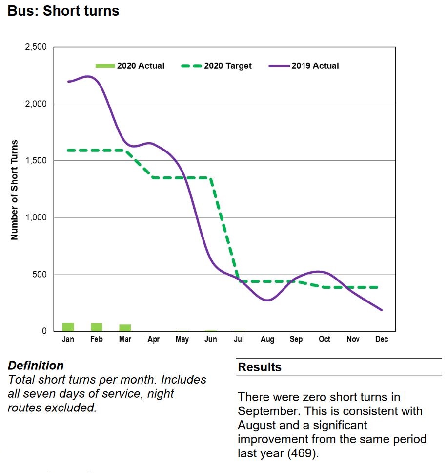
The Mythology of Short Turns
Short turns are a technique of service regulation by putting vehicles back on time by turning them “short” of their intended terminus. They are a long-standing issue for riders and for the politicians to whom they complain.
This practice was affected by aspects of what might be described as “TTC culture” including:
- Drivers hoping for a long break would deliberately drive slowly in the hopes that they would be short-turned. There was rarely any monitoring of or penalty for this type of behaviour.
- Some route supervisors would aggressively short turn vehicles “on spec” even though they might not actually need the extra time.
- Some drivers would simply short turn themselves.
From an operational point of view, the common claim was and is that if only there were longer scheduled travel times, vehicles would never fall late except under the most unusual conditions. Scheduled times have been extended on many routes under the rubric of “improved reliability”. This often has little actual cost as all that changes is the scheduled speed and headway, not the number of vehicles on a route.
In response to political demands, management worked to drive down the number of short turns. There is a widely-rumoured but unacknowledged practice that short turns are banned, or at least strongly discouraged. A problem this can bring is that conditions that cry out for short turns are not addressed and service degrades because it is not managed to optimize vehicle spacing.
This produces two operational problems:
- The unwritten understanding that short turns should be avoided causes route supervisors to leave vehicles running out their trips rather than short-turning to fill gaps and space service.
- With so much extra scheduled travel time, long layovers at terminals are common, in some cases extravagantly so to the point that vehicle congestion is a major problem at some locations.
These practices affect service quality, and waste vehicles and drivers, but the short turn stats earn management a gold star.
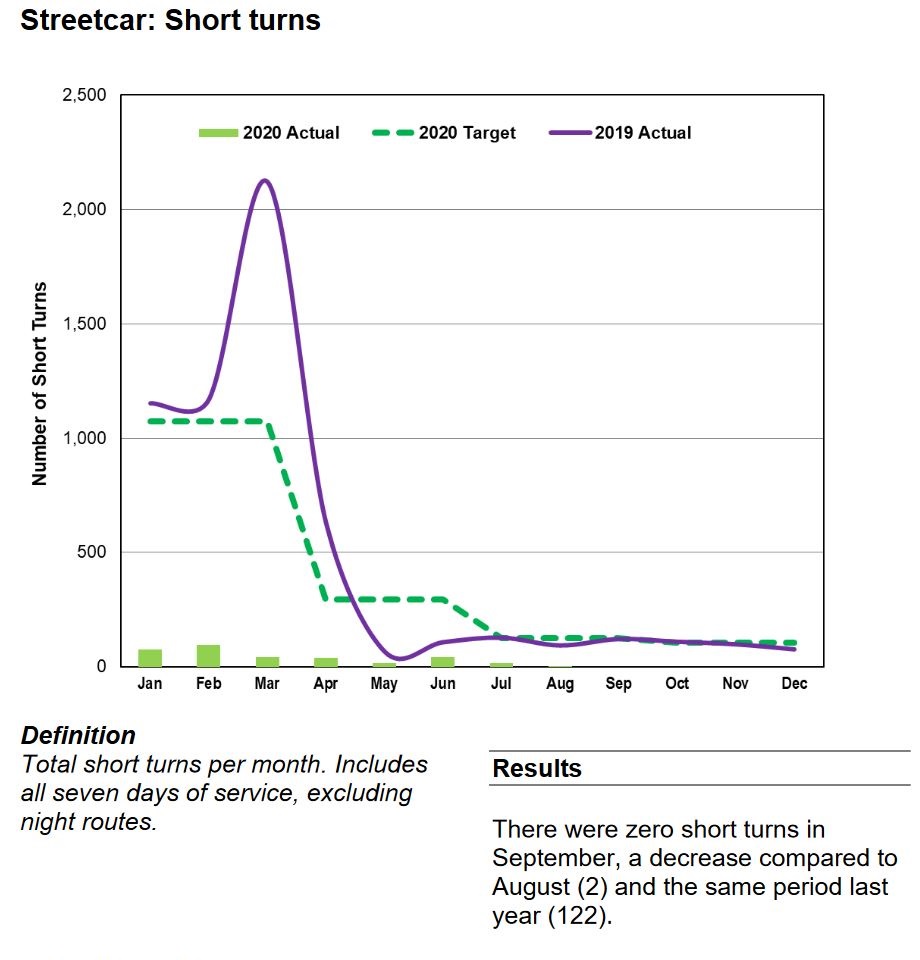
In the November 2020 CEO’s Report, management, in effect, declared victory over short turns by reporting that their number had dropped to zero in recent months and they would no longer include this metric in the report. However, as someone who regularly looks at detailed vehicle tracking data, I can assure readers that short turns still exist albeit not at historic levels. To claim that the practice is vanquished is self-congratulatory nonsense.
Vehicle Reliability
The CEO’s Report includes mean distance between failures (MDBF) values for each transit mode, with a subdivision of the bus and subway fleets into technologically different sets of vehicles.
Reliability metrics for vehicles fall into a few categories:
- MDBF values with a “failure” defined as one that causes a service delay of five minutes or more for rail modes, or a “chargeable mechanical road call”.
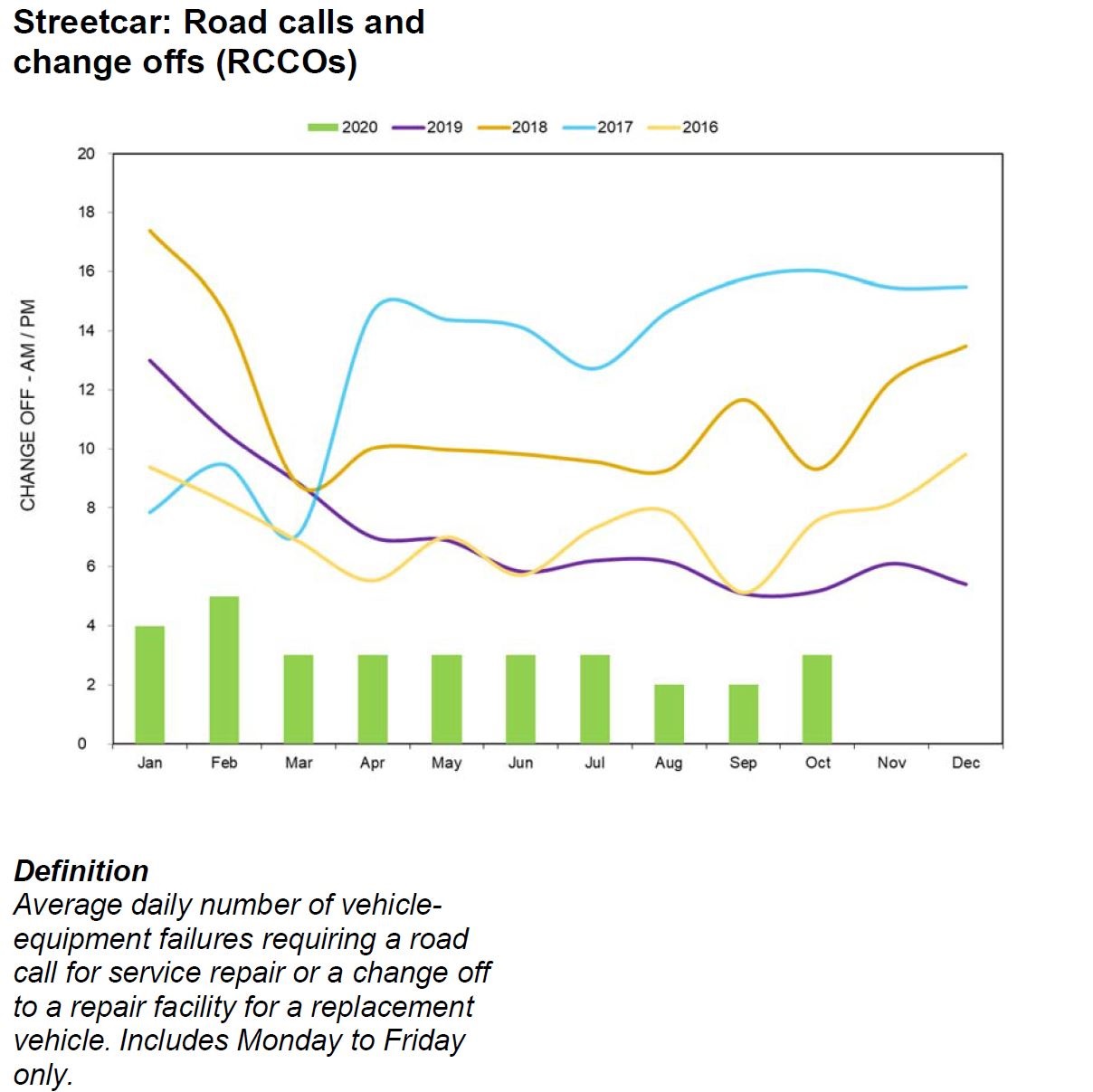
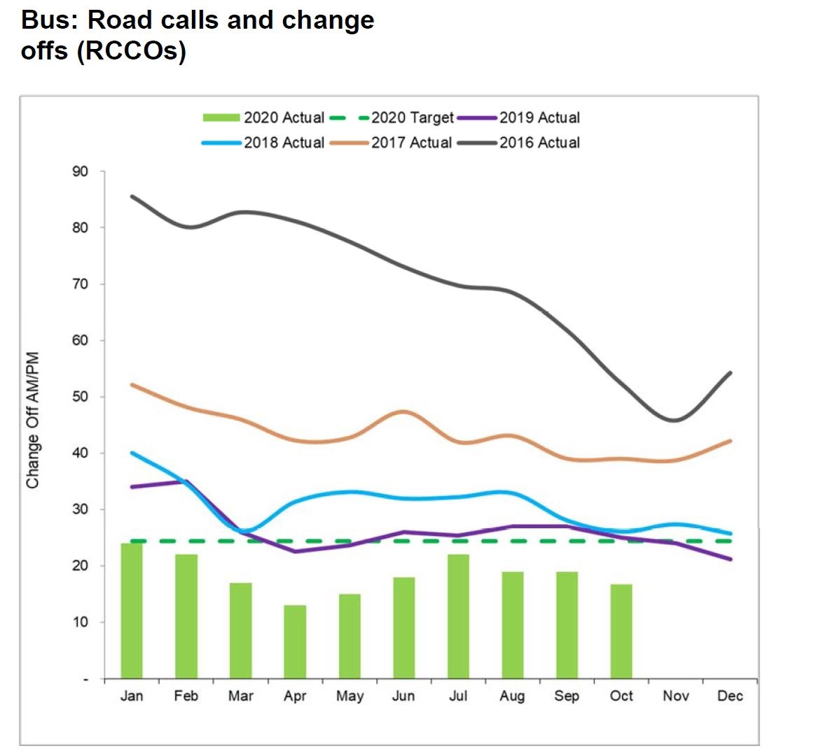
- Road calls and change offs (RCCO): How many times does a vehicle fail in service requiring service call and replacement with another vehicle.
- Percentage of scheduled service operated.
For some reason, the technical reasons behind failures, especially for rail vehicles, are explained in excruciating detail.
The passenger door-related incident was a result of a loose master cylinder arm jam nut. The car had been in revenue service for 130 days with no issues on the door set. The master cylinder arm jam nut has been tightened to specifications and the doors cycle tested with positive results.
CEO’s Report, November 2020, at p. 40
We learn about faulty shims, loose nuts and malfunctioning locks without any sense of what this represents for overall reliability and trends.
The real issue for any Board of Directors is not the minutiae of their operation, but whether there are emerging patterns and problems that could affect future operations, and how management plans to address them.
Service-related reliability values do not reveal problems that occur or are detected when vehicles are not in service. A bus that never gets out of the garage never fails in service, but it does not provide any service either.
Preventative maintenance is important too, although it is not directly visible in the statistics. An incipient failure might not interrupt service because it is caught in advance, but this type of fault brings ongoing inspection and maintenance costs that might be trimmed in “efficiency” reviews.
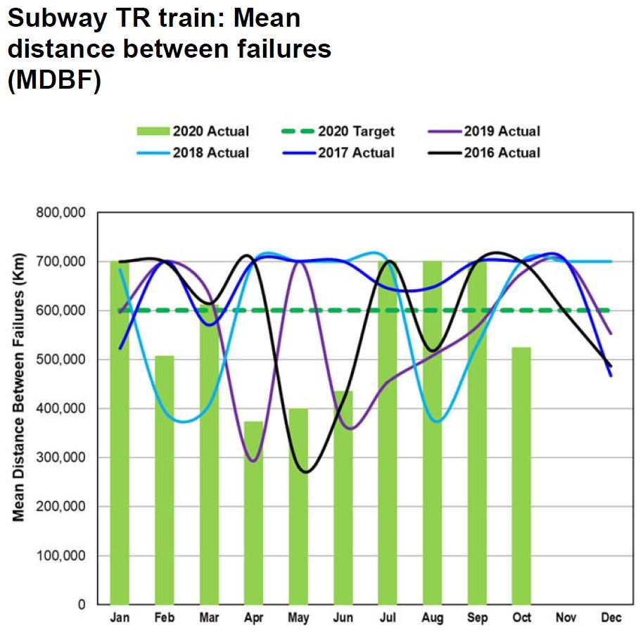
Mean Distance Between Failure (MDBF)
For rail modes, a “failure” is defined as one that causes a service delay of five minutes or more. For buses, it is a “chargeable mechanical road call”, presumably where the a bus actually ceased to work on its own, as opposed to an external factor such as a collision that required its replacement.
Reported MDBF values have several problems including:
- Many charts are artificially capped at a target level rather than showing how much better reliability might be and how the values vary from month to month.
- Month-by-month values are constant rather than varying. This is simply not credible data.
- No data is plotted on some charts for prior years.
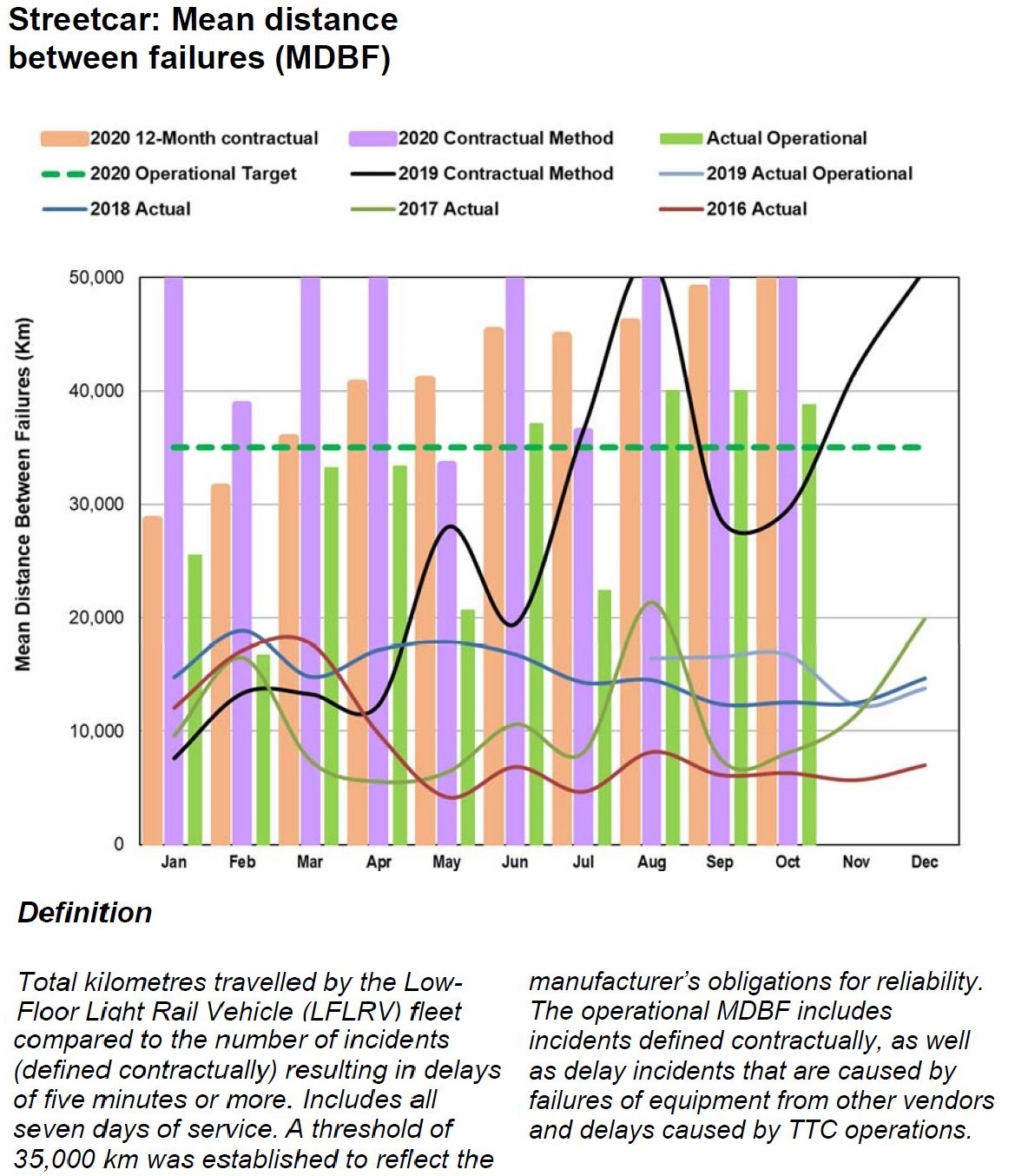
In the case of the new streetcars, there are two separate standards for counting incidents against the MDBF value and target. Some types of failures are still subject to claims against the manufacturer, but not all. Separate stats are maintained so that contractual targets can be tracked separately from general vehicle reliability trends. The chart is capped at 50,000 km although recent values clearly top this value.
What is not clear from this chart is the reliability of the fleet as a whole as opposed to those cars which are actually in service. This is related to fleet availability which is discussed below.
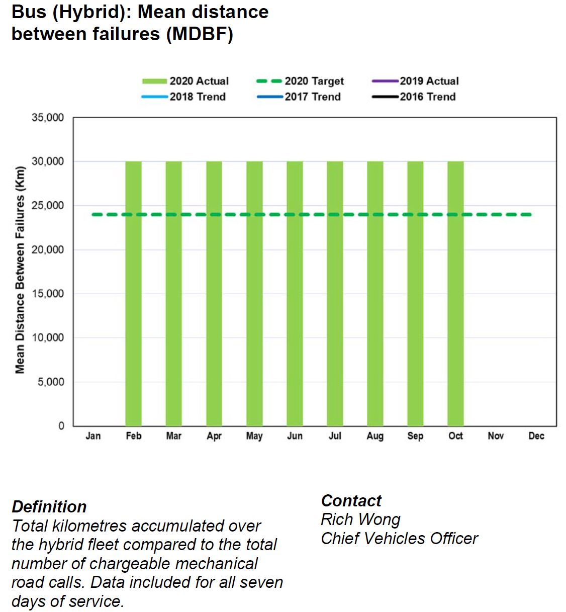
The charts of bus reliability are meaningless because they show a constant value (e.g. 30,000 km for hybrid) rather than the true month-to-month variation, and no data for previous years is actually plotted although they are included in the legend. Previous CEO’s reports have included this information, but it “fell off” the charts for no apparent reason.
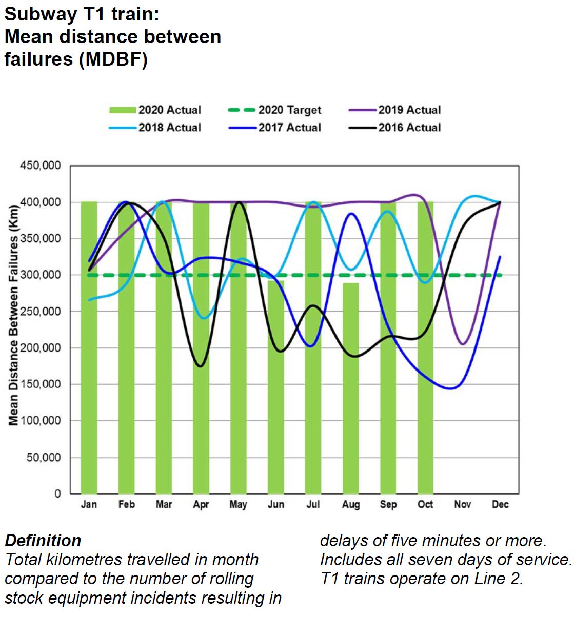
For the T1 fleet (Line 2), the MDBF plotted has clearly been capped at 400,000 km rather than showing the actual variation. An unchanging value is not credible particularly considering how much the values in prior years gyrate.
For the TR fleet (Lines 1 and 3), there is the same problem that MDBF values are artificially capped. We know from prior CEO’s Reports that higher values have actually been shown.
The problem lies in the comparative rarity of failures on the subway fleet. Proportionately, the value of “n” changes a lot each month causing wide swings in MDBF values. The trend is more important than the month-by-month numbers, but that is hidden here.
Road Calls and Change Offs (RCCO)
The RCCO value is a count as opposed to a failure rate, with the target level set relative to the total scheduled service. The target is difficult to display in this chart because it varies with historical levels of service.
The reduction in failure counts is a direct result of the retirement of the older CLRV and ALRV fleets which completed at the end of 2019.
For the bus fleet, a reduced vehicle replacement cycle of 12 rather than 18 years led to retirement of the oldest and least reliable vehicles. This is reflected in reduced failure counts. It is misleading to show the target value as a straight line because this value is based on scheduled service and will vary from month to month.
Fleet Availability for Service
The service availability target is set to match scheduled service, but this hides the fact that those schedules are designed within the constraints of the expected fleet. This is almost like firing an arrow at a blank target and then painting the bull’s eye around where it landed.
The number of vehicles represented by 100% of scheduled service varies from time to time. Hitting this level today might not represent the same achievement as an earlier era with more scheduled service.
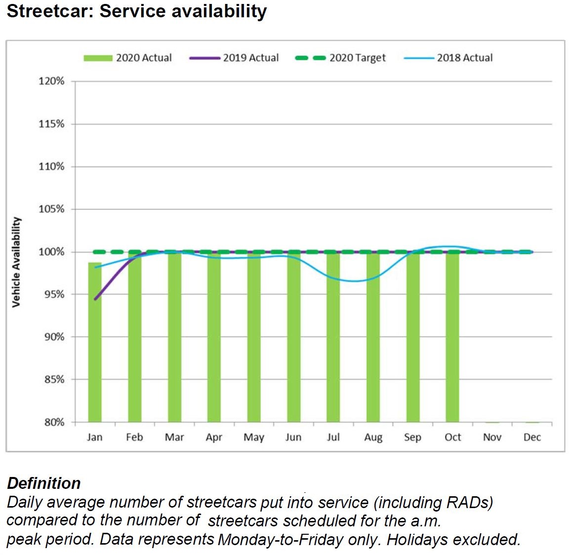
The percentage of scheduled service operated basically says “you scheduled 1000 buses and we ran 1000 buses”. That yields a 100% rating, but it does not reveal important information about the fleet that can be compared with other transit systems.
The allocation of any transit fleet is typically broken down into the following categories:
- Service requirements including scheduled extras (e.g. “Run as Directed” vehicles).
- Service spares: vehicles available for use as change-offs in case of in-service failures, and also for unscheduled extra service (emergencies and special events).
- Maintenance spares: vehicles that are undergoing routine inspection and preventative maintenance.
- Capital maintenance spares: vehicles that are cycling through major rebuilds such as the seven-year overhaul of buses or the various major overhaul programs for subway cars.
- Warranty spares: vehicles that are still within their warranty period and are cycling through retrofits to correct defects.
- Out of service vehicles awaiting retirement.
The TTC only reports the first of this group, and the number is substantially lower than the overall fleet, especially for buses. Indeed, the scheduled service level might be artificially constrained to reflect actual availability and reliability as is now the case with the streetcars.
When transit systems report the ratio of spares to scheduled service, they include all of these categories. Having a lot of spares represents a capital investment, and could indicate vehicle reliability problems where the “problem” vehicles simply never see active service.
Infrastructure Reliability
As for infrastructure, there is little reporting on failures. We know about escalators, elevators and fare machines, but not about signals, power systems, track and structures.
- How often do signals systems fail?
- How does this vary by line and signalling technology?
- Is there a measurable improvement from the new Automatic Train Control (ATC) system?
- How often are there track failures?
- Do they result only in slow orders, or do they block service?
- How often do streetcars derail, and why?
- How reliable is the power supply for streetcar and subway routes, and why does it fail?
- How often do fires, or at least reports of smoke, occur?
- How severely do these disrupt service?
- Are they caused by deteriorating infrastructure or other factors?
- What is the overall condition of subway tunnels and trackbeds?
- Are major overhauls required that will severely affect service through extended shutdowns?
- What pro-active maintenance occurs to reduce infrastructure failures?
The CEO’s Report is silent on these issues.

I note with great interest your comments of increasing run times end to end so that everyone leaves on time (they euphemistically call it recovery time). 84 Sheppard West is a classic example with the unbalanced schedule of 5 – then 10 then 5 then 10 etc. during the afternoon rush. It is not uncommon to see an 84A pull in to the station to offload while the 84C AND the 84A AND 84D in front of this vehicle are still in the station – nice job… drive 35 minutes (arguably) and get a 25+ break at the other end – they are having problems finding room to keep all the buses in the station area at times. All that dead time could make one heck of a service improvement don’t you think?
Steve: Yes, this is a large and growing problem. I was waiting for schedules to return to “normal” before critiquing them, but plan to look at the issue in more detail in coming months.
LikeLike
On measuring TTC operations, TransSee has launch a series of charts that shows the operations details of the TTC and many other transit agencies.
Today I added the Performance chart which shows things like the average headway and the average wait time experienced by a rides for each stop on a branch as well the speed and schedule adherence. You can customize the range covered in a variety of ways, including a date range and time of day.
There is the Operating chart, which should be familiar to people who read this blog, which shows vehicles as they go back and forth on their route letting you easily see bunching, delays and short turns.
There are also scatter charts of gaps for a stop and link times between stops.
These charts require TransSee premium, but they are free for streetcar routes (even when operated by buses).
Steve: One can only wonder why the TTC does not have this sort of analytical tool available already.
LikeLike
If the headway is supposed to be 5 minutes and 1 bus leaves at the hour and 11 buses leave at 59 after, the average headway is 5 minutes.
Steve: Precisely. And most of the buses ar closer together than the scheduled spacing which, in some calculations is a “good thing” even though the result is obviously terrible service.
LikeLike
The issue with padded run times and bunching at the terminals is that management’s next move will likely enforce on time performance at stops throughout the route instead of at terminal departure point. This is what YRT does and the buses run painfully slow along the route to be on time or late. I’d rather have occasional delays in my commute than a permanent scheduled increase in travel time. Just imagine 7 Bathurst, with buses often running 7-15 minutes ahead of schedule along the route, now having to stay on time. Assume a 7 to 15 minutes x 2 trips/day x 5 days/week x 49 days/year = 57 to 122 hours of extra time on the bus a year that I could better spend elsewhere.
Steve, hopefully you can keep the TTC in check because its too easy to “look good” by achieving good on time performance (pad schedule), buses/hr (blame lack of funding on less headways), and ridership growth (normal population growth, but they won’t compare ridership growth rate vs population growth rate in area). It would be good if they also focused on speed in “fast & reliable” by using a less easy to manipulate metric like automobile (or bike) to scheduled route speed as that should be a main factor in a rider’s decision to use an alternative method of transportation and influence ridership statistics.
Steve: The situation in York Region is the result of Rick Leary’s tenure there, and he is now doing the same thing to TTC routes. Rathe than actually manage service, his approach is to build schedules so that the stats will always look good. The amount of padding is hidden from most riders because they do not see the pile-up of vehicles at terminals, but if they go to mid-route timepoints, it will be very obvious, very fast.
LikeLike
Perhaps it is time to look to technology for a solution. With GPS in one form or another the TTC can “see” where all the buses are all the time. And anyone you has used Google Maps know that traffic flow data can be collected and projected for the routes. Combine the data to build reasonable route schedules and give the driver a reasonable (±2 minutes) margin of error for any and all stops on his route. Some routes this system should work well on. Others, with high demand, might need the driver to signal HQ that he has a full bus and will run to the station non-stop (been on a few crowded one pre-C that did this (88A&B) trick) and this could trigger the trailing buses to close the gap, or slide a RAD bus in the gap.
Steve: Actually, the detailed profile of speeds is available from the TTC’s own tracking data. I have plotted this sort of thing many times on this site. The problem is that in moves to drive down the short turn stats, the scheduled times are padded out to cover close to 100% of observed travel times. On some routes, the range of values can be quite wide and if schedules cover the worst case many vehicles will have a lot of spare time. “Sliding in” a RAD bus and other tactics require actually managing the service, something that demonstrably does not happen all of the time when one looks at operating problems such as persistent bunching.
Other systems run buses and have their own KPI’s – I am hoping Steve will lay out some of these other systems best practices for examination and discussion. We all know the TTC’s current system is inadequate (the above article lays that out clearly – Kudos Steve) but we need to find solutions that will fix the problem. Importing a York Region solution that will be just as ineffective is not the answer. Mr. Leary will obviously turn to what has worked for him in the past, even if it is flawed. I am hoping Steve will be presenting us, in future articles, some options from places where the buses run on time, Italy? – no that was trains… Then we can advocate to the City council and TTC board to adopt these effective KPI’s to make the TTC the better way.
LikeLike
Great article, but the description of weightings given by the Excess Wait Time (EWT) metric could be improved.
EWT measures the average extra waiting time that customers experience due to irregular headways. It is calculated with the assumption that customers do not look at timetables when planning their trip, which means the time they arrive at the stop is not related to when the bus comes. In this environment, longer headway = more people at the stop when the bus arrives. Usually it is assumed 1 person arrives at the stop every minute.
The formula is:
EWT = Avg. wait time – Expected wait time
or sum(squared headways)/2/(Time period) – (Scheduled headway)/2
For example, on a route with a 5 minute headway, the expected waiting time is 2.5 minutes (5/2).
If the actual headways within a 10 minute period are 5 min and 5 min, 5 people are at the stop when each bus arrives.
Average wait time = ((5+4+3+2+1) + (5+4+3+2+1))/10 = 2.5 minutes, so EWT = 0.
However, if the actual headways are 8 minutes followed by 2 minutes, 8 people will get on the first bus, and two on the second.
Average wait time = ((8+7+6+5+4+3+2+1) + (2+1))/10 = 3.9 minutes, so EWT = 3.9-2.5 = 1.4 minutes.
Steve: I didn’t want to get to deeply into the weeds of the math in this article, but will leave the behaviour of various metric schemes to a future one. The fact that accumulated wait times go up as the square of headway is something I wrestled with a few years ago when trying to construct this type of measure. The “excess” concept is important because it generates a penalty in the metric for irregular service without giving a “bonus” for the short headways after a gap.
In your example, by the way, you calculate the excess wait time per passenger. This must be multiplied by the number of passengers (the demand level) to weight the effect of irregular service depending on when and where it occurs.
LikeLike