
In many articles over several years, I have written about the quality of transit service in Toronto and the degree to which it varies from the sometimes sunny presentations by TTC management. Since the onset of the Covid-19 pandemic and heading into an extremely difficult budget year for 2021, understanding service from a rider’s perspective has become more important than ever to retain and rebuild demand on the transit system.
On the budget side, there are already harbingers of cuts to come. The TTC proposes to remove poor performing routes from the network and to trim hours of service on some routes. This includes the 14x Downtown Express services with their notoriously high cost/passenger and a few routes’ late evening operations. This is really small-scale stuff especially considering that the saving from cancelled express routes is already in place since Spring 2020.
The larger problem Toronto will face will be to decide what deeper trimming might look like, how candidates for cuts might be chosen, and how to evaluate the operation of what remains. There are already problems with erratic service that accentuates crowding problems coupled with an underutilized fleet of transit vehicles. Conversely, advocates for service retention and impovement, including, one hopes, TTC management, need solid ground to support calls for specific improvements and to measure them when they occur.
Management reports monthly on service quality and vehicle performance, but the metrics used fall far short of telling the whole story. Recently, CEO Rick Leary mentioned to the TTC Board that these metrics will be updated. This is worthwhile to the extent that new information is actually revealed, not simply a rehash of what we have already.
This article reviews the metrics now in the CEO Report and proposes updates both to the metrics and to the standards against which they report.
Broadly the areas covered here are:
- Ridership and Trip Counts
- Budget, Scheduled and Actual Service
- On Time Performance and Service Reliability
- Service Capacity
- Vehicle Reliability and Utilization
- Infrastructure Reliability
This is a long article because it covers many topics and I wanted to put the arguments together so that the way factors interact is clear. If you want to skip all the details, at least for your first read, there are consolidated recommendations at the end of the article.
Technical note: Many of the illustrations were taken from the October 2020 CEO’s Report. Although I have enlarged them for readability, their resolution is limited by the quality of the source document.
The Tyranny of Averages
Almost all TTC performance metrics consolidate data into monthly average values and, sometimes, into annual moving averages. While this approach simplifies presentation and shows long term trends, it hides a great deal of variation that is at least as important to quality measurement as the long term view.
As I have written many times:
Passengers do not ride average buses.
Telling riders that on average buses are not full and that their arrival is within standards is meaningless to someone who waits twice or more the scheduled headway (the time between vehicles) and finds a crowded bus when one shows up. This problem existed long before the pandemic, but crowding and the effect of service cuts combine to make it a greater concern than before.
Averaging in the performance of off-peak services such as evenings and weekends with overall route behaviour masks poor quality service. Conditions during busy periods are diluted by data from trips when demand on a route is lower.
Averaging performance across the network dilutes the behaviour on busy routes even further by including vehicles running with less crowding and better reliability.
Service Standards, On-Time Performance, Reliability and Short Turns
Service Standards
Some measurements are complicated by standards that give a wide latitude for what might be called “acceptable failure”.
The Board-approved Service Standards include the following for surface routes:
- Departures: “To be considered on-time, a vehicle must leave its origin timepoint between 1 minute early and 5 minutes late. TTC’s goal is to have 90% of all trips depart on-time.”
- Arrivals: “To be considered on-time, a vehicle must arrive at its terminal timepoint between 1 minute early and 5 minutes late. TTC’s goal is to have 60% of all trips arrive on-time.”
- Where scheduled headways are greater than 10 minutes: “Service is considered to be on time if it is no more than one minute early and no more than five minutes late. TTC’s goal is to have 60% of all trips meet the on-time performance standard.”
- “For services that operate between five and ten minutes, passengers do not rely on printed schedules, but expect vehicles to arrive at prescribed headways. Therefore, on-time performance for frequent service is measured by how well actual headways correlate to scheduled headway intervals. Trips are monitored at a location based on arrival time, without regard to whether the trip that arrived was scheduled for that time slot. The vehicle is considered on-time when the headway deviation is less than 50% of the scheduled headway. […] TTC’s goal is to have 60% of all trips operated within +-50% of the scheduled headway over the entire service day.” [Emphasis added]
- “For services that operate better than five minutes, the vehicle is considered on-time when the headway deviation is less than 75% of the scheduled headway. […] TTC’s goal is to have 60% of all trips operated within +-75% of the scheduled headway over the entire service day.”
It is particularly ironic that the Service Standards clearly state that headways are more important than being “on time” to riders on frequent services, and yet the TTC dwells incessantly on the latter measure. They falsely assume that if service is “on time” at terminals, this will guarantee good service along the route.
In fact, vehicles on frequent routes can be running “on time” while they are in pairs or even triplets given the six-minute window relative to scheduled departures. Conversely, every vehicle could be late or early, but evenly spaced, and riders would not notice nor care.
Even worse, the bunching and gaps worsen along a route as vehicles catch up to each other and gaps between the bunches widens. However, the TTC only measures “on time” performance for terminal departures.
The TTC does not report on terminal arrivals, and this number would probably fall well below the standard because many schedules are padded. The extra time ensures that even with the worst traffic and the least aggressive drivers, buses and streetcars will not fall late and need to be short-turned. Terminals with multiple buses or streetcars laying over awaiting their scheduled departure are a symptom of this problem.
This is a case where one standard, “on time” arrival, conflicts with the practice of reducing or eliminating short turns.
In a recent article, I wrote about the degree to which a few routes (501 Queen, 506 Carlton Bus and 35 Jane) fail to meet these standards. The results were disappointing, but there is a much wider problem.
The most stringent goal is that service depart from terminals within a six-minute window of the scheduled time. This is to be achieved for 90% of trips. This metric has problems in the current environment where there can be a large difference between the scheduled and actual service due to selective cancellation of trips and the operation of unscheduled extras. “On time” is a meaningless concept when the schedule is at best a guide to what might operate from day-to-day.
Even with “normal” schedules, the frequency of many TTC services is such that a six minute window allows vehicles to be bunched, but officially “on time”.
Beyond terminal departures, the standards aim for 60% adherence over the course of the entire day. Leaving 40% of the service beyond the range of standards coupled with all-day averaging can lead to extremely erratic service during certain periods that is offset by relatively better performance at other times.
Averaged across the entire system and with monthly reporting, there is a wide range for service quality on individual routes and at specific times to be completely outside of the standards but for this to be drowned in a sea of “acceptable” numbers from other routes.
Reporting on Service Quality
There is a Daily Customer Service Report listing on time stats for the rapid transit lines and for the bus and streetcar systems, but these are all day, all network averages. As noted above, “on time” is a meaningless value on a system where the actual service operated does not match the schedule due to Covid-related cuts.

The TTC does not actually publish any headway reliability stats, and stopped publishing detailed terminal departure on-time stats in April 2018.

The page for these is still listed on the Customer Service page, but the link is dead.
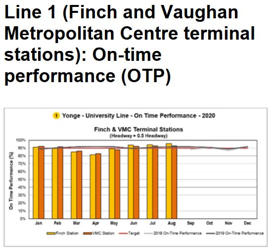
To confuse the issue, the TTC publishes charts of terminal “on time” performance for the subway routes, but this is actually defined in terms of headways, not of the actual scheduled departure times of trains. “On time” means that the headway is no more than 50% greater than scheduled. More over, these are all-day averages that do not reflect variations between different periods.
There is a large difference for Lines 1 and 2 between the OTP numbers for terminals and the capacity provided during peak periods.
Note that the way the standard is structured, one third of the service could be missing while the line was still considered to be “on time”. If trains were scheduled every 2 minutes, a 50% margin allows for a 3 minute headway. Therefore a line could advertise 30 trains/hour but only provide 20, and still be “on time”.
Alternately one train could be in a wide gap with a parade of followers. Only the gap train would be counted as exceeding the standard spacing even though the gap itself would substantially reduce the route’s capacity and could cause severe crowding.
The standard sounds good in theory, but it gives little indication of the possible gulf between service as advertised and as operated.


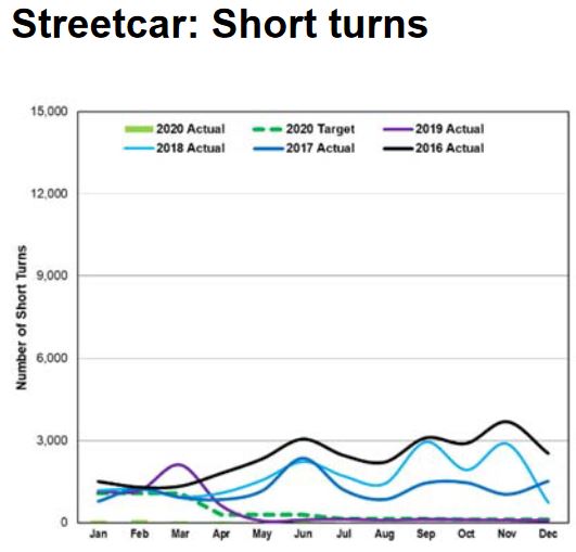
Short Turns
Short turns (a vehicle that advertises one destination but then turns back before it gets there) are the bane of riders particularly on the outer ends of routes where a turned-back vehicle is more likely to interrupt their trip.
They are not a new problem. This cartoon appeared in the Ward 9 News decades ago. Ward 9 used to be in The Beach in pre-amalgamation days, and at the time the streetcar would have been a PCC, two generations of cars before the current vehicles. (This was also a simpler time when the idea of an armed takeover of a streetcar did not have the same implications as it would today.)

Short turns have been a focus of political complaints about service quality for as long as I can recall, and I have been at the transit advocacy game for nearly half a century. The problem, however, is that they are only one aspect of more complex problems with service.
TTC management reports with some pride on driving the number of short turns down to almost zero. This has been the case for streetcars particularly since April 2019 when the number fell to zero and stayed there ever since. For buses, although not zero, the number has been very low over roughly the same period.
That pride could be misplaced because there are legitimate cases where short turns are essential to restoring regular headways. There is no point in a parade of cars travelling to their terminal in a block just so that management can report there were no short turns. The gap outbound is the same, and even worse the gap reflects back on the inbound service.
One might think, looking at some vehicle tracking data, that TTC route supervisors have forgotten how to manage service with short turns. However, the tracking data shows that there are more short turns than are reported suggesting that this is a political statistic, not reflective of actual operations.
There is nothing wrong with short turns properly used. They are essential for recovery from major delays. Minor delays can and should be absorbed by terminal recovery times. A short turn should not be a reward for a driver who deliberately operates slowly to get a turnback and a siesta at riders’ expense.
The TTC has been adjusting schedules to more closely match actual conditions typically by stretching headways to give vehicles more time to make their trips. For example, a route might have operated every 6 minutes on a one hour round trip using ten vehicles. If the trip time is extended to 70 minutes but no vehicles are added, the headway goes up to 7 minutes and the scheduled service goes down by about 17%. More vehicles may reach their terminals, but there is less service on most of the route.
On many routes, the travel time end-to-end can vary quite a bit due to road conditions, passenger loads and driver behaviour. Combined with extra running time this leads to buses and streetcars having long layovers at terminals simply to await their scheduled departures.
As we know from both the terminal-based “on-time” stats and many reviews of service quality, ragged service from terminals is common even with the expanded travel times and layovers and with the lower traffic congestion of the Covid era.
For each mode, the target for short turns is based on the past year’s experience although the numbers reported now are so low that the target is close to zero. This is meaningless in the context of real-world operations where major delays occur often enough to require service adjustments with short turns.


Ridership and Trip Counts
Total ridership as measured by fares received has been the standard by which the TTC (and many other agencies) measured their year-over-year success.

This outlook works when fare revenue and “rides” move in lock step, but not when the meaning of “fare” and “ride” drift apart.
The link between rides and revenue was also stretched by the increasing usage of passes that became the dominant fare medium long ago, followed by the two-hour transfer, effectively a limited-time pass. These both eliminated the arcane rules about when and where transfers might be valid, and riders could simply travel for the length of time their pass was valid. Statistical gymnastics were required to reconcile the old way of counting rides in order to provide valid year-to-year comparisons.
Major network changes can affect the cost side of a budget with considerably less effect on the revenue side. A prime example was the Vaughan subway extension which increased TTC costs by about $30 million annually, but did not add proportionately more riders as most of those on the new subway were already using the TTC. They received a more attractive journey, but that was a gift with no marginal cost to riders.
For many years, TTC ridership grew, but by a declining amount. All that mattered, however, was that this year’s numbers were higher than last year’s. Eventually that model failed, but by that time the factors that contributed to a declining rate of growth were already entrenched, notably the tactic of squeezing as many riders into as few vehicles as possible.
First the peak period ran out of room for growth, and later the off-peak was bulging.
The pandemic’s arrival has completely changed the way that the TTC looks at ridership. To their credit, they now subdivide ridership reports by week and, in some cases by day, to monitor the system’s recovery, and they separate stats for the three major modes: subways, buses and streetcars.
This is a much more granular view of the system than we have seen in years past, and it shows how the TTC is also tracking crowding on its bus network where all vehicles have automatic passenger counters (APCs).


Breaking the system by mode loosely divides services that are core-oriented, central city and suburban in their focus. The big surprise through past months was the quick rebound of the bus network because it serves so many trips that are not easily replaced by work-at-home arrangements, and are taken by people for whom driving to work is not a cost-effective alternative to transit.
However, these numbers still hide important details. They do not show a breakdown of routes with strong demand, nor do they identify time-of-day issues with crowding. One definite change is that the conventional “peaks” have largely disappeared, and demand is spread out over more hours at a lower level than before. This actually means that a given number of passengers can be carried with less crowding than would occur if the demand were concentrated into a few hours per day.
The table above shows that service is running at a fairly high percentage of pre-Covid levels overall, but this masks major differences by route and time of day. Particularly hard-hit were routes that had a mixture of local and express services, but lost their express buses.
On weekdays, many of these routes gained “trippers” that were in service for extended periods replacing at least some of the express service. However, on weekends, the lost express buses could represent a substantial portion of a route’s capacity, but they were not replaced. Even with demand at half of pre-Covid levels, crowding did not change.
The claim that only 8% of trips were at 50% of capacity or more hides the fact that many trips are counter-peak and off-peak (to the extent that peaks exist). These trips dilute the apparent severity of problems where crowding occurs.
The TTC produces “heat maps” of crowding, and these should be published regularly. Other systems have plugged their own APC data into service reports and sites including next vehicle arrival information, although this is not necessarily based on real-time, but rather historic crowding data.

Crowding maps broken down by time of day would show how well, or not, service and demand are staying in balance, and these should be regularly published just like the daily customer service report. If there are problem areas and times, management should be held to account for why they persist.
One limitation of the TTC’s “hot and cold” crowding maps is that they only flag where very high or very low ridership is seen sometime over a long period of the day. A more granular view is needed.
A related issue is the question of service regularity and its effect on crowding. The TTC does not subdivide its counts to indicate the range of loads on vehicles at a point, only the total numbers and the fact that some service was crowded. It is a big difference for a “hot spot” to represent buses that are all full versus one where vehicles have widely varying loads.
“Boardings”, used in the chart of ridership above, refers to one rider getting on one vehicle whether they pay a fare or transfer. Another planning term for this is “unlinked trips” where each segment of a rider’s journey counts separately. The concept of a “trip” gets messy when one considers “trip chaining” or the assembly of several short journeys into one circuit. These might have cost separate fares because of transfer rules a few years ago, but now can be accomplished on a single fare.
To some extent, boardings can be counted by Presto taps, at least in locations where riders must (or should) tap their card as they board a vehicle or enter a station. Transfers within a paid area do not include a tap, but overall, tap counts are a surrogate for tracking boardings.


The cost of serving a passenger boarding let alone a complete trip varies across the system because different boardings consume different amounts of service. For example, if a bus route is only two kilometres long, the cost of one boarding is limited by the fact that the passenger cannot ride very far. Conversely, a long route will have a combination of short-haul and long-haul riders. Long-haul riders tend to accumulate driving up vehicle loads and more service is needed handle them, even if the capacity is not fully used over the full round trip. Some routes have strong bi-directional demand while others run with many empty seats in the counter-peak direction.
A simplistic analysis that says route “X” carries twice as many riders as route “Y” is meaningless without knowing how far they might travel and how their trips are distributed in space and time along the route.
Route structure can affect boarding statistics depending on whether the network forces transfers (thereby creating new boardings) or not. For example, a through-routed service replacing two local ones will see a drop in total boarding counts because each rider across the break will only count for one boarding rather than two.
It can be dangerous to rank services based only on the cost per passenger or average load. There will always be routes where this cost is inherently high even if the route is well-used. Equally, buses can run with relatively light loads but with a low cost per passenger.
During a previous round of cutbacks in the Ford mayoralty, the TTC evaluated a poor performing route based on boardings/hour. However, the 2017 Service Standards adopted a more complex metric that attempts to link fare and service related gains or losses. If a proposed service change performs worse, per $100 spent or saved, than a ten per cent fare increase, it would not qualify for implementation. Ironically, this does not apply to rapid transit projects that produce much larger changes in costs and revenues.
This metric is sensitive both to the presumed elasticity (the relationship between fare and riding changes) due to fare increases, as well as the sensitivity of riders to cost vs service quality.
No single metric can express the productivity of a transit service particularly in comparison with other routes that have different characteristics.
Budget, Scheduled and Actual Service
The amount of service is budgeted and reported in vehicle hours or, in the case of rapid transit, train hours because the dominant cost variable is the wages for crews. Vehicles also incur maintenance costs but these are affected by a combination of mileage (wear and tear) as well as the calendar (regular scheduled inspections). There is also the cost of infrastructure which is affected very little by the amount of service operated, especially in the subway.
The charts below, from the October CEO’s report, show how the service actually on the street varied from the original pre-Covid budget and from the scheduled level.
The chart for buses has not been updated since May 2020 while those for streetcar and subway bring us to the end of September. This could be due to problems with tracking the use of unscheduled extra service.
Note: Current data is unavailable due a technical issue with our VISION system. We are working to resolve this issue.
CEO’s Report at p. 56


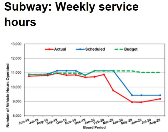
Another way to look at this is the service budget. Notable in comparing these charts and the table is that the percentage change for individual service (“actual” vs “budget”) appears to be higher in the charts than the scheduled changes shown in the table below.

Service Capacity
There is a problem with servie reporting, especially at the individual route level, relative to pre-Covid times. The TTC cites an overall figure of 15% as the cut in service, but this varies from route to route and by time of day and week. Routes that formerly had express services did not see these fully replaced, with weekends being particularly hard hit in some cases. Some routes have unscheduled extra service, but this is not tracked or reported at the system or route level. (Remarks at the recent Board meeting suggest that this is about to change.)
In a recent article about the 35 Jane bus, I compared pre- and post-Covid service levels on the corridor. In summary, the ratios of service by time period are shown in the table below. Note that this does not include any unscheduled extra service.
| 35/935 Jane Pre/Post Covid Service Ratios | Weekdays | Saturdays | Sundays |
| AM Peak M-F/Early AM S-S | 82% | 52% | 100% |
| Midday M-F/Late AM S-S | 58% | 52% | 50% |
| PM Peak M-F/Afternoon S-S | 75% | 54% | 50% |
| Early Evening | 91% | 93% | 87% |
| Late Evening | 100% | 100% | 95% |
It is meaningless to report on service quality and crowding without providing breakdowns of the level of service actually operated by route and time of day.
Bunching and gaps play havoc with useful capacity because buses running in pairs or worse tend to be unevenly loaded with the lead vehicle taking the brunt of demand. In theory, the TTC might advertise 10 buses/hour or 250 passengers’ worth at their “level 2” loading standard of 25/vehicle. However, when the service actually operates as pairs of buses 5 times/hour, there is no guarantee that the capacity of the two vehicles will be used evenly.
Moreover, the longer gap between vehicles can reinforce this uneven loading unless the drivers play “hopscotch” taking turns being the first to serve a stop. This has its own problems on branching services where the bus some riders want might skip past its mate that is serving a stop.
On the subway, service capacity is reported relative to the scheduled level of service. There are various reasons for drops below the target levels shown in these charts and these are typically explained in the text of the CEO’s report. What is not broken out is the proportion of the total lost capacity due to controllable (i.e. “own goals” by the TTC) as opposed to uncontrollable reasons such as medical emergencies.
Long term projections of route capacity depend not just on the theoretical value of train capacity multiplied by trains/hour, but on the reasonable expectation of capacity that will be achieved on a typical day. If there are other system constraints such as transfer or station capacity, and these have no headroom to be overloaded, then the usable capacity of the lines falls below the theoretical level.
When everything works, life is tolerable if not comfortable, but when things go wrong, theoretical capacity is of no use to anyone.
Even without delays caused by passengers or equipment, there are weather effects on the level of demand. Rapid transit demand projections assume that all of the theoretical capacity will be available, but in practice this would rarely be the case.
The charts below show the capacity delivered at key points in the peak periods as a percentage of scheduled capacity, not as an absolute number in trains/hour or passenger spaces. This masks changes in scheduled capacity.


Vehicle Reliability and Utilization
The TTC reports vehicle performance using three metrics:
- Mean distance between failures (MDBF): How far do vehicles travel, on average, between in-service failures.
- Road calls and change-offs (RCCO): How many times per month does a vehicle have to be repaired and, possibly, replaced while in service.
- The proportion of scheduled service, counted in vehicles, that is actually operated.
These are fairly common industry metrics, but like any schemes to monitor performance, they can hide as well as reveal information.
A number that is not included in these reports is the proportion of the fleet that is actually used on any given day. Over past years, the TTC has driven up its ratio of spare vehicles to service with the stated intent of improving pro-active maintenance and avoiding in-service failures. One much-lauded purchase of new buses was used in part to provide more spares, and only indirectly added actual service on the street.
Some vehicles, typically older ones, but also those with troublesome technologies, spend more time in the shop or in storage than they do in service. They contribute to the total fleet count, but not to service. The TTC is moving from an 18-year to a 12-year replacement cycle so that the less reliable older buses can be culled from the fleet, and this will drive up average reliability.
However, there is no regular report of the amount of service operated compared to the fleet size, nor of the proportion of vehicles that are held back either for maintenance or because they are in semi-retirement. This is a particular issue during the pandemic era when the level of scheduled service and number of vehicles required are considerably below historic levels.
A vital, but unanswered, question is how many vehicles could the TTC field if there were no constraints on the pool of drivers and budget headroom to operate them. The situation varies by mode and, in the case of the subway, there are infrastructure constraints on the amount of service possible even if trains were available.
The CEO’s report goes into some detail about the performance of vehicles, but is silent on other sources of delay such as infrastructure failures, notably track and signals. I will turn to this later in the article.
Buses
For some time, the MDBF numbers cited for the diesel and hybrid bus fleets have been rounded to 20k and 30k km respectively. There is no indication of the degree of month-to-month variation in values nor of how these values have evolved over time. For example, a longer-term view of both fleets should reveal the effects of the changing mix of younger and older vehicles. It is heartening to see that the hybrid bus numbers are so good, but the artificial cap in the values shown prevents a true comparison.


The eBus fleet (all-electric battery buses) is still in its infancy and the values shown below do not yet include one supplier, BYD, whose vehicles did not begin entering service until September.

The number of road calls has been falling over the years showing an improvement in the in-service reliability of the fleet, although this value leveled off in 2019. Some of the improvement in 2020 is due to lower utilization of the fleet during the pandemic, and it is not clear that this could be sustained as service levels return to normal.
Note that this metric does not adjust for service levels to show the ratio between scheduled service and the rate of interruptions due to vehicle failures. Both the absolute numbers and the ratio to service (preferably to vehicle hours, not peak vehicles) should be provided.

The service availability chart simply establishes that if, say, 1,600 buses are scheduled to go out each day that they actually made it out of the garage and into service. An anomaly in this metric began with the pandemic era because so many buses were operated as unscheduled extras or “RADs” (Run As Directed).
Through the summer of 2020, almost 30 per cent more buses were operated than scheduled. This was not due to an increase in overall service, but to a reduction in the scheduled service for which the RADs compensated in part.
What this chart does not show is the actual level of scheduled service, nor the proportion of buses in other states including:
- Spares available for service
- Buses in the routine inspection and maintenance pool
- Buses in the major overhaul pool
- Buses stored out of service
For many years, the standard response to calls for service improvements has been “we have no buses”. This is no longer true. Moreover, with a younger average age in the fleet, the proportion that must be kept aside for maintenance should decline releasing more vehicles for service.
Conversely, if there is a substantial pool of buses either held back for maintenance or simply dead-stored as unreliable, this too should be known. As older buses are replaced with new ones, the number available for service should rise, although that will drive up operating costs because more drivers will be needed.
The service availability chart should be revised to show the total makeup of the fleet, not just the attainment of service needs. Indeed, one might ask whether service is artificially constrained so that only the most reliable vehicles leave the garage and the need for drivers is limited.

In June 2020, the bus fleet numbered about 2,111 and with a 20 per cent allowance for spares, this would translate to a peak service of 1,759 plus 352 spares. The actual peak service before the pandemic cutbacks was 1,613 indicating that either a lot of buses that should be available for service are not, or that far more service could be operated if only the TTC had the budget headroom to do so.

Streetcars
Reliability of the streetcar fleet has improved over the years thanks both to the new Flexity cars (although they had severe teething pains) and the retirement of the aging CLRV and ALRV fleets.
In the charts below, the MDBF value is for Flexitys only. The RCCO numbers are for the entire fleet as it existed over time and show improvements as older cars retired.
MDBF reliability is stated against two sets of criteria. One measures failures chargeable to manufacturing defects (mauve bars) while the other includes failures that lie outside the supply contract (green bars).


As with the bus fleet, “service availability” can be misleading. Although 100 per cent of scheduled service is provided, this amounts to only 129 out of 204 cars. Also, as with buses, the scheduled level of service is determined by a combination of buses and the number of vehicles the equipment planners are comfortable with setting as their target. In January, the peak scheduled service was 160 streetcars, and the decline in this number to August is hidden by the format of the chart.
The TTC is using the conversion of some routes to bus operation during construction (506 Carlton, 511 Bathurst) and the reduced service needs of the pandemic era to accelerate maintenance programs. This includes retrofits to improve performance and correct manufacturing problems, as well as the major reworking of 67 cars to repair frame welding problems.
At some point, the number of cars available for service should rise, but there is no way to track this as the chart is presented. At some point, the entire fleet should reach a level where only 20 per cent spares would be needed. This would translate to 170 cars for service plus 34 spares in a total fleet of 204.

Rapid Transit
The rapid transit fleet contains four sets of trains:
| Line 1 | Line 2 | Line 3 | Line 4 | |
| Fleet | 76 6-car TR trains | 61 6-car T-1 trains | 7 4-car trains | 6 4-car TR trains |
| Peak Required (Feb 2020) | 65 trains | 46 trains | 5 trains | 4 trains |
| Spare Factor | 17% | 33% | 40% | 50% |
The high spare factor on Line 2 is due to a surplus of T-1 trains that were originally expected to be used for the Vaughan extension, and in later plans for the Scarborough extension. The change to ATC signalling precludes either of these.
The high spare factor on Line 3 is due to the age of the fleet. Peak service today is only four trains.
The high spare factor on Line 4 is due to the relatively small number of 4-car sets and the fact that these were adapted from a planned set of four six-car TRs for Line 1.
The MDBF values for both the TR and T-1 fleets bounce around a lot because the number of failures each month is small and so a change up or down of even one in the total has a large effect on the MDBF. A moving average as well as a monthly figure would be useful here to show overall trends.


As with the surface fleets, “availability” is stated relative to the scheduled service, not to the size of the fleet that could be operated if this were physically possible.
Once ATC (Automatic Train Control) is fully implemented on Line 1, it should be possible to reduce round trip travel times. This will free up a few TR trainsets that could be added to the spare pool, used as additional gap trains, or used to improve the number of trains/hour on the line. Substantial changes in Line 1 service will require more trains.
Line 2 has many more trains than it needs, but the level of peak service is constrained by the signal system and terminal geometry to about 140 seconds (2’20”). A new fleet will be required for ATC operation and for the Scarborough extension. Still under debate is the question of whether all trains will run through to Sheppard or if half of the service will turn back at Kennedy. This, plus the level of service on Line 2 overall will affect the target fleet size.

The Causes of Delays
The TTC publishes delay logs for its three modes through the City of Toronto’s Open Data site.
For the rapid transit lines, there are over 100 different codes for incidents that can range from on board equipment failures, through track and signal problems, medical emergencies, disorderly passengers and many more. I am not going to attempt to summarize these here, but the point is that the information exists at this level of detail.
In the case of surface modes, there is a very limited set of causes used to describe delays, and “Mechanical” (dark blue in these charts) is a grab-bag for a wide variety of issues and of varying severity.
For the streetcar system, there is no subdivision between equipment failures and infrastructure failures. There is no sense of whether a problem is a car that does not work, or any of several possible track or overhead problems except one code for “Overhead – Pantograph”.
On the bus system, a prominent source of delays is the practice of borrowing vehicles for other routes (purple). There are enough problems with buses entering service late that there are four separate codes to distinguish them (various shades of green).
None of this is reported in the CEO’s monthly summary, only the MDBF and RCCO numbers, and there is no co-relation between the CEO report and the delay incident counts.


Infrastructure Reliability
Delays on the subway affect many riders directly through the interruption of service and indirectly when buses are redeployed to act as shuttles during major delays.
None of the infrastructure-related delays affecting service are included in the CEO’s report and we learn of them only indirectly when they affect the level of peak service delivered. These include the ever-present signal failures which, despite the ATC conversion of over half of Line 1, still manage to occur within ATC territory. This type of metric should be followed to verify that the rate of problems has, in fact, declined where ATC is now in operation.
Other problems of note include track-related failures, losses of electrical power and fires.
It is ironic that the CEO’s report tracks elevator and escalator availability as well as the status of the Presto system, but not key infrastructure on which subway operations depend.
On the surface system, the catch-all “mechanical” problem can cover a wide variety of issues. The delay logs do not mention “operational issues”, a common term used in customer alerts, and so there is no indication just what sort of issue might have occurred. At times one can guess at the nature of a problem such as track issues, a derailment or overhead down, but this is rarely mentioned in the alerts and these incidents have no specific identity in the delay logs.
Consolidated Recommendations
General:
- Avoid averages as measures of system quality and performance except for broad-brush trend monitors.
- Establish an online portal to timely, detailed performance metrics to supplement the CEO’s report.
Service quality:
- Establish standards for bunching and gaps, and report on adherence to these standards at key points.
- Increase the target for adherence to standards from 60 per cent of trips to at least 80 per cent.
- Report service reliability on a route-by-route basis subdivided by time of day and type of day including weekends, not just weekdays.
- Measure service reliability based on headway adherence for service every 10 minutes or better, not on-time performance. Present data for key points along routes, not just the terminals.
- Report crowding data including maximum and minimum values, not just averages. Provide exception reporting for above-standard trips by route and time of day.
- Report individual route and corridor capacities, not just overall values for each mode. Report absolute values in vehicles or trains per hour, not just as percentages of scheduled service.
Service management:
- Review the use of short turns so that they are not artificially restricted and are recognized as a legitimate service management tool.
- Ensure that unscheduled service is counted and tracked as part of overall route service quality.
Fleet management:
- Report fleet statistics as proportions of the total fleet including a breakdown of spares and out-of-service vehicles. Report availability for service relative to fleet size, as well as to scheduled service levels.
- Review the spare factor for buses in light of the aim to reduce the average age of the fleet.
- Report bus failure rates without artificial caps on values.
- Establish a target for streetcar availability based on the projected end of retrofit and major repair programs now in progress.
Delay tracking:
- Establish additional reporting descriptions for surface modes to distinguish types of mechanical and operational delays including those related to infrastructure.
- Include tracking of infrastructure reliability and problems in the CEO’s Report.

I’m sorry for my repetition, but I feel that route supervisors should be held accountable. Passengers are provided the bus/streetcar operator number, to give feedback on their ride. I have been on a bus that went through a red light. I have been on a bus where the operator missed a bus stop, when passengers yelled, he slammed on the brakes. Steve’s data shows there are operators who screw up the schedule, not once in a while, but on every shift. This is not isolated, you can spot them on many of the routes Steve has published.
For me, a route supervisor is accountable for the service on his/her route. The TTC has spent millions of dollars on tracking equipment. At the very least, a route supervisor should control bad operator behaviour. If TTC management can’t spot them, Steve can. The route supervisor cannot hide behind anonymity. Steve has a chart that gives the whole history of his/her shift, including, bunching, stops with long wait times and inconsistent departure times from terminals. Service depends on how well route supervisors do their job and passengers should know who they are (badge number) to report failed performance. There are successful businesses who put up a picture of the manager on duty, they take pride in their work.
I’ve been complaining about bunched buses for a long time. I was once told buses cannot pass each other unless told to by the route supervisor. This is not the case. It is clear that operators don’t know what to do when they end up in a pack. A bad case is a pack made up of buses of different routes. Operators don’t know which bus the person at the stop wants, so they are forced to stay in a pack. Route supervisors only track their buses, there is no management of all the buses on that street. The TTC needs procedures to deal with bunching. In addition, far away from the bunch are stops missing those buses. There needs to be a procedure to have catch-up buses that are sent to a point in the route to even out spacing of service.
In a ideal world, buses should stick to a schedule. This is possible off hours but not always during rush hour. When buses fall behind schedule, it is more important to give evenly space service with the shortest gaps than to put buses back on schedule. This may mean pushing a bus further up the route, skipping pick-ups but allowing drop-offs to close a gap.
There are ways to fix service problems. We all know the bunching problems during storms. The route supervisor now has the whole picture, with the technology at hand.
LikeLiked by 1 person
Regarding cutting Express routes and other low performers. Here is an opening for a Pilot whereby Uber Pool or Uber Express Pool (or other such operators) start up an alternative choice for riders.
This way operating costs will be kept down with lower hourly pay schedule and hours paid only as necessary rather than a Union requirement for 8 hours pay per day plus deadheading pay to/from garage.
Nothing to loose and everything to gain.
Steve: This would have to be operated outside of the TTC, but I really doubt that the users of the express routes would be prepared to pay Uber fares for their journeys.
As for 8 hours per day, there are two points. First, dead head time is part of a crew, not additional to it. Second, many buses on the express services are hooked up with service on other routes, notably for school trips on the shoulder peaks. Even if a driver on an AM peak express takes their bus back to the garage, they would work the rest of their day on another route possibly with an unpaid break between split shifts.
You are giving the impression that an express bus costs a full 8 hours plus dead head time for a small amount of service. That is simply not true.
LikeLike
Steve, your advocacy for the passengers is much appreciated!
Whatever metrics, measures, the one that never gets measured is the actual experience of the rider.
Did I have to stand in the bitter cold wind (or humid hot sun) with no shelter 30 minutes for a bus that was scheduled every 10 minutes? (And no seats either).
Is the bus driver being a real jerk? I mean, can I get out of my seat at my stop without being thrown around like a sack of potatoes?
Did I get off at my subway station only to find all the escalators running downward (and I’m disabled)??
All of the above has actually happened to me. I could add more to the list.
LikeLike
TL;DR:
“No.”
😦
LikeLike