
In recent articles, I have reviewed a pervasive problem on the TTC’s network with uneven headways (the time between vehicles). This is annoying enough in “normal” times, but with the concerns about crowding during the pandemic, anything that contributes to crowding is more than just an annoyance.
The CEO’s Report presents only a few measures of service quality:
- the proportion of service that is “on time” leaving terminals,
- the number of short turns, and
- the amount of service fielded compared to what is scheduled.
These metrics are utterly inadequate to showing how the system is behaving at the level seen day-by-day, hour-by-hour by riders for several reasons:
- Most riders do not board vehicles at or near terminals, and measures that look only at terminal performance do not reflect most of each route.
- “On time” is a meaningless concept for most routes because service is (or should be) frequent enough that riders do not time their arrivals at stops to meet their bus.
- A count of short turns only indicates that most vehicles reached their terminals, not whether the absence of short-turns contributed to poor service quality. Moreover, there is good reason to believe that the number of short turns is under-reported.
- Statistics are averaged on an all-day, all month basis and do not reflect route-by-route or hour-by-hour variations.
Riders to not ride “average” buses and streetcars – they take what shows up when they try to use the system. Indeed, if the TTC actually provided “average” service, a lot of problems would be solved because the service would be much more reliable.
At the recent TTC Board meeting, CEO Rick Leary noted that the metrics in his monthly report will be changed in the near future. This is long overdue, but it remains to be seen just how informative these will be.
This article includes displays of headway reliability in a new type of chart I have been working on recently. Reader feedback on this is welcome.
TTC’s Service Standards
Although it may be hard for some to believe, the TTC Service Standards include targets for headway performance. These vary depending on service frequency.
Less than five minutes: The TTC’s standard for very frequent service allows for a deviation from the scheduled headway up to ±75%. This means that for a 3 minute scheduled headway, the actual value could fall anywhere from 0.75 to 5.25 minutes.
Between five and ten minutes: The standard for less frequent service allows for a deviation from the scheduled headway up to ±50%. For a 6 minute scheduled service, headways could range from 3 to 9 minutes.
Over ten minutes: For infrequent service, the standard used is the TTC’s “on time” performance metric where vehicles have a six minute window around their scheduled departure time. This can produce wide gaps in service.
The TTC’s goal is to meet these standards 60% of the time. In other words, for the other 40% of trips (nearly half of the service), the headway standards effectively do not apply.
This is no “standard” at all especially if the 40% of trips are concentrated during certain time periods. Good service in the evening and on weekends does not offset poor service on weekdays, but because the stats are averaged over all time periods it is impossible to tell how good the service is when it is most heavily used.
Very ragged service can fit within the standards.
Suppose that a route is scheduled to come every 12 minutes on this pattern:
8:00 8:12 8:24 8:36 8:48 9:00
If every second bus is five minutes late, and the others are one minute early (all within the “on time” window), the actual pattern would be:
8:05 8:11 8:29 8:35 8:53 8:59
This is an alternating pattern of 6 and 18 minute gaps, a huge variation for a “standard”. The problem here is that each bus is measured against its own schedule, not against the gap in front of and behind it on the route.
For a scheduled 6 minute service, buses could show up on alternating headways of 3 and 9 minutes and meet the standard. It is obvious that the typical rider experience will be the 9 minute wait, and that this bus will be more crowded than the one only 3 minutes behind. Indeed, the following vehicle will catch up to its leader and the service will collapse into pairs of buses every 12 minutes.
On average, all of the service is there, but not as it was intended nor as it is advertised.
For very frequent services, bunching is difficult to prevent because traffic signals, typically with an 80 or 90 second cycle time, act as “dispatchers” forcing vehicles into patterns that are a multiple of the cycle. This is particularly the case with nearside stops at signals where buses and streetcars tend to fall out of the main traffic wave and sit through a red signal phase. This can be partly offset with transit signal priority to extend green time, but this tends to be implemented only at minor intersections to avoid interference with cross-street traffic flow.
During planning for the King Street Pilot, the TTC noted that they prefer headways of at least 4 minutes to avoid problems with bunching at stops. This is not always possible on routes with high demand. Note also that under the standards, a scheduled 4 minute headway could range from 1 to 7 minutes, effectively two cars every 8 minutes.
The chart below shows how the Service Standards translate to the range of permitted headways. Few TTC services operate at very short headways, and so they have a fair amount of leeway for actual vs scheduled behaviour.

Methodology
In the charts that follow, I have used two data sources to calculate the degree to which TTC services meet their own headway standards.
- Vehicle tracking data from the TTC’s Vision vehicle management system, supplemented by the older CIS for streetcar routes. As I write this, about 80% of the streetcar fleet has been converted to the new system.
- The TTC’s GTFS schedule feed which includes the actual scheduled service.
Thanks as always to the TTC’s IT staff who have been providing the tracking data on request since 2007.
I do not use the “Scheduled Service Summary” reports for two reasons:
- During the pandemic, they have not been published regularly because so much of the service is adjusted relative to the info in those reports.
- The GTFS feed gives the actual minute-by-minute information as opposed to the SSS which divides the day into blocks such as “AM peak” that have different time periods depending on the route and location. Moreover, in the pandemic era, the concept of “peak periods” has more or less disappeared.
The analysis here does not include data for the “run as directed” buses and streetcars operating under the internal route number “600”. The reason for this is that Vision is not set up to track this “route” and associate the vehicles with the real routes they serve. A fix for this is in process, but they are pesky vehicles to sort out from the data of a 2000+ strong fleet.
For both the tracking data and the schedules, the days are divided into half hourly increments to obtain average headways for scheduled trips, as well as the headways of those vehicles actually operated. In turn, that yields counts of the number and proportion of headways that fall below, within or above the standards.
In some transitional periods, the average of the scheduled headways will not necessarily be the same as the advertised headway, but the value is close enough for my purposes here. The within-standards ranges of headways are calculated based on these averages.
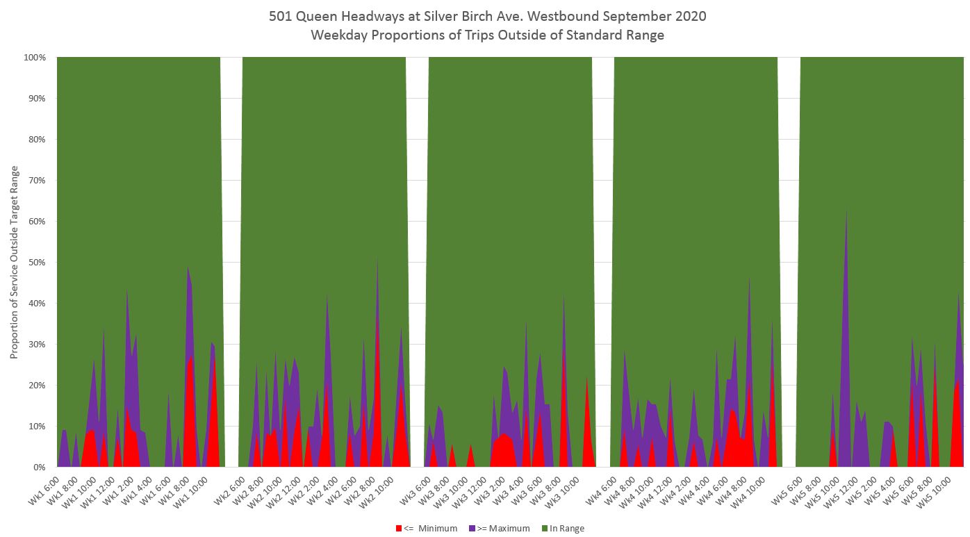
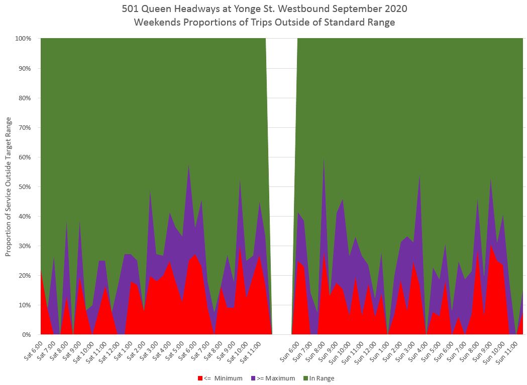
501 Queen Streetcar
Service leaving Neville Loop westbound is measured a few blocks west of the loop, at Silver Birch, to avoid problems with cars laying over at Neville. Putting the screen line further west ensures that they have actually departed by the time they are measured.
In the charts below, the values shown are the percentage of trips that fall into each group, subdivided by half-hour. For weekday service, the values for each of five weeks are shown separately for two reasons:
- Conditions can vary from week to week causing problems due, for example, to a short-term construction project to be averaged into invisibility. (This can still be a problem for one-day events.)
- The schedule in use might change part way through the month, and headways should be measured versus the current schedules in each week.
The red and purple section of the charts indicates the portion of service falling below or above the headway target. Note how this is not a uniform value, and yet this variation completely vanishes if the data are presented as an overall average.
This is the chart for all Saturdays and all Sundays.

For reference, this is what the scheduled headways and target bands look like for the three types of service: weekday, Saturday and Sunday. On 501 Queen they are almost identical. The downward spikes in the evening are caused by headway transitions to early and late evening service when the total count of cars from Neville includes the run-in trips.
501 Queen operates at a 10 minute headway during most of the day. Under the standards, this permits headways from 5 to 15 minutes. Therefore, the red sections in the charts above represent cars closer than 5 minutes together, while the purple sections represent gaps of more than 15 minutes.

By the time the service reaches Yonge Street, the gaps are wider and the bunching is worse. This drives up the proportion of trips that fall outside of the target range compared to the values near Neville Loop. The situation here and further west at Humber (see below) is worse on weekends than weekdays.

Leaving Humber Loop outbound to Long Branch, the many trips still are outside of the target range.

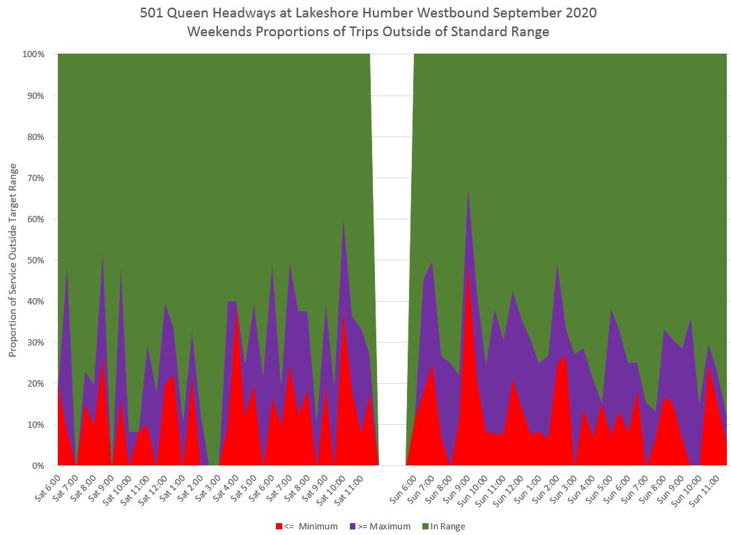
Through all of these charts, the outside-of-range values stay mostly below the 40% line and so the TTC hits its rather generous target of 60% adherence to their standard. However, the degree to which this is true varies over the day and the standard is not met during some periods, notably on weekends.
In the chart sets below, three eastbound locations are included for interested readers.
- Silver Birch westbound
- Yonge westbound
- Humber Loop at Lake Shore westbound
- Long Branch eastbound
- Humber Loop at The Queensway eastbound
- Yonge eastbound
506 Carlton Bus
At Main Station westbound, part of the service is already running outside of the target band of headways, although the proportions vary from week to week.
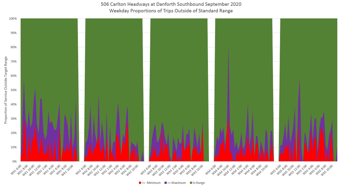
Weekend service has somewhat more trips outside of the target than weekdays.

At Yonge Westbound, the proportion of trips that fall outside of the targets is much higher than at Main Station, and this is a particular problem on weekends. The combination of a large proportion of headways in the red and purple bands indicates that a substantial number of vehicles are running in pairs on a very short headway followed by a wide gap.
(This aligns with Twitter comments from some readers remarking on the erratic service on the 506 Carlton.)


The eastbound charts are included in the sets below, and they are similar. For the west end of the route, I have used Dufferin Street as it is a common screenline for service on the two routes buses have used between Lansdowne/College and Dundas West Station. As with the westbound service, the headway stats are worse eastbound at Yonge because more buses are running in pairs.
- Danforth & Main southbound
- Yonge & Carlton westbound
- Dufferin & College eastbound
- Yonge & College eastbound
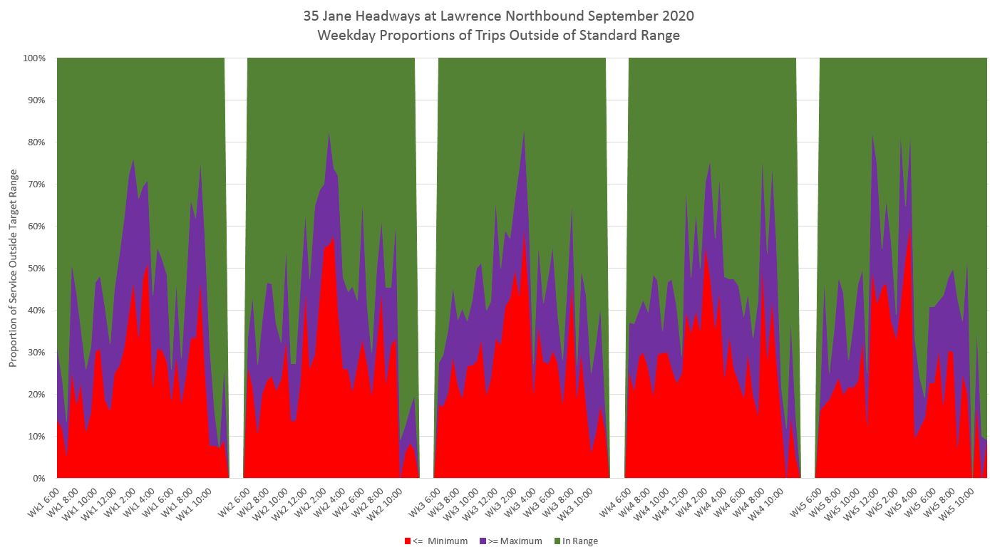
35 Jane Bus
The 35 Jane Bus was the topic of a recent article reviewing its very poor headway adherence on Saturdays: A Travesty of Transit Service. The charts here present 35 Jane’s statistics for September 2020.
Northbound from Jane Station a great deal of the service lies outside of the target range even though this is right at the terminal where service should be well-regulated. The situation is particularly appalling on weekends.


By the time the service reaches Lawrence, the situation is even worse, and there are periods on weekends when over 80 percent of the trips are on headways outside of the target band. This is not a case of a minor disruption but of a chronic abdication of the need to monitor and manage service.

Lest that chart seem difficult to believe, here is a scatter diagram of headways northbound at Lawrence on 35 Jane for Saturdays in September 2020. The target range of headways in the early to mid-afternoon is roughly from 4 to 11 minutes, but most of the data points lie outside of that range, some well above 20 minutes.

The southbound service is similar, and charts for service leaving Pioneer Village Station as well as at Lawrence are included below.
- Northbound from Jane Station
- Northbound at Lawrence
- Southbound from Pioneer Village Station
- Southbound at Lawrence
If you have come this far, thanks for reading. Please let me know if the new chart format conveys the problems with headway reliability in a clear manner.
As for the TTC, they are long overdue to report on how their service does not meet their own standards, and to make the reporting more granular by route and time of day. A target that only 60% of service overall meets a fairly lax standard is a recipe for inaction, for contentment with a status quo which is clearly not working.
And please, please, do not tell be that these are “Board Approved” standards. Technical stuff like this is beyond the level of detail board members (who tend to focus more on budgets anyhow) are comfortable with challenging. They might have a sense that service is not as good as it should be, but they do not challenge management on the quality of what they actually operate.
This must change if the service on the street is to provide the quality and capacity of service Toronto so badly needs during the pandemic and beyond.

Do the operators (bus and streetcar) know how many minutes they are behind the vehicles in front of them and ahead of the vehicles behind them? That’s plural. If some of the transit apps show up where a vehicle(s) is, shouldn’t they be able to show the operators the same information?
Steve: To an extent, this info is available on the Vision console. Not a full route diagram but leaders and followers. This could be useful especially on branching routes (and for short turns) so that streams merged properly, but instead it is left largely to chance.
LikeLike
As always, I applaud and thank Steve for his unselfish efforts to improve TTC service. He is trying to provide management information in a statistical format to avoid the curse words. A lot of thinking has gone into how to measure service.
I am a frustrated TTC user who can’t understand why the wait times for buses varies so much. For important appointments I have to now add 40 minutes buffer time to make sure I arrive on time because sometimes it takes forever for a bus to come. For many, many years it was a 20 minute buffer but the subway has hiccups at least once a week. We all know the message “Attention all passengers, there is a malfunction at the Broadview station. Crews have been dispatched …”
TTC management has been telling the board that buses have a very good on time performance. I can say, I experience very irregular service, but maybe everybody else is doing fine. I’m in no position to challenge the TTC. I know it’s very annoying to be on a short-turned streetcar or subway and people were able to make it an issue. It was one clear example of things not running as well as the TTC reported, so the TTC focused on it.
Steve’s work has been to summarize for the whole system what each of us has been experiencing. He can determine the time gap between buses and summarizes it. His reports match what is happening to me. Wait times vary greatly. The implication is that this is a management issue. Route supervisors should make sure buses leave terminals properly spaced and separate bunched buses.
It is hard to keep buses to a schedule because traffic conditions can make delays. When schedules are off, what is important is to space the buses to try to sustain even service on the rest of the route.
Steve’s studies question if any effort is made to balance service in this dynamic environment. This is a harsh statement but if you are able to read the charts, the evidence is clear.
This is all new for TTC. They have never taken complaints of bunched buses seriously. There have to be other parts of the route that will be poorly served. In a pack of buses there are full ones and less full. They could install a light on the outside of the bus, if the light is flashing passengers can get off but waiting passengers cannot board, to create room on a packed bus. This tells other drivers in the pack to pick-up passengers. This is just a suggestion, but the TTC has never taken bunched buses seriously.
It appears the TTC’s measure of service is based on bus activity at a terminal. The board must tell the TTC that service at every stop is important! One way to measure it is Steve’s charts.
It is important to make route supervisors accountable to the passengers on their route. Every couple of weeks the route supervisor should be at the platform and answer the passengers’ questions. Route supervisors’ oversights currently go unpunished because they are not even detected. Steve’s charts tell the tale.
The board must make an effort to understand how the TTC is currently reporting performance and get an explanation of Steve’s reporting measures, so as to assess if the TTC’s revised measures are adequate. Reasonable service at every stop is important. The measures should reflect route supervisor accountability to address Steve’s comment – “no one’s minding the store.”
Steve: Thanks for the extended praise! One of the most frustrating parts of doing these analyses is to see how bad service can be during a period when traffic congestion is way down, a factor that shows up in reduced and more reliable travel times for buses. “Congestion” has been a catch-all excuse for as long as I can remember, but it does not explain what the data show on many routes. Toronto is unusual in keeping most of the service running in the pandemic era even though ridership is down and transit has to fight against a sense that it might not be a safe place to be. Depending on how long the ridership drop and the pandemic last (the former could be longer than the latter), there will be pressure to rein in budgets and that will lead to service cuts that will amplify all of the existing problems.
This is a deep cultural issue within the TTC, and I can show you stats from Christmas Days past that were mild and snow free where service was poorly spaced. Boxing Day at Yorkdale is quite another matter, and there really is traffic congestion on a grand scale, but this is an exception. It will be interesting to see how the City addresses locations like this where, unlike the Eglinton-Kingston-Morningside corridor, the street does not have capacity that can easily be reserved for transit. But this gets us into a completely different discussion where under the guise of addressing “congestion”, TTC management is trying to speed up service by removing stops.
LikeLike
More good information. I personally prefer the whisker graphs, but that is a personal preference.
Steve: The whisker graphs tell a different story because they are divided by percentiles, not by which range the actual headways fall in by half hour. Also, I wanted to emphasize the over/under segments of the total which would be relegated to whiskers in that format. The stacked area chart produces those “mountain ranges” that tell a tale. But, yes, personal preferences.
This maybe too much to ask, but at some point could you do an article on the Vision system and its potential capabilities? Knowing what information it can provide to drivers, route supervisors, station managers and senior management would add to this discussion.
Steve: At the point the pandemic hit, I had been thinking of arranging a meeting with the Vision folks to talk about their system. Something for “after times”, I suspect.
I like Bill R’s idea of a “drop passenger’s only” light – this would need to be on both the front (clear indication to potential riders) and on the rear (advise the “follower” bus to do the pick up.
The idea of using the vision system to space the vehicles on the route is excellent too. A concern though is how many things does a driver have to pay attention to while on the road – at what point does he become distracted?
Steve: The driver would only have to look at the spacing info at stops when deciding whether to kill a bit of time. BTW the old CIS system gave an early/late indication, but (a) it was often utterly unreliable, and (b) early/late does not give any info about spacing relative to other vehicles. There are “features” in both the original CIS and Vision that are hallmarks of systems designed to specs from people who have a certain way of thinking their system “works”. Vision is very much oriented to stops and on time performance, not to the overall behaviour of a route.
And outside the box, what do other municipalities transit systems use as performance metrics, or line management, and how effective are they? Could we steal some best practices?
Steve: One big problem is that on time performance is a fairly commonly used metric, but this is largely among systems where headways are wider, and staying on time (a) is good customer service and (b) effectively manages headways. This is not a practical approach where most riders just show up at a stop in hope a bus will come by soon going where they desire and with room to board.
I have seen cases where there is an explicit measure of bunching such as not including buses running on short headways in the calculated capacity/level of service offered. This is roughly akin to rider experience where three buses in a pack are not the same as three well-space vehicles for convenience and comfort.
LikeLike
Though I realise that we Torontonians always like to re-invent the wheel but are there other similar transit systems that use ideas (like the ‘drop passengers only’ idea) that could be imported here. Usually when one visits another City one is just happy to catch (the right) bus going in the right direction so don’t pay much attention to ‘punctuality’ or other (important) details. (I will say that NextBus here generally works, in Valetta (Malta) buses would show on their version of it but vanish just as they were due!)
LikeLike