
The reduced transit riding and auto traffic in Toronto during past months provides an opportunity to compare travel times during what used to be “typical” conditions with the situation when there is no congestion and stop service times might be shorter.
This article examines the 504 King route from January to May 2020. I plan to publish data for other streetcar and bus routes, but I am awaiting the May data extract from the TTC’s new Vision system which tracks all buses and a substantial portion of the streetcar fleet. (In May, the King route operated substantially with cars using the old CIS system from which I have already received data, and so there are enough data from that route to represent its operation.)
504 King operates with two branches: 504A from Dundas West Station to Distillery Loop, and 504B from Broadview Station to Dufferin Loop. Only trips late at night after service to Distillery and Dufferin Loops ends make the full trip between Broadview and Dundas West Stations. For this analysis, I have split the route in half at Yonge Street to measure travel times to that midpoint from the outer ends of the lines.
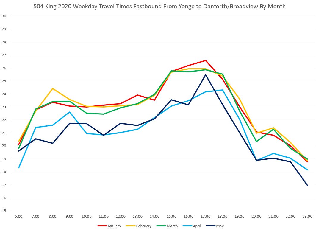
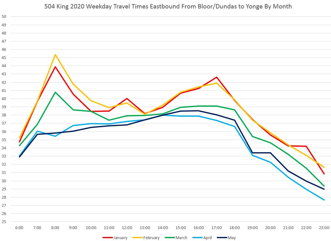
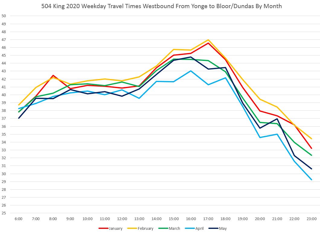
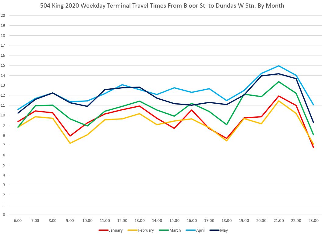
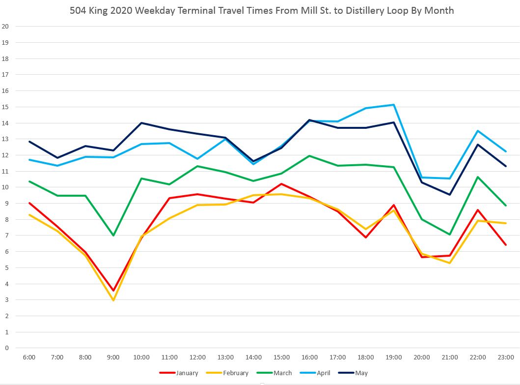
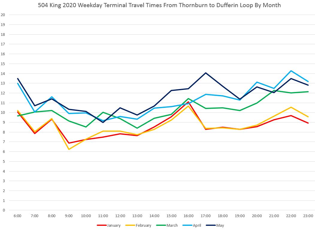
The change in travel times is quite obvious looking at month-by-month averages. In the charts below, travel times are averaged for all weekdays in each month, grouped by hour of departure from Danforth and Broadview. (The screen lines at terminals are located far enough from the loops to avoid including queuing times to enter crowded loops in the measured travel times to and from Yonge.)
January and February (red and yellow) are the highest because they represent normal pre-covid conditions. During March (green), the amount of transit riding and traffic began to fall as offices closed and non-essential travel was reduced. The King car was particularly affected because it serves the business district. April and May (light and dark blue) represent a “new normal” for travel times.
Note that in these charts, the Y-axis does not begin at zero so that the spread in the data values is clearer.
(A full set of PDFs of these charts is at the end of the article.)

Although the monthly averages show a clear pattern, the weekly values change within the two broad bands of pre- and post-covid conditions. Note that for this chart there are no data for the week of April 20 because streetcar service on Broadview north of Gerrard was suspended for track repairs.

The eastbound chart for the same segment shows a similar pattern but with two important differences: a PM peak replaces the AM peak as the high point, and there is almost no change for March relative to earlier months.
On the west end of the route, the pattern inbound is similar to the east end chart with March data sitting midway between pre- and post-covid values. (Note that the Y-axis spans a longer range in this chart because of the greater range of values.)
The outbound data from Yonge westbound show some changes over time, but mainly in the PM peak, and even then moreso for April than for May.
Collectively, these charts tell an important story. Travel times are reduced, but not by a large amount proportionately to the route overall. The margin for capturing this either to reduce the number of cars providing service or running closer headways is limited, and the situation is quite different depending on which part of the route one examines.
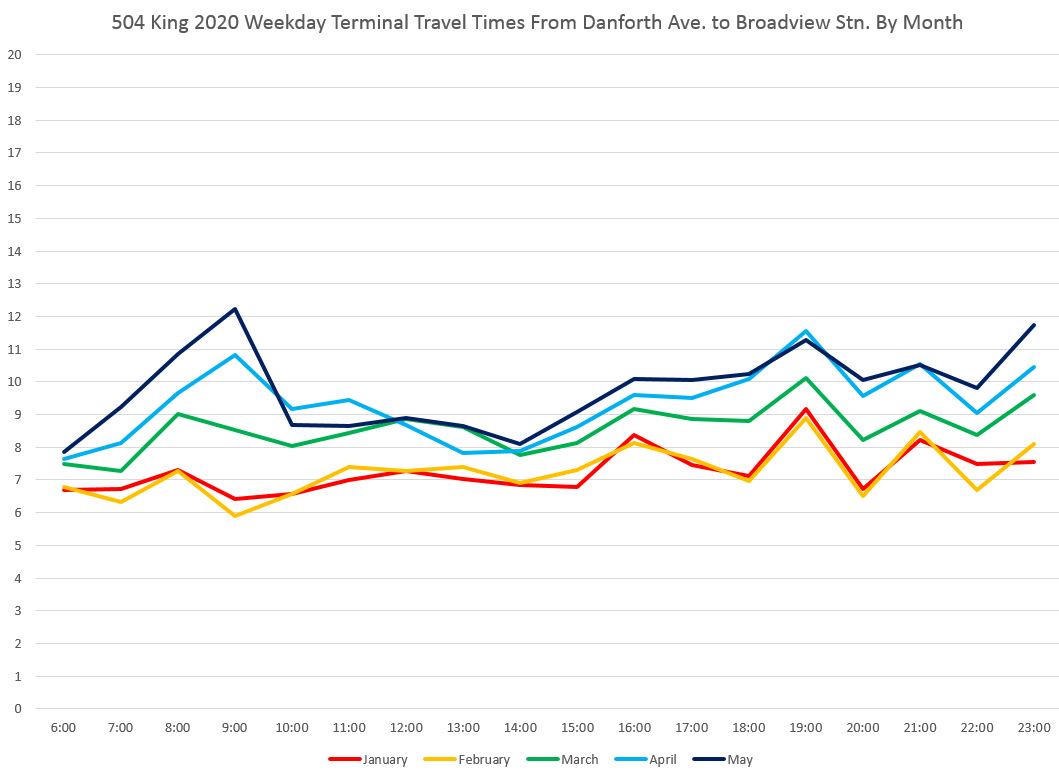
A related change in shorter travel times is an increase in terminal times. For the purpose of this analysis, “terminal time” is measured as for a round trip from a screenline near the loop. This avoids problems with terminal queues where a vehicle is effectively at the end of its trip, but cannot physically enter the terminal. For example, at Broadview Station the terminal time counts the trip from crossing Danforth northbound to crossing the same line southbound.
The terminal times begin to rise in March and grow slightly in April and May. The largest change is in the AM peak corresponding to the period when the largest change occurred in Yonge-to-Danforth travel times.
At Dundas West Station, the screenline is in the middle of Bloor Street. The pattern of terminal times is similar to those at Broadview.
At Distillery Loop, the screenline is at Mill Street north of the loop. Terminal times there pre-covid were quite short in the AM peak, but otherwise similar to those at other locations.
At Dufferin Loop, the screenline is at Thornburn, the first street north of Springhurst which is the north side of the loop. This location was chosen to avoid queuing time on Dufferin north of Springhurst at this sometimes crowded location.
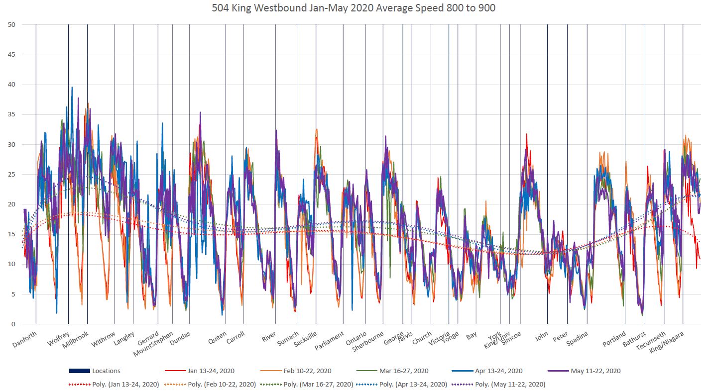
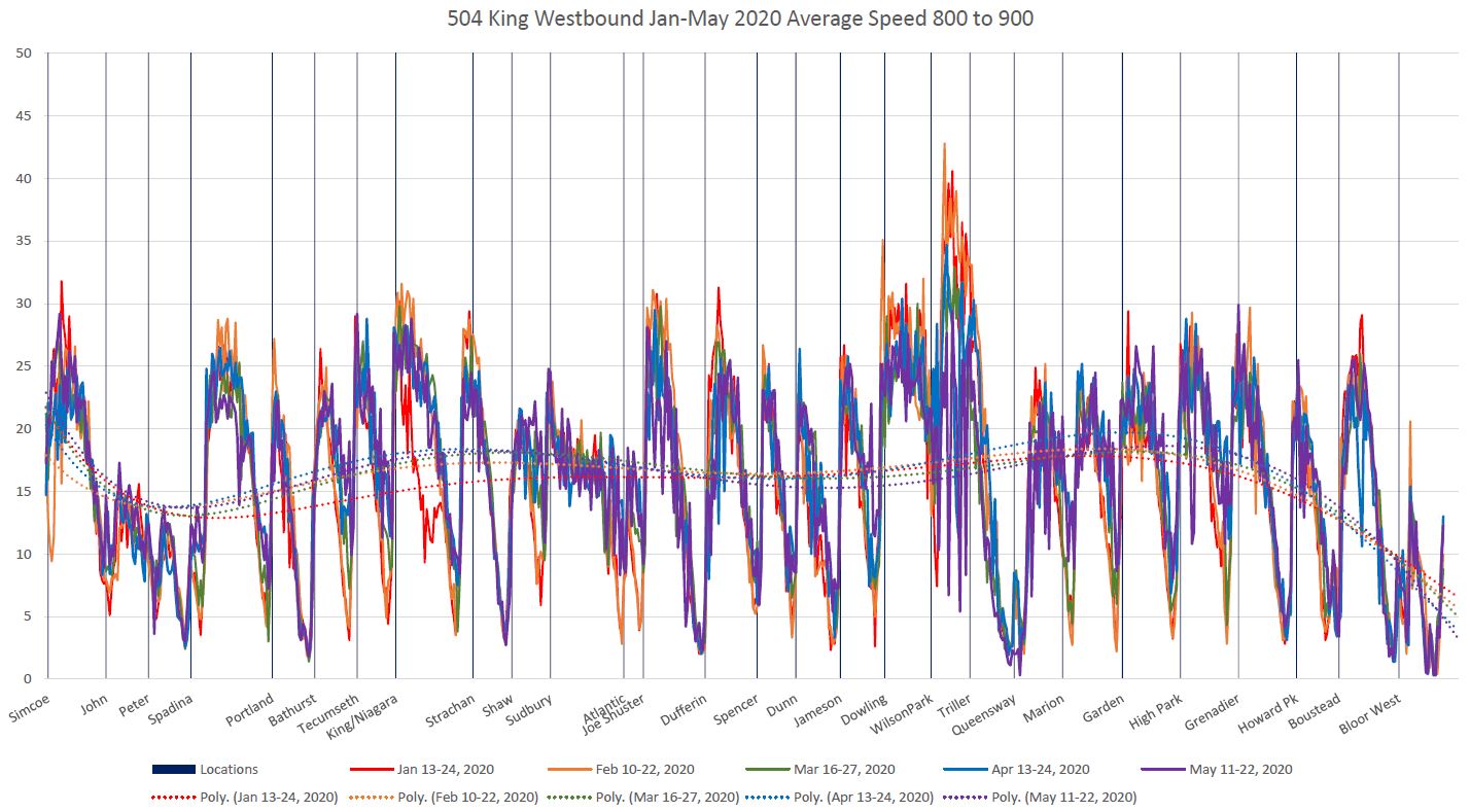
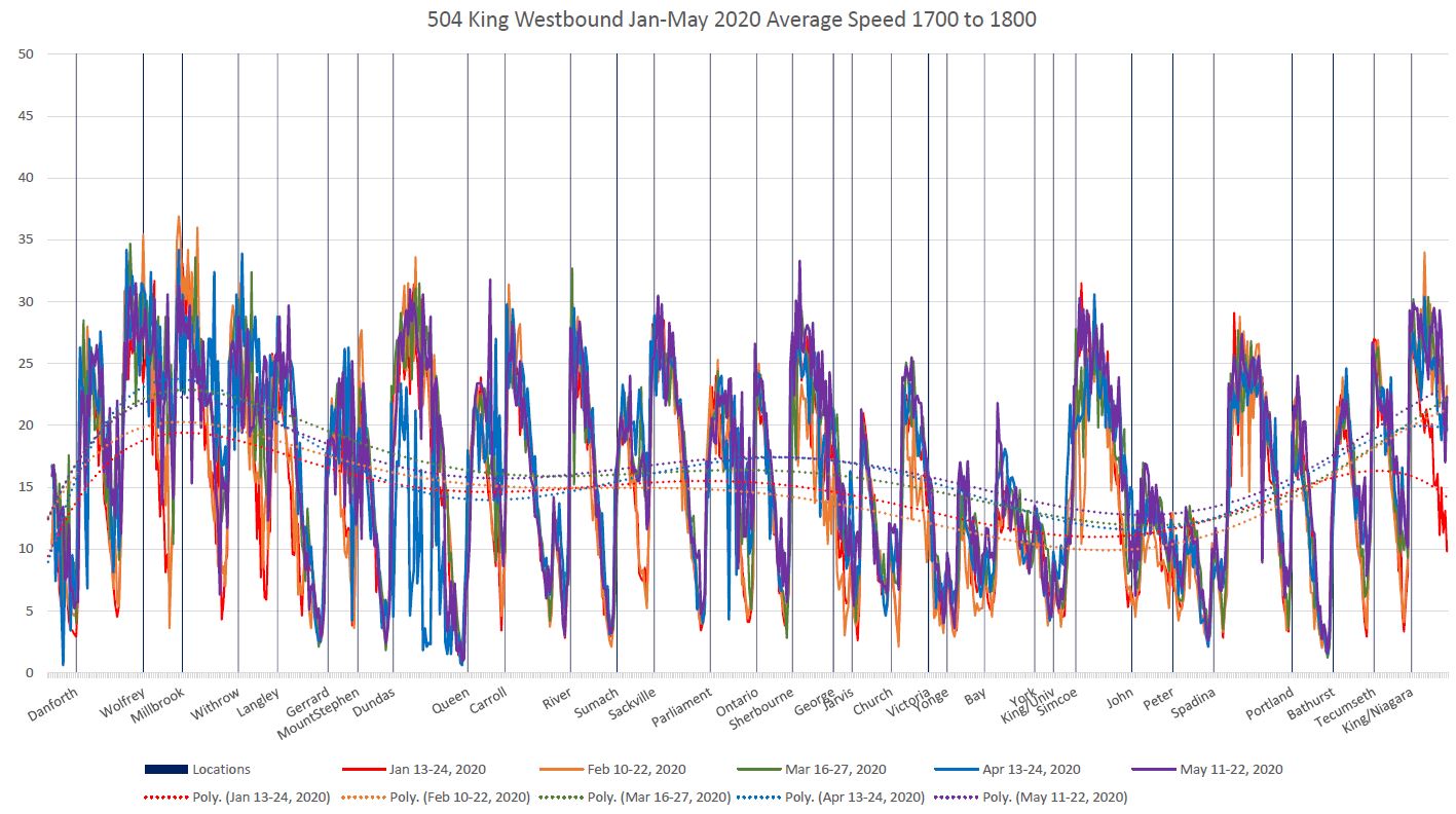
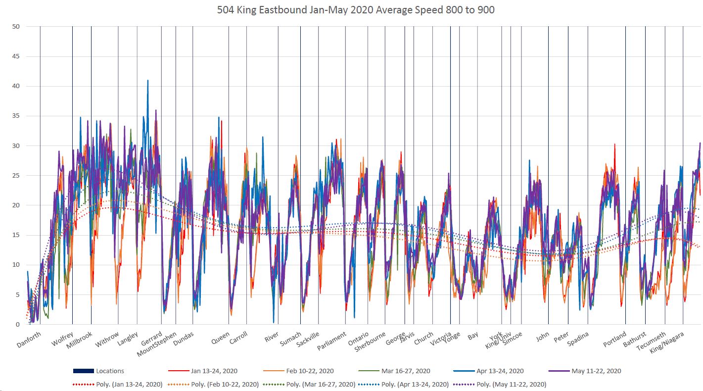
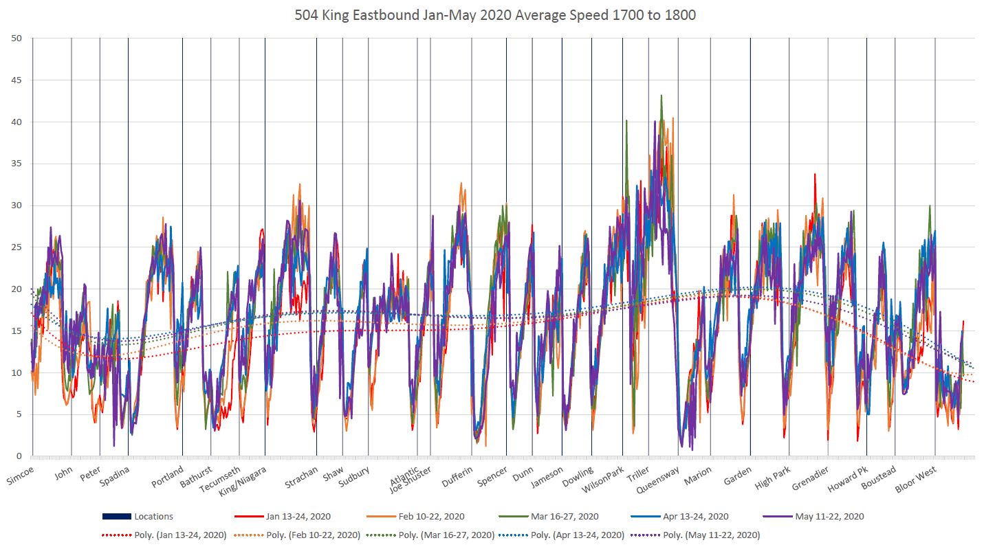
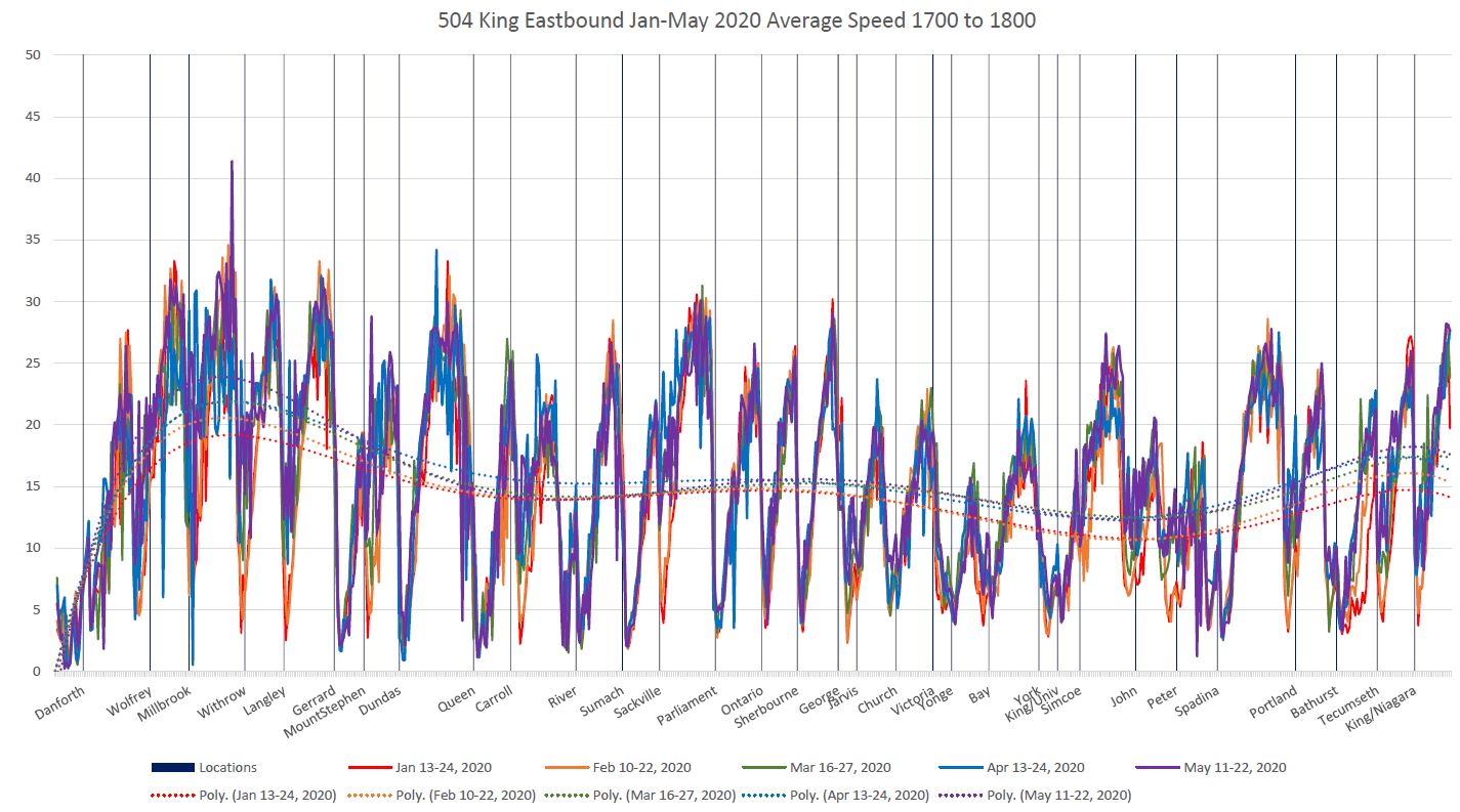
On a much more fine-grained level, one can look at vehicle speeds along the route. Here are two charts (split with an overlap due to space constraints) showing average speeds during the AM peak for westbound service.
For this analysis, I have included data from the middle two weeks of each month with nine or ten days included depending on whether there was a Statutory Holiday (Family Day and Victoria Day) within the period.
The data values (solid lines) generally stay on top of each other showing that there is not much difference in the pre- and post-covid values, although there are some exceptions. For example, the section of Broadview between Danforth and Gerrard has no traffic signals, and this is also a location where pre-covid there was strong demand at stops for people headed to the business district. With lower demand, streetcars stops for a short time, if at all, and this is reflected in the higher average speeds through this area at stops. Similar patterns are evident at other stops (Sackville, Ontario, for example) where there is no traffic signal.
This demonstrates how stop elimination, a sometimes fetish of the TTC, would speed operation (albeit at the expense of longer walks for riders) where stops are not at traffic signals. However, where there is a signal, the benefit is less clear
The trend lines (dotted) are interpolated between the data values to show the overall pattern. Where the darker colours (post-covid) pull away from the lighter ones (pre-covid) this shows a substantial change as on Broadview north of Gerrard. However, there are parts of the route where the trend lines are close to each other or completely overlap because there has been no change in travel speed.
Of particular note is the slow operation approaching the King-Queen-Roncesvalles intersection. This is worse in the PM than the AM, but with only a slight post-covid improvement. This location has always been a bottleneck due to the large volume of turning traffic from King to The Queensway and the three-phase signal operation. Even when this intersection is redesigned in 2021, that westbound turning traffic (which will now have to make a standard 90 degree turn rather than the much gentler one with the current geometry) will present a significant obstacle to streetcars.
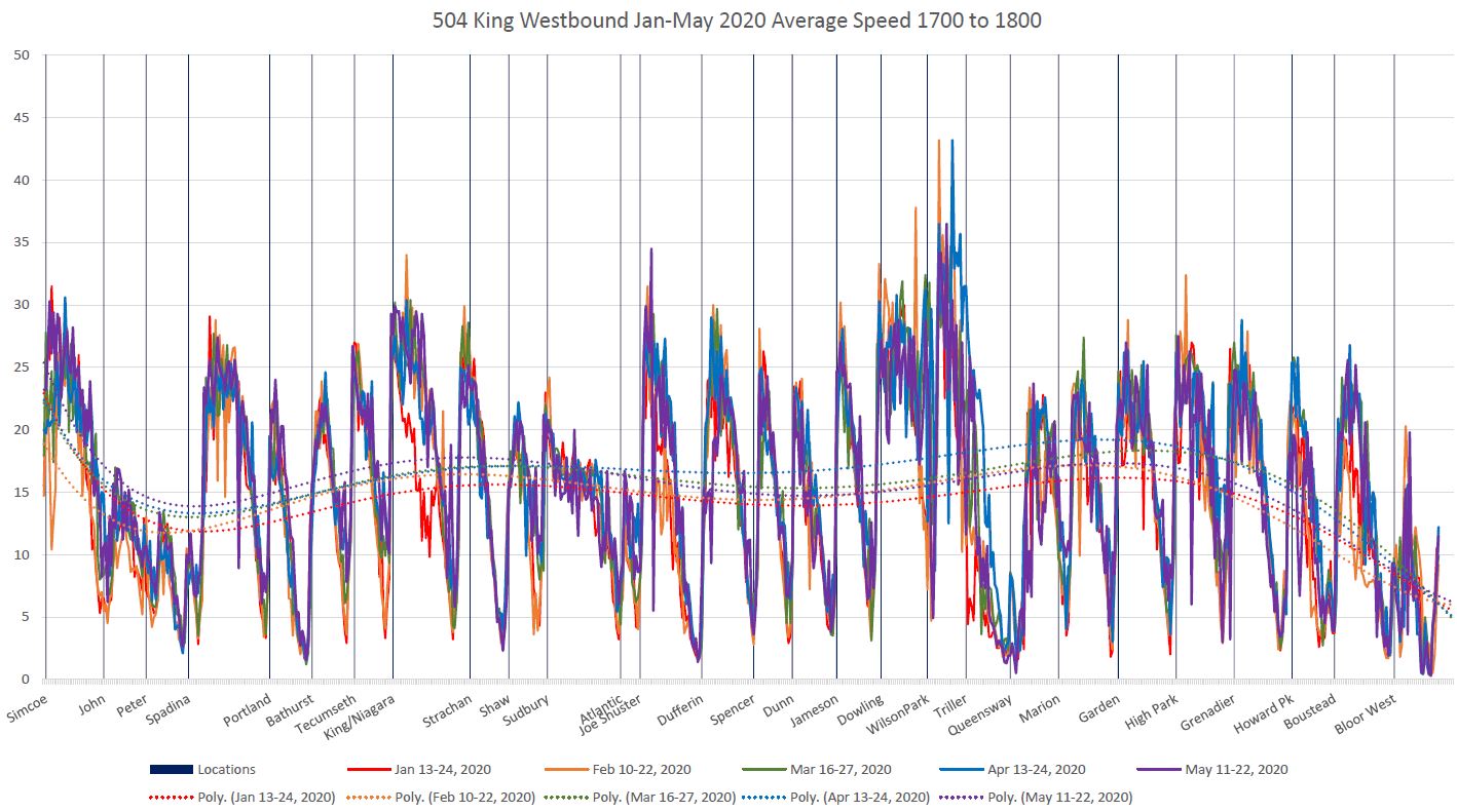
Here are the charts for the PM peak westbound.
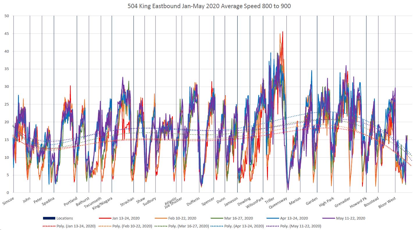
Here are the corresponding charts for eastbound service. These should be read from right to left because the same grid is used for plotting as with the westbound data, but the cars are moving in the opposite direction.
PM Peak
PDFs of the travel and terminal time charts are linked below. Each file contains both the monthly and weekly charts for its location.
- 504_202001_202005_Danforth_Yonge_TravelTimes
- 504_202001_202005_Yonge_BloorWest_TravelTimes
- 504_202001_202005_BloorWest_Yonge_TravelTimes
- 504_202001_202005_Yonge_Danforth_TravelTimes
- 504_202001_202005_Danforth_BroadviewStn_TerminalTimes
- 504_202001_202005_Bloor_DundasWStn_TerminalTimes
- 504_202001_202005_Mill_Distillery_TerminalTimes
- 504_202001_202005_Thornburn_DufferinLp_TerminalTimes
PDFs of the speed charts are linked below. There are 19 pages per chart, one for each hour beginning at 6 am and running to 12 midnight. Stepping through the pages will provide a flip-chart animation of the changes in speeds over the course of the day.

Hey Steve,
This is probably beating a dead horse at this point, but have you been tracking pre-pandemic and post-pandemic bunching of vehicles?
I remember walking along Howard Park in the first month of the pandemic (when Toronto felt like a ghost town) and seeing three westbound 506’s pass within a 5-minute window. That really frustrated me to see that (If they can’t get the service spacing right when there’s no traffic, then is there ever any hope)?
Steve: I just received the tracking data for May and am planning to review several aspects of it including changes in operating speeds and bunching. One challenge is that some of the extra service does not get tracked because of how operators “sign on” to the system. However, bunching does show up. There are also issues with “scheduled gaps” where runs were cancelled as a quick way to adjust schedules in May. This is supposed to be fixed by adjusting headways, but I’m not sure that this always happens. When I work my way through several routes to get an overall sense of what is happening, then I will write this up.
My post on 504 King travel speeds is the first of a few I plan regarding just how much improvement the TTC can hope to attain on a permanent basis with transit priority schemes like those now proposed for some suburban bus corridors. Even if every vehicle does not show up in the tracking data, the sample size is large enough to be representative for the affected routes.
Stay tuned!
LikeLike
Steve: This comment was submitted by a reader who wishes to remain anonymous, and so I am posting it under my own userid here.
While some runs have been cut to match Covid demand, running time was not changed on most streetcar routes. As an operator there was too much running time on some routes even when it was still busy. Especially Queen and Carlton. Now during Covid, the largest challenge is dawdling along slowly enough as to not arrive at the terminals too early while dealing with frustrated passengers and motorists because we are inching along. It was a godsend when the 2nd berth at Broadview Stn opened for King cars. Having driven the 504B at the peak of the pandemic in April and May, the PM increase in travel time was attributed solely to the PM rush running time increase which still remained in the schedules, so we had to dawdle along even more slowly.
I realise making wholesale system wide changes in short order is a monumental task, but if the company truly wants to save money, they need to look at cutting running time. This fad of schedule resiliency by increasing running time so that a route will stay on time as if every day were a concert, Jay’s game, Leaf’s game, Caribana parade all at once and stay on time is an incredible waste of resources and a real test of patience of passengers and motorists!
We might even be able to restore service to the entire network within the 204 car fleet once all of the construction is finished, but more importantly it would be nice to get across town before Christmas!
Steve: Yes, the whole issue with padded schedules is a huge waste of resources, but it is driven by a simplistic view of what “success” in managing the system is from both the TTC Board and Rick Leary whose job was to “get rid of short turns”. It would have been interesting to see how the Board would react if this were presented as a clear cut budget and service level issue. There is also the false claim made that the old schedules were no good and the new headways are simply what we would have seen anyhow. But the short turn count drops like a stone even though service regularity, something riders really care about, it still a mess.
There is an interesting difference in how operators of bus and streetcar routes behave that says something about TTC “culture”. When buses operate on streetcar routes, they go like mad and any thought of staying “on time” goes out the window — long layovers at terminals result as we saw, for example, at Broadview Station on 505 Dundas, or at Long Branch on 501 Queen.
I don’t expect the reserved bus lanes the TTC is talking about will have much effect because the amount of time they will actually save will be much less than expected. I’m working on comparisons of several bus routes pre/post covid and the changes in travel times are not gigantic with fewer autos on the road. Also, some of the saving is reduced stop service time with fewer riders, not as a result of less congestion.
LikeLike
I miss Andy!
LikeLike
CORRECTION
I STILL miss Andy!
LikeLike