
For many years, publication of ridership data has been sporadic, and information on crowding appears even less frequently. A major problem has been the cost of acquiring information on a system-wide basis and staff cuts in the group that once performed this task manually. Even when data were published annually, the values for major routes such as 501 Queen did not change in each year because the resources needed to conduct a count on such a large, busy route were not always available. However, most vehicles now have automatic passenger counters and the amount of data on tap today has increased quite substantially.
Recently, the TTC published data for 2017 and 2018, bringing us more up-to-date than the 2014 tables. Those were more than a little stale, especially in an era when strong growth has been reported anecdotally and is clearly evident with the success of the King Street Pilot.
An important point about these counts: they measure riders who are actually on vehicles, not those who could not board nor those who gave up and took another route or mode. A badly needed companion report is a review of vehicle crowding by route and time of day, not to mention an evaluation of the interaction between uneven service and crowding.
One long-standing problem within the TTC is that there is an ongoing struggle between the very large “operations” side of the organization responsible for running service and the tiny “planning” group who look after things like schedules and riding counts. Operational metrics given monthly in the CEO’s report say almost nothing about service quality especially at a granular level experienced by riders. Simple targets and all-day averages mask what is really happening, and there are no real “standards” for how to measure service and crowding.
These are topics for another day. At least now we have comparatively current ridership data, and we must hope that they will now appear annually to better track the system’s evolution.
A troubling fact about the charts in this article is the number of routes and the areas of the city where riding has been stagnant or in decline for many years if not decades. There are areas of growth, but many of these can easily be linked with specific changes such as a new subway line, the growth of housing to the edges of the city, and more recently the growing population along the waterfront.
This is a system that is doing well in certain places, but has a malaise over many parts of its network. Years of making do with only marginal increases have taken their toll. Any Ridership Growth Strategy would do well to understand this situation, and address how or if those trends can be reversed.
The TTC published route-by-route ridership numbers, among other data, starting in 1976, although from 2006 onward, this did not happen regularly. The practice began in the early days of “Service Standards” when the growing level of political involvement in TTC affairs brought a concern that new and modified routes would arise not because they were the best use of resources, but because their advocates had “friends at court”. A fundamental problem was to compare existing and proposed services, and that required ridership counts.
Service Standards and the methodology behind evaluation of routes have changed over the years. The current version was adopted in May 2017 consolidating existing standards, policies and practices, reviewing standards used by other cities and incorporating information from rider surveys about what matters to them.
- Service Standards document (May 2017)
- Full Report and Presentation from May 2017 (includes the above as an appendix)
In December 2019, some changes were proposed to the existing standards, but these modifications are not yet reflected in the document linked above. See Appendix 3 of the following report for details.
A problem with technical standards is that they are meaningless without understandable, public data. The standards themselves are “board approved”, but this process does not guarantee that those voting to endorse them actually understand the tradeoffs built into the policy. Even worse, without regular reporting on how well the system meets the standards, there is the nagging sense that they exist more as a lofty goal than an actual bar against which riders can judge TTC performance.
Ridership and Boardings
When the TTC reports that it expects to carry 533.5 million “rides” in 2020, this number is a computed equivalent to fares dropped in a now-vanishing farebox. In the old days these were easy to count by processing coins, tokens and tickets. Even with Presto farecards, there is a count of “taps”, but even here the link to “rides” in the traditional sense is not what it was fifty years ago.
As riders moved to passes from single fares, the link between countable revenue and “rides” became less certain. More recently, the introduction of a two-hour fare replacing the byzantine TTC transfer rules allowed “trip chaining” where travel formerly considered as separate rides (each requiring its own fare) could be consolidated into fewer charges against a Presto card or ticket. The riders did not go away, but the ability to count them one by one from fare revenue no longer exists. Even before Presto, the TTC handled Metropass ridership by using rider surveys of travel patterns to determine the typical number of conventional token-based “trips” a passholder would take. This produced a conversion factor to translate between pass sales and “ridership”.
In recent years, the validity of this conversion fell under a cloud as some riders, those for whom a Metropass represented more of a convenience than an actual saving over single fares, migrated away from passes. They represented a paper “loss” falling from over 70 trips/month assumed for a pass to under 50 in single fares, but those 20 trips were rides they never actually took.
Meanwhile, the view of transit service seen by looking at vehicles showed that crowding was an increasing problem and this ran contrary to the revenue-based view that ridership was falling. Budget hawks care only about dollars, not about service or riders, and this remains a problem in an era where year-over-year municipal operating costs are supposed to be held at inflationary levels, but no more. Any new service or extraordinary cost increase is paid for by cutting something else. We will see how the TTC fares on that score when its 2020 budget comes before Council.
For the purpose of looking at demand on a route, the relevant measure is not fares collected, but “boardings”, or what planners call “unlinked trips”. In this view of the transit world, each change between vehicles counts as a new boarding even if no fare is paid. This eliminates the artificial linkage between revenue and measured demand. In the budget, TTC management notes that in recent years boardings were going up even while “ridership” was falling. This is a direct result of the change in how ridership is calculated and, more recently, of the amount of travel a rider can purchase for one fare.
Methodology
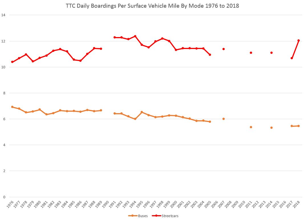
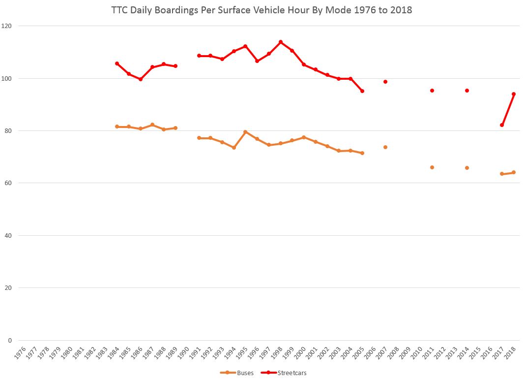
Over the years, the data to build the charts in this article have been issued in varying formats, and I have been accumulating them for a long time. The actual data fields changed periodically, and for the purpose of long-term tracking I have consolidated the data into a common format. One obvious thing readers will spot is the use of “miles” because the vast majority of the data were reported using that measurement. Recent values are converted from kilometres to miles for consistency.
This is really not as big an issue as it might seem because the more important value is vehicle hours, not miles. The primary cost of transit vehicles is the drivers, and they are paid by the hour.
The daily vehicle hours per route were not reported from 1976 to 1983, and therefore no hourly-based stats are shown before 1984. From 1984 to 1989, reports included the route’s average speed, and this was used to calculate the vehicle hours by conversion from vehicle miles. From 1991 onward, vehicle hours are reported and the values are as they appear in reports.
In early years, the TTC attempted to allocated fare revenue and costs to each route because the bean counters just love the concept of “profitability”. In a flat fare system where one “fare” can be distributed over multiple trip segments, indeed over multiple trips, it is not possible to allocated fares to individual trip segments or boardings. Any scheme purporting to do this has built-in bias that will overallocate revenue for some trips and underallocate for others. There is a similar problem with costs and especially in route-vs-route and mode-vs-mode comparisons where operating conditions, notably traffic speed and stop spacing, can have a huge effect on the cost of a route’s service. The allocations were dropped some years back, and none of those bogus numbers appear in this analysis.
In some of the charts, each year is given equal spacing along the horizontal axis. This results in gaps where there were no data published, but preserves the overall shape of the data without distorting the rate of change in values over time. Some charts compress out the missing years to conserve space, but with the result that recent changes can appear more abrupt than they might have been.
Data for some routes, notably express buses, are missing in earlier years. This does not affect overall totals because the number of passengers is small in each case.
Data for the 500-series streetcar routes is reported with the streetcar network regardless of the vehicle type(s) actually scheduled or operated.
All of the charts in this article are collected in one pdf here:
The Evolution of Ridership and Service
The high point in measurements of TTC operations was until quite recently 1989. This was the year of the highest ridership just before the onset of the 1990s recession, widespread cutbacks in public services and a substantial drop in ridership.
An example of the magnitude of the change was the status of the so-called Relief subway line. In the late 1980s, the system was bulging with passengers and relief of the Yonge-Bloor interchange was needed as soon as possible. By the mid 1990s, the subway had lost twenty percent of its demand, and suddenly there was “room” for the crowds a Richmond Hill extension would bring. This attitude persisted for many years even as system ridership recovered, and is fundamental to understanding how anyone could have thought that “relief” could sit on the back burner.
On the surface system, demand fell in the 1990s as well, but this was compounded by downsizing of the streetcar fleet and the addition of a new Spadina/Harbourfront route that soaked up all remaining spare cars. There has been little room for peak growth in service for two decades until the recent arrival of the Flexity low floor cars.
On the bus network, there has been some growth in the bus fleet, but this has been achieved mainly by stuffing as many vehicles as possible into existing yards. Even when McNicoll Garage opens later in 2019, the system will be over-full, and yet another garage is in the early planning stages. Meanwhile, the TTC is storing some buses on land acquired for a new subway yard southwest of Kipling Station. Even if the TTC Board wanted and Council funded more peak bus service, the TTC has no place to put more vehicles.
Originally, the plan was that opening of Transit City lines would reduce the number of buses required, and Toronto could get by with what it had. However, new rapid transit lines have not come on stream as quickly as once assumed, and the TTC has no spare garage capacity. This is an example of how decisions on one part of a transit plan have unexpected consequences that are not always taken into account by those seeking only a quick (and sometimes vindictive) announcement trashing a former rival’s plans.
The chart below shows the total boardings reported for surface routes since 1976 with the gaps in the lines showing where no data were published by the TTC. The big drop in the 1990s is quite evident as is the long slow recovery from its effects.
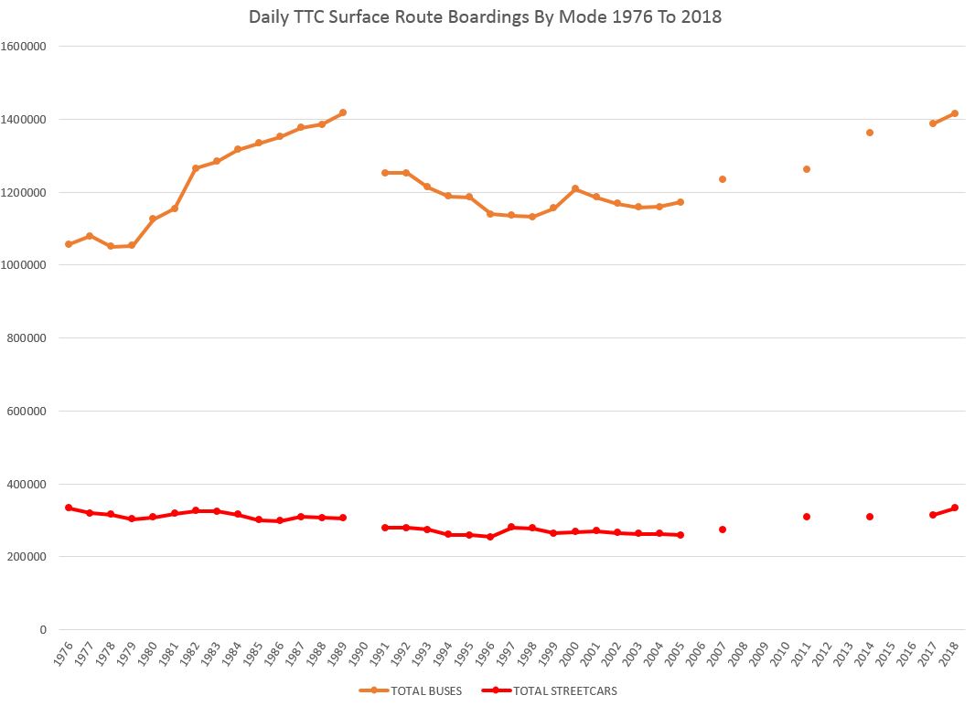
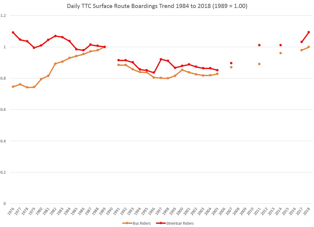
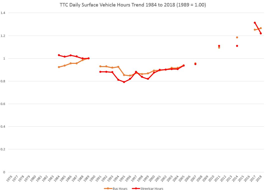
The charts of relative level of usage on the streetcar and bus systems below are scaled so that 1989 is “1.00”, the system’s high point . Visible here is the continuous growth of the bus system through the 1970s and 1980s as the suburban network built out, followed by a drop in boardings in the recession hitting a low point at 80% of 1989 levels. The number of bus network boardings only quite recently crested the 1989 level. In part, some bus passengers were siphoned off into new rapid transit routes (the Spadina extensions and Sheppard), and the streetcar system gained the demand from 77 Spadina and the downtown growth in jobs and residential population. However, a major reason was the lack of service growth. It has taken a long time for the TTC’s surface network to regain the demand of former decades.
Vehicle Miles and Hours
The scale of surface operations can be seen by looking at Vehicle Miles or Vehicle Hours. In each case below, the raw numbers are followed by charts in which 1989 is “1.00” for purposes of tracking growth (or lack of it).
Vehicle mileage and hours on the bus system grew until 1990 then dropped and stagnated until the early 2000s. The streetcar system was harder-hit in the 1990s partly because old vehicles (the PCCs) were being retired. The situation was not unlike what was seen recently as the CLRV fleet dwindled even though the new fleet is unable to provide enough service to fully operate the streetcar network. In turn, this limits any growth in capacity except by moving streetcars to the busiest routes and leaving the rest to fend for themselves with buses. This is not an activist, pro-transit policy, but it has been the TTC’s standard mode of operations for decades thanks to deferred investment in the streetcar network.
Bus mileage and hours continue to grow, but this did not get underway until the mid-2000s with the Ridership Growth Strategy (RGS) after a decade of making do with no substantial growth in transit service. It must be said here that the RGS was not simply a marketing exercise to renumber existing routes, to provide spiffy amenities to make the wait for a bus less tedious. Its aim was to actually build service and with that, build demand. TTC’s latest incarnation of a growth strategy is more flash than real substance because it does not address two key issues: increasing transit capacity and operating service on a reliable basis that riders can count on.
Bus operations were also affected by the transition to low-floor vehicles with lower capacity that effectively made each vehicle about ten percent smaller (for service design purposes) and drove up the number of vehicles needed just to maintain capacity levels. Some of the growth in service operated does not translate to additional capacity.
There is one anomalous data point in the series caused by the 501 Queen route’s operation with buses for a good chunk of 2017. The mileage and hours reported for it are based on operation of many more buses than the usual streetcar fleet pushing up the mileage and hours reported for streetcar routes.
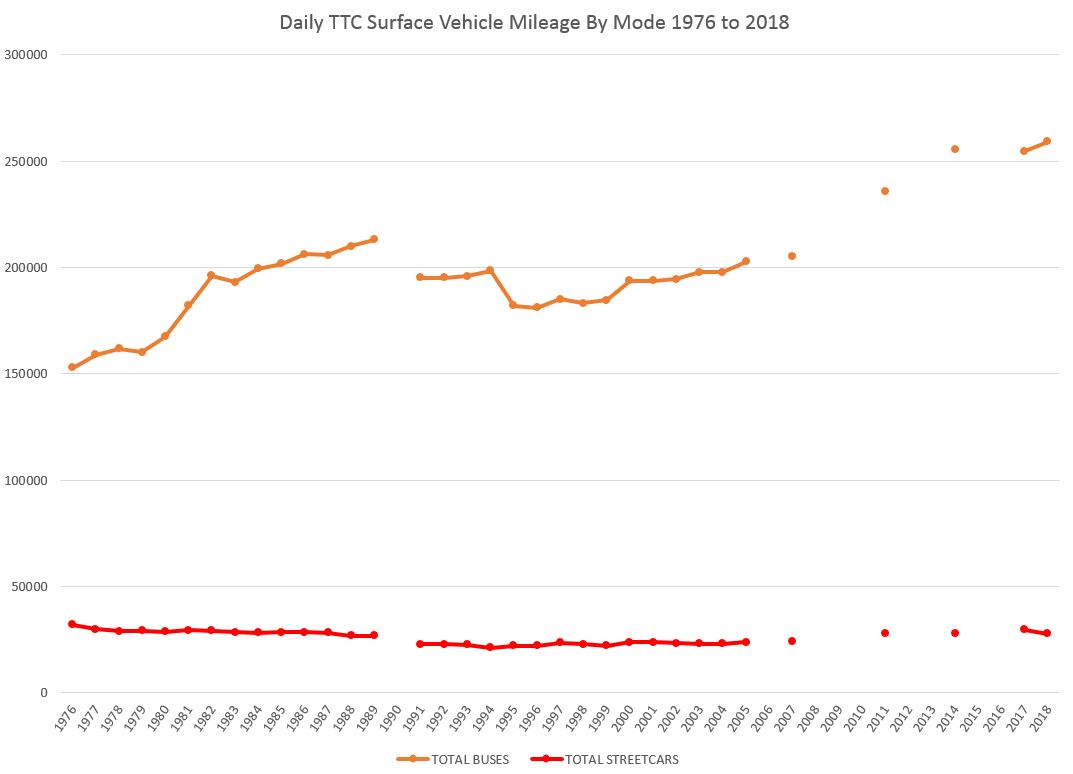
The trend in streetcar mileage takes a dip in 2018 for two reasons. First, 2017 includes the Queen car operating with buses and an abnormally high number of vehicle miles. Second, 2018 saw the beginning of the transition to the larger low-floor cars and a reduction in the number of cars required to serve some lines. This accelerated through 2019 and the effect should be fully visible when stats for 2019 and 2020 are published.
Note the jump in streetcar mileage coinciding with the opening of the Spadina line in 1997. This increase was lost over the next few years to service cuts, but then recovered. Major increases in the amount of streetcar service operated did not begin until the mid 2000s, and this then stabilized at a new plateau only slightly about the 1989 level.
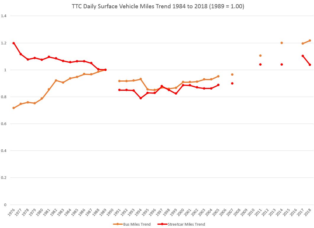
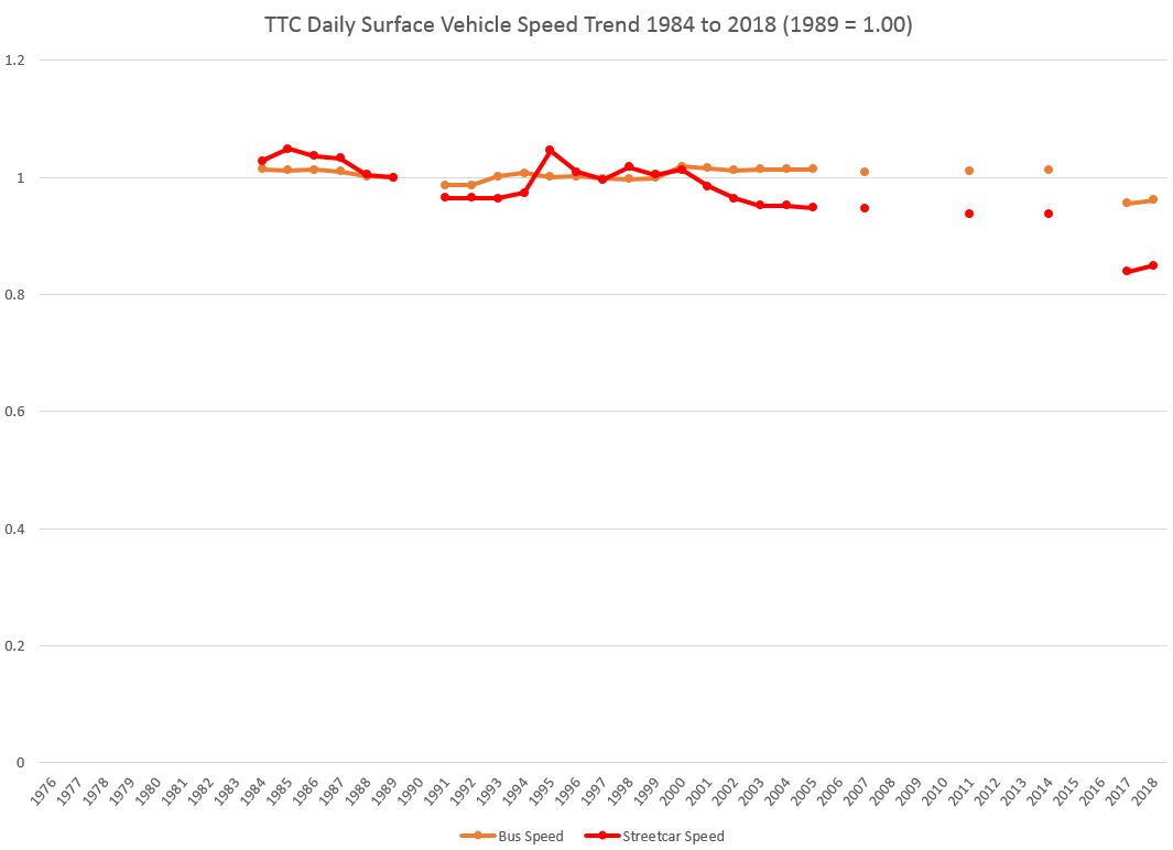
The next two charts show the vehicle hours as opposed to mileage. Note that the trend value versus 1989 for hours rises to a higher level than for the mileage above. The reason for this is that vehicles may be providing more hours of service, but they are driving more slowly than they did in 1989, particularly the streetcars.
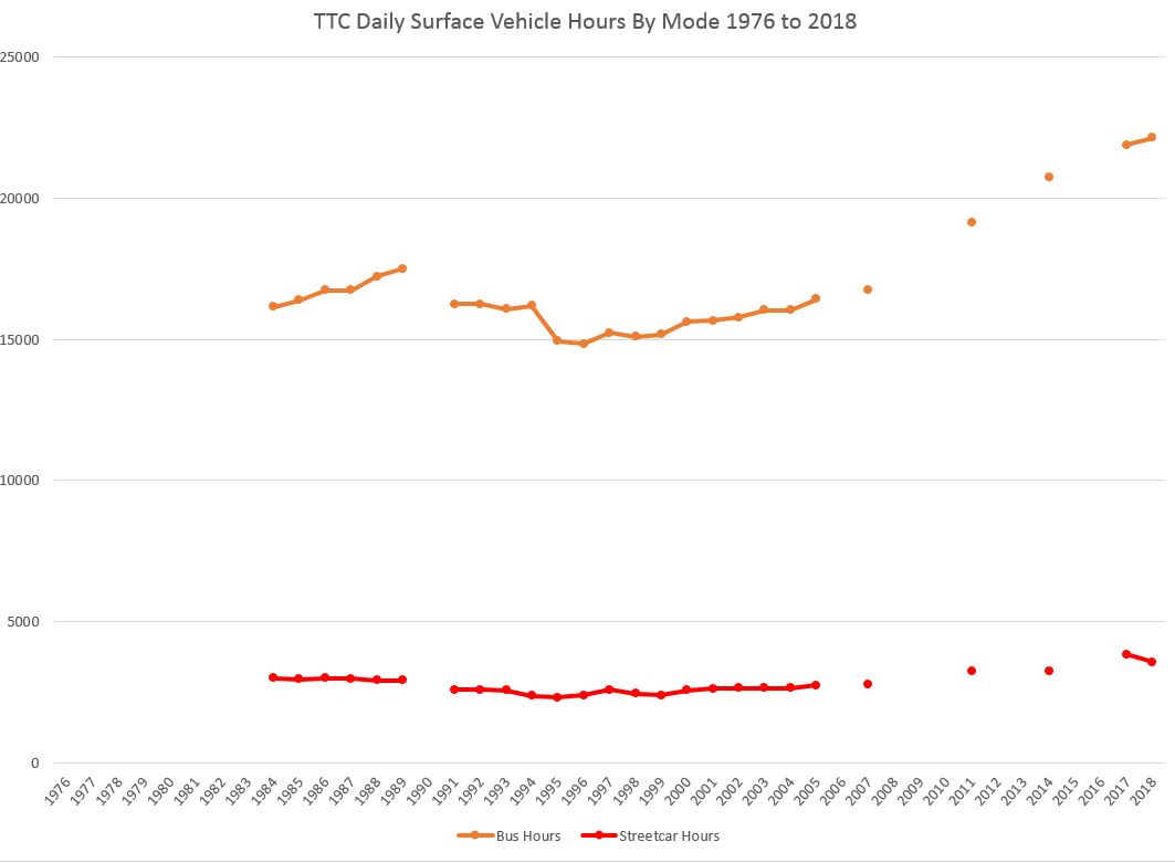
As with the mileage figures, the hours for streetcars jumps up in 2017 because of the bus replacement service on Queen, but drops back again in 2018 because Dundas is a much short route and uses fewer vehicles.
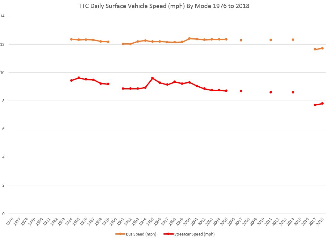
Vehicle Speed
Increased traffic congestion and decreased speed are well known to drivers throughout the city, and this has the effect of slowing transit service.
In recent years, the TTC has extended driving and recovery times on many routes to bring schedules more in line with operating conditions. The result in some cases is excessive as is seen at terminals where many vehicles can be found laying over as they are early. In many cases, the schedules simply stretch the existing vehicles over longer trips causing less frequent service and a reduction in vehicle mileage, but not vehicle hours.
Note that in these charts, vehicle speeds are available only from 1984 onward as explained under “Methodology” above.
The average speed of weekday bus operations stayed fairly constant through to 2014, but it has dropped in reported 2017 and 2018 results. Streetcar speeds began to drop in the early 2000s, then stabilized, and finally took another drop in the 2017-18. To what extent this is the result of real changes in traffic conditions and to what extent this is padding to make short turns almost beyond requiring is difficult to say. I will review the schedule changes on bus and streetcar routes and compare them with actual operating data in future articles.
However, there is a chicken-and-egg situation in that the time taken to drive from “A” to “B” can itself be influenced by the schedule. A streetcar operator friend of mine retired, he claimed only partly in jest, because he could not drive slowly enough to achieve the longer travel times.
Ridership Density
The density of transit demand, a term I use here to mean the number of boardings per unit of transit service, will vary from route to route and mode to mode. This is partly a function of vehicle capacity, but also and very importantly of each route’s characteristics. Some routes have heavy demand in one direction and almost nothing in the other. Half of their vehicle hours or miles are consumed just getting back to a point where they can pick up passengers. Other routes have not only bidirectional demand, but a lot of turnover between major stops. For example, the King route is effectively made up of at least four demand neighbourhoods:
- Dundas West Station to Parkdale
- Parkdale, Liberty Village and Bathurst/Niagara neighbourhoods to downtown
- Distillery and St. Lawrence neighbourhoods to downtown
- Broadview Avenue
Moreover, there is a lot of overlap between these areas and strong “reverse peak” demand such as outbound in the AM peak to businesses in Liberty Village and schools in St. Lawrence and points east. This allows several passengers to occupy one “space” on a streetcar over its trip with the ebb and flow of riders in and between each route segment. This is responsible for the very high count of boardings on King compared to the amount of service operated. Routes that carry proportionately more riders over longer distances do not fare as well even if buses are full because more resources (“seat miles and hours”) are consumed to move each rider than on other routes. It is important to separate the concept of utilization, crowding and “ridership” from each other because each route has its own characteristics and limitations on how much “riding” one can get out of each vehicle.
A good example of how route structure can distort statistics is the Queen car and its Long Branch extension. During the hours when the routes are split at Humber Loop, passengers making a through journey count twice even though the number of vehicle hours and miles would be roughly the same if alternate cars were through routed. This inflates the “productivity” of the Long Branch car because it sees boardings that would otherwise be continuous rides on a single, long Queen trip. Conversely, a well-known benefit of the split route is improved service reliability west of Humber Loop.
Similarly, transfers between rapid transit lines are counted as new boardings in some stats, notably those published by APTA, but the TTC treats subway trips as a single boarding even when they include a transfer. (The RT, however, is treated as a separate route.) Perversely, total system boardings could go down when a subway line is extended because passengers who used to count both for a bus feeder, and maybe the RT, and then the subway might now use fewer routes to make their journeys. It is essential that network structure and procedural effects built into measurements be understood, especially for long-term historical reviews.
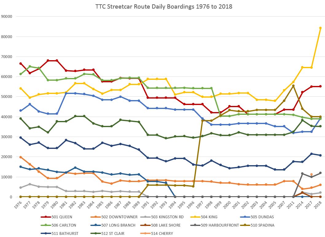
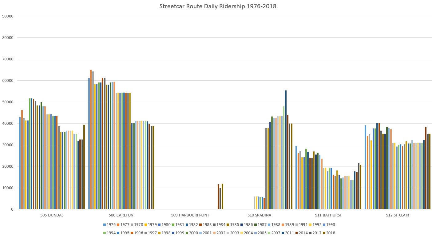
Streetcar Route Ridership
Note that in this section and the one following, the charts are formatted without the missing years. The effect is to telescope the period from 2005 to 2018 into a small space because so many years’ data are missing.
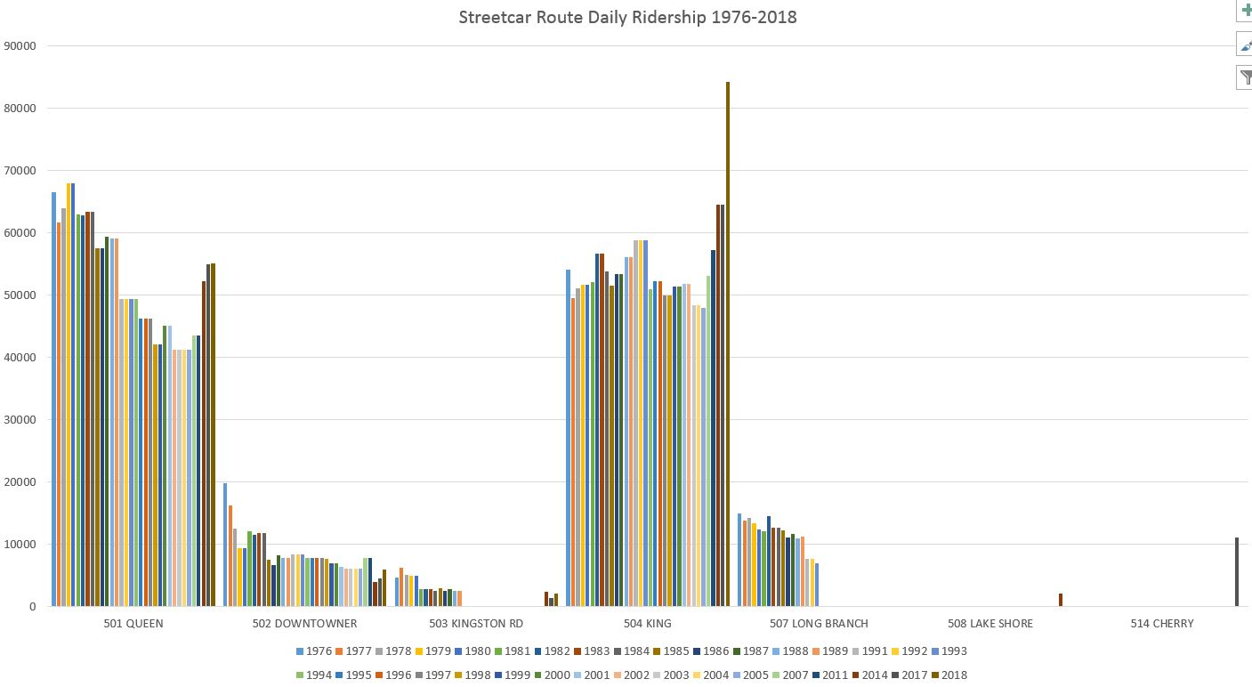
For the streetcar routes, I have presented the ridership data in two ways:
- with a graph showing all of the routes on one page
- with columnar charts showing the evolution of each route’s figures with the network spread over two pages.
A few notes:
- Until the 501 and 507 routes merged, data for the 507 Long Branch were reported separately. The blue Long Branch line on the chart ends in 1994.
- 509 Harbourfront was not reported independently of 511 Spadina until 2014. Before then, data for the two routes was consolidated in TTC reports.
- Data for 503 Kingston Road was consolidated with 502 Downtowner starting in 1991. The 503 re-appears in 2014 as a separate line in the chart.
- 514 Cherry appears only once, as a dot on the chart in 2017.
- Rising demand on 504 King is evident a decade before the King Street Pilot was implemented.
Another way to look at these data is to separate each route in its own chart. Here are the routes that collectively serve the Queen/King corridor.
- 501 Queen ridership dropped dramatically over the years, but it has been rebounding. The same cannot be said for the service except that there are now larger cars. For a considerable period before new cars were introduced, the service was provided by a mix of ALRVs and CLRVs but the schedule was designed for ALRVs, 50% larger.
- 502 and 503, the Kingston Road services have also lost riding. This is a classic question of whether the loss triggered lower service or the other way around. Until we see data from the unified 503 via King with a (one hopes) more reliable service than on two separate routes, it will be hard to tell if better reliability can build up demand again.
- 504 King shows large growth in recent years. Note that the one year when 514 Cherry was reported, its passengers were not included in King counts. The 2017 value for King would be higher if Cherry riders were consolidated with it.
- Riding on Dundas and Carlton shows a long decline, but the big drop came with the recession. Service never recovered to its former level, and riding growth is limited.
- Spadina shows strong growth. The most recent three columns here have lower values because the TTC now reports Harbourfront as a separate route.
- Bathurst had a long decline, but has been improving in the past decade.
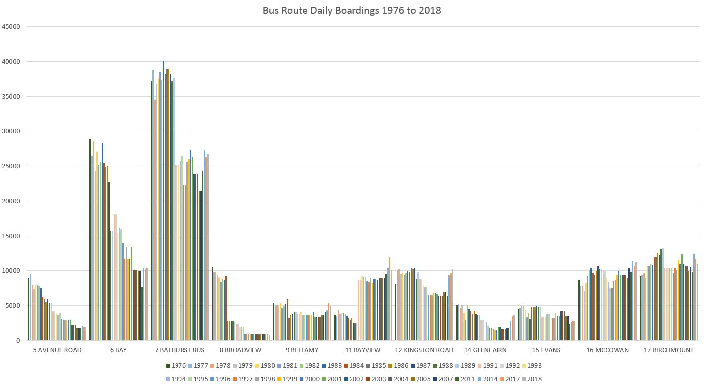
Bus Route Ridership
There are far too many bus routes to talk about individually, and I will leave it to readers to browse the full set of charts linked in the pdf earlier in the article. Here is the first page of buses as a sample. Various aspects of these charts are worth noting:
- The scale of each page is determined by the highest value shown on the page so that the shape of each block is clear to the maximal extent. Values between pages should be compared with caution taking the different maxima into account.
- The history is not the same for every route.
- The effect of the 1990s recession is not the same for every route.
- The recovery from the recession is not the same for every route. Some routes have returned to their former levels, others did not and may even continue their decline.
- Routes on both Steeles East (53) and West (60) show sustained growth corresponding to the build-up of population along the Steeles corridor.
- Some major changes in a route’s ridership arise from a change in service patterns, such as:
- Routes that have acquired separate Express services (900 series) are reported as two routes in the 2018 data. I have not consolidated them, and so routes like 24 Victoria Park, 25 Don Mills and 29 Dufferin show a riding drop in 2018.
- 34 Eglinton East shows a big drop in the early 1990s corresponding to its service east of Kennedy Station being split off as 116 Morningside.
- 52 Lawrence included the 58 Malton from the 2014 stats onward; previously these were separate routes.
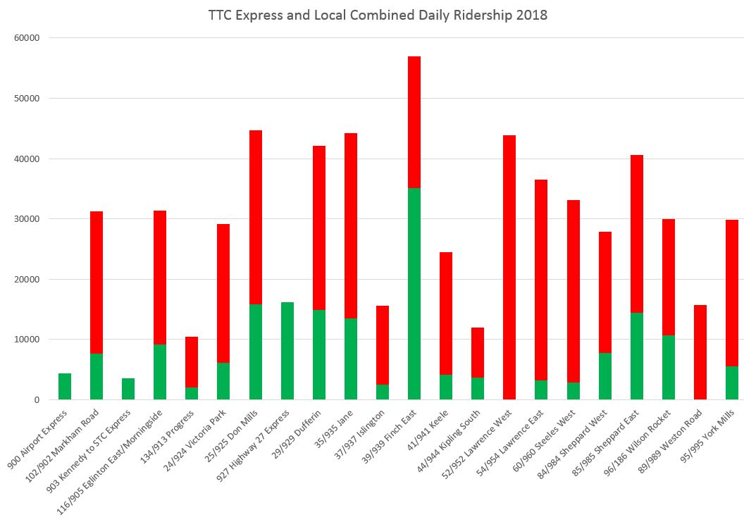
The 900 Express Routes
The 900-series express routes were carved out of existing services as a branding exercise with the intent that at some future date the express services would actually grow. In most cases, as I have discussed elsewhere, the creation of an “express bus network” was mostly hype, a marketing exercise to give the impression of progress by the TTC when in fact almost nothing changed. Subsequent schedule changes for “resiliency” have actually made service worse in a few cases, notably on Keele. Until the TTC makes changes that are demonstrable improvements for riders, we are unlikely to see strong growth in demand on the affected corridors.
For the sake of consolidating the numbers, I have merged the express and local counts for the express network as reported for 2018. As more years are operated and reported, this chart will be extended to show the change, if any, in demand on these routes.
Note that for 2018, 52 Lawrence and 89 Weston Road were still reported as a single route.
There is a large variation in the demand on these corridors, and on some the local service dominates. This can occur especially for peak-only express routes where the cumulative all-day ridership of the local service can swamp the numbers generated by the limited express service. The TTC should break down ridership info by service period so that direct comparison is possible between stats for those periods when both local and express services operate.
The Downtown Express Buses
For many years, the TTC did not publish riding counts for the 14x Downtown Express routes probably because they are embarrassingly low. Each of these routes owes its existence to a special pleading from a councillor (and often board member) wanting some way for their constituents to get downtown without facing the horrors of the subway or, even worse [cue SFX: gasps in the audience] on the Queen car.
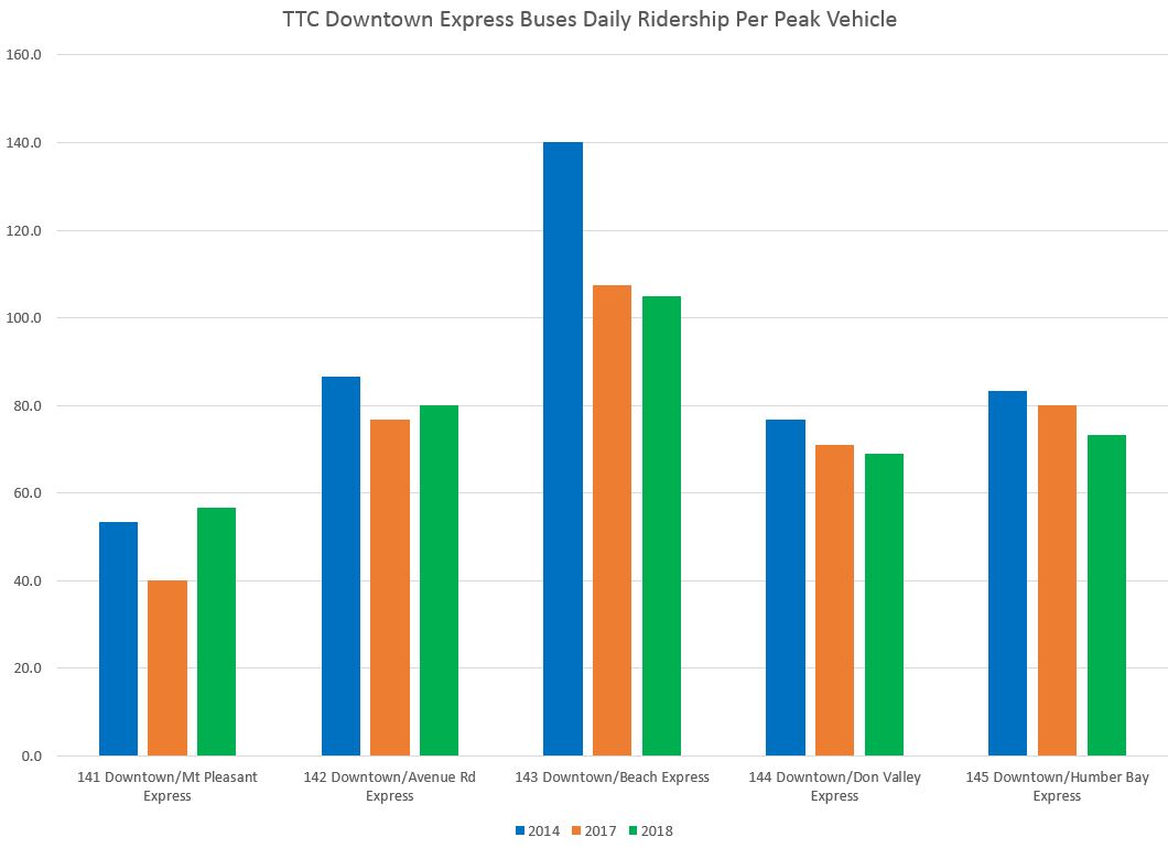
The reported daily ridership for these routes is shown in the chart below. In terms of riding counts, the 144 Don Valley service does the best, but as a long route this comes at a cost.
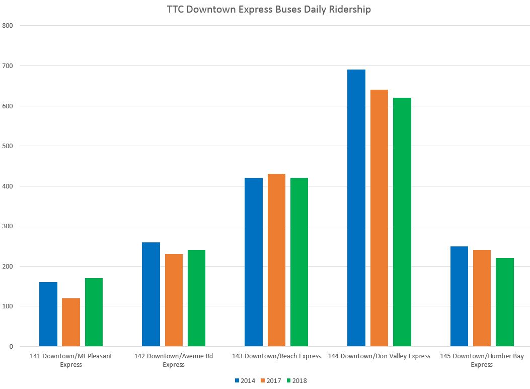
When we look at the ridership per vehicle, the situation is quite different. Here the 143 Beach Express does best, although it fell back from its original high level. Remember, by the way, that these are totals for both peak periods, and that some vehicles are able to make more than one trip on comparatively short routes.
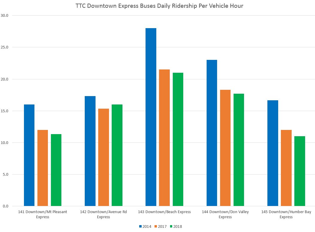
Finally, we have the boardings per vehicle hour. This is the metric used to flag poor-performing routes and to filter proposed new services or changes. The Service Standards includes the following table in which the Downtown Express services are explicitly excluded. That’s a good thing because these routes cannot even meet the standard required of a local bus service, never mind an express.
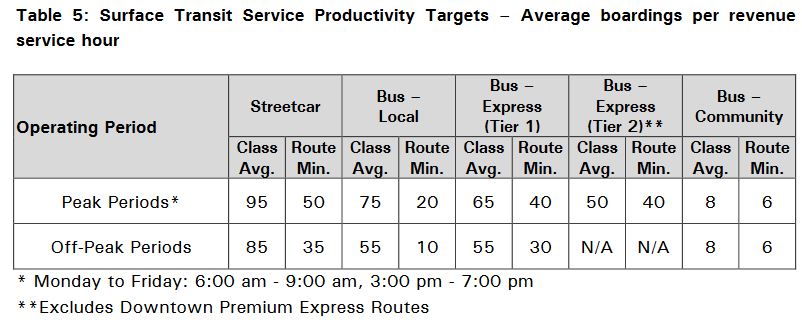
One potential point of difference here is that the standard is based on boardings per “revenue service hour” and this does not include dead-head time from and to garages. That represents a considerable overhead for routes that only run in the peak and may only operate a single trip.
The point here is that these routes provide only the most rudimentary “relief” where they parallel the Yonge subway, and resources dedicated to them might be put to better use elsewhere. However, this is unlikely to happen, and they will continue to lead charmed lives.

Thank you for all of this.
I recall in the early 2000’s a TTC Growth Strategy Plan that if 100% successful would never recover the expense of the strategy. The TTC has no business pursuing growth: they should focus on improving service and then the people will come.
Among the many many things that frustrate me about the TTC, my number one peeve is the use of “averages” to measure their ‘on-time’ record. In the real world – from a riders perspective, an early vehicle is an entire vehicle cycle late. The fix is so easy – never leave a stop ahead of schedule. (don’t get me started on short-turn or removal of low frequency vehicles)
As you touch on, the key to service improvements is in knowing the detail of ridership through the entire journey. The TTC seems satisfied to operate under the original “trunk line” model counting only whomever shows up rather than understanding who doesn’t and where those who do show up are in fact traveling.
LikeLike
Steve, you are to be lauded for this exhaustive collection of data, presentation, and analysis! Bravo!
Steve: Thanks. I have been accumulating this over many years!
LikeLike
The background story is the neglect of public transit by government. The City of Toronto has three real priorities – transit, housing, and health. Toronto, as a municipality, is under the full jurisdiction of the provincial government. So, let’s put any and all blame there, to Queens Park, for shortcomings. We know who is running Ontario now, but what about opposition voices? I wish that Andrea Horwath, Leader of the Opposition, would pick up on the transit file, or housing or health care, I have heard nothing in months.
LikeLike
Hi Steve, I noticed that a new branch of the 141 (the 141A) was launched at the start of this board period. The 141A runs parallel to the 141 and starts/finishes at Lawrence and Mt. Pleasant as opposed to Eglinton and Redpath (the last stop for the 141). I could not find any notices on the TTC’s website that advertise this new route except for a new 141 route map nor did I see any flyers posted on the 141 bus stop poles. The 141 bus stop poles that are no longer in use given the new 141A route located south on Redpath avenue are still present and don’t have the ‘stop not in service’ signage. Is this 141A a temporary route? Do you know why it wasn’t advertised — not that the TTC doesn’t operate in secrecy…, but this seems quite odd.
Steve: The change was implemented with the November 24, 2019 board period, and is among those listed in my regular update. With the concurrent shift of the 14x buses to King Street, this change to the 141 at the north end might have been missed. As to why the TTC didn’t announce this, or if the changes in stops have left some locations high and dry, that’s a matter for TTC Planning to sort out. The map on the TTC’s site for the 141 shows the extension, and the stops to Lawrence are included in the “all stops” list. Not all trips run to/from Lawrence, and so the stops on the old loop are still active, but not as much so. Obviously a notice to riders would have been nice, but the change was over a month ago and any posted notice might have disappeared by now.
LikeLike