
In Part I of this series, I reviewed travel times for the 505 Dundas service operating with streetcars and buses. As I have reported for other routes, the buses are slightly faster only when they operate on uncongested sections of a route where the more aggressive driving style of bus operators gives them a slight advantage. On the portions of the routes in the older city, generally west of Parliament Street, there is little difference between the two modes.
This article reviews service reliability and capacity on Dundas.
As with the analysis of 506 Carlton, the headway data are presented in three formats to illustrate different aspects of route behaviour.
As a general observation, the reliability of service on Dundas has not been good for several years and this worsened during the period of construction diversions in 2017. The TTC does not report on service quality, and when they do, it is on an averaged basis that hides a great deal of the variation that, to riders, translates to “where is my streetcar” and disbelief in the “official story”.
Service is ragged leaving the terminals, and it becomes more bunched and “gappy” as it moves across the line. Buses run in pairs commonly, even from terminals, in direct contradiction of the TTC’s goal that service be evenly spaced at least at the ends of the line.
There are a lot of charts in this post, and I have included them all so that readers can select items of interest.
As for the capacity charts, they show how Dundas has received no improvement in route capacity for years and, if anything, capacity has fallen.
Chart Formats
Percentiles Within One Hour
These charts show the headway data subdivided into four ranges for a one-hour period from 8-9 am. Each point across the chart is one weekday. There are gaps for months where I do not have the data.
- 100% (red): The highest (longest) headway seen on the day in question.
- 85% (orange): The headway value below which 85% of the trips within the hour operated.
- 50% (green): The median value for which half of the trips had wider and half had narrower headways.
- 25% (purple): The headway value below which one quarter of the trips operated.
The number of riders affected by any particular trip depends on several factors, including the availability of alternatives. The 100% line is the worst case situation, although a very long gap likely means that many would-be riders had a long wait, or took an alternate route. Shorter gaps between vehicles mean less waiting time, and the more reliable the headway, the more likely that loadings will be evenly distributed between vehicles. If the 85% and 25% values are close together, this shows that much of the service operates within a small window of headway values. If the 25% line is close to the horizontal axis, then many vehicles are travelling at very short headways, probably bunched with another vehicle.
The sample below shows headways leaving Broadview & Danforth southbound in the AM peak hour. Although the median value is fairly stable, the extremes of the 85th and 100th percentiles are not. The median rises slightly during mid-2017 corresponding to the period when running times and headways were stretched for the construction diversion. The drop in February marks the change to bus service with more vehicles on a shorter headway.
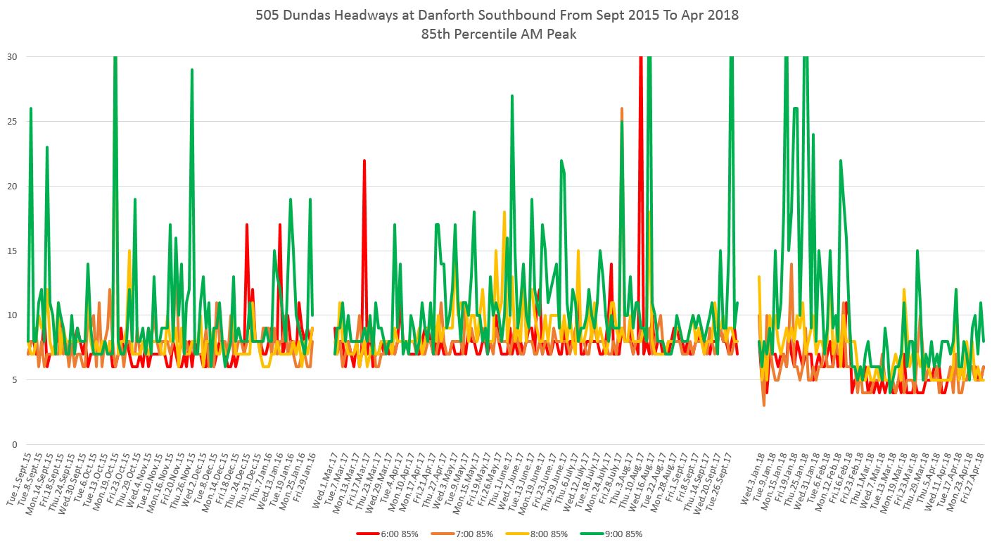
85th Percentiles by Time of Day
These charts use the same 85% percentile data, but combine displays for successive hours to highlight periods when the 85th percentile bounces around more. In the sample below, again for Broadview & Danforth, the highest values occur in the 9-10 am period when there is a lot of short turning to correct the effects of the AM peak and service at the terminal is erratic.
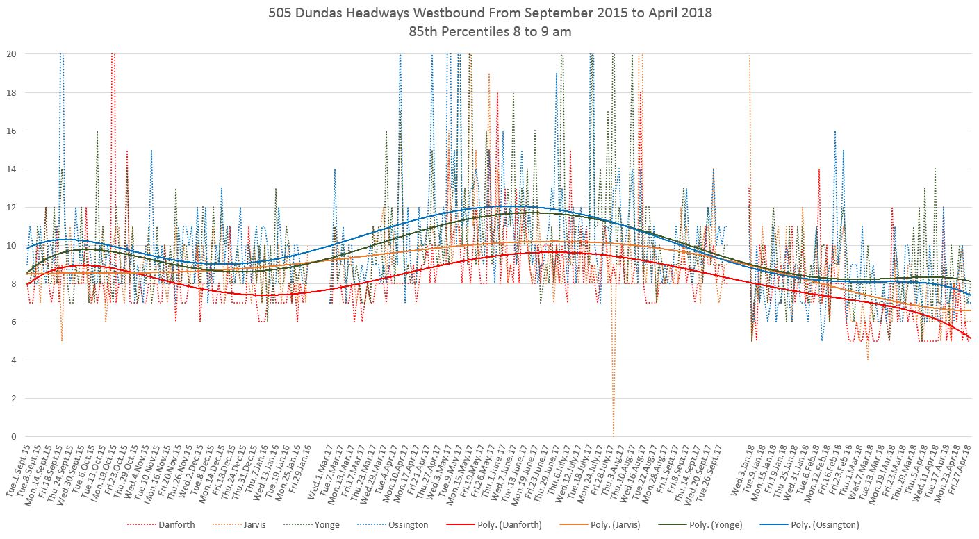
Percentiles by Location
In these charts, the data for four locations across the route are combined into one chart, and the data values are shown in the background as dotted lines. In the foreground are trend lines through the data. The purpose of the charts is to illustrate both the evolution of headways along a route, and the danger of looking at only one measure of service quality.
The median values for headways as the service travels west on Dundas stay fairly close together and they track, roughly, the scheduled headways.

The 85th percentile values behave differently. Quite evident here is a much wider range of values than for the medians above, and also lower 85th percentiles near the origin of the service (Broadview/Danforth) and to a lesser extent a few kilometers into the route (Jarvis). This is the result of bunching which is accompanied by wider gaps and hence a higher 85th percentile value. The situation is even worse in the following 100th percentile (maxima) chart. Service is somewhat erratic leaving Broadview/Danforth but the situation worsens by the time vehicles reach Yonge or Ossington.
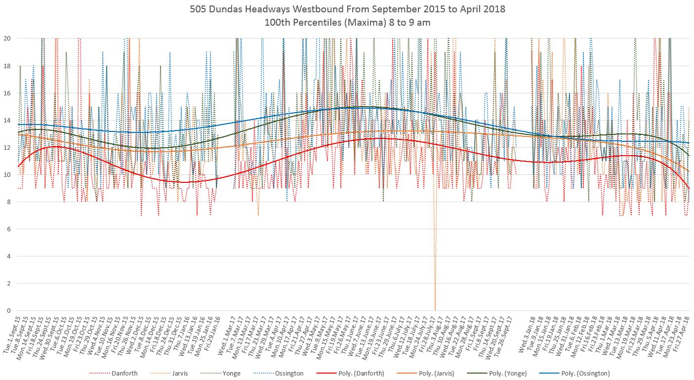
The 25th percentiles tell a similar story about gaps and bunching but from the other end of the spectrum compared with the 85th and 100th percentiles. As service bunches, there are more trips at short headways, and the 25th percentile value falls. This is shown below with the decline of the 25th percentile by the time service reaches Ossington as compared with Broadview/Danforth.

Westbound Service
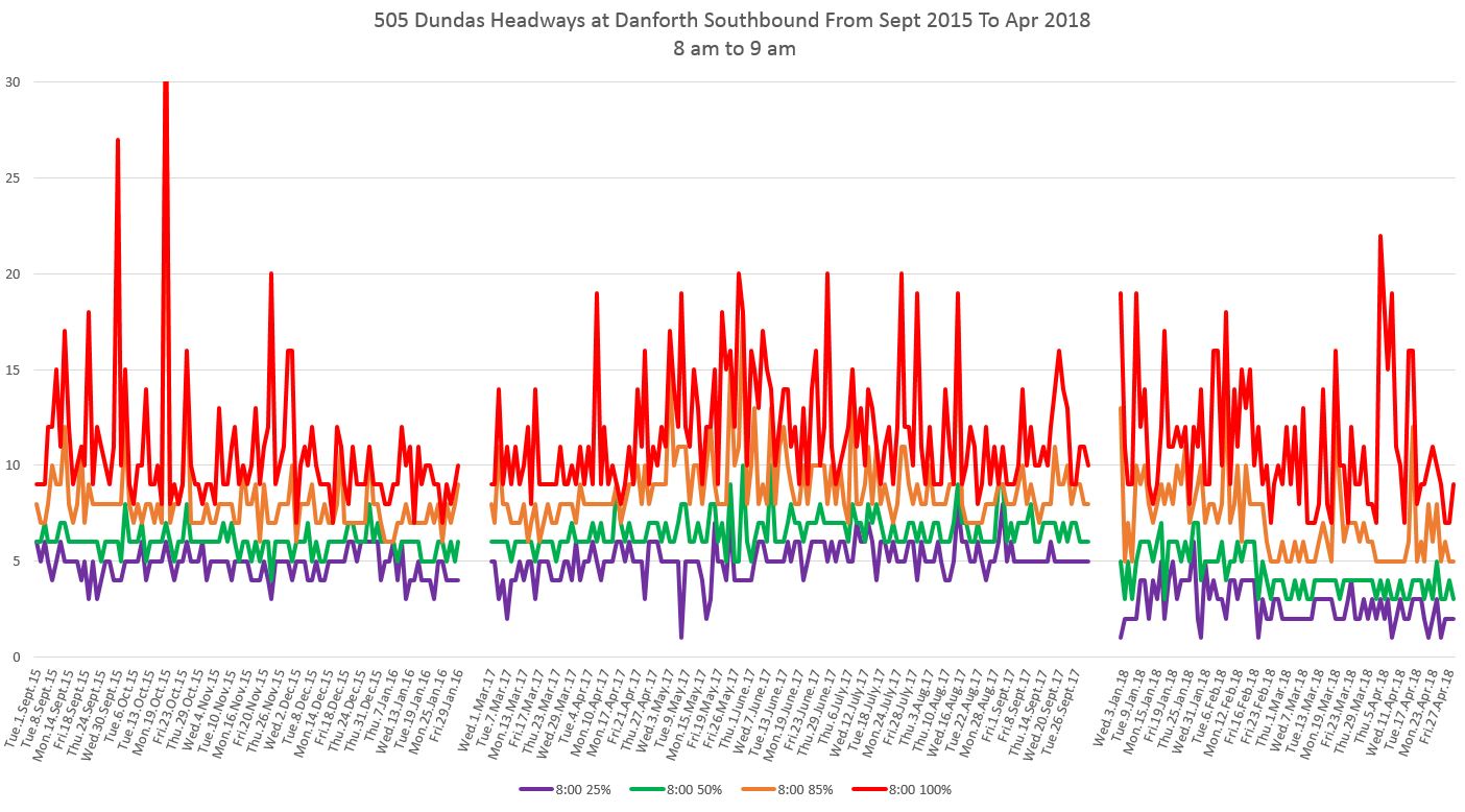
Broadview & Danforth Southbound
505_201509_201804_Danforth_SB_MonthHeadwayStats
The median headway leaving Broadview Station rises slightly in mid-2017 with the stretched schedule allowing for the construction diversion. By January, the median has dropped back, and it falls again with the conversion to buses in February. The degree of change varies by time of day.
What is particularly striking is how “spiky” the 85% and 100% lines are especially when one gets into later periods in the day. Wide gaps are common on the east end of 505 Dundas even in the peak period.
These effects show up clearly in the charts isolating the 85% values by time of day. The problem is not confined to a few hours, but appears throughout the day, and has been a part of the route’s behaviour for years.
Dundas & Jarvis Westbound
505_201509_201804_Jarvis_WB_MonthHeadwayStats
By the time the service reaches Jarvis Street, the bunching is worse and the gaps are wider. This shows up in very low values for the 25th percentile (bunching produces many short headways) and the spread between the median and 85th/100th percentile lines (gaps between bunches get longer as bunching tightens).
Dundas & Yonge Westbound
505_201509_201804_Yonge_WB_MonthHeadwayStats
Problems with bunched service and gapping at Yonge are similar to those at Jarvis. This is especially bad in the evening. Note that the 85th and 100th percentile lines for the period of bus operation are similar to those with streetcars. Even though there are more buses, they are simply running in packs with long gaps in between.
Dundas & Ossington Westbound
505_201509_201804_Ossington_WB_MonthHeadwayStats
The 8-9 am data for Ossington include some of the westbound trips by bus trippers that had been reassigned from King. This explains the particularly low 25th and 50th percentile values during this period.
Percentiles by Time of Day
505_201509_201804_WB_HeadwayPercentiles
As noted earlier, this set of charts contains a quartet of images for each time period through the day. The median values look good because they stay roughly near the scheduled headway. However, the 85th and 100th percentiles show a much greater swing, and they diverge a great deal from the schedule. Similarly, the 25th percentile numbers show the degree of bunching.
As one moves across the route, the differences between percentiles spreads apart reflecting the bunching and gapping.
Eastbound Service
Dundas & Bloor Southbound
505_201509_201804_Bloor_SB_MonthHeadwayStats
The situation eastbound from Dundas West Station is similar to what is seen at Broadview Station above. Even in the morning peak, the median tells a better story than the other percentile ranges and the 100% maxima spikes are already present. They will get worse as the day progresses.
The effect of the bus trippers diverted from King is evident in early 2018 from 8-9 am in the lower median headway. Unfortunately, the 25th percentile is also quite low indicating that there was a lot of bunching.
Dundas & Ossington Eastbound
505_201509_201804_Ossington_EB_MonthHeadwayStats
By the time the service reaches Ossington, the 85th/100th percentiles pull away from the 50th (median) and 25th percentile lines showing that the bunching that departed from Dundas West only gets worse as the service moves eastward.
Dundas & Yonge Eastbound
505_201509_201804_Yonge_EB_MonthHeadwayStats
At Yonge Street, the service is even more badly bunched than it was at Ossington. This is the service outbound riders to the area east of downtown receive, and it can be considerably worse than the advertised headway. Because Yonge is further away from the western terminal than the eastern one, the route’s bunching has more time to develop before it reaches the eastbound outbound peak than for westbound service.
Dundas & Jarvis Eastbound
505_201509_201804_Jarvis_EB_MonthHeadwayStats
Service at Jarvis simply mirrors what has already left Yonge Street.
Percentiles by Time of Day
505_201509_201804_EB_HeadwayPercentiles
The time of day charts show similar patterns eastbound as westbound with relatively well-behaved median values, but a much greater range for the higher and lower percentiles.
Capacity
The capacity provided on 505 Dundas has changed little over many years and if anything has been declining. The charts below show the design capacity of the actual service operated at three locations at various times since late 2006. (The selection of dates is governed by which data I have in my archives, not by some grand scheme to include or exclude specific periods.)
For each set of charts, one page is shown inline here for the peak hour (8-9 am or 5-6 pm), but the linked pdfs contain four pages each with hourly views over the full peak periods.
Unlike similar charts for 504 King which have shown both a growth in capacity and an evolution of the mix of vehicles, 505 Dundas has always been served by the standard-sized CLRVs until the recent replacement by buses.
Redeployment of 504 King Tripper Buses
In the fall of 2017, bus trippers that were scheduled to operate on 504 King were redeployed to 505 Dundas. This was done nominally to release streetcars for use on King, but in fact the level of streetcar service on Dundas did not change and the buses simply provided a burst of extra capacity. These trippers, on King, were scheduled to come eastbound into the core during the height of the peak period. In the charts below, they show up in eastbound peak capacity, but only have a small effect on westbound capacity during the 8-9 am hour.
With the formal rescheduling of 505 Dundas as a bus route, the trippers were removed, and the level of service fell back to the normal level.
Westbound at Broadview & Dundas, AM Peak Hour
The trippers show up on a small scale (the blue fringe above the main red streetcar service below) from 8-9 am. However, the full set of charts linked below shows the extra capacity provided by the buses making their westbound trip earlier in the morning.

505_200612_201804_Capacity_WB_Broadview_AM
Eastbound at University & Dundas, AM Peak Hour
In this chart, the effect of the bus trippers is obvious with Dundas experiencing an unexpected, and brief, increase in service capacity until they were discontinued.
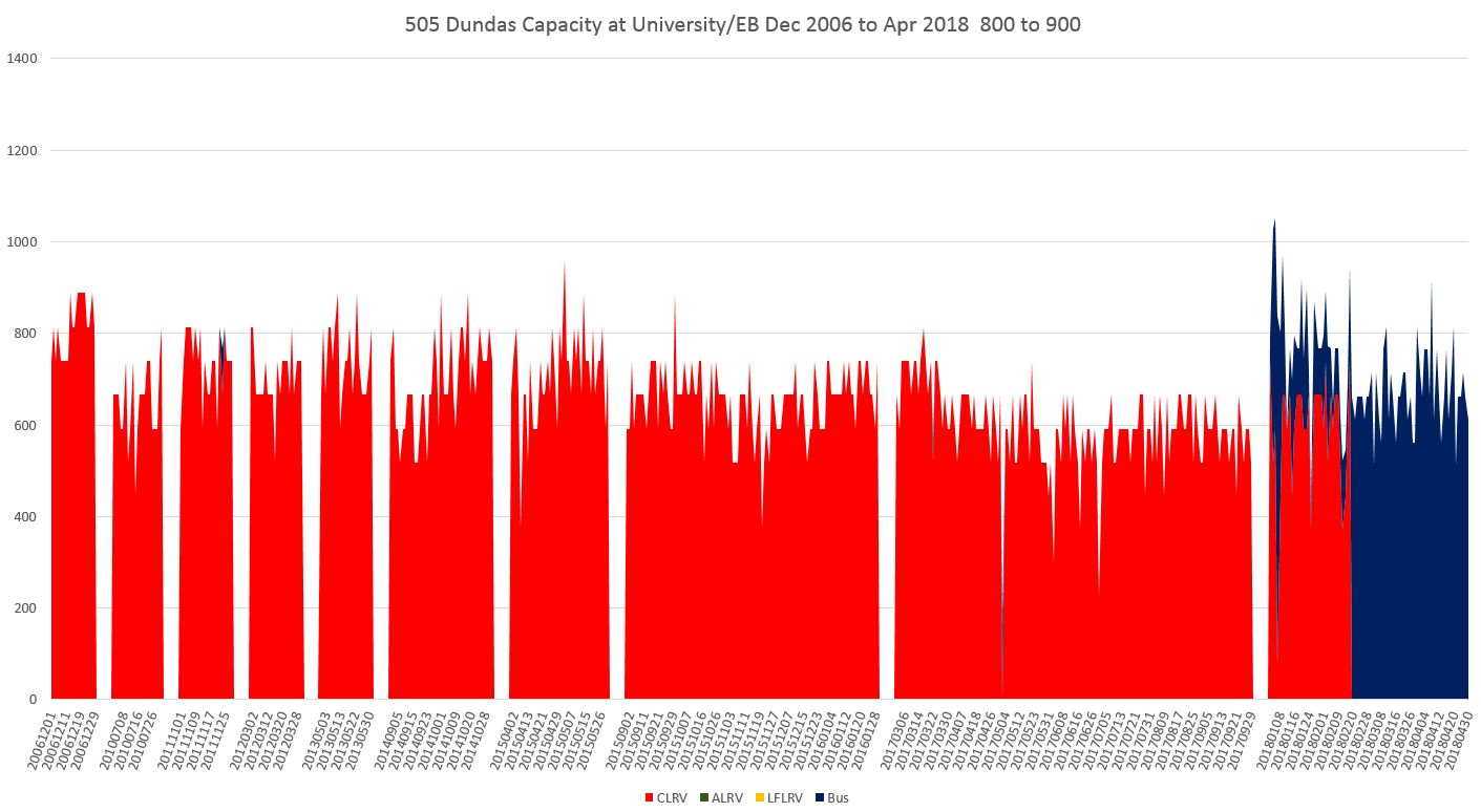
505_200612_201804_Capacity_EB_University_AM
Westbound at Yonge & Dundas, PM Peak Hour
As with the morning peak, afternoon capacity has not changed much over recent years. Note that for the period of construction in 2017, the capacity is measured at Yonge & College/Carlton. The effect of extended headways during this work shows up as a dip in the capacity provided on the route.
There were only a few scheduled 504 King bus trippers in the PM peak, and so their contribution to 505 Dundas after being shifted to that route was small compared to the AM peak.

505_200612_201804_Capacity_WB_Yonge_PM
Eastbound at Yonge & Dundas, PM Peak Hour
The service level eastbound at Yonge is comparable to westbound.

505_200612_201804_Capacity_EB_Yonge_PM
Scheduled Headway History
The chart below shows scheduled service levels for five periods in the day from 2008 onward. Peak period service on Dundas changed little over the past decade until 2015 when peak capacity was reduced by widening the scheduled headway (red and green lines). Seasonal changes until 2015 show up as blips in the chart, although the larger change in 2017 was related to the construction diversion. The recent change to bus operation appears as a drop in the scheduled headway to compensate for the lower vehicle capacity. The only major change in service level for the decade is the reduction in late evening headway from 14, to 12 and then 10 minutes.

(Source: Scheduled Service Summaries 2008-2018)
505_HeadwayHistory [pdf]

But, what I find interesting…Dundas West Station has no signage to identify it as a TTC station. This is especially frustrating to anyone who arrives on the UP train and can’t even find the station. As a neighbour, I seem to have become an unofficial travel director to out of town visitors. I have written to TTC and they have informed their “way finder” department, but really…shouldn’t a sign on the station be standard???????
Steve: There used to be a sign in front of the station. Several images on Google show it. The whole issue of wayfinding between the two stations deserves a photo gallery, and I will have to drop by Dundas West to walk the route showing just how bad it is for anyone who might be lost going either way. I am often at this station, but just passing through enroute to places like the Revue or Sunnyside.
LikeLike