Toronto loves to pat itself on the back for being the best at just about anything, although understanding exactly what that means seems to matter less than just being somebody’s “number one”. A few recent events combine to provide a view of the city and its transit system from different perspectives.
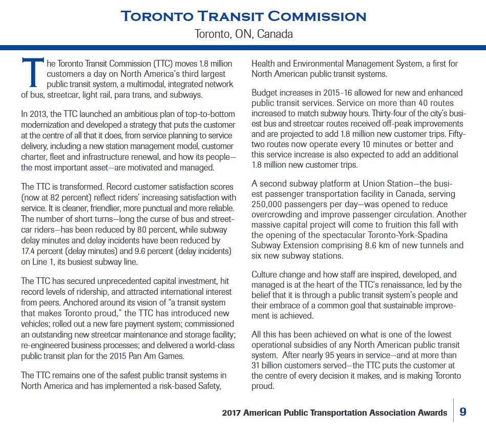
- The TTC receives the American Public Transit Association’s “Transit System of the Year” award for 2017. (See APTA 2017 Awards Program at pp. 10-11.)
- Arcadis, a design and consultancy firm, has issued their 2017 Sustainable Cities Mobility Index in which Toronto ranks 54 out of 100 on a global ranking, 9 out of 23 for North America.
- The Toronto Star, in an article by Ben Spurr, reveals that some TTC routes are crowded beyond the target level of TTC standards.
The APTA Award
The APTA award was announced with much fanfare by the TTC even before it was actually acknowledged on the APTA website. Every vehicle now sports a logo touting this win, and it is a matter of considerable pride for TTC management. Riders might be forgiven for wondering just what APTA was thinking given long-standing problems with overcrowding and irregular service. If Toronto is the best, what are the rest like?
In fact, APTA does not send out teams of mystery shoppers to gauge the quality of its member transit systems. Nominations are submitted by member agencies like the TTC and cite the basis on which they feel entitled to the prize, and these are judged by an APTA panel. In Toronto’s case, the win is for activities that, in the main, made up the Five Year Plan instituted by CEO Andy Byford in 2013, completion of activities already underway such as the Spadina-Vaughan extension and delivery of new subway cars, and reversal of the service cutbacks of the Ford era.
The list of achievements to date in the Five Year Plan is notable for the omission of improved quality of service as an explicit, measured goal. Yes, there has been a reduction in short turns, but this has not been accompanied by an improvement in service reliability. Bunching of at least pairs of vehicles is common, and the TTC’s stock answer is that “congestion” is responsible for this.
Line-by-line reports of service quality, long-promised by the TTC, have not been published since the first quarter of 2015. Even with such data, the metric is on time performance at terminals with a six-minute window to qualify for acceptable service. The result on most routes is that service can leave a terminus in pairs of vehicles and still be “on time”. Despite this generous standard, the system comes nowhere near the overall target.
Subway trains are crowded during peak periods to the point that passengers cannot board, and this cannot be fixed without additional subway capacity that is, for parts of the network, many years away.
This is the reality transit riders experience, and the APTA award and logos brought as much laughter as praise when they appeared.
Sustainable Cities
When BlogTO reported on the Arcadis Sustainable Cities rankings, it did so under the mistaken headline “New ranking trashes public transit in Toronto”. In fact, the rankings look at a much broader view of how cities compare to each other, and transit is only one part of the evaluation.
The review is of urban mobility generally, with transit being an important part, but also auto congestion, cycling and pedestrian facilities. The scoring comes from three “pillars” of sustainability with several sub-indices for specific aspects of city mobility. For those interested in the component scores, a visit to the detailed rankings shows info that is not available in the main report. (Click on various tabs to see the three pillars, and then the components of these. Scores are normalized so that top cities get 100, and the actual component score can be view by clicking on the bars of the charts.)
Toronto lies in the middle of the pack at 54th out of 100, but this masks the offsetting effect of different scores in the three component pillars.
An important point to bear in mind here is that for the purpose of the study, a “city” is defined as not as the metropolitan area, but as the city proper. In Toronto’s case this means the 416 alone, and in the case of some other cities, the area covered would be less even that what Toronto represents in its own region.
The topics under which cities were scored are summarized below (click to enlarge).
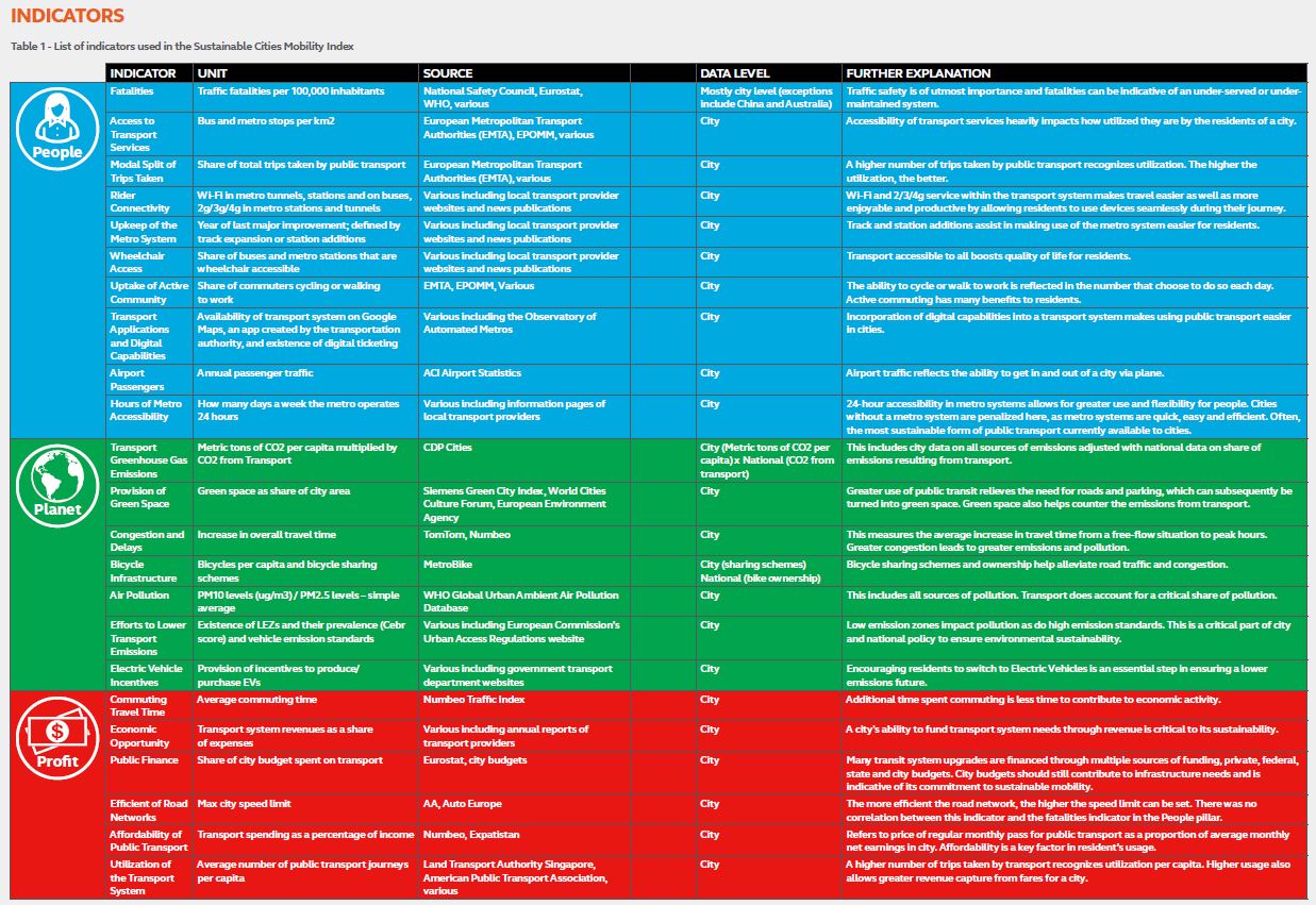
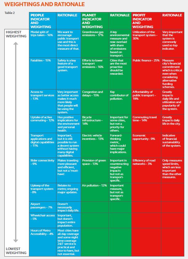
These components were weighted based on their importance within each group.
Under “People” (which deals mainly with mobility issues), Toronto ranks 65th with a score of 43.9%. The ranks and scores for sub-indices are:
- Fatalities: 18th / 90.1%
- Access to Transport Service (Bus and Metro stops per sq km): 64th / 10.8%
- Modal Split: 54th / 36.5%
- Rider Connectivity (WiFi): 67th / 32.8%
- Upkeep of the Transit System: 67th (note that there were no data for 28 cities) / 66.7%
- Wheelchair Access: 68th /55.9%
- Uptake of Active Commuting: 84th / 7.9%
- Transit Applications and Digital Capabilities: 73rd / 63.2%
- Airport Passengers: 33rd / 53.3%
- Hours of Metro Operation: 34th (in a group of 54) / 20%
Some of these numbers are a direct result of the scope of the review. For example, Toronto includes large suburban areas where route spacing is wider than downtown, and the stop density is lower. A “city” with a comparatively small suburban component would have a higher stop density. Similarly, the uptake of Active Transportation as a mode will be higher in a dense urban area than in the suburbs. By contrast, the percentage of passengers to the airport by transit is high. It could well be that the airport in question is on the Island, not Pearson Airport which is outside of the city proper. Moreover, even Pearson’s transit mode share for Toronto-based flyers is higher than for those in the 905 simply because there is better transit service available from Toronto (TTC and UPX).
Under “Planet” (which deals with environmental issues), Toronto does well at 32nd and a score of 62.5%. It is this comparatively high ranking that pulls up Toronto’s overall score and prevents it from falling to the lower tier of the global rankings.
- Greenhouse Gas Emissions: 67th / 60.3%
- Provision of Green Space: 57th / 20.6%
- Congestion and Delays: 51st / 56.3%
- Bicycle Infrastructure: 26th / 65.4%
- Air Pollution: 8th / 90.3%
- Efforts to Lower Transport Emissions: 40th / 40%
- Electric Vehicle Incentives: 34th (in a group of 62) / 100%
Almost none of these scores has anything to do with the transit system directly with an indirect effect only through the absence of good transit as an alternative in some parts of the city.As for “electric vehicle incentives”, this consists of a provincial giveaway to new vehicle buyers, not a widespread availability of the infrastructure needed to operate these vehicles. A significant part of Toronto’s good score is its low air pollution which has much more to do with changes in industrial activity in southern Ontario and the midwestern USA than it does with transit policy.
Under “Profit” (which deals with financial issues), Toronto ranks poorly at 86th and a score of 31.9%.
- Commuting Travel Time: 60th / 45.2%
- Economic Opportunity: 25th / 58.7%
- Public Finance: 74th / 14.5%
- Efficiency of Road Networks: 94th / 14.6%
- Affordability of Public Transit: 85th / 34.7%
- Utilization of the Transport System: 46th / 32.3%
Toronto’s low score here is clearly a combination of the relatively low level of public financial support and the low efficiency of the road network, something one must reasonably ask whether we should want to improve. Indeed, “efficiency” is measured as the maximum speed of the road network on the premise that higher speeds show that the roads can operate more safely. I am not sure this is a valid metric especially if one’s goal is to discourage rather than build travel by private auto.
Public financial support is measured against the operating budget, not capital, and Toronto ranks low on this score because so much of its revenue comes from the farebox. The affordability index measures the ratio of a monthly pass price to average monthly net earnings in the city, and Toronto has a high-priced Metropass compared to much of the rest of the world.
These scorings are not intended as an absolute measure, but as a way of providing a comparison across many cities. Toronto may do relatively well within the North American context, but it is still very much a car-oriented city compared to other parts of the world, and its fiscal policies are rules by keeping taxes down, not by constant improvements to transit service.
Overcrowded Routes
The Toronto Star article revealed that many TTC routes are overcrowded, although the degree to which this is so and the time of day when it occurs varies across the system. The following two files contain the raw data as provided by the TTC, and charts showing the percentages of overcrowding by time period.
Overcrowded routes 2017-10-25 Data
Overcrowded routes charts 2017-10-25
These data do not appear in published reports, but they should be part of the CEO’s Report to indicate the degree to which the system is falling short of the Board-approved Service Standards (see section 3.2, p. 10). The TTC, after all, prides itself on being a customer-focussed organization.
Where there is only a slight difference between the average load and the standard, one might be tempted to let things be. However, a critical factor not included in the data is the degree to which individual vehicle loads vary from the hourly averages. This is an aspect of service which can be quite sensitive to service quality and bunching, with the trailing vehicles running half empty while leaders of bunches are crammed. The difference between the “average” rider experience and the “typical” one can be quite substantial.
The standards are intended to allow for this effect in that there is “elbow room” to accommodate small variations in average loads. However, when service is erratic, this leeway is insufficient, and the crowding on lead vehicles, coupled with the extra wait endured for them to arrive, make for a less than ideal experience. Indeed, a route might have average loads within standards but typical riding experience of crowded, irregular service.
Finally, the TTC is fond of saying that it cannot run more service because it has no spare vehicles. This only applies to peak services, however, when the fleet is stretched thin. For off-peak services, the real issue is that the TTC is pinching pennies on service, operating considerably less of it this year than they had originally planned. That’s a political decision, one that says a lot about the kind of city we live in.
Summary
There are many factors by which a transit system and a city could be measured, and these will always come with a set of caveats, long footnotes to explain how the numbers work, and how to filter out the oddballs among them.
That said, there is an important place for seeing the transit system through the eyes of its riders and the city through the eyes of its residents. This is not necessarily the same as a more narrow view of attainment of management goals, or of reviews that only look at the tourist version of a city rather than its many neighbourhoods.