
The City of Toronto recently polled residents on a variety of issues related to transportation, notably the effect of and attitudes toward construction activities, as well as the top issues facing the city. A summary of the results appeared in a press release on June 26, 2015. Although the survey focuses on road work, it also picks up an interesting view of transit users and of travel choices.
As the Globe’s Oliver Moore first pointed out on Twitter, the headline on the release misleadingly states:
Congestion and gridlock remain top concern for Toronto residents, according to City of Toronto survey
There is a fundamental problem with this claim.
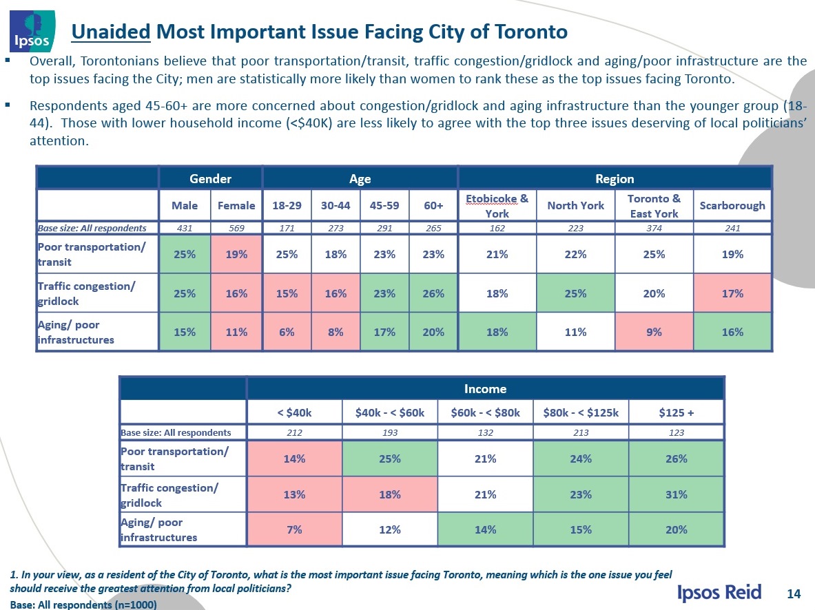
Better transit actually appears under three separate responses: Poor transportation/transit (22%), Poor TTC (4%) and Building subway transit network (3%). This is not to dispute that congestion and gridlock are important, but that this response ranks well behind, collectively, transit-related responses.

In the detailed breakdown, only the top three responses remain, and there is some disparity between the rankings. What is unfortunate, quite obviously, is that the category “poor transportation/transit” does not distinguish between modes. We do not know what type of “transportation” most concerns each type of respondent.
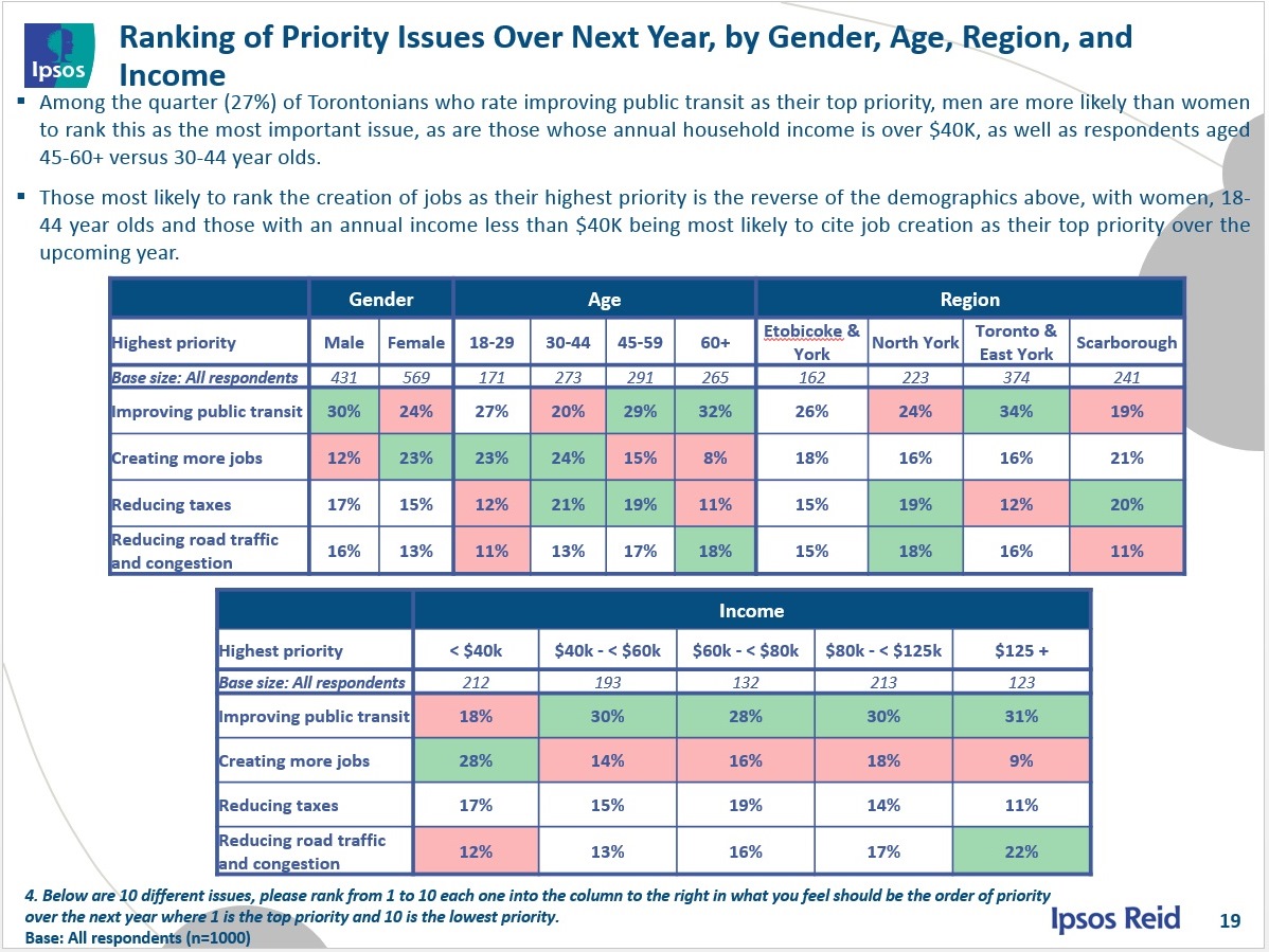
When the survey turns to the question of where Toronto should focus its efforts, transit comes out quite clearly on top as the number one pick of 27%, and in the top three for 61%.

The breakdown is revealing because it shows that there is much stronger support for better transit among those living in more central areas, and this support falls off notably in Scarborough, especially north of Highway 401. This begs a “chicken and egg” question: does improved transit get more support in areas where service is already relatively good and transit usage is higher, and can transit spending be politically competitive further from the core where it does not have as strong a presence?
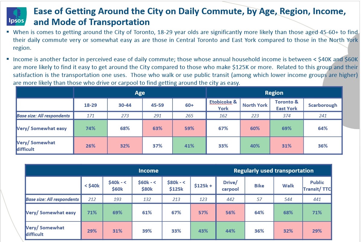
Next, the survey looked at perceptions of the ease of travel within the city and whether this had changed in the past few years. Two thirds of the respondents ranked their commuting travel as “very” or “somewhat” easy. This is hardly reason for celebration or indifference to transportation problems when the other third regard their travel as difficult. Moreover, this is a sample of Torontonians, not residents of the GTAH, and so it disproportionately reflects the views of transit users on a regional basis.
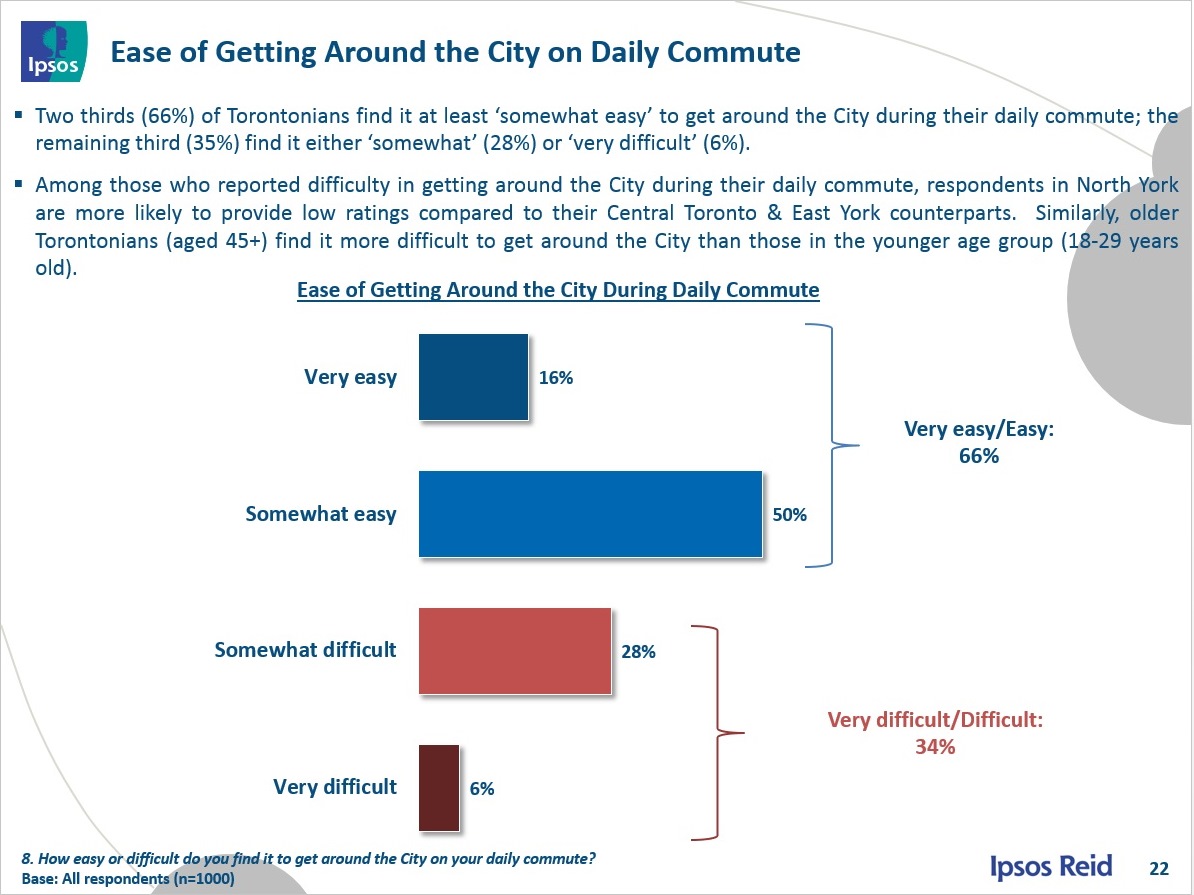
This also shows up in the breakdowns where there is a higher dissatisfaction among those who drive regularly, even though they live inside of Toronto.
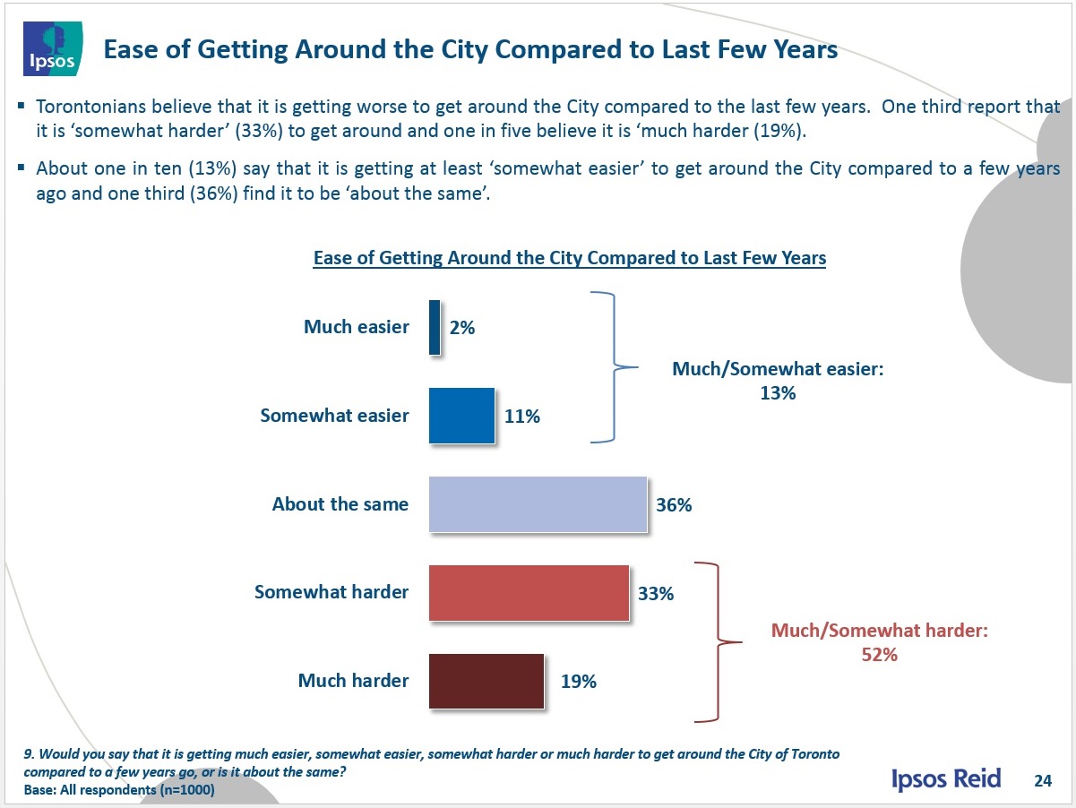
Looking at the evolution of commuting, the majority felt that this had become harder in recent years, while only 13% (less than one in seven) felt things had improved. This suggests that if nothing is done, the comparatively rosy figures in the chart on page 22 above will deteriorate.
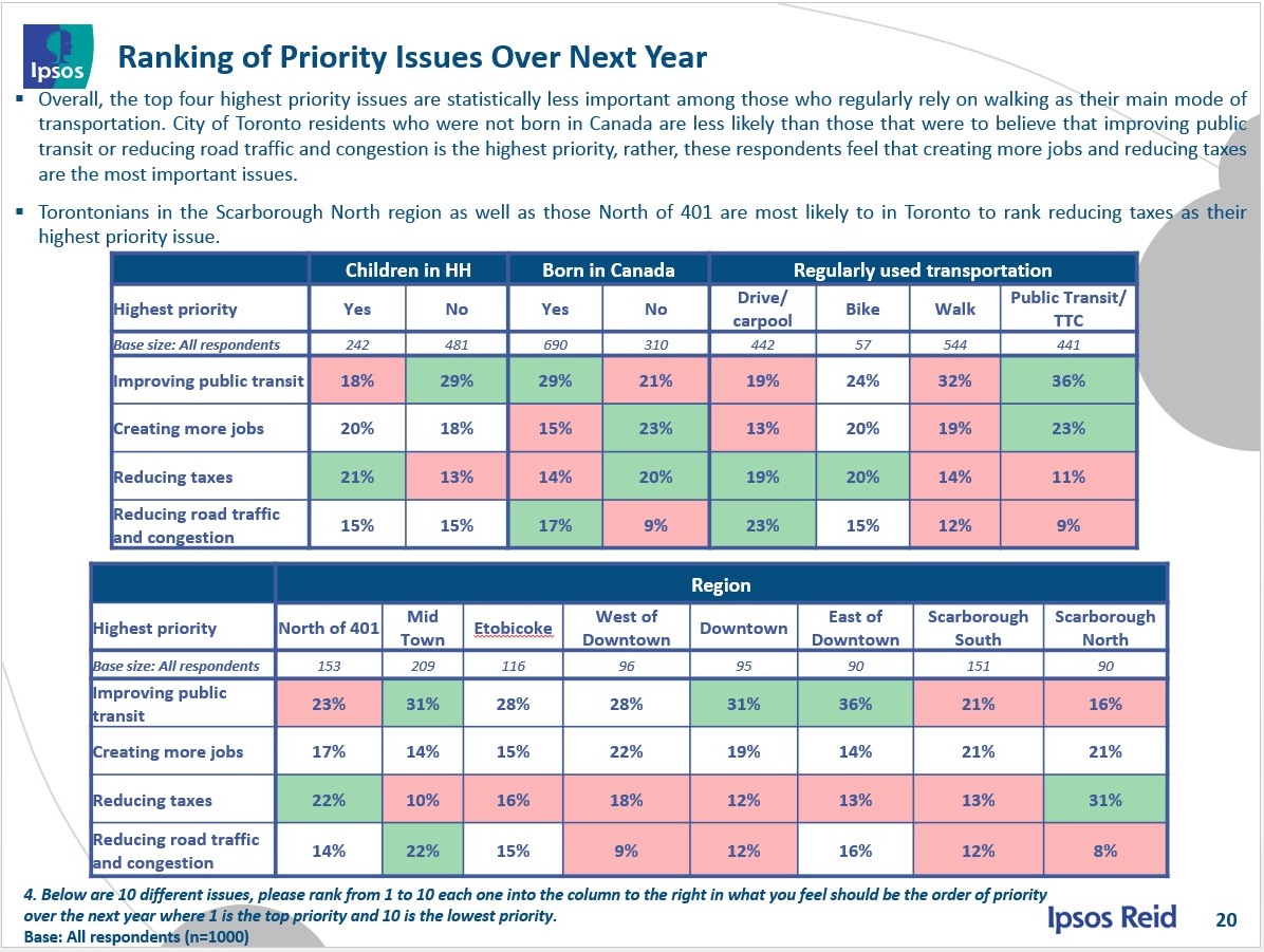
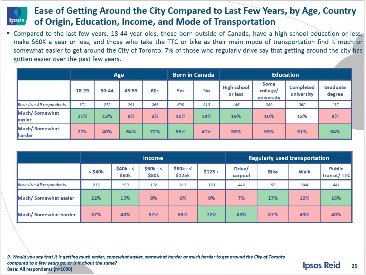
The spread of responses by age, education, income and regular mode of transport beg questions about the type of travel each group is making. For example, the sense that travel is harder is markedly stronger among those with higher education or income. Does this reflect their home and work locations, or even their lifestyle choices including a primary mode of transport?
Those who are older feel much more strongly (by almost a 3:1 ratio) that travel is more difficult. To what degree does this reflect the type of trips each group makes, and the greater (or at least more tolerated) options among youth?
Looking at the commuting modes, drivers feel more strongly that travel is harder in recent years, but so do 40% of transit users, a factor of which the TTC should take particular note. One figure really sticks out: almost half of those who cite walking as a mode say that travel has become worse. These numbers should be read with care because the count of responses adds to more than 1,000, the survey size. There is no breakdown as to which portion of someone’s trip has become worse, and walking, for example, is an inherent part of travel by transit.
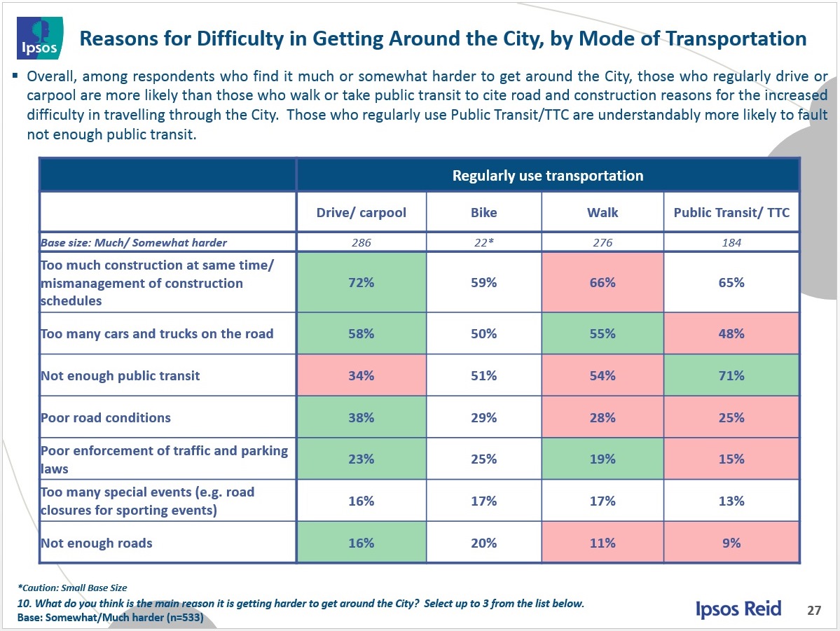
Why do people feel there are problems getting around? Too much construction and too much traffic rank high, but “not enough public transit” is right up there in third place. When looking at these numbers, remember that they only include the subset of people who feel travel is worse in recent years, and there are 1.5 times more drivers than transit riders in this group based on the chart above.
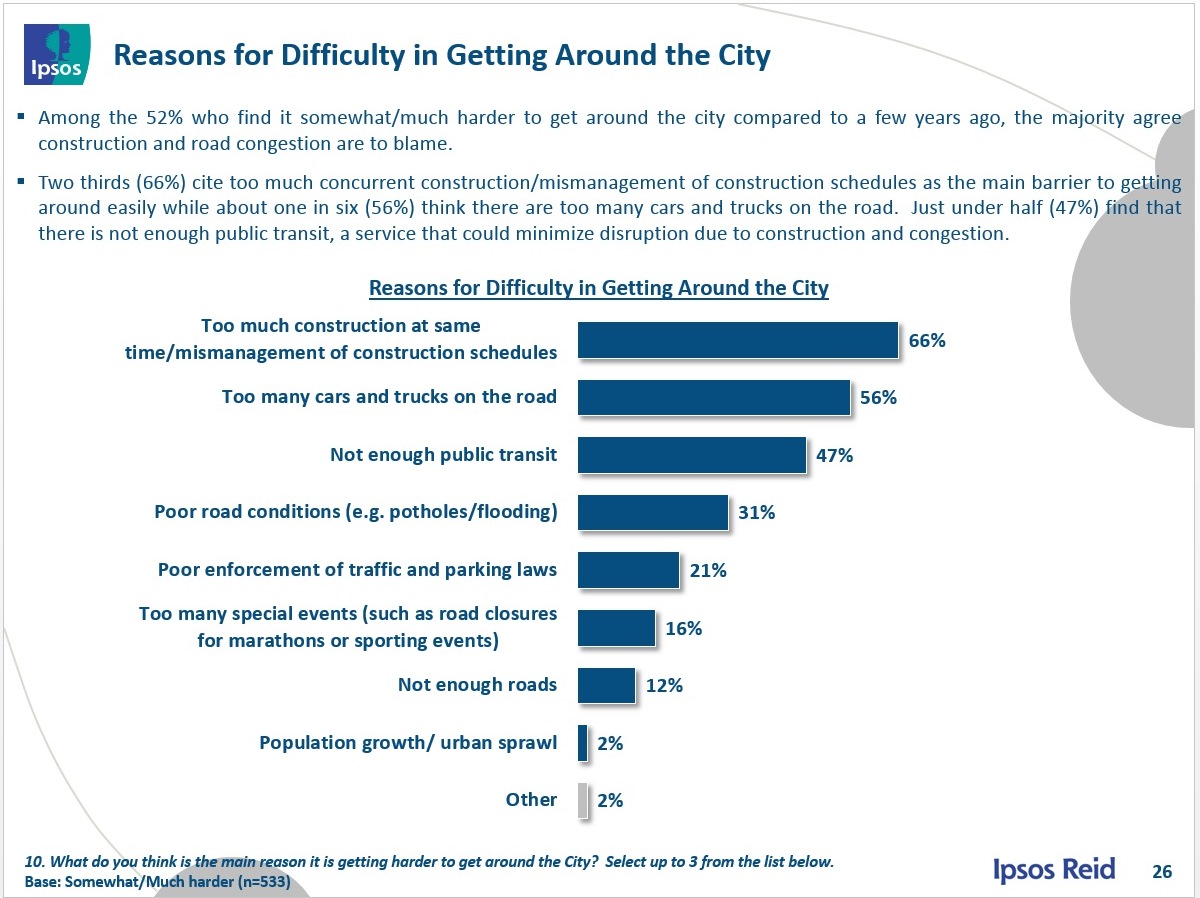
It is no surprise that among regular transit users, 71% cite “not enough public transit” as their reason for difficulty, although construction issues come a close second.
The next sections of the survey deal with infrastructure renewal, sources of news and information about projects, and possible ways to adjust the city’s messages about work it is doing to improve information reach and acceptance of the undertakings. These are not germane to this article.
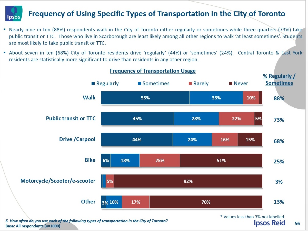
Finally, we have breakdowns of the use of each mode of travel. In the first chart we see that lots of people walk, 88% of respondents, hardly a surprise. Those who use public transit or drive are close in numbers, and these add to well above 100% showing that many people do both. Only 5% report never taking transit, while 15% never drive. At the other end of the scale, one quarter cycle at least some of the time. The regional breakdowns are not included as charts in the report, but the text notes that those in Scarborough are least likely to walk at least sometimes.
And the real shocker: “Central Toronto and East York residents are statistically more significant to drive than residents in any other region.” Yes, that’s right, the implication here is that there are more drivers in the central area (not to be confused with downtown), and yet that is also where there is a higher use of transit. This line is buried almost at the end of the report, but it begs major questions about the market for improved transit services.
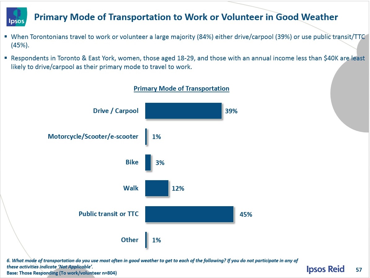
When only the primary mode of travel is considered, public transit wins out by 45% to 39% over driving, although this may in part reflect the geographic distribution of the respondents. There is no surprise here that those who live closer to downtown, women, the young, and those with lower incomes are least likely to drive to work. The number for cycling is particularly low at only 3%, outnumbered by walking by a 4:1 ratio.
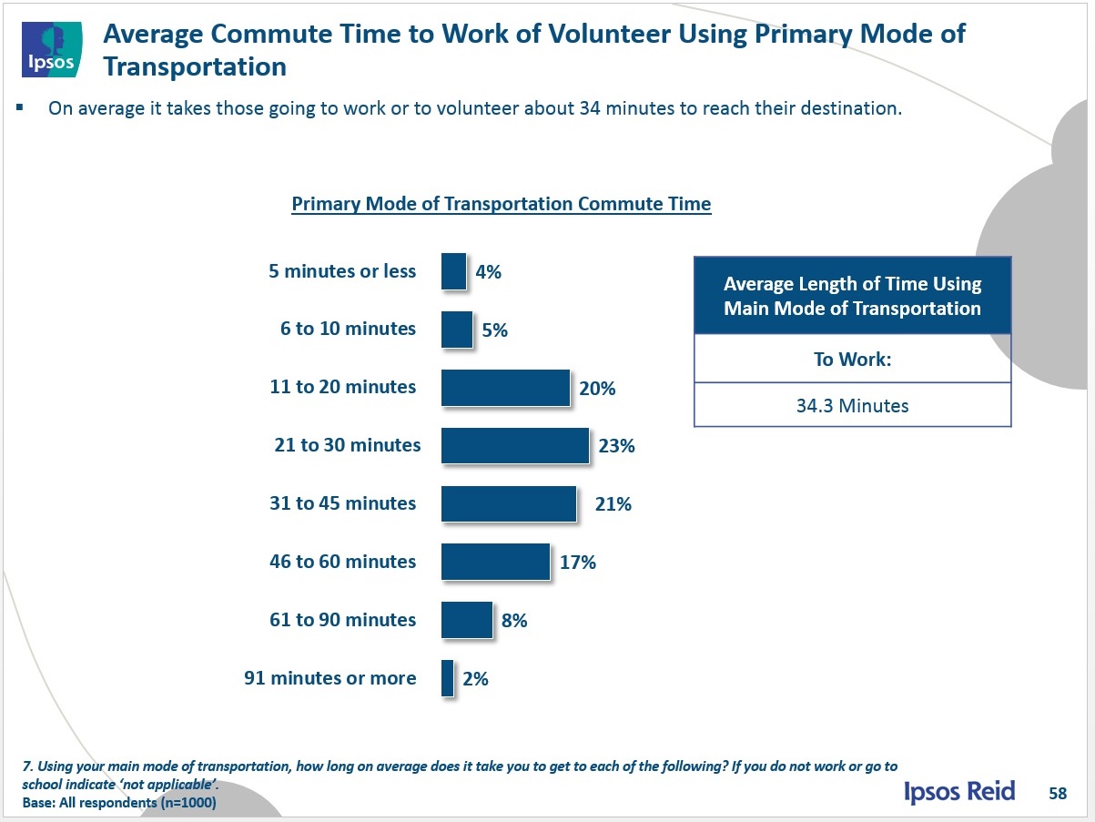
Last but certainly not least is a chart of average commute times. Note that the overall average is 34.3 minutes. Just over 1/4 report a travel time greater than 45 minutes, and only 1/10 of respondents cite a time of one hour or more. This no doubt reflects that the survey is of people living within the 416 (although comparable data for the 905 would make a fascinating comparison).
When we talk of saving the “average commuter” 16 minutes each way (as in the well-known “What Would You Do With 32?” campaign), we are quite clearly not addressing people who, on average, commute within Toronto. Those longer trips are primarily outside of the 416, and the questions then become both “where are they going” and “which of them will see any benefit from the infrastructure and service investments that are or might be in the pipeline”. These are questions far beyond a traffic congestion survey within Toronto, but they bear asking in the wider context.

Neither this article nor the City’s press release has (or I have somehow missed) a pointer to the actual survey data. Is there one, preferably one that includes details such as questions asked and how respondents were selected?
Steve: Nope. I got my copy of the presentation from another member of the media.
LikeLike
Postscript: then it occurred to me to look for myself. The City release says Ipsos-Reid conducted the poll. Here’s the polling company’s own release, which includes additional details and a pointer to a large PDF file of results.
The results file includes the questions, and breaks results down by geographic region, sex, age, and amount of education.
The basic background: Study conducted online, using a sample of 1000 “Toronto residents from Ipsos’s Canadian online panel.” (I don’t know just what that means; does anyone here?) Data were weighted to match with Census demographic data (this is the normal way to do such things). 95% confidence interval is 3.5 percent.
Oddly, Ipsos’s own release has the same misleading headline.
Steve: Thanks for the link. I will have to pore through the tables to see if there’s anything to add to my commentary.
Re the online panel: Survey companies maintain a pool of people who do web-based questionnaires from time to time (I am a member of such a panel for a different survey company). For some specialized polls they may recruit by phone, and then set up the panel for online responses. Other times, the filtering may occur at the top of the survey if the demographics of a respondent don’t fit what they need.
And the headline? Don’t know whether the City wrote it (trying to match the flavour of the day in the Mayor’s office) or Ipsos-Reid.
PS: After a quick review, I noticed that some of the breakdowns that are in the presentation are not in the table linked from the press release.
LikeLike
Sadly, I think the old concept of “always a car/bus in sight” will never come back.
LikeLike
The other issue is that actually looking at people’s current experience is not a good way of measuring future need, when you know you are close to capacity in many areas of the system. Most people cannot reasonably be aware of how system overloads will affect their journey, and this is really what needs to be addressed in Toronto. People’s journeys are likely to be seriously disrupted, by a relatively minor issue, or a small increase in load.
LikeLike
Perhaps with more rail no matter what the form, more people in outer areas will feel the same as those more centrally located
LikeLike