
The TTC is experimenting with changes to its signage for surface stops with trial installations on the 94 Wellesley bus route.
TTC’s Chris Upfold presented the new designs at the February 25th Commission meeting using a short PowerPoint which I have excerpted here.
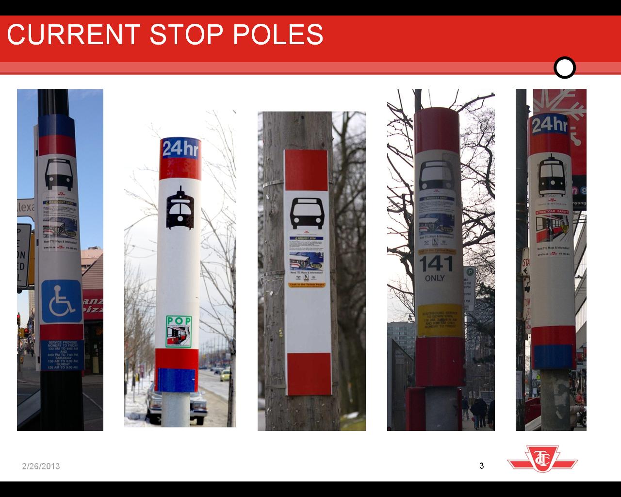
The rationale for the new design is that existing stop poles are inconsistent in their display of information and format. This is no surprise given the evolution of stop treatment over the years, and the application of overlay stickers as needed to reflect changing services.
Maps in shelters give the entire system view, but with a lot of extra detail that clutters the map. However, these maps also suffer from the scale at which they are displayed and the absence of “You Are Here” indications.
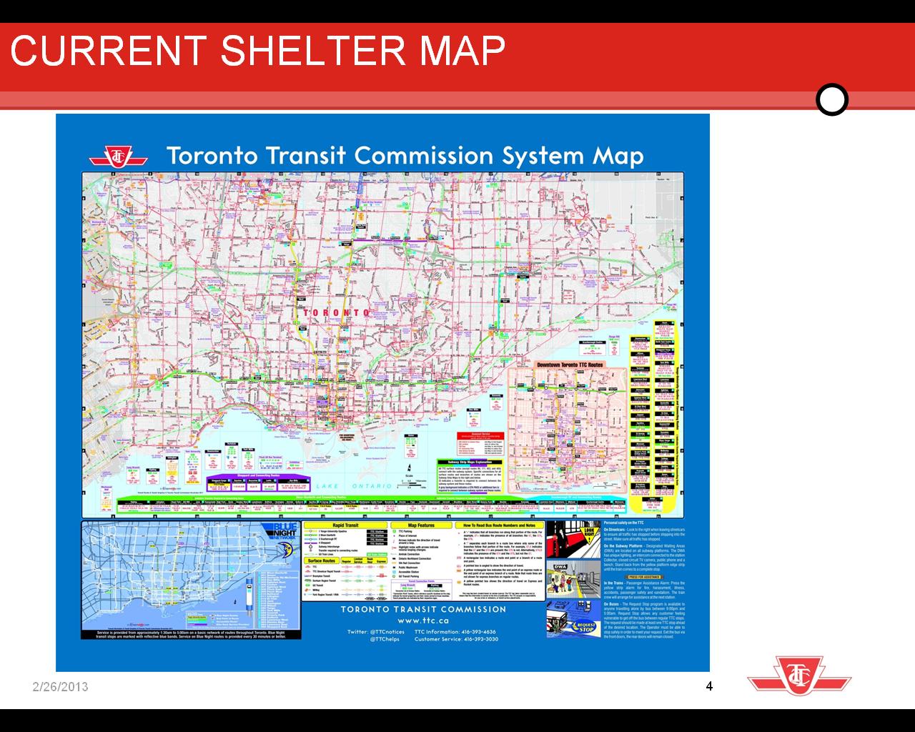
Much supplementary information is crowded onto the map that may be of little interest to the casual traveller who just wants to get from “A” to “B”. TTC research finds that these maps are not heavily used.
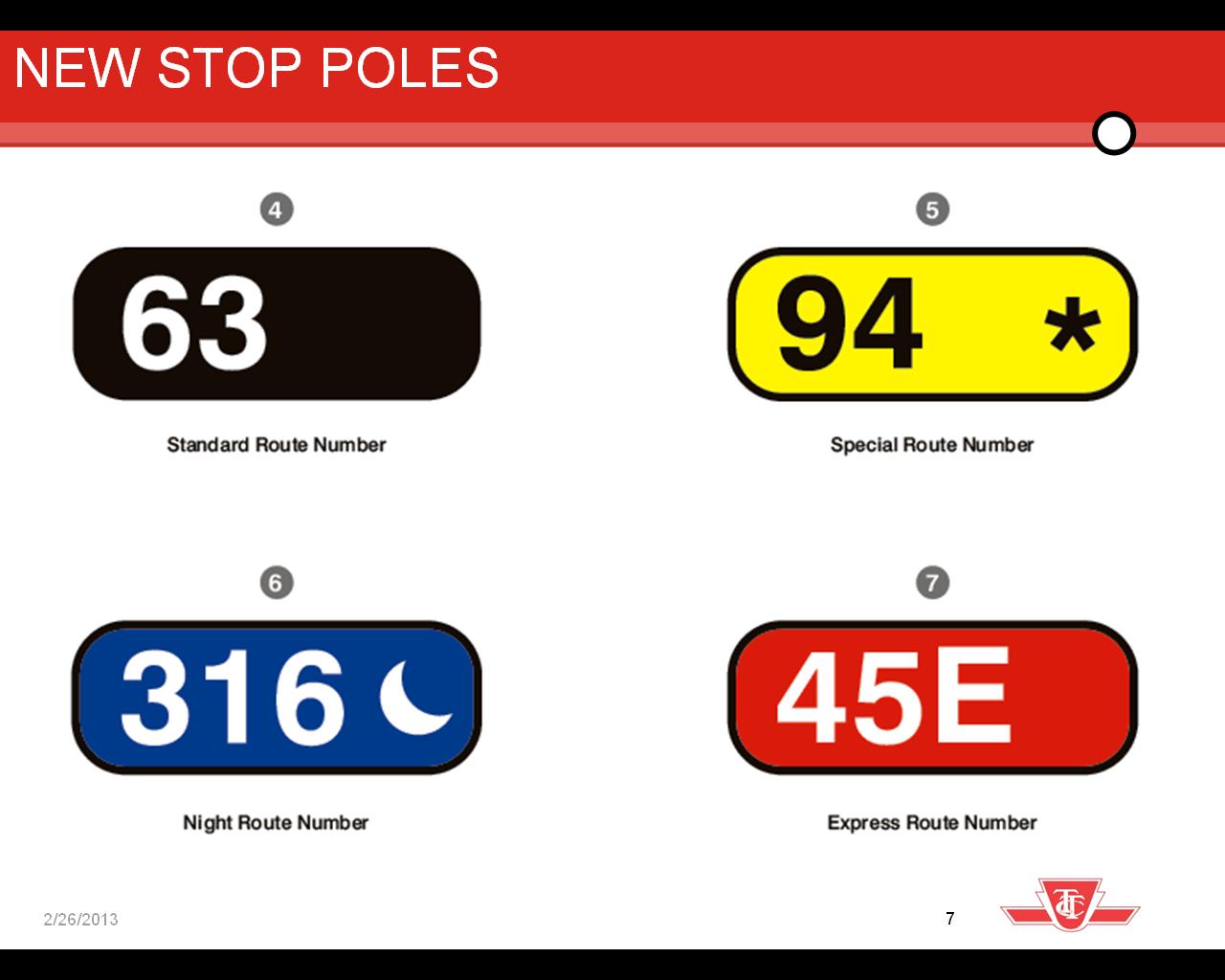
For the new stop poles, the design principles used by the TTC were [from the presentation at page 5]:
- Focus on critical information
- Focus on the service rather than the stop
- Focus on the intuitive hierarchy of information
- Stick with the current infrastructure
These principles lead to updated stop poles looking like this:

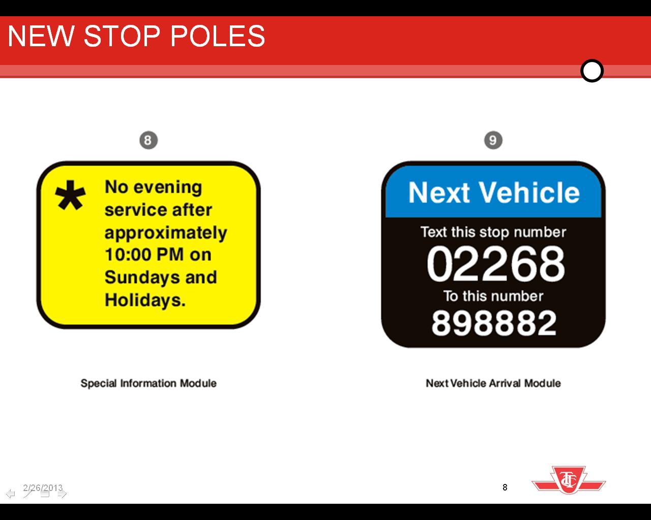
The pole shows the mode(s) serving the stop, whether the vehicles are accessible, the route numbers of all services, and the stop number for NextBus text messages. The overall legend is:

Notable by its absence is any redesign of the schedule information posted at many bus stops.
The system maps are to be replaced with a hybrid local area map that includes, in diagrammatic format, selected information about routes beyond the local map.
Here is a view of a full map for one stop:
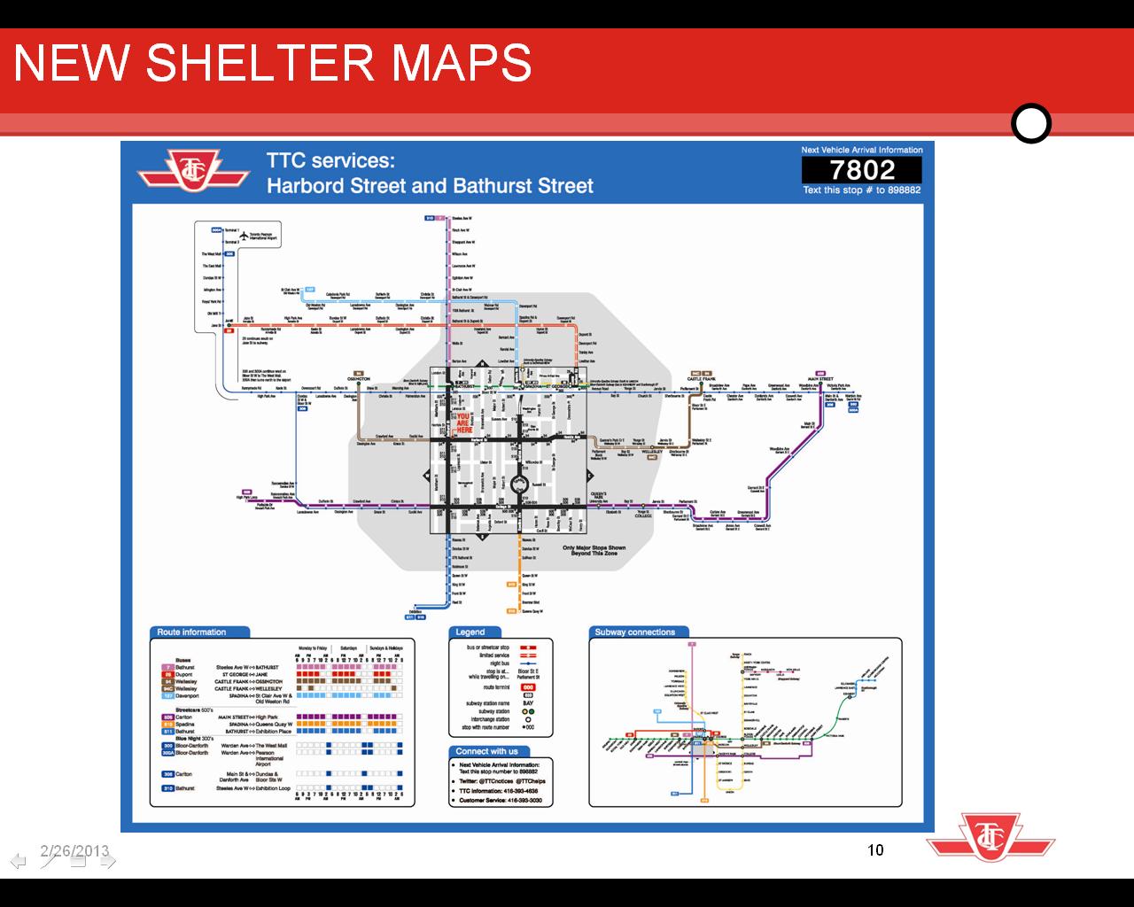
(A high resolution view of one such map has been posted by blogTO on Flickr.)
The centre of the new map is a local area street map overlaid by routes and showing the location of the stops. Except for the subway lines and the “You Are Here” pointer, there is no colour coding within this box.
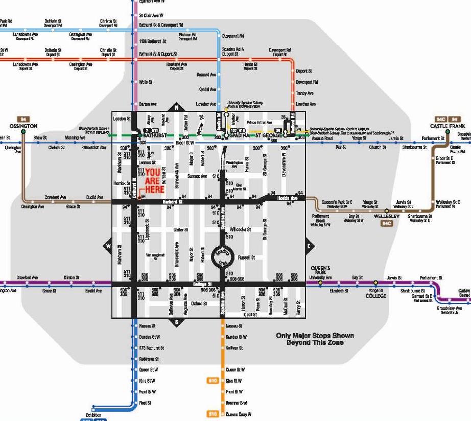
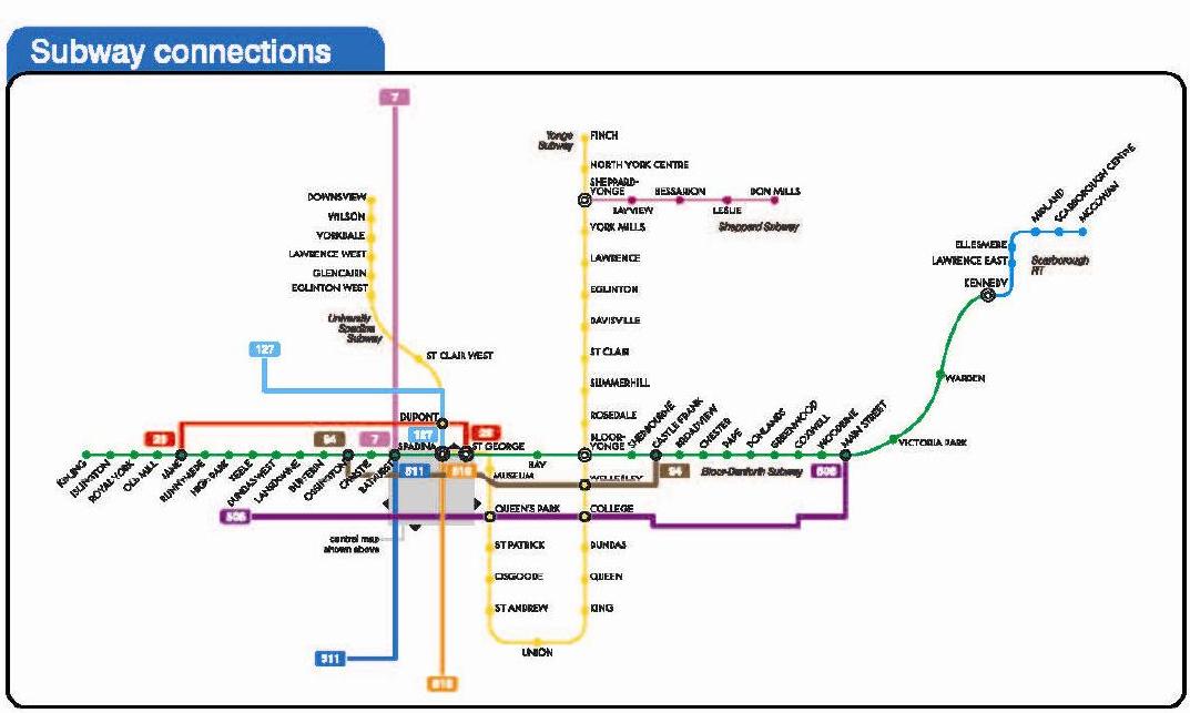
In the lower right is a subway map to which is added the routes passing through the local box. This is a very strange way to show routing information because it is far from geographically accurate, and gives no sense of the wider system of which these routes are a part.
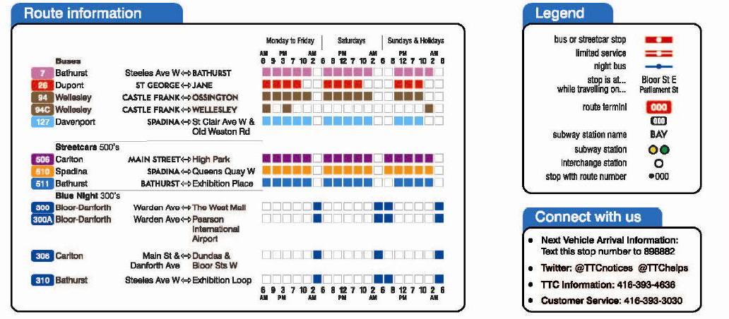
Finally, in the lower left, there is a legend which is supposed to show the periods of service during which each of the various routes and sub-routes operates.
These maps fail on many criteria, not least of which is that they completely replace a city-wide view of the system. Moreover, one of the more important components, the local area map, occupies so small a space that it does not have room to add notations or graphics for major points of interest. At the TTC meeting, there was a request from one Commissioner for Bixi locations, and obvious additions would be hospitals and other major public buildings. The local map will get very crowded very quickly.
By giving so much real estate over to the outlying parts of routes that happen to pass nearby, a vast amount of space is precluded from use for information people might actually want. This layout will become extraordinarily complex at places like Finch and Yonge where “nearby routes” stretch across the entire city and reach down to the waterfront, not to mention the effect if York Region services are added.
The hours of service legend is meaningful to someone like me, but it will definitely confuse a casual browser. What is completely missing is any sense of service frequency. Indeed, one might get the impression that the Davenport and Dupont buses are just as important as the three streetcar lines (Carlton, Bathurst and Spadina) that are also shown, but in fact they run infrequently. The white fine line along the routes is intended to show “limited hours of service”, and one can refer to the legend to see exactly when the routes do not operate. However, both of these routes are infrequent.
This brings me to Jarrett Walker’s concept of “frequent service maps” that show the network from a point of view of major and minor routes based on frequency. There may be many roads to Rome, but only one of them will get you there without a tedious series of transfers and waits. See Walker’s articles here, here, here and here.
The TTC, in abandoning its system map, has missed the opportunity to show people the hierarchy of its routes, which will provide fairly reliable, frequent service, and which require a timetable and NextBus to improve one’s odds of actually finding a vehicle.
For more commentary on this issue, please see Sean Marshall’s article on Spacing Toronto and Chris Bateman’s on blogTO. There are additional views of the maps in Steve Kupferman’s article on Torontoist.
The TTC will be seeking feedback on the new designs, and I am sure they will get an earful.
For long-time aficionados of TTC signage, we can start placing our bets on how long it will take for this detailed level of information to go out of date if the TTC makes no provision for ongoing maintenance, or relegates this to a “maybe next year” status.

I get where TTC are coming from with the new maps–they are a rough Toronto equivalent of London’s ‘spider’ maps, which show the local street map with the relevant bus routes extending out of the box.
The spider maps are great, but seem London-specific to me for two reasons: first, many London bus stops have half a dozen or more routes serving them, often with wildly zig-zagging paths, and a graphic of this type is required to see where they all go in a city with no street grid. Second, the full London bus system is so vast that a citywide map would be completely pointless. Interestingly, the spiders do not even include Tube lines.
This solution seems too clever by half in a city whose surface routes are organized along a grid with the principle that to move diagonally you need to change routes. There’s a certain geometry to Toronto’s system that should be transparent to riders.
LikeLike
I like the new stop poles, but the map and schedule are just confusing. I hope they didn’t part with money to produce it.
It’s not exactly a pretty solution, but I really like how MiWay handles route maps at Islington station. Some individual bus bays handle multiple routes, and every route gets its own map and schedule in a metal frame box strapped to the pole. The pole certainly gets cluttered, but I find it incredibly easy to tell both when my ride will get there and where it will go. The route maps are better than the TTC’s current ones; they actually show changes in direction and cross-streets so even when you hop on for the first time, you have a sense of when you’ll need to get off.
I’d be happy for a bit of haphazard sign-posting at TTC stops if the signs themselves were clear.
LikeLike
There’s likely a lot to like and hate about the redesign, though two thoughts come to mind.
1) The lack of a destination or direction is disheartening. These are common in other cities. A simple Castle Frank or Ossington (or Yonge perhaps) label beside 94 would at least help those who aren’t sure which way is which (you’d think they would … but it’s a common question I hear being asked at stops)
2) If we can do detailed mapping like this, then perhaps we can do similar to the current version of the maps in the subway stations, which don’t even show nearby bus routes – let alone bus stops!
Steve: The current station maps are an example of a TTC problem. The first cut at “new” maps were complete horrors because whoever drew them used a stone-age map of local points of interest and included countless errors on the map. Then they were replaced with an updated version that was clearly lifted from something like Google Maps, complete with the street grid rotated to true north, but missing simple details about transit routes. In both cases, the TTC was defensive about what they had done. I hope that this isn’t another case where we are stuck with updated maps because they’re too proud to admit mistakes.
Preliminary feedback I have received suggests that they’re open to criticism, but whether this will extend to major reworking remains to be seen. From this comment, you could rightly conclude that I think the new maps have few redeeming virtues. They may be a format imported from London, UK, but that doesn’t mean they’re good or suitable.
LikeLike
This redesign fails to take advantage of 21st century technology. The technology is there for real time interactive displays. Just think of the human resources needed to update the maps at every stop on a route like 39. Let’s say the TTC adds another branch to route 39, does that mean every post and map needs to be replaced.
There should be one giant video screen at every stop. This way, information can be updated remotely so that the information is always up to date. If there are any accidents or diversions on the route, at least people would know. I have a problem with the NextBus system. Why should I waste a text message to find out when the next bus is coming? With a video screen, this information can be displayed in real time.
Advertisers can also pay for spots on that screen. I do not mind seeing 30 second spots of anything really. There are so many ways for the TTC to make money with the assets they hold.
There is no real need to have buildings of significance on a route map. This information should be placed on ttc.ca so that people can know ahead of time. A map that shows all the stops should be sufficient.
LikeLike
Are city wide maps at each stop relevant in a city the size of Toronto? There many routes I have never ridden or may never ride. Do we really need these at each and every stop? More localized spider maps make more sense.
Steve: My complaint is with the balance. Comparatively little space is given over to the “local” map, and a lot of space is used up showing the outer ends of routes that are a long way away. In the case of Carlton, this gives the map a span from High Park to Main, but no sense of what else might be in between (not even the Yonge-University subway). Imagine what a map for Yonge and Eglinton would have to cover in the outlying arms of the spider. I don’t think the designers thought through what this map would look like expanded to the full system.
As for system maps, I agree that a subset appropriate to the part of the city one is in would be adequate, if only because it could be at a scale where someone could make sense of it. But this could be handled by making the “local” part of the map larger to increase both its scale and scope. The spider arms convey little because they are only a tiny subset of the routes reaching out beyond the small local area.
LikeLike
I would like to see either the compass direction the vehicles will be going, or better, the Up or Down direction which would reflect on the paper transfers given. They could put that on the bottom red bar of the stop pole.
Wouldn’t the little handicap sticker be a little redundant after the last low-floor light rail vehicle arrives? Wouldn’t ALL TTC vehicles become handicap-accessible? Maybe it should be replaced with a non-handicap accessible sticker (a red line through the handicap symbol?), might be cheaper?
LikeLike
Observations:
1. I understand the goal of giving the TTC logo pride of place at the top of the pole but I like the blue bands at the top of the poles denoting Blue Night service (as well as the 24hrs) because it was easy to see at a glance (and at a distance) that I was at the right stop.
Steve: This is also important for operators. It’s noteworthy that they have also forgotten a distinct character for Sunday stops, and with the new design it would be easy for someone to think it’s a real stop during the week unless they read the fine print. The different colour makes it obvious.
2. I also don’t really see the need for the round, red “Express Route” badge when the express route is already identified in the red rectangular badge above.
3. I agree that if they plan on highlighting the “local area” they should give it more space and give less information about outlying portions of the routes.
4. Some kind of frequent service indicator (thicker lines) would be welcome and easier to see than the thin white line.
5. The “Subway Connections” continues to emphasize the subway over other (often, more direct, scenic and faster) routes … why not include streetcar/LRT routes in there as well … or an indication of “frequent and fast” (with the appropriate disclaimer about traffic conditions “usually” affecting service) options.
I’ve seen local service maps in a variety of places including Singapore and London and I’ve found them useful so long as they are kept simple and clear. The ones shown here may just have too much information.
Cheers, Moaz
Ps. Steve, would you entertain people posting links to images of good, bad and ugly service maps and bus stop poles to this thread? You know, for comparison and understanding best (and worst) practices.
Steve: By all means: links to examples illustrating what people would like to see (or would hate to see imported here) are welcome. If these can be in context, it would be particularly useful. For example, there may be a map, but it may be part of a larger set of info conveying directions to riders at stops.
LikeLike
If there is enough space at a transit shelter then why can’t we have both a system map and a “local” map?
Steve: They are working within the constraint of the existing map frames. Changing this is just about impossible as it would require Astral to redesign the shelters, and that won’t happen. The main issue is to use the available real estate to best advantage.
LikeLike
Surprise! Steve Munro doesn’t like something.
Steve: If I liked everything, there would be no point in having this blog whose purpose is, among other things, to stimulate debate. I am not a shill for the TTC, and when they do something that could be improved on, I say so.
It’s truly amazing that we have a GTHA where transit and its many shortcomings are major issues for debate both as to funding, management and political philosophy, and yet “not liking something” is something I should avoid.
If you want a good news blog, start your own.
LikeLike
The maps do a few things well:
They point out how the local system of movement in my area works.
The maps provide a conceptualization of transit in a neighbourhood that most of us, focused only on our own routes, don’t realise. (I am convinced that most people do not know alternate routes.)
The maps look like they are being designed for people to use, rather then for directing ttc drivers where they are going.
And they at least begin to address a view of the TTC as a system that is made up of different weighted parts, rather then a series of lines that all look equal.
But, the maps fail because they attempt to bludgeon all movements into those that can get there from here on a vehicle that is at some point nearby. If I only looked at this sort of a map, I don’t think it would show me how to get to most of the places I take the TTC to get to.
LikeLike
I do want to call out one thing I like about the local system maps – using the Toronto Subway font (or a very close facsimile) to denote subway station locations and names.
Too bad they’re using it for stations that never had the Toronto Subway font, thus muddling the branding a teense.
LikeLike
I’m still annoyed that the system map was shrunk to fit the smaller holders in the aquarium-style bus shelters.
LikeLike
Steve: Moaz sent in a number of URLs pointing to various maps. I have corrected some of the supplied URLs.
London bus stop
Branching route map
Spider map from Elephant & Castle
Branch map with QR
Kuala Lumpur GO KL free bus
Kuala Lumpur Rapid KL area 4 bus map
Kuala Lumpur zone based bus stop route map
Cheers, Moaz
LikeLike
Not having a direction on the sign means the improvement isn’t much of an improvement at all. A route number goes in two completely opposite directions.
I too like that they have the Toronto Subway font but without them being consistent that something in that font is a station name, and something not in that font is not a station name, across all signage, maps, and station walls, then there is no benefit of using the Toronto Subway font other than to make it less readable. I would far more prefer then use this font on the station walls than in small print on a map.
LikeLike
When I moved to Toronto over a decade ago I was always puzzled whether the bus or streetcar I was catching was going in the right direction. As each stop sign will be ‘handcrafted’ (getting a code number) it hardly seems unreasonable to have them add a direction or terminus. Now I am often asked by tourists (?) which direction they need to go so this is a common problem and one fairly easily fixed.
I note that the stop signs do not deal with the timetables the TTC posts – even after a decade here these remain hard to use and the FS notation is a mystery to most people. The Montreal posted timetables are FAR clearer.
LikeLike
What these maps completely miss is that Toronto is built on connections. These maps would do well in a place like Ottawa where more often than not your trip involves a single route direct to downtown, but in Toronto, I’d think its far more useful to know which frequent routes connect to the one you’re about to get on.
LikeLike
Instead of texting for NextBus information, can’t it just have an LED screen that gets data from NextBus?
The maps need to be an interactive display. I would even suggest a route-finder interface but that might be too much.
Steve: The TTC is installing panels that display NextBus info in many stops, but it will be a long time before we see this system-wide. Interactive would be nice, but I would rather have more stops equipped with passive readouts now than waiting for the development and roll out of a more complex option.
LikeLike
EnviroTO said:
…there is no benefit of using the Toronto Subway font other than to make it less readable. I would far more prefer then use this font on the station walls than in small print on a map.
Neither my Toronto Subway, nor the TTC’s own version of the subway font is appropriate for how they’re using it on the map. They are display fonts, meant for headlines and large type, not dinky text on a map.
LikeLike
I cannot stand these maps. Supremely confusing.
As a rider, I want to be able to find three things as quickly and simply as possible:
(1) where I am, and where I want to go
(2) how frequent are the routes that will get me from A to B
(3) where I need to connect, and whether I’ll be connecting to subway, streetcar, or another bus
At first glance, these maps tell me only where I am, and if I already know the station/stop name beforehand (which we shouldn’t assume of the average rider), then where I need to connect. But I’ll still have no idea how quickly I can expect to get there, nor whether the rest of my trip will be by bus, streetcar, or subway.
And that’s without mentioning that colour scheme has absolutely no connection to anything I’ve ever experienced as a TTC rider.
This isn’t rocket science: yellow/green/purple lines for subways, red lines for streetcars, black lines for buses, and blue lines for night buses — all differentiated by line thickness corresponding to frequency. That so hard? (Sigh.)
LikeLike
I have been complaining, mostly to myself, for thirty years that bus and streetcar stops should have the route numbers and service restrictions where applicable listed. It was typical of the TTC to assume you were in the know what services went by your stop; typically insular Toronto thinking.
But system maps are still needed in shelters. Geographically, and for various Mike Harris style silly amalgamations, Ottawa is a geographically bigger, but squatter, city than Toronto. Yet, the OC Transpo shelters still show a detailed system map, while the route map at the stop makes it quite clear the direction of travel and local amenities, attractions, etc. If only Ottawa actually UPDATED this info from time to time.
LikeLike
I definitely agree with those who say the stop pole signs are crucially lacking direction/destination info and QR codes. For someone unfamiliar with an area, knowing which side of the street to board on to go eastbound (or towards the subway, etc.) can be hard. And while I’m normally not a huge fan of QR codes, they’d allow for future flexibility — much easier to include them upfront (even if the pages they link to are fairly basic for now) than to have to add them all later.
From the comments I’ve seen, it also seems like the “badges” are misunderstood — aren’t they essentially meant as a legend for symbols/colours that appear above? The * “special information module” seems to work better; maybe all badges should look like that.
As for the map, I’d argue the first step would have been to figure out what people are trying to use them for! Did they just get off a bus and want local street info, are they trying to verify the bus they’re waiting for goes where they think it does, or are they trying to plan a full trip from scratch? One would hope the TTC would do field research on this. Simply importing spider maps from London doesn’t make a lot of sense — not only does London lack our street grid, but their bus routes meander much more and act more as an independent network rather than as a feeder to the underground (no free transfer between the two) — so map needs at a bus stop in the two cities are potentially quite different.
Steve: I am told that the TTC has done some research both of other systems and of focus groups to gauge reaction to the designs. However, none of the info that might have come from this, nor any discussion of the design trade-offs as they came to the version now proposed, have been published. I think they would have done themselves good simply by showing the thought process that went into these designs and why some elements were discarded. In effect, we have to go through the whole feedback exercise and risk an “oh but we studied that already” response.
If there’s a good reason for the style of the maps, then the TTC should tell us what it is and show us the variants they didn’t use. This sort of thing cries out for an online feedback page where more detail about design evolutions could be included.
LikeLike
Detail is critical in these maps, and an oversimplification only works if your destination is on a major street within the expanded view of the map. Without a context to the TTC map, to someone unfamiliar with the streets of Toronto the new map provides little detail about where they need to get to, and without this ‘handy’ information, infrequent transit users will need to plan their trip in greater detail as the necessary information likely will not longer be present at the stops. I feel that an implicit reliance on electronic navigation has been incorporated into these maps. At the very least, perhaps the new maps should be in addition to, rather than a replacement of the existing system map.
Steve: The problem is that in Toronto the only “real estate” available for maps is the frame already included in the bus shelters provided by Astral under the city’s street furniture contract. We don’t have the option of both a system and a local map.
An important issue about electronic maps is that until the world is converted to tablet-sized devices, it is not practical to read a regional map on a smart phone. Getting the “big picture” simply won’t happen via that medium in the near future.
LikeLike
Maybe add a QR code so a person with a smartphone can get the whole route information, maps, timetable, next vehicle, etc. at one scan.
Steve: Yes! A vital change. The TTC should be creating a portal to its website that will merge service information into one source rather than expecting people to learn how to navigate (not to mention the different protocols for the mobile and desktop versions of the site).
LikeLike
It’s quaint each stop is customized with a nextbus stop number. Why not a QR code linked to detailed stop/route, realtime vehicle and local point of interest information?
LikeLike
I like the new bus stops. I too think that they should add a compass direction to the post. A destination would be nice but at some stops, especially on North Yonge or Eglinton you get a lot of bus lines and you would quickly run out of room. If it is an inbound stop to a subway station why not just say “All routes to Subway” and just list the ones that further in separately such the 97 southbound north of Finch. The one thing I hope they do is list the buses in numeric order. I have been in cities with many buses at on stop and the list of routes seems to be in a totally random order.
The idea of the local area map is good but why is it basically black and white when the legs that extend out from it are in colour? It should also be larger and less cluttered. The colour could be better used to indicate frequency of service that to try and distinguish all the routes from each other. Perhaps they could match these colours with those used for the route numbers on the stops, yellow for limited service, red for express etc.
I agree that the fonts should be simplified to improve legibility. Most newspapers and magazines us a simple sans serif font for headlines and the more conventional serif fonts for main text. Studies have shown that serif fonts are easier for people who have reading difficulties.
There are two different ways people read maps. Some are more spatial and like to see everything in proper relationship with north up. The second like to see the map show things in a linear progression. In general men tend to fall into he first camp with women in the second; however, air forces give their pilots charts with direction of travel, not north, up as there is less likelihood of screwing up.
Rather than the funny little subway connection map in the bottom right I would prefer something like a frequent service map to help people decide which route to make connections at. The one thing to remember is that no map will please everyone and these maps are made out of paper so they are easily replaced. Let’s wait and see how the normal user, rather than the transit freaks, find them.
LikeLike
You must be new here.
LikeLike
Ah, they did a focus group? Well, there’s the problem. Run poorly (which takes real skill to avoid), a focus group gets everyone playing amateur map designer. Just because 10 people think they’ve worked together to come up with a good map design doesn’t mean it will be helpful to anyone outside that room.
A well-run focus group might give a good sense of why people use stop maps, but that only defines the problem rather than validating the solution. Borrowing from the digital world, a usability study could be far more effective at the latter. Simply have real commuters try the map and measure how long it takes someone to find the information they need, how accurate the result is, and how confused they get along the way.
LikeLike
While it is easy to understand what motivates the TTC to put their old map on display – they are proud they “cover” the whole city! Even a casual rider knows that on some routes service is better than on others.
I suggest the following:
Simplify the current complete map by removing non-frequent service bus and streetcar routes. There is no need to create an impression that 504 and 508 are equally important. Also if I live in Scarborough I might never ride the 66A Prince Edward bus. The full map may still be available upon request but does not need to be on display at every bus shelter.
Add a district map with all existing routes. Here thick and thin lines could be featured. Area attractions and amenities should be added us well. What is important and what is not? Police stations, hospitals, schools, BIXI stations? This can be debated but the outcome is not that important. Just make a decision and stick to it.
Showing the outer ends of the lines is not needed. I don´t want to see all 105 stops of the Queen car from Neville to Long Branch. Not even the major ones such as Kipling, Islington, Royal York… Most downtowners very rarely travel that far on a streetcar. I would be more interested to see how do I get to Spadina & College if I am currently at Bathurst and Queen. What are the possible routes? Where do I transfer?
LikeLike
Joe Clark says:
Nope, the studies I have read about people with learning disabilities show that serif fonts are easier to decode. If they are not then why do most of the major newspapers and periodicals use them for main text and sans serif for headings?
LikeLike
I like the fact that the TTC has finally got a professional graphic designer for the bus stop redesign – notwithstanding the mess of the maps well noted above. Hopefully the TTC’ll take these comments as constructive. I also like the bus stop text codes – I use these codes whenever I take the streetcar.
LikeLike
A few miscellaneous comments on the stop poles:
Referencing individual routes is probably an improvement, but has the potential to get out of hand. It’s not clear why the first example (with routes 111, 112 and 123) shows every branch separately, since the only stops where that route combination could be applicable include all branches for all three routes. Seven entries for three routes makes it unnecessarily complicated and takes longer to read.
Presumably the TTC has figured out the stop served by the most routes to see what that would look like on the sign (and to make sure it will fit)… This would include any branches that need to be shown separately, any express routes/branches (presumably those automatically would be shown separately), and any night routes.
Notwithstanding concern over fitting too many routes on a sign, I would suggest an additional category: routes that DO NOT stop at that location. This could be the route number within a white rectangle with red outline and red slash through the centre, for example. One example is SB Vic Park on the south side of Lawrence, where only the 91 stops — the 24 stops on the north side only. It is not uncommon for this to surprise people who watch the 24 sail by.
(Actually, according to the apparent layout rules, presumably the stop sign would need to say:
…which is an illustration of how showing individual branches could be taken too far. No one at that stop would care that the 91A doesn’t stop there. They’re just interested in boarding a southbound 91 of any flavour.)
I wonder how vehicle symbols will be shown for stops serving both buses and streetcars (e.g., along Kingston Road). Right now the stops show both a bus and streetcar symbol, a little smaller than normal. Will they show this:
Will all of that fit? Will all three daytime routes need to have separate asterisks for “special service”?
The red and yellow boxes are counter-intuitive to me. I associate yellow boxes with express routes, since that’s how the route map shows all express routes (express branches; premium express routes, Rocket routes). Red boxes either seem prohibitive or restrictive, or standard (e.g. you could use red boxes for regular routes and it would match the “branding” used for surface routes within the route map and within subway stations).
LikeLike
The presentation omits one of the more legendary pole designs currently in use.
This would appear to be the TTC at its legendary best (Carlton/Sherbourne)!
LikeLike
Violet Wister said:
Has it? I haven’t read that. Can you point me to that info? The signs look like an inside job to me.
LikeLike
Brent said,
This is a bit of an issue with me: the designation of various branches in directions with a common destination. All flavours of route 91 heading southbound should be signed and appear on timetables as simply “91” because they all go to Woodbine Station. Nobody waiting for such a bus cares where it is coming from. Catching a northbound bus is a whole other issue, because the destination may affect the usability of the bus.
The exceptions to not separating multiple branches with the same designation are express runs and runs that take a different route to get to the same destination (91C and 91F when northbound comes to mind).
I am not familiar with how this route is signed, but the TTC tends to be pretty good at this (at least compared to YRT). Their route 68B southbound from Major Mac, only shows a “68” on the sign. The question is how this appears on bus stop schedule information. Multiple branches that are all heading to the same destination need not be separated as it only makes the information more complex to read.
Apply the KISS principle: Keep It Simple, Stupid!
LikeLike
There’s certainly lots to comment on regarding the new maps and poles.
Firstly, let’s look at the old poles and see what didn’t get transferred to the new poles : Request stop info, POP needed, street car safety notes. The wheelchair logo got transferred but to the wrong position. It should be on the route, not the vehicle type. I presume there are stops with multiple routes where not all buses are accessible.
Steve: Actually all buses are now accessible, one way or another. It is the streetcar fleet that will have a mixture of vehicles, and your comment certainly applies there.
The new poles use blue for 3 purposes, accessibility, night routes and as a heading for next bus. Using blue for next bus and night routes confuses the interpretation of the colour blue. Use black on white for the heading.
I agree with others that the destination and direction should be added to the stop pole.
Now the map concept of local detail and distant destinations is an interesting idea, but I don’t think they have got it quite right. Firstly, the “You are here” point should be centered on the local map. In the example, the TTC presumes I need more info east of the point rather than west of it. I suspect the TTC were lazy (cheap?) and want to limit the number of local maps they need to produce, and thus every stop within a set area will get the same map. I wonder what the maps would look like at Jane & Steeles of Birchmount & Kingston Rd? In the sample map the routes that traverse the local map zone are not mapped with the same colour as used outside the zone. Just use the same colour and that colour should never be blue unless the route is a night route. Colour has meaning and should only be used for one purpose. Curiously, some stops shown outside the local zone are identified by cross street name while others are by street address. Each stop should show both. Since Toronto never renumbered the street addresses a century ago, as Montreal did, knowing a street address on Bathurst does not translate to the same block on Bay.
What happens at the outer reaches of the city when YRT, MT traverse some of the same streets. Will their routes be shown, if the TTC haven’t done much for inter-region operations.
Steve: I asked the TTC about this, and they are undecided. It would certainly make the reach of the spider maps immense for locations like Finch Station, but they need to rethink their display of the outer ends of “nearby” routes anyhow.
This would add yet another conundrum re colours — should the “system” colours be used to distinguish different operators’ routes?
The schedule information is difficult to understand. At first glance I thought the colour of the boxes represented frequency, but it only serves enhance the readability of each row. And the times across the top are not equally spaced, then I realized that they really represented AM rush, midday, PM rush, early evening, late evening and overnight. Likewise the schedule info shows both the originating point and the destination, only the destination is needed.
Steve: A further problem is that those time periods correspond to the TTC’s breakdown of its schedules. However, the transition between periods differs from route to route, and this has implications for routes that don’t run at all hours. Even late at night, some routes cut out well before the subway closing at 2 am.
I think what is missing is the entire night bus route map. During the day, there will be people to ask for assistance and many routes that could take me to my destination. But that is not the case at night. When travelling to the suburbs knowing which streets have night service is critical.
LikeLike
The wheelchair symbol denotes if the stop itself is accessible. Indeed all of the bus routes are now classified accessible, but not all stops are accessible due to space constraints preventing the deployment of the ramp or lift.
LikeLike
The TTC is becoming a regressive system instead of its former progressive system.
1) Let’s remove any assistance on how people can use maps to tell them how to get from one point to another.
2) Let’s NOT tell them of alternative routes in their area or travels, just in case.
3) Let’s overload the bus stop themselves so they create more visual pollution, but not give much more information.
4) Let’s reduce the amount of reflective bands on the stops so when there is NO lighting available, the passenger cannot be seen.
5) How do you tell where each branch goes when that information, that is currently available on the current maps, is taken away with the new maps.
LikeLike
At any stop with both streetcars and buses, there will be accessible and non-accessible routes/vehicles (unless the streetcars are bustituted).
The poles on Lake Shore northbound between Royal York and Mimico have, as I recall, at the very least:
* Bus and streetcar icons
* 24h sticker
* POP sticker
* Next vehicle text sticker
* Route 76 sticker (meant I think to indicate that it’s this route that’s accessible, however it’s often placed far away from the handicap symbol, sometimes even on the pole when there’s no room on the sign)
There may be other stickers — I just goggle at them when I pass by; I don’t actually use those stops.
Oh, yes, handicap sticker on those signs as well. Forgot one of the biggest.
I wonder if there are also stickers for the 145 express bus (“limited service, extra fare”), since that also uses the same stops as the 501/508 and 76.
LikeLike
Indeed, QR codes to bring you to a page of relevant information, “next vehicle”, etc. When travelling in another city with a confusing transit system, the more information the better. I’m usually scanning for a “destination name” and that usually works. Having tourists scan a QR code would take them into the TTC info system, but also the relevant routes for that stop.
LikeLike
Just a question about accessibility, is it the law that this be specified? Or since we are now much more accessible – buses, and soon the streetcars – could we go to a system where we only show that a stop is non-accessible? This would free up space on most of the signs, it would also have the benefit of showing everyone where the system needs to be improved.
LikeLike