
In all the debates about streetcar operation and lack of speed, there is little by way of an overview of where the problem locations and times really are. There are discussions of track switching technology, signal priority (or the lack of it), whether stops are too close together, and operating practices such as standing slow orders at various locations. Much less so a line-by-line review to see where the worst problems lie, and where the greatest opportunities for improvement might be found.
Some advocates claim that an improvement of as much as 40% might be achieved in streetcar speeds, although this has too often been misinterpreted as an absolute number, not a best case target. It is worth noting that some routes, segments and times of day already achieve much higher average speeds. The question then is what prevents this from being standard operation across the system.
This post uses vehicle tracking data to plot average vehicle speed, by hour, over segments of each streetcar route for June 1-5, 2026. This interval was chosen because it was just before the onset of special services and conditions related to the World Cup, but during the moratorium of works and diversions that could have distorted the data.
In Part II, I will take a deeper dive into specific problem areas on some lines, and look at comparative data from pre-covid times.
Introduction
In the charts that follow, each route is divided into segments between major intersections. Generally speaking, the screenlines I have used are in the middle of an intersection except where specifically noted. (These “lines” mark the boundaries between route segments.) Thus, a measurement from, say, Yonge to University, gives the time from a car passing across Yonge to passing across University. The intent is to avoid problems with screenlines located within areas where streetcars would normally stop for signals or to load passengers.
The choice of locations is taken from past analyses of streetcar operation, and these have remained fixed through the decade-plus that I have tracked operations simplifying historical comparisons.
The data are averaged by hour so that the travel time over a segment represents the average period taken by all trips across the segment within the hour over the course of one week. Some plots show peak period effects, but many show consistent averages through the day. An important consideration is that these charts do not show the range of values nor the standard deviations (a measure of scatter). Generally speaking, travel times tend to lie in a narrow band on TTC routes with much greater variation coming in the headways (spacing between cars).
Values are plotted for eastbound and westbound operation with side-by-side charts using consistent colours for each segment. Long routes are broken into two or three charts to avoid clutter.
Time taken at terminals is not considered here, and each route’s analysis ends outside of the terminal area. This avoids terminal layovers and, in some cases, queuing on the approach being counted as part of travel time over the route. Terminal operations are a separate problem that varies from location to location, and also is affected by padding in schedules.
Note that for many routes and segments, existing speeds are below 10km/hr. Comparative figures from other cities (notably in the oft-cited “slowest streetcars in the world” study from Melbourne) are used to claim that Toronto could see a big jump in average speed. The problem is that the slowest parts of the system now run at well below that average, and a jump to the new target (nominally from 10km/hr to 14km/hr) actually represents a doubling of speeds in some cases. Although some improvements are possible, a jump of that magnitude is improbable.
501 Queen
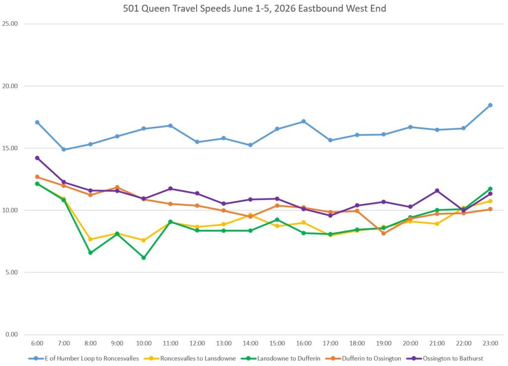
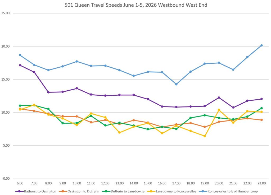
The top row of charts below shows travel times on The Queensway between Roncesvalles and just east of Humber Loop (blue). This includes the slow westbound progress through switches entering the carhouse, plus Sunnyside Loop. Eastbound there are only two trailing switches, one at Sunnyside and one at the carhouse. With the line on private right-of-way, it is no surprise that this is the fastest segment. Note that it still does not have full signal priority.
The segment from Bathurst to Ossington westbound (purple, right) is comparatively fast while eastbound is generally slower because congestion on Queen backs up from Spadina to Bathurst and beyond. Eastbound travel through Parkdale (Roncesvalles to Lansdowne, yellow, and Lansdowne to Dufferin, green) is notably slower in the AM peak even though stopping is prohibited from 7-9am.
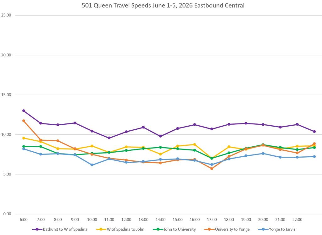
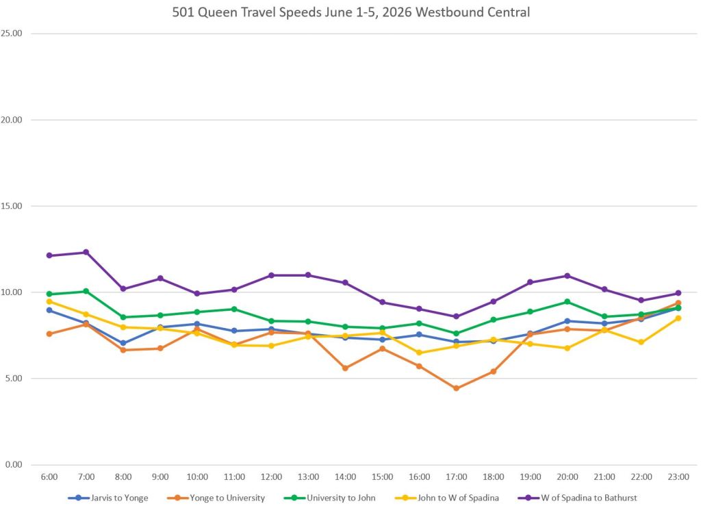
Through the central part of the route, between Bathurst and Jarvis, operation is slower, notably for the segments from Jarvis to Yonge (blue) and Yonge to University (orange) which include the Ontario Line diversions around Queen Station. The segment from Spadina to Bathurst is “faster”, but only by comparison to other segments through the core.
East of Jarvis, the fastest eastbound segment is from Jarvis to Parliament where there is rarely any traffic congestion.
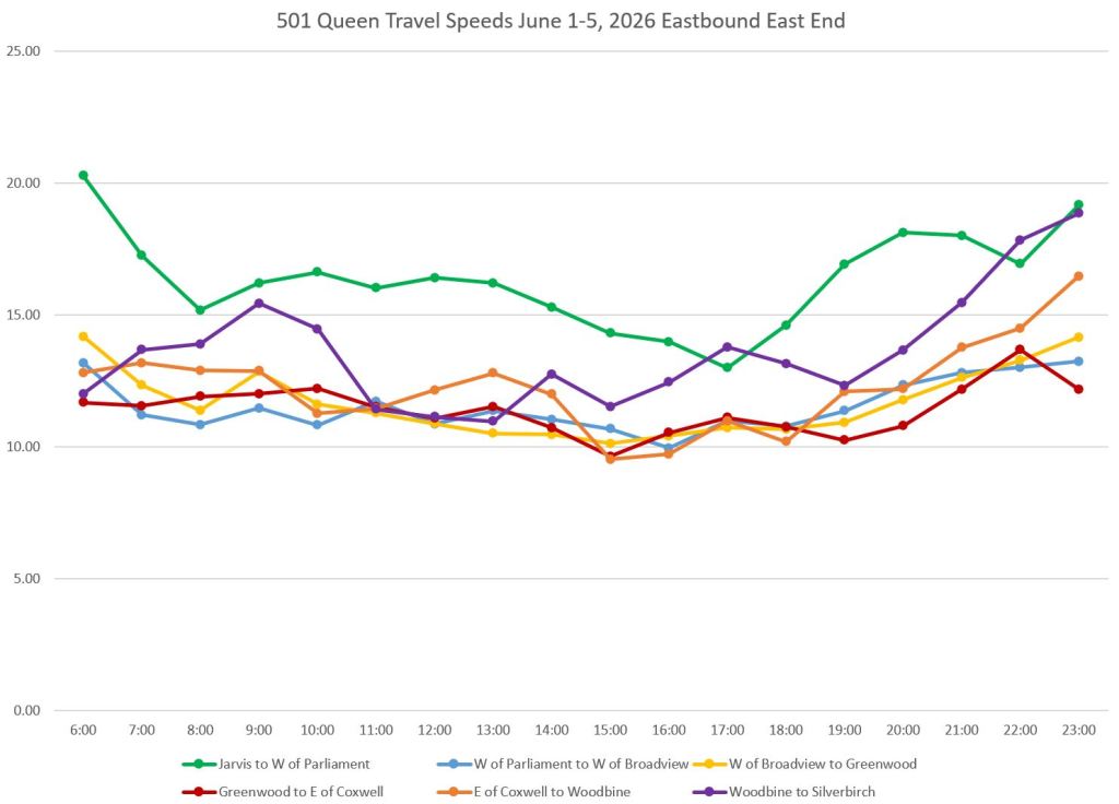
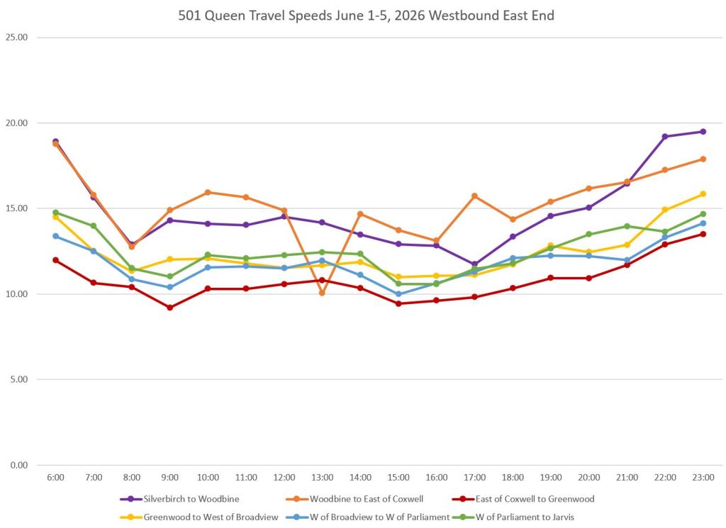
In the east end, the westbound segments in The Beach (Silverbirch to Woodbine, purple, and Woodbine to Coxwell) are generally the fastest. Eastbound numbers are not as good. Congestion in this area has seasonal fluctuations depending on various events, and the degree to which traffic attempts to bypass congestion on Kingston Road.
As a general note, although there are some peak period effects obvious in these charts, the average travel times are fairy consistent through the day on many segments. If speeds are to be improved, peak only changes will not affect most of the service.
504 King
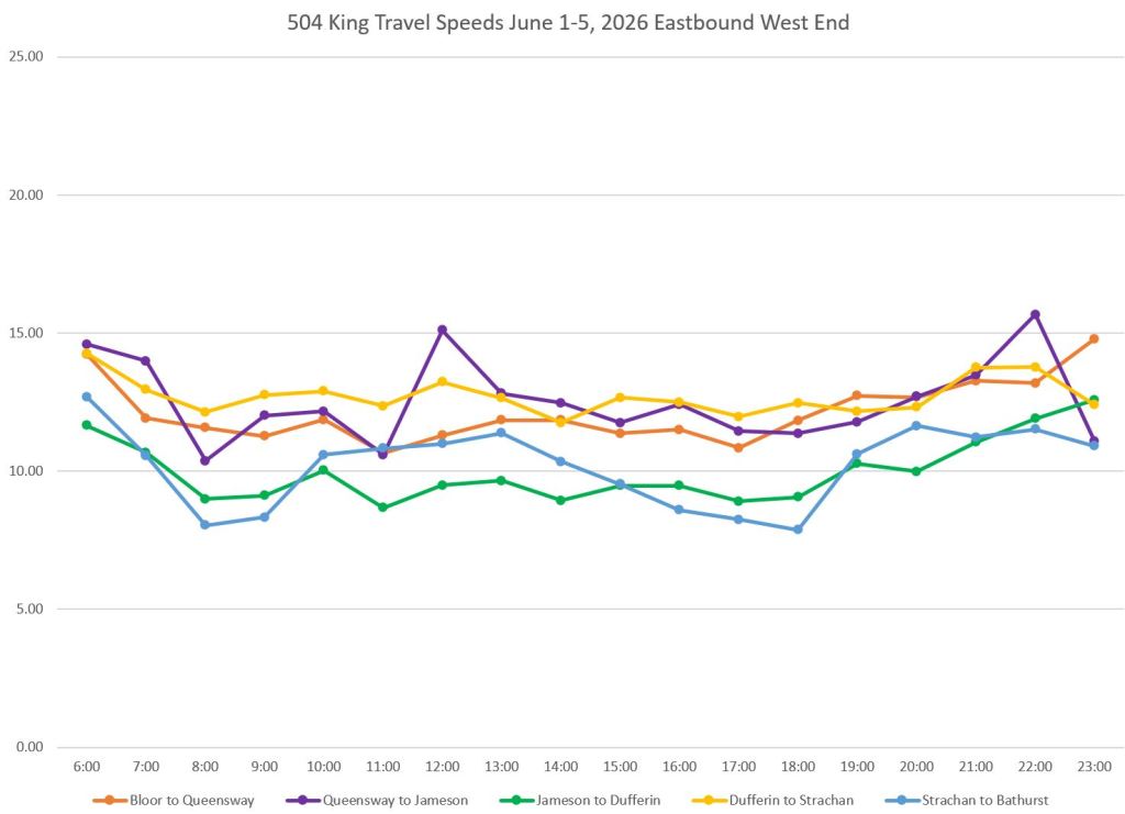
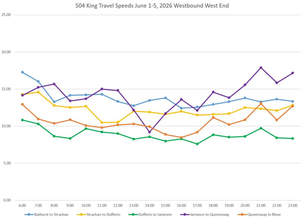
In the west end, the 504 King car is slow westbound from Dufferin to Jameson (green, top right below). A good chunk of this problem is due to autos queuing to turn south to the Gardiner Expressway. Eastbound travel times are better because they are not as affected by this problem. The segment between Strachan and Bathurst (blue) is noticeably faster westbound than eastbound thanks to traffic queuing up at Bathurst Street.
The segment from Jameson to The Queensway (purple) is fairly fast eastbound, but shows quite a dip westbound due to congestion approaching The Queensway. The dip in the westbound data arises mainly from Wednesday, June 3 when there was an extended delay westbound at The Queensway. I have left these data points in the chart to illustrate the need to look “under the covers” for unusual situations.
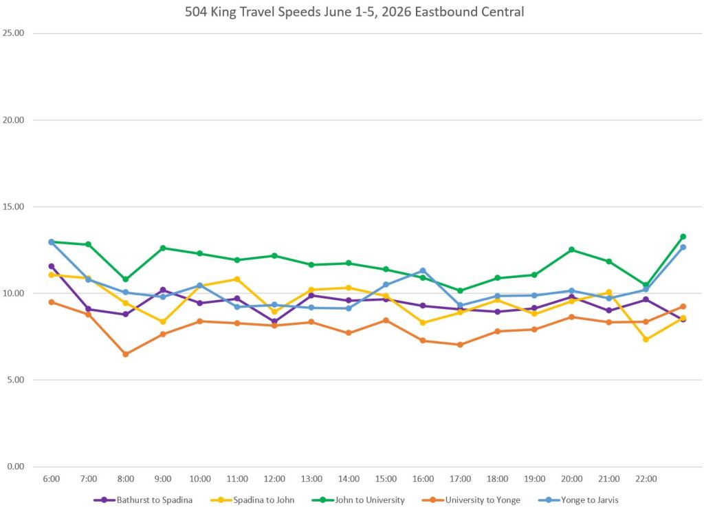
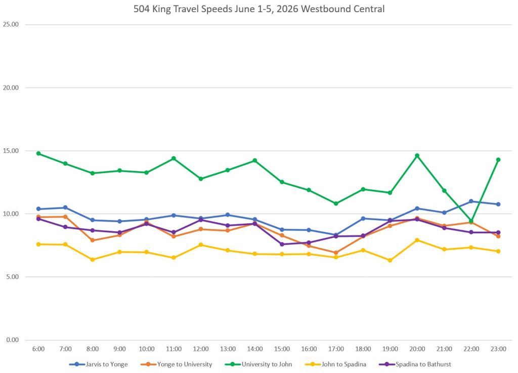
Between Bathurst and Jarvis (middle charts below), regular riders will notice that eastbound from University to Yonge (orange) is the slowest, but westbound the slowest segment is from John to Spadina (yellow). By contrast, the segment from University to John fares best.
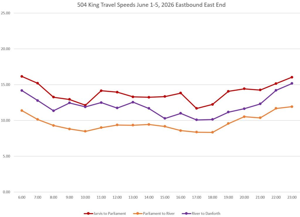
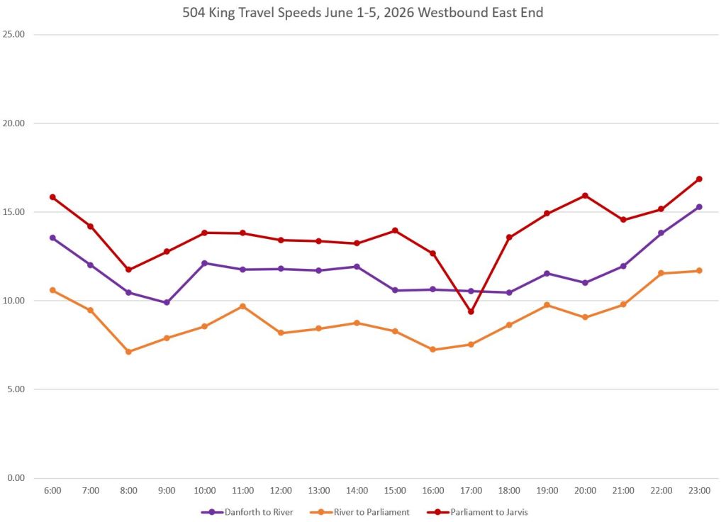
In the east end (bottom charts), the segment from Jarvis to Parliament (red) is the fastest because there are no major delay points in between. Where there have been problems here in the past, they arose from curb lane occupancies for construction projects.
The segment from Parliament to River (orange) fares worst primarily thanks to a so-called priority signal at Sumach (the diversion point for Distillery service) that hampers transit vehicles by making them wait an inordinate amount of time for a green signal.
The segment east and north from River to Broadview/Danforth lies between the other two. Travel north of Gerrard can be swift thanks to the presence of only one traffic signal, but signals at Gerrard, Dundas and Queen are less helpful. There is a transit-only left turn eastbound at Queen & Broadview. At Dundas, the green time goes mainly to east-west traffic.
Northbound at Danforth can see streetcars backed up south of the intersection thanks to capacity limits at Broadview Station. This problem was to be addressed with an enlarged loop, but the idea was squelched thanks to opposition by the local BIA fearing the effect of lost parking.
505 Dundas
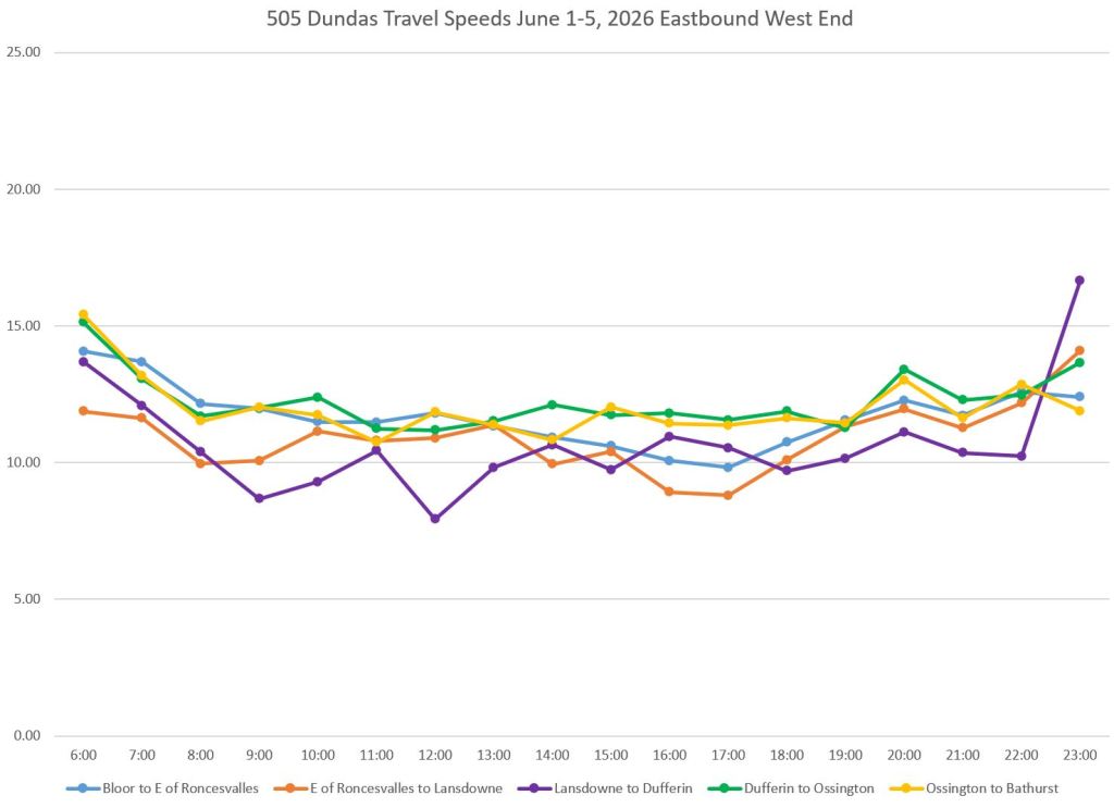
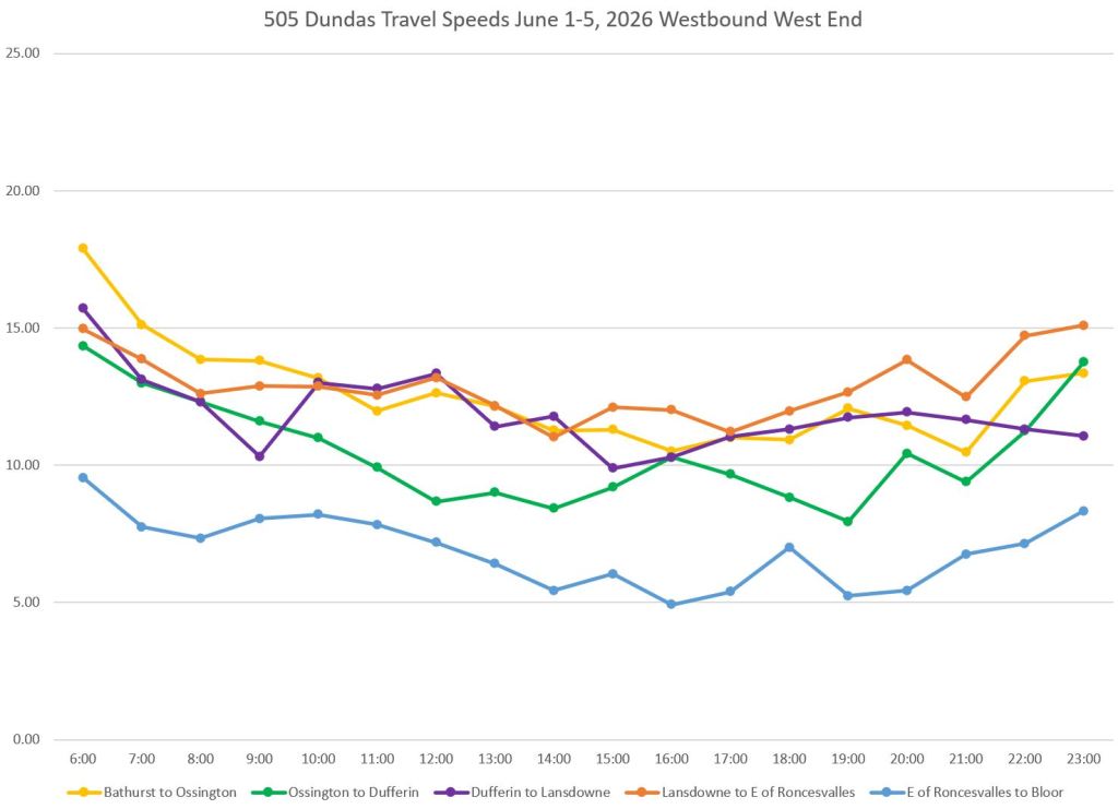
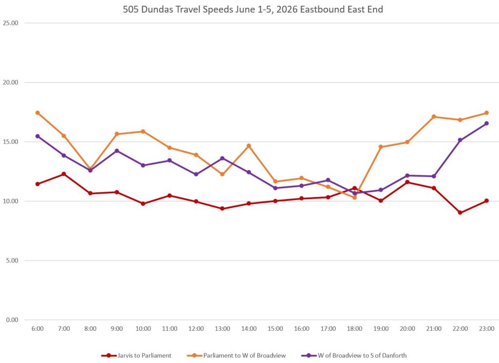
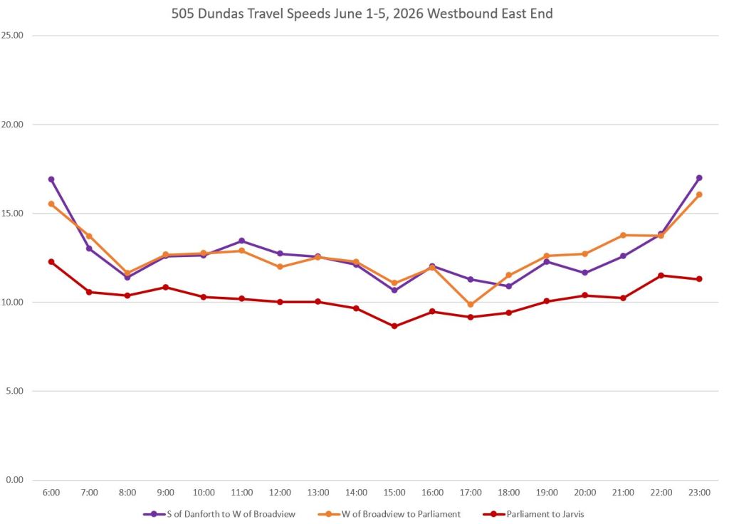
In the west end (top row), Dundas cars are often held south of Bloor (blue, top right) by capacity constraints in Dundas West Station. In spite of having room for two cars on each of the 504 and 505 routes, it is possible for the loop to be “full” due to long layovers.
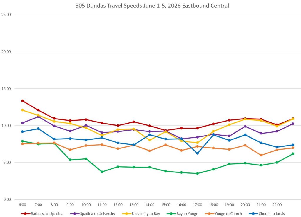
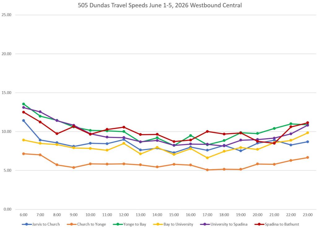
In the central part of the route, the slowest segments are approaching Yonge from Bay eastbound (green, middle left) and from Church westbound (orange, middle right). Part of this is due to the signal arrangement at Yonge with an all-walk phase, but also from general congestion and curb lane blockages.
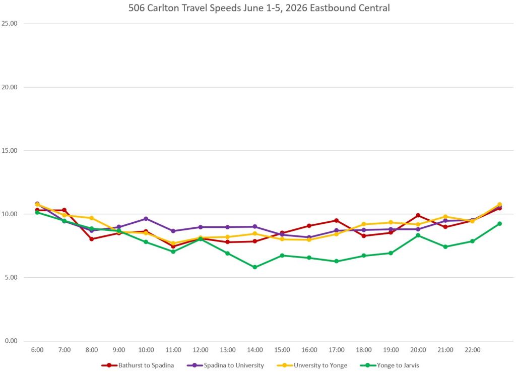
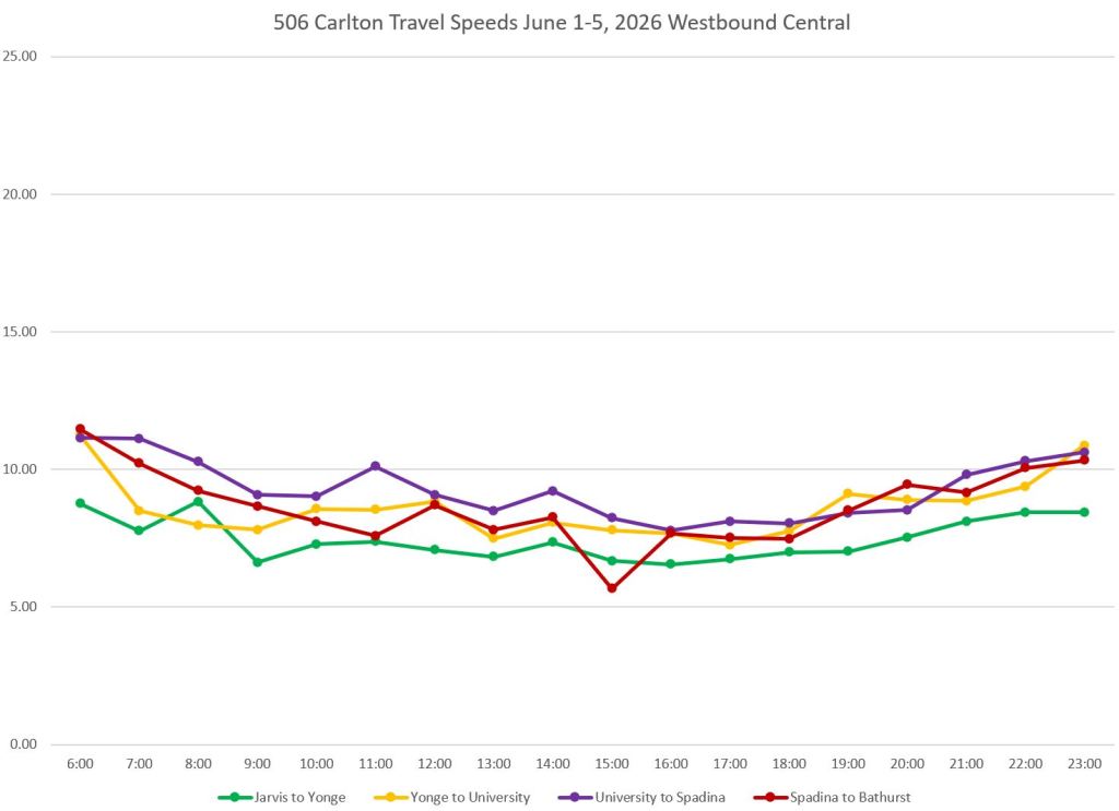
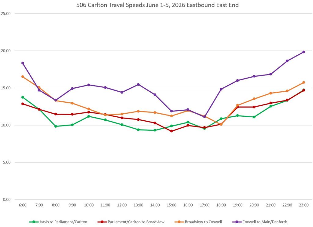
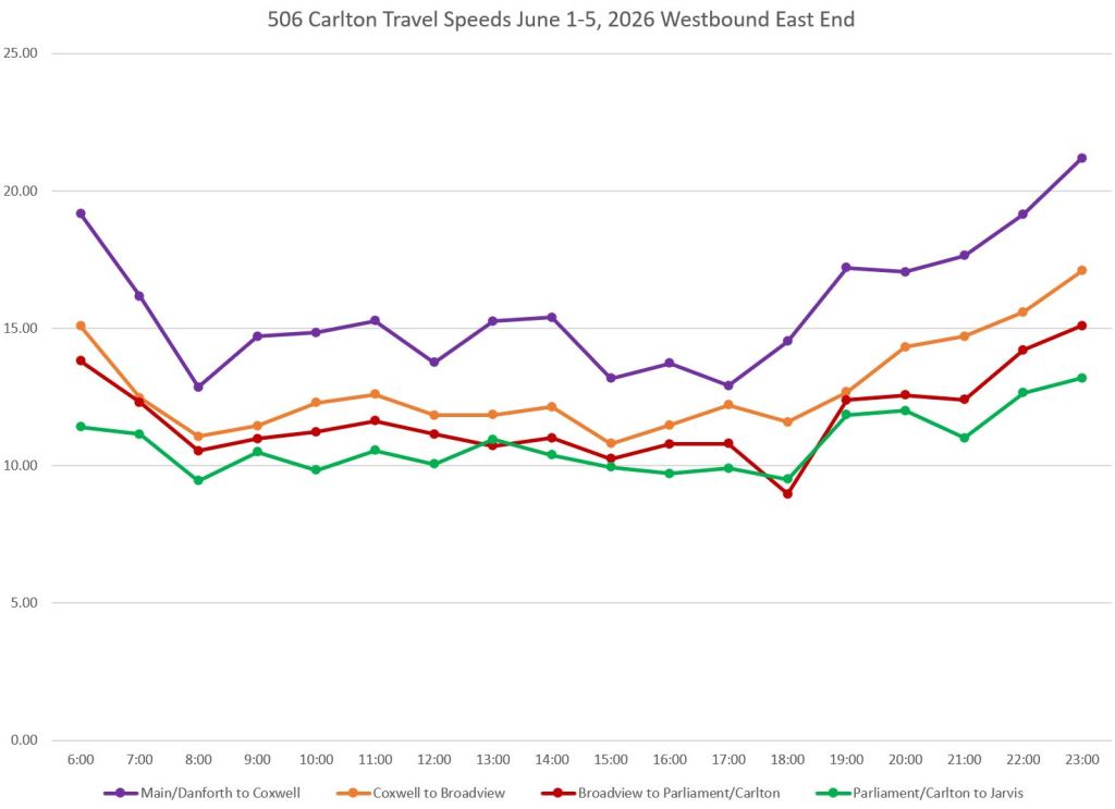
506 Carlton
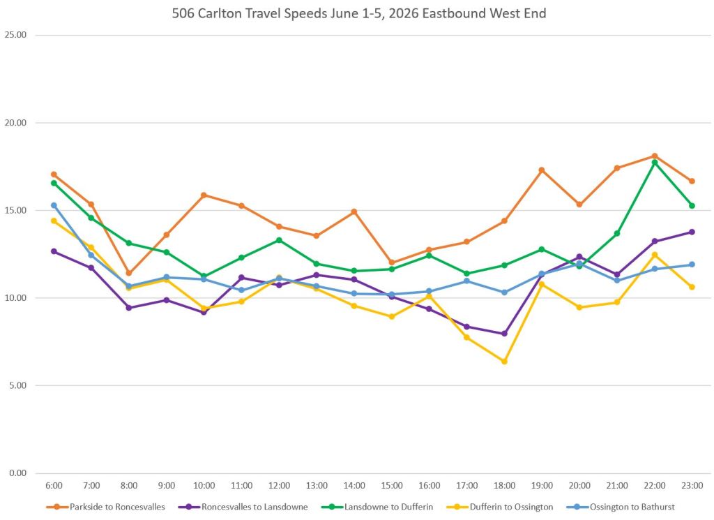
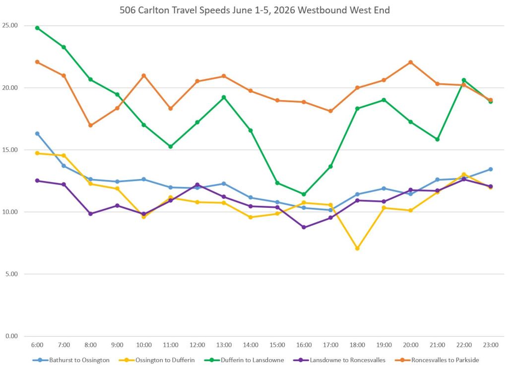
On the west end of 506 Carlton, it is no surprise that the fastest segment lies between Roncesvalles and Parkside (just east of High Park Loop). Eastbound trips are slower because they include a stop at Roncesvalles, the first major stop and traffic signal east of High Park. The dip in westbound Dufferin to Lansdowne speed was caused by unusually long travel times on Friday, June 5. Again this is an example of how unusual variations in data need to be examined for an underlying cause.
The central part of the route shows consistent speeds with the Yonge-Jarvis segment (green) being the slowest. Eastbound there is an ongoing problem with queues for left turning traffic at Jarvis.
In the east end, the fastest segment is from Coxwell to Main & Danforth. This area has few traffic signals holding streetcars for cross-street flow, and generally light motor traffic.
507 Long Branch
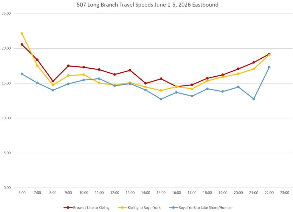
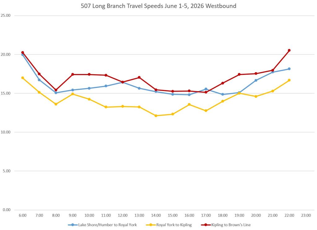
The 507 Long Branch car operates between Humber and Long Branch Loops generally on a wide road. Safety islands at stops are common, but not universal. The weekday scheduled speed is the highest across the streetcar system ranging from 13.3 to 16.1 km/hr. Note that this includes terminal approaches, but not recovery time.
509 Harbourfront
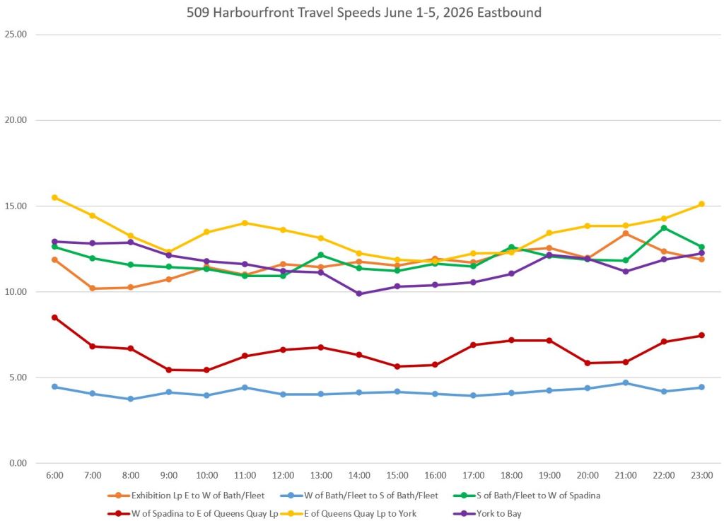
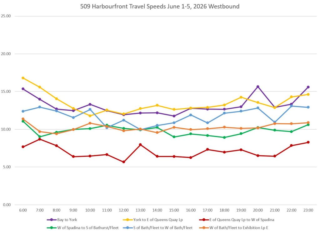
The 509 Harbourfront car runs from Union Station to Exhibition Loop completely on a private right-of-way. It slowest segment is at the Bathurst/Fleet/Lakeshore intersection eastbound (blue, left below). The segment through the Spadina/Queens Quay intersection is another slow area. This includes both stop service time, and the traffic signals at both Spadina and at the entrance to Queens Quay Loop.
510 Spadina
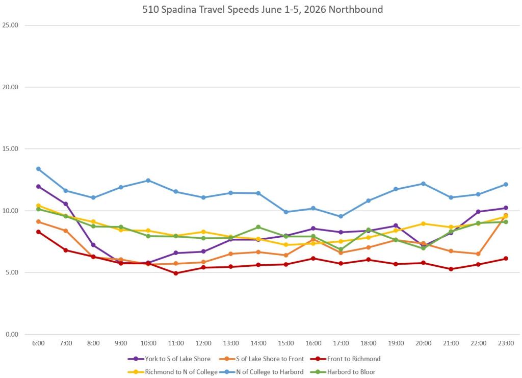
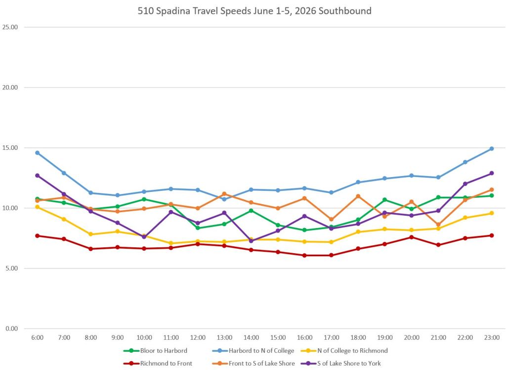
The fastest segment on 510 Spadina both ways is between College, north side, and Harbord (blue), while the slowest is between Front and Richmond. This route operates entirely on a private right-of-way, but the speeds give no indication of that. In many cases they are slower than mixed traffic operations on other routes. Some of this is due to demand and stop service time, but much arises from the many cross streets and track junctions that add delay from signals and slow orders.
511 Bathurst
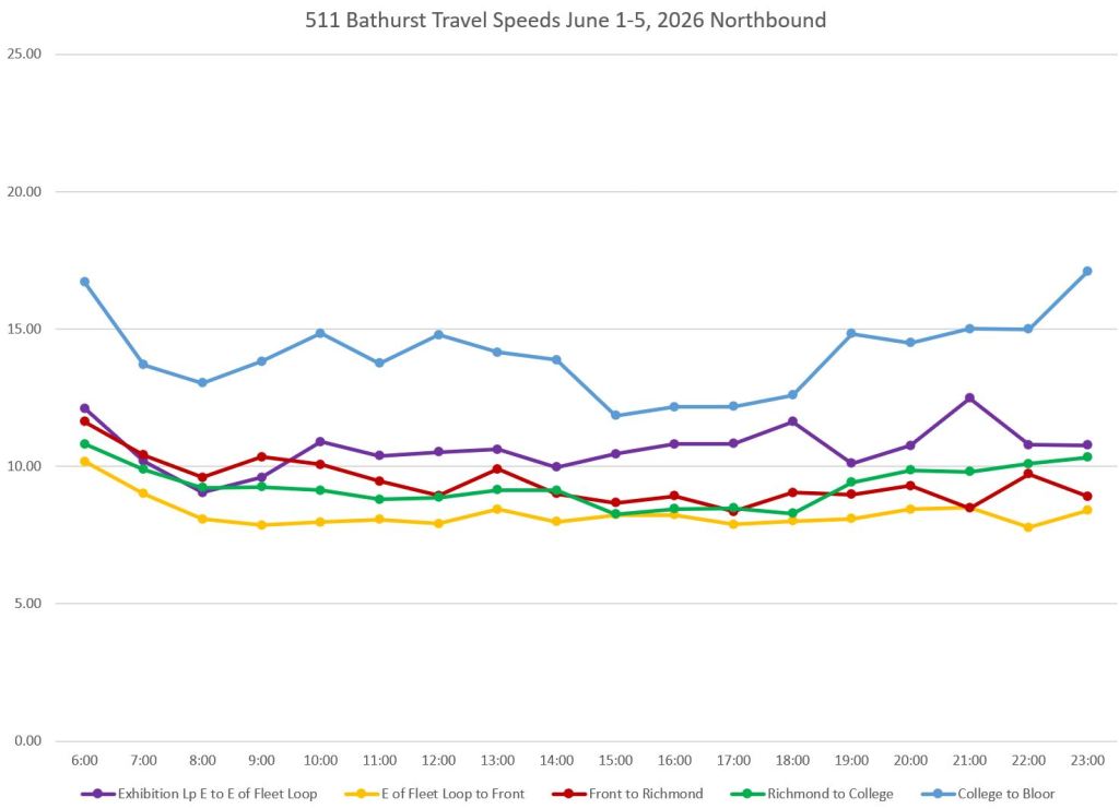
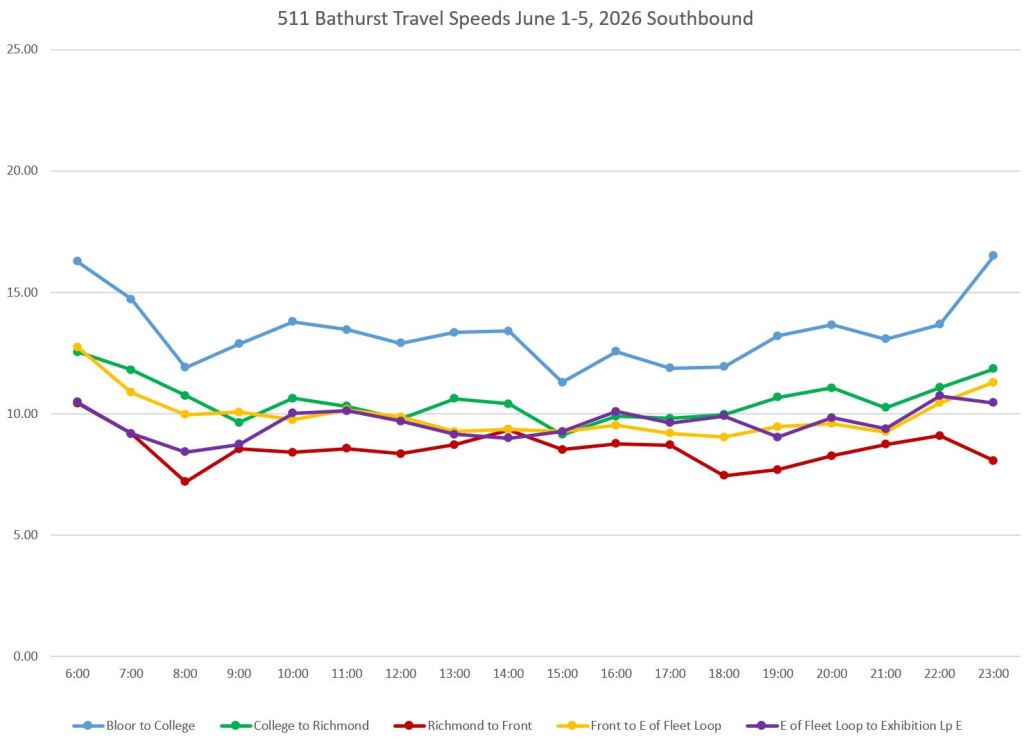
The fastest segment on 511 Bathurst both ways lies between College and Bloor (blue). The slowest segments are the approaches to Front Street from the south (yellow, left below) and from the north (red, right below).
The Bathurst/Fleet intersection is contained in the Fleet-Front segment, but speeds there differ between the two directions, probably because of delays northbound to Front Street. (I will review this area in greater detail in Part II of this series.)
512 St. Clair
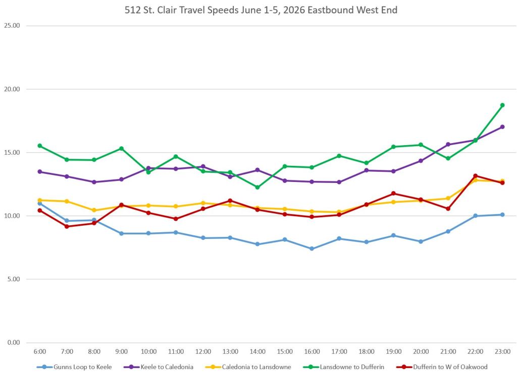
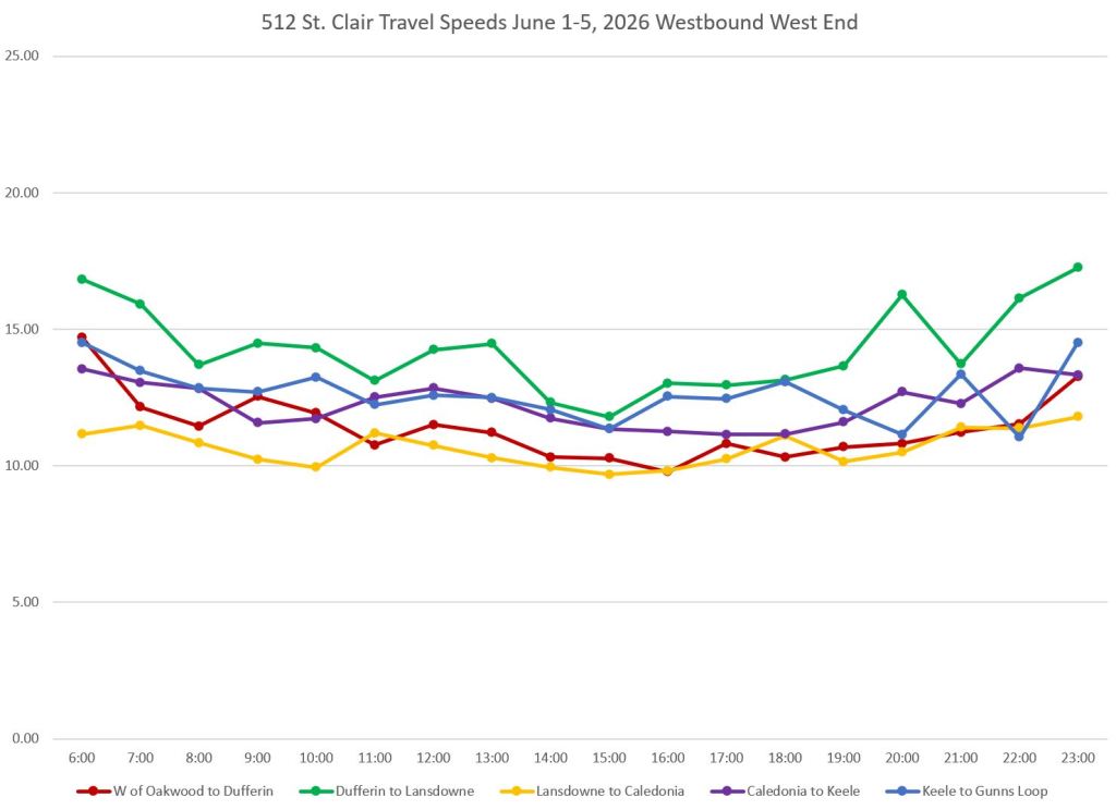
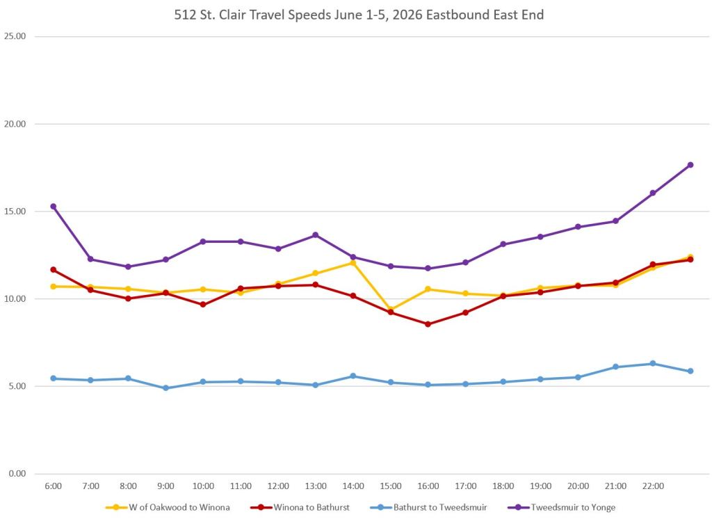
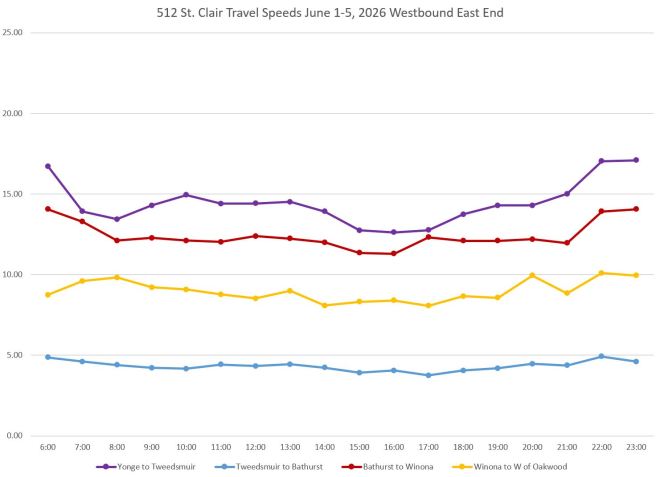
The 512 St. Clair route is almost entirely on private right-of-way except for a section between Old Weston Road and Keele Street, and a short section east of Yonge Street. Travel speeds vary quite a lot along the route.
Speeds over various segments lie between 10-15 km/hr with a few exceptions:
- Travel times eastbound from Gunn’s Loop to Keele, a short distance, include traffic signal delay at Keele and stop service time at the Stock Yards. These are not present in the westbound data, hence the lower average speed westbound (blue, upper left below).
- The segment between Bathurst and Tweedsmuir includes St. Clair West Station, and hence the low speed over the segment (blue, lower charts below).
Note that the underlying data for these charts have been modified to remove very long trips caused by delays.


The queuing of the 504 eastbound at Bathurst has been quite bad since the red lanes went in. They either need to extend the green phase until the streetcar can clear the intersection or relocate the turning lane to the curb lane so the cars do not obstruct the streetcar’s progress. This is especially bad in the evenings when people are heading to the bars and the city has given up on traffic agent deployment.
Steve: One thing that shows up in other analyses is that the Entertainment District congestion is concentrated late in the week. This is underrepresented in charts combining Monday-Friday data. Addressing problem areas will require detailed understanding of the local patterns.
LikeLike
From a quick glance at the data it seems that the ROW streetcars often do worse than mixed traffic streetcars. First thing that comes to mind is the left turn signals. Looking forward to seeing the next parts of the analysis.
LikeLiked by 1 person
I was pretty sure Spadina was the slowest and seeing that it’s the only streetcar that never breaks 15km confirms it. Lots of intersections and mostly far-side boarding will do that.
Steve: And a lot of very closely spaced signals.
LikeLike
If only the city could buy the space needed to widen King Street West at Jameson to put in a left turn lane for left turning autos or trucks…
…or shift the streetcar tracks to the curb lane and make the centre lane a left turn lane only. Put far-side streetcar stops and allow autos to be able to pass streetcars on the left side of the streetcars. Problems when it snows and we end up with snow windrows at the streetcar stop.
Solve it here, then solve at other problem points in the streetcar network.
Steve: Shifting tracks to the curb lane is not a trivial change. Utilities are under that lane, and moving the tracks would make any maintenance much more complicated. There is also an issue with the “crown” of the road which would have to change. Fixing a traffic problem at a few locations by completely rebuilding streetcar infrastructure is a completely wrong-headed way to deal with the problem. There are also backlogs from King-Queen-Roncesvalles, and there is no way track there could be reorganized into curb running.
LikeLike
For decades, we have been discussing how to improve streetcar travel times and reliability but things have not improved and in fact have gotten worse. Even brand new streetcar lines such as Finch West and Eglinton East have proven too slow and unreliable and frequently break down stranding all streetcars behind. It is high time that we look at alternative technologies. I am sure that streetcars work fabulously well in every other city in the world as Steve is kind enough to inform us but the fact is that they don’t work here and so we need to look at alternatives. I live near Olivia Chow and have met her a number of times. I voted for her last time and have informed her that blind support for streetcars will not get her my vote in this coming election.
Steve: The problems lie with poor management of the existing streetcar system and appallingly incompetent design and construction of Lines 5 and 6 by the so-called expertise of Metrolinx and their private sector partners.
LikeLike
I’m a bit puzzled why 507 Long Branch does oddly worse westbound Royal York to Kipling than any other segment or direction.
The school rush leads to a lot of left turns from Lake Shore to Col Sam Smith, but that should not affect say 11 AM or 2 PM, however this segment is slower throughout the day. Is there a particular area where speed is reduced?
I suppose it could be general slow operation through New Toronto, but I don’t see why that would only happen westbound.
Steve: I’m not entirely sure what is going on here. Working on comparative data from 2019 for part II of this series, I see a difference in eastbound and westbound speeds for this segment both in 2026 and 2019, although not quite as marked in 2019. The 2019 westbound speed is lower than the other two segments, but not by as much as in 2026. 2019 speeds are generally higher especially west of Kipling. I’m going to have to dig further to see what is happening.
LikeLike
A reasonably able-bodied person can comfortably walk at around 1.5 m/s or 5.4 km/h.
Now with that information, I will go back and look again at the number of route segments running in the ballpark of 5 to 6 km/h (not including time waiting for a streetcar!).
LikeLike
A reasonably able-bodies person can probably walk brisky at 6 km/h.
Note that there is no way they will be able to maintain that speed along any streetcar line, because they also will catch red lights. When I’m trying to get to Union station down Bay St, sometimes I spend more time waiting at the red than actually walking.
A briskly-walking person will likely average 3, maybe 4 km/h inclusive of waiting at the same red lights that streetcars etc. have to wait at.
LikeLike
Spadina will be a perfect candidate to convert to BRT using high capacity electric buses which would mean no more patients dying because of ambulances getting delayed due to years upon years of endless streetcar track construction. The streetcars thus freed from Spadina can be used to increase service on other lines or sold for scrap metal.
Steve: This is a BS argument. Please document the urban myth of patients dying from ambulance delays.
The issues on Spadina relate to excessive priority for east west traffic especially at the south end of the line, coupled with TTC’S lethargic operating practices across intersections.
TTC loves to invoke “safety” for the situation, but prefers crappy service to actually addressing the issue.
LikeLike