
With the many route changes for the opening of Lines 5 and 6, an obvious “project” is to review how all of the new and updated routes are operating. I cannot guarantee that I will get to them all, but will nibble away at the list.
We still cannot see vehicle tracking data for 5 Eglinton LRT, but a route we can see is the vestigial replacement bus 34 Eglinton.
Full disclosure: The Eglinton East corridor is one I have used all of my life, and quality of service affects me personally. However, it also affects the many would-be riders along the line for whom transit “service” has all but disappeared.
This route shows a classic laissez-faire attitude of TTC management where buses appear to run more or less on a schedule of their own making. Riders on other routes are familiar with this problem, but 34 Eglinton shows how an infrequent service can be left to rot and discourage riders from using it. TTC has even talked of the 20-minute service as “interim” and that it might be cut in the future.
The idea of a parallel surface bus was to provide accessibility for those who could not walk to an LRT station, and this is, in theory, a key part of accessibility for the line. However, service is so erratic on this nominally 20-minute route that actually catching a bus requires good timing through a transit app to find one. To add insult to injury, the TTC removed several stops along Eglinton just before Line 5 opened, adding access time to the remaining riders in the name of speeding up a frequent bus service that was about to vanish.
TTC talks about its “family of services” scheme that encourages potential Wheel-Trans users to make part of their trip on the conventional system. 34 Eglinton demonstrates just how badly they actually deliver alternatives.
There is no excuse for the poor quality of service on this route, and three months’ data show that the current operation is “normal” with no visible effort to rein in irregularities.
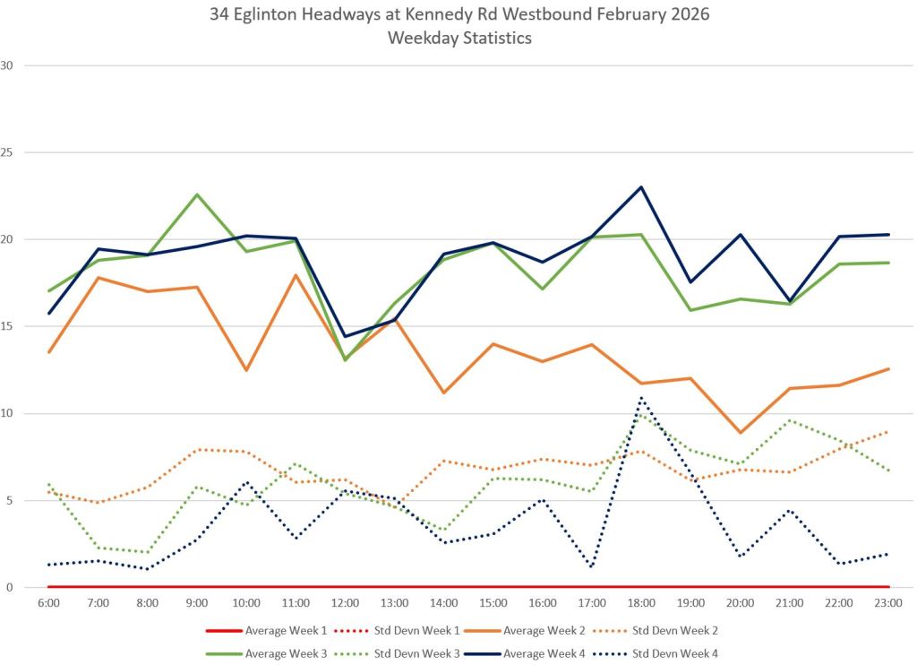
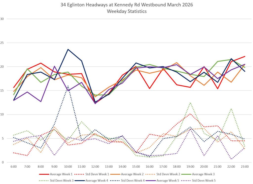
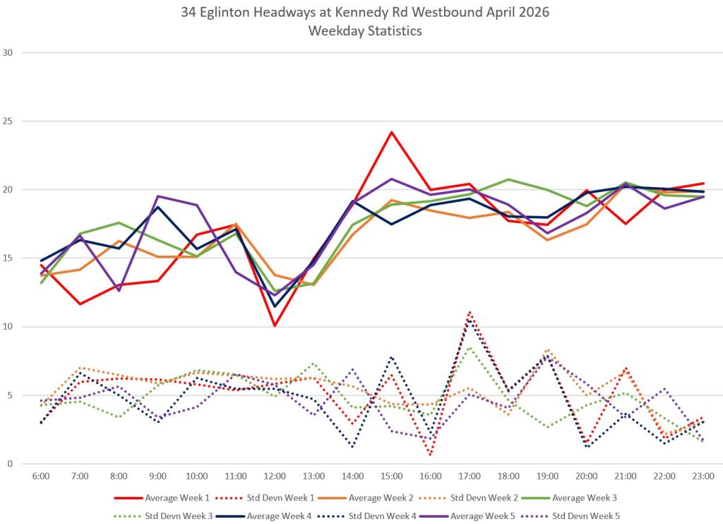
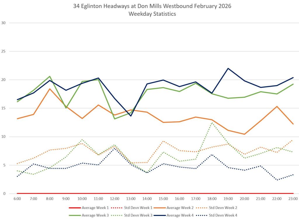
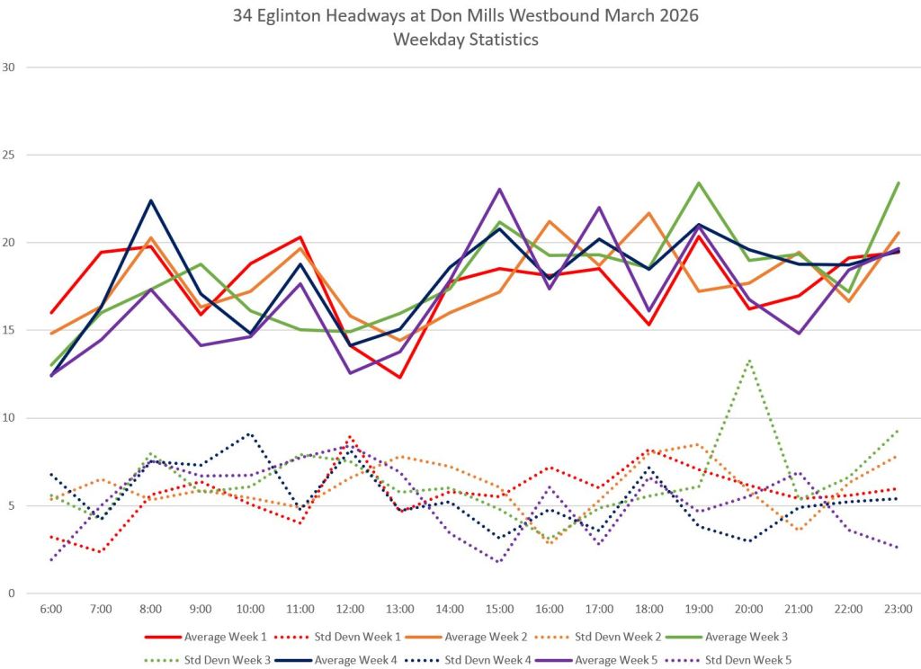
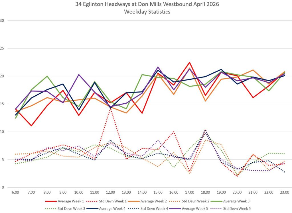
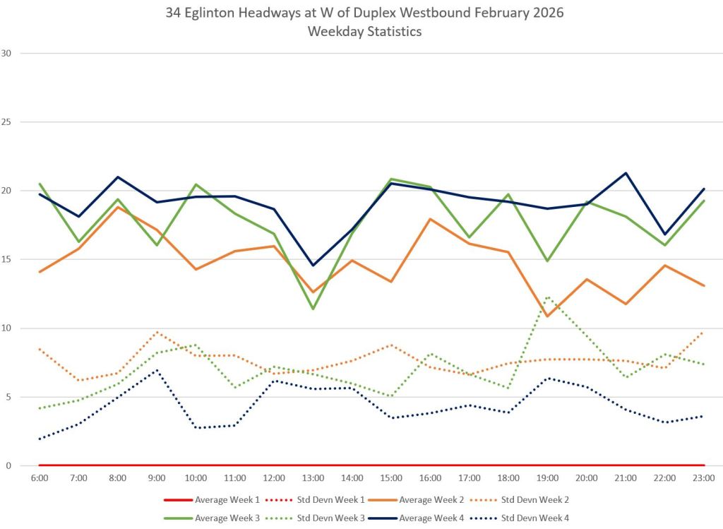
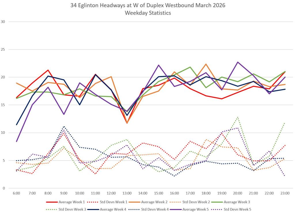
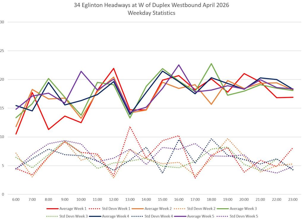
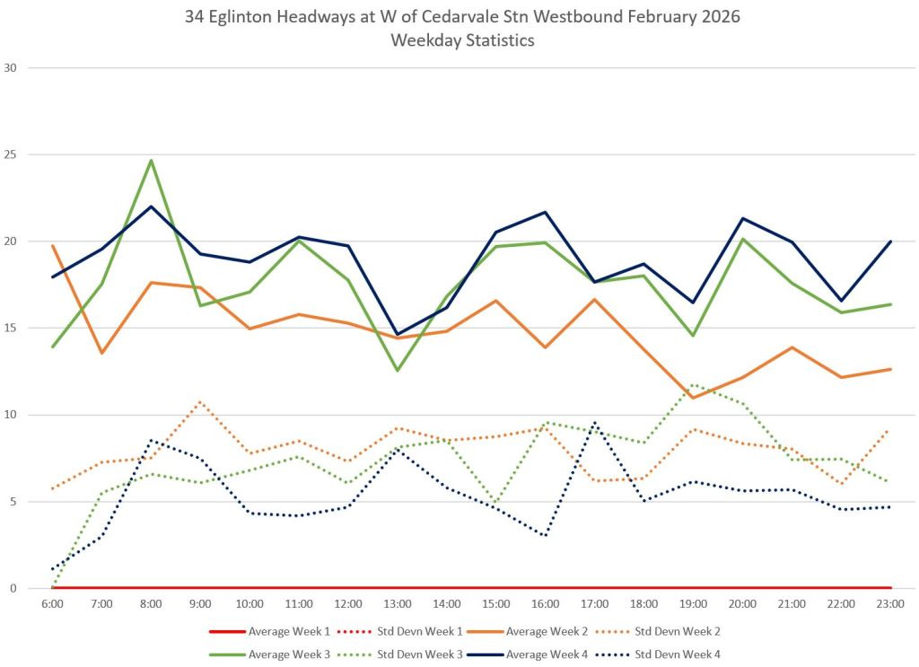
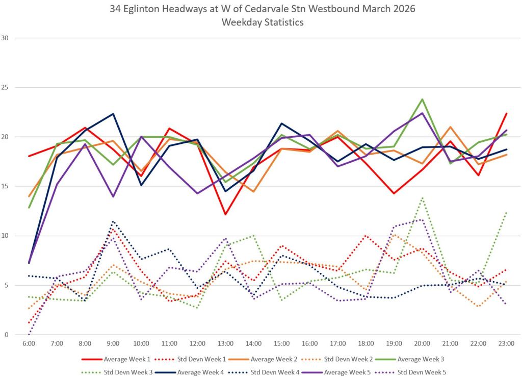
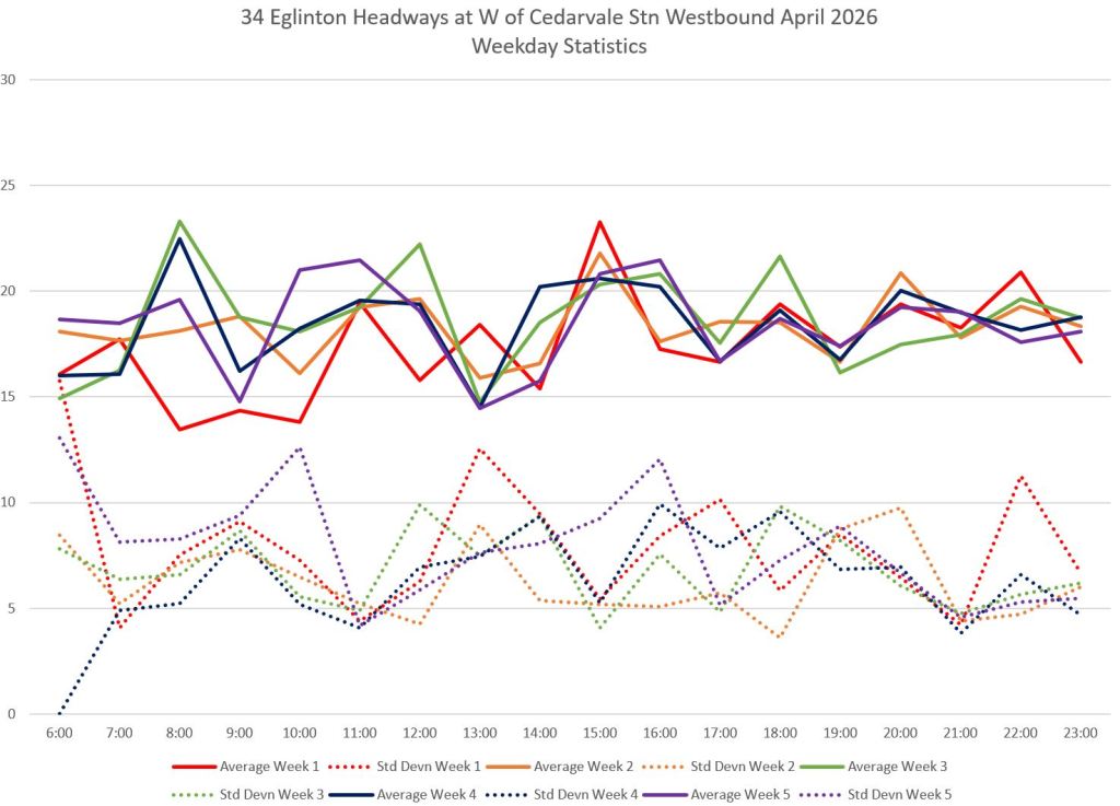
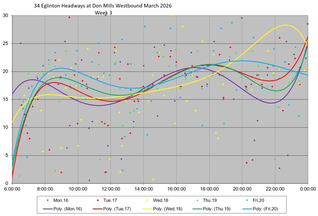
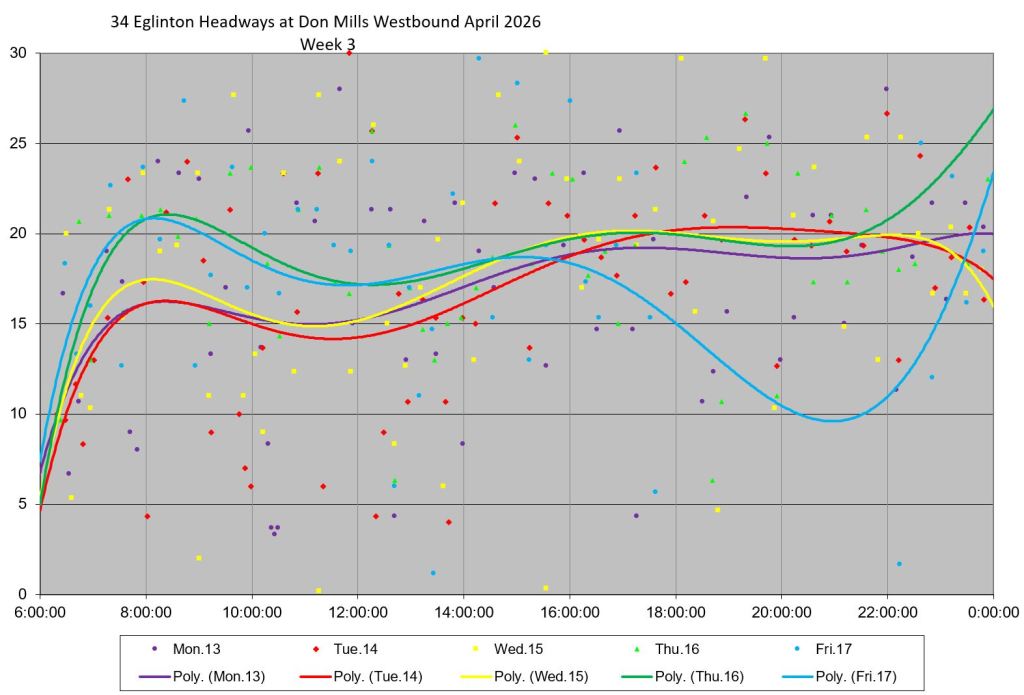
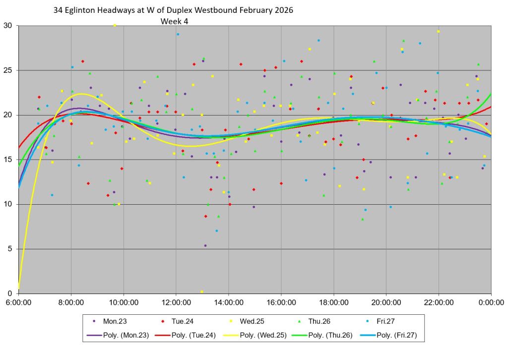
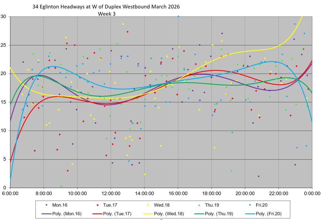
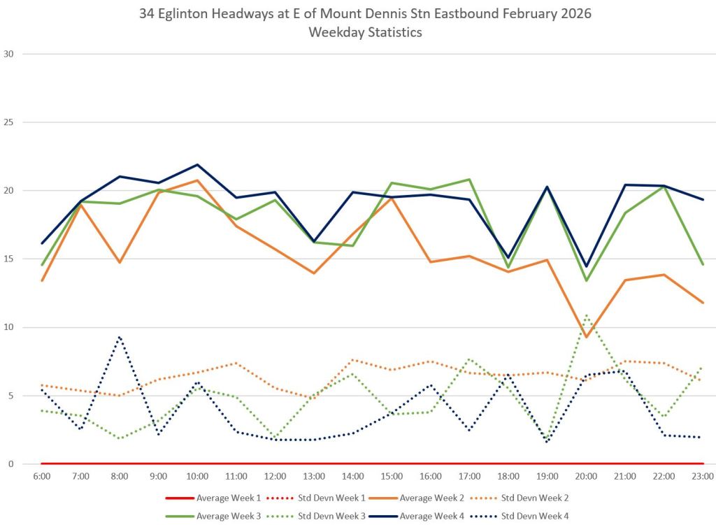
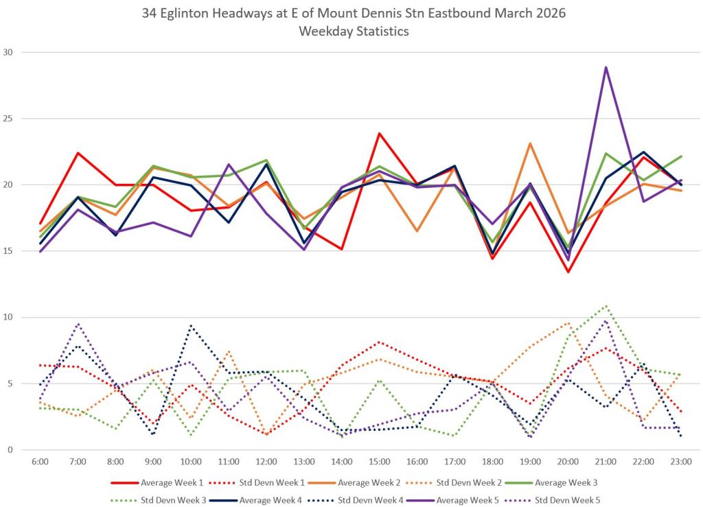
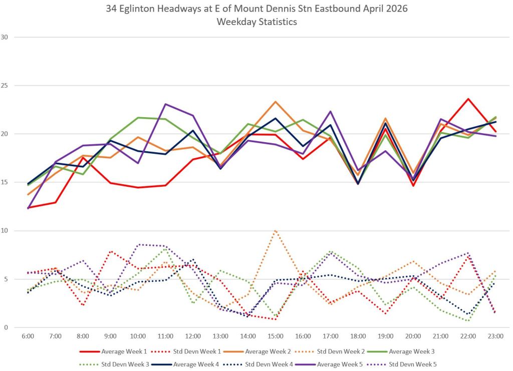
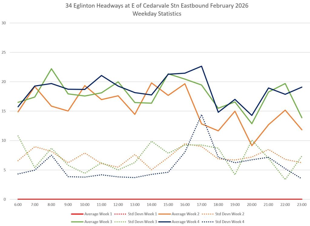
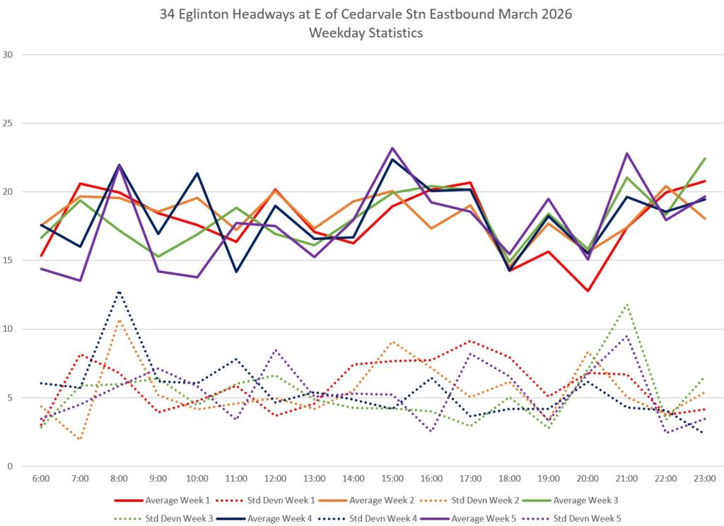
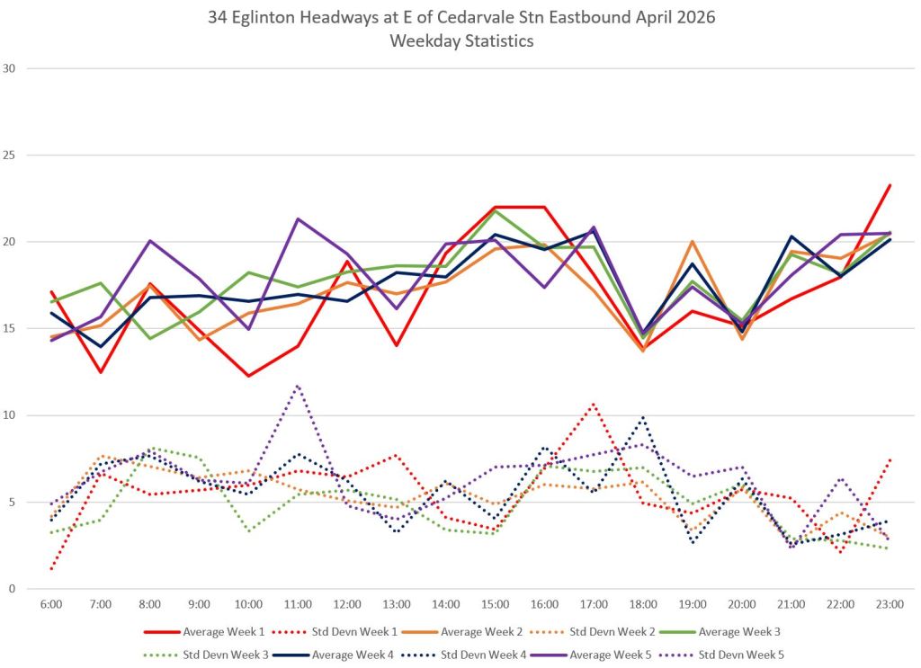
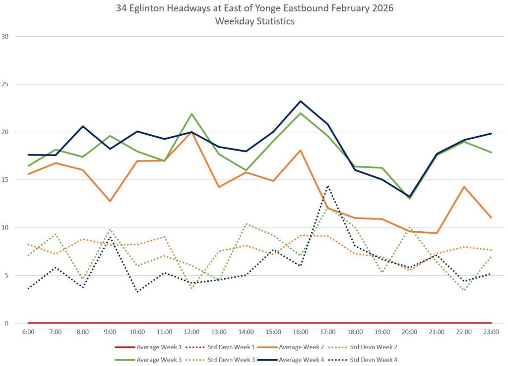
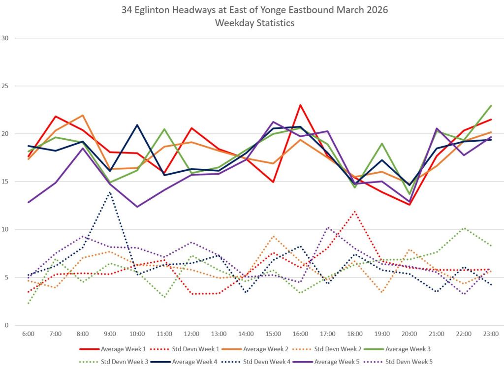
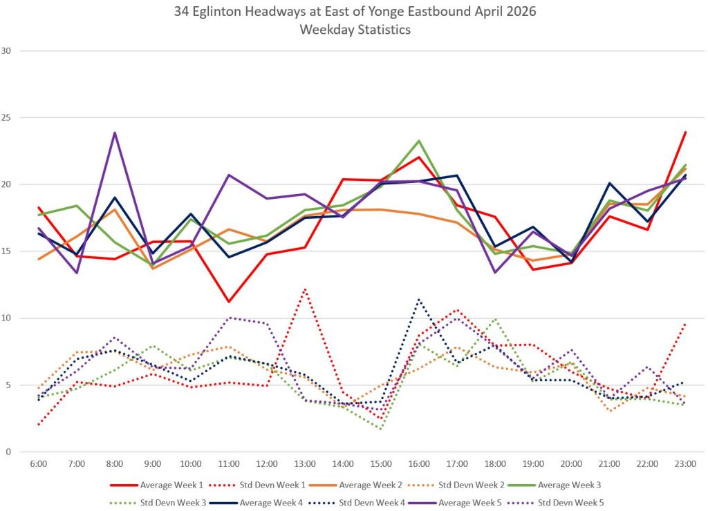
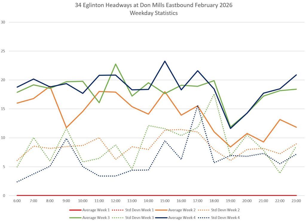
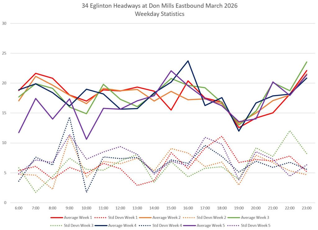
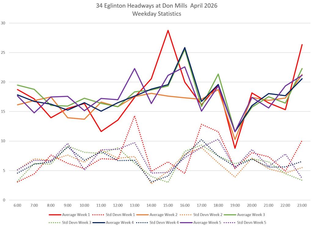
Service Statistics Westbound
These charts show stats for weekday service over three months: February (left), March (middle) and April (right). The solid lines are weekly averages, by hour, while the dotted lines are standard deviations (SD), a measure of dispersion within the data.
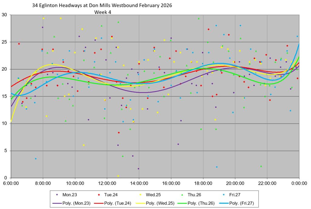
Each row shows data for westbound trips starting from Kennedy & Eglinton and working west to Cedarvale Station. Service is not well organized even leaving Kennedy where the averages bounce around and the SD values lie at 5 minute or higher. This does not improve in later months when the teething problems of opening compounded by foul winter weather might be invoked to explain the February data.
By the time service reaches Don Mills, the SD values are a bit higher than at Kennedy, but the change is really apparent just west of Eglinton Station (Duplex) and west of Cedarvale. Both of these are points where headway reliability could be re-established without making an on-street layover, but clearly that is not attempted. Ragged service from Kennedy just gets worse as buses travel along the route.
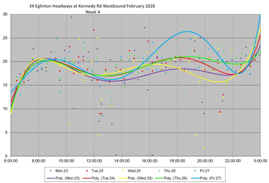
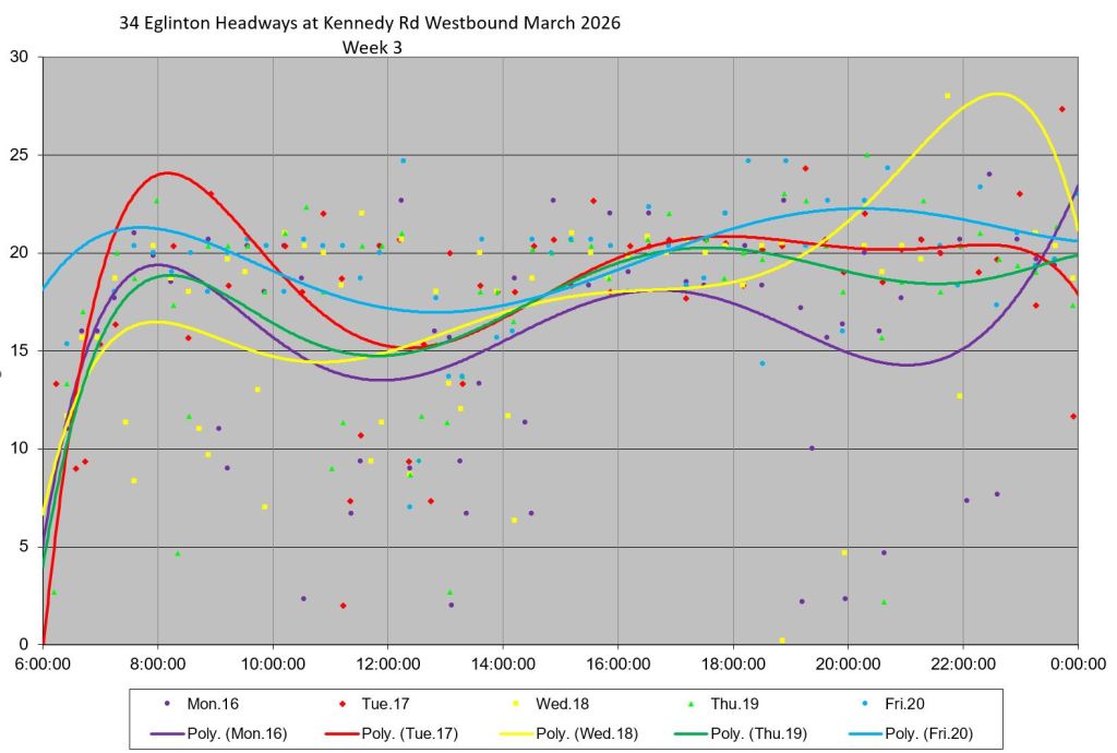
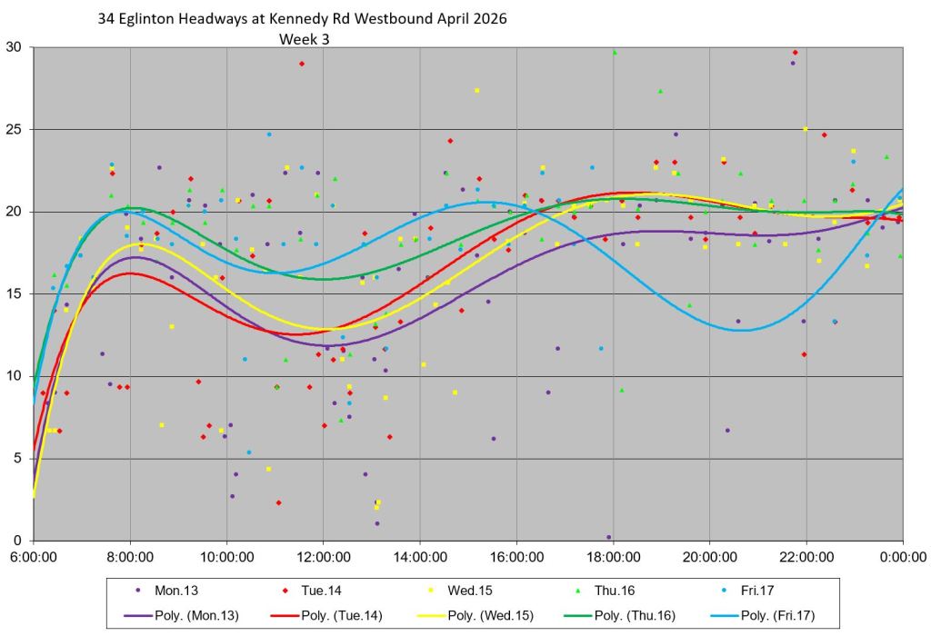
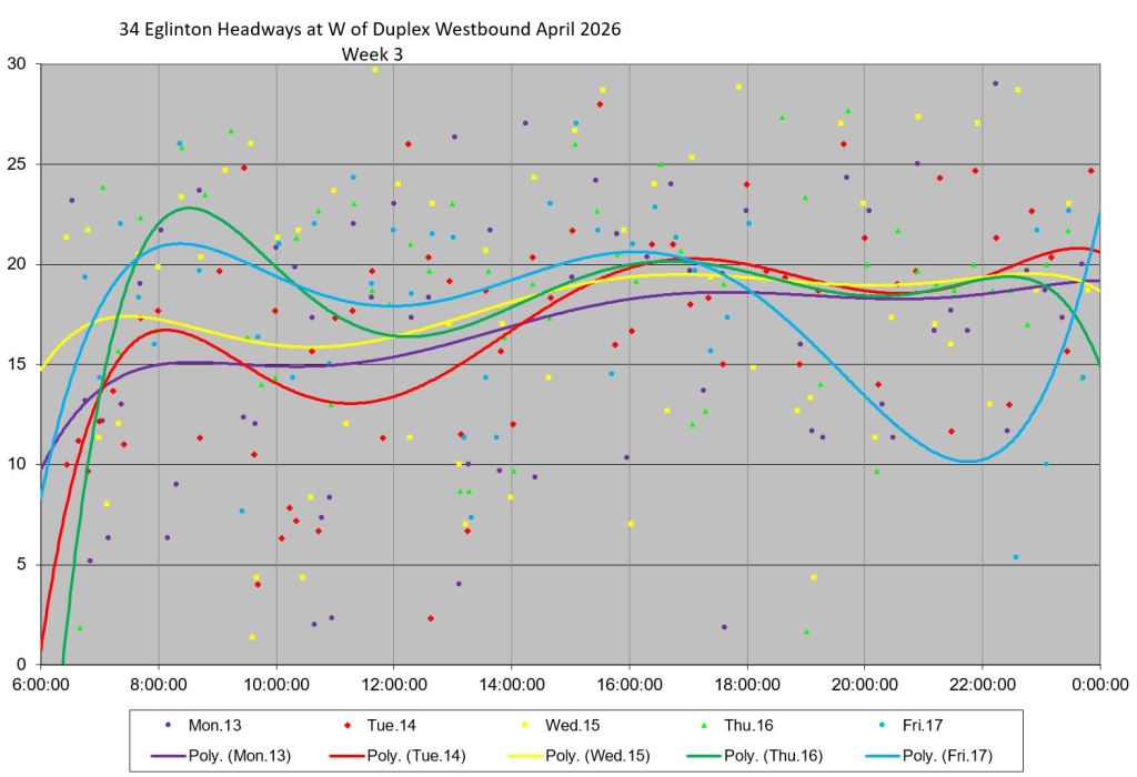
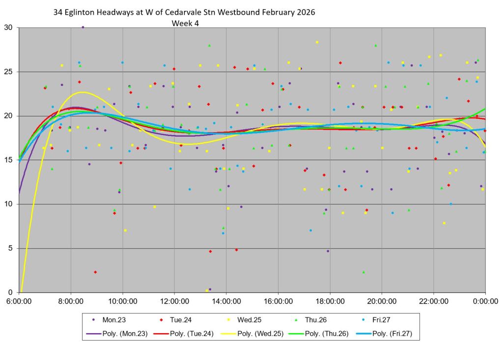
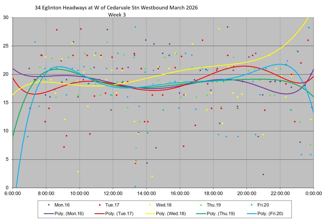
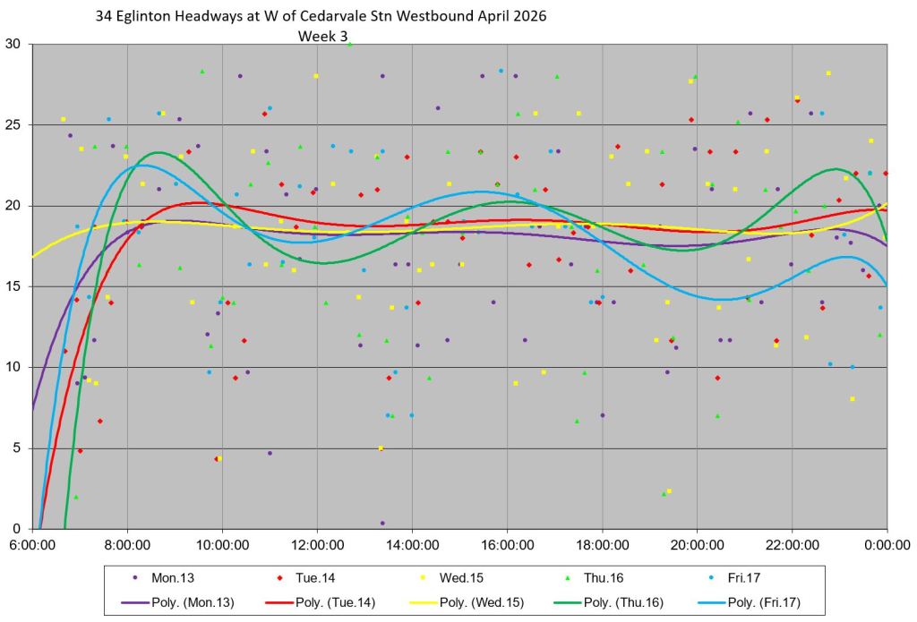
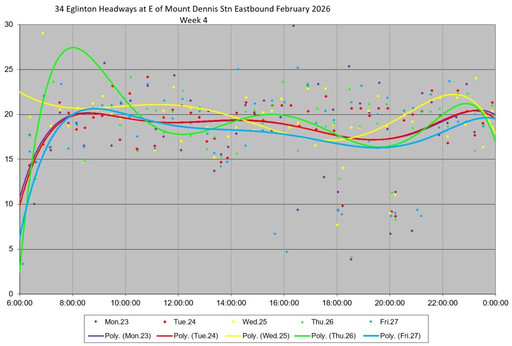
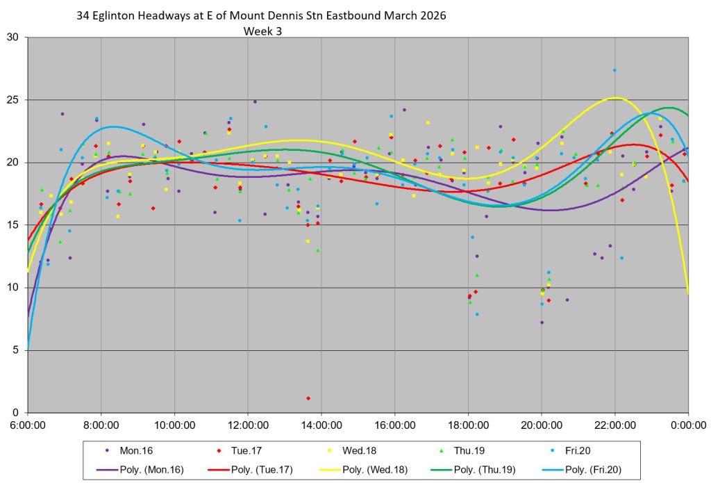
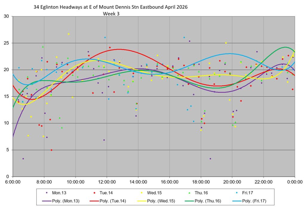
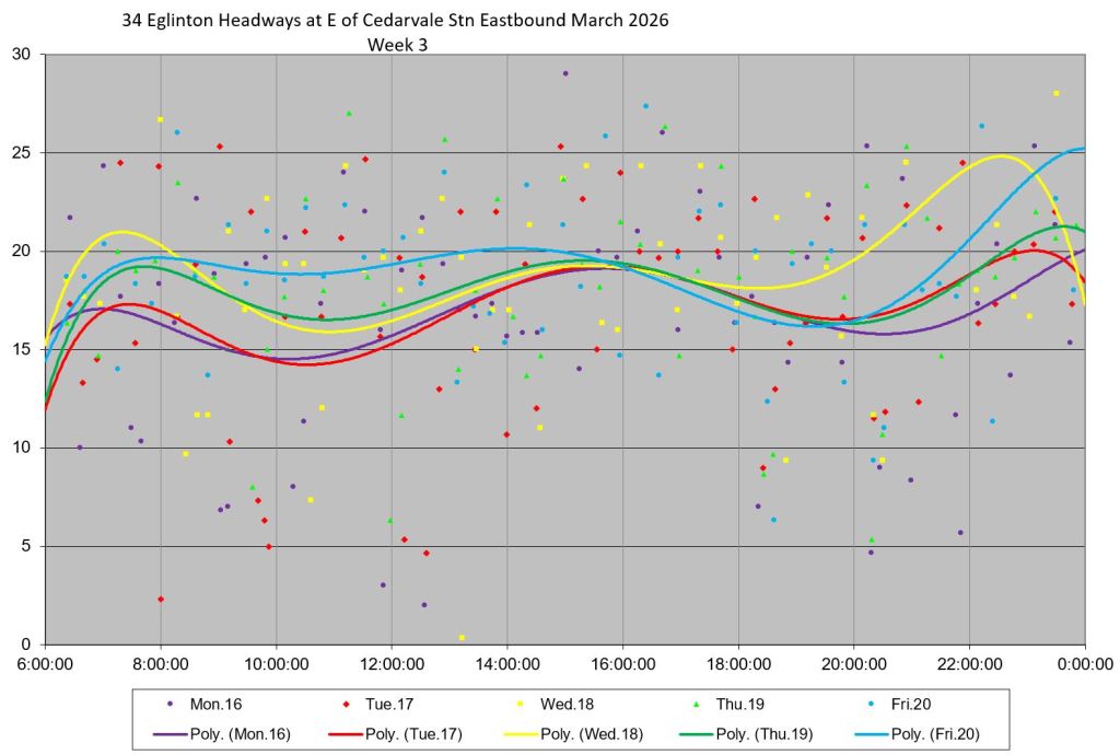
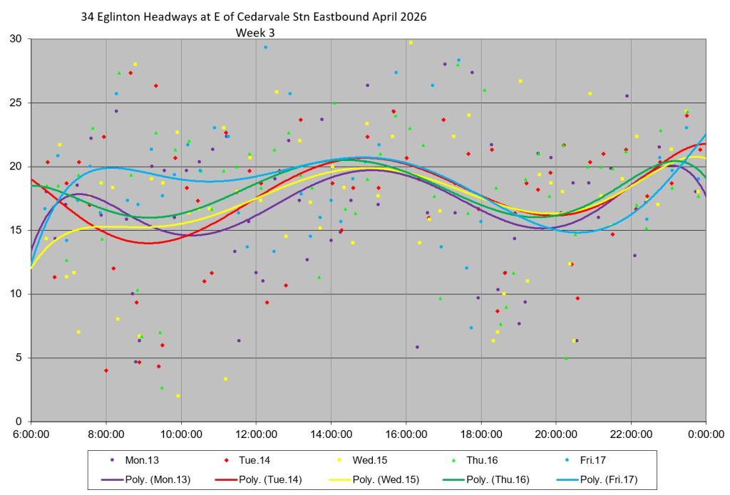
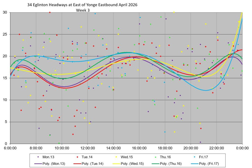
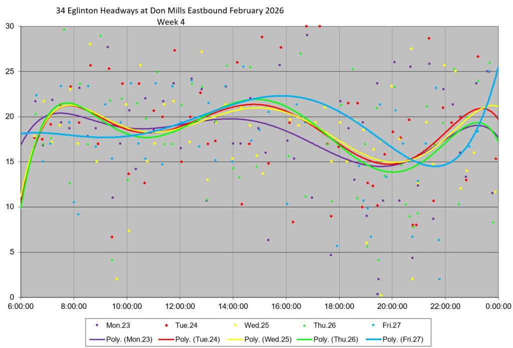
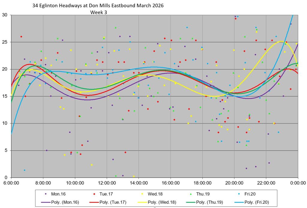
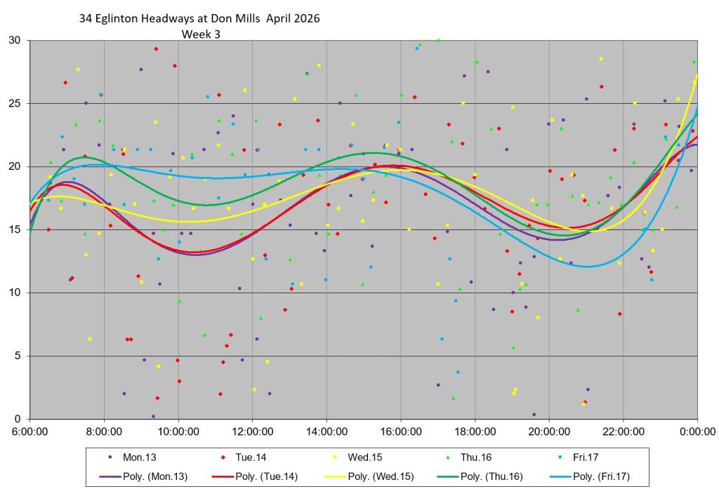
Detailed Headway Charts Westbound
These charts show samples of the detailed data underlying the summaries above. One week’s details are shown for each month with each day having its own colour. The solid lines show the overall trends of data values threaded through the individual dots.
The vertical spread of values is already bad at Kennedy with many headways well below or above the 20-minute schedule, but the scatter worsens at locations westward across the route.
Note that some data points lie above the top of the charts in the 30-45 minute range. They are comparatively rare, but show just how bad the gaps on 34 Eglinton can be.
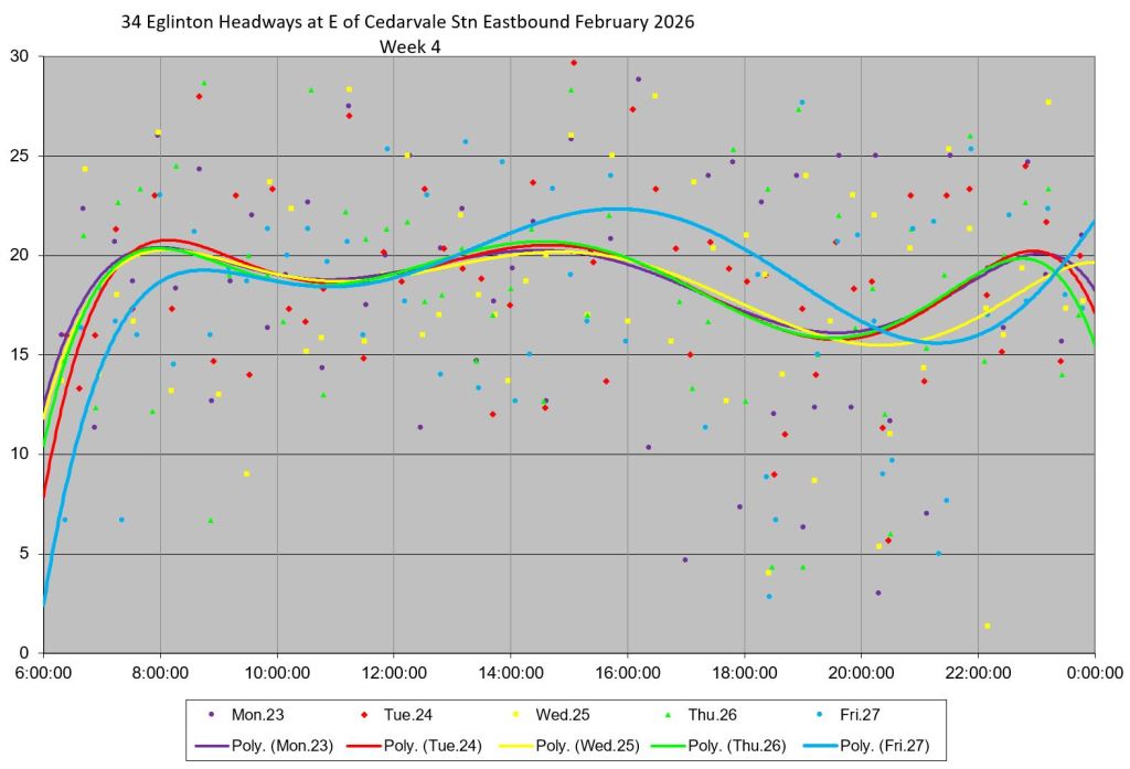
Service Statistics Eastbound
Eastbound service behaves similarly to westbound leaving Mount Dennis Station with scattered headways. The SD values here are at times lower than corresponding values for Kennedy westbound, bu they are already high.
Leaving Cedarvale and Eglinton Stations eastbound, the SD values are higher even though these locations could be easily used to restore regular service. The numbers are even worse at Don Mills eastbound.
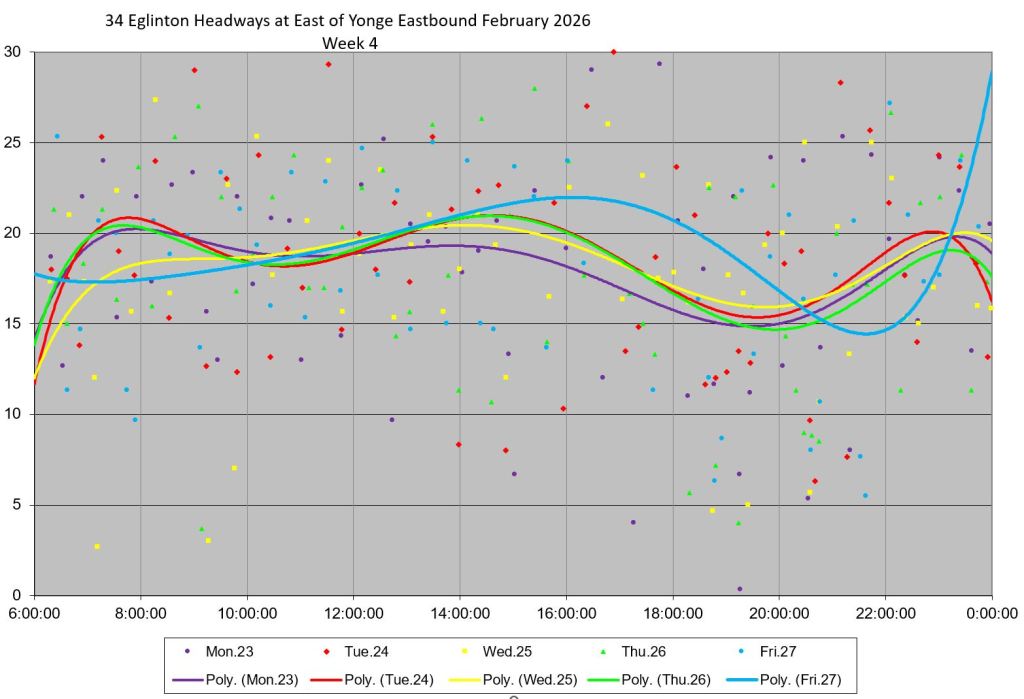
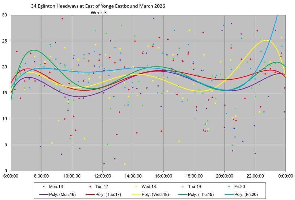
Detailed Headway Charts Eastbound
The scatter of headways leaving Mount Dennis station is visibly smaller than corresponding values westward from Kennedy, although it worsens in the evening. Much greater scatter is obvious at points further east.
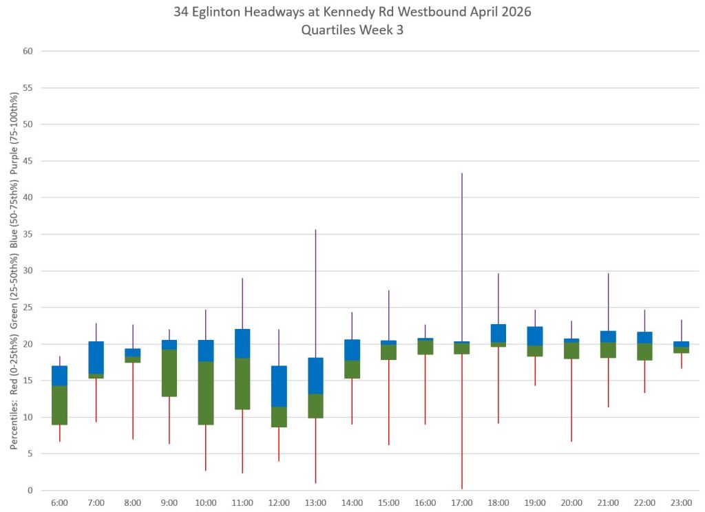
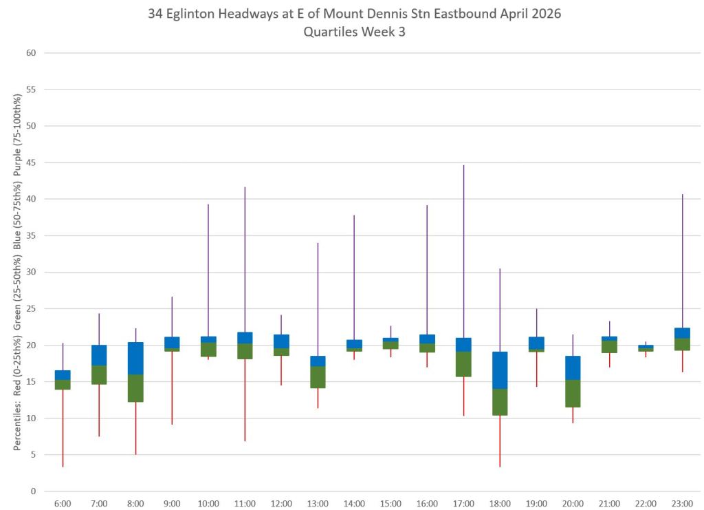
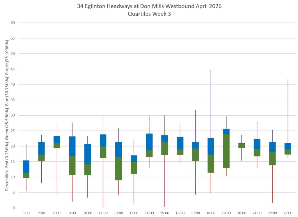
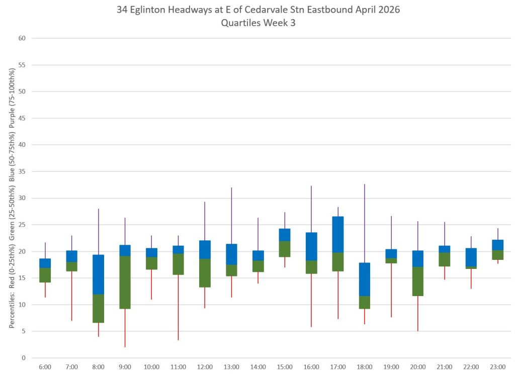
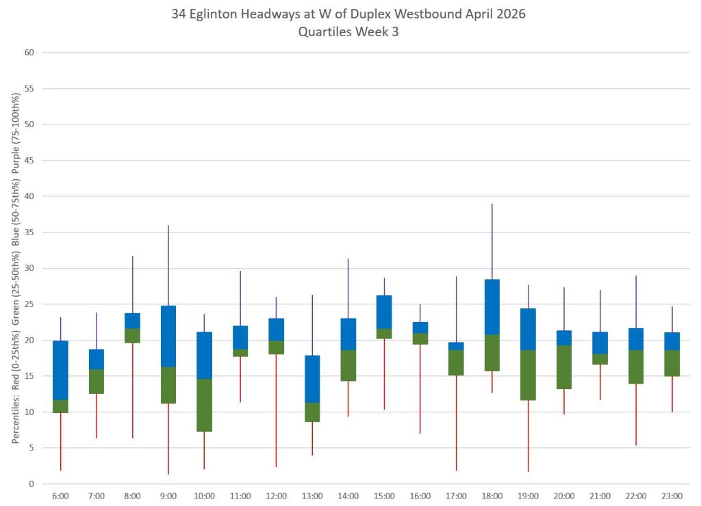
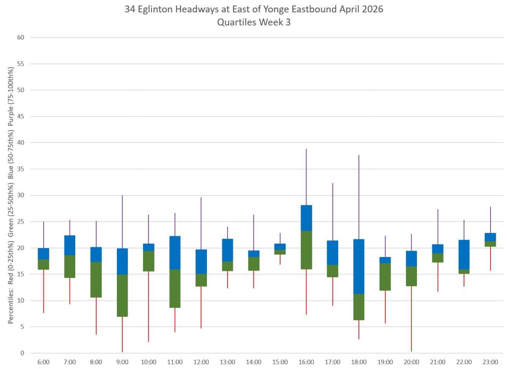
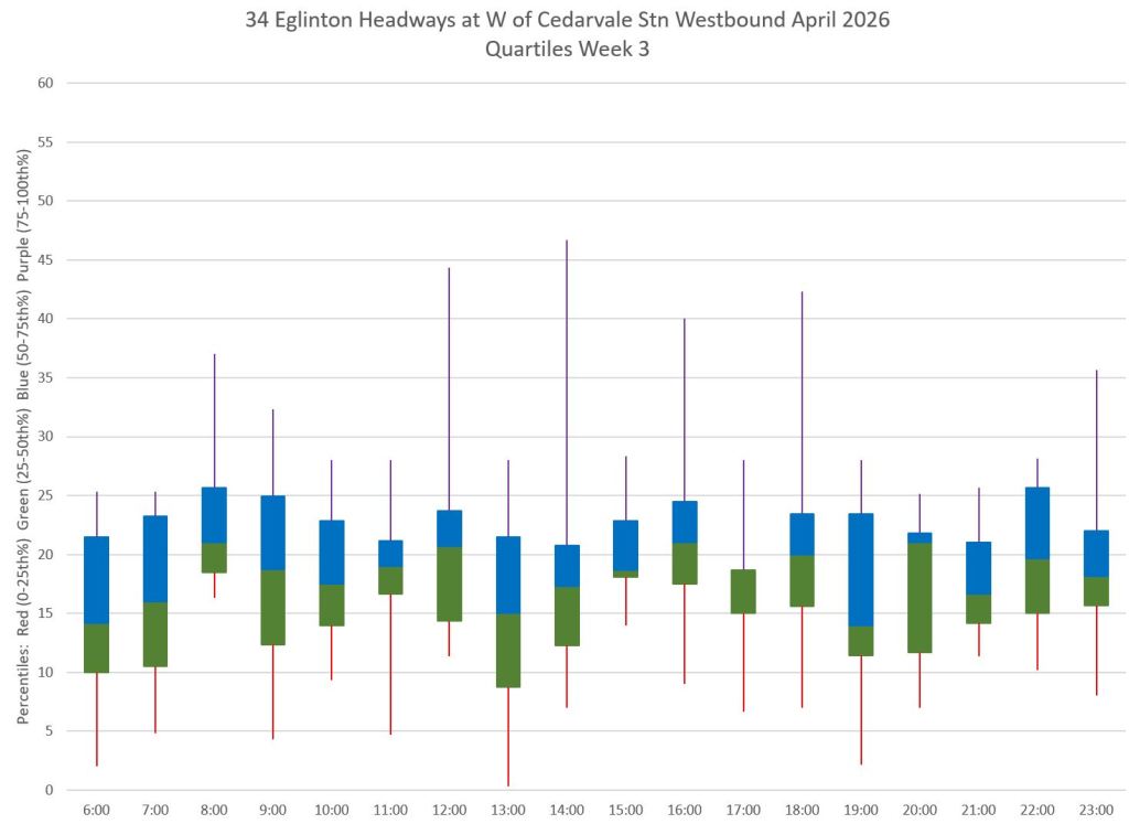
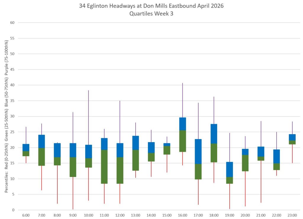
Headway Quartiles for mid-April 2026
The charts below show the range of headways by hour in the third week of April 2026. Westbound data are on the left, and eastbound on the right. The top row is at the terminus and subsequent rows show the changes working across the route. The ranges of headway values are broken into quartiles with the central two being in a blue/green box, and the outliers in tails above and below the boxes.
One half of the service lies within the blocks, and where these are short this indicates that at least half of the service was close to a consistent headway. The tails, however, contain the other half of the service and show how much headways wander from the target. The vertical axis is set to 60 minutes unlike earlier charts to show the full range of values.
Where the blue/green blocks are wider, even the central half of the data points are spread over a substantial range often well beyond the TTC’s service standard target. The red tails often touch the axis showing a very short, bunched headway, and the purple tails reach to 40 minutes and beyond.

Thanks for this! Perhaps it will make a difference???
Steve: The single biggest problem with the TTC from a rider’s point of view is service quality. For years we have not held TTC management’s feet to the fire about this. I am not hopeful.
LikeLike
There is rampant fare evasion due to the on surface sections of the Eglinton LRT being used to access the underground section and the subway system. Whatever little money was saved by not burying a few kilometres of the Eglinton LRT, you are going to lose many times more in fare evasion due to it. Toronto never thinks long-term.
Steve: The marginal cost of burying the line from Brentcliffe to Ionview, roughly 7.5km, would have easily been over $2-3billion based on actual costs including the projection for the Eglinton West extension. Just the interest on the added capital debt would be around $100-million yearly. It would take a lot of evaded fares to pay for that. There is a general issue that there is not enough fare inspection and we’re not willing to spend the money on doing a better job.
LikeLike
The few times I rode the 34 on the surface portion, it’s been faster than the Eglinton LRT which is pathetic for how much money was spent on it. I hope it gets proper signal priority and lifted speed restrictions to be better than the bus. It needs less dwell times at stops and faster door opening/closing (see: line 2) at stops too. I filled out the TTC’s line 5 survey they’ve been promoting where I highlighted these issues. I also wrote to the TTC and counsellors – I hope they actually take what customers have to say into consideration to speed it up ASAP. Otherwise for the Scarborough surface portion, you are often better off timing the 34 and at least you know it will show up on the apps and be a decent ride versus trying your luck with the LRT.
Steve: Eglinton still suffers from poor design choices foisted on us by a combination of Metrolinx, City Transportation and the TTC. These happened in the background without anyone in the public knowing what was happening, and so the line opened to well deserved ridicule. A textbook example of how to bastardized a project and guarantee the technology has a lousy credibility. The subway jocks are happy, but it costs us billions.
LikeLike
Austin J: The few times I rode the 34 on the surface portion, it’s been faster than the Eglinton LRT which is pathetic for how much money was spent on it.
We predicted this and warned about this in advance countless times but Steve and his followers dismissed us because they know better.
Steve: Well before the line opened I and many others who advocated for it learned that the planned transit priority scheme was not going to be implemented. The heavy in this story was City Transportation Services, and the regime then in charge was John Tory’s.
That was disappointing enough but it was compounded by ridiculous TTC operating practices that hobbled the speed cars could travel. What had been proposed as a fast service turned out to be a lumbering embarrassment, especially on Finch where equipment reliability kept Line 6 running with buses much of the time.
Now you blame the advocates for a totally cocked up implementation where the real problem is the incompetence of those who designed and built the operation. Imagine if we built a new subway line that couldn’t run properly thanks to design compromises. Would I be dumping on the subway jocks or rather asking whether we need a new crew in charge?
The problem here if course is that none of the agencies involved can be trusted, especially Metrolinx, who are more a construction management company than a transit operator.
LikeLike