
Recently, the Toronto Star ran an article with the headline “19 of Toronto’s 20 dirtiest subway stations are on the Bloor-Danforth line”. One could (mis)read that as implying that the BD line is some sort of cesspool of poorly maintained stations, while the YUS is a sparkling beacon. There is also an unfortunate echo of arguments made by some that the BD line gets second class treatment because of the people it serves.
Intrigued to learn what the details of station cleanliness scores actually looked like, I asked for a copy from the TTC, and this was provided by Stuart Green, a sidekick in TTC Communications of the better-known Brad Ross.
Green provided a few comments to flesh out the numbers:
You will see an obvious upward trend globally, notwithstanding a few peaks and valleys.
Andy [Byford] has made station cleanliness a priority and our customers have noticed. Our modernized station management model and the hard work of our frontline janitorial staff are making a tremendous difference.
In a subway environment, the TTC is one of the cleanest systems in the world (just visit NYC). Our customer satisfaction surveys also reflect customer appreciation for just how clean stations – and vehicles – are today over five years ago.
FYI, we are also in the process of procuring new equipment which can blast clean the terrazzo surfaces with much better results (see attached pic).
A few points…
The rating criteria is established by the TTC and provided to our external auditors.
The summary of it as follows:
- The scoring for each component (glass, metal, platform edge markers, elevators etc) is rated on a low-high scale of 1-5. The auditors assess the cleanliness of the components based on the criteria listed in the contract and scores it accordingly.
- The audit report takes the score for each component and averages them together to come up with a station score.
- Components of the stations are also averaged to see what specific items are problematic in a station.
The data are revealing when they are split apart in various ways. First, the system average scores including the maximum and minimum values attained in each survey by individual stations.
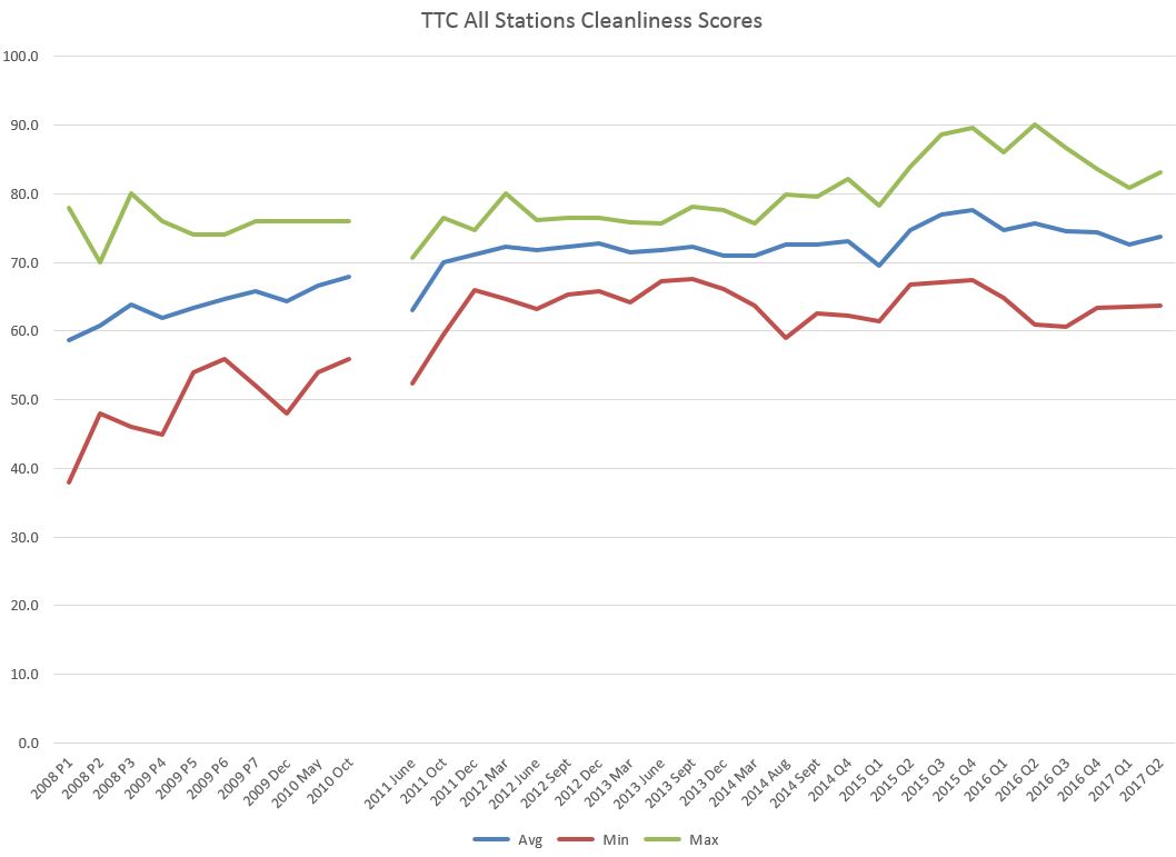
As Green notes, there is an upward trend, although it stalled for a considerable period from 2012-14, and after an improvement in 2015-16, values fell again in 2017. Quite clearly there was a wide range of scores back in 2008 when this process started, but a lot of the improvement over early years was to pull up the bottom performers (thereby increasing both the minimum score and the average). The maximum score did not start to rise substantially until 2015.
There are two obvious points where there are changes in the data:
- The gap for the first part of 2011 was caused by a change in the contractors doing the condition surveys. It is intriguing that the first results from the new contractor showed a dip in values although this was quickly reset. Whether this was due to a change in TTC practices, or a re-calibration of the survey is hard to know.
- There is a marked improvement starting in 2015, although more so in the maximum values. Much of this improvement fell away by 2017.
When the data are split apart by route, here is what we see:
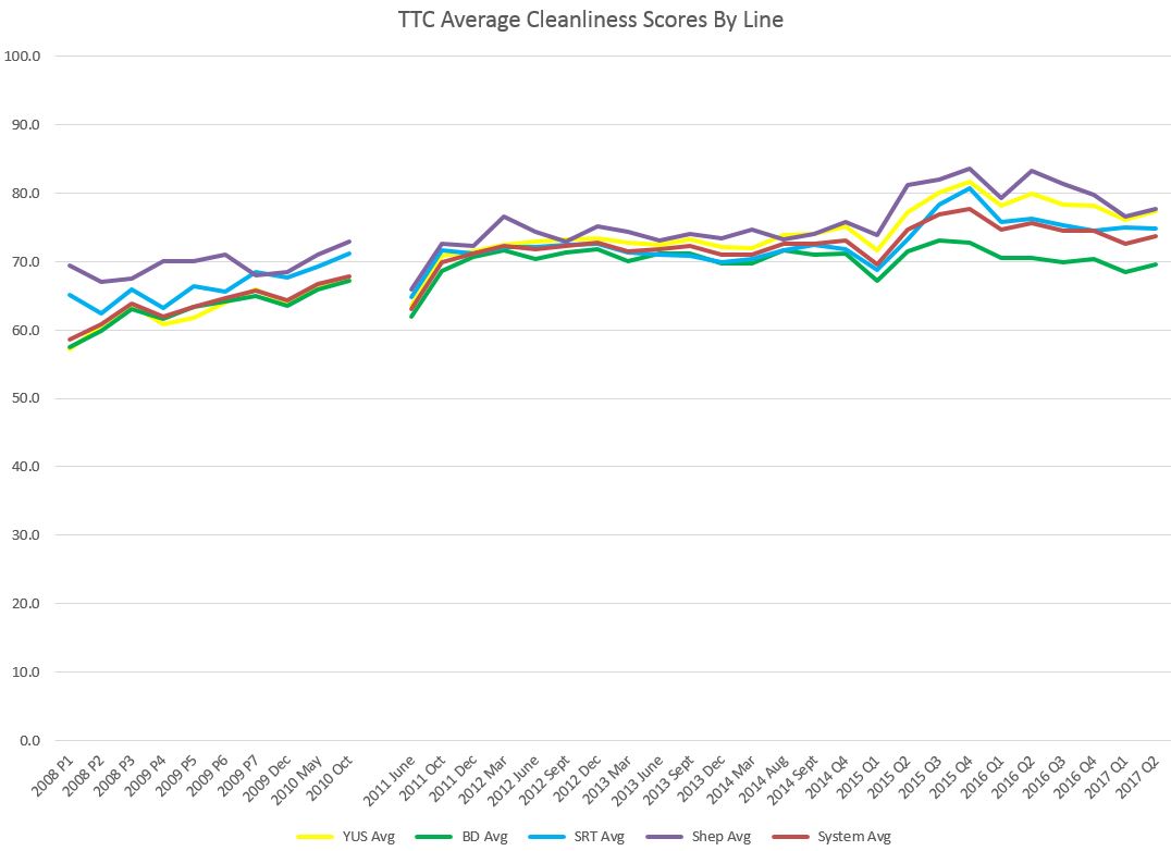
The biggest jump for 2015 came on the Sheppard line with Yonge a close second and then the SRT. What is quite striking is that the improvement had little effect on the Bloor-Danforth line.
Another factor that stands out here are dips in Q1 of recent years probably due to winter conditions. This could well be a function of when the surveys were done as past years show data explicitly for December and March, but not for January or February.
