
Regular readers will be familiar with many analyses published here that review the behaviour of transit service on streetcar and bus routes. One of the more galling parts of a transit rider’s life is the uneven headways (the times between vehicles) for almost all services that make the anticipated wait longer than the advertised average in the schedule.
This article is an attempt to devise a measure of this problem that can be used to show the degree to which actual service deviates from the scheduled value in a way directly related to rider experience. Some of the material is a tad technical, but not overly so. Also, readers should note that this is a first cut, and suggestions for improvement are welcome.
Wait Times Versus Headways
In theory, service is scheduled to arrive at a stop every “N” minutes, like clockwork. Therefore, the average rider will wait half of this time for a vehicle to show up. If buses are supposed to arrive every 5 minutes, then the average wait is 2.5 minutes. But the situation is more subtle than this.
If riders arrive at the stop at a uniform rate, say one each minute, they will not all wait the same length of time. Someone who arrives in the first minute will wait almost the entire headway, 4.5 minutes on average, while someone who arrives within a minute of the bus will wait on average only 0.5 minutes. The five riders who arrived in the five minute headway will have varying wait times, but on average the value will be 2.5 minutes per rider, and a total of 12.5 for the group overall.
    Rider  Wait Time
      1       4.5
      2       3.5
      3       2.5
      4       1.5
      5       0.5
    Total    12.5
The total above is the sum of a simple arithmetic series, and because of the values chosen here, the formula for calculating the total is quite simple. It is the square of the headway in minutes divided by two.
Total = (N * N) / 2
If the service is “well behaved” with consistent headways, this is just a complicated way of getting to the same result with the average wait being half a headway (5 minutes divided by 2 giving 2.5 minutes). However, when headways are not consistent, the square factor in that formula shows its effect.
Suppose that vehicles are supposed to arrive every 5 minutes, but in fact two vehicles arrive sometime within a 10 minute window on varying headways. These might both be 5 minutes, but they could also be 6 and 4, 7 and 3, etc. In this case, the wait times behave differently. The table below shows how the average wait time for the ten riders accumulating at a stop during a 10 minute period vary depending on the regularity, or not, of the headways.
    First     Wait    Second    Wait    Total    Average
    Headway   Time    Headway   Time     Time     Wait
      5'      12.5'     5'      12.5'    25.0'     2.5'
      6'      18.0'     4'       8.0'    26.0'     2.6'
      7'      24.5'     3'       4.5'    29.0'     2.9'
      8'      32.0'     2'       2.0'    34.0'     3.4'
      9'      40.5'     1'       0.5'    41.0'     4.1'
     10'      50.0'     0'       0.0'    50.0'     5.0'
It is self-evident that if two buses arrive every 10 minutes, the average wait time is 5 minutes, but this table shows how the values rise for different levels of headway inconsistency in between.
The TTC considers that vehicles that are only slightly off schedule (one minute early or up to five minutes late) are “on time” for purposes of reporting service reliability. The problem with this scheme is that the leeway it allows is very broad for routes that operate frequent service. Indeed, if a bus is planned to come every 5 minutes, two could come every 10 and the service would still be “on time”.
There is also the problem that riders on such routes don’t care about the schedule because it really is meaningless. They only care about reliable service, and a six-minute swing of “on time” values is often wider than the scheduled headway. The result is a meaningless metric of “on time performance”.
For wider scheduled headways, that six minute swing does not represent, proportionately, as much of a potential change in average wait times. Consider pairs of buses on a 20 minute headway:
    First     Wait    Second    Wait    Total    Average
    Headway   Time    Headway   Time     Time     Wait
      20'     200.0'    20'     200.0'   400.0    10.00'
      21'     220.5'    19'     180.5'   401.0'   10.03'
      22'     242.0'    18'     162.0'   404.0'   10.10'
      23'     264.5'    17'     144.5'   409.0'   10.25'
      24'     288.0'    16'     128.0'   416.0'   10.40'
      25'     312.5'    15'     112.5'   425.0'   10.63'
Although the headways are wider, the percentage in change relative to the scheduled value is smaller, and so both the total rider-wait time and the average wait time don’t shift as much as they do for more frequent service for the same latitude in headway adherence. To get the same effect, proportionately, as in the first example, the two buses would have to arrive together in a 40 minute gap.
Note that these values behave the same way regardless of the assumed arrival rate of passengers provided that this rate does not change. The total rider-wait times would be higher for an arrival rate above one per minute, but the average values would remain the same.
There is also a presumption here that for infrequent services, riders will arrive uniformly over the headway. Where the route is the origin for a trip, riders might be expected to time their trips to minimize waits, although this behaviour can be thrown off if service is not reliable, especially if it is often early. For riders arriving at a bus-to-bus connection or at a subway-to-bus transfer, they are unlikely to be able to fine-tune their trips to just catch a bus. (The exception would be a network with protected, timed transfers, but the TTC does not have any of these.)
Crowding Effects
These values also affect on-board crowding because a vehicle carrying a wider than scheduled headway will accumulate more passengers and will have longer stop service times. It will become later and later, and the vehicle behind will eventually catch up. As with “average” wait times, the “average” crowding level will not represent the actual situation experienced by the “average” rider. Just as more riders wait longer than the planned average when buses do not arrive regularly, more riders are on the more crowded vehicles.
The problem is further compounded because most riders try to get on the first vehicle that arrives lest the second one be short-turned and they are left in a big gap waiting to continue their journeys.
If one were to poll 100 riders distributed between two streetcars, they would not complain about crowding if they were equally distributed and all had a seat. However, if 80 of them were on the first car and only 20 on the second, the average perception of crowding would be that the service was overloaded and that it did not show up reliably.
This is a fundamental split between service as the TTC sees it (on average) and as riders see it (as an individual experience).
Measuring the Difference Between Actual and Scheduled Wait Times
In preparing this article, I have been wrestling with various ways to calculate and display these values in a useful way. There are pitfalls both in the methodology and in the charting of information. The examples below are only one way to present this information, and should not be read as definitive.
Here is the basic premise:
- Within each hour of the day, vehicles pass by a location on a route, each of them on its own headway.
- From the headway values, one can calculate the wait time for riders assuming an arrival rate of one/minute. The total of these times divided by 60 gives the average wait per rider over the hour period.
- The count of vehicles within each hour is easily converted to an average scheduled wait time of one half the average headway.
These values are graphed for the 504 King route for Tuesday, November 1, 2016. A sample page is shown below and the full sets are linked as PDFs.
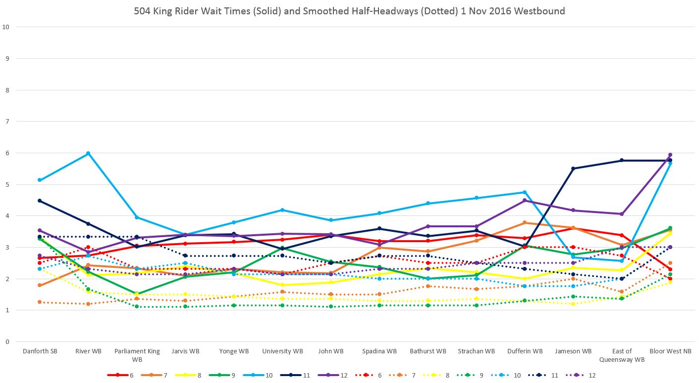
In these charts the solid lines represent the rider wait time in minutes/passenger while the dotted lines are the average that would have applied if all of the service had been evenly spaced over an hour. Each colour shows data for a different hour through the day, and the horizontal positions show various locations along the route. Note that the rider wait times are generally higher than the average times implied by the vehicles/hour.
There are several caveats about this presentation:
- For the 6:00 am line (red on page 1 of each set), the first headway is assumed to occur from 6:00 am until the arrival of the first vehicle. This will generally understate the headway on which that vehicle is operating.
- Depending on how badly disrupted the service is, the wait time contributed by the first vehicle passing in any hour may include time accumulated during the previous hour. This causes wait time to be mis-attributed, and it is possible for the rider wait time in the previous hour to be understated. For example, if one car passes a stop at 7:56 and the next one at 8:04, all of the rider wait time associated with the second vehicle will be included in the 8:00 data as will the vehicle in the total count. This effect is generally small enough that it balances out, but it can be more pronounced on wider headways where there are fewer vehicles to smooth out the data.
- In some cases, a gradual increase in rider wait times is visible along the length of the route showing how service becomes progressively more bunched into pairs.
- Major delays can result in a large increase in rider wait time because the long gap dominates the calculation, and following cars contribute almost nothing to this value. However, the number of cars/hour could still be at the scheduled level and the “average” wait times are not affected.
For reference, I have also included here the chart of overall service for the day.
There is a disruption of service westbound at Dufferin between 10:00 and 10:30 am. This causes headways west of this point to be bunched, and that bunching is reflected back on the eastward trip from Dundas West as a parade of cars makes its way across the city. Note that nothing was short-turned into the gap eastbound, and it was not until the next westbound trips after 11:00 that service began to be sorted out.
A delay eastbound at Queen & Roncesvalles just after 15:30 shows up as a spike in “3 pm” rider wait times at that location, but most of the gap passes points further east during the “4 pm” interval. This explains the behaviour of the plots for these two time periods.
As I wrote above, this is a first cut at attempting to measure what riders experience versus what the TTC will typically state as its quality of service.
A useful corollary to this would be to examine data from automatic passenger counters on the vehicles, but these have not yet been rolled out fleet wide. This would allow us to tie the service reliability values to crowding conditions on vehicles.
What will not show up, of course, is the number of passengers who simply never get on because they tire of waiting for a vehicle with room on it. At least with detailed counts, we would know how often “full vehicles” actually occur, and especially cases of lightly-loaded ones that are not pulling their weight because they are part of a parade. That is a task for a future round.
If I get any other ideas about how to present this information, I will update this article with additional examples.
