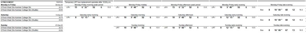
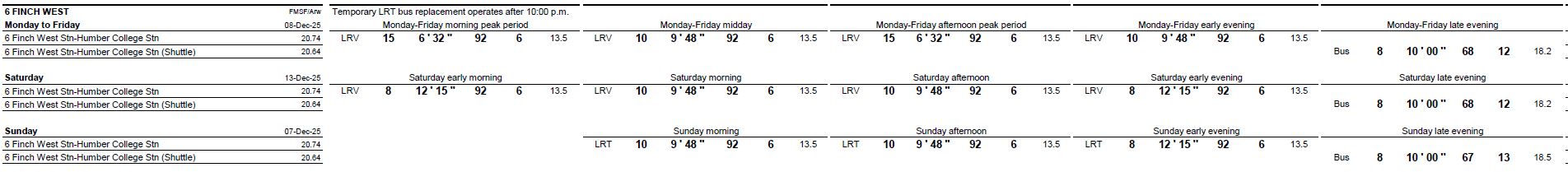
From the moment Line 6 opened in a magisterial whoosh of grandeur, well, maybe not exactly a whoosh, the issue of its glacial operating speed has fuelled many debates in social media.
One comparison that is always made is between the “LRT” and subway speeds. Yes, the LRT has closer stops, it has to deal with traffic signals, errant motorists and pedestrians, but it gives a new meaning to “glacial”. The downtown streetcar lines are in the same ballpark, and some of them best the brand new “LRT”.
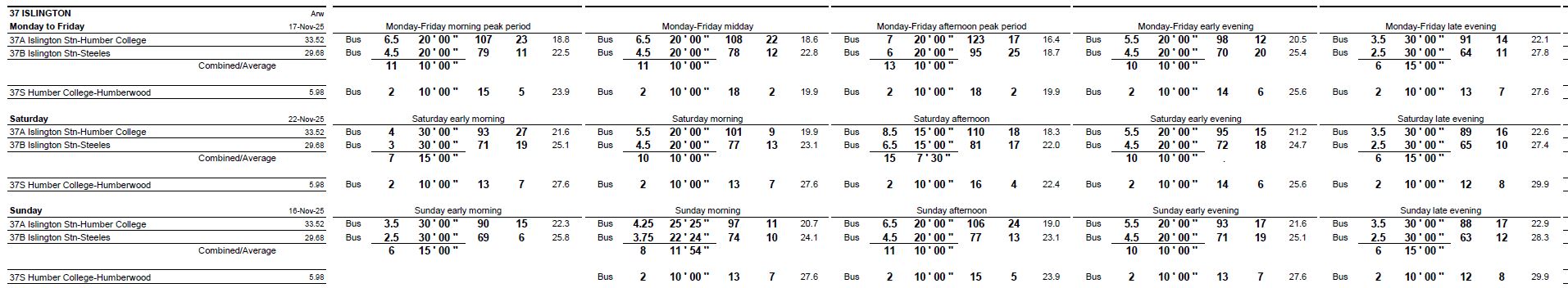
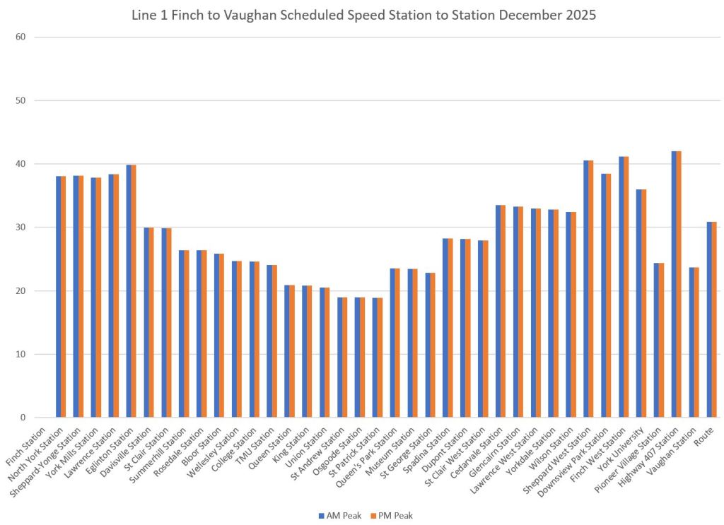
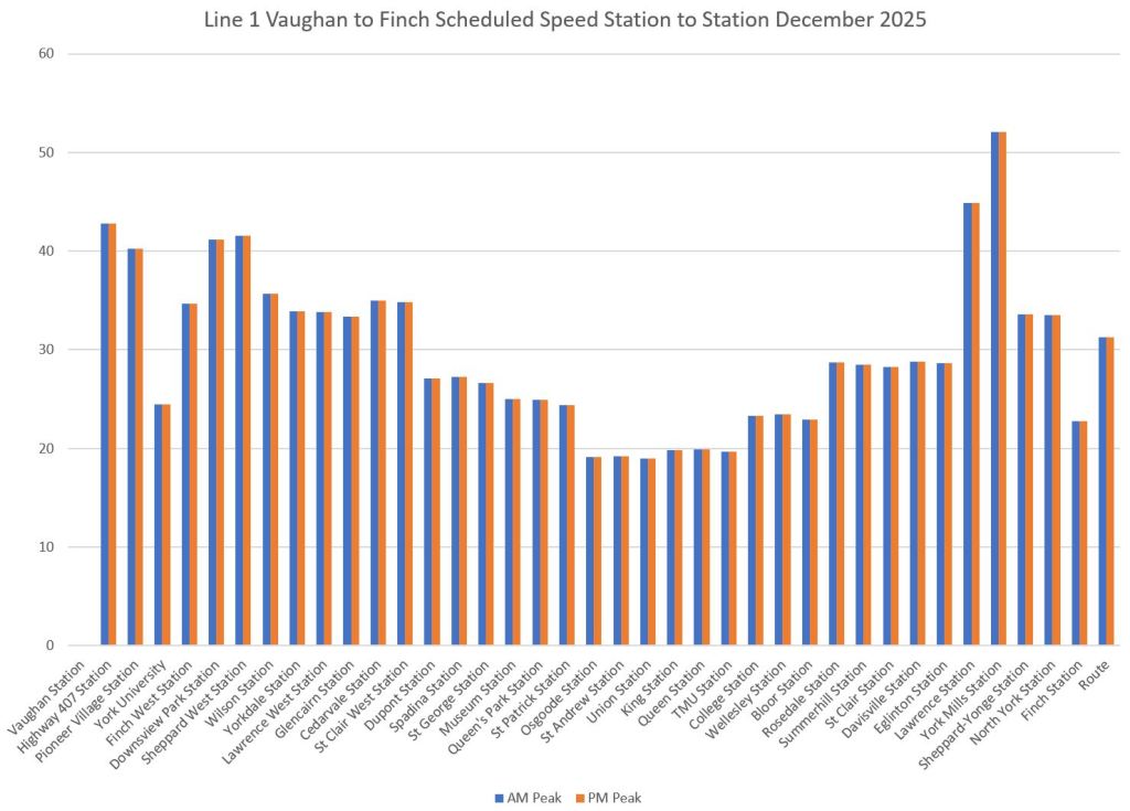
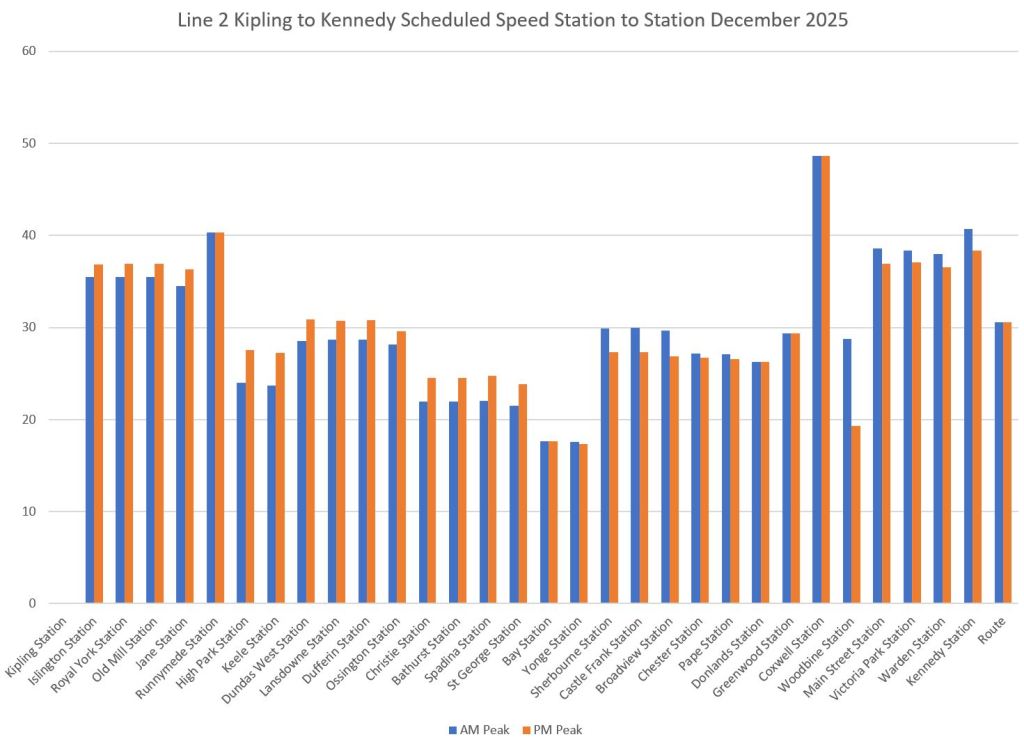
There are many factors at work which I will leave for another day. This post is intended to provide info on the scheduled travel speeds of the two major subway lines and the new 6 Finch West.
The data are taken from the GTFS version of schedules used by trip planning apps. They do not match the actual speeds, but give a sense of what the TTC expects these to be, in general, for trains running “on time”. (The GTFS data includes times and spacing for every stop from which the scheduled speed can be calculated easily.)
In the charts for Lines 1 and 2 (Yonge-University and Bloor-Danforth), data are shown for both the AM and PM peaks. For Line 6 Finch, only one set of data is shown because the TTC has used a generic all-day schedule for the initial service.
The vertical scale is set at 60 km/hr for all charts. The average values for each set of data are at the right end of each chart labelled “Route”.
It is self-evident that subway speeds will be higher for many reasons including stop spacing and the fact that trains both accelerate to and run at higher speeds. However, the LRT speeds are embarrassingly slow. Riding the line even on a trip that makes its scheduled time, the car crawls across the route.

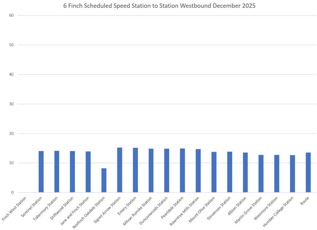
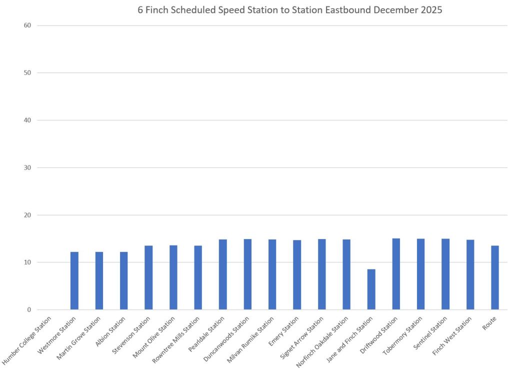
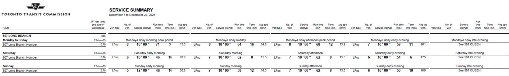
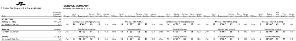
As a matter of comparison, the 512 St. Clair car is only slightly slower than 6 Finch and at times faster. The 507 Long Branch running on Lake Shore Boulevard in Etobicoke is consistently faster than 6 Finch.