
In a previous article, I presented a proposed way to display service frequency on a route in a manner that, I hoped, would convey the pervasiveness of irregular service, be clear to casual readers, and in a consistent format. Several readers commented on this either on Twitter or via email, and I thank all for their contributions.
One immediate change, which I included in an addendum to the article, was to replace the vehicles/hour counts (which indicated how many buses or streetcars passed a point each hour) with an average wait time for a would-be rider. That time was calculated on a weighted basis to penalize long gaps in service.
The average wait time stat has other uses which I will explore later in this article.
My intent in developing this new type of chart is to add to the repertoire of charts I publish when reviewing a route’s performance and to show how, or if, changes the TTC makes to schedules affect service riders actually encounter.
For those interested in the details, read on. Again, comments are welcome. I would like to nail down the format before launching into a series of route reviews.
Headway Distribution and Average Wait Time
First off, here is a side-by-side comparison of the original chart format and the revised one. The changes are:
- The colour scheme has been revised to improve contrast between the bands.
- The bars have been widened to make the bands more prominent against the background.
- The average wait value has replace he vehicles/hour count.
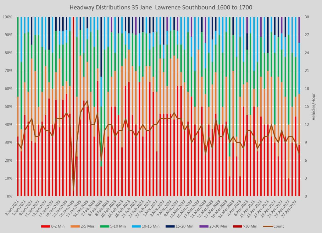
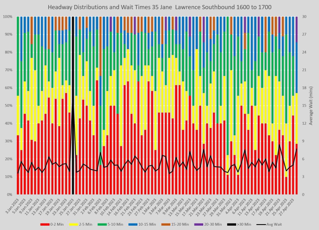
The average wait time is a value that is rider-focused giving an estimate of the length of time a rider arriving at the stop would have to wait. The vehicle count is important, but for a different reason — the analysis of the proportion of service the TTC advertised that it actually operated.
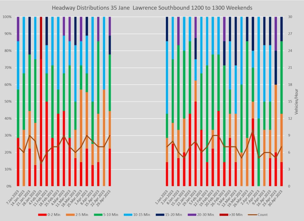
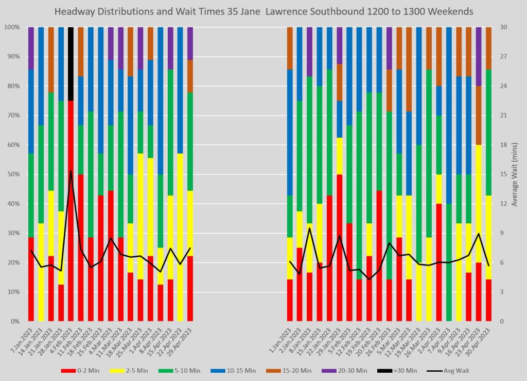
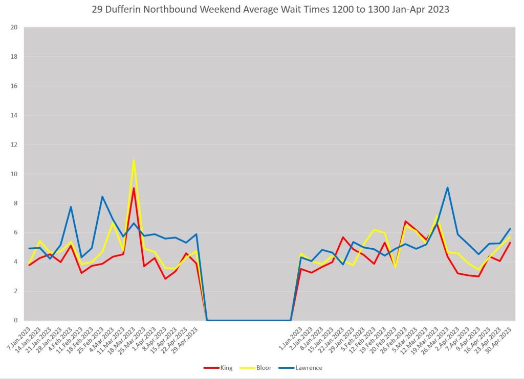
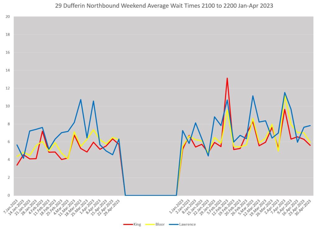
Here is a pair of charts for weekend service. Note that the Sunday portion on the right includes stat holidays and so there are more columns than for Saturday on the left.
How Average Wait Times Work
As I explained in the first article, the calculation starts out with the premise that one rider arrives at the stop each minute. It does not actually matter how many, but a consistent rate is assumed and using “1” simplifies the calculation.
Each rider will wait, on average, half of the time between two buses. This means that if the scheduled service runs every 10 minutes, a rider will on average wait 5 minutes. However, the actual service does not run to the clock and the wait times can be longer. For example, if there is a 15 minute gap, the average wait is 7.5 minutes. For a short gap, 5 minutes, the average wait is 2.5 minutes. More riders wait longer, and so the average wait overall is dominated by the long waits.
However, these values compound because in the gap between buses more riders will have the long wait and fewer will have the short wait. The table below illustrates the effect.
On the left is a regular 10 minute headway, and the average time for 60 riders works out to 5 minutes, of course. On the right is a headway that meets the TTC’s Service Standards with alternating buses 5 minutes late and 1 minute early. Note that the first bus to count toward the 12:00-1:00 stats is the 12:15 bus because the preceding two are counted against 11:00-12:00.
For the regular service the average wait time is shorter than for the irregular one because, in the latter case 48 riders wait in the gap while only 12 are in the short interval behind it.
| Time | Headway | Riders | Rider Wait Time | Time | Headway | Riders | Rider Wait Time |
| 11:50 | 11:55 | ||||||
| 12:00 | 10′ | 10 | 50′ | 11:59 | |||
| 12:10 | 10′ | 10 | 50′ | 12:15 | 16′ | 16 | 128′ |
| 12:20 | 10′ | 10 | 50′ | 12:19 | 4′ | 4 | 8′ |
| 12:30 | 10′ | 10 | 50′ | 12:35 | 16′ | 16 | 128′ |
| 12:40 | 10′ | 10 | 50′ | 12:39 | 4′ | 4 | 8′ |
| 12:50 | 10′ | 10 | 50′ | 12:45 | 16′ | 16 | 128′ |
| 1:00 | 12:49 | 4′ | 4 | 8′ | |||
| 1:05 | |||||||
| Total | 60 | 300′ | 60 | 408 | |||
| Average Wait | 5′ | 6.8′ |
This is a worst case scenario within the Standards, but it shows how service can be almost 40% worse from a rider’s point of view and still meet TTC’s “on time” target. In the real world, the TTC does not hit its target regularly, and the spread between advertised service frequency and experience can be even wider.
The actual average headway at any point, time and day will vary depending on then-current conditions. The coloured bars in the chart show the distribution of headway values while the average headway line traces how regular, or not, a rider’s expected wait will be.
How Average Wait Times Evolve Along Routes
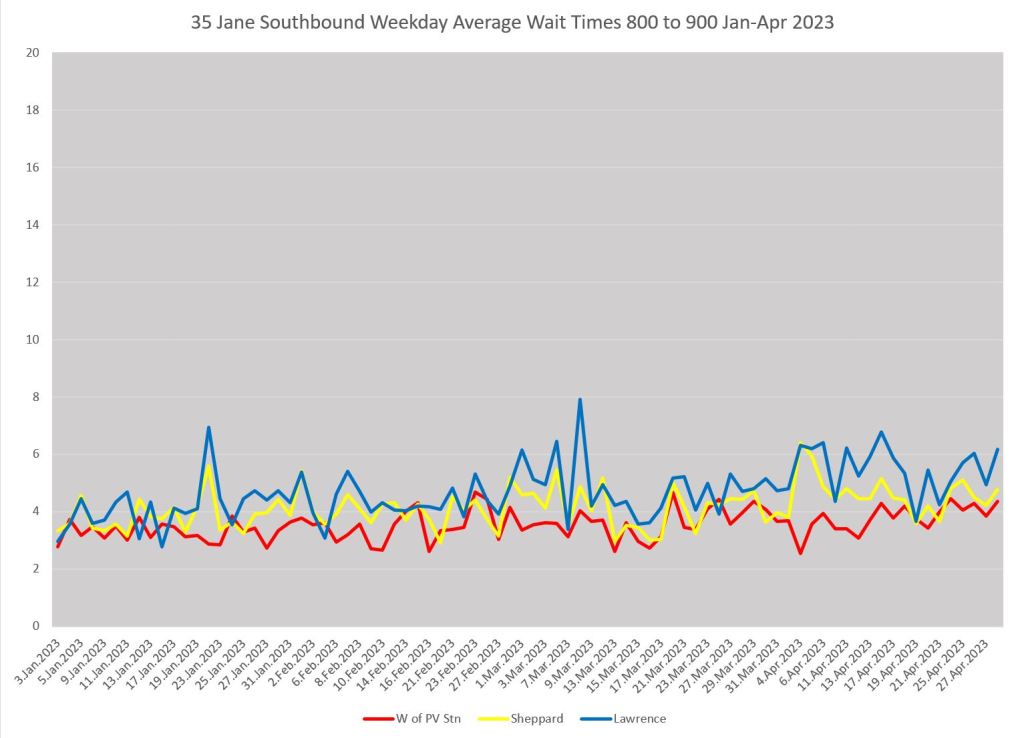
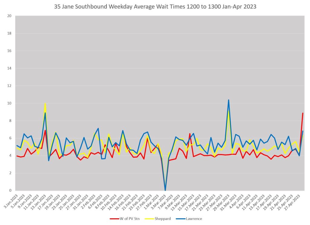
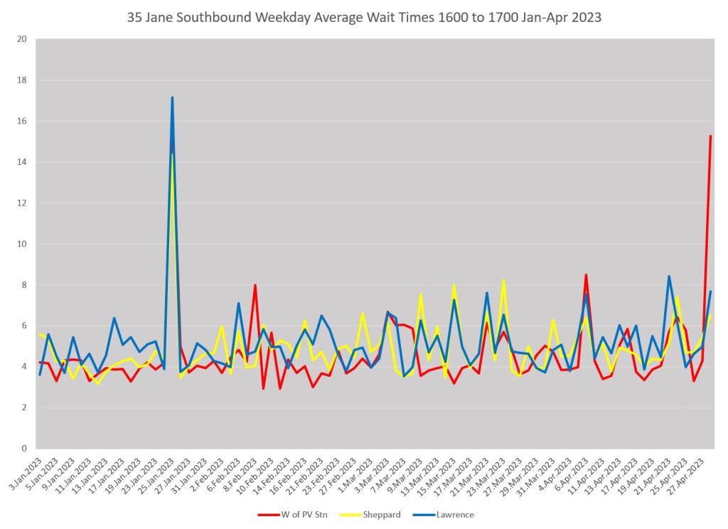
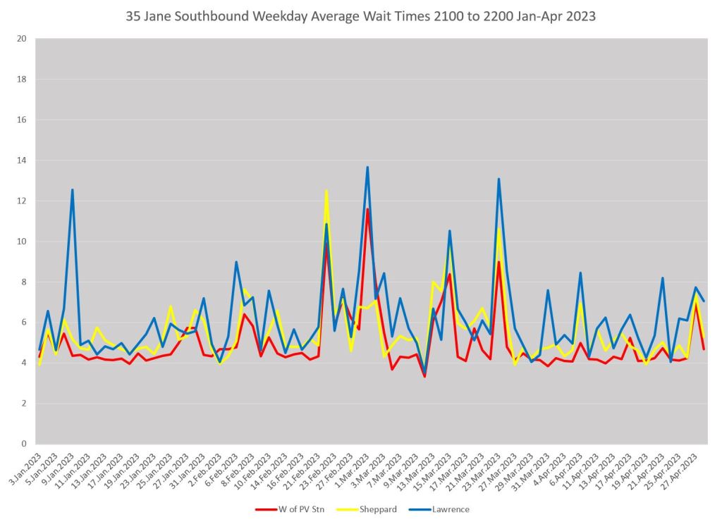
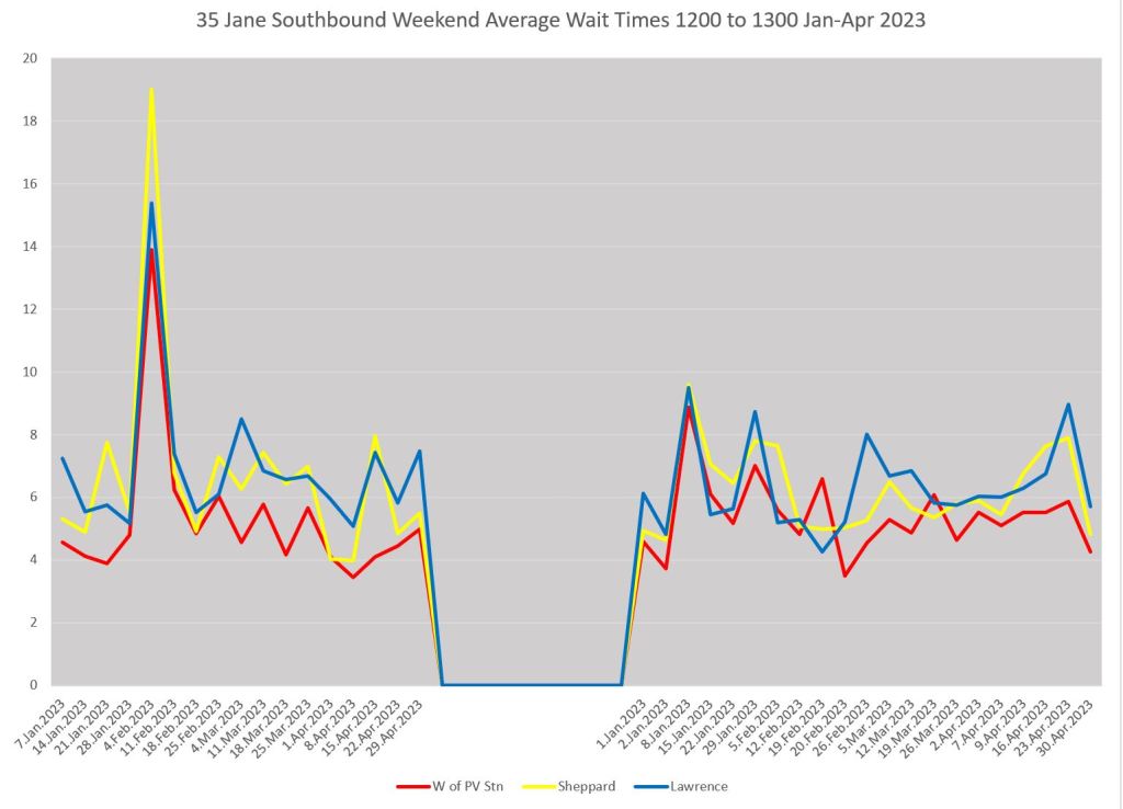
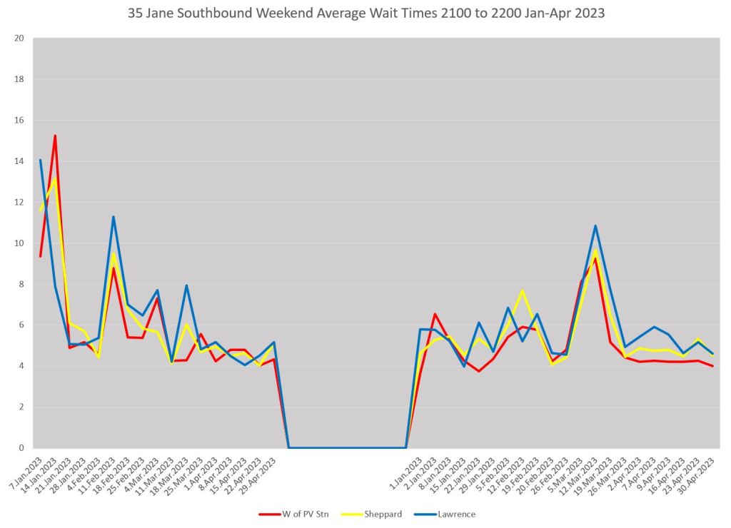
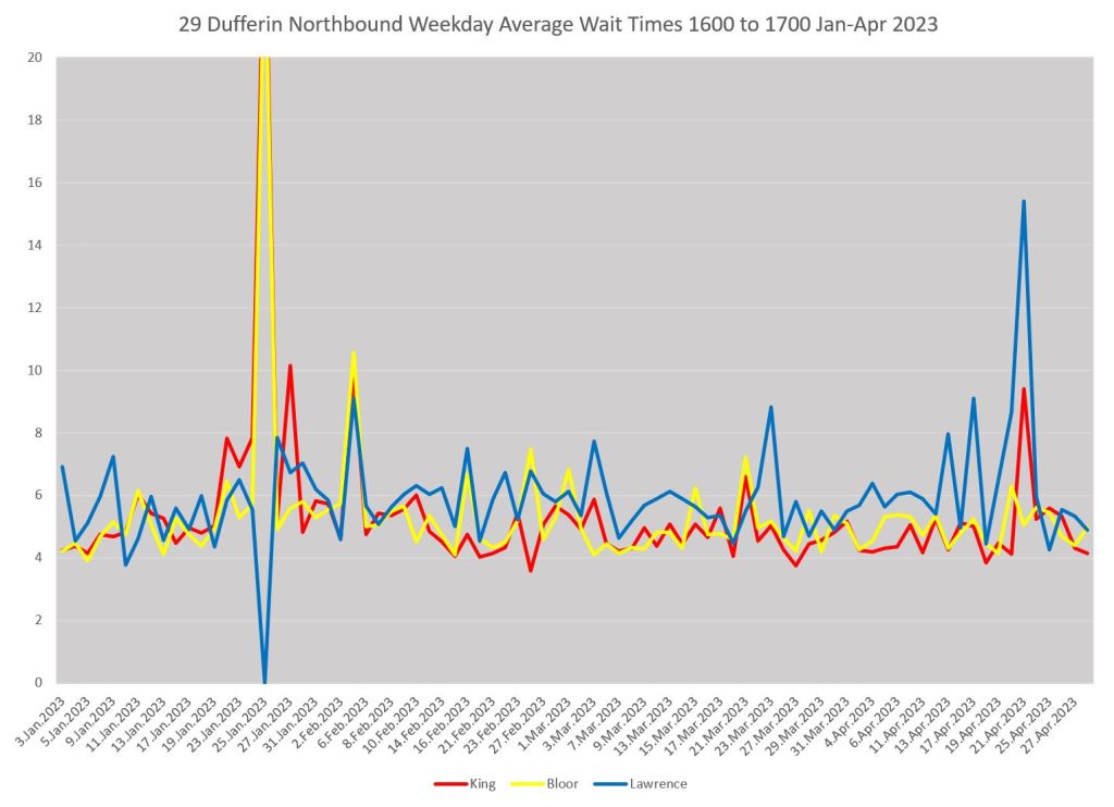
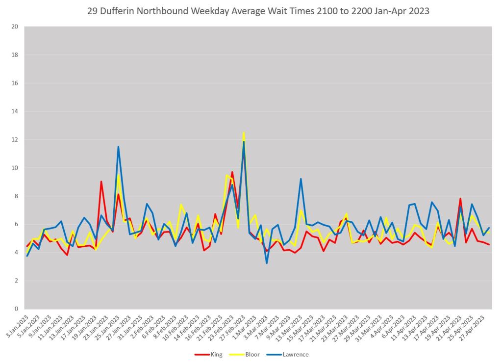
A typical situation on any route is that whatever service quality might exist is seen at the terminal. From that point onward bunches get closer together and gaps get wider. The charts below show weekday average wait times leaving Pioneer Village Station (red), at Sheppard (yellow) and at Lawrence (blue).
The situation varies from day to day, but generally the average at the terminal is lower than further south. This illustrates how a terminal-only measurement can understate how erratic service can be as seen by riders who board along the way.
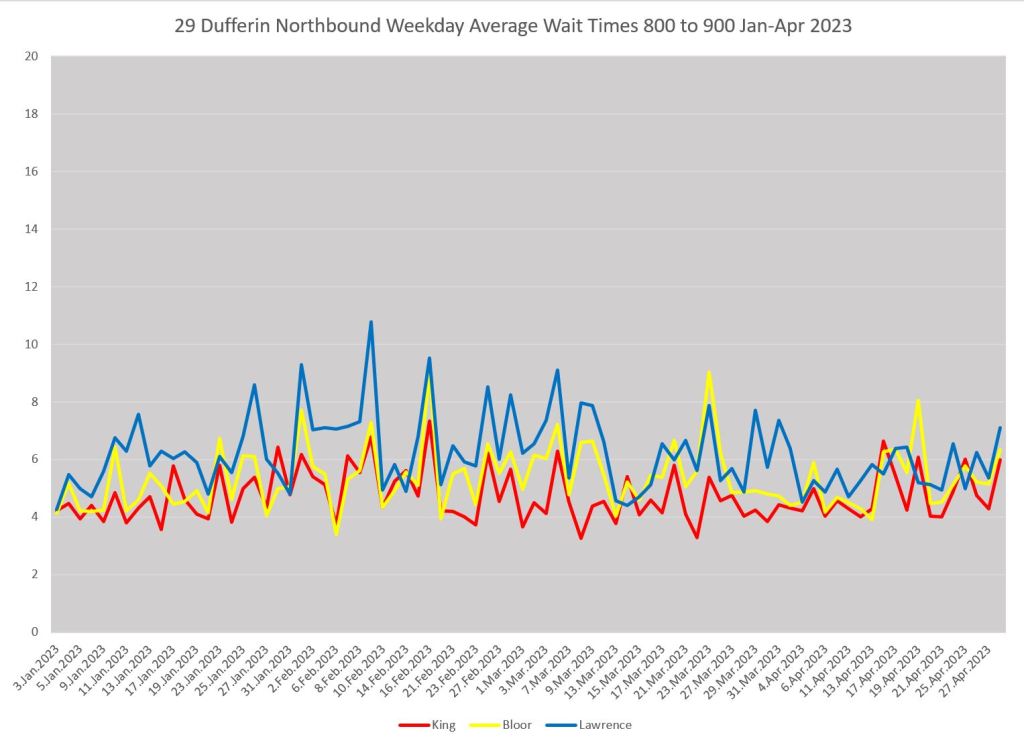
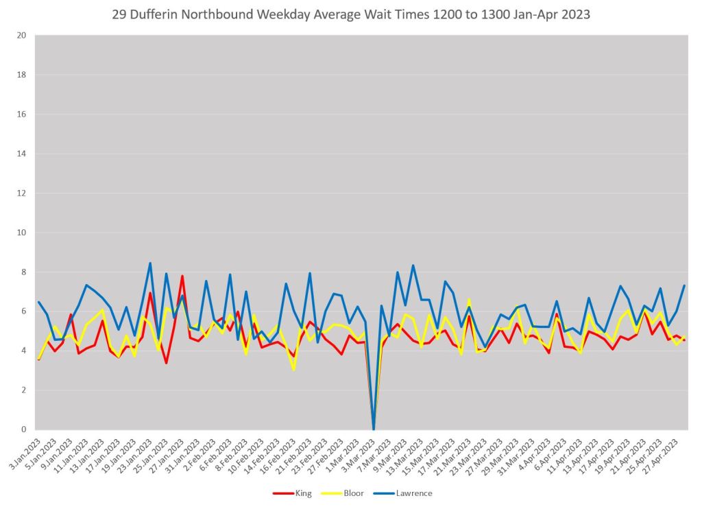
Here is a comparable set of charts for 29 Dufferin northbound as seen at King (red), Bloor (yellow) and Lawrence (blue).
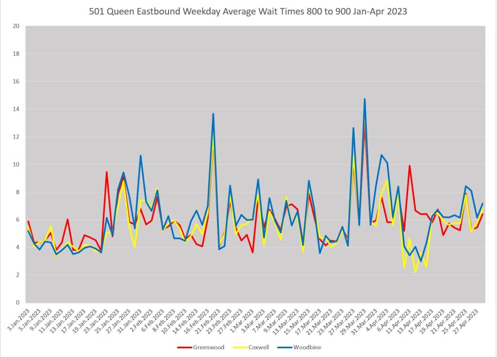
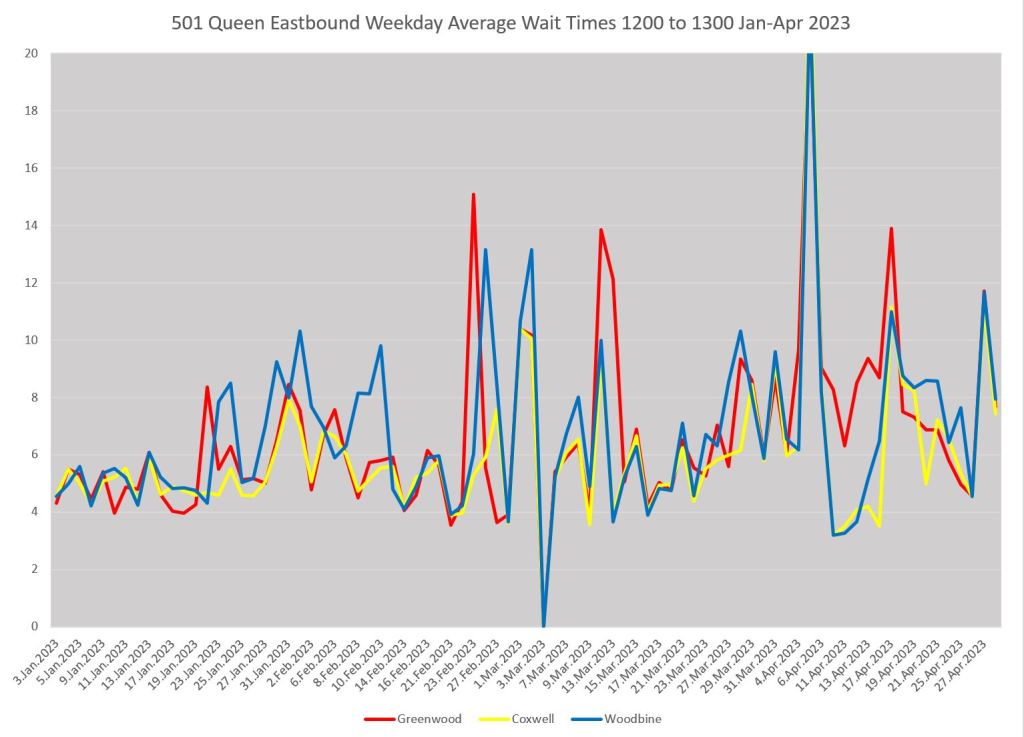
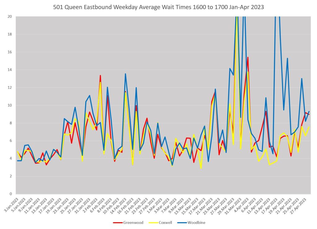
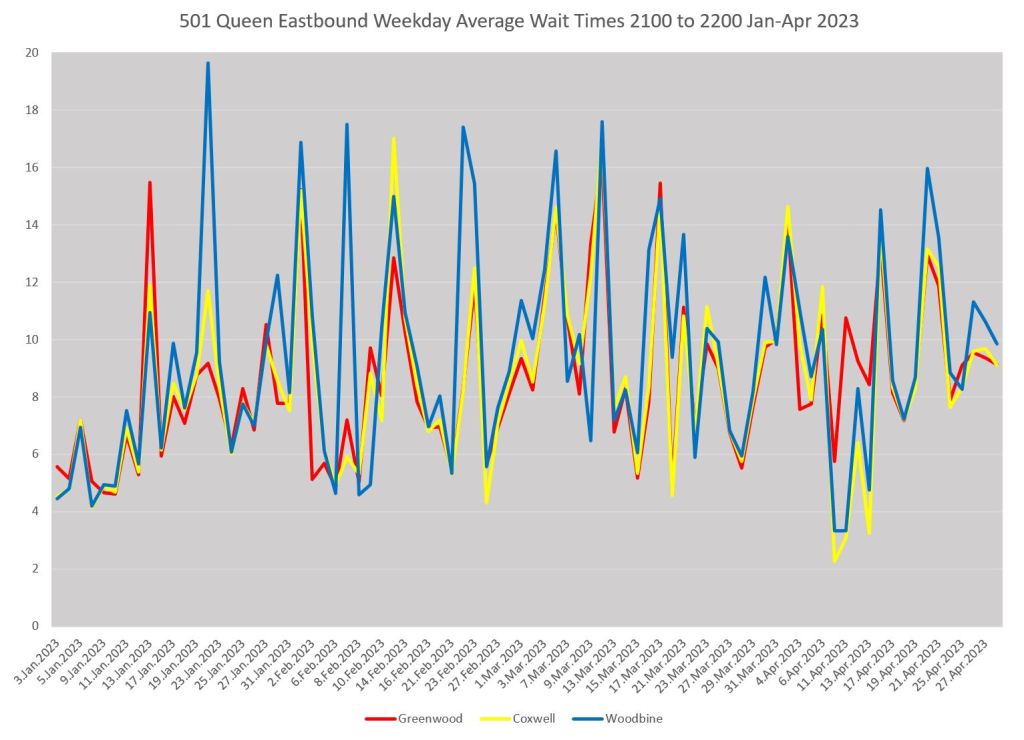
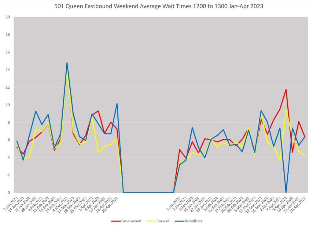
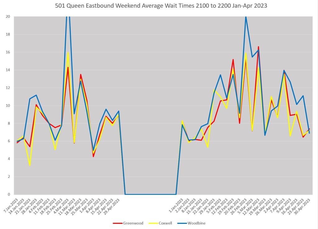
Another variation on this shows the effect of short turns affecting service at the eastern end of the 501 Queen car. The service is already erratic eastbound at Greenwood (just west of Russell Carhouse, red), and it gets worse by Coxwell (yellow), and even worse by Woodbine (blue). Weekday evenings are particularly bad. There is a short turn location between each of these points (Russell Carhouse and Woodbine Loop at Kingston Road).
(Note: During a period in early April, buses replaced streetcars east from Coxwell. This results in counting of both types of vehicles at the Coxwell screenline during that period. I have not filtered out this effect because it illustrates how one must take care to deal with exceptional conditions on routes.)
Comments Please!
Subject to any fine tuning, these will be the format of charts I will use in a series of route reviews beginning in June with data to the end of May. My intent is to look at routes affected by recent service changes to see how they are behaving with their new schedules.
Thanks to all who have contributed to this process.

Far more useful from the rider’s point of view – three buses bunched together do not provide the same service as three with proper headways. Thanks for all the hard work.
Steve: You’re very welcome!
LikeLiked by 3 people
When will construction end at College, Rosedale, Museum, Spadina, Donlands, Greenwood, and Warden stations? When will the connection between the Dundas West subway station and the Bloor GO/UPX station open? Construction going on at any other stations and what are the finishing deadlines? When will the second platform construction at Yonge station begin and when will it end? When will the Mount Dennis GO/UPX station open?
Steve: The schedule for the Easier Access program is on the TTC site. Metrolinx is tendering the work at Dundas West and should be awarding soon. Come back in about 2025 for opening. Yonge Station early works are underway. It won’t end until the early 2030s. Mount Dennis GO/UPX? I don’t know, but it would not make much sense until the Crosstown opens.
LikeLike
I like the chart format. It does a good job of describing the service as experienced by real passengers in real life. Thank you, Steve!
LikeLiked by 1 person