
This article has been split apart from the coverage of the October TTC Board meeting to accommodate updates and to keep the comment thread separate from other issues.
The Board considered a presentation entitled New Wayfinding Standards which, among other things, proposed a change in naming for subway lines to the use of numerals. This has provoked no end of comment, some on this blog, as an ill-advised waste of money.
More to the point, this presentation is neither a “standard” nor a comprehensive review of TTC wayfinding. It is an overview of a few changes, and even these are not set out on a thorough basis. What we have here is a proposed trial, but not a systemic review of wayfinding.
The goals are simple: avoid multiple styles of signs, convey information in a consistent way so that riders know the “language” of the signs across the system, make maps easier to understand, and make all forms of wayfinding more accessible. One style, one letter font, one style of branding should identify a “TTC” message wherever it appears.
Consistency and legibility are not important just for the casual user, but for the regular passenger who may be in an unfamiliar part of the system. They may walk through their “home” station on auto-pilot, but off of their regular territory, they too will be “tourists”.
The TTC has a recognizable “brand”, the flying keystone, but this has been diluted over the years by numerous slogans, different marketing campaigns that have left their marks on the system like shells accumulating on the sea floor.
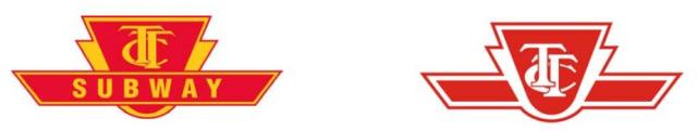
The original TTC logo from the days of the Toronto Transortation Commission did not have the wings. These were added when “rapid transit” came on the scene. The colours of the logo on left reflect the fleet colours of the time.
In this example, we have the keystone logo in its current red-and-white format and two separate slogans each with its own typeface. Neither of these is the well-known “Subway” font used for station names on much, but not all, of the system.

This is intended to be the simplified, standard logo with simply the organization name and no additional messages.
Passengers wandering through the system need to be able to decide where to go quickly even if they are in an unfamiliar location. This is important at congested points where a single rider stopped because they can’t easily see the appropriate path can block many more.
That’s a nice idea, but we must see whether the TTC actually achieves this goal with proposed new signs.
Recently, a new “standard” construction notice began to appear.
This maintains the red-and-white colour scheme, but it is different from other notices that have appeared for station maintenance projects, a standard that is itself fairly new. This style is also poor for use in electronic copies where black ink on white paper with limited use of colour endears organizations to people wishing to produce printed copies as handouts.
It is unclear which of the construction notices is to be the new “standard”, and how long this will last before someone dreams up yet a new way to present this type of information.
Current signage and other materials (web pages, printed materials) have many formats.
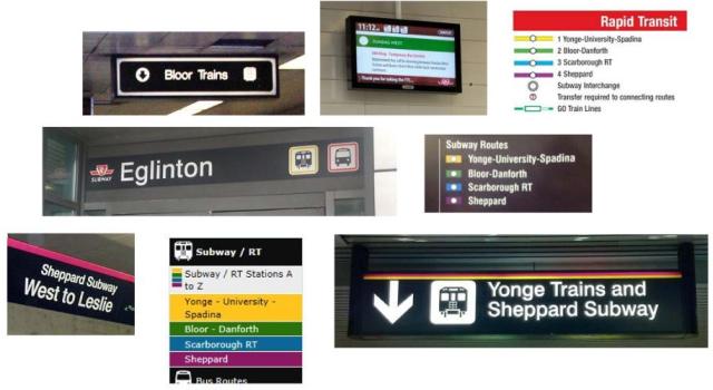
This is only a sample. Notable by its absence is the style found in some older stations such as the original BD line where the “subway” font is used for directional signage, not just for station names. These represent various generations of design each considered valid in its time, but presenting an inconsistent whole.
The use of names and colours is inconsistent and, in some cases, it is rather subtle. The TTC would like to move to line numbers, but would keep line names.

The intent here is not simply to use numbers but also to establish the circle as indicating “rapid transit”. However, no proposals has been made for surface routes, let alone how locations with other providers services (e.g. GO Transit, Mississauga, VIVA, etc) would handle consolidated signage.
When these are combined into other sign forms, however, consistency takes a beating.
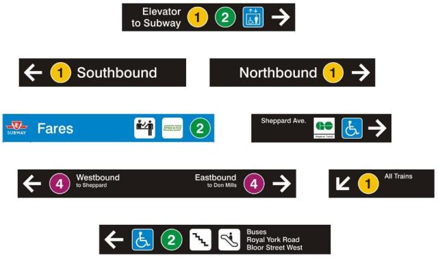
Why, for example, is some information in such small type (compare “All Trains” with “Northbound”)? Why is the “Fares” sign unique in having a blue background? Why does line 4 run westbound “to Sheppard” rather than to “Sheppard-Yonge”, the actual name of the terminal station?
In these signs, the subway pictogram has become a numeral, but the mode-specific pictograms would remain as generic references to buses and streetcars.
One of the worst problems at major stations is visual clutter. The presentation gives a before-and-after view of the east concourse at Bloor-Yonge intended to show how signs could be more prominent, but actually demonstrating a much more severe problem.


Although there is somewhat improved information about the location of trains for lines 1 and 2, the dominant message here is that this is the “Corolla” station. Leaving aside the fact that this is a competing technology, the basic problem is that “station domination” advertising can totally swamp the viewer in images that have nothing to do with wayfinding. On particularly memorable Amex campaign even managed to cover up the station names and was so visually busy that one could have a hard time finding the directional signs.
This is a basic policy issue about wayfinding: yes, the TTC needs advertising revenue, but it should not allow campaigns that make the stations illegible even to the point of being unrecognizable.
In the sample above, note that the sign over the escalator lists “Eastbound” and “Westbound” rather than using the “All Trains” designation introduced in the samples above.
St. George Station fares a bit better, but shows how much more is to be done.


Notable in the new sign is the disappearance of the red-and-white “Exit” designation. This brings up the question of cases where certain signs may require standard formats under the Building Code. Both the St. George and Bedford concourses lead to exits from the station, but it is unclear whether the term “Exit” here is intended to say “this is the shortest way out”.
A sample street entrance is shown for Osgoode, here at the northeast corner of Queen and University.

Leaving aside the less-than-ideal letterspacing in “Osgoode”, this sign begs the question of whether so much real estate should be devoted to directing would-be riders to another entrance in a way that requires both fluency in English and a knowledge of local geography. It is quite conceivable that some entrances will require space for more information, and there must be a policy about the hierarchy of messages. All entrances do not have a large wall space over a stairway and the space available for supplementary information may be limited.
There are other samples in the presentation, but I think that I have made the point that the samples are not fully thought out and don’t represent a comprehensive “standard” for new signage. (I am avoiding the term “wayfinding” as that implies somewhat more than updating the look of signs to the current administration’s preferred flavour.) Also, beyond the issue of composite identification of routes with a symbol, colour, number and name, there is no discussion of accessibility.
Maps
A sample of an expanded Rapid Transit map is worth including here, if only for amusement.

First off, note that the exploded section focused on Sheppard-Yonge station would not appear on the regular map. It is intended to show more detail as part of the presentation.
In this case, we have the “future” lines 5-Eglinton (not “Crosstown”), 6-Sheppard East LRT and 7-Finch West LRT co-existing with 3-Scarborough RT in a configuration that will never exist (unless the RT leads an unusually charmed life and Toronto gets a serious penchant for building LRT).
This map shows the ongoing problem with trying to preserve a map format that is out of scale (vertical vs horizontal) to reality so that it will fit in the space over a doorway on a subway car.
TTC staff, who earlier this year appeared to have the system route map targeted for oblivion, have reconsidered and now recognize that there is a need for such a map. The problem is how to convey a mass of information in this format.
Here are three versions of a segment of the system map. First is the current Ride Guide which uses a street map as an underlying grid.

Next is a guide with routes given different colours for clarity where many of them run close together (I will skate past the issue of colour blindness already raised with respect to subway colours). None of the colours, other than those of the subway lines, has any meaning.

Finally, we have a map where the lines indicate the frequency of service. In particular, routes with frequent service get a thicker line. There are many, many errors on this map including the omission of the Eglinton services 32/34 as “frequent” routes, the indication that the 97 Yonge bus provides service south of Davisville all of the time, and coding the 140 series of routes as if they were all-day services when they are peak-only. I will be generous and hope that this is just a sample, and that if a real map appears using this scheme, better proof-reading is applied to it.

During his presentation, the TTC’s Chris Upfold quoted Jarrett Walker’s line “frequency equals freedom”, but did not really put this in the proper context. If anything, the map above shows just how much of the central area of Toronto does not have “frequent” service much of the time.
All of this is very much in early stages, and yet we may see some of the ideas rolled out early in 2014 when print media come up for their regular refresh. There is a chance that we would see a new “standard” evolve without enough time to discuss what the real goals may be.
Overall, my feeling about the presentation is that as a wayfinding system it is far from “ready for prime time”. These are a scattered set of ideas, but not an overall style guide, and the interaction of various proposals has not been thought through.
The TTC plans to implement a trial of new signage at Bloor-Yonge and St. George this winter. In most cases, existing signs will be covered with vinyl wraps (just like advertising campaigns) using the new layouts. Only illuminated signs require new inserts, and these will be sized to existing fixtures.
The whole matter will come back to the Board for discussion sometime in 2014 complete with a cost estimate. That may be premature because without a overall style manual or a sense of how far the TTC would go in retrofitting existing signage, it is difficult to know what the scope of cost would be.

Has there been any studies / research which suggested that commuters / visitors are having a hard time and getting confused by the only 3 lines that we got? Or it it just that Andy Byford decided that it was too confusing (perhaps it was too confusing for him when he moved here from England in which case I can’t imagine how he was ever qualified to run the 11 lines of the London Underground)? Have there been any studies that suggest that a numbering system is less confusing? Or it it just that Andy Byford decided that it would be better?
When I moved to Toronto, I never found it confusing nor did any of my family members. The London Underground that Andy Byford came from does NOT use a numbering system and Andy Byford never pushed a numbering system and so why is he so desperate to number the lines here? Why waste millions of dollars in replacing thousands of signs and replacing thousands of posted maps and reprinting hundreds of thousands of new maps? Why waste all the old signs and maps and create unnecessary environmental wastage?
The London Underground colour codes the lines and our lines here are already colour coded and so I don’t see why we should waste millions of dollars on this when our stations are breaking down, our streetcars are in short supply, many of our buses are not frequent enough, etc etc etc? Besides, it has been shown that colour coding helps people remember better than number coding (the latter is what Andy Byford wants). The reason Andy Byford wants number coding is because if he asked for colour coding, the lines are already colour coded and so he will not get to drop the meaningful line names and so he will not have to include the word ‘Downtown’ when trying to sell the suburbanites the ‘Downtown Relief Line’. Don’t waste millions of our dollars to deceive the suburban people into giving support for the project.
As for me, I like the meaningful names helpful and replacing them with numbers will be more confusing (imagine a subway announcement that they are experiencing delays on line 3 and somebody might not remember which one is line 3 but if the name is announced, then there is no ambiguity or confusion). If Andy Byford wants to number the lines, then number them but do NOT drop the meaningful names. I have read at least 20 different articles that suggest that Andy Byford wants to number the lines so that he can avoid the word ‘Downtown’ when trying to get approval for the ‘Downtown Relief Line’. If all he wants to do is to avoid the word ‘Downtown’ from the ‘Downtown Relief Line’, then he can call it the Don Mills-Pape-Queen Line or something (without wasting thousands of tonnes of environmental waste (1 tonne = 1000 kg) and without wasting millions of our dollars) and to be honest the latter is more meaningful. It is a shame that Andy Byford has come to pure deception in trying to sell the Downtown Relief Line to suburbanites.
I also found some media interviews with people on the street about how they get confused on the Yonge University Spadina line and that numbering the lines will be helpful. Really? If they are so smart that they get confused on it, then I don’t think you can do much to help them other than give them detailed directions every single time that they travel. Besides, how does numbering help? We already have nice colour coded lines with meaningful names which we do not need to change. Thank You!
Steve: The argument for something other than colours is that a significant portion of the population is colour blind. That said, nothing prevents the TTC from keeping the colours and giving the lines a number or letter. This whole business started with a general review of wayfinding in subway stations of which line identities is only part.
I am waiting for the presentation at the meeting [tomorrow as I write this] to see just how extensive this proposal is and whether it’s a “done deal” or merely an experiment.
On a related note, I am getting a bit tired of Byford’s concentration of the superficial aspects of the system to the apparent detriment of focus on actual operations. Things are supposed to be happening “behind the scenes” but there is precious little to show for it.
LikeLike
Indeed, a photo posted by Brad Ross today shows a scheme using both numbers and colours. If the TTC introduces line numbering, it should keep the line colouring.
Agreed.
LikeLike
Route numbering for our subway is a waste of time. We don’t interline and we only have two major transfer stations. Seriously folks, you’d have to be borderline retarded to not understand our system.
YUS causes confusion because it’s a U and most of the time the train’s destination sign will show a station that’s in the opposite direction of travel. For Pete’s sake, we’ve got southbound trains leaving Downsview that read Finch (which is north). How about FINCH VIA UNION until it reaches UNION and then just FINCH? The signs are electronic now and there’s no reason they can’t automatically change en route — aside from the fact that the electronic displays are too small.
These numbering schemes are seen in other cities where lines meander and don’t primarily follow a single street. How else would you name them, except arbitrarily? Maybe numbers would have been of value when we ran that 3-route service back in 1966, but even then, people were smart enough to figure it out with no route maps at platform level.
LikeLike
Wayfinding and signage are not superficial aspects of a transit system. They are integral and extremely important. The fact is that signage on the TTC has been a jumbled, confusing mess for years now.
Steve: I agree that existing signage is a mess, but we really need to see movement on service quality and quantity, and for that we must await the budget.
LikeLike
Sure seems that way. Although I am a little surprised by dismissal of the two top Operating officials for not being in tune with Andy Byford’s vision and even more surprised you have not commented on this.
Steve: Too much of what I hear on this is rumour, and this is not an item to speculate on. However, if too many people are walking the plank, that will be a sign of a deeper problem worth comment. I am in “wait and see” mode.
I have to wonder if Byford has tried to get TTC upper management to make changes to the benefit of the customer rather than always doing things the TTC way? I have long stated the only way to get things changed is to start at the top and FIRE anyone who obstructs the customer service goal. Eventually, enough dismissals will get the attention of similar recalcitrant managers and supervisors. They will suddenly decide, why yes, we CAN to that! The TTC ALWAYS has an excuse for not doing something. Put more effort into finding ways TO do it!
As for numbering two lines… big deal! 1 and 2. What is next? The only thing confusing is on YUS when there is no mention of direction. How about FINCH VIA UNION etc. ?
Loss of the streetcar route names in favour of a stupid number that made no sense and minuscule lettering that has to include “station” in the sign board was a step backwards. How many people getting on the King car say, need to know it is going to Broadview Station? It sure isn’t going to Pape station! They need to know it is going to Danforth. (or, is being SHORT turned, or SNIS (Sorry, not in service) They are NOT sorry. Don’t rub it in! KISS!
What is likewise dumb is all the route destination signs on crosstown routes from the west to read say, 32 Eglinton route it says: EGLINTON WEST STATION or EGLINTON STATION. How about a sign that gives the destination STREET? Such as, SPADINA and YONGE? That is where I want to go. KISS!
End of rant! (for now!)
LikeLike
Maybe because more people want to go to Eglinton Station (and then onward) than want to go to Yonge?
Also, the bus is short-turning at Eglinton West Station, not at Spadina. While there is no eastbound stop called Spadina, there is one westbound (#2410). However, it is 6 stops (over 1400 meters) east of the station, so stating the bus would be short-turning at Spadina would certainly not make it clear to riders what stops they could get to on this bus.
Rightly or wrongly the TTC has made the subway system the center of the system. Virtually every route (exceptions are #99, 403, 405, 407) connects to the subway, so it makes sense to use them in the signs when they are the end points.
LikeLike
On “confusing” subway names: first time I was in Toronto, I arrived at Union station, and then went down to the subway platform. I knew I wanted to go northwest, but what I saw on the platform was “Northbound Yonge line” and “Northbound University-Spadina line”. Nothing on the maps indicated which ‘line’ was which, nor that they were two seperate lines. (So I asked someone, and was driected to the correct side 🙂 )
Steve: Eventually you will see “1 Northbound to Richmond Hill” and “1 Northbound to Vaughan Centre”. Figure out which platform takes you to Eaton Centre or the UofT campus.
LikeLike
Line numbering along with colors as shown in the examples is excellent – adopting a circle, a numeral and a color – it is quickly recognized as transit sign and akin to a trademark.
However, there is a lot involved in getting the whole thing right beyond line numbers, and the examples presented suggest they still have miles to go. Best advice for Andy would to take another look at LU signage systems, where for the most part they have got it right.
Interchanges with streetcar and GO lines are missing.
Some station names are confused – ‘Sheppard’ and ‘Sheppard Yonge’ for instance, how about calling YongeBloor station ‘Uptown’.
Steve: Aside from the now-departed “Uptown Theatre”, that’s about as meaningless a name as you could concoct. And try telling people who live there that they are not “downtown”. “Uptown” today is Eglinton and I’m sure the folks in North York will try to claim it eventually.
One BD route diagram turns it vertical, not the brightest effort, having kept the north at top orientation with the corresponding YUS diagram.
The challenge for all signage is that a viewer can orient him/herself to the sign in a nanosecond, and then find the information needed in a millisecond. Sign placement is equally important.
LikeLike
People have said that it is necessary to number them because of a few people that are colour blind (I am not even sure if it legally qualifies as a disability). How about spend the money to make all stations, streetcars, and buses accessible first (because that helps many more much more severely disabled persons than the limited disability that colour blindness presents)? Because even people who are colour blind can still read the colour coded TTC maps (only they don’t distinguish all of the different colours but then we only have 2 and a half different lines and so there is nothing confusing).
Andy Byford pretends to be worried about a few colour blind people who exist in Toronto but how about change the traffic lights for colour blind people? If anything, the traffic lights is more of a safety issue but since traffic lights (including but not limited to pedestrian countdowns, pedestrian flashing hand, and pedestrian STOP hand) have never been a problem for colour blind people, then why should TTC maps with 2 and half colour coded lines be the end of the world?
Steve: I am going to jump in here. There are more than “a few” colour blind people in the population in general. Traffic signals are organized so that they can be correctly interpreted based on the position of the signal aspects. As for the number of lines, the TTC will have many more than two in the foreseeable future.
Colour blind people are not that bad off compared to blind people for whom the meaningful names of lines are extremely important and Andy Byford wants to drop these meaningful names because he is not worried about colour blind people or blind people or disabled people or anyone else for that matter but just that he gets the Downtown Relief Line built. Instead of wasting this money on this useless numbering, how about use that money to increase streetcar service or bus service or to make more stations and vehicles accessible? Or how about using that money to give free rides to senior citizens and disabled persons? Besides, numbers can be added without dropping meaningful line names which Andy Byford is so desperate to drop just so that he can avoid the word ‘Downtown’ from the ‘Downtown Relief Line’.
Another argument has been made that not everyone can read English but pretty much everyone can read numbers? So, does that mean we are going to drop meaningful station names, meaningful bus and streetcar stop and route names, meaningful street names, etc etc etc and have a system solely based on numbers? Can you imagine what it would be like? For example I might need to get to street property number 5385 street name 1024 (major intersection (1115 and 1327)) and in order to do so, I need to get off at bus stop number 56794. My point is if you want to add numbers for people who are colour blind and/or can’t read English, then that is fine but please do NOT drop the meaningful line names (also please note that colour blind people can read the line names perfectly well and we have only 2 and a half different lines and not 24 different lines like New York City that anyone might get confused).
Steve: You really are not paying attention in the midst of your rant, are you. There is no intention to drop the existing names, but to have them co-exist with the line numbers.
I must take strong exception to the premise that some people are not disabled enough to be considered in system planning, not to mention the idea that there are only “a few” of them who can be safely ignored.
With this rant, you have used up your one free comment without my just deleting it because it is both insensitive and wrong on so many points. Don’t leave another one. It will vanish.
LikeLike
It’s your site, you can choose to be a bully. I doubt your readers appreciate threats when they don’t share your philosophy.
You might think you’ve found some principle on which to take offense, but it’s not well informed. I’m a little surprised too, given what you’ve mentioned about your professional background. David’s general premise is correct, even if he’s wrong on the specifics. The severity and frequency of disability and cost of remedy, plus impacts to other stakeholders are implicitly taken into account in any project or endeavor. The implicit assumptions and expenditure deemed reasonable have greatly changed over time as our society has become more affluent. Reasonable people can disagree on those assumptions and expenditures.
David’s wrong because colour-blindness is possibly the most common physical disability, affecting more than 10% of the population by some estimates. However, the great majority of colour-blindness is red-green, and despite the term, colour blind people are not blind to colour, so there’s nothing wrong with using yellow for YUS and green for BD (although red and green would not be recommended).
Steve: I am not being a bully. There are people who leave comments here that are extremely uninformed not to mention insulting, and most of these get deleted. (There are some blogs where I simply won’t participate because of the neanderthal level of commentary that is permitted.)
In this case, I thought there was an important issue at hand. As you may know, there is a lot of controversy about the Wheel Trans system and the degree to which it excludes people because they are “not disabled enough”. The suggestion that colour-blindness is something we should ignore (or can afford to ignore) is at best quite insensitive and ill-informed as you yourself point out. Moreover, we will have far more than the “yellow” and “green” lines in the none too distant future. We already have “plum” (Sheppard) and “turquoise” (SRT). GO Transit has its own rainbow of colours on its maps, and there are new lines to come such as Crosstown, Finch and Sheppard East. Wayfinding looked at in a regional context is much bigger than just two subway lines in downtown Toronto.
The cost of providing both colour and symbol (number) for routes as is now proposed, while keeping the familiar route names, addresses various audiences at little marginal cost and without undue clutter, at least in the TTC context. David’s rant implied that vast resources would be expended on an item of little importance, and he fixated on the colour-blind as his target of criticism. Speak to whether we should spend any money on updating wayfinding, but don’t attack one group for whom accommodation is easily provided.
There are legitimate bases on which to critique the “wayfinding strategy” notably that it is a partial, small-scale attempt and does not goes into enough detail to explain how the wider system might be affected. The intent of the presentation, as I took it, was a status update, not a definitive statement, although that’s not how it may have come across.
LikeLike
I suppose Yonge-University-Spadina-Vaughan and Bloor-Danforth-McCowan would be a bit too much, but the new scheme is an obvious copy of NYC’s, and simply repeats the much better test that was done at St. George in the 90s. I’m surprised that prototype sign at Osgoode didn’t actually say “1 – Downtown & Brooklyn”. If color-blindness is a true concern, then the color on BD shouldn’t stay green. Red-green color blindness is very common.
In New York, uptown and downtown are directions, and it was actually used here for a while. I remember there was a sign on the Yonge platform that said “EXIT AND YONGE TRAINS DOWNTOWN”, instead of “southbound”. The opposite sign didn’t say “uptown”. The directional signs at St. George and Bay used to both say DOWNTOWN instead of southbound, which I always thought was odd too.
LikeLike
Looking that the Bloor-Danforth map with interchanges, I’m starting to agree with those who say Yonge and University (plus Spadina-Allen-Sheppard-Keele-Finch-Steeles-Jane…how’s that for meandering?) should be identified as two different lines.
If going by the order of construction+magnitude of insult to Scarborough:
1 Yonge
2 University
3 Bloor-Danforth
3R Scarborough RT
4 Sheppard Subway
4L Sheppard LRT
5 Eglinton
6 Finch West
7 Don Mills
Because aside from the confusion at Union, St. George and Bloor-Yonge, it makes no sense to give the SRT a number that will (presumably) disappear when(if) the Bloor-Danforth line is extended northeast to McCowan and Sheppard. As for Sheppard East LRT, does it make sense for it to have a separate number and colour? Perhaps yes, perhaps no, and all depending on what Mayor Ford accomplishes in 2014.
We need to remember that this work has been done in house by the TTC…that is why they are designing a system that works best for them, not necessarily best for users.
The fact that they want to number and identify the lines based on their internal numbering system rather than what might make the most sense to users…is pretty telling.
I give them points for trying, with bonus points to Brad Ross for genuinely believing that this will make things a lot better… but they’re going to have to go back to the drawing board this time.
Waterloo Region held 4 focus groups and came up with numerous reports to create a logo for their new ION LRT service. TTC has a lot more at stake.
Cheers, Moaz
Steve: At this point, all that will be done is to update the existing signage at St. George and Bloor-Yonge by overlaying existing signs with vinyl covers (the same way advertising is installed). Only the illuminated signs require new material, and they are a minority. But yes, there needs to be more public input on this sort of thing and a system-wide view of how changes might be done, not simply an ad hoc conversion to whatever the staff feels like implementing.
LikeLike
Steve wrote:
Not only that (which can be difficult to determine at a distance at night), but the green light has traditionally been a blueish-green hue. I understand this is because the most common form of colour blindness is the ability to distinguish red and green.
I say ‘traditionally’ because I have noticed that newer LED green lights are greener than the incandescent ones. It is likely that the LEDs chosen have a wavelength range that extends into blue, and I suspect there are specifications requiring this.
LikeLike
This sounds like a case of out-of-control costs. The PCC’s presumably had no electronics, and they ran just fine. My 1966 Malibu has no electronics, and it runs just fine. 1970’s electronics are just awful, but $1m per car to update sounds like gouging. For comparison, how much does a new Bombardier streetcar cost?
Steve: A new streetcar costs around $4.5m in current dollars, plus inflation, plus warranty and spare parts. The all-in cost to the completion of delivery is about $6m per car. The $1m for renovation includes new electronics which are a substantial cost, but not the entire bill. Part of the work is mechanical overhaul so the cars do not fall apart on the road, updated ventillation and possibly air conditioning.
LikeLike
Wow, $6m per car suddenly makes $1m sound like a bargain. Though, for your $6 million you get a brand new vehicle with that new car smell, a car about twice the capacity of a CLRV, and a 25-to-30-year life expectancy. I remember a few decades back when the TTC rebuilt some PCC’s that the cost was astonishing, for those days. There was a lot of bodywork to repair rust and dents, new seats, new bumpers and mirrors, etc.
Steve: Another issue that came up regarding rebuilding the CLRVs was that this was seen by the disabled community as artificially prolonging inaccessibility for this part of the fleet. At that time, the proposed new car order would not have replaced all of the old ones.
On another thread or two, I was suggesting that using smaller vehicles in more frequent service is appropriate in certain situations. For example, CLRV’s could run evenings and late night. Not much sense in hauling around a LFLRV at 25% capacity or less and making passenegers wait twice as long. Instead of outright scrapping out-of-commission CLRV’s, use them for parts to keep the rest usable. Ex-TTC PCC’s went into service in many places throughout the world. I wonder if there is a market for our CLRV’s and ALRV’s?
Steve: You would be keeping aged, non-accessible vehicles in operation for comparatively limited service, and would incur the logistical problems of swapping out the larger “daytime” fleets. The primary cost of running vehicles at off peak is the operator (much of the servicing and maintenance cost is per vehicle, not per kilometre). The real challenge is to ensure that the TTC does not strip service and concurrently do nothing about the ragged headways. This is a big challenge because I don’t think they really appreciate the effort needed to undo decades of laissez-faire line management and schedules that don’t fit real operating conditions that vary by day of week and by season, not to mention construction projects for which no allowance is made in running times.
Cannibalizing old cars works up to a point, but there are limitations. Comparing PCCs with CLRV/ALRVs isn’t valid because the PCC controls were simple, mechanical devices that did not depend on access to now-obsolete technology (the controls in the CLRV/ALRV fleets are not exactly modern). PCCs were designed to be reliable and easy to maintain in a pre-solid state era.
The TTC should not immediately start to scrap old cars as the new ones roll out (other than those that simply don’t work anyhow). The fleet plan needs to be modified to allow for service improvements on routes still operating with older equipment as vehicles are freed up by conversions to LFLRV operation.
LikeLike
Ok, I can legitimately speak on behalf of some disabled people, not all. Earlier this year, I was wheelchair-bound and needed help getting dressed. I got better, and I am able to drive again, but with limitations. I walk with difficulty. My Mum is 92 and I took her home from the hospital on Wednesday in a private ambulance at an unsubsidised cost of $305. Mum is too weak to take Wheel-Trans and I am too strong. I have no trouble boarding a CLRV but I am slow disembarking. Elsewhere on this thread was mention of blindness & colour blindness. So, there are zillions of variations of what “disabled” is.
What is really wrong is the politically correct attitude that disabled people MUST be able to enjoy public services the same as fully able-bodied people. That is ridiculous. I think that those who are disabled in some way understand their limitations and can live with them knowing that they have no choice.
The politically correct attitude will force everyone including seniors and those disabled people who are not using a wheelchair to hike half a km. over to Bermondsey because there will not be a stop at Swift/Credit Union on the Eglinton LRT (due to the slope of the road). Would it be so difficult to post a sign saying “Wheelchair service not available at this stop”? This is not just ridiculous, it is just plain stupid.
On the news yesterday was that Toronto taxis will all have to be wheelchair accessible, at a cost of $50,000 each. More ridiculous!
I suggested that CLRV’s would be appropriate for evening and late night service. Any wheelchair-bound disabled people out dancing & partying late at night really ought to take a taxi home.
Steve: “Politically correct” or not, it is the law in Ontario that public transit service must be fully accessible. No new inaccessible facilities can be created, and existing services must be made accessible by 2024.
LikeLike
No, we won’t. Over 75% of people in the citynews poll opposed the numbering of the lines due to unnecessary wastage of money. TTC can’t just ignore the will of its fare paying customers and that of the taxpayers. If anything, the TTC should first conduct a study to see whether or not numbering is actually less confusing and then conduct a survey of whether or not the citizens of Toronto want this unnecessary change which is just wasting money on fixing something that is not even broken.
LikeLike
The ‘Uptown’ station name was just a suggestion – my idea is to name some key stations with something other than street references. Midtown, Yorktown, Bombardier, Heaven, Thunder, take your pick. Looks like a naming contest would be fun.
As for the line number signage, keep in mind that the proposed sign is three things in one – a shape, a color, and a numeral. Most people will quickly recognize all three, but a person with no color recognition would still recognize two of the three characteristics and a person with language difficulties will likely figure it out in very short order. After all we go to non English language places like China, Saudi and Germany, and we can figure it out, can’t we?
GO lines might use similar colors but with perhaps a square sign and letters. Streetcars, which need a major rebranding (as well as reserved lanes) anyway, should be given new monikers, perhaps part of the subway system, so if Eglinton is line 5, King car becomes line 6.
LikeLike
All “rapid transit” lines in Ontario should use the round symbol to designate it as “rapid transit”. Whether heavy rail, light rail, or bus, seeing the round symbol with whatever number on it would help everyone across Ontario. Travel to Ottawa and you just look for the “rapid transit” symbol.
Maybe Ontario should then use the square symbol for “commuter” rail or bus routes as well.
Steve: And then we can have a never-ending tiff over how fast a line must be to be called “rapid transit”.
LikeLike
I do agree that the TTC needs to clean up its wayfinding and informational signage but I’m not really sold on the idea that the subway lines need to be numbered. London Underground has a much bigger and complicated system in terms of number of lines and lines with multiple branches and is just as multicultural a city as Toronto, if not more so, and they manage just fine without anybody suggesting they change the Metropolitan line to #1, the District line to #2 etc. Unfortunately, like a lot of the TTC’s customer service initiatives recently, it doesn’t address the fundamental problems affecting the service the TTC provides its customers. It won’t make the subway any less of a jam packed ride during rush hour. It won’t fix the totally erratic night bus service, something I got plenty of experience with when I used to start work at 5 AM, and it won’t change getting booted off short turned streetcars all the time and so on.
The comments that were posted about colour blindness are interesting. It sounds like it’s not understood very well. There are multiple types of colour blindness including several different variations or red/green colour blindness based on which specific parts of the visible light spectrum are affected and the severity of the effect, so it’s not a cut and dry binary condition where someone is or isn’t colour blind, which is why you get hit with a 24 plate test at minimum at the ophthalmologist’s office when they’re testing for colour blindness instead of something shorter. This means there’s no sure fire, guaranteed to work for everybody out there set of colours to identify subway lines on a map with, hence the need to add at least one other identifying mechanism like names or numbers or letters to make it easily usable.
The complaint that numbering the subway lines to avoid creating problems for colour blind people is a waste of money is a total red(?) herring. If the TTC does go ahead with rejigging the wayfinding system, they’re going to be having new signs made and printing new maps and new documents no matter how they redesign it so they should make sure it’s usable by colour blind people given that the replacement costs for everything they’ll have to change will be the same no matter what’s printed on it anyways.
Here’s a practical, transit related example: The self service Presto card machine that Metrolinx has been pilot testing in Union Station. I saw it broken down twice during the summer and Metrolinx put this sign out in front of it saying that it’s out of service. I took pictures of it because whoever at Metrolinx designed the thing thought it would be ok to put red text on a green background and it’s totally illegible to most colour blind people. This is exactly the sort of thing the TTC should try to avoid if they do go ahead and redesign all their signage. I also don’t think anybody can realistically claim that it would’ve cost Metrolinx more money to make that sign with a different set of colours that would be much more easily read by someone who’s colour blind.
LikeLike
Didn’t we already do that?
Link to Joe Clark’s photos of Paul Arthur’s signage for St. George Station
They should pull up their own reports from the past.
LikeLike
Using numbers for lines makes perfect sense to me. Even if Toronto seems to have about the simplest subway system in the world there are no shortage of tourists who get lost and can’t figure out which platform at Bloor-Yonge station is “westbound” because of the ancient signage. Getting rid of unwieldy names like “Don Mills-Overlea-Pape-Queen-King-Roncesvalles” would be a significant benefit, because the downtown relief line has no logical name. We could call it the “downtown line” but then there would be 3 subways downtown. Presumably then the DRL would be line 3, using the number freed up by closing the SRT. Of course having line numbers seems to make more obvious how having two different lines on Sheppard makes no sense (my opinion).
LikeLike
Along the lines of what Mimmo said, the TTC should look at its own plans before jumping the gun. If the Paul Arthur signage and experiment were successful they would have been carried out fully.
The fact is they were not and that says something. It did not work out back then and it will not work out now.
It’s better than calling the Scarborough subway extension the BDSM line … I am sure that would be a rather overpowering name … dominating the headlines of the day.
Steve: I would never consent to such a name. 😉
As for Arthur’s signage, there were issues with the idea of a pictogram. A dragon means different things to different people, and not everyone gets the connection between St. George and the dragon. Some stations would probably be quite challenging, and historical references wouldn’t mean anything except to the cognoscenti. Even worse would be references to things no longer present rather like the hockey players at College.
LikeLike
I think I may have finally reached my limit of exasperation with the TTC after asking the GSO to address the meeting this week and simply being ignored. As a result, the pikers on the TTC Board were materially misled that this whole proposal actually makes sense and is new (and is not a half-retread each of Paul Arthur’s and the MTA’s systems). I now know what the worst-case scenario of a design-hostile organization, one that employs no designers whatsoever, presenting its case to a design-ignorant Board really looks like.
I believe further I have lost whatever confidence I ever had in Chris Upfold.
LikeLike
To those who think that changing the signs are a waste of money. Signs do not last indefinitely. They rust, fade, are vandalized, stolen, damaged, weather damaged, fall, etc. They must be maintained. Same like uniforms, which don’t last forever. They don’t need to be changed all at once, over time would be fine, or by using decals (please, don’t use Deco Labels).
As for the maps, I feel that the streetcar routes should be displayed in a different colour than the bus routes. In addition, routes with less frequent headways (greater than 10 minutes, average) should be shown in a paler shade, IE. pink for buses.
Steve: If the streetcars have a distinct colour, then you will have the joy of explaining why they are buses. There was an hilarious exchange years ago in Boston where the Arborway car had been replaced by a bus. As part of the Green line, Arborway was part of the subway fare zone. A befuddled, non English speaker boarded and flashed his bus pass (the bus network is part of the surface fare zone). The operator got into an extended and unproductive conversation trying to explain that the vehicle was not in fact a bus, it was a streetcar, and the pass was not valid.
LikeLike
It is hard to argue with having clear, consistent and current signage – the problem is in getting agreement on what all these terms mean and then agreeing on a “standard”. Running a few tests is a good idea (though maybe doing them in less complex stations might be better) but one of the major problems with TTC signage is its total absence. For example, the King station has four street entrances – three are marked with a variety of external signage, the 4th (NE corner) has absolutely NO external signage. Once a standard is decided it might be best to implement it across the system by “function”. Do all the station entrance and name signs, then do all the exit signage, then all the transfers to other subways lines, then all the transfers to buses, then all the directional signage to “places” etc etc.
Steve: More to the point, the TTC needs to have an actual standard and system, and not change it whenever someone gets the bright idea that they want a different system. That’s how we have so many flavours of signs today.
While we’re on the subject, it would be nice if our brand new Station Managers would take down signs that are no longer current. It is embarrassing when people spend time reading through a notice and may, or may not, determine that it is no longer in effect. I have even seen competing signs for the same diversion with different info close to each other at the same station.
LikeLike
I hate to be pedantic (who am I kidding … I love being pedantic … but I try to keep it to a minimum) but …
With the current Metrolinx plan Eglinton and Finch West both open in 2020, and Sheppard East opens in 2021. The earliest date I’ve heard for the Danforth extension to Scarborough Centre is 2023, with the SRT undergoing some life extension. It’s possible that what’s shown on that map might actually function for a couple of years … perhaps even more if Metrolinx does use their already budgeted 2014-2018 SRT money on one of the other 2 lines, which they seem to be thinking about.
Still who knows … presumably we are still in for lots of flip-flops.
On the bright side … once Line 3 closed for good, there’s a very prominent number and colour available for re-use for the DRL … which would then simplify things with Lines 1-4 being heavy subway and Lines 5 and up being LRT (with line 5 being more subway-like than the other LRT lines).
Steve: I am waiting for Scarborough and North York to get into a fight over the use of “1” for the Yonge-University Line.
LikeLike
Steve,
One issue that comes to mind with the switch to numbered lines is that the numbers will begin to impact on the bus system. What will they call the 5-Avenue Road or 6-Bay or 7-Bathurst when those numbers are taken up by the Rapid Transit System (whether subway or LRT)?
If this is based on what other transit systems in the world are doing, the TTC could also consider using letters such as New York City. That would solve the potential issue of the rapid transit system encroaching on the same numbers the bus system currently uses.
Steve: I actually prefer letters for the subway (and LRT lines when we get there). There is potential confusion with instructions for people to go to level 3 to board line 1, etc. Then we can decide whether to simply go “A”, “B”, etc., or attempt to use letters that fit the line such as “Y”, “B”, “S”. There will inevitably be duplicates.
LikeLike
Firstly, TTC need to stop calling this wayfinding strategy if it’s only going to be about sigange. Better signs are definitely a Good Thing, but it’s not the same as wayfinding.
TTC’s system map is actually one of the best I have seen for large systems. It works for quick glance (“there is a bus on this street”), with extra info coded in through the line type if you want it (“dotted line means not running all day”). Showing frequent routes through thicker lines would be an useful addition – but there has to be a rigorous, useful and consistent definition of “frequent”. (Personally, I’d go with every 10 mins or better 7am-10pm).
The St. George example shown also contradicts itself. It states the Exit is ↑, but then says St George St (which is outside) is →. Oh, and the other sign says the Exit is ←…
(Also, best practice is to use “Way out”, not “Exit”… the latter word should be reserved for emergency exit signage).
(Also, you state “All entrances do not have a large wall space over a stairway” – do you mean “Not all entrances have a large wall space over a stairway”?)
Steve: The placement incorrectly of words a sentence in occasionally into these articles creeps.
LikeLike
I like switch to numbers. It will allow short, consistent line representations, esp in cases where space is very constrained — e.g. on mobile.
I agree with Steve that there could be improvements. But I’m surprised that Steve has such negative tone: he didn’t say a single positive thing, only criticized the signage. Sometimes I feel like he’s critical of TTC just because he likes being critical of TTC.
Steve: My criticism is that this is presented as a “system” of “wayfinding” when it is little more than tinkering with some parts of the signage and maps. It is not a coherent scheme and there are contradictions even within the examples used. I really get the impression that someone wants to number the subways, and has tried to fly this through approvals in a context it does not deserve. As such, it is not a good idea because it gives the impression something is being done, when in fact it is just the current administration’s overlay of its preferences on what is already there.
LikeLike
The focus for me is how much is bad signage compromising passenger flow at key stations. If good wayfinding can appreciably smooth overcrowded areas, then start there. I wonder if simplifying Y/B and St George might be enough for now. PS: (Pet peeve warning:) Is Yonge/Bloor downtown? Or is it in this wonderfully imprecise place called “the downtown core”? 😉
Steve: And now that we have “South Core”, where is “North Core”?
LikeLike
Worst signage in the systems is easily the platform level stuff at Union where the YUS line turns into a yellow arrow going the opposite direction of the train that will be arriving on that side of the platform.
LikeLike
I do not agree this Wayfinding effort is a waste of time, although it may well be a subject trotted out to divert public attention from tougher issues. Good signage can, by moving riders through crowded areas quicker, actually reduce the congestion a little; and it may also attract more riders, otherwise tentative of riding with confusing signage. Remember the appalling and non existent signs when the recent Queen/York track renewal was underway.
LikeLike
The maps have an arrow indicating north, and I don’t find it hard to stop and look at a map. Even though I have not been to New York for years, after all this renumbering came out, I took a good look at their transit system (thanks to Wikipedia for this) and Google Maps to figure a couple of things out. It was not that hard to make a few decisions on how to get from point A to point B on the New York Subway if you do a tiny bit of research and our system is simple in comparison. I would not simply show up in another city and go “Gee, how do I get to?” I want to do some research first so I have some idea.
However, the signs on trains could be better for the YUS line as you stated. I have seen a subway marked ‘Downsview’ arrive at Union and have an announcement of ‘this train is out of service’ then the train continued up University only to appear a few minute later on the other side of the platform marked ‘Finch.’ And it was one of the new consists with the electronic signs and they could not have a ‘Union’ destination for the train when it arrived?
They have better signs for the streetcars.
And what about now? The issue here is that if you don’t know that the Eaton Centre is on Yonge Street, the new signs will not help you.
If you know that the Eaton Centre is on Yonge, then you know that you need to go along Yonge Street. Which is why they need to keep the names on the signs describing the routes, and not just the numbers. Also, I would not assign ‘3’ as Scarborough R.T. as it will be part of the B-D line soon.
Steve: Maybe zero?
The sign at Bloor-Yonge station in the one picture could use a slightly bigger arrow pointing down, but otherwise makes sense – go down to the platform for the Bloor line. Maybe changing it to ‘Bloor-Danforth’ would make sense, but it is still clear to that I have to go down a level to get to the subways along Bloor, something that a ‘2’ is not as obvious.
LikeLike
That is a hilariously bad idea. Have you seen what happens to the maps in the transit shelters when they get exposed to a little bit of water?
LikeLike
They could use cookies for Christie station. Once upon a time, the stations were actually numbered on the maps, but that was ages ago. Eglinton was 1, then Finch became 1, etc. I thought that part of Arthur’s test (trying to assign a pictogram for each station) was just plain stupid. Maybe the lines should be lettered, and the stations numbered, but no system will ever be 100% intuitive to everybody. Arthur’s signs were confusing — too much information, and he dropped the line names completely.
Even the vintage signs from the 60s were complete crap. The signs were simple, but you had to know the system. And, that subway font is really not all that unique folks. That font was a common 1950s era font. As a kid, I remember that exact same font was used on the closing credits of Leave It To Beaver. See for yourself
Steve: It is quite similar, but I’m not sure it’s exactly the same. I will leave this for Joe Clark to sort out.
LikeLike
Yoda: hmmm? (shakes head)
LikeLike
I would happily identify Yonge-Bloor as a part of “Downtown” (perhaps the unnamed “North Core” since it is on the northern edge of “downtown”, has numerous office buildings — especially between Bloor St E. and Bloor St. — and commercial buildings). Heading north on Yonge St. it becomes relatively clear that St. Clair is “Mid” and Eglinton is quite “Up”. I suppose that the area around Mel Lastman Square could be called Upper Uptown … and why not? This is after all a city with the Upper Beach(es) and a thoroughfare called “Avenue Road”.
Moaz: I think that is just a reflection of the unconscious desire of TTC people to actually have a “Corolla Station” one day.
I find this to be a good example of how the wayfinding “system” breaks down when exposed to a challenge. Here (presumably) “Eastbound” and “Westbound” for Bloor Trains are probably meant to suggest that Yonge is an interchange station and at this point directions matter more than the actual consistency in signage.
What this really seems to suggest is that things really are being done “in house” in a very well-meaning way, and that may not be the best idea as the staff responsible may not fully understand the concepts those signs are meant to deliver.
Of course, the optics of having the TTC hire wayfinding consultants wouldn’t be great either.
I still think that TTC should unofficially split Yonge & University and number them 1 & 2 (which is fine according to history since they were built in that order. Bloor-Danforth can be 3, Scarborough RT 3S (lasting until the RT is replaced), Sheppard 4 etc.
Cheers, Moaz
LikeLike
No, you are wrong. Regardless of what you think of the subway font, it is unique. The font you are seeing in the Beaver credits is Futura, or one of its lookalikes. It is not “the exact same font.”
LikeLike
Hi Steve,
Quick question – how much opportunity is lost with the station announcements and tv screens in the new subway trains? If the TTC wants to follow NYC with the look and feel of its signs, why not emulate the announcements as well? The automated messaging could include transfer stations and (in the downtown core and the few stops on the B-D line) which streetcars pass by above.
Also, I think it’s time to stop showing the entire system in one map. Why not show one line in a single map (with transfers)? I know it would be silly along Sheppard or the SRT (for now) but with more effective station announcements it would be more than enough for anyone on the train to know where they are. Then you can have more effective signage in each station, as discussed.
Steve: The larger question here is how much the TTC is cherry picking items from London and New York (and who knows where else) without looking at signage and wayfinding as a system. I agree that line-based maps are long overdue, but with the trains swapping from one line to another all the time, this has been difficult. There will be a period when the YUS is all TR trains, and the BD is all T1s, but that won’t last long before another order of TRs for the BD line comes in.
There have been huge debates about video screens in trains for advertising, but if the TTC would look on them as a passenger convenience rather than as a revenue source, we could have much richer information for riders that changed as needed from stop to stop, line to line.
LikeLike